


English · 繁中 · 简中 · 粵語 · 日本語 · 한국어 · Français · Español
A modern, SwiftUI-native "What's New" presentation framework for all Apple platforms — animated gradient backgrounds, glass effects, remote data loading, and full RTL/localization support out of the box.


1. Add the package in Xcode → File → Add Package Dependencies…
Important
Package URL
https://github.com/1998code/SwiftNEWKit
2. Add a data.json to your app bundle:
Tip
Sample release notes JSON
[
{
"version": "1.0",
"new": [
{ "icon": "star.fill", "title": "Welcome", "subtitle": "Get Started", "body": "Thanks for downloading our app!" }
]
}
]
3. Drop it in your view:
Note
Minimal SwiftUI integration
import SwiftNEW
structContentView:View{@StateprivatevarshowNew=falsevarbody:someView{SwiftNEW(show: $showNew)}}
That's it — SwiftNEW auto-triggers when the app version changes.

If your host app already has an Apple-approved CarPlay entitlement and a
CPTemplateApplicationSceneDelegate, install a loading template synchronously
in templateApplicationScene(_:didConnect:), then replace it with SwiftNEW's
template asynchronously on the main actor. Supply the same continuation to
both templates so the driver can enter the host app while loading or after
reading the release notes:
import CarPlay
import SwiftNEW
letcontinueToContent:SwiftNEWCarPlayTemplateFactory.ContinueAction={[weak self] controller in
// This scene-delegate method cancels loading and replaces the root with
// the host app's native CPTemplate.
self?.showCarPlayContent(on: controller)}letloadingTemplate=SwiftNEWCarPlayTemplateFactory.makeLoadingTemplate(
title:"What's New",
interfaceController: interfaceController,
onContinue: continueToContent
)
interfaceController.setRootTemplate(
loadingTemplate,
animated:false){ succeeded, _ inguard succeeded else{return}
loadingTask =Task{@MainActorindo{tryawaitSwiftNEWCarPlayTemplateFactory.setRootTemplate(
on: interfaceController,
from:"data",
bundle:.main,
includesHistory:true,
onContinue: continueToContent
)}catch is CancellationError{
// Continue or a CarPlay disconnect cancelled loading.
}catch{
// Don't strand the driver on a failed What's New screen.
continueToContent(interfaceController)}}}
Include data.json in the iOS host target just as you do for the SwiftUI view.
Continue is a trailing CarPlay navigation-bar button; it does not open the
phone's SwiftUI ContentView. The callback must replace the root with the
host's own native CPTemplate and cancel any in-flight loading task. Pass
continueButtonTitle: when the app needs a custom title; nil or whitespace
uses SwiftNEW's localized Continue label.
With includesHistory: true, the loaded template also shows History when
older content exists. It switches the same root list to older releases and
changes to Return for the trip back to the current release, so opening a
detail still uses only one additional hierarchy level.
SwiftNEW pre-rasterizes row SF Symbols as system-blue light/dark bitmaps at the
CarPlay display scale, so the remote renderer can't turn them into black
template glyphs.
The host app remains responsible for retaining the interface controller,
cancelling work when CarPlay disconnects, registering its scene, and supplying
the exact entitlement and provisioning profile Apple approved. General product
changelogs aren't automatically CarPlay-eligible. See the full
CarPlay integration guide for a complete lifecycle-safe
implementation, remote data, decoded models, and testing instructions.
| Feature | Since | Description |
|---|---|---|
| ⌚ Native watchOS Support | 27.0 | Run compact current, history, and update views on watchOS 8+, with adaptive visual fallbacks and companion App Store lookup |
| 🚘 CarPlay Template Support | 27.0 | Present eligible updates from approved CarPlay host apps in native list and detail templates using the same local or remote JSON |
| 📥 Standalone Release Loader | 27.0 | Decode local or remote release data with SwiftNEWReleaseNotesLoader without creating a SwiftUI view |
| 🎛️ Configurable Button Radius | 27.0 | Set buttonCornerRadius directly or with a binding while keeping primary action buttons visually consistent |
| 🔎 History Search Controls | 27.0 | Enable Search per instance and filter current or historical release notes by title / subtitle / body |
| 📝 Optional Descriptions | 27.0 | Use showDescription directly or with a binding to hide body text while preserving each icon, title, and subtitle |
| 🌊 Reusable SwiftNEW Backdrop | 27.0 | Reuse still or liquid mesh backgrounds and decorative effects with SwiftNEWBackdrop |
| 🌐 More Languages | 6.6.0 | Release notes are now localized in German, Hebrew, Indonesian, Russian, and Vietnamese |
| 🌗 Adaptive Icon Styling | 6.6.0 | Icon backdrops and glyph gradients improve contrast automatically in Dark Mode |
| 🫧 Tinted Glass Controls | 6.6.0 | Release-note and primary action buttons use native interactive tinted glass on iOS 26 |
| 🔄 Alternate App Icons | 6.6.0 | Keep the header icon synchronized with the app’s selected alternate icon |
| 🎨 Smart App Icon Dark Mode | 6.6.0 | Generate a dark fallback from broad white or neutral artwork while preserving accent colors |
| 📱 Automatic App Icon Loading | 6.6.0 | Find and display the best bundled app icon for the current device |
| ⬆️ Remote Update Screen | 6.5.0 | Opt in with checkForUpdates; a newer remote JSON version shows an update screen with a customizable App Store action |
| 🔁 Animated Icon Loop | 6.4.0 | Loop through SF Symbols with native replace transitions |
| 🧾 Flexible Icon Schema | 6.4.0 | Define icons with icon, toIcon, or a full icons array |
| 🎯 Default Glass Badge | 6.4.0 | Rounded glass icon badges give rows a softer default look |
| 🌈 Adaptive Icon Glyphs | 6.4.0 | Icon glyphs use the theme gradient in Light Mode and an accent-to-white gradient in Dark Mode |
| 🧩 Refined Row Layout | 6.4.0 | Larger icons, tighter rows, and rounder action buttons |
| ⬇️ Lower Continue Controls | 6.4.0 | Continue controls sit closer to the bottom for easier reach |
| 🌊 Liquid Mesh Motion | 6.4.0 | meshStyle: .still or .liquid animated mesh backgrounds |
| 🏷️ Custom Heading Prefix | 6.4.0 | Customize the heading title line with headingPrefix |
| 🔍 In-Sheet Search | 6.3.0 | Filter the current release notes by title / subtitle / body |
| 🛡️ Resilient Loading | 6.3.0 | Handles loading failures with an inline retry state instead of an endless spinner |
| 🏷️ Customizable Heading | 6.3.0 | headingStyle: .version, .versionOnly, or .appName |
| 🔢 Optional Build Number | 6.3.0 | Hide build number via showBuild: false |
| 🎨 Floating Particles Effect | 6.3.0 | New .particles special effect (TimelineView + Canvas) |
| 🎯 Flexible Presentations | 6.2.0 | .sheet, .fullScreenCover, .embed |
| 🌈 Adaptive Text Color | 6.2.0 | Button text auto-contrasts with background |
| 🛠️ Simplified Initializer | 6.2.0 | Direct values — no .constant() wrapping needed |
| 🪟 Glass Morphism | 5.5.0 | Modern blur with customizable transparency |
| 🌈 Mesh & Linear Gradients | 5.3.0 | Animated gradient backgrounds |
| 🥽 visionOS Support | 4.1.0 | Native spatial computing |
| 🔄 Auto-trigger | 4.0.0 | Shows automatically when version/build changes |
| 🎄 Special Effects | 3.9.0 | .christmas snowfall, .particles rainbow |
| 📱 Drop Notifications | 3.5.0 | iOS-style banner notifications |
| 🔥 Firebase Realtime DB | 3.0.0 | Live content updates |
| 🌐 Remote JSON | 3.0.0 | Load from any REST endpoint |
| 📚 Version History | 2.0.0 | Browse all previous releases |
- SwiftNEW stores its last-seen version/build using namespaced app storage keys:
swiftnew.versionandswiftnew.build. - Version comparison is string-safe, so non-numeric values such as
1.0-betaor1.0b3will not crash auto-triggering. - Passing
checkForUpdates: truewith a remotedataURL enables update checks. If the highest remotesubVersion(orversion) is newer than the installed app version, SwiftNEW presents the Update screen instead of What's New and resolves the App Store destination from Apple's iTunes Lookup API using the app's bundle identifier. The primary action defaults to localized Download Now; useupdateButtonTitlefor custom verbatim text. SetallowsSkippingUpdate: falsefor a non-skippable update screen. - SwiftNEW loads the bundled app-icon raster automatically. In Dark Mode, its fallback smoothly maps bright neutral pixels toward black while preserving saturated artwork and transparency, including apps that use an Icon Composer
.iconfile. An ordinary Any/Dark Image Set namedSwiftNEWAppIconremains the art-directed override. See Configuration.
SwiftNEW uses Apple's Swift Testing framework for package tests. Run coverage locally with Xcode 16 or newer:
swift test --enable-code-coverage
swift test --show-codecov-path
The GitHub Actions Xcode 26 job also runs Swift Testing with native SwiftPM code coverage enabled and uploads the report to Codecov. Codecov upload is non-blocking while coverage reporting is being established.
| Mesh Gradient (5.3+) | visionOS (4.1+) |
|---|---|
 |  |
| App Icon (3.9.6+) | History (2.0+) |
|---|---|
 |  |
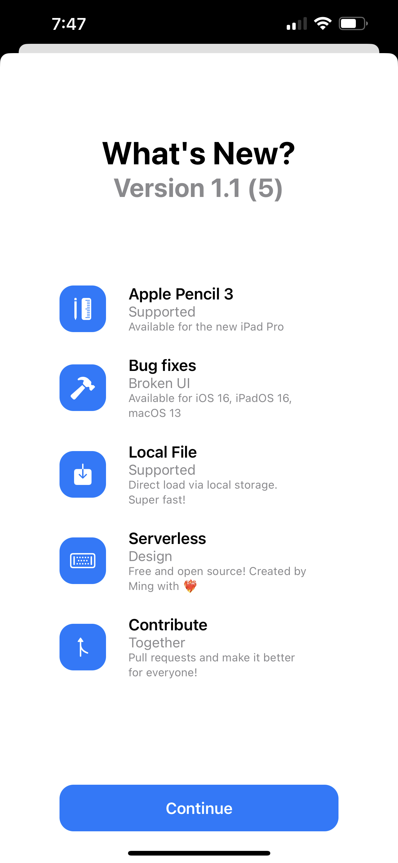
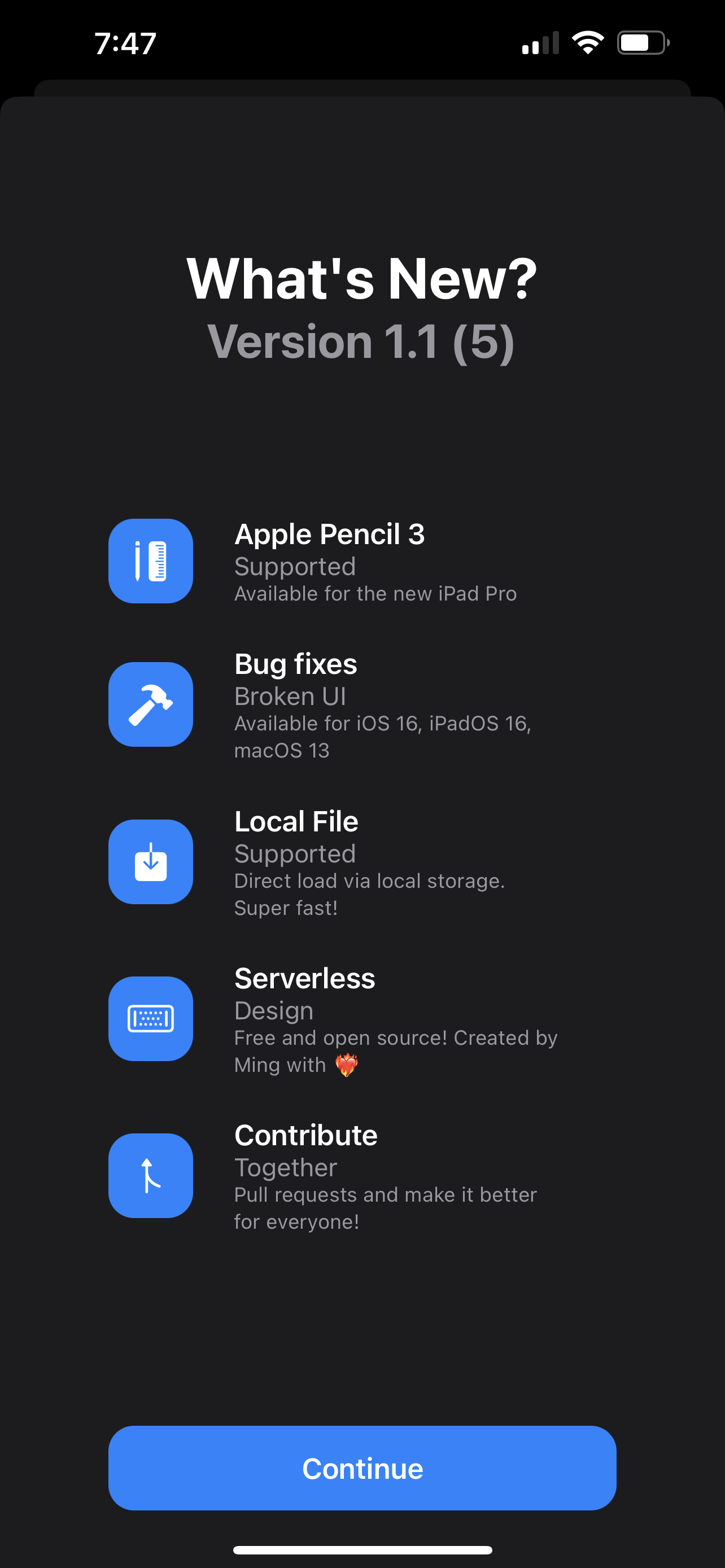
| Light | Dark |
|---|---|
 |  |
| Guide | Covers |
|---|---|
| Configuration | All parameters, examples, data sources (local / remote / Firebase), data model |
| Platform Support & Installation | Supported OS versions, requirements, feature matrix, SPM setup |
| CarPlay Integration | Template factory, scene lifecycle, data loading, entitlement requirements |
| Contributing | Project structure, dev setup, running the Demo (code signing, CarPlay), PR guidelines, troubleshooting |
SwiftNEW is released under the MIT License — one of the most permissive open-source licenses.
| Details | |
|---|---|
| ✅ You can | Use it in commercial apps (including paid App Store apps), modify it, redistribute it, and ship it inside closed-source software |
| 📝 You must | Keep the original copyright and license notice in your project |
| The software is provided "as is" — the author is not liable for any issues arising from its use |
See LICENSE for the full text.
| Sponsor | Resource |
|---|---|
 | Cloud infrastructure |
 | AI-powered docs Q&A |