I no longer have the time nor the energy to maintain Picky. Please fork and improve. For alternatives I suggest:
Yet another React select list.




When dealing with medium+ length select lists, especially multi-select lists. The common approach is to use tags e.g.

Source: React-Select by Jed Watson
This approach is fine for smaller lists. When you have options for 20, 30, 100+ options that the use can select, it becomes unmanigable.
For example you have a internal staff mailing list. You want to mail all staff in a department (30 employees). You select all. That would be 30 tags taking unneccessary space.
This is a multiselect with checkboxes, a select all option, and a filter. Along a similar vein as David Stutz's Bootstrap Multiselect. There is a port of that library to react with Skratchdot's React Bootstrap Multiselect. However I don't want a dependency on jQuery. If you are already using jQuery that might be an alternative for you.
If you like the tag list like React-Select, then that would be a great option for you. It's a really great, well-tested library. Give it a look.
You can also achieve the same result with a great deal of flexibility using Paypal's Downshift.
React Select V2 is pretty incredible, you can replace and provide custom functionality for almost every element of the select component. With a little work you could rebuild Picky from the components of React Select, take a look at React Select: Experimental, the Popout example is close to what Picky does. You could even build a date picker in React Select...HOW COOL IS THAT!
Picky provides a medium amount of flexibility, you can custom render: Options, List (useful for creating a virtualized menu), and SelectAll. Any further customisation and it's a little out of scope for Picky. It was built with a common pattern in mind so you can get up and running with little-to-no work. If you need Picky to be more flexible, I'm happy to take a PR if it would benefit the rest of the community.
 "react": "^16.8.0",
"react-dom": "^16.8.0"
 npm install --save react-picky
# or
yarn add react-picky
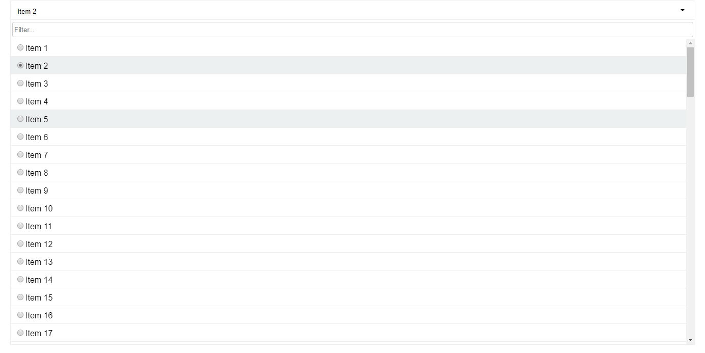
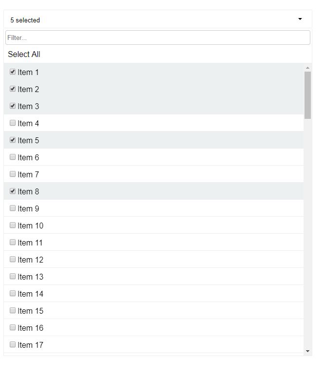
import{Picky}from'react-picky';import'react-picky/dist/picky.css';// Include CSS<Pickyid="picky"options={[1,2,3,4,5]}value={[]}multiple={true}includeSelectAll={true}includeFilter={true}onChange={values=>console.log(values)}dropdownHeight={600}/>;Picky.defaultProps={numberDisplayed: 3,options: [],filterDebounce: 150,dropdownHeight: 300,onChange: ()=>{},tabIndex: 0,keepOpen: true,selectAllText: 'Select all',selectAllMode: 'default',};Picky.propTypes={id: PropTypes.string.isRequired,placeholder: PropTypes.string,value: PropTypes.oneOfType([PropTypes.array,PropTypes.string,PropTypes.number,PropTypes.object,]),numberDisplayed: PropTypes.number,multiple: PropTypes.bool,options: PropTypes.array.isRequired,onChange: PropTypes.func.isRequired,open: PropTypes.bool,includeSelectAll: PropTypes.bool,includeFilter: PropTypes.bool,filterDebounce: PropTypes.number,dropdownHeight: PropTypes.number,onFiltered: PropTypes.func,onOpen: PropTypes.func,onClose: PropTypes.func,valueKey: PropTypes.string,labelKey: PropTypes.string,render: PropTypes.func,tabIndex: PropTypes.oneOfType([PropTypes.string,PropTypes.number]),keepOpen: PropTypes.bool,manySelectedPlaceholder: PropTypes.string,allSelectedPlaceholder: PropTypes.string,selectAllText: PropTypes.string,renderSelectAll: PropTypes.func,defaultFocusFilter: PropTypes.bool,className: PropTypes.string,renderList: PropTypes.func,filterPlaceholder: PropTypes.string,disabled: PropTypes.bool,getFilterValue: PropTypes.func,caseSensitiveFilter: PropTypes.bool,buttonProps: PropTypes.object,selectAllMode: PropTypes.oneOf(['default','filtered']),clearFilterOnClose: PropTypes.bool,singleSelectPlaceholder: PropTypes.func,};id- HTML id assigned to input. Also used as a base for other elements inside Picky.placeholder- Default message when no items are selected.value- The selected value(s), array if multiple is true. Not needed if using as an uncontolled componentnumberDisplayed- Then number of selected options displayed until it turns into '(selected count) selected'.multiple- Set to true for a multiselect, defaults to false.options- Array of possible options.onChange- Called whenever selected value(s) have changed. Pass the selected value back intovalue.open- Can open or close the dropdown manually. Defaults to false.includeSelectAll- If set totruewill add aSelect Allcheckbox at the top of the list.includeFilter- If set totruewill add an input at the top of the dropdown for filtering the results.filterDebounce- Debounce timeout, used to limit the rate the internalonFilterChangegets called. Defaults to 150ms.dropdownHeight- The height of the dropdown. Defaults to 300px.onFiltered- Called after a filter has been done with the filtered options.onOpen- Called after the dropdown has opened.onClose- Called after the dropdown has closed.valueKey- If supplying an array of objects as options, this is required. It's used to identify which property on the object is the value.labelKey- If supplying an array of objects as options, this is required. It's used to identify which property on the object is the label.render- Used for custom rendering of items in the dropdown. More info below.tabIndex- Pass tabIndex to component for accessibility. Defaults to 0keepOpen- Default true. Single selects close automatically when selecting a value unless this is set to true.manySelectedPlaceholder- Default "%s selected" where %s is the number of items selected. This gets used when the number if items selected is more than thenumberDisplayedprop and when all options are not selected.allSelectedPlaceholder- Default "%s selected" where %s is the number of items selected. This gets used when all options are selected.selectAllText- Default "Select all", use this to override "Select all" text from top of dropdown when included withincludeSelectAll.renderSelectAll- Used for rendering a custom select alldefaultFocusFilter- If set to true, will focus the filter by default when opened.renderList- Render prop for whole list, you can use this to add virtualization/windowing if necessaryfilterPlaceholder- Override the filter placeholder. Defaults to 'Filter...'getFilterValue- Will provide the input value of filter to the picky dropdown, so that if we have a larger list of options then we can only supply the matching options based on this value.caseSensitiveFilter- If true options will be returned when they match casebuttonProps- Additional props to apply the the button component, useful for supplying class names.selectAllMode- default:default. When the mode isfilteredthe Select All won't be hidden when filtering.clearFilterOnClose- When set to true filtered options and filtered state will be cleared on close. Defaults to false.filterTermProcessor- A function that takes a string and returns a string. Useful for trimming and processing a filter term before it filters the options. Default: (term) => termsingleSelectPlaceholder- A function that takes the currently selected value and returns a string.(val: OptionType) => string
You can render out custom items for the dropdown.
Example
<Pickyid="picky"value={this.state.arrayValue}options={bigList}onChange={this.selectMultipleOption}open={false}valueKey="id"labelKey="name"multiple={true}includeSelectAll={true}includeFilter={true}getFilterValue={this.getFilterValue}dropdownHeight={600}render={({
style,
isSelected,
item,
selectValue,
labelKey,
valueKey,
multiple,})=>{return(<listyle={style}// requiredclassName={isSelected ? 'selected' : ''}// required to indicate is selectedkey={item[valueKey]}// requiredonClick={()=>selectValue(item)}>{/* required to select item */}<inputtype="checkbox"checked={isSelected}readOnly/><spanstyle={{fontSize: '30px'}}>{item[labelKey]}</span></li>);}}/>
The render callback gets called with the following properties: style, isSelected, item, labelKey, valueKey, selectValue, multiple
isSelected- boolean - true if item is selected. Use this for styling accordingly.item- object | number | string - The item to render.labelKey- Used to get the label if item is an objectvalueKey- Used to get the value if item is an object, good for keys.selectValue- function(item) - Selects the item on clickmultiple- boolean - Indicates if is a multiselect.
Note
- If your rendered item affects the height of the item in anyway. Supply
itemHeightto Picky. - If you wish to show a radio button or a checkbox, be sure to add
readOnlyprop to the input.
<Picky// ...renderSelectAll={({
filtered,
tabIndex,
allSelected,
toggleSelectAll,
multiple,})=>{// Don't show if single select or items have been filtered.if(multiple&&!filtered){return(<divtabIndex={tabIndex}role="option"className={allSelected ? 'option selected' : 'option'}onClick={toggleSelectAll}onKeyPress={toggleSelectAll}><h1>SELECT ALL</h1></div>);}}}/>
Gets called with the following properties:
filtered: boolean - true if items have been filtered.allSelected: boolean true if all items are selected.toggleSelectAll: function selects or deselects all items.tabIndex: number used for specifying tab index.multiple: boolean true if multiselect.
<Pickyid="picky"value={this.state.arrayValue}options={bigList}onChange={this.selectMultipleOption}open={true}valueKey="id"labelKey="name"multiple={true}includeSelectAll={true}includeFilter={true}dropdownHeight={600}manySelectedPlaceholder={dynamicPlaceholder}defaultFocusFilter={true}renderList={({ items, selected, multiple, selectValue, getIsSelected })=>items.map(item=>(<likey={item.id}onClick={()=>selectValue(item)}>{getIsSelected(item) ? <strong>{item.name}</strong> : item.name}</li>))}/>This is an example of a custom rendered list.
Support is pretty basic by allowing a className prop to <Picky>, so as a side effect you can add a custom class to the core Picky for easier style overrides.
Usage
constSelect=styled(Picky)` background-color: #ff0000; .picky__dropdown, .option { font-size: 2em; }`;Picky is no longer a default export
V4
import Picky from 'react-picky'
V5
import { Picky } from 'react-picky'