



This is a Calendar Picker Component for React Native

To use the calendar you just need to:
npm install --save react-native-calendar-pickerNote: react-native-calendar-picker v5 is a complete re-write of the calendar. This calendar is now written using ES6 syntax. I kept most of the same functionalities and added support for date ranges.
If you need the old code I saved it on a branch v4
CalendarPicker requires Moment JS. Date props may be anything parseable by Moment: Javascript Date, Moment date, or ISO8601 datetime string.
importReact,{Component}from'react';import{StyleSheet,Text,View}from'react-native';importCalendarPickerfrom'react-native-calendar-picker';exportdefaultclassAppextendsComponent{constructor(props){super(props);this.state={selectedStartDate: null,};this.onDateChange=this.onDateChange.bind(this);}onDateChange(date){this.setState({selectedStartDate: date,});}render(){const{ selectedStartDate }=this.state;conststartDate=selectedStartDate ? selectedStartDate.toString() : '';return(<Viewstyle={styles.container}><CalendarPickeronDateChange={this.onDateChange}/><View><Text>SELECTED DATE:{startDate}</Text></View></View>);}}conststyles=StyleSheet.create({container: {flex: 1,backgroundColor: '#FFFFFF',marginTop: 100,},});| Prop | Type | Description |
|---|---|---|
weekdays | Array | Optional. List of week days. Eg. ['Mon', 'Tue', ...] Must be 7 days |
months | Array | Optional. List of months names. Eg. ['Jan', 'Feb', ...] Must be 12 months |
startFromMonday | Boolean | Optional. Default first day of week will be Sunday. You can set start of week from Monday by setting this to true. Default is false |
allowRangeSelection | Boolean | Optional. Allow to select date ranges. Default is false |
previousTitle | String | Optional. Title of button for previous month. Default is Previous |
nextTitle | String | Optional. Title of button for next month. Default is Next |
selectedDayColor | String | Optional. Color for selected day |
selectedDayStyle | ViewStyle | Optional. Style for selected day. May override selectedDayColor. |
selectedDayTextColor | String | Optional. Text color for selected day |
selectedRangeStartStyle | ViewStyle | Optional. Style for range selected start day. |
selectedRangeEndStyle | ViewStyle | Optional. Style for range selected end day. |
selectedRangeStyle | ViewStyle | Optional. Style for all days in range selection. |
todayBackgroundColor | String | Optional. Background color for today. Default is #cccccc |
todayTextStyle | TextStyle | Optional. Text styling for today. |
textStyle | Object | Optional. Style overall text. Change fontFamily, color, etc. |
customDatesStyles | Array | Optional. Style individual date(s). Array of objects {date: Moment-parseable date, containerStyle: ViewStyle, style: ViewStyle, textStyle: TextStyle} |
scaleFactor | Number | Optional. Default (375) scales to window width |
minDate | Date | Optional. Specifies minimum date to be selected |
maxDate | Date | Optional. Specifies maximum date to be selected |
initialDate | Date | Optional. Date that calendar opens to. Defaults to today. |
width | Number | Optional. Width of CalendarPicker's container. Defaults to Dimensions width. |
height | Number | Optional. Height of CalendarPicker's container. Defaults to Dimensions height. |
swipeConfig | Object | Optional. Config passed to Swiper. |
enableSwipe | Boolean | Optional. Whether to enable swiping. Default is true |
onDateChange | Function | Optional. Callback when a date is selected. Returns Moment date as first parameter. |
onMonthChange | Function | Optional. Callback when Previous / Next month is pressed. Returns Moment date as first parameter. |
Some styles will overwrite some won't. For instance:
- If you provide textStyle with fontFamily and color, out of ranges dates will not apply your color, just fontFamily.
Order of precedence:
- defaultColor => textStyle => selectedDayColor
- defaultTodayBackgroundColor => todayBackgroundColor
- defaultBackgroundColor => selectedDayColor
- defaultTextStyles => textStyle => selectedDayTextColor

importReact,{Component}from'react';import{StyleSheet,Text,View}from'react-native';importCalendarPickerfrom'react-native-calendar-picker';exportdefaultclassAppextendsComponent{constructor(props){super(props);this.state={selectedStartDate: null,selectedEndDate: null,};this.onDateChange=this.onDateChange.bind(this);}onDateChange(date,type){if(type==='END_DATE'){this.setState({selectedEndDate: date,});}else{this.setState({selectedStartDate: date,selectedEndDate: null,});}}render(){const{ selectedStartDate, selectedEndDate }=this.state;constminDate=newDate();// TodayconstmaxDate=newDate(2017,6,3);conststartDate=selectedStartDate ? selectedStartDate.toString() : '';constendDate=selectedEndDate ? selectedEndDate.toString() : '';return(<Viewstyle={styles.container}><CalendarPickerstartFromMonday={true}allowRangeSelection={true}minDate={minDate}maxDate={maxDate}todayBackgroundColor="#f2e6ff"selectedDayColor="#7300e6"selectedDayTextColor="#FFFFFF"onDateChange={this.onDateChange}/><View><Text>SELECTED START DATE:{startDate}</Text><Text>SELECTED END DATE:{endDate}</Text></View></View>);}}conststyles=StyleSheet.create({container: {flex: 1,backgroundColor: '#FFFFFF',marginTop: 100,},});
importReact,{Component}from'react';import{StyleSheet,Text,View}from'react-native';importCalendarPickerfrom'react-native-calendar-picker';exportdefaultclassAppextendsComponent{constructor(props){super(props);this.state={selectedStartDate: null,selectedEndDate: null,};this.onDateChange=this.onDateChange.bind(this);}onDateChange(date,type){if(type==='END_DATE'){this.setState({selectedEndDate: date,});}else{this.setState({selectedStartDate: date,selectedEndDate: null,});}}render(){const{ selectedStartDate, selectedEndDate }=this.state;constminDate=newDate();// TodayconstmaxDate=newDate(2017,6,3);conststartDate=selectedStartDate ? selectedStartDate.toString() : '';constendDate=selectedEndDate ? selectedEndDate.toString() : '';return(<Viewstyle={styles.container}><CalendarPickerstartFromMonday={true}allowRangeSelection={true}minDate={minDate}maxDate={maxDate}weekdays={['Seg','Ter','Qua','Qui','Sex','Sab','Dom']}months={['Janeiro','Fevereiro','Março','Abril','Maio','Junho','Julho','Agosto','Setembro','Outubro','Novembro','Dezembro']}previousTitle="Anterior"nextTitle="Próximo"todayBackgroundColor="#e6ffe6"selectedDayColor="#66ff33"selectedDayTextColor="#000000"scaleFactor={375}textStyle={{fontFamily: 'Cochin',color: '#000000',}}onDateChange={this.onDateChange}/><View><Text>SELECTED START DATE:{startDate}</Text><Text>SELECTED END DATE:{endDate}</Text></View></View>);}}conststyles=StyleSheet.create({container: {flex: 1,backgroundColor: '#FFFFFF',marginTop: 100,},});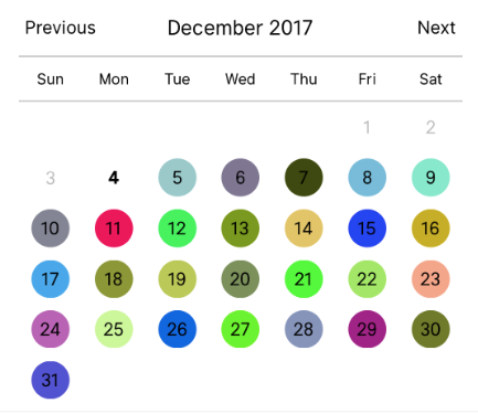
lettoday=moment();letday=today.clone();letcustomDatesStyles=[];while(day.add(1,'day').isSame(today,'month')){customDatesStyles.push({date: day.clone(),// Random colorsstyle: {backgroundColor: '#'+('#00000'+(Math.random()*(1<<24)|0).toString(16)).slice(-6)},});}render(){return(<CalendarPickertodayTextStyle={{fontWeight: 'bold'}}todayBackgroundColor={'transparent'}customDatesStyles={this.state.selectedTab==='tours' ? this.state.customTourDatesStyles : this.state.customRentalDatesStyles}minDate={today}/>);}Open Issues. Submit PRs.
I would like to call out some contributors who have been helping with this project
git clone git@github.com:stephy/CalendarPicker.git CalendarPicker
npm install
In Package.json modify
"main": "./CalendarPicker",to
"main": "./node_modules/react-native-scripts/build/bin/crna-entry.js",npm startnpm run ios