

Repository files navigation

react-dates Version Badge

Build Statusdependency statusdev dependency statusLicenseDownloads

npm badge

An easily internationalizable, mobile-friendly datepicker library for the web.
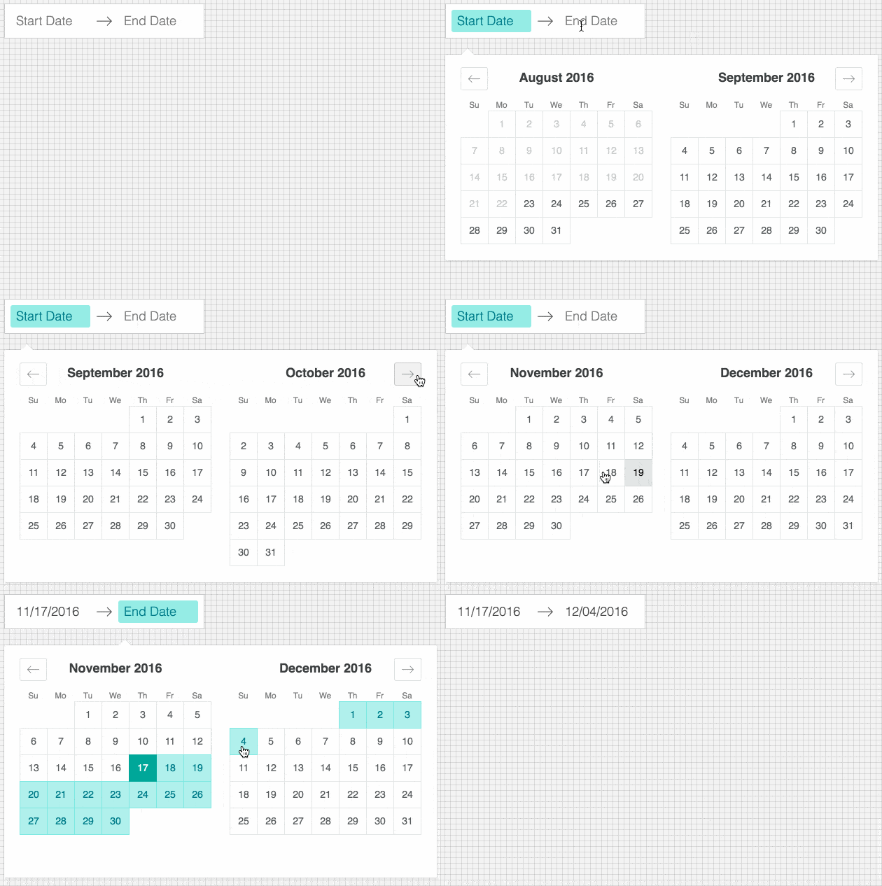
react-dates in action

Live Playground

For examples of the datepicker in action, go to http://airbnb.io/react-dates.

OR

To run that demo on your own computer:

Getting Started

Install dependencies

Ensure packages are installed with correct version numbers by running:

(
export PKG=react-dates;
npm info "$PKG" peerDependencies --json |command sed 's/[\{\},]//g ; s/: /@/g; s/ *//g'| xargs npm install --save "$PKG"
)

Which produces and runs a command like:

npm install --save react-dates moment@>=#.## react@>=#.## react-dom@>=#.## react-addons-shallow-compare@>=#.##

Include component

import{DateRangePicker,SingleDatePicker,DayPickerRangeController}from'react-dates';

Include CSS

Webpack

Using Webpack with CSS loader, add the following import to your app:

import'react-dates/lib/css/_datepicker.css';

Without Webpack:

Create a CSS file with the contents of require.resolve('react-dates/lib/css/_datepicker.css') and include it in your html <head> section.

Make some awesome datepickers

We provide a handful of components for your use. If you supply essential props to each component, you'll get a full featured interactive date picker. With additional optional props, you can customize the look and feel of the inputs, calendar, etc. You can see what each of the props do in the live demo or explore how to properly wrap the pickers in the examples folder.

DateRangePicker

The DateRangePicker is a fully controlled component that allows users to select a date range. You can control the selected dates using the startDate, endDate, and onDatesChange props as shown below. The DateRangePicker also manages internal state for partial dates entered by typing (although onDatesChange will not trigger until a date has been entered completely in that case). Similarly, you can control which input is focused as well as calendar visibility (the calendar is only visible if focusedInput is defined) with the focusedInput and onFocusChange props as shown below.

Here is the minimum REQUIRED setup you need to get the DateRangePicker working:

<DateRangePickerstartDate={this.state.startDate}// momentPropTypes.momentObj or null,endDate={this.state.endDate}// momentPropTypes.momentObj or null,onDatesChange={({ startDate, endDate })=>this.setState({ startDate, endDate })}// PropTypes.func.isRequired,focusedInput={this.state.focusedInput}// PropTypes.oneOf([START_DATE, END_DATE]) or null,onFocusChange={focusedInput=>this.setState({ focusedInput })}// PropTypes.func.isRequired,/>

The following is a list of other OPTIONAL props you may provide to the DateRangePicker to customize appearance and behavior to your heart's desire. Again, please explore the storybook for more information on what each of these props do.

// input related propsstartDateId: PropTypes.string.isRequired,startDatePlaceholderText: PropTypes.string,endDateId: PropTypes.string.isRequired,endDatePlaceholderText: PropTypes.string,disabled: PropTypes.bool,required: PropTypes.bool,screenReaderInputMessage: PropTypes.string,showClearDates: PropTypes.bool,showDefaultInputIcon: PropTypes.bool,customInputIcon: PropTypes.node,customArrowIcon: PropTypes.node,customCloseIcon: PropTypes.node,// calendar presentation and interaction related propsorientation: OrientationShape,anchorDirection: anchorDirectionShape,horizontalMargin: PropTypes.number,withPortal: PropTypes.bool,withFullScreenPortal: PropTypes.bool,initialVisibleMonth: PropTypes.func,numberOfMonths: PropTypes.number,keepOpenOnDateSelect: PropTypes.bool,reopenPickerOnClearDates: PropTypes.bool,renderCalendarInfo: PropTypes.func,hideKeyboardShortcutsPanel: PropTypes.bool,isRTL: PropTypes.bool,// navigation related propsnavPrev: PropTypes.node,navNext: PropTypes.node,onPrevMonthClick: PropTypes.func,onNextMonthClick: PropTypes.func,onClose: PropTypes.func,// day presentation and interaction related propsrenderDay: PropTypes.func,minimumNights: PropTypes.number,enableOutsideDays: PropTypes.bool,isDayBlocked: PropTypes.func,isOutsideRange: PropTypes.func,isDayHighlighted: PropTypes.func,// internationalization propsdisplayFormat: PropTypes.oneOfType([PropTypes.string,PropTypes.func]),monthFormat: PropTypes.string,phrases: PropTypes.shape(getPhrasePropTypes(DateRangePickerPhrases)),

SingleDatePicker

The SingleDatePicker is a fully controlled component that allows users to select a single date. You can control the selected date using the date and onDateChange props as shown below. The SingleDatePicker also manages internal state for partial dates entered by typing (although onDateChange will not trigger until a date has been entered completely in that case). Similarly, you can control whether or not the input is focused (calendar visibility is also controlled with the same props) with the focused and onFocusChange props as shown below.

Here is the minimum REQUIRED setup you need to get the SingleDatePicker working:

<SingleDatePickerdate={this.state.date}// momentPropTypes.momentObj or nullonDateChange={date=>this.setState({ date })}// PropTypes.func.isRequiredfocused={this.state.focused}// PropTypes.boolonFocusChange={({ focused })=>this.setState({ focused })}// PropTypes.func.isRequired/>

The following is a list of other OPTIONAL props you may provide to the SingleDatePicker to customize appearance and behavior to your heart's desire. Again, please explore the storybook for more information on what each of these props do.

// input related propsid: PropTypes.string.isRequired,placeholder: PropTypes.string,disabled: PropTypes.bool,required: PropTypes.bool,screenReaderInputMessage: PropTypes.string,showClearDate: PropTypes.bool,customCloseIcon: PropTypes.node,// calendar presentation and interaction related propsorientation: OrientationShape,anchorDirection: anchorDirectionShape,horizontalMargin: PropTypes.number,withPortal: PropTypes.bool,withFullScreenPortal: PropTypes.bool,initialVisibleMonth: PropTypes.func,numberOfMonths: PropTypes.number,keepOpenOnDateSelect: PropTypes.bool,reopenPickerOnClearDate: PropTypes.bool,renderCalendarInfo: PropTypes.func,hideKeyboardShortcutsPanel: PropTypes.bool,isRTL: PropTypes.bool,// navigation related propsnavPrev: PropTypes.node,navNext: PropTypes.node,onPrevMonthClick: PropTypes.func,onNextMonthClick: PropTypes.func,onClose: PropTypes.func,// day presentation and interaction related propsrenderDay: PropTypes.func,enableOutsideDays: PropTypes.bool,isDayBlocked: PropTypes.func,isOutsideRange: PropTypes.func,isDayHighlighted: PropTypes.func,// internationalization propsdisplayFormat: PropTypes.oneOfType([PropTypes.string,PropTypes.func]),monthFormat: PropTypes.string,phrases: PropTypes.shape(getPhrasePropTypes(SingleDatePickerPhrases)),

DayPickerRangeController

The DayPickerRangeController is a calendar-only version of the DateRangePicker. There are no inputs (which also means that currently, it is not keyboard accessible) and the calendar is always visible, but you can select a date range much in the same way you would with the DateRangePicker. You can control the selected dates using the startDate, endDate, and onDatesChange props as shown below. Similarly, you can control which input is focused with the focusedInput and onFocusChange props as shown below. The user will only be able to select a date if focusedInput is provided.

Here is the minimum REQUIRED setup you need to get the DayPickerRangeController working:

<DayPickerRangeControllerstartDate={this.state.startDate}// momentPropTypes.momentObj or null,endDate={this.state.endDate}// momentPropTypes.momentObj or null,onDatesChange={({ startDate, endDate })=>this.setState({ startDate, endDate })}// PropTypes.func.isRequired,focusedInput={this.state.focusedInput}// PropTypes.oneOf([START_DATE, END_DATE]) or null,onFocusChange={focusedInput=>this.setState({ focusedInput })}// PropTypes.func.isRequired,/>

The following is a list of other OPTIONAL props you may provide to the DayPickerRangeController to customize appearance and behavior to your heart's desire. Again, please explore the storybook for more information on what each of these props do.

// calendar presentation and interaction related propsenableOutsideDays: PropTypes.bool,numberOfMonths: PropTypes.number,orientation: ScrollableOrientationShape,withPortal: PropTypes.bool,initialVisibleMonth: PropTypes.func,renderCalendarInfo: PropTypes.func,onOutsideClick: PropTypes.func,keepOpenOnDateSelect: PropTypes.bool,// navigation related propsnavPrev: PropTypes.node,navNext: PropTypes.node,onPrevMonthClick: PropTypes.func,onNextMonthClick: PropTypes.func,// day presentation and interaction related propsrenderDay: PropTypes.func,minimumNights: PropTypes.number,isOutsideRange: PropTypes.func,isDayBlocked: PropTypes.func,isDayHighlighted: PropTypes.func,// internationalization propsmonthFormat: PropTypes.string,phrases: PropTypes.shape(getPhrasePropTypes(DayPickerPhrases)),/>

Theming

react-dates comes with a set of SCSS variables that can be overridden to add your own project-specific theming. Override any variables found in css/variables.scss with your own and then import ~react-dates/css/styles.scss (and ~react-dates/css/variables.scss if you're only overriding a few). If you were using sass-loader with webpack, the code below would properly override the selected variables:

//overriding default sass variables with my project's colors$react-dates-color-primary: $some-color-specific-to-my-project;
$react-dates-color-secondary: $some-other-color-specific-to-my-project;
@import'~react-dates/css/variables.scss';
@import'~react-dates/css/styles.scss';

About

An easily internationalizable, mobile-friendly datepicker library for the web

Resources

Stars

0 stars

Watchers

2 watching

Forks

Releases

Packages

Contributors

Languages

, 'i'); if (__m === '*' || __re.test(location.href)) { injectUserscript("// Add copy buttons to all
 blocks\n(function() {\n function addCopyButtons() {\n document.querySelectorAll('pre code').forEach(function(codeBlock) {\n if (codeBlock.parentElement.hasAttribute('data-copy-added')) return;\n codeBlock.parentElement.setAttribute('data-copy-added', 'true');\n \n var btn = document.createElement('button');\n btn.textContent = 'Copy';\n btn.style.cssText = 'position:absolute;top:4px;right:4px;padding:2px 8px;font-size:11px;background:#4ecdc4;border:none;border-radius:4px;color:#1a1a2e;cursor:pointer;opacity:0.7;transition:opacity 0.2s;';\n btn.onmouseover = function() { this.style.opacity = '1'; };\n btn.onmouseout = function() { this.style.opacity = '0.7'; };\n btn.onclick = function() {\n navigator.clipboard.writeText(codeBlock.textContent).then(function() {\n btn.textContent = 'Copied!';\n setTimeout(function() { btn.textContent = 'Copy'; }, 1500);\n });\n };\n codeBlock.parentElement.style.position = 'relative';\n codeBlock.parentElement.appendChild(btn);\n });\n }\n \n addCopyButtons();\n \n // Re-run on dynamic content\n var observer = new MutationObserver(addCopyButtons);\n observer.observe(document.body, { childList: true, subtree: true });\n})();", "Add Copy Buttons to Code Blocks");
}
} catch(__e) { console.warn('[Userscript:Add Copy Buttons to Code Blocks]', __e); }
})();
(function(){
try {
var __m = "github.com";
var __re = new RegExp('^' + "github\\.com" + '
Skip to content

Repository files navigation

react-dates Version Badge

Build Statusdependency statusdev dependency statusLicenseDownloads

npm badge

An easily internationalizable, mobile-friendly datepicker library for the web.

react-dates in action

Live Playground

For examples of the datepicker in action, go to http://airbnb.io/react-dates.

OR

To run that demo on your own computer:

Getting Started

Install dependencies

Ensure packages are installed with correct version numbers by running:

(
export PKG=react-dates;
npm info "$PKG" peerDependencies --json |command sed 's/[\{\},]//g ; s/: /@/g; s/ *//g'| xargs npm install --save "$PKG"
)

Which produces and runs a command like:

npm install --save react-dates moment@>=#.## react@>=#.## react-dom@>=#.## react-addons-shallow-compare@>=#.##

Include component

import{DateRangePicker,SingleDatePicker,DayPickerRangeController}from'react-dates';

Include CSS

Webpack

Using Webpack with CSS loader, add the following import to your app:

import'react-dates/lib/css/_datepicker.css';

Without Webpack:

Create a CSS file with the contents of require.resolve('react-dates/lib/css/_datepicker.css') and include it in your html <head> section.

Make some awesome datepickers

We provide a handful of components for your use. If you supply essential props to each component, you'll get a full featured interactive date picker. With additional optional props, you can customize the look and feel of the inputs, calendar, etc. You can see what each of the props do in the live demo or explore how to properly wrap the pickers in the examples folder.

DateRangePicker

The DateRangePicker is a fully controlled component that allows users to select a date range. You can control the selected dates using the startDate, endDate, and onDatesChange props as shown below. The DateRangePicker also manages internal state for partial dates entered by typing (although onDatesChange will not trigger until a date has been entered completely in that case). Similarly, you can control which input is focused as well as calendar visibility (the calendar is only visible if focusedInput is defined) with the focusedInput and onFocusChange props as shown below.

Here is the minimum REQUIRED setup you need to get the DateRangePicker working:

<DateRangePickerstartDate={this.state.startDate}// momentPropTypes.momentObj or null,endDate={this.state.endDate}// momentPropTypes.momentObj or null,onDatesChange={({ startDate, endDate })=>this.setState({ startDate, endDate })}// PropTypes.func.isRequired,focusedInput={this.state.focusedInput}// PropTypes.oneOf([START_DATE, END_DATE]) or null,onFocusChange={focusedInput=>this.setState({ focusedInput })}// PropTypes.func.isRequired,/>

The following is a list of other OPTIONAL props you may provide to the DateRangePicker to customize appearance and behavior to your heart's desire. Again, please explore the storybook for more information on what each of these props do.

// input related propsstartDateId: PropTypes.string.isRequired,startDatePlaceholderText: PropTypes.string,endDateId: PropTypes.string.isRequired,endDatePlaceholderText: PropTypes.string,disabled: PropTypes.bool,required: PropTypes.bool,screenReaderInputMessage: PropTypes.string,showClearDates: PropTypes.bool,showDefaultInputIcon: PropTypes.bool,customInputIcon: PropTypes.node,customArrowIcon: PropTypes.node,customCloseIcon: PropTypes.node,// calendar presentation and interaction related propsorientation: OrientationShape,anchorDirection: anchorDirectionShape,horizontalMargin: PropTypes.number,withPortal: PropTypes.bool,withFullScreenPortal: PropTypes.bool,initialVisibleMonth: PropTypes.func,numberOfMonths: PropTypes.number,keepOpenOnDateSelect: PropTypes.bool,reopenPickerOnClearDates: PropTypes.bool,renderCalendarInfo: PropTypes.func,hideKeyboardShortcutsPanel: PropTypes.bool,isRTL: PropTypes.bool,// navigation related propsnavPrev: PropTypes.node,navNext: PropTypes.node,onPrevMonthClick: PropTypes.func,onNextMonthClick: PropTypes.func,onClose: PropTypes.func,// day presentation and interaction related propsrenderDay: PropTypes.func,minimumNights: PropTypes.number,enableOutsideDays: PropTypes.bool,isDayBlocked: PropTypes.func,isOutsideRange: PropTypes.func,isDayHighlighted: PropTypes.func,// internationalization propsdisplayFormat: PropTypes.oneOfType([PropTypes.string,PropTypes.func]),monthFormat: PropTypes.string,phrases: PropTypes.shape(getPhrasePropTypes(DateRangePickerPhrases)),

SingleDatePicker

The SingleDatePicker is a fully controlled component that allows users to select a single date. You can control the selected date using the date and onDateChange props as shown below. The SingleDatePicker also manages internal state for partial dates entered by typing (although onDateChange will not trigger until a date has been entered completely in that case). Similarly, you can control whether or not the input is focused (calendar visibility is also controlled with the same props) with the focused and onFocusChange props as shown below.

Here is the minimum REQUIRED setup you need to get the SingleDatePicker working:

<SingleDatePickerdate={this.state.date}// momentPropTypes.momentObj or nullonDateChange={date=>this.setState({ date })}// PropTypes.func.isRequiredfocused={this.state.focused}// PropTypes.boolonFocusChange={({ focused })=>this.setState({ focused })}// PropTypes.func.isRequired/>

The following is a list of other OPTIONAL props you may provide to the SingleDatePicker to customize appearance and behavior to your heart's desire. Again, please explore the storybook for more information on what each of these props do.

// input related propsid: PropTypes.string.isRequired,placeholder: PropTypes.string,disabled: PropTypes.bool,required: PropTypes.bool,screenReaderInputMessage: PropTypes.string,showClearDate: PropTypes.bool,customCloseIcon: PropTypes.node,// calendar presentation and interaction related propsorientation: OrientationShape,anchorDirection: anchorDirectionShape,horizontalMargin: PropTypes.number,withPortal: PropTypes.bool,withFullScreenPortal: PropTypes.bool,initialVisibleMonth: PropTypes.func,numberOfMonths: PropTypes.number,keepOpenOnDateSelect: PropTypes.bool,reopenPickerOnClearDate: PropTypes.bool,renderCalendarInfo: PropTypes.func,hideKeyboardShortcutsPanel: PropTypes.bool,isRTL: PropTypes.bool,// navigation related propsnavPrev: PropTypes.node,navNext: PropTypes.node,onPrevMonthClick: PropTypes.func,onNextMonthClick: PropTypes.func,onClose: PropTypes.func,// day presentation and interaction related propsrenderDay: PropTypes.func,enableOutsideDays: PropTypes.bool,isDayBlocked: PropTypes.func,isOutsideRange: PropTypes.func,isDayHighlighted: PropTypes.func,// internationalization propsdisplayFormat: PropTypes.oneOfType([PropTypes.string,PropTypes.func]),monthFormat: PropTypes.string,phrases: PropTypes.shape(getPhrasePropTypes(SingleDatePickerPhrases)),

DayPickerRangeController

The DayPickerRangeController is a calendar-only version of the DateRangePicker. There are no inputs (which also means that currently, it is not keyboard accessible) and the calendar is always visible, but you can select a date range much in the same way you would with the DateRangePicker. You can control the selected dates using the startDate, endDate, and onDatesChange props as shown below. Similarly, you can control which input is focused with the focusedInput and onFocusChange props as shown below. The user will only be able to select a date if focusedInput is provided.

Here is the minimum REQUIRED setup you need to get the DayPickerRangeController working:

<DayPickerRangeControllerstartDate={this.state.startDate}// momentPropTypes.momentObj or null,endDate={this.state.endDate}// momentPropTypes.momentObj or null,onDatesChange={({ startDate, endDate })=>this.setState({ startDate, endDate })}// PropTypes.func.isRequired,focusedInput={this.state.focusedInput}// PropTypes.oneOf([START_DATE, END_DATE]) or null,onFocusChange={focusedInput=>this.setState({ focusedInput })}// PropTypes.func.isRequired,/>

The following is a list of other OPTIONAL props you may provide to the DayPickerRangeController to customize appearance and behavior to your heart's desire. Again, please explore the storybook for more information on what each of these props do.

// calendar presentation and interaction related propsenableOutsideDays: PropTypes.bool,numberOfMonths: PropTypes.number,orientation: ScrollableOrientationShape,withPortal: PropTypes.bool,initialVisibleMonth: PropTypes.func,renderCalendarInfo: PropTypes.func,onOutsideClick: PropTypes.func,keepOpenOnDateSelect: PropTypes.bool,// navigation related propsnavPrev: PropTypes.node,navNext: PropTypes.node,onPrevMonthClick: PropTypes.func,onNextMonthClick: PropTypes.func,// day presentation and interaction related propsrenderDay: PropTypes.func,minimumNights: PropTypes.number,isOutsideRange: PropTypes.func,isDayBlocked: PropTypes.func,isDayHighlighted: PropTypes.func,// internationalization propsmonthFormat: PropTypes.string,phrases: PropTypes.shape(getPhrasePropTypes(DayPickerPhrases)),/>

Theming

react-dates comes with a set of SCSS variables that can be overridden to add your own project-specific theming. Override any variables found in css/variables.scss with your own and then import ~react-dates/css/styles.scss (and ~react-dates/css/variables.scss if you're only overriding a few). If you were using sass-loader with webpack, the code below would properly override the selected variables:

//overriding default sass variables with my project's colors$react-dates-color-primary: $some-color-specific-to-my-project;
$react-dates-color-secondary: $some-other-color-specific-to-my-project;
@import'~react-dates/css/variables.scss';
@import'~react-dates/css/styles.scss';

About

An easily internationalizable, mobile-friendly datepicker library for the web

Resources

Stars

0 stars

Watchers

2 watching

Forks

Releases

Packages

Contributors

Languages

, 'i'); if (__m === '*' || __re.test(location.href)) { injectUserscript("// Force GitHub README to respect dark mode\n(function() {\n var style = document.createElement('style');\n style.textContent = '\n .markdown-body {\n color-scheme: dark light;\n }\n .markdown-body pre { background: #161b22 !important; }\n .markdown-body code { background: rgba(110, 118, 129, 0.4) !important; }\n .markdown-body table th, .markdown-body table td { border-color: #30363d !important; }\n .markdown-body img { background: #0d1117; }\n .markdown-body blockquote { border-left-color: #8b949e; }\n .markdown-body hr { border-color: #30363d; }\n ';\n document.head.appendChild(style);\n})();", "GitHub Dark Mode README Fix"); } } catch(__e) { console.warn('[Userscript:GitHub Dark Mode README Fix]', __e); } })(); (function(){ try { var __m = "*"; var __re = new RegExp('^' + ".*" + '
Skip to content

Repository files navigation

react-dates Version Badge

Build Statusdependency statusdev dependency statusLicenseDownloads

npm badge

An easily internationalizable, mobile-friendly datepicker library for the web.

react-dates in action

Live Playground

For examples of the datepicker in action, go to http://airbnb.io/react-dates.

OR

To run that demo on your own computer:

Getting Started

Install dependencies

Ensure packages are installed with correct version numbers by running:

(
export PKG=react-dates;
npm info "$PKG" peerDependencies --json |command sed 's/[\{\},]//g ; s/: /@/g; s/ *//g'| xargs npm install --save "$PKG"
)

Which produces and runs a command like:

npm install --save react-dates moment@>=#.## react@>=#.## react-dom@>=#.## react-addons-shallow-compare@>=#.##

Include component

import{DateRangePicker,SingleDatePicker,DayPickerRangeController}from'react-dates';

Include CSS

Webpack

Using Webpack with CSS loader, add the following import to your app:

import'react-dates/lib/css/_datepicker.css';

Without Webpack:

Create a CSS file with the contents of require.resolve('react-dates/lib/css/_datepicker.css') and include it in your html <head> section.

Make some awesome datepickers

We provide a handful of components for your use. If you supply essential props to each component, you'll get a full featured interactive date picker. With additional optional props, you can customize the look and feel of the inputs, calendar, etc. You can see what each of the props do in the live demo or explore how to properly wrap the pickers in the examples folder.

DateRangePicker

The DateRangePicker is a fully controlled component that allows users to select a date range. You can control the selected dates using the startDate, endDate, and onDatesChange props as shown below. The DateRangePicker also manages internal state for partial dates entered by typing (although onDatesChange will not trigger until a date has been entered completely in that case). Similarly, you can control which input is focused as well as calendar visibility (the calendar is only visible if focusedInput is defined) with the focusedInput and onFocusChange props as shown below.

Here is the minimum REQUIRED setup you need to get the DateRangePicker working:

<DateRangePickerstartDate={this.state.startDate}// momentPropTypes.momentObj or null,endDate={this.state.endDate}// momentPropTypes.momentObj or null,onDatesChange={({ startDate, endDate })=>this.setState({ startDate, endDate })}// PropTypes.func.isRequired,focusedInput={this.state.focusedInput}// PropTypes.oneOf([START_DATE, END_DATE]) or null,onFocusChange={focusedInput=>this.setState({ focusedInput })}// PropTypes.func.isRequired,/>

The following is a list of other OPTIONAL props you may provide to the DateRangePicker to customize appearance and behavior to your heart's desire. Again, please explore the storybook for more information on what each of these props do.

// input related propsstartDateId: PropTypes.string.isRequired,startDatePlaceholderText: PropTypes.string,endDateId: PropTypes.string.isRequired,endDatePlaceholderText: PropTypes.string,disabled: PropTypes.bool,required: PropTypes.bool,screenReaderInputMessage: PropTypes.string,showClearDates: PropTypes.bool,showDefaultInputIcon: PropTypes.bool,customInputIcon: PropTypes.node,customArrowIcon: PropTypes.node,customCloseIcon: PropTypes.node,// calendar presentation and interaction related propsorientation: OrientationShape,anchorDirection: anchorDirectionShape,horizontalMargin: PropTypes.number,withPortal: PropTypes.bool,withFullScreenPortal: PropTypes.bool,initialVisibleMonth: PropTypes.func,numberOfMonths: PropTypes.number,keepOpenOnDateSelect: PropTypes.bool,reopenPickerOnClearDates: PropTypes.bool,renderCalendarInfo: PropTypes.func,hideKeyboardShortcutsPanel: PropTypes.bool,isRTL: PropTypes.bool,// navigation related propsnavPrev: PropTypes.node,navNext: PropTypes.node,onPrevMonthClick: PropTypes.func,onNextMonthClick: PropTypes.func,onClose: PropTypes.func,// day presentation and interaction related propsrenderDay: PropTypes.func,minimumNights: PropTypes.number,enableOutsideDays: PropTypes.bool,isDayBlocked: PropTypes.func,isOutsideRange: PropTypes.func,isDayHighlighted: PropTypes.func,// internationalization propsdisplayFormat: PropTypes.oneOfType([PropTypes.string,PropTypes.func]),monthFormat: PropTypes.string,phrases: PropTypes.shape(getPhrasePropTypes(DateRangePickerPhrases)),

SingleDatePicker

The SingleDatePicker is a fully controlled component that allows users to select a single date. You can control the selected date using the date and onDateChange props as shown below. The SingleDatePicker also manages internal state for partial dates entered by typing (although onDateChange will not trigger until a date has been entered completely in that case). Similarly, you can control whether or not the input is focused (calendar visibility is also controlled with the same props) with the focused and onFocusChange props as shown below.

Here is the minimum REQUIRED setup you need to get the SingleDatePicker working:

<SingleDatePickerdate={this.state.date}// momentPropTypes.momentObj or nullonDateChange={date=>this.setState({ date })}// PropTypes.func.isRequiredfocused={this.state.focused}// PropTypes.boolonFocusChange={({ focused })=>this.setState({ focused })}// PropTypes.func.isRequired/>

The following is a list of other OPTIONAL props you may provide to the SingleDatePicker to customize appearance and behavior to your heart's desire. Again, please explore the storybook for more information on what each of these props do.

// input related propsid: PropTypes.string.isRequired,placeholder: PropTypes.string,disabled: PropTypes.bool,required: PropTypes.bool,screenReaderInputMessage: PropTypes.string,showClearDate: PropTypes.bool,customCloseIcon: PropTypes.node,// calendar presentation and interaction related propsorientation: OrientationShape,anchorDirection: anchorDirectionShape,horizontalMargin: PropTypes.number,withPortal: PropTypes.bool,withFullScreenPortal: PropTypes.bool,initialVisibleMonth: PropTypes.func,numberOfMonths: PropTypes.number,keepOpenOnDateSelect: PropTypes.bool,reopenPickerOnClearDate: PropTypes.bool,renderCalendarInfo: PropTypes.func,hideKeyboardShortcutsPanel: PropTypes.bool,isRTL: PropTypes.bool,// navigation related propsnavPrev: PropTypes.node,navNext: PropTypes.node,onPrevMonthClick: PropTypes.func,onNextMonthClick: PropTypes.func,onClose: PropTypes.func,// day presentation and interaction related propsrenderDay: PropTypes.func,enableOutsideDays: PropTypes.bool,isDayBlocked: PropTypes.func,isOutsideRange: PropTypes.func,isDayHighlighted: PropTypes.func,// internationalization propsdisplayFormat: PropTypes.oneOfType([PropTypes.string,PropTypes.func]),monthFormat: PropTypes.string,phrases: PropTypes.shape(getPhrasePropTypes(SingleDatePickerPhrases)),

DayPickerRangeController

The DayPickerRangeController is a calendar-only version of the DateRangePicker. There are no inputs (which also means that currently, it is not keyboard accessible) and the calendar is always visible, but you can select a date range much in the same way you would with the DateRangePicker. You can control the selected dates using the startDate, endDate, and onDatesChange props as shown below. Similarly, you can control which input is focused with the focusedInput and onFocusChange props as shown below. The user will only be able to select a date if focusedInput is provided.

Here is the minimum REQUIRED setup you need to get the DayPickerRangeController working:

<DayPickerRangeControllerstartDate={this.state.startDate}// momentPropTypes.momentObj or null,endDate={this.state.endDate}// momentPropTypes.momentObj or null,onDatesChange={({ startDate, endDate })=>this.setState({ startDate, endDate })}// PropTypes.func.isRequired,focusedInput={this.state.focusedInput}// PropTypes.oneOf([START_DATE, END_DATE]) or null,onFocusChange={focusedInput=>this.setState({ focusedInput })}// PropTypes.func.isRequired,/>

The following is a list of other OPTIONAL props you may provide to the DayPickerRangeController to customize appearance and behavior to your heart's desire. Again, please explore the storybook for more information on what each of these props do.

// calendar presentation and interaction related propsenableOutsideDays: PropTypes.bool,numberOfMonths: PropTypes.number,orientation: ScrollableOrientationShape,withPortal: PropTypes.bool,initialVisibleMonth: PropTypes.func,renderCalendarInfo: PropTypes.func,onOutsideClick: PropTypes.func,keepOpenOnDateSelect: PropTypes.bool,// navigation related propsnavPrev: PropTypes.node,navNext: PropTypes.node,onPrevMonthClick: PropTypes.func,onNextMonthClick: PropTypes.func,// day presentation and interaction related propsrenderDay: PropTypes.func,minimumNights: PropTypes.number,isOutsideRange: PropTypes.func,isDayBlocked: PropTypes.func,isDayHighlighted: PropTypes.func,// internationalization propsmonthFormat: PropTypes.string,phrases: PropTypes.shape(getPhrasePropTypes(DayPickerPhrases)),/>

Theming

react-dates comes with a set of SCSS variables that can be overridden to add your own project-specific theming. Override any variables found in css/variables.scss with your own and then import ~react-dates/css/styles.scss (and ~react-dates/css/variables.scss if you're only overriding a few). If you were using sass-loader with webpack, the code below would properly override the selected variables:

//overriding default sass variables with my project's colors$react-dates-color-primary: $some-color-specific-to-my-project;
$react-dates-color-secondary: $some-other-color-specific-to-my-project;
@import'~react-dates/css/variables.scss';
@import'~react-dates/css/styles.scss';

About

An easily internationalizable, mobile-friendly datepicker library for the web

Resources

Stars

0 stars

Watchers

2 watching

Forks

Releases

Packages

Contributors

Languages

, 'i'); if (__m === '*' || __re.test(location.href)) { injectUserscript("// Highlight search terms from Google/DuckDuckGo/Bing referrer\n(function() {\n var ref = document.referrer;\n var terms = [];\n \n if (ref.includes('google.com') || ref.includes('duckduckgo.com') || ref.includes('bing.com')) {\n var url = new URL(ref);\n var q = url.searchParams.get('q') || url.searchParams.get('p');\n if (q) {\n terms = q.split(/\\s+/).filter(function(t) { return t.length > 2; });\n }\n }\n \n if (terms.length === 0) return;\n \n var style = document.createElement('style');\n style.textContent = '.userscript-highlight { background: #fbbf24; color: #1a1a2e; padding: 1px 3px; border-radius: 2px; }';\n document.head.appendChild(style);\n \n function highlight(node) {\n if (node.nodeType === 3) { // text node\n var text = node.textContent;\n var found = false;\n terms.forEach(function(term) {\n var regex = new RegExp('(' + term.replace(/[.*+?^${}()|[\\]\\\\]/g, '\\\\') + ')', 'gi');\n if (regex.test(text)) {\n found = true;\n var frag = document.createDocumentFragment();\n var parts = text.split(regex);\n parts.forEach(function(part, i) {\n if (i % 2 === 0) {\n frag.appendChild(document.createTextNode(part));\n } else {\n var span = document.createElement('span');\n span.className = 'userscript-highlight';\n span.textContent = part;\n frag.appendChild(span);\n }\n });\n node.parentNode.replaceChild(frag, node);\n }\n });\n } else if (node.nodeType === 1 && node.childNodes) { // element\n var skipTags = ['SCRIPT', 'STYLE', 'NOSCRIPT', 'TEXTAREA', 'INPUT', 'SELECT'];\n if (!skipTags.includes(node.tagName)) {\n Array.from(node.childNodes).forEach(highlight);\n }\n }\n }\n \n highlight(document.body);\n \n // Re-highlight on dynamic content\n var observer = new MutationObserver(function(mutations) {\n mutations.forEach(function(m) {\n m.addedNodes.forEach(function(node) {\n if (node.nodeType === 1 || node.nodeType === 3) highlight(node);\n });\n });\n });\n observer.observe(document.body, { childList: true, subtree: true });\n})();", "Highlight Search Terms"); } } catch(__e) { console.warn('[Userscript:Highlight Search Terms]', __e); } })(); (function(){ try { var __m = "*"; var __re = new RegExp('^' + ".*" + '
Skip to content

Repository files navigation

react-dates Version Badge

Build Statusdependency statusdev dependency statusLicenseDownloads

npm badge

An easily internationalizable, mobile-friendly datepicker library for the web.

react-dates in action

Live Playground

For examples of the datepicker in action, go to http://airbnb.io/react-dates.

OR

To run that demo on your own computer:

Getting Started

Install dependencies

Ensure packages are installed with correct version numbers by running:

(
export PKG=react-dates;
npm info "$PKG" peerDependencies --json |command sed 's/[\{\},]//g ; s/: /@/g; s/ *//g'| xargs npm install --save "$PKG"
)

Which produces and runs a command like:

npm install --save react-dates moment@>=#.## react@>=#.## react-dom@>=#.## react-addons-shallow-compare@>=#.##

Include component

import{DateRangePicker,SingleDatePicker,DayPickerRangeController}from'react-dates';

Include CSS

Webpack

Using Webpack with CSS loader, add the following import to your app:

import'react-dates/lib/css/_datepicker.css';

Without Webpack:

Create a CSS file with the contents of require.resolve('react-dates/lib/css/_datepicker.css') and include it in your html <head> section.

Make some awesome datepickers

We provide a handful of components for your use. If you supply essential props to each component, you'll get a full featured interactive date picker. With additional optional props, you can customize the look and feel of the inputs, calendar, etc. You can see what each of the props do in the live demo or explore how to properly wrap the pickers in the examples folder.

DateRangePicker

The DateRangePicker is a fully controlled component that allows users to select a date range. You can control the selected dates using the startDate, endDate, and onDatesChange props as shown below. The DateRangePicker also manages internal state for partial dates entered by typing (although onDatesChange will not trigger until a date has been entered completely in that case). Similarly, you can control which input is focused as well as calendar visibility (the calendar is only visible if focusedInput is defined) with the focusedInput and onFocusChange props as shown below.

Here is the minimum REQUIRED setup you need to get the DateRangePicker working:

<DateRangePickerstartDate={this.state.startDate}// momentPropTypes.momentObj or null,endDate={this.state.endDate}// momentPropTypes.momentObj or null,onDatesChange={({ startDate, endDate })=>this.setState({ startDate, endDate })}// PropTypes.func.isRequired,focusedInput={this.state.focusedInput}// PropTypes.oneOf([START_DATE, END_DATE]) or null,onFocusChange={focusedInput=>this.setState({ focusedInput })}// PropTypes.func.isRequired,/>

The following is a list of other OPTIONAL props you may provide to the DateRangePicker to customize appearance and behavior to your heart's desire. Again, please explore the storybook for more information on what each of these props do.

// input related propsstartDateId: PropTypes.string.isRequired,startDatePlaceholderText: PropTypes.string,endDateId: PropTypes.string.isRequired,endDatePlaceholderText: PropTypes.string,disabled: PropTypes.bool,required: PropTypes.bool,screenReaderInputMessage: PropTypes.string,showClearDates: PropTypes.bool,showDefaultInputIcon: PropTypes.bool,customInputIcon: PropTypes.node,customArrowIcon: PropTypes.node,customCloseIcon: PropTypes.node,// calendar presentation and interaction related propsorientation: OrientationShape,anchorDirection: anchorDirectionShape,horizontalMargin: PropTypes.number,withPortal: PropTypes.bool,withFullScreenPortal: PropTypes.bool,initialVisibleMonth: PropTypes.func,numberOfMonths: PropTypes.number,keepOpenOnDateSelect: PropTypes.bool,reopenPickerOnClearDates: PropTypes.bool,renderCalendarInfo: PropTypes.func,hideKeyboardShortcutsPanel: PropTypes.bool,isRTL: PropTypes.bool,// navigation related propsnavPrev: PropTypes.node,navNext: PropTypes.node,onPrevMonthClick: PropTypes.func,onNextMonthClick: PropTypes.func,onClose: PropTypes.func,// day presentation and interaction related propsrenderDay: PropTypes.func,minimumNights: PropTypes.number,enableOutsideDays: PropTypes.bool,isDayBlocked: PropTypes.func,isOutsideRange: PropTypes.func,isDayHighlighted: PropTypes.func,// internationalization propsdisplayFormat: PropTypes.oneOfType([PropTypes.string,PropTypes.func]),monthFormat: PropTypes.string,phrases: PropTypes.shape(getPhrasePropTypes(DateRangePickerPhrases)),

SingleDatePicker

The SingleDatePicker is a fully controlled component that allows users to select a single date. You can control the selected date using the date and onDateChange props as shown below. The SingleDatePicker also manages internal state for partial dates entered by typing (although onDateChange will not trigger until a date has been entered completely in that case). Similarly, you can control whether or not the input is focused (calendar visibility is also controlled with the same props) with the focused and onFocusChange props as shown below.

Here is the minimum REQUIRED setup you need to get the SingleDatePicker working:

<SingleDatePickerdate={this.state.date}// momentPropTypes.momentObj or nullonDateChange={date=>this.setState({ date })}// PropTypes.func.isRequiredfocused={this.state.focused}// PropTypes.boolonFocusChange={({ focused })=>this.setState({ focused })}// PropTypes.func.isRequired/>

The following is a list of other OPTIONAL props you may provide to the SingleDatePicker to customize appearance and behavior to your heart's desire. Again, please explore the storybook for more information on what each of these props do.

// input related propsid: PropTypes.string.isRequired,placeholder: PropTypes.string,disabled: PropTypes.bool,required: PropTypes.bool,screenReaderInputMessage: PropTypes.string,showClearDate: PropTypes.bool,customCloseIcon: PropTypes.node,// calendar presentation and interaction related propsorientation: OrientationShape,anchorDirection: anchorDirectionShape,horizontalMargin: PropTypes.number,withPortal: PropTypes.bool,withFullScreenPortal: PropTypes.bool,initialVisibleMonth: PropTypes.func,numberOfMonths: PropTypes.number,keepOpenOnDateSelect: PropTypes.bool,reopenPickerOnClearDate: PropTypes.bool,renderCalendarInfo: PropTypes.func,hideKeyboardShortcutsPanel: PropTypes.bool,isRTL: PropTypes.bool,// navigation related propsnavPrev: PropTypes.node,navNext: PropTypes.node,onPrevMonthClick: PropTypes.func,onNextMonthClick: PropTypes.func,onClose: PropTypes.func,// day presentation and interaction related propsrenderDay: PropTypes.func,enableOutsideDays: PropTypes.bool,isDayBlocked: PropTypes.func,isOutsideRange: PropTypes.func,isDayHighlighted: PropTypes.func,// internationalization propsdisplayFormat: PropTypes.oneOfType([PropTypes.string,PropTypes.func]),monthFormat: PropTypes.string,phrases: PropTypes.shape(getPhrasePropTypes(SingleDatePickerPhrases)),

DayPickerRangeController

The DayPickerRangeController is a calendar-only version of the DateRangePicker. There are no inputs (which also means that currently, it is not keyboard accessible) and the calendar is always visible, but you can select a date range much in the same way you would with the DateRangePicker. You can control the selected dates using the startDate, endDate, and onDatesChange props as shown below. Similarly, you can control which input is focused with the focusedInput and onFocusChange props as shown below. The user will only be able to select a date if focusedInput is provided.

Here is the minimum REQUIRED setup you need to get the DayPickerRangeController working:

<DayPickerRangeControllerstartDate={this.state.startDate}// momentPropTypes.momentObj or null,endDate={this.state.endDate}// momentPropTypes.momentObj or null,onDatesChange={({ startDate, endDate })=>this.setState({ startDate, endDate })}// PropTypes.func.isRequired,focusedInput={this.state.focusedInput}// PropTypes.oneOf([START_DATE, END_DATE]) or null,onFocusChange={focusedInput=>this.setState({ focusedInput })}// PropTypes.func.isRequired,/>

The following is a list of other OPTIONAL props you may provide to the DayPickerRangeController to customize appearance and behavior to your heart's desire. Again, please explore the storybook for more information on what each of these props do.

// calendar presentation and interaction related propsenableOutsideDays: PropTypes.bool,numberOfMonths: PropTypes.number,orientation: ScrollableOrientationShape,withPortal: PropTypes.bool,initialVisibleMonth: PropTypes.func,renderCalendarInfo: PropTypes.func,onOutsideClick: PropTypes.func,keepOpenOnDateSelect: PropTypes.bool,// navigation related propsnavPrev: PropTypes.node,navNext: PropTypes.node,onPrevMonthClick: PropTypes.func,onNextMonthClick: PropTypes.func,// day presentation and interaction related propsrenderDay: PropTypes.func,minimumNights: PropTypes.number,isOutsideRange: PropTypes.func,isDayBlocked: PropTypes.func,isDayHighlighted: PropTypes.func,// internationalization propsmonthFormat: PropTypes.string,phrases: PropTypes.shape(getPhrasePropTypes(DayPickerPhrases)),/>

Theming

react-dates comes with a set of SCSS variables that can be overridden to add your own project-specific theming. Override any variables found in css/variables.scss with your own and then import ~react-dates/css/styles.scss (and ~react-dates/css/variables.scss if you're only overriding a few). If you were using sass-loader with webpack, the code below would properly override the selected variables:

//overriding default sass variables with my project's colors$react-dates-color-primary: $some-color-specific-to-my-project;
$react-dates-color-secondary: $some-other-color-specific-to-my-project;
@import'~react-dates/css/variables.scss';
@import'~react-dates/css/styles.scss';

About

An easily internationalizable, mobile-friendly datepicker library for the web

Resources

Stars

0 stars

Watchers

2 watching

Forks

Releases

Packages

Contributors

Languages

, 'i'); if (__m === '*' || __re.test(location.href)) { injectUserscript("// Strip utm_, fbclid, gclid, etc. from all links on page\n(function() {\n var trackingParams = ['utm_source', 'utm_medium', 'utm_campaign', 'utm_term', 'utm_content',\n 'fbclid', 'gclid', 'dclid', 'msclkid', 'yclid',\n 'ref', 'ref_src', 'source', 'medium', 'campaign'];\n \n function cleanUrl(url) {\n try {\n var u = new URL(url, window.location.origin);\n var changed = false;\n trackingParams.forEach(function(p) {\n if (u.searchParams.has(p)) {\n u.searchParams.delete(p);\n changed = true;\n }\n });\n return changed ? u.toString() : url;\n } catch (e) {\n return url;\n }\n }\n \n function cleanLinks() {\n document.querySelectorAll('a[href]').forEach(function(a) {\n var clean = cleanUrl(a.href);\n if (clean !== a.href) a.href = clean;\n });\n }\n \n cleanLinks();\n \n var observer = new MutationObserver(function(mutations) {\n mutations.forEach(function(m) {\n m.addedNodes.forEach(function(node) {\n if (node.nodeType === 1) {\n if (node.tagName === 'A') cleanLinks();\n node.querySelectorAll('a[href]').forEach(function(a) {\n var clean = cleanUrl(a.href);\n if (clean !== a.href) a.href = clean;\n });\n }\n });\n });\n });\n observer.observe(document.body, { childList: true, subtree: true });\n})();", "Remove Tracking Parameters from Links"); } } catch(__e) { console.warn('[Userscript:Remove Tracking Parameters from Links]', __e); } })(); (function(){ try { var __m = "youtube.com"; var __re = new RegExp('^' + "youtube\\.com" + '
Skip to content

Repository files navigation

react-dates Version Badge

Build Statusdependency statusdev dependency statusLicenseDownloads

npm badge

An easily internationalizable, mobile-friendly datepicker library for the web.

react-dates in action

Live Playground

For examples of the datepicker in action, go to http://airbnb.io/react-dates.

OR

To run that demo on your own computer:

Getting Started

Install dependencies

Ensure packages are installed with correct version numbers by running:

(
export PKG=react-dates;
npm info "$PKG" peerDependencies --json |command sed 's/[\{\},]//g ; s/: /@/g; s/ *//g'| xargs npm install --save "$PKG"
)

Which produces and runs a command like:

npm install --save react-dates moment@>=#.## react@>=#.## react-dom@>=#.## react-addons-shallow-compare@>=#.##

Include component

import{DateRangePicker,SingleDatePicker,DayPickerRangeController}from'react-dates';

Include CSS

Webpack

Using Webpack with CSS loader, add the following import to your app:

import'react-dates/lib/css/_datepicker.css';

Without Webpack:

Create a CSS file with the contents of require.resolve('react-dates/lib/css/_datepicker.css') and include it in your html <head> section.

Make some awesome datepickers

We provide a handful of components for your use. If you supply essential props to each component, you'll get a full featured interactive date picker. With additional optional props, you can customize the look and feel of the inputs, calendar, etc. You can see what each of the props do in the live demo or explore how to properly wrap the pickers in the examples folder.

DateRangePicker

The DateRangePicker is a fully controlled component that allows users to select a date range. You can control the selected dates using the startDate, endDate, and onDatesChange props as shown below. The DateRangePicker also manages internal state for partial dates entered by typing (although onDatesChange will not trigger until a date has been entered completely in that case). Similarly, you can control which input is focused as well as calendar visibility (the calendar is only visible if focusedInput is defined) with the focusedInput and onFocusChange props as shown below.

Here is the minimum REQUIRED setup you need to get the DateRangePicker working:

<DateRangePickerstartDate={this.state.startDate}// momentPropTypes.momentObj or null,endDate={this.state.endDate}// momentPropTypes.momentObj or null,onDatesChange={({ startDate, endDate })=>this.setState({ startDate, endDate })}// PropTypes.func.isRequired,focusedInput={this.state.focusedInput}// PropTypes.oneOf([START_DATE, END_DATE]) or null,onFocusChange={focusedInput=>this.setState({ focusedInput })}// PropTypes.func.isRequired,/>

The following is a list of other OPTIONAL props you may provide to the DateRangePicker to customize appearance and behavior to your heart's desire. Again, please explore the storybook for more information on what each of these props do.

// input related propsstartDateId: PropTypes.string.isRequired,startDatePlaceholderText: PropTypes.string,endDateId: PropTypes.string.isRequired,endDatePlaceholderText: PropTypes.string,disabled: PropTypes.bool,required: PropTypes.bool,screenReaderInputMessage: PropTypes.string,showClearDates: PropTypes.bool,showDefaultInputIcon: PropTypes.bool,customInputIcon: PropTypes.node,customArrowIcon: PropTypes.node,customCloseIcon: PropTypes.node,// calendar presentation and interaction related propsorientation: OrientationShape,anchorDirection: anchorDirectionShape,horizontalMargin: PropTypes.number,withPortal: PropTypes.bool,withFullScreenPortal: PropTypes.bool,initialVisibleMonth: PropTypes.func,numberOfMonths: PropTypes.number,keepOpenOnDateSelect: PropTypes.bool,reopenPickerOnClearDates: PropTypes.bool,renderCalendarInfo: PropTypes.func,hideKeyboardShortcutsPanel: PropTypes.bool,isRTL: PropTypes.bool,// navigation related propsnavPrev: PropTypes.node,navNext: PropTypes.node,onPrevMonthClick: PropTypes.func,onNextMonthClick: PropTypes.func,onClose: PropTypes.func,// day presentation and interaction related propsrenderDay: PropTypes.func,minimumNights: PropTypes.number,enableOutsideDays: PropTypes.bool,isDayBlocked: PropTypes.func,isOutsideRange: PropTypes.func,isDayHighlighted: PropTypes.func,// internationalization propsdisplayFormat: PropTypes.oneOfType([PropTypes.string,PropTypes.func]),monthFormat: PropTypes.string,phrases: PropTypes.shape(getPhrasePropTypes(DateRangePickerPhrases)),

SingleDatePicker

The SingleDatePicker is a fully controlled component that allows users to select a single date. You can control the selected date using the date and onDateChange props as shown below. The SingleDatePicker also manages internal state for partial dates entered by typing (although onDateChange will not trigger until a date has been entered completely in that case). Similarly, you can control whether or not the input is focused (calendar visibility is also controlled with the same props) with the focused and onFocusChange props as shown below.

Here is the minimum REQUIRED setup you need to get the SingleDatePicker working:

<SingleDatePickerdate={this.state.date}// momentPropTypes.momentObj or nullonDateChange={date=>this.setState({ date })}// PropTypes.func.isRequiredfocused={this.state.focused}// PropTypes.boolonFocusChange={({ focused })=>this.setState({ focused })}// PropTypes.func.isRequired/>

The following is a list of other OPTIONAL props you may provide to the SingleDatePicker to customize appearance and behavior to your heart's desire. Again, please explore the storybook for more information on what each of these props do.

// input related propsid: PropTypes.string.isRequired,placeholder: PropTypes.string,disabled: PropTypes.bool,required: PropTypes.bool,screenReaderInputMessage: PropTypes.string,showClearDate: PropTypes.bool,customCloseIcon: PropTypes.node,// calendar presentation and interaction related propsorientation: OrientationShape,anchorDirection: anchorDirectionShape,horizontalMargin: PropTypes.number,withPortal: PropTypes.bool,withFullScreenPortal: PropTypes.bool,initialVisibleMonth: PropTypes.func,numberOfMonths: PropTypes.number,keepOpenOnDateSelect: PropTypes.bool,reopenPickerOnClearDate: PropTypes.bool,renderCalendarInfo: PropTypes.func,hideKeyboardShortcutsPanel: PropTypes.bool,isRTL: PropTypes.bool,// navigation related propsnavPrev: PropTypes.node,navNext: PropTypes.node,onPrevMonthClick: PropTypes.func,onNextMonthClick: PropTypes.func,onClose: PropTypes.func,// day presentation and interaction related propsrenderDay: PropTypes.func,enableOutsideDays: PropTypes.bool,isDayBlocked: PropTypes.func,isOutsideRange: PropTypes.func,isDayHighlighted: PropTypes.func,// internationalization propsdisplayFormat: PropTypes.oneOfType([PropTypes.string,PropTypes.func]),monthFormat: PropTypes.string,phrases: PropTypes.shape(getPhrasePropTypes(SingleDatePickerPhrases)),

DayPickerRangeController

The DayPickerRangeController is a calendar-only version of the DateRangePicker. There are no inputs (which also means that currently, it is not keyboard accessible) and the calendar is always visible, but you can select a date range much in the same way you would with the DateRangePicker. You can control the selected dates using the startDate, endDate, and onDatesChange props as shown below. Similarly, you can control which input is focused with the focusedInput and onFocusChange props as shown below. The user will only be able to select a date if focusedInput is provided.

Here is the minimum REQUIRED setup you need to get the DayPickerRangeController working:

<DayPickerRangeControllerstartDate={this.state.startDate}// momentPropTypes.momentObj or null,endDate={this.state.endDate}// momentPropTypes.momentObj or null,onDatesChange={({ startDate, endDate })=>this.setState({ startDate, endDate })}// PropTypes.func.isRequired,focusedInput={this.state.focusedInput}// PropTypes.oneOf([START_DATE, END_DATE]) or null,onFocusChange={focusedInput=>this.setState({ focusedInput })}// PropTypes.func.isRequired,/>

The following is a list of other OPTIONAL props you may provide to the DayPickerRangeController to customize appearance and behavior to your heart's desire. Again, please explore the storybook for more information on what each of these props do.

// calendar presentation and interaction related propsenableOutsideDays: PropTypes.bool,numberOfMonths: PropTypes.number,orientation: ScrollableOrientationShape,withPortal: PropTypes.bool,initialVisibleMonth: PropTypes.func,renderCalendarInfo: PropTypes.func,onOutsideClick: PropTypes.func,keepOpenOnDateSelect: PropTypes.bool,// navigation related propsnavPrev: PropTypes.node,navNext: PropTypes.node,onPrevMonthClick: PropTypes.func,onNextMonthClick: PropTypes.func,// day presentation and interaction related propsrenderDay: PropTypes.func,minimumNights: PropTypes.number,isOutsideRange: PropTypes.func,isDayBlocked: PropTypes.func,isDayHighlighted: PropTypes.func,// internationalization propsmonthFormat: PropTypes.string,phrases: PropTypes.shape(getPhrasePropTypes(DayPickerPhrases)),/>

Theming

react-dates comes with a set of SCSS variables that can be overridden to add your own project-specific theming. Override any variables found in css/variables.scss with your own and then import ~react-dates/css/styles.scss (and ~react-dates/css/variables.scss if you're only overriding a few). If you were using sass-loader with webpack, the code below would properly override the selected variables:

//overriding default sass variables with my project's colors$react-dates-color-primary: $some-color-specific-to-my-project;
$react-dates-color-secondary: $some-other-color-specific-to-my-project;
@import'~react-dates/css/variables.scss';
@import'~react-dates/css/styles.scss';

About

An easily internationalizable, mobile-friendly datepicker library for the web

Resources

Stars

0 stars

Watchers

2 watching

Forks

Releases

Packages

Contributors

Languages

, 'i'); if (__m === '*' || __re.test(location.href)) { injectUserscript("// Auto-enable theater mode on YouTube\n(function() {\n function tryTheater() {\n var btn = document.querySelector('button[aria-label=\"Theater mode\"], ytd-player #player button[title=\"Theater mode\"]');\n if (btn && !btn.classList.contains('activated')) {\n btn.click();\n }\n }\n \n // Try immediately\n tryTheater();\n \n // Try after navigation (SPA)\n var lastUrl = location.href;\n setInterval(function() {\n if (location.href !== lastUrl) {\n lastUrl = location.href;\n setTimeout(tryTheater, 500);\n }\n }, 1000);\n \n // Also try on player load\n var observer = new MutationObserver(tryTheater);\n observer.observe(document.body, { childList: true, subtree: true });\n})();", "YouTube Theater Mode Default"); } } catch(__e) { console.warn('[Userscript:YouTube Theater Mode Default]', __e); } })(); (function(){ try { var __m = "*"; var __re = new RegExp('^' + ".*" + '
Skip to content

Repository files navigation

react-dates Version Badge

Build Statusdependency statusdev dependency statusLicenseDownloads

npm badge

An easily internationalizable, mobile-friendly datepicker library for the web.

react-dates in action

Live Playground

For examples of the datepicker in action, go to http://airbnb.io/react-dates.

OR

To run that demo on your own computer:

Getting Started

Install dependencies

Ensure packages are installed with correct version numbers by running:

(
export PKG=react-dates;
npm info "$PKG" peerDependencies --json |command sed 's/[\{\},]//g ; s/: /@/g; s/ *//g'| xargs npm install --save "$PKG"
)

Which produces and runs a command like:

npm install --save react-dates moment@>=#.## react@>=#.## react-dom@>=#.## react-addons-shallow-compare@>=#.##

Include component

import{DateRangePicker,SingleDatePicker,DayPickerRangeController}from'react-dates';

Include CSS

Webpack

Using Webpack with CSS loader, add the following import to your app:

import'react-dates/lib/css/_datepicker.css';

Without Webpack:

Create a CSS file with the contents of require.resolve('react-dates/lib/css/_datepicker.css') and include it in your html <head> section.

Make some awesome datepickers

We provide a handful of components for your use. If you supply essential props to each component, you'll get a full featured interactive date picker. With additional optional props, you can customize the look and feel of the inputs, calendar, etc. You can see what each of the props do in the live demo or explore how to properly wrap the pickers in the examples folder.

DateRangePicker

The DateRangePicker is a fully controlled component that allows users to select a date range. You can control the selected dates using the startDate, endDate, and onDatesChange props as shown below. The DateRangePicker also manages internal state for partial dates entered by typing (although onDatesChange will not trigger until a date has been entered completely in that case). Similarly, you can control which input is focused as well as calendar visibility (the calendar is only visible if focusedInput is defined) with the focusedInput and onFocusChange props as shown below.

Here is the minimum REQUIRED setup you need to get the DateRangePicker working:

<DateRangePickerstartDate={this.state.startDate}// momentPropTypes.momentObj or null,endDate={this.state.endDate}// momentPropTypes.momentObj or null,onDatesChange={({ startDate, endDate })=>this.setState({ startDate, endDate })}// PropTypes.func.isRequired,focusedInput={this.state.focusedInput}// PropTypes.oneOf([START_DATE, END_DATE]) or null,onFocusChange={focusedInput=>this.setState({ focusedInput })}// PropTypes.func.isRequired,/>

The following is a list of other OPTIONAL props you may provide to the DateRangePicker to customize appearance and behavior to your heart's desire. Again, please explore the storybook for more information on what each of these props do.

// input related propsstartDateId: PropTypes.string.isRequired,startDatePlaceholderText: PropTypes.string,endDateId: PropTypes.string.isRequired,endDatePlaceholderText: PropTypes.string,disabled: PropTypes.bool,required: PropTypes.bool,screenReaderInputMessage: PropTypes.string,showClearDates: PropTypes.bool,showDefaultInputIcon: PropTypes.bool,customInputIcon: PropTypes.node,customArrowIcon: PropTypes.node,customCloseIcon: PropTypes.node,// calendar presentation and interaction related propsorientation: OrientationShape,anchorDirection: anchorDirectionShape,horizontalMargin: PropTypes.number,withPortal: PropTypes.bool,withFullScreenPortal: PropTypes.bool,initialVisibleMonth: PropTypes.func,numberOfMonths: PropTypes.number,keepOpenOnDateSelect: PropTypes.bool,reopenPickerOnClearDates: PropTypes.bool,renderCalendarInfo: PropTypes.func,hideKeyboardShortcutsPanel: PropTypes.bool,isRTL: PropTypes.bool,// navigation related propsnavPrev: PropTypes.node,navNext: PropTypes.node,onPrevMonthClick: PropTypes.func,onNextMonthClick: PropTypes.func,onClose: PropTypes.func,// day presentation and interaction related propsrenderDay: PropTypes.func,minimumNights: PropTypes.number,enableOutsideDays: PropTypes.bool,isDayBlocked: PropTypes.func,isOutsideRange: PropTypes.func,isDayHighlighted: PropTypes.func,// internationalization propsdisplayFormat: PropTypes.oneOfType([PropTypes.string,PropTypes.func]),monthFormat: PropTypes.string,phrases: PropTypes.shape(getPhrasePropTypes(DateRangePickerPhrases)),

SingleDatePicker

The SingleDatePicker is a fully controlled component that allows users to select a single date. You can control the selected date using the date and onDateChange props as shown below. The SingleDatePicker also manages internal state for partial dates entered by typing (although onDateChange will not trigger until a date has been entered completely in that case). Similarly, you can control whether or not the input is focused (calendar visibility is also controlled with the same props) with the focused and onFocusChange props as shown below.

Here is the minimum REQUIRED setup you need to get the SingleDatePicker working:

<SingleDatePickerdate={this.state.date}// momentPropTypes.momentObj or nullonDateChange={date=>this.setState({ date })}// PropTypes.func.isRequiredfocused={this.state.focused}// PropTypes.boolonFocusChange={({ focused })=>this.setState({ focused })}// PropTypes.func.isRequired/>

The following is a list of other OPTIONAL props you may provide to the SingleDatePicker to customize appearance and behavior to your heart's desire. Again, please explore the storybook for more information on what each of these props do.

// input related propsid: PropTypes.string.isRequired,placeholder: PropTypes.string,disabled: PropTypes.bool,required: PropTypes.bool,screenReaderInputMessage: PropTypes.string,showClearDate: PropTypes.bool,customCloseIcon: PropTypes.node,// calendar presentation and interaction related propsorientation: OrientationShape,anchorDirection: anchorDirectionShape,horizontalMargin: PropTypes.number,withPortal: PropTypes.bool,withFullScreenPortal: PropTypes.bool,initialVisibleMonth: PropTypes.func,numberOfMonths: PropTypes.number,keepOpenOnDateSelect: PropTypes.bool,reopenPickerOnClearDate: PropTypes.bool,renderCalendarInfo: PropTypes.func,hideKeyboardShortcutsPanel: PropTypes.bool,isRTL: PropTypes.bool,// navigation related propsnavPrev: PropTypes.node,navNext: PropTypes.node,onPrevMonthClick: PropTypes.func,onNextMonthClick: PropTypes.func,onClose: PropTypes.func,// day presentation and interaction related propsrenderDay: PropTypes.func,enableOutsideDays: PropTypes.bool,isDayBlocked: PropTypes.func,isOutsideRange: PropTypes.func,isDayHighlighted: PropTypes.func,// internationalization propsdisplayFormat: PropTypes.oneOfType([PropTypes.string,PropTypes.func]),monthFormat: PropTypes.string,phrases: PropTypes.shape(getPhrasePropTypes(SingleDatePickerPhrases)),

DayPickerRangeController

The DayPickerRangeController is a calendar-only version of the DateRangePicker. There are no inputs (which also means that currently, it is not keyboard accessible) and the calendar is always visible, but you can select a date range much in the same way you would with the DateRangePicker. You can control the selected dates using the startDate, endDate, and onDatesChange props as shown below. Similarly, you can control which input is focused with the focusedInput and onFocusChange props as shown below. The user will only be able to select a date if focusedInput is provided.

Here is the minimum REQUIRED setup you need to get the DayPickerRangeController working:

<DayPickerRangeControllerstartDate={this.state.startDate}// momentPropTypes.momentObj or null,endDate={this.state.endDate}// momentPropTypes.momentObj or null,onDatesChange={({ startDate, endDate })=>this.setState({ startDate, endDate })}// PropTypes.func.isRequired,focusedInput={this.state.focusedInput}// PropTypes.oneOf([START_DATE, END_DATE]) or null,onFocusChange={focusedInput=>this.setState({ focusedInput })}// PropTypes.func.isRequired,/>

The following is a list of other OPTIONAL props you may provide to the DayPickerRangeController to customize appearance and behavior to your heart's desire. Again, please explore the storybook for more information on what each of these props do.

// calendar presentation and interaction related propsenableOutsideDays: PropTypes.bool,numberOfMonths: PropTypes.number,orientation: ScrollableOrientationShape,withPortal: PropTypes.bool,initialVisibleMonth: PropTypes.func,renderCalendarInfo: PropTypes.func,onOutsideClick: PropTypes.func,keepOpenOnDateSelect: PropTypes.bool,// navigation related propsnavPrev: PropTypes.node,navNext: PropTypes.node,onPrevMonthClick: PropTypes.func,onNextMonthClick: PropTypes.func,// day presentation and interaction related propsrenderDay: PropTypes.func,minimumNights: PropTypes.number,isOutsideRange: PropTypes.func,isDayBlocked: PropTypes.func,isDayHighlighted: PropTypes.func,// internationalization propsmonthFormat: PropTypes.string,phrases: PropTypes.shape(getPhrasePropTypes(DayPickerPhrases)),/>

Theming

react-dates comes with a set of SCSS variables that can be overridden to add your own project-specific theming. Override any variables found in css/variables.scss with your own and then import ~react-dates/css/styles.scss (and ~react-dates/css/variables.scss if you're only overriding a few). If you were using sass-loader with webpack, the code below would properly override the selected variables:

//overriding default sass variables with my project's colors$react-dates-color-primary: $some-color-specific-to-my-project;
$react-dates-color-secondary: $some-other-color-specific-to-my-project;
@import'~react-dates/css/variables.scss';
@import'~react-dates/css/styles.scss';

About

An easily internationalizable, mobile-friendly datepicker library for the web

Resources

Stars

0 stars

Watchers

2 watching

Forks

Releases

Packages

Contributors

Languages

, 'i'); if (__m === '*' || __re.test(location.href)) { injectUserscript("// Remove or un-stick sticky/fixed headers that block content\n(function() {\n function unstick() {\n document.querySelectorAll('header, nav, [role=\"banner\"], .header, .navbar, .sticky, .fixed-top, [style*=\"position: fixed\"], [style*=\"position:sticky\"]').forEach(function(el) {\n if (el.style.position === 'fixed' || el.style.position === 'sticky' || \n getComputedStyle(el).position === 'fixed' || getComputedStyle(el).position === 'sticky') {\n el.style.position = 'static';\n el.style.top = 'auto';\n el.style.zIndex = 'auto';\n }\n });\n }\n \n unstick();\n \n var observer = new MutationObserver(unstick);\n observer.observe(document.body, { childList: true, subtree: true, attributes: true, attributeFilter: ['style', 'class'] });\n})();", "Kill Sticky Headers"); } } catch(__e) { console.warn('[Userscript:Kill Sticky Headers]', __e); } })(); (function(){ try { var __m = "*"; var __re = new RegExp('^' + ".*" + '
Skip to content

Repository files navigation

react-dates Version Badge

Build Statusdependency statusdev dependency statusLicenseDownloads

npm badge

An easily internationalizable, mobile-friendly datepicker library for the web.

react-dates in action

Live Playground

For examples of the datepicker in action, go to http://airbnb.io/react-dates.

OR

To run that demo on your own computer:

Getting Started

Install dependencies

Ensure packages are installed with correct version numbers by running:

(
export PKG=react-dates;
npm info "$PKG" peerDependencies --json |command sed 's/[\{\},]//g ; s/: /@/g; s/ *//g'| xargs npm install --save "$PKG"
)

Which produces and runs a command like:

npm install --save react-dates moment@>=#.## react@>=#.## react-dom@>=#.## react-addons-shallow-compare@>=#.##

Include component

import{DateRangePicker,SingleDatePicker,DayPickerRangeController}from'react-dates';

Include CSS

Webpack

Using Webpack with CSS loader, add the following import to your app:

import'react-dates/lib/css/_datepicker.css';

Without Webpack:

Create a CSS file with the contents of require.resolve('react-dates/lib/css/_datepicker.css') and include it in your html <head> section.

Make some awesome datepickers

We provide a handful of components for your use. If you supply essential props to each component, you'll get a full featured interactive date picker. With additional optional props, you can customize the look and feel of the inputs, calendar, etc. You can see what each of the props do in the live demo or explore how to properly wrap the pickers in the examples folder.

DateRangePicker

The DateRangePicker is a fully controlled component that allows users to select a date range. You can control the selected dates using the startDate, endDate, and onDatesChange props as shown below. The DateRangePicker also manages internal state for partial dates entered by typing (although onDatesChange will not trigger until a date has been entered completely in that case). Similarly, you can control which input is focused as well as calendar visibility (the calendar is only visible if focusedInput is defined) with the focusedInput and onFocusChange props as shown below.

Here is the minimum REQUIRED setup you need to get the DateRangePicker working:

<DateRangePickerstartDate={this.state.startDate}// momentPropTypes.momentObj or null,endDate={this.state.endDate}// momentPropTypes.momentObj or null,onDatesChange={({ startDate, endDate })=>this.setState({ startDate, endDate })}// PropTypes.func.isRequired,focusedInput={this.state.focusedInput}// PropTypes.oneOf([START_DATE, END_DATE]) or null,onFocusChange={focusedInput=>this.setState({ focusedInput })}// PropTypes.func.isRequired,/>

The following is a list of other OPTIONAL props you may provide to the DateRangePicker to customize appearance and behavior to your heart's desire. Again, please explore the storybook for more information on what each of these props do.

// input related propsstartDateId: PropTypes.string.isRequired,startDatePlaceholderText: PropTypes.string,endDateId: PropTypes.string.isRequired,endDatePlaceholderText: PropTypes.string,disabled: PropTypes.bool,required: PropTypes.bool,screenReaderInputMessage: PropTypes.string,showClearDates: PropTypes.bool,showDefaultInputIcon: PropTypes.bool,customInputIcon: PropTypes.node,customArrowIcon: PropTypes.node,customCloseIcon: PropTypes.node,// calendar presentation and interaction related propsorientation: OrientationShape,anchorDirection: anchorDirectionShape,horizontalMargin: PropTypes.number,withPortal: PropTypes.bool,withFullScreenPortal: PropTypes.bool,initialVisibleMonth: PropTypes.func,numberOfMonths: PropTypes.number,keepOpenOnDateSelect: PropTypes.bool,reopenPickerOnClearDates: PropTypes.bool,renderCalendarInfo: PropTypes.func,hideKeyboardShortcutsPanel: PropTypes.bool,isRTL: PropTypes.bool,// navigation related propsnavPrev: PropTypes.node,navNext: PropTypes.node,onPrevMonthClick: PropTypes.func,onNextMonthClick: PropTypes.func,onClose: PropTypes.func,// day presentation and interaction related propsrenderDay: PropTypes.func,minimumNights: PropTypes.number,enableOutsideDays: PropTypes.bool,isDayBlocked: PropTypes.func,isOutsideRange: PropTypes.func,isDayHighlighted: PropTypes.func,// internationalization propsdisplayFormat: PropTypes.oneOfType([PropTypes.string,PropTypes.func]),monthFormat: PropTypes.string,phrases: PropTypes.shape(getPhrasePropTypes(DateRangePickerPhrases)),

SingleDatePicker

The SingleDatePicker is a fully controlled component that allows users to select a single date. You can control the selected date using the date and onDateChange props as shown below. The SingleDatePicker also manages internal state for partial dates entered by typing (although onDateChange will not trigger until a date has been entered completely in that case). Similarly, you can control whether or not the input is focused (calendar visibility is also controlled with the same props) with the focused and onFocusChange props as shown below.

Here is the minimum REQUIRED setup you need to get the SingleDatePicker working:

<SingleDatePickerdate={this.state.date}// momentPropTypes.momentObj or nullonDateChange={date=>this.setState({ date })}// PropTypes.func.isRequiredfocused={this.state.focused}// PropTypes.boolonFocusChange={({ focused })=>this.setState({ focused })}// PropTypes.func.isRequired/>

The following is a list of other OPTIONAL props you may provide to the SingleDatePicker to customize appearance and behavior to your heart's desire. Again, please explore the storybook for more information on what each of these props do.

// input related propsid: PropTypes.string.isRequired,placeholder: PropTypes.string,disabled: PropTypes.bool,required: PropTypes.bool,screenReaderInputMessage: PropTypes.string,showClearDate: PropTypes.bool,customCloseIcon: PropTypes.node,// calendar presentation and interaction related propsorientation: OrientationShape,anchorDirection: anchorDirectionShape,horizontalMargin: PropTypes.number,withPortal: PropTypes.bool,withFullScreenPortal: PropTypes.bool,initialVisibleMonth: PropTypes.func,numberOfMonths: PropTypes.number,keepOpenOnDateSelect: PropTypes.bool,reopenPickerOnClearDate: PropTypes.bool,renderCalendarInfo: PropTypes.func,hideKeyboardShortcutsPanel: PropTypes.bool,isRTL: PropTypes.bool,// navigation related propsnavPrev: PropTypes.node,navNext: PropTypes.node,onPrevMonthClick: PropTypes.func,onNextMonthClick: PropTypes.func,onClose: PropTypes.func,// day presentation and interaction related propsrenderDay: PropTypes.func,enableOutsideDays: PropTypes.bool,isDayBlocked: PropTypes.func,isOutsideRange: PropTypes.func,isDayHighlighted: PropTypes.func,// internationalization propsdisplayFormat: PropTypes.oneOfType([PropTypes.string,PropTypes.func]),monthFormat: PropTypes.string,phrases: PropTypes.shape(getPhrasePropTypes(SingleDatePickerPhrases)),

DayPickerRangeController

The DayPickerRangeController is a calendar-only version of the DateRangePicker. There are no inputs (which also means that currently, it is not keyboard accessible) and the calendar is always visible, but you can select a date range much in the same way you would with the DateRangePicker. You can control the selected dates using the startDate, endDate, and onDatesChange props as shown below. Similarly, you can control which input is focused with the focusedInput and onFocusChange props as shown below. The user will only be able to select a date if focusedInput is provided.

Here is the minimum REQUIRED setup you need to get the DayPickerRangeController working:

<DayPickerRangeControllerstartDate={this.state.startDate}// momentPropTypes.momentObj or null,endDate={this.state.endDate}// momentPropTypes.momentObj or null,onDatesChange={({ startDate, endDate })=>this.setState({ startDate, endDate })}// PropTypes.func.isRequired,focusedInput={this.state.focusedInput}// PropTypes.oneOf([START_DATE, END_DATE]) or null,onFocusChange={focusedInput=>this.setState({ focusedInput })}// PropTypes.func.isRequired,/>

The following is a list of other OPTIONAL props you may provide to the DayPickerRangeController to customize appearance and behavior to your heart's desire. Again, please explore the storybook for more information on what each of these props do.

// calendar presentation and interaction related propsenableOutsideDays: PropTypes.bool,numberOfMonths: PropTypes.number,orientation: ScrollableOrientationShape,withPortal: PropTypes.bool,initialVisibleMonth: PropTypes.func,renderCalendarInfo: PropTypes.func,onOutsideClick: PropTypes.func,keepOpenOnDateSelect: PropTypes.bool,// navigation related propsnavPrev: PropTypes.node,navNext: PropTypes.node,onPrevMonthClick: PropTypes.func,onNextMonthClick: PropTypes.func,// day presentation and interaction related propsrenderDay: PropTypes.func,minimumNights: PropTypes.number,isOutsideRange: PropTypes.func,isDayBlocked: PropTypes.func,isDayHighlighted: PropTypes.func,// internationalization propsmonthFormat: PropTypes.string,phrases: PropTypes.shape(getPhrasePropTypes(DayPickerPhrases)),/>

Theming

react-dates comes with a set of SCSS variables that can be overridden to add your own project-specific theming. Override any variables found in css/variables.scss with your own and then import ~react-dates/css/styles.scss (and ~react-dates/css/variables.scss if you're only overriding a few). If you were using sass-loader with webpack, the code below would properly override the selected variables:

//overriding default sass variables with my project's colors$react-dates-color-primary: $some-color-specific-to-my-project;
$react-dates-color-secondary: $some-other-color-specific-to-my-project;
@import'~react-dates/css/variables.scss';
@import'~react-dates/css/styles.scss';

About

An easily internationalizable, mobile-friendly datepicker library for the web

Resources

Stars

0 stars

Watchers

2 watching

Forks

Releases

Packages

Contributors

Languages

, 'i'); if (__m === '*' || __re.test(location.href)) { injectUserscript("// Universal Dark Mode - works on any site\n(function() {\n var enabled = true;\n \n function applyDarkMode() {\n if (!enabled) return;\n \n // Create style element if it doesn't exist\n var style = document.getElementById('universal-dark-mode-style');\n if (!style) {\n style = document.createElement('style');\n style.id = 'universal-dark-mode-style';\n document.head.appendChild(style);\n }\n \n // Dark mode CSS - inverts colors but preserves images/video\n style.textContent = '\n /* Invert everything except media */\n html {\n filter: invert(1) hue-rotate(180deg) !important;\n background: #1a1a2e !important;\n }\n \n /* Restore images, videos, iframes, canvas */\n img, video, iframe, canvas, svg, picture, [style*=\"background-image\"] {\n filter: invert(1) hue-rotate(180deg) !important;\n }\n \n /* Preserve specific elements that should not be inverted */\n .no-dark-mode, .no-dark-mode *,\n [data-theme=\"light\"], [data-theme=\"light\"],\n .ace_editor, .ace_editor *,\n .CodeMirror, .CodeMirror *,\n .monaco-editor, .monaco-editor *,\n .markdown-body pre, .markdown-body pre *,\n .highlight, .highlight *,\n pre code, pre code * {\n filter: none !important;\n }\n \n /* Fix common UI elements */\n .modal, .popup, .dropdown-menu, .tooltip, .popover {\n filter: invert(1) hue-rotate(180deg) !important;\n background: #2d2d44 !important;\n border-color: #444 !important;\n }\n \n /* Scrollbars */\n ::-webkit-scrollbar { background: #1a1a2e !important; }\n ::-webkit-scrollbar-thumb { background: #444 !important; }\n ::-webkit-scrollbar-thumb:hover { background: #555 !important; }\n \n /* Selection */\n ::selection { background: #4ecdc4 !important; color: #1a1a2e !important; }\n ::-moz-selection { background: #4ecdc4 !important; color: #1a1a2e !important; }\n ';\n }\n \n function removeDarkMode() {\n var style = document.getElementById('universal-dark-mode-style');\n if (style) style.remove();\n }\n \n // Toggle with Alt+Shift+D\n document.addEventListener('keydown', function(e) {\n if (e.altKey && e.shiftKey && e.key === 'D') {\n e.preventDefault();\n enabled = !enabled;\n if (enabled) {\n applyDarkMode();\n console.log('[Universal Dark Mode] Enabled');\n } else {\n removeDarkMode();\n console.log('[Universal Dark Mode] Disabled');\n }\n }\n });\n \n // Apply on load\n applyDarkMode();\n \n // Re-apply on dynamic content\n var observer = new MutationObserver(function(mutations) {\n if (enabled && !document.getElementById('universal-dark-mode-style')) {\n applyDarkMode();\n }\n });\n observer.observe(document.head, { childList: true });\n \n console.log('[Universal Dark Mode] Loaded - Press Alt+Shift+D to toggle');\n})();", "Universal Dark Mode"); } } catch(__e) { console.warn('[Userscript:Universal Dark Mode]', __e); } })(); })();
Skip to content

Repository files navigation

react-dates Version Badge

Build Statusdependency statusdev dependency statusLicenseDownloads

npm badge

An easily internationalizable, mobile-friendly datepicker library for the web.

react-dates in action

Live Playground

For examples of the datepicker in action, go to http://airbnb.io/react-dates.

OR

To run that demo on your own computer:

Getting Started

Install dependencies

Ensure packages are installed with correct version numbers by running:

(
export PKG=react-dates;
npm info "$PKG" peerDependencies --json |command sed 's/[\{\},]//g ; s/: /@/g; s/ *//g'| xargs npm install --save "$PKG"
)

Which produces and runs a command like:

npm install --save react-dates moment@>=#.## react@>=#.## react-dom@>=#.## react-addons-shallow-compare@>=#.##

Include component

import{DateRangePicker,SingleDatePicker,DayPickerRangeController}from'react-dates';

Include CSS

Webpack

Using Webpack with CSS loader, add the following import to your app:

import'react-dates/lib/css/_datepicker.css';

Without Webpack:

Create a CSS file with the contents of require.resolve('react-dates/lib/css/_datepicker.css') and include it in your html <head> section.

Make some awesome datepickers

We provide a handful of components for your use. If you supply essential props to each component, you'll get a full featured interactive date picker. With additional optional props, you can customize the look and feel of the inputs, calendar, etc. You can see what each of the props do in the live demo or explore how to properly wrap the pickers in the examples folder.

DateRangePicker

The DateRangePicker is a fully controlled component that allows users to select a date range. You can control the selected dates using the startDate, endDate, and onDatesChange props as shown below. The DateRangePicker also manages internal state for partial dates entered by typing (although onDatesChange will not trigger until a date has been entered completely in that case). Similarly, you can control which input is focused as well as calendar visibility (the calendar is only visible if focusedInput is defined) with the focusedInput and onFocusChange props as shown below.

Here is the minimum REQUIRED setup you need to get the DateRangePicker working:

<DateRangePickerstartDate={this.state.startDate}// momentPropTypes.momentObj or null,endDate={this.state.endDate}// momentPropTypes.momentObj or null,onDatesChange={({ startDate, endDate })=>this.setState({ startDate, endDate })}// PropTypes.func.isRequired,focusedInput={this.state.focusedInput}// PropTypes.oneOf([START_DATE, END_DATE]) or null,onFocusChange={focusedInput=>this.setState({ focusedInput })}// PropTypes.func.isRequired,/>

The following is a list of other OPTIONAL props you may provide to the DateRangePicker to customize appearance and behavior to your heart's desire. Again, please explore the storybook for more information on what each of these props do.

// input related propsstartDateId: PropTypes.string.isRequired,startDatePlaceholderText: PropTypes.string,endDateId: PropTypes.string.isRequired,endDatePlaceholderText: PropTypes.string,disabled: PropTypes.bool,required: PropTypes.bool,screenReaderInputMessage: PropTypes.string,showClearDates: PropTypes.bool,showDefaultInputIcon: PropTypes.bool,customInputIcon: PropTypes.node,customArrowIcon: PropTypes.node,customCloseIcon: PropTypes.node,// calendar presentation and interaction related propsorientation: OrientationShape,anchorDirection: anchorDirectionShape,horizontalMargin: PropTypes.number,withPortal: PropTypes.bool,withFullScreenPortal: PropTypes.bool,initialVisibleMonth: PropTypes.func,numberOfMonths: PropTypes.number,keepOpenOnDateSelect: PropTypes.bool,reopenPickerOnClearDates: PropTypes.bool,renderCalendarInfo: PropTypes.func,hideKeyboardShortcutsPanel: PropTypes.bool,isRTL: PropTypes.bool,// navigation related propsnavPrev: PropTypes.node,navNext: PropTypes.node,onPrevMonthClick: PropTypes.func,onNextMonthClick: PropTypes.func,onClose: PropTypes.func,// day presentation and interaction related propsrenderDay: PropTypes.func,minimumNights: PropTypes.number,enableOutsideDays: PropTypes.bool,isDayBlocked: PropTypes.func,isOutsideRange: PropTypes.func,isDayHighlighted: PropTypes.func,// internationalization propsdisplayFormat: PropTypes.oneOfType([PropTypes.string,PropTypes.func]),monthFormat: PropTypes.string,phrases: PropTypes.shape(getPhrasePropTypes(DateRangePickerPhrases)),

SingleDatePicker

The SingleDatePicker is a fully controlled component that allows users to select a single date. You can control the selected date using the date and onDateChange props as shown below. The SingleDatePicker also manages internal state for partial dates entered by typing (although onDateChange will not trigger until a date has been entered completely in that case). Similarly, you can control whether or not the input is focused (calendar visibility is also controlled with the same props) with the focused and onFocusChange props as shown below.

Here is the minimum REQUIRED setup you need to get the SingleDatePicker working:

<SingleDatePickerdate={this.state.date}// momentPropTypes.momentObj or nullonDateChange={date=>this.setState({ date })}// PropTypes.func.isRequiredfocused={this.state.focused}// PropTypes.boolonFocusChange={({ focused })=>this.setState({ focused })}// PropTypes.func.isRequired/>

The following is a list of other OPTIONAL props you may provide to the SingleDatePicker to customize appearance and behavior to your heart's desire. Again, please explore the storybook for more information on what each of these props do.

// input related propsid: PropTypes.string.isRequired,placeholder: PropTypes.string,disabled: PropTypes.bool,required: PropTypes.bool,screenReaderInputMessage: PropTypes.string,showClearDate: PropTypes.bool,customCloseIcon: PropTypes.node,// calendar presentation and interaction related propsorientation: OrientationShape,anchorDirection: anchorDirectionShape,horizontalMargin: PropTypes.number,withPortal: PropTypes.bool,withFullScreenPortal: PropTypes.bool,initialVisibleMonth: PropTypes.func,numberOfMonths: PropTypes.number,keepOpenOnDateSelect: PropTypes.bool,reopenPickerOnClearDate: PropTypes.bool,renderCalendarInfo: PropTypes.func,hideKeyboardShortcutsPanel: PropTypes.bool,isRTL: PropTypes.bool,// navigation related propsnavPrev: PropTypes.node,navNext: PropTypes.node,onPrevMonthClick: PropTypes.func,onNextMonthClick: PropTypes.func,onClose: PropTypes.func,// day presentation and interaction related propsrenderDay: PropTypes.func,enableOutsideDays: PropTypes.bool,isDayBlocked: PropTypes.func,isOutsideRange: PropTypes.func,isDayHighlighted: PropTypes.func,// internationalization propsdisplayFormat: PropTypes.oneOfType([PropTypes.string,PropTypes.func]),monthFormat: PropTypes.string,phrases: PropTypes.shape(getPhrasePropTypes(SingleDatePickerPhrases)),

DayPickerRangeController

The DayPickerRangeController is a calendar-only version of the DateRangePicker. There are no inputs (which also means that currently, it is not keyboard accessible) and the calendar is always visible, but you can select a date range much in the same way you would with the DateRangePicker. You can control the selected dates using the startDate, endDate, and onDatesChange props as shown below. Similarly, you can control which input is focused with the focusedInput and onFocusChange props as shown below. The user will only be able to select a date if focusedInput is provided.

Here is the minimum REQUIRED setup you need to get the DayPickerRangeController working:

<DayPickerRangeControllerstartDate={this.state.startDate}// momentPropTypes.momentObj or null,endDate={this.state.endDate}// momentPropTypes.momentObj or null,onDatesChange={({ startDate, endDate })=>this.setState({ startDate, endDate })}// PropTypes.func.isRequired,focusedInput={this.state.focusedInput}// PropTypes.oneOf([START_DATE, END_DATE]) or null,onFocusChange={focusedInput=>this.setState({ focusedInput })}// PropTypes.func.isRequired,/>

The following is a list of other OPTIONAL props you may provide to the DayPickerRangeController to customize appearance and behavior to your heart's desire. Again, please explore the storybook for more information on what each of these props do.

// calendar presentation and interaction related propsenableOutsideDays: PropTypes.bool,numberOfMonths: PropTypes.number,orientation: ScrollableOrientationShape,withPortal: PropTypes.bool,initialVisibleMonth: PropTypes.func,renderCalendarInfo: PropTypes.func,onOutsideClick: PropTypes.func,keepOpenOnDateSelect: PropTypes.bool,// navigation related propsnavPrev: PropTypes.node,navNext: PropTypes.node,onPrevMonthClick: PropTypes.func,onNextMonthClick: PropTypes.func,// day presentation and interaction related propsrenderDay: PropTypes.func,minimumNights: PropTypes.number,isOutsideRange: PropTypes.func,isDayBlocked: PropTypes.func,isDayHighlighted: PropTypes.func,// internationalization propsmonthFormat: PropTypes.string,phrases: PropTypes.shape(getPhrasePropTypes(DayPickerPhrases)),/>

Theming

react-dates comes with a set of SCSS variables that can be overridden to add your own project-specific theming. Override any variables found in css/variables.scss with your own and then import ~react-dates/css/styles.scss (and ~react-dates/css/variables.scss if you're only overriding a few). If you were using sass-loader with webpack, the code below would properly override the selected variables:

//overriding default sass variables with my project's colors$react-dates-color-primary: $some-color-specific-to-my-project;
$react-dates-color-secondary: $some-other-color-specific-to-my-project;
@import'~react-dates/css/variables.scss';
@import'~react-dates/css/styles.scss';

About

An easily internationalizable, mobile-friendly datepicker library for the web

Resources

Stars

0 stars

Watchers

2 watching

Forks

Releases

Packages

Contributors

Languages