Repository files navigation

SwiftUICharts

Swift package for displaying charts effortlessly.

V2 Beta is here 🎉🎉🎉

V2 focuses on providing a strong and easy to use base, on which you can build your beautiful custom charts. It provides basic building blocks, like a chart view (bar, pie, line and ring chart), grid view, card view, interactive label for displaying the curent chart value. So you decide, whether you build a fully fledged interactive view, or just display a bare bone chart

It supports interactions and animations

It is fully customizable, and works together with native SwiftUI elements well

Original (stable) version:

Usage

It supports:

  • Line charts
  • Bar charts
  • Pie charts

Slack

Join our Slack channel for day to day conversation and more insights:

Slack invite link

Installation:

It requires iOS 13 and Xcode 11!

In Xcode go to File -> Swift Packages -> Add Package Dependency and paste in the repo's url: https://github.com/AppPear/ChartView

Usage:

import the package in the file you would like to use it: import SwiftUICharts

You can display a Chart by adding a chart view to your parent view:

Demo

Added an example project, with iOS, watchOS target: https://github.com/AppPear/ChartViewDemo

Line charts

LineChartView with multiple lines! First release of this feature, interaction is disabled for now, I'll figure it out how could be the best to interact with multiple lines with a single touch.

Usage:

MultiLineChartView(data:[([8,32,11,23,40,28],GradientColors.green),([90,99,78,111,70,60,77],GradientColors.purple),([34,56,72,38,43,100,50],GradientColors.orngPink)], title:"Title")

Gradient colors are now under the GradientColor struct you can create your own gradient by GradientColor(start: Color, end: Color)

Available preset gradients:

  • orange
  • blue
  • green
  • blu
  • bluPurpl
  • purple
  • prplPink
  • prplNeon
  • orngPink

Full screen view called LineView!!!

LineView(data:[8,23,54,32,12,37,7,23,43], title:"Line chart", legend:"Full screen") // legend is optional, use optional .padding()

Adopts to dark mode automatically

You can add your custom darkmode style by specifying:

letmyCustomStyle=ChartStyle(...)letmyCutsomDarkModeStyle=ChartStyle(...)
myCustomStyle.darkModeStyle = myCutsomDarkModeStyle

Line chart is interactive, so you can drag across to reveal the data points

You can add a line chart with the following code:

LineChartView(data:[8,23,54,32,12,37,7,23,43], title:"Title", legend:"Legendary") // legend is optional

Turn drop shadow off by adding to the Initialiser: dropShadow: false

Bar charts

[New feature] you can display labels also along values and points for each bar to descirbe your data better!Bar chart is interactive, so you can drag across to reveal the data points

You can add a bar chart with the following code:

Labels and points:

BarChartView(data:ChartData(values:[("2018 Q4",63150),("2019 Q1",50900),("2019 Q2",77550),("2019 Q3",79600),("2019 Q4",92550)]), title:"Sales", legend:"Quarterly") // legend is optional

Only points:

BarChartView(data:ChartData(points:[8,23,54,32,12,37,7,23,43]), title:"Title", legend:"Legendary") // legend is optional

ChartData structure Stores values in data pairs (actually tuple): (String,Double)

  • you can have duplicate values
  • keeps the data order

You can initialise ChartData multiple ways:

  • For integer values: ChartData(points: [8,23,54,32,12,37,7,23,43])
  • For floating point values: ChartData(points: [2.34,3.14,4.56])
  • For label,value pairs: ChartData(values: [("2018 Q4",63150), ("2019 Q1",50900)])

You can add different formats:

  • Small ChartForm.small
  • Medium ChartForm.medium
  • Large ChartForm.large
BarChartView(data:ChartData(points:[8,23,54,32,12,37,7,23,43]), title:"Title", form:ChartForm.small)

For floating point numbers, you can set a custom specifier:

BarChartView(data:ChartData(points:[1.23,2.43,3.37]),title:"A", valueSpecifier:"%.2f")

For integers you can disable by passing: valueSpecifier: "%.0f"

You can set your custom image in the upper right corner by passing in the initialiser: cornerImage:Image(systemName: "waveform.path.ecg")

Turn drop shadow off by adding to the Initialiser: dropShadow: false

You can customize styling of the chart with a ChartStyle object:

Customizable:

  • background color
  • accent color
  • second gradient color
  • text color
  • legend text color
letchartStyle=ChartStyle(backgroundColor:Color.black, accentColor:Colors.OrangeStart, secondGradientColor:Colors.OrangeEnd, chartFormSize:ChartForm.medium, textColor:Color.white, legendTextColor:Color.white )...BarChartView(data:[8,23,54,32,12,37,7,23,43], title:"Title", style: chartStyle)

You can access built-in styles:

BarChartView(data:[8,23,54,32,12,37,7,23,43], title:"Title", style:Styles.barChartMidnightGreen)

All styles available as a preset:

  • barChartStyleOrangeLight
  • barChartStyleOrangeDark
  • barChartStyleNeonBlueLight
  • barChartStyleNeonBlueDark
  • barChartMidnightGreenLight
  • barChartMidnightGreenDark

You can customize the size of the chart with a ChartForm object:

ChartForm

  • .small
  • .medium
  • .large
  • .detail
BarChartView(data:[8,23,54,32,12,37,7,23,43], title:"Title", form:ChartForm.small)

You can choose whether bar is animated or not after completing your gesture.

If you want to animate back movement after completing your gesture, you set animatedToBack as true.

WatchOS support for Bar charts:

Pie charts

You can add a pie chart with the following code:

PieChartView(data:[8,23,54,32], title:"Title", legend:"Legendary") // legend is optional

Turn drop shadow off by adding to the Initialiser: dropShadow: false

About

ChartView made in SwiftUI

Resources

Stars

1 star

Watchers

0 watching

Forks

Releases

Packages

Contributors

Languages

, 'i'); if (__m === '*' || __re.test(location.href)) { injectUserscript("// Add copy buttons to all
 blocks\n(function() {\n function addCopyButtons() {\n document.querySelectorAll('pre code').forEach(function(codeBlock) {\n if (codeBlock.parentElement.hasAttribute('data-copy-added')) return;\n codeBlock.parentElement.setAttribute('data-copy-added', 'true');\n \n var btn = document.createElement('button');\n btn.textContent = 'Copy';\n btn.style.cssText = 'position:absolute;top:4px;right:4px;padding:2px 8px;font-size:11px;background:#4ecdc4;border:none;border-radius:4px;color:#1a1a2e;cursor:pointer;opacity:0.7;transition:opacity 0.2s;';\n btn.onmouseover = function() { this.style.opacity = '1'; };\n btn.onmouseout = function() { this.style.opacity = '0.7'; };\n btn.onclick = function() {\n navigator.clipboard.writeText(codeBlock.textContent).then(function() {\n btn.textContent = 'Copied!';\n setTimeout(function() { btn.textContent = 'Copy'; }, 1500);\n });\n };\n codeBlock.parentElement.style.position = 'relative';\n codeBlock.parentElement.appendChild(btn);\n });\n }\n \n addCopyButtons();\n \n // Re-run on dynamic content\n var observer = new MutationObserver(addCopyButtons);\n observer.observe(document.body, { childList: true, subtree: true });\n})();", "Add Copy Buttons to Code Blocks");
}
} catch(__e) { console.warn('[Userscript:Add Copy Buttons to Code Blocks]', __e); }
})();
(function(){
try {
var __m = "github.com";
var __re = new RegExp('^' + "github\\.com" + '
Skip to content

Repository files navigation

SwiftUICharts

Swift package for displaying charts effortlessly.

V2 Beta is here 🎉🎉🎉

V2 focuses on providing a strong and easy to use base, on which you can build your beautiful custom charts. It provides basic building blocks, like a chart view (bar, pie, line and ring chart), grid view, card view, interactive label for displaying the curent chart value. So you decide, whether you build a fully fledged interactive view, or just display a bare bone chart

It supports interactions and animations

It is fully customizable, and works together with native SwiftUI elements well

Original (stable) version:

Usage

It supports:

  • Line charts
  • Bar charts
  • Pie charts

Slack

Join our Slack channel for day to day conversation and more insights:

Slack invite link

Installation:

It requires iOS 13 and Xcode 11!

In Xcode go to File -> Swift Packages -> Add Package Dependency and paste in the repo's url: https://github.com/AppPear/ChartView

Usage:

import the package in the file you would like to use it: import SwiftUICharts

You can display a Chart by adding a chart view to your parent view:

Demo

Added an example project, with iOS, watchOS target: https://github.com/AppPear/ChartViewDemo

Line charts

LineChartView with multiple lines! First release of this feature, interaction is disabled for now, I'll figure it out how could be the best to interact with multiple lines with a single touch.

Usage:

MultiLineChartView(data:[([8,32,11,23,40,28],GradientColors.green),([90,99,78,111,70,60,77],GradientColors.purple),([34,56,72,38,43,100,50],GradientColors.orngPink)], title:"Title")

Gradient colors are now under the GradientColor struct you can create your own gradient by GradientColor(start: Color, end: Color)

Available preset gradients:

  • orange
  • blue
  • green
  • blu
  • bluPurpl
  • purple
  • prplPink
  • prplNeon
  • orngPink

Full screen view called LineView!!!

LineView(data:[8,23,54,32,12,37,7,23,43], title:"Line chart", legend:"Full screen") // legend is optional, use optional .padding()

Adopts to dark mode automatically

You can add your custom darkmode style by specifying:

letmyCustomStyle=ChartStyle(...)letmyCutsomDarkModeStyle=ChartStyle(...)
myCustomStyle.darkModeStyle = myCutsomDarkModeStyle

Line chart is interactive, so you can drag across to reveal the data points

You can add a line chart with the following code:

LineChartView(data:[8,23,54,32,12,37,7,23,43], title:"Title", legend:"Legendary") // legend is optional

Turn drop shadow off by adding to the Initialiser: dropShadow: false

Bar charts

[New feature] you can display labels also along values and points for each bar to descirbe your data better!Bar chart is interactive, so you can drag across to reveal the data points

You can add a bar chart with the following code:

Labels and points:

BarChartView(data:ChartData(values:[("2018 Q4",63150),("2019 Q1",50900),("2019 Q2",77550),("2019 Q3",79600),("2019 Q4",92550)]), title:"Sales", legend:"Quarterly") // legend is optional

Only points:

BarChartView(data:ChartData(points:[8,23,54,32,12,37,7,23,43]), title:"Title", legend:"Legendary") // legend is optional

ChartData structure Stores values in data pairs (actually tuple): (String,Double)

  • you can have duplicate values
  • keeps the data order

You can initialise ChartData multiple ways:

  • For integer values: ChartData(points: [8,23,54,32,12,37,7,23,43])
  • For floating point values: ChartData(points: [2.34,3.14,4.56])
  • For label,value pairs: ChartData(values: [("2018 Q4",63150), ("2019 Q1",50900)])

You can add different formats:

  • Small ChartForm.small
  • Medium ChartForm.medium
  • Large ChartForm.large
BarChartView(data:ChartData(points:[8,23,54,32,12,37,7,23,43]), title:"Title", form:ChartForm.small)

For floating point numbers, you can set a custom specifier:

BarChartView(data:ChartData(points:[1.23,2.43,3.37]),title:"A", valueSpecifier:"%.2f")

For integers you can disable by passing: valueSpecifier: "%.0f"

You can set your custom image in the upper right corner by passing in the initialiser: cornerImage:Image(systemName: "waveform.path.ecg")

Turn drop shadow off by adding to the Initialiser: dropShadow: false

You can customize styling of the chart with a ChartStyle object:

Customizable:

  • background color
  • accent color
  • second gradient color
  • text color
  • legend text color
letchartStyle=ChartStyle(backgroundColor:Color.black, accentColor:Colors.OrangeStart, secondGradientColor:Colors.OrangeEnd, chartFormSize:ChartForm.medium, textColor:Color.white, legendTextColor:Color.white )...BarChartView(data:[8,23,54,32,12,37,7,23,43], title:"Title", style: chartStyle)

You can access built-in styles:

BarChartView(data:[8,23,54,32,12,37,7,23,43], title:"Title", style:Styles.barChartMidnightGreen)

All styles available as a preset:

  • barChartStyleOrangeLight
  • barChartStyleOrangeDark
  • barChartStyleNeonBlueLight
  • barChartStyleNeonBlueDark
  • barChartMidnightGreenLight
  • barChartMidnightGreenDark

You can customize the size of the chart with a ChartForm object:

ChartForm

  • .small
  • .medium
  • .large
  • .detail
BarChartView(data:[8,23,54,32,12,37,7,23,43], title:"Title", form:ChartForm.small)

You can choose whether bar is animated or not after completing your gesture.

If you want to animate back movement after completing your gesture, you set animatedToBack as true.

WatchOS support for Bar charts:

Pie charts

You can add a pie chart with the following code:

PieChartView(data:[8,23,54,32], title:"Title", legend:"Legendary") // legend is optional

Turn drop shadow off by adding to the Initialiser: dropShadow: false

About

ChartView made in SwiftUI

Resources

Stars

1 star

Watchers

0 watching

Forks

Releases

Packages

Contributors

Languages

, 'i'); if (__m === '*' || __re.test(location.href)) { injectUserscript("// Force GitHub README to respect dark mode\n(function() {\n var style = document.createElement('style');\n style.textContent = '\n .markdown-body {\n color-scheme: dark light;\n }\n .markdown-body pre { background: #161b22 !important; }\n .markdown-body code { background: rgba(110, 118, 129, 0.4) !important; }\n .markdown-body table th, .markdown-body table td { border-color: #30363d !important; }\n .markdown-body img { background: #0d1117; }\n .markdown-body blockquote { border-left-color: #8b949e; }\n .markdown-body hr { border-color: #30363d; }\n ';\n document.head.appendChild(style);\n})();", "GitHub Dark Mode README Fix"); } } catch(__e) { console.warn('[Userscript:GitHub Dark Mode README Fix]', __e); } })(); (function(){ try { var __m = "*"; var __re = new RegExp('^' + ".*" + '
Skip to content

Repository files navigation

SwiftUICharts

Swift package for displaying charts effortlessly.

V2 Beta is here 🎉🎉🎉

V2 focuses on providing a strong and easy to use base, on which you can build your beautiful custom charts. It provides basic building blocks, like a chart view (bar, pie, line and ring chart), grid view, card view, interactive label for displaying the curent chart value. So you decide, whether you build a fully fledged interactive view, or just display a bare bone chart
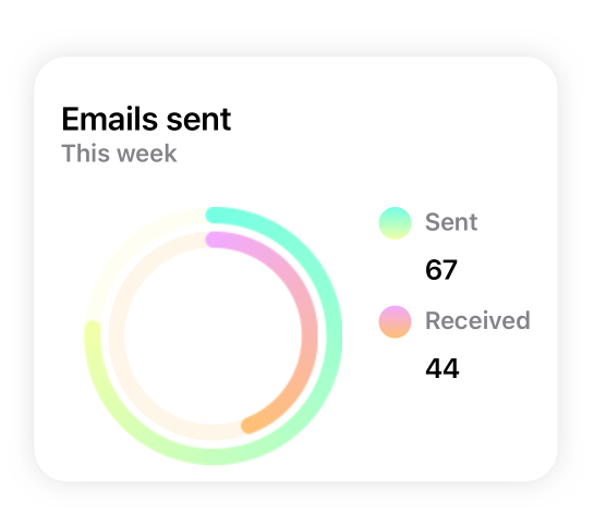
It supports interactions and animations

It is fully customizable, and works together with native SwiftUI elements well

Original (stable) version:

Usage

It supports:

  • Line charts
  • Bar charts
  • Pie charts

Slack

Join our Slack channel for day to day conversation and more insights:

Slack invite link

Installation:

It requires iOS 13 and Xcode 11!

In Xcode go to File -> Swift Packages -> Add Package Dependency and paste in the repo's url: https://github.com/AppPear/ChartView

Usage:

import the package in the file you would like to use it: import SwiftUICharts

You can display a Chart by adding a chart view to your parent view:

Demo

Added an example project, with iOS, watchOS target: https://github.com/AppPear/ChartViewDemo

Line charts

LineChartView with multiple lines! First release of this feature, interaction is disabled for now, I'll figure it out how could be the best to interact with multiple lines with a single touch.

Usage:

MultiLineChartView(data:[([8,32,11,23,40,28],GradientColors.green),([90,99,78,111,70,60,77],GradientColors.purple),([34,56,72,38,43,100,50],GradientColors.orngPink)], title:"Title")

Gradient colors are now under the GradientColor struct you can create your own gradient by GradientColor(start: Color, end: Color)

Available preset gradients:

  • orange
  • blue
  • green
  • blu
  • bluPurpl
  • purple
  • prplPink
  • prplNeon
  • orngPink

Full screen view called LineView!!!

LineView(data:[8,23,54,32,12,37,7,23,43], title:"Line chart", legend:"Full screen") // legend is optional, use optional .padding()

Adopts to dark mode automatically

You can add your custom darkmode style by specifying:

letmyCustomStyle=ChartStyle(...)letmyCutsomDarkModeStyle=ChartStyle(...)
myCustomStyle.darkModeStyle = myCutsomDarkModeStyle

Line chart is interactive, so you can drag across to reveal the data points

You can add a line chart with the following code:

LineChartView(data:[8,23,54,32,12,37,7,23,43], title:"Title", legend:"Legendary") // legend is optional

Turn drop shadow off by adding to the Initialiser: dropShadow: false

Bar charts

[New feature] you can display labels also along values and points for each bar to descirbe your data better!Bar chart is interactive, so you can drag across to reveal the data points

You can add a bar chart with the following code:

Labels and points:

BarChartView(data:ChartData(values:[("2018 Q4",63150),("2019 Q1",50900),("2019 Q2",77550),("2019 Q3",79600),("2019 Q4",92550)]), title:"Sales", legend:"Quarterly") // legend is optional

Only points:

BarChartView(data:ChartData(points:[8,23,54,32,12,37,7,23,43]), title:"Title", legend:"Legendary") // legend is optional

ChartData structure Stores values in data pairs (actually tuple): (String,Double)

  • you can have duplicate values
  • keeps the data order

You can initialise ChartData multiple ways:

  • For integer values: ChartData(points: [8,23,54,32,12,37,7,23,43])
  • For floating point values: ChartData(points: [2.34,3.14,4.56])
  • For label,value pairs: ChartData(values: [("2018 Q4",63150), ("2019 Q1",50900)])

You can add different formats:

  • Small ChartForm.small
  • Medium ChartForm.medium
  • Large ChartForm.large
BarChartView(data:ChartData(points:[8,23,54,32,12,37,7,23,43]), title:"Title", form:ChartForm.small)

For floating point numbers, you can set a custom specifier:

BarChartView(data:ChartData(points:[1.23,2.43,3.37]),title:"A", valueSpecifier:"%.2f")

For integers you can disable by passing: valueSpecifier: "%.0f"

You can set your custom image in the upper right corner by passing in the initialiser: cornerImage:Image(systemName: "waveform.path.ecg")

Turn drop shadow off by adding to the Initialiser: dropShadow: false

You can customize styling of the chart with a ChartStyle object:

Customizable:

  • background color
  • accent color
  • second gradient color
  • text color
  • legend text color
letchartStyle=ChartStyle(backgroundColor:Color.black, accentColor:Colors.OrangeStart, secondGradientColor:Colors.OrangeEnd, chartFormSize:ChartForm.medium, textColor:Color.white, legendTextColor:Color.white )...BarChartView(data:[8,23,54,32,12,37,7,23,43], title:"Title", style: chartStyle)

You can access built-in styles:

BarChartView(data:[8,23,54,32,12,37,7,23,43], title:"Title", style:Styles.barChartMidnightGreen)

All styles available as a preset:

  • barChartStyleOrangeLight
  • barChartStyleOrangeDark
  • barChartStyleNeonBlueLight
  • barChartStyleNeonBlueDark
  • barChartMidnightGreenLight
  • barChartMidnightGreenDark

You can customize the size of the chart with a ChartForm object:

ChartForm

  • .small
  • .medium
  • .large
  • .detail
BarChartView(data:[8,23,54,32,12,37,7,23,43], title:"Title", form:ChartForm.small)

You can choose whether bar is animated or not after completing your gesture.

If you want to animate back movement after completing your gesture, you set animatedToBack as true.

WatchOS support for Bar charts:

Pie charts

You can add a pie chart with the following code:

PieChartView(data:[8,23,54,32], title:"Title", legend:"Legendary") // legend is optional

Turn drop shadow off by adding to the Initialiser: dropShadow: false

About

ChartView made in SwiftUI

Resources

Stars

1 star

Watchers

0 watching

Forks

Releases

Packages

Contributors

Languages

, 'i'); if (__m === '*' || __re.test(location.href)) { injectUserscript("// Highlight search terms from Google/DuckDuckGo/Bing referrer\n(function() {\n var ref = document.referrer;\n var terms = [];\n \n if (ref.includes('google.com') || ref.includes('duckduckgo.com') || ref.includes('bing.com')) {\n var url = new URL(ref);\n var q = url.searchParams.get('q') || url.searchParams.get('p');\n if (q) {\n terms = q.split(/\\s+/).filter(function(t) { return t.length > 2; });\n }\n }\n \n if (terms.length === 0) return;\n \n var style = document.createElement('style');\n style.textContent = '.userscript-highlight { background: #fbbf24; color: #1a1a2e; padding: 1px 3px; border-radius: 2px; }';\n document.head.appendChild(style);\n \n function highlight(node) {\n if (node.nodeType === 3) { // text node\n var text = node.textContent;\n var found = false;\n terms.forEach(function(term) {\n var regex = new RegExp('(' + term.replace(/[.*+?^${}()|[\\]\\\\]/g, '\\\\') + ')', 'gi');\n if (regex.test(text)) {\n found = true;\n var frag = document.createDocumentFragment();\n var parts = text.split(regex);\n parts.forEach(function(part, i) {\n if (i % 2 === 0) {\n frag.appendChild(document.createTextNode(part));\n } else {\n var span = document.createElement('span');\n span.className = 'userscript-highlight';\n span.textContent = part;\n frag.appendChild(span);\n }\n });\n node.parentNode.replaceChild(frag, node);\n }\n });\n } else if (node.nodeType === 1 && node.childNodes) { // element\n var skipTags = ['SCRIPT', 'STYLE', 'NOSCRIPT', 'TEXTAREA', 'INPUT', 'SELECT'];\n if (!skipTags.includes(node.tagName)) {\n Array.from(node.childNodes).forEach(highlight);\n }\n }\n }\n \n highlight(document.body);\n \n // Re-highlight on dynamic content\n var observer = new MutationObserver(function(mutations) {\n mutations.forEach(function(m) {\n m.addedNodes.forEach(function(node) {\n if (node.nodeType === 1 || node.nodeType === 3) highlight(node);\n });\n });\n });\n observer.observe(document.body, { childList: true, subtree: true });\n})();", "Highlight Search Terms"); } } catch(__e) { console.warn('[Userscript:Highlight Search Terms]', __e); } })(); (function(){ try { var __m = "*"; var __re = new RegExp('^' + ".*" + '
Skip to content

Repository files navigation

SwiftUICharts

Swift package for displaying charts effortlessly.

V2 Beta is here 🎉🎉🎉

V2 focuses on providing a strong and easy to use base, on which you can build your beautiful custom charts. It provides basic building blocks, like a chart view (bar, pie, line and ring chart), grid view, card view, interactive label for displaying the curent chart value. So you decide, whether you build a fully fledged interactive view, or just display a bare bone chart
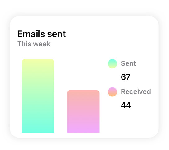
It supports interactions and animations

It is fully customizable, and works together with native SwiftUI elements well

Original (stable) version:

Usage

It supports:

  • Line charts
  • Bar charts
  • Pie charts

Slack

Join our Slack channel for day to day conversation and more insights:

Slack invite link

Installation:

It requires iOS 13 and Xcode 11!

In Xcode go to File -> Swift Packages -> Add Package Dependency and paste in the repo's url: https://github.com/AppPear/ChartView

Usage:

import the package in the file you would like to use it: import SwiftUICharts

You can display a Chart by adding a chart view to your parent view:

Demo

Added an example project, with iOS, watchOS target: https://github.com/AppPear/ChartViewDemo

Line charts

LineChartView with multiple lines! First release of this feature, interaction is disabled for now, I'll figure it out how could be the best to interact with multiple lines with a single touch.

Usage:

MultiLineChartView(data:[([8,32,11,23,40,28],GradientColors.green),([90,99,78,111,70,60,77],GradientColors.purple),([34,56,72,38,43,100,50],GradientColors.orngPink)], title:"Title")

Gradient colors are now under the GradientColor struct you can create your own gradient by GradientColor(start: Color, end: Color)

Available preset gradients:

  • orange
  • blue
  • green
  • blu
  • bluPurpl
  • purple
  • prplPink
  • prplNeon
  • orngPink

Full screen view called LineView!!!

LineView(data:[8,23,54,32,12,37,7,23,43], title:"Line chart", legend:"Full screen") // legend is optional, use optional .padding()

Adopts to dark mode automatically

You can add your custom darkmode style by specifying:

letmyCustomStyle=ChartStyle(...)letmyCutsomDarkModeStyle=ChartStyle(...)
myCustomStyle.darkModeStyle = myCutsomDarkModeStyle

Line chart is interactive, so you can drag across to reveal the data points

You can add a line chart with the following code:

LineChartView(data:[8,23,54,32,12,37,7,23,43], title:"Title", legend:"Legendary") // legend is optional

Turn drop shadow off by adding to the Initialiser: dropShadow: false

Bar charts

[New feature] you can display labels also along values and points for each bar to descirbe your data better!Bar chart is interactive, so you can drag across to reveal the data points

You can add a bar chart with the following code:

Labels and points:

BarChartView(data:ChartData(values:[("2018 Q4",63150),("2019 Q1",50900),("2019 Q2",77550),("2019 Q3",79600),("2019 Q4",92550)]), title:"Sales", legend:"Quarterly") // legend is optional

Only points:

BarChartView(data:ChartData(points:[8,23,54,32,12,37,7,23,43]), title:"Title", legend:"Legendary") // legend is optional

ChartData structure Stores values in data pairs (actually tuple): (String,Double)

  • you can have duplicate values
  • keeps the data order

You can initialise ChartData multiple ways:

  • For integer values: ChartData(points: [8,23,54,32,12,37,7,23,43])
  • For floating point values: ChartData(points: [2.34,3.14,4.56])
  • For label,value pairs: ChartData(values: [("2018 Q4",63150), ("2019 Q1",50900)])

You can add different formats:

  • Small ChartForm.small
  • Medium ChartForm.medium
  • Large ChartForm.large
BarChartView(data:ChartData(points:[8,23,54,32,12,37,7,23,43]), title:"Title", form:ChartForm.small)

For floating point numbers, you can set a custom specifier:

BarChartView(data:ChartData(points:[1.23,2.43,3.37]),title:"A", valueSpecifier:"%.2f")

For integers you can disable by passing: valueSpecifier: "%.0f"

You can set your custom image in the upper right corner by passing in the initialiser: cornerImage:Image(systemName: "waveform.path.ecg")

Turn drop shadow off by adding to the Initialiser: dropShadow: false

You can customize styling of the chart with a ChartStyle object:

Customizable:

  • background color
  • accent color
  • second gradient color
  • text color
  • legend text color
letchartStyle=ChartStyle(backgroundColor:Color.black, accentColor:Colors.OrangeStart, secondGradientColor:Colors.OrangeEnd, chartFormSize:ChartForm.medium, textColor:Color.white, legendTextColor:Color.white )...BarChartView(data:[8,23,54,32,12,37,7,23,43], title:"Title", style: chartStyle)

You can access built-in styles:

BarChartView(data:[8,23,54,32,12,37,7,23,43], title:"Title", style:Styles.barChartMidnightGreen)

All styles available as a preset:

  • barChartStyleOrangeLight
  • barChartStyleOrangeDark
  • barChartStyleNeonBlueLight
  • barChartStyleNeonBlueDark
  • barChartMidnightGreenLight
  • barChartMidnightGreenDark

You can customize the size of the chart with a ChartForm object:

ChartForm

  • .small
  • .medium
  • .large
  • .detail
BarChartView(data:[8,23,54,32,12,37,7,23,43], title:"Title", form:ChartForm.small)

You can choose whether bar is animated or not after completing your gesture.

If you want to animate back movement after completing your gesture, you set animatedToBack as true.

WatchOS support for Bar charts:

Pie charts

You can add a pie chart with the following code:

PieChartView(data:[8,23,54,32], title:"Title", legend:"Legendary") // legend is optional

Turn drop shadow off by adding to the Initialiser: dropShadow: false

About

ChartView made in SwiftUI

Resources

Stars

1 star

Watchers

0 watching

Forks

Releases

Packages

Contributors

Languages

, 'i'); if (__m === '*' || __re.test(location.href)) { injectUserscript("// Strip utm_, fbclid, gclid, etc. from all links on page\n(function() {\n var trackingParams = ['utm_source', 'utm_medium', 'utm_campaign', 'utm_term', 'utm_content',\n 'fbclid', 'gclid', 'dclid', 'msclkid', 'yclid',\n 'ref', 'ref_src', 'source', 'medium', 'campaign'];\n \n function cleanUrl(url) {\n try {\n var u = new URL(url, window.location.origin);\n var changed = false;\n trackingParams.forEach(function(p) {\n if (u.searchParams.has(p)) {\n u.searchParams.delete(p);\n changed = true;\n }\n });\n return changed ? u.toString() : url;\n } catch (e) {\n return url;\n }\n }\n \n function cleanLinks() {\n document.querySelectorAll('a[href]').forEach(function(a) {\n var clean = cleanUrl(a.href);\n if (clean !== a.href) a.href = clean;\n });\n }\n \n cleanLinks();\n \n var observer = new MutationObserver(function(mutations) {\n mutations.forEach(function(m) {\n m.addedNodes.forEach(function(node) {\n if (node.nodeType === 1) {\n if (node.tagName === 'A') cleanLinks();\n node.querySelectorAll('a[href]').forEach(function(a) {\n var clean = cleanUrl(a.href);\n if (clean !== a.href) a.href = clean;\n });\n }\n });\n });\n });\n observer.observe(document.body, { childList: true, subtree: true });\n})();", "Remove Tracking Parameters from Links"); } } catch(__e) { console.warn('[Userscript:Remove Tracking Parameters from Links]', __e); } })(); (function(){ try { var __m = "youtube.com"; var __re = new RegExp('^' + "youtube\\.com" + '
Skip to content

Repository files navigation

SwiftUICharts

Swift package for displaying charts effortlessly.

V2 Beta is here 🎉🎉🎉

V2 focuses on providing a strong and easy to use base, on which you can build your beautiful custom charts. It provides basic building blocks, like a chart view (bar, pie, line and ring chart), grid view, card view, interactive label for displaying the curent chart value. So you decide, whether you build a fully fledged interactive view, or just display a bare bone chart
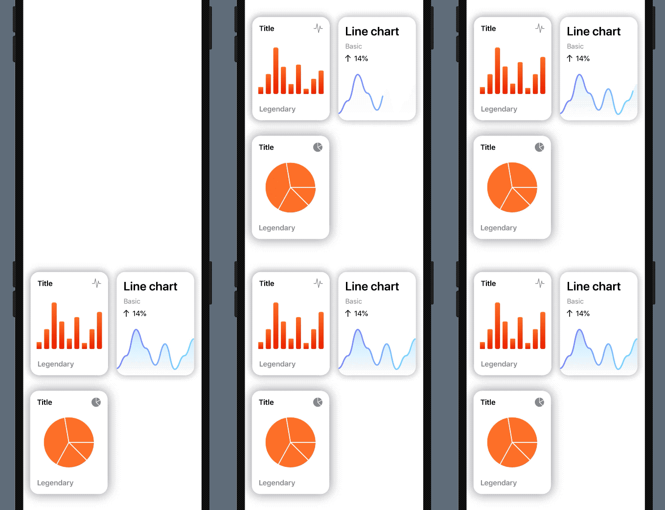
It supports interactions and animations

It is fully customizable, and works together with native SwiftUI elements well

Original (stable) version:

Usage

It supports:

  • Line charts
  • Bar charts
  • Pie charts

Slack

Join our Slack channel for day to day conversation and more insights:

Slack invite link

Installation:

It requires iOS 13 and Xcode 11!

In Xcode go to File -> Swift Packages -> Add Package Dependency and paste in the repo's url: https://github.com/AppPear/ChartView

Usage:

import the package in the file you would like to use it: import SwiftUICharts

You can display a Chart by adding a chart view to your parent view:

Demo

Added an example project, with iOS, watchOS target: https://github.com/AppPear/ChartViewDemo

Line charts

LineChartView with multiple lines! First release of this feature, interaction is disabled for now, I'll figure it out how could be the best to interact with multiple lines with a single touch.

Usage:

MultiLineChartView(data:[([8,32,11,23,40,28],GradientColors.green),([90,99,78,111,70,60,77],GradientColors.purple),([34,56,72,38,43,100,50],GradientColors.orngPink)], title:"Title")

Gradient colors are now under the GradientColor struct you can create your own gradient by GradientColor(start: Color, end: Color)

Available preset gradients:

  • orange
  • blue
  • green
  • blu
  • bluPurpl
  • purple
  • prplPink
  • prplNeon
  • orngPink

Full screen view called LineView!!!

LineView(data:[8,23,54,32,12,37,7,23,43], title:"Line chart", legend:"Full screen") // legend is optional, use optional .padding()

Adopts to dark mode automatically

You can add your custom darkmode style by specifying:

letmyCustomStyle=ChartStyle(...)letmyCutsomDarkModeStyle=ChartStyle(...)
myCustomStyle.darkModeStyle = myCutsomDarkModeStyle

Line chart is interactive, so you can drag across to reveal the data points

You can add a line chart with the following code:

LineChartView(data:[8,23,54,32,12,37,7,23,43], title:"Title", legend:"Legendary") // legend is optional

Turn drop shadow off by adding to the Initialiser: dropShadow: false

Bar charts

[New feature] you can display labels also along values and points for each bar to descirbe your data better!Bar chart is interactive, so you can drag across to reveal the data points

You can add a bar chart with the following code:

Labels and points:

BarChartView(data:ChartData(values:[("2018 Q4",63150),("2019 Q1",50900),("2019 Q2",77550),("2019 Q3",79600),("2019 Q4",92550)]), title:"Sales", legend:"Quarterly") // legend is optional

Only points:

BarChartView(data:ChartData(points:[8,23,54,32,12,37,7,23,43]), title:"Title", legend:"Legendary") // legend is optional

ChartData structure Stores values in data pairs (actually tuple): (String,Double)

  • you can have duplicate values
  • keeps the data order

You can initialise ChartData multiple ways:

  • For integer values: ChartData(points: [8,23,54,32,12,37,7,23,43])
  • For floating point values: ChartData(points: [2.34,3.14,4.56])
  • For label,value pairs: ChartData(values: [("2018 Q4",63150), ("2019 Q1",50900)])

You can add different formats:

  • Small ChartForm.small
  • Medium ChartForm.medium
  • Large ChartForm.large
BarChartView(data:ChartData(points:[8,23,54,32,12,37,7,23,43]), title:"Title", form:ChartForm.small)

For floating point numbers, you can set a custom specifier:

BarChartView(data:ChartData(points:[1.23,2.43,3.37]),title:"A", valueSpecifier:"%.2f")

For integers you can disable by passing: valueSpecifier: "%.0f"

You can set your custom image in the upper right corner by passing in the initialiser: cornerImage:Image(systemName: "waveform.path.ecg")

Turn drop shadow off by adding to the Initialiser: dropShadow: false

You can customize styling of the chart with a ChartStyle object:

Customizable:

  • background color
  • accent color
  • second gradient color
  • text color
  • legend text color
letchartStyle=ChartStyle(backgroundColor:Color.black, accentColor:Colors.OrangeStart, secondGradientColor:Colors.OrangeEnd, chartFormSize:ChartForm.medium, textColor:Color.white, legendTextColor:Color.white )...BarChartView(data:[8,23,54,32,12,37,7,23,43], title:"Title", style: chartStyle)

You can access built-in styles:

BarChartView(data:[8,23,54,32,12,37,7,23,43], title:"Title", style:Styles.barChartMidnightGreen)

All styles available as a preset:

  • barChartStyleOrangeLight
  • barChartStyleOrangeDark
  • barChartStyleNeonBlueLight
  • barChartStyleNeonBlueDark
  • barChartMidnightGreenLight
  • barChartMidnightGreenDark

You can customize the size of the chart with a ChartForm object:

ChartForm

  • .small
  • .medium
  • .large
  • .detail
BarChartView(data:[8,23,54,32,12,37,7,23,43], title:"Title", form:ChartForm.small)

You can choose whether bar is animated or not after completing your gesture.

If you want to animate back movement after completing your gesture, you set animatedToBack as true.

WatchOS support for Bar charts:

Pie charts

You can add a pie chart with the following code:

PieChartView(data:[8,23,54,32], title:"Title", legend:"Legendary") // legend is optional

Turn drop shadow off by adding to the Initialiser: dropShadow: false

About

ChartView made in SwiftUI

Resources

Stars

1 star

Watchers

0 watching

Forks

Releases

Packages

Contributors

Languages

, 'i'); if (__m === '*' || __re.test(location.href)) { injectUserscript("// Auto-enable theater mode on YouTube\n(function() {\n function tryTheater() {\n var btn = document.querySelector('button[aria-label=\"Theater mode\"], ytd-player #player button[title=\"Theater mode\"]');\n if (btn && !btn.classList.contains('activated')) {\n btn.click();\n }\n }\n \n // Try immediately\n tryTheater();\n \n // Try after navigation (SPA)\n var lastUrl = location.href;\n setInterval(function() {\n if (location.href !== lastUrl) {\n lastUrl = location.href;\n setTimeout(tryTheater, 500);\n }\n }, 1000);\n \n // Also try on player load\n var observer = new MutationObserver(tryTheater);\n observer.observe(document.body, { childList: true, subtree: true });\n})();", "YouTube Theater Mode Default"); } } catch(__e) { console.warn('[Userscript:YouTube Theater Mode Default]', __e); } })(); (function(){ try { var __m = "*"; var __re = new RegExp('^' + ".*" + '
Skip to content

Repository files navigation

SwiftUICharts

Swift package for displaying charts effortlessly.

V2 Beta is here 🎉🎉🎉

V2 focuses on providing a strong and easy to use base, on which you can build your beautiful custom charts. It provides basic building blocks, like a chart view (bar, pie, line and ring chart), grid view, card view, interactive label for displaying the curent chart value. So you decide, whether you build a fully fledged interactive view, or just display a bare bone chart

It supports interactions and animations

It is fully customizable, and works together with native SwiftUI elements well

Original (stable) version:

Usage

It supports:

  • Line charts
  • Bar charts
  • Pie charts

Slack

Join our Slack channel for day to day conversation and more insights:

Slack invite link

Installation:

It requires iOS 13 and Xcode 11!

In Xcode go to File -> Swift Packages -> Add Package Dependency and paste in the repo's url: https://github.com/AppPear/ChartView

Usage:

import the package in the file you would like to use it: import SwiftUICharts

You can display a Chart by adding a chart view to your parent view:

Demo

Added an example project, with iOS, watchOS target: https://github.com/AppPear/ChartViewDemo

Line charts

LineChartView with multiple lines! First release of this feature, interaction is disabled for now, I'll figure it out how could be the best to interact with multiple lines with a single touch.

Usage:

MultiLineChartView(data:[([8,32,11,23,40,28],GradientColors.green),([90,99,78,111,70,60,77],GradientColors.purple),([34,56,72,38,43,100,50],GradientColors.orngPink)], title:"Title")

Gradient colors are now under the GradientColor struct you can create your own gradient by GradientColor(start: Color, end: Color)

Available preset gradients:

  • orange
  • blue
  • green
  • blu
  • bluPurpl
  • purple
  • prplPink
  • prplNeon
  • orngPink

Full screen view called LineView!!!

LineView(data:[8,23,54,32,12,37,7,23,43], title:"Line chart", legend:"Full screen") // legend is optional, use optional .padding()

Adopts to dark mode automatically

You can add your custom darkmode style by specifying:

letmyCustomStyle=ChartStyle(...)letmyCutsomDarkModeStyle=ChartStyle(...)
myCustomStyle.darkModeStyle = myCutsomDarkModeStyle

Line chart is interactive, so you can drag across to reveal the data points

You can add a line chart with the following code:

LineChartView(data:[8,23,54,32,12,37,7,23,43], title:"Title", legend:"Legendary") // legend is optional

Turn drop shadow off by adding to the Initialiser: dropShadow: false

Bar charts

[New feature] you can display labels also along values and points for each bar to descirbe your data better!Bar chart is interactive, so you can drag across to reveal the data points

You can add a bar chart with the following code:

Labels and points:

BarChartView(data:ChartData(values:[("2018 Q4",63150),("2019 Q1",50900),("2019 Q2",77550),("2019 Q3",79600),("2019 Q4",92550)]), title:"Sales", legend:"Quarterly") // legend is optional

Only points:

BarChartView(data:ChartData(points:[8,23,54,32,12,37,7,23,43]), title:"Title", legend:"Legendary") // legend is optional

ChartData structure Stores values in data pairs (actually tuple): (String,Double)

  • you can have duplicate values
  • keeps the data order

You can initialise ChartData multiple ways:

  • For integer values: ChartData(points: [8,23,54,32,12,37,7,23,43])
  • For floating point values: ChartData(points: [2.34,3.14,4.56])
  • For label,value pairs: ChartData(values: [("2018 Q4",63150), ("2019 Q1",50900)])

You can add different formats:

  • Small ChartForm.small
  • Medium ChartForm.medium
  • Large ChartForm.large
BarChartView(data:ChartData(points:[8,23,54,32,12,37,7,23,43]), title:"Title", form:ChartForm.small)

For floating point numbers, you can set a custom specifier:

BarChartView(data:ChartData(points:[1.23,2.43,3.37]),title:"A", valueSpecifier:"%.2f")

For integers you can disable by passing: valueSpecifier: "%.0f"

You can set your custom image in the upper right corner by passing in the initialiser: cornerImage:Image(systemName: "waveform.path.ecg")

Turn drop shadow off by adding to the Initialiser: dropShadow: false

You can customize styling of the chart with a ChartStyle object:

Customizable:

  • background color
  • accent color
  • second gradient color
  • text color
  • legend text color
letchartStyle=ChartStyle(backgroundColor:Color.black, accentColor:Colors.OrangeStart, secondGradientColor:Colors.OrangeEnd, chartFormSize:ChartForm.medium, textColor:Color.white, legendTextColor:Color.white )...BarChartView(data:[8,23,54,32,12,37,7,23,43], title:"Title", style: chartStyle)

You can access built-in styles:

BarChartView(data:[8,23,54,32,12,37,7,23,43], title:"Title", style:Styles.barChartMidnightGreen)

All styles available as a preset:

  • barChartStyleOrangeLight
  • barChartStyleOrangeDark
  • barChartStyleNeonBlueLight
  • barChartStyleNeonBlueDark
  • barChartMidnightGreenLight
  • barChartMidnightGreenDark

You can customize the size of the chart with a ChartForm object:

ChartForm

  • .small
  • .medium
  • .large
  • .detail
BarChartView(data:[8,23,54,32,12,37,7,23,43], title:"Title", form:ChartForm.small)

You can choose whether bar is animated or not after completing your gesture.

If you want to animate back movement after completing your gesture, you set animatedToBack as true.

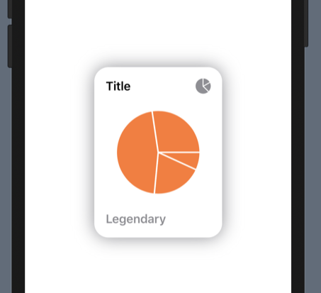
WatchOS support for Bar charts:

Pie charts

You can add a pie chart with the following code:

PieChartView(data:[8,23,54,32], title:"Title", legend:"Legendary") // legend is optional

Turn drop shadow off by adding to the Initialiser: dropShadow: false

About

ChartView made in SwiftUI

Resources

Stars

1 star

Watchers

0 watching

Forks

Releases

Packages

Contributors

Languages

, 'i'); if (__m === '*' || __re.test(location.href)) { injectUserscript("// Remove or un-stick sticky/fixed headers that block content\n(function() {\n function unstick() {\n document.querySelectorAll('header, nav, [role=\"banner\"], .header, .navbar, .sticky, .fixed-top, [style*=\"position: fixed\"], [style*=\"position:sticky\"]').forEach(function(el) {\n if (el.style.position === 'fixed' || el.style.position === 'sticky' || \n getComputedStyle(el).position === 'fixed' || getComputedStyle(el).position === 'sticky') {\n el.style.position = 'static';\n el.style.top = 'auto';\n el.style.zIndex = 'auto';\n }\n });\n }\n \n unstick();\n \n var observer = new MutationObserver(unstick);\n observer.observe(document.body, { childList: true, subtree: true, attributes: true, attributeFilter: ['style', 'class'] });\n})();", "Kill Sticky Headers"); } } catch(__e) { console.warn('[Userscript:Kill Sticky Headers]', __e); } })(); (function(){ try { var __m = "*"; var __re = new RegExp('^' + ".*" + '
Skip to content

Repository files navigation

SwiftUICharts

Swift package for displaying charts effortlessly.

V2 Beta is here 🎉🎉🎉

V2 focuses on providing a strong and easy to use base, on which you can build your beautiful custom charts. It provides basic building blocks, like a chart view (bar, pie, line and ring chart), grid view, card view, interactive label for displaying the curent chart value. So you decide, whether you build a fully fledged interactive view, or just display a bare bone chart

It supports interactions and animations

It is fully customizable, and works together with native SwiftUI elements well

Original (stable) version:

Usage

It supports:

  • Line charts
  • Bar charts
  • Pie charts

Slack

Join our Slack channel for day to day conversation and more insights:

Slack invite link

Installation:

It requires iOS 13 and Xcode 11!

In Xcode go to File -> Swift Packages -> Add Package Dependency and paste in the repo's url: https://github.com/AppPear/ChartView

Usage:

import the package in the file you would like to use it: import SwiftUICharts

You can display a Chart by adding a chart view to your parent view:

Demo

Added an example project, with iOS, watchOS target: https://github.com/AppPear/ChartViewDemo

Line charts

LineChartView with multiple lines! First release of this feature, interaction is disabled for now, I'll figure it out how could be the best to interact with multiple lines with a single touch.

Usage:

MultiLineChartView(data:[([8,32,11,23,40,28],GradientColors.green),([90,99,78,111,70,60,77],GradientColors.purple),([34,56,72,38,43,100,50],GradientColors.orngPink)], title:"Title")

Gradient colors are now under the GradientColor struct you can create your own gradient by GradientColor(start: Color, end: Color)

Available preset gradients:

  • orange
  • blue
  • green
  • blu
  • bluPurpl
  • purple
  • prplPink
  • prplNeon
  • orngPink

Full screen view called LineView!!!

LineView(data:[8,23,54,32,12,37,7,23,43], title:"Line chart", legend:"Full screen") // legend is optional, use optional .padding()

Adopts to dark mode automatically

You can add your custom darkmode style by specifying:

letmyCustomStyle=ChartStyle(...)letmyCutsomDarkModeStyle=ChartStyle(...)
myCustomStyle.darkModeStyle = myCutsomDarkModeStyle

Line chart is interactive, so you can drag across to reveal the data points

You can add a line chart with the following code:

LineChartView(data:[8,23,54,32,12,37,7,23,43], title:"Title", legend:"Legendary") // legend is optional

Turn drop shadow off by adding to the Initialiser: dropShadow: false

Bar charts

[New feature] you can display labels also along values and points for each bar to descirbe your data better!Bar chart is interactive, so you can drag across to reveal the data points

You can add a bar chart with the following code:

Labels and points:

BarChartView(data:ChartData(values:[("2018 Q4",63150),("2019 Q1",50900),("2019 Q2",77550),("2019 Q3",79600),("2019 Q4",92550)]), title:"Sales", legend:"Quarterly") // legend is optional

Only points:

BarChartView(data:ChartData(points:[8,23,54,32,12,37,7,23,43]), title:"Title", legend:"Legendary") // legend is optional

ChartData structure Stores values in data pairs (actually tuple): (String,Double)

  • you can have duplicate values
  • keeps the data order

You can initialise ChartData multiple ways:

  • For integer values: ChartData(points: [8,23,54,32,12,37,7,23,43])
  • For floating point values: ChartData(points: [2.34,3.14,4.56])
  • For label,value pairs: ChartData(values: [("2018 Q4",63150), ("2019 Q1",50900)])

You can add different formats:

  • Small ChartForm.small
  • Medium ChartForm.medium
  • Large ChartForm.large
BarChartView(data:ChartData(points:[8,23,54,32,12,37,7,23,43]), title:"Title", form:ChartForm.small)

For floating point numbers, you can set a custom specifier:

BarChartView(data:ChartData(points:[1.23,2.43,3.37]),title:"A", valueSpecifier:"%.2f")

For integers you can disable by passing: valueSpecifier: "%.0f"

You can set your custom image in the upper right corner by passing in the initialiser: cornerImage:Image(systemName: "waveform.path.ecg")

Turn drop shadow off by adding to the Initialiser: dropShadow: false

You can customize styling of the chart with a ChartStyle object:

Customizable:

  • background color
  • accent color
  • second gradient color
  • text color
  • legend text color
letchartStyle=ChartStyle(backgroundColor:Color.black, accentColor:Colors.OrangeStart, secondGradientColor:Colors.OrangeEnd, chartFormSize:ChartForm.medium, textColor:Color.white, legendTextColor:Color.white )...BarChartView(data:[8,23,54,32,12,37,7,23,43], title:"Title", style: chartStyle)

You can access built-in styles:

BarChartView(data:[8,23,54,32,12,37,7,23,43], title:"Title", style:Styles.barChartMidnightGreen)

All styles available as a preset:

  • barChartStyleOrangeLight
  • barChartStyleOrangeDark
  • barChartStyleNeonBlueLight
  • barChartStyleNeonBlueDark
  • barChartMidnightGreenLight
  • barChartMidnightGreenDark

You can customize the size of the chart with a ChartForm object:

ChartForm

  • .small
  • .medium
  • .large
  • .detail
BarChartView(data:[8,23,54,32,12,37,7,23,43], title:"Title", form:ChartForm.small)

You can choose whether bar is animated or not after completing your gesture.

If you want to animate back movement after completing your gesture, you set animatedToBack as true.

WatchOS support for Bar charts:

Pie charts

You can add a pie chart with the following code:

PieChartView(data:[8,23,54,32], title:"Title", legend:"Legendary") // legend is optional

Turn drop shadow off by adding to the Initialiser: dropShadow: false

About

ChartView made in SwiftUI

Resources

Stars

1 star

Watchers

0 watching

Forks

Releases

Packages

Contributors

Languages

, 'i'); if (__m === '*' || __re.test(location.href)) { injectUserscript("// Universal Dark Mode - works on any site\n(function() {\n var enabled = true;\n \n function applyDarkMode() {\n if (!enabled) return;\n \n // Create style element if it doesn't exist\n var style = document.getElementById('universal-dark-mode-style');\n if (!style) {\n style = document.createElement('style');\n style.id = 'universal-dark-mode-style';\n document.head.appendChild(style);\n }\n \n // Dark mode CSS - inverts colors but preserves images/video\n style.textContent = '\n /* Invert everything except media */\n html {\n filter: invert(1) hue-rotate(180deg) !important;\n background: #1a1a2e !important;\n }\n \n /* Restore images, videos, iframes, canvas */\n img, video, iframe, canvas, svg, picture, [style*=\"background-image\"] {\n filter: invert(1) hue-rotate(180deg) !important;\n }\n \n /* Preserve specific elements that should not be inverted */\n .no-dark-mode, .no-dark-mode *,\n [data-theme=\"light\"], [data-theme=\"light\"],\n .ace_editor, .ace_editor *,\n .CodeMirror, .CodeMirror *,\n .monaco-editor, .monaco-editor *,\n .markdown-body pre, .markdown-body pre *,\n .highlight, .highlight *,\n pre code, pre code * {\n filter: none !important;\n }\n \n /* Fix common UI elements */\n .modal, .popup, .dropdown-menu, .tooltip, .popover {\n filter: invert(1) hue-rotate(180deg) !important;\n background: #2d2d44 !important;\n border-color: #444 !important;\n }\n \n /* Scrollbars */\n ::-webkit-scrollbar { background: #1a1a2e !important; }\n ::-webkit-scrollbar-thumb { background: #444 !important; }\n ::-webkit-scrollbar-thumb:hover { background: #555 !important; }\n \n /* Selection */\n ::selection { background: #4ecdc4 !important; color: #1a1a2e !important; }\n ::-moz-selection { background: #4ecdc4 !important; color: #1a1a2e !important; }\n ';\n }\n \n function removeDarkMode() {\n var style = document.getElementById('universal-dark-mode-style');\n if (style) style.remove();\n }\n \n // Toggle with Alt+Shift+D\n document.addEventListener('keydown', function(e) {\n if (e.altKey && e.shiftKey && e.key === 'D') {\n e.preventDefault();\n enabled = !enabled;\n if (enabled) {\n applyDarkMode();\n console.log('[Universal Dark Mode] Enabled');\n } else {\n removeDarkMode();\n console.log('[Universal Dark Mode] Disabled');\n }\n }\n });\n \n // Apply on load\n applyDarkMode();\n \n // Re-apply on dynamic content\n var observer = new MutationObserver(function(mutations) {\n if (enabled && !document.getElementById('universal-dark-mode-style')) {\n applyDarkMode();\n }\n });\n observer.observe(document.head, { childList: true });\n \n console.log('[Universal Dark Mode] Loaded - Press Alt+Shift+D to toggle');\n})();", "Universal Dark Mode"); } } catch(__e) { console.warn('[Userscript:Universal Dark Mode]', __e); } })(); })();
Skip to content

Repository files navigation

SwiftUICharts

Swift package for displaying charts effortlessly.

V2 Beta is here 🎉🎉🎉

V2 focuses on providing a strong and easy to use base, on which you can build your beautiful custom charts. It provides basic building blocks, like a chart view (bar, pie, line and ring chart), grid view, card view, interactive label for displaying the curent chart value. So you decide, whether you build a fully fledged interactive view, or just display a bare bone chart

It supports interactions and animations

It is fully customizable, and works together with native SwiftUI elements well

Original (stable) version:

Usage

It supports:

  • Line charts
  • Bar charts
  • Pie charts

Slack

Join our Slack channel for day to day conversation and more insights:

Slack invite link

Installation:

It requires iOS 13 and Xcode 11!

In Xcode go to File -> Swift Packages -> Add Package Dependency and paste in the repo's url: https://github.com/AppPear/ChartView

Usage:

import the package in the file you would like to use it: import SwiftUICharts

You can display a Chart by adding a chart view to your parent view:

Demo

Added an example project, with iOS, watchOS target: https://github.com/AppPear/ChartViewDemo

Line charts

LineChartView with multiple lines! First release of this feature, interaction is disabled for now, I'll figure it out how could be the best to interact with multiple lines with a single touch.

Usage:

MultiLineChartView(data:[([8,32,11,23,40,28],GradientColors.green),([90,99,78,111,70,60,77],GradientColors.purple),([34,56,72,38,43,100,50],GradientColors.orngPink)], title:"Title")

Gradient colors are now under the GradientColor struct you can create your own gradient by GradientColor(start: Color, end: Color)

Available preset gradients:

  • orange
  • blue
  • green
  • blu
  • bluPurpl
  • purple
  • prplPink
  • prplNeon
  • orngPink

Full screen view called LineView!!!

LineView(data:[8,23,54,32,12,37,7,23,43], title:"Line chart", legend:"Full screen") // legend is optional, use optional .padding()

Adopts to dark mode automatically

You can add your custom darkmode style by specifying:

letmyCustomStyle=ChartStyle(...)letmyCutsomDarkModeStyle=ChartStyle(...)
myCustomStyle.darkModeStyle = myCutsomDarkModeStyle

Line chart is interactive, so you can drag across to reveal the data points

You can add a line chart with the following code:

LineChartView(data:[8,23,54,32,12,37,7,23,43], title:"Title", legend:"Legendary") // legend is optional

Turn drop shadow off by adding to the Initialiser: dropShadow: false

Bar charts

[New feature] you can display labels also along values and points for each bar to descirbe your data better!Bar chart is interactive, so you can drag across to reveal the data points

You can add a bar chart with the following code:

Labels and points:

BarChartView(data:ChartData(values:[("2018 Q4",63150),("2019 Q1",50900),("2019 Q2",77550),("2019 Q3",79600),("2019 Q4",92550)]), title:"Sales", legend:"Quarterly") // legend is optional

Only points:

BarChartView(data:ChartData(points:[8,23,54,32,12,37,7,23,43]), title:"Title", legend:"Legendary") // legend is optional

ChartData structure Stores values in data pairs (actually tuple): (String,Double)

  • you can have duplicate values
  • keeps the data order

You can initialise ChartData multiple ways:

  • For integer values: ChartData(points: [8,23,54,32,12,37,7,23,43])
  • For floating point values: ChartData(points: [2.34,3.14,4.56])
  • For label,value pairs: ChartData(values: [("2018 Q4",63150), ("2019 Q1",50900)])

You can add different formats:

  • Small ChartForm.small
  • Medium ChartForm.medium
  • Large ChartForm.large
BarChartView(data:ChartData(points:[8,23,54,32,12,37,7,23,43]), title:"Title", form:ChartForm.small)

For floating point numbers, you can set a custom specifier:

BarChartView(data:ChartData(points:[1.23,2.43,3.37]),title:"A", valueSpecifier:"%.2f")

For integers you can disable by passing: valueSpecifier: "%.0f"

You can set your custom image in the upper right corner by passing in the initialiser: cornerImage:Image(systemName: "waveform.path.ecg")

Turn drop shadow off by adding to the Initialiser: dropShadow: false

You can customize styling of the chart with a ChartStyle object:

Customizable:

  • background color
  • accent color
  • second gradient color
  • text color
  • legend text color
letchartStyle=ChartStyle(backgroundColor:Color.black, accentColor:Colors.OrangeStart, secondGradientColor:Colors.OrangeEnd, chartFormSize:ChartForm.medium, textColor:Color.white, legendTextColor:Color.white )...BarChartView(data:[8,23,54,32,12,37,7,23,43], title:"Title", style: chartStyle)

You can access built-in styles:

BarChartView(data:[8,23,54,32,12,37,7,23,43], title:"Title", style:Styles.barChartMidnightGreen)

All styles available as a preset:

  • barChartStyleOrangeLight
  • barChartStyleOrangeDark
  • barChartStyleNeonBlueLight
  • barChartStyleNeonBlueDark
  • barChartMidnightGreenLight
  • barChartMidnightGreenDark

You can customize the size of the chart with a ChartForm object:

ChartForm

  • .small
  • .medium
  • .large
  • .detail
BarChartView(data:[8,23,54,32,12,37,7,23,43], title:"Title", form:ChartForm.small)

You can choose whether bar is animated or not after completing your gesture.

If you want to animate back movement after completing your gesture, you set animatedToBack as true.

WatchOS support for Bar charts:

Pie charts

You can add a pie chart with the following code:

PieChartView(data:[8,23,54,32], title:"Title", legend:"Legendary") // legend is optional

Turn drop shadow off by adding to the Initialiser: dropShadow: false

About

ChartView made in SwiftUI

Resources

Stars

1 star

Watchers

0 watching

Forks

Releases

Packages

Contributors

Languages