


A flutter package which will help you to generate pin code fields with beautiful design and animations. Can be useful for OTP or pin code inputs 🤓🤓
- Automatically focuses the next field on typing and focuses previous field on deletation
- Can be set to any length. (3-6 fields recommended)
- 3 different shapes for text fields
- Highly customizable
- 3 different types of animation for input texts
- Animated active, inactive, selected and disabled field color switching
- Autofocus option
- Otp-code pasting from clipboard
- iOS autofill support
- Error animation. Currently have shake animation only. Watch the example app for how to integrate.
- Get currently typed text and use your condition to validate it. (for example: if (currentText.length != 6 || currentText != "your desired code"))
/// length of how many cells there should be. 3-8 is recommended by mefinalint length;
/// you already know what it does i guess :P default is falsefinalbool obsecureText;
/// returns the current typed text in the fieldsfinalValueChanged<String> onChanged;
/// returns the typed text when all pins are setfinalValueChanged<String> onCompleted;
/// returns the typed text when user presses done/next action on the keyboardfinalValueChanged<String> onSubmitted;
/// the style of the text, default is [ fontSize: 20, color: Colors.black, fontWeight: FontWeight.bold]finalTextStyle textStyle;
/// background color for the whole row of pin code fields. Default is [Colors.white]finalColor backgroundColor;
/// This defines how the elements in the pin code field align. Default to [MainAxisAlignment.spaceBetween]finalMainAxisAlignment mainAxisAlignment;
/// [AnimationType] for the text to appear in the pin code field. Default is [AnimationType.slide]finalAnimationType animationType;
/// Duration for the animation. Default is [Duration(milliseconds: 150)]finalDuration animationDuration;
/// [Curve] for the animation. Default is [Curves.easeInOut]finalCurve animationCurve;
/// [TextInputType] for the pin code fields. default is [TextInputType.visiblePassword]finalTextInputType textInputType;
/// If the pin code field should be autofocused or not. Default is [false]finalbool autoFocus;
/// Should pass a [FocusNode] to manage it from the parentfinalFocusNode focusNode;
/// A list of [TextInputFormatter] that goes to the TextFieldfinalList<TextInputFormatter> inputFormatters;
/// Enable or disable the Field. Default is [true]finalbool enabled;
/// [TextEditingController] to control the text manually. Sets a default [TextEditingController()] object if none givenfinalTextEditingController controller;
/// Auto dismiss the keyboard upon inputting the value for the last field. Default is [true]finalbool autoDismissKeyboard;
/// Auto dispose the [controller] and [FocusNode] upon the destruction of widget from the widget tree. Default is [true]finalbool autoDisposeControllers;
/// Configures how the platform keyboard will select an uppercase or lowercase keyboard. /// Only supports text keyboards, other keyboard types will ignore this configuration. Capitalization is locale-aware. /// - Copied from 'https://api.flutter.dev/flutter/services/TextCapitalization-class.html' /// Default is [TextCapitalization.none]finalTextCapitalization textCapitalization;
finalTextInputAction textInputAction;
/// Triggers the error animationfinalStreamController<ErrorAnimationType> errorAnimationController;
/// Configuration for paste dialog. Read more [DialogConfig]finalDialogConfig dialogConfig;
/// Theme for the pin cells. Read more [PinTheme]finalPinTheme pinTheme;
/// Callback method to validate if text can be pasted. This is helpful when we need to validate text before pasting. /// e.g. validate if text is number. Default will be pasted as received.finalboolFunction(String text) beforeTextPaste;
** PinTheme
/// Colors of the input fields which have inputs. Default is [Colors.green]finalColor activeColor;
/// Color of the input field which is currently selected. Default is [Colors.blue]finalColor selectedColor;
/// Colors of the input fields which don't have inputs. Default is [Colors.red]finalColor inactiveColor;
/// Colors of the input fields if the [PinCodeTextField] is disabled. Default is [Colors.grey]finalColor disabledColor;
/// Colors of the input fields which have inputs. Default is [Colors.green]finalColor activeFillColor;
/// Color of the input field which is currently selected. Default is [Colors.blue]finalColor selectedFillColor;
/// Colors of the input fields which don't have inputs. Default is [Colors.red]finalColor inactiveFillColor;
/// Border radius of each pin code fieldfinalBorderRadius borderRadius;
/// [height] for the pin code field. default is [50.0]finaldouble fieldHeight;
/// [width] for the pin code field. default is [40.0]finaldouble fieldWidth;
/// Border width for the each input fields. Default is [2.0]finaldouble borderWidth;
/// this defines the shape of the input fields. Default is underlinedfinalPinCodeFieldShape shape;
** DialogConfig
/// title of the [AlertDialog] while pasting the code. Default to [Paste Code]finalString dialogTitle;
/// content of the [AlertDialog] while pasting the code. Default to ["Do you want to paste this code "]finalString dialogContent;
/// Affirmative action text for the [AlertDialog]. Default to "Paste"finalString affirmativeText;
/// Negative action text for the [AlertDialog]. Default to "Cancel"finalString negativeText;Thanks to everyone whoever suggested their thoughts to improve this package. And special thanks goes to these people:
Emmanuel Vlad 📖💻 |  Atiqur Rahaman 🎨 | Milind Mevada 📖💻 | Reme Le Hane 📖💻 | TabooSun 💻 | Thalles Santos 💻 | ItamarMu 💻 | ThinkDigitalSoftware 💻 |


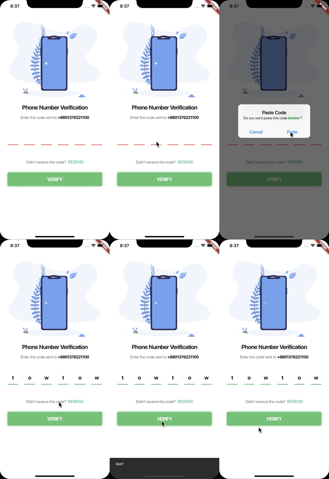
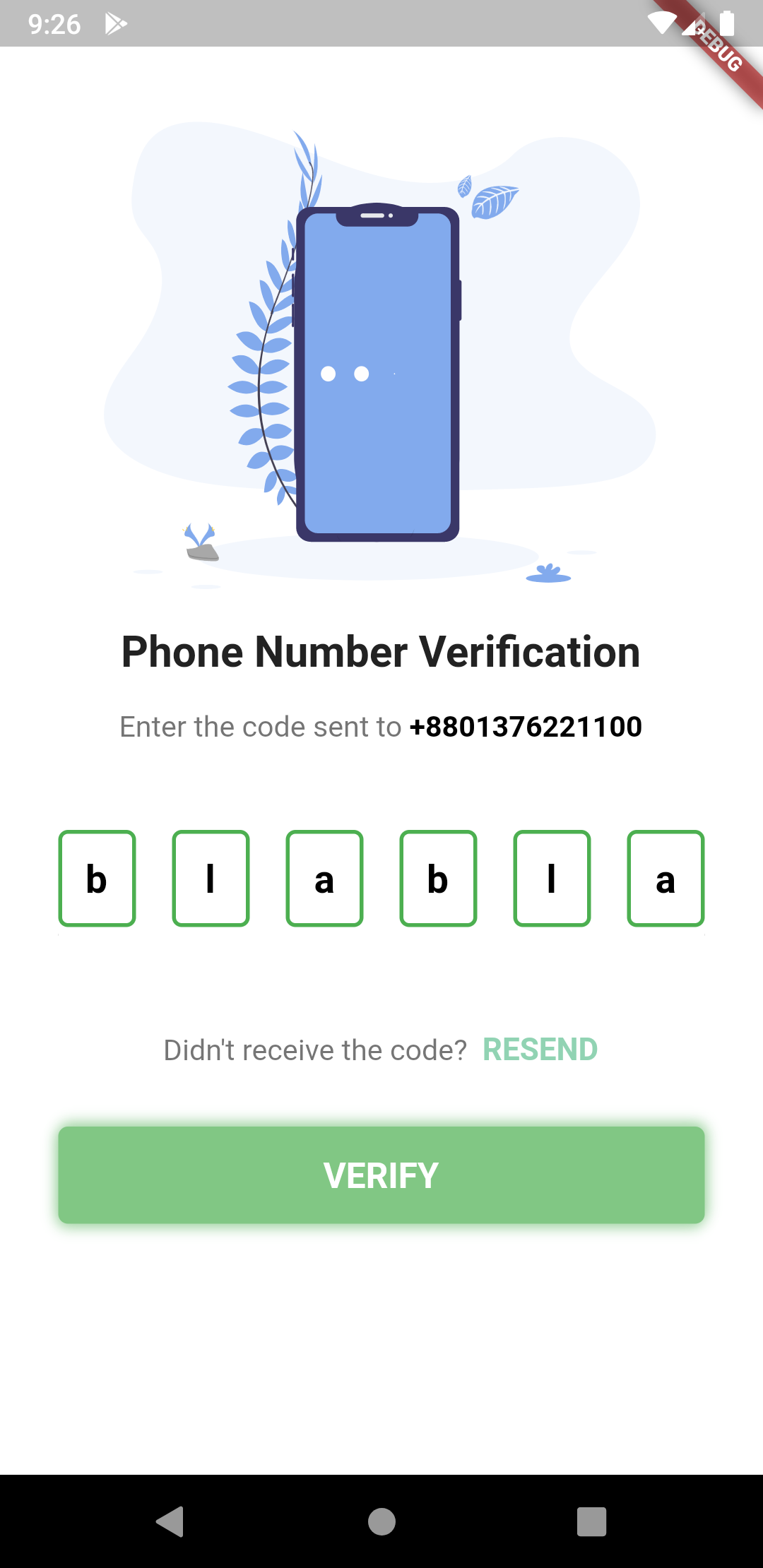
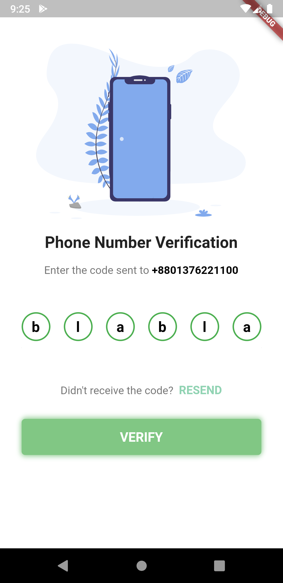

The pin code text field widget example
PinCodeTextField(
length:6,
obsecureText:false,
animationType:AnimationType.fade,
pinTheme:PinTheme(
shape:PinCodeFieldShape.box,
borderRadius:BorderRadius.circular(5),
fieldHeight:50,
fieldWidth:40,
activeFillColor:Colors.white,
),
animationDuration:Duration(milliseconds:300),
backgroundColor:Colors.blue.shade50,
enableActiveFill:true,
errorAnimationController: errorController,
controller: textEditingController,
onCompleted: (v) {
print("Completed");
},
onChanged: (value) {
print(value);
setState(() {
currentText = value;
});
},
beforeTextPaste: (text) {
print("Allowing to paste $text");
//if you return true then it will show the paste confirmation dialog. Otherwise if false, then nothing will happen.//but you can show anything you want here, like your pop up saying wrong paste format or etcreturntrue;
},
)
Shape can be among these 3 types
enumPinCodeFieldShape { box, underline, circle }Animations can be among these 3 types
enumAnimationType { scale, slide, fade, none }Trigger Error animation
- Create a StreamController
StreamController<ErrorAnimationType> errorController =StreamController<ErrorAnimationType>();- And pass the controller like this.
PinCodeTextField(
length:6,
obsecureText:false,
animationType:AnimationType.fade,
animationDuration:Duration(milliseconds:300),
errorAnimationController: errorController, // Pass it here
onChanged: (value) {
setState(() {
currentText = value;
});
},
)- Then you can trigger the animation just by writing this:
errorController.add(ErrorAnimationType.shake); // This will shake the pin code fieldThis full code is from the example folder. You can run the example to see.
classMyAppextendsStatelessWidget {
// This widget is the root of your application.@overrideWidgetbuild(BuildContext context) {
returnMaterialApp(
title:'Flutter Demo',
theme:ThemeData(
primarySwatch:Colors.blue,
),
home:PinCodeVerificationScreen(
"+8801376221100"), // a random number, please don't call xD
);
}
}
classPinCodeVerificationScreenextendsStatefulWidget {
finalString phoneNumber;
PinCodeVerificationScreen(this.phoneNumber);
@override_PinCodeVerificationScreenStatecreateState() =>_PinCodeVerificationScreenState();
}
class_PinCodeVerificationScreenStateextendsState<PinCodeVerificationScreen> {
var onTapRecognizer;
TextEditingController textEditingController =TextEditingController()
..text ="123456";
StreamController<ErrorAnimationType> errorController;
bool hasError =false;
String currentText ="";
finalGlobalKey<ScaffoldState> scaffoldKey =GlobalKey<ScaffoldState>();
@overridevoidinitState() {
onTapRecognizer =TapGestureRecognizer()
..onTap = () {
Navigator.pop(context);
};
errorController =StreamController<ErrorAnimationType>();
super.initState();
}
@overridevoiddispose() {
errorController.close();
super.dispose();
}
@overrideWidgetbuild(BuildContext context) {
returnScaffold(
backgroundColor:Colors.blue.shade50,
key: scaffoldKey,
body:GestureDetector(
onTap: () {
FocusScope.of(context).requestFocus(FocusNode());
},
child:Container(
height:MediaQuery.of(context).size.height,
width:MediaQuery.of(context).size.width,
child:ListView(
children:<Widget>[
SizedBox(height:30),
Container(
height:MediaQuery.of(context).size.height /3,
child:FlareActor(
"assets/otp.flr",
animation:"otp",
fit:BoxFit.fitHeight,
alignment:Alignment.center,
),
),
// Image.asset(// 'assets/verify.png',// height: MediaQuery.of(context).size.height / 3,// fit: BoxFit.fitHeight,// ),SizedBox(height:8),
Padding(
padding:constEdgeInsets.symmetric(vertical:8.0),
child:Text(
'Phone Number Verification',
style:TextStyle(fontWeight:FontWeight.bold, fontSize:22),
textAlign:TextAlign.center,
),
),
Padding(
padding:constEdgeInsets.symmetric(horizontal:30.0, vertical:8),
child:RichText(
text:TextSpan(
text:"Enter the code sent to ",
children: [
TextSpan(
text: widget.phoneNumber,
style:TextStyle(
color:Colors.black,
fontWeight:FontWeight.bold,
fontSize:15)),
],
style:TextStyle(color:Colors.black54, fontSize:15)),
textAlign:TextAlign.center,
),
),
SizedBox(
height:20,
),
Padding(
padding:constEdgeInsets.symmetric(vertical:8.0, horizontal:30),
child:PinCodeTextField(
length:6,
obsecureText:false,
animationType:AnimationType.fade,
pinTheme:PinTheme(
shape:PinCodeFieldShape.box,
borderRadius:BorderRadius.circular(5),
fieldHeight:50,
fieldWidth:40,
activeFillColor:Colors.white,
),
animationDuration:Duration(milliseconds:300),
backgroundColor:Colors.blue.shade50,
enableActiveFill:true,
errorAnimationController: errorController,
controller: textEditingController,
onCompleted: (v) {
print("Completed");
},
onChanged: (value) {
print(value);
setState(() {
currentText = value;
});
},
beforeTextPaste: (text) {
print("Allowing to paste $text");
//if you return true then it will show the paste confirmation dialog. Otherwise if false, then nothing will happen.//but you can show anything you want here, like your pop up saying wrong paste format or etcreturntrue;
},
)),
Padding(
padding:constEdgeInsets.symmetric(horizontal:30.0),
child:Text(
hasError ?"*Please fill up all the cells properly":"",
style:TextStyle(color:Colors.red.shade300, fontSize:15),
),
),
SizedBox(
height:20,
),
RichText(
textAlign:TextAlign.center,
text:TextSpan(
text:"Didn't receive the code? ",
style:TextStyle(color:Colors.black54, fontSize:15),
children: [
TextSpan(
text:" RESEND",
recognizer: onTapRecognizer,
style:TextStyle(
color:Color(0xFF91D3B3),
fontWeight:FontWeight.bold,
fontSize:16))
]),
),
SizedBox(
height:14,
),
Container(
margin:constEdgeInsets.symmetric(vertical:16.0, horizontal:30),
child:ButtonTheme(
height:50,
child:FlatButton(
onPressed: () {
// conditions for validatingif (currentText.length !=6|| currentText !="towtow") {
errorController.add(ErrorAnimationType
.shake); // Triggering error shake animationsetState(() {
hasError =true;
});
} else {
setState(() {
hasError =false;
scaffoldKey.currentState.showSnackBar(SnackBar(
content:Text("Aye!!"),
duration:Duration(seconds:2),
));
});
}
},
child:Center(
child:Text(
"VERIFY".toUpperCase(),
style:TextStyle(
color:Colors.white,
fontSize:18,
fontWeight:FontWeight.bold),
)),
),
),
decoration:BoxDecoration(
color:Colors.green.shade300,
borderRadius:BorderRadius.circular(5),
boxShadow: [
BoxShadow(
color:Colors.green.shade200,
offset:Offset(1, -2),
blurRadius:5),
BoxShadow(
color:Colors.green.shade200,
offset:Offset(-1, 2),
blurRadius:5)
]),
),
SizedBox(
height:16,
),
Row(
mainAxisAlignment:MainAxisAlignment.center,
children:<Widget>[
FlatButton(
child:Text("Clear"),
onPressed: () {
textEditingController.clear();
},
),
FlatButton(
child:Text("Set Text"),
onPressed: () {
textEditingController.text ="123456";
},
),
],
)
],
),
),
),
);
}
}