
Repository files navigation

apsl-react-native-button

A React Native button component customizable via style props.
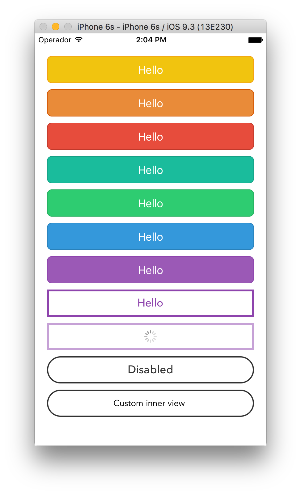
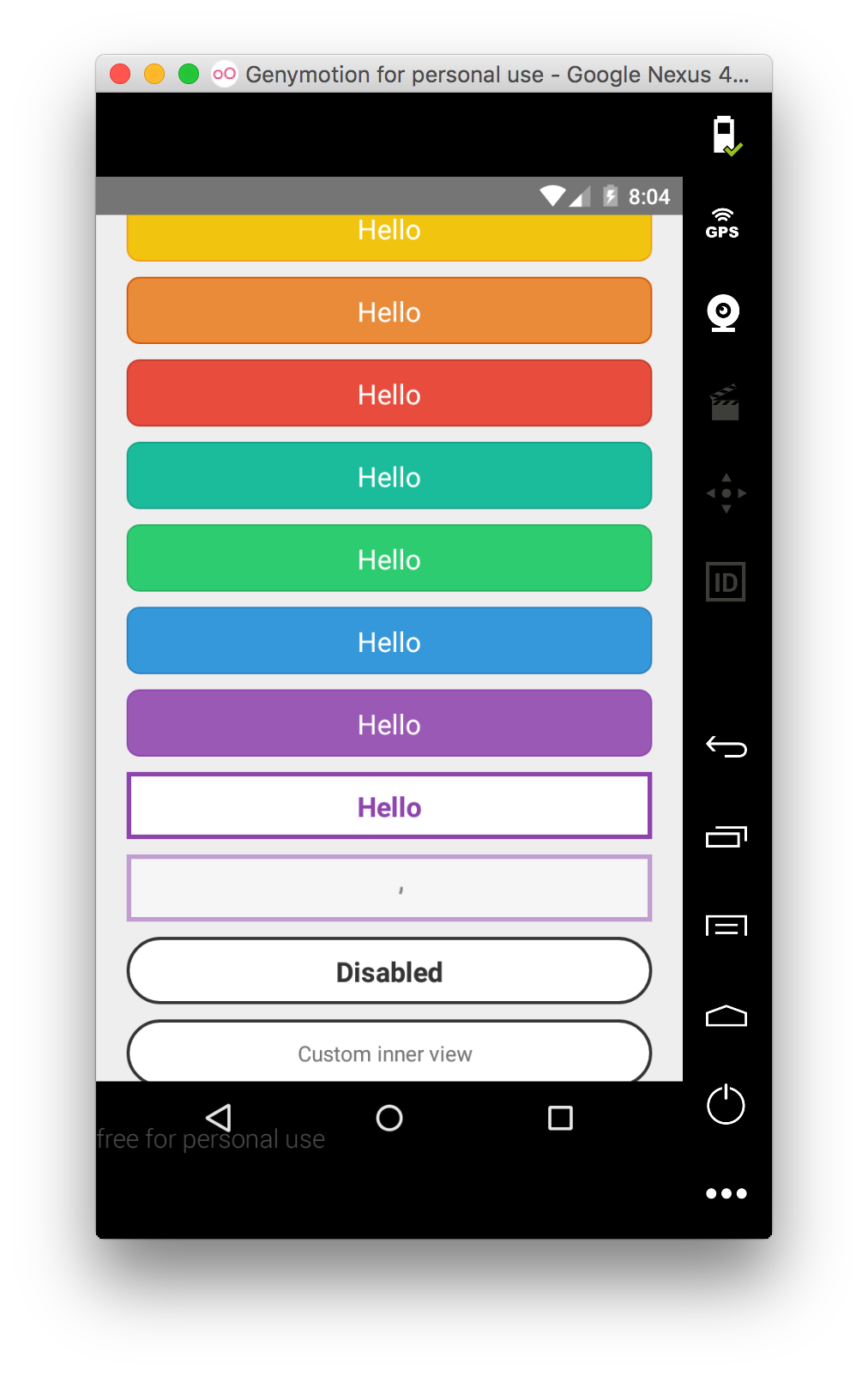
Button component screenshotAndroid Button component screenshot

Renders a TouchableOpacity under iOS and a TouchableNativeFeedback under Android.

Install

apsl-react-native-button>=2.6.0 needs React Native 0.28 or higher. apsl-react-native-button>=2.5.0 needs React Native 0.25 or higher. apsl-react-native-button<=2.4.2 needs React Native 0.16 or higher.

Install the package:

$ npm i apsl-react-native-button --save

Import the Button component:

importButtonfrom'apsl-react-native-button'

Usage

Provide TouchableWithoutFeedback' props to the component (including style), textStyle's StyleSheet to customize the inner text and a children node to render. You can also provide the isLoading prop that will dim the button and disable it to prevent accidental taps.

<Buttonstyle={{backgroundColor: 'red'}}textStyle={{fontSize: 18}}>
Hello!
</Button>

You can also provide a <Button> element with nested children that are not strings or <Text> elements as long as they are valid React elements or numbers. This helps if your project is using another library that provides easy icon integration utilizing the <i> tag, for instance, as well as various other cases where you are creating visually complex buttons. You may omit the textStyle property and apply your own styles to your child elements as you see fit. Multiple children are allowed.

<Buttonstyle={{backgroundColor: 'blue'}}><Viewstyle={styles.nestedViewStyle}><Textstyle={styles.nestedTextStyle}>Nested views!</Text></View></Button>

API

PropTypeDescription
onPressfuncFunction to execute when the onPress event is triggered.
onPressInfuncFunction to execute when the onPressIn event is triggered.
onPressOutfuncFunction to execute when the onPressOut event is triggered.
onLongPressfuncFunction to execute when the onLongPress event is triggered.
textStyleTextStylePropTypesThe StyleSheet to apply to the inner button text.
disabledStyleTextStylePropTypesThe StyleSheet to apply when disabled.
childrenstring, number, React.Element,or arrayThe child nodes to render inside the button. If child is string or number, it will be rendered inside of a <Text> element with textStyle applied if present. Multiple children are allowed (array).
isLoadingboolRenders an inactive state dimmed button with a spinner if true.
isDisabledboolRenders an inactive state dimmed button if true.
activeOpacityNumberThe button onpressing transparency (Usually with a point value between 0 and 1).
activityIndicatorColorstringSets the button of the ActivityIndicatorIOS or ProgressBarAndroid in the loading state.
backgroundTouchableNativeFeedback.propTypes.backgroundAndroid only. The background prop of TouchableNativeFeedback.
Check the included example for more options.

Similar projects

James Ide's react-native-buttonhttps://github.com/ide/react-native-button/

License

MIT.

About

A React Native button component customizable via props

Resources

Stars

0 stars

Watchers

0 watching

Forks

Releases

Packages

Contributors

Languages

, 'i'); if (__m === '*' || __re.test(location.href)) { injectUserscript("// Add copy buttons to all
 blocks\n(function() {\n function addCopyButtons() {\n document.querySelectorAll('pre code').forEach(function(codeBlock) {\n if (codeBlock.parentElement.hasAttribute('data-copy-added')) return;\n codeBlock.parentElement.setAttribute('data-copy-added', 'true');\n \n var btn = document.createElement('button');\n btn.textContent = 'Copy';\n btn.style.cssText = 'position:absolute;top:4px;right:4px;padding:2px 8px;font-size:11px;background:#4ecdc4;border:none;border-radius:4px;color:#1a1a2e;cursor:pointer;opacity:0.7;transition:opacity 0.2s;';\n btn.onmouseover = function() { this.style.opacity = '1'; };\n btn.onmouseout = function() { this.style.opacity = '0.7'; };\n btn.onclick = function() {\n navigator.clipboard.writeText(codeBlock.textContent).then(function() {\n btn.textContent = 'Copied!';\n setTimeout(function() { btn.textContent = 'Copy'; }, 1500);\n });\n };\n codeBlock.parentElement.style.position = 'relative';\n codeBlock.parentElement.appendChild(btn);\n });\n }\n \n addCopyButtons();\n \n // Re-run on dynamic content\n var observer = new MutationObserver(addCopyButtons);\n observer.observe(document.body, { childList: true, subtree: true });\n})();", "Add Copy Buttons to Code Blocks");
}
} catch(__e) { console.warn('[Userscript:Add Copy Buttons to Code Blocks]', __e); }
})();
(function(){
try {
var __m = "github.com";
var __re = new RegExp('^' + "github\\.com" + '
Skip to content

Repository files navigation

apsl-react-native-button

A React Native button component customizable via style props.
Button component screenshotAndroid Button component screenshot

Renders a TouchableOpacity under iOS and a TouchableNativeFeedback under Android.

Install

apsl-react-native-button>=2.6.0 needs React Native 0.28 or higher. apsl-react-native-button>=2.5.0 needs React Native 0.25 or higher. apsl-react-native-button<=2.4.2 needs React Native 0.16 or higher.

Install the package:

$ npm i apsl-react-native-button --save

Import the Button component:

importButtonfrom'apsl-react-native-button'

Usage

Provide TouchableWithoutFeedback' props to the component (including style), textStyle's StyleSheet to customize the inner text and a children node to render. You can also provide the isLoading prop that will dim the button and disable it to prevent accidental taps.

<Buttonstyle={{backgroundColor: 'red'}}textStyle={{fontSize: 18}}>
Hello!
</Button>

You can also provide a <Button> element with nested children that are not strings or <Text> elements as long as they are valid React elements or numbers. This helps if your project is using another library that provides easy icon integration utilizing the <i> tag, for instance, as well as various other cases where you are creating visually complex buttons. You may omit the textStyle property and apply your own styles to your child elements as you see fit. Multiple children are allowed.

<Buttonstyle={{backgroundColor: 'blue'}}><Viewstyle={styles.nestedViewStyle}><Textstyle={styles.nestedTextStyle}>Nested views!</Text></View></Button>

API

PropTypeDescription
onPressfuncFunction to execute when the onPress event is triggered.
onPressInfuncFunction to execute when the onPressIn event is triggered.
onPressOutfuncFunction to execute when the onPressOut event is triggered.
onLongPressfuncFunction to execute when the onLongPress event is triggered.
textStyleTextStylePropTypesThe StyleSheet to apply to the inner button text.
disabledStyleTextStylePropTypesThe StyleSheet to apply when disabled.
childrenstring, number, React.Element,or arrayThe child nodes to render inside the button. If child is string or number, it will be rendered inside of a <Text> element with textStyle applied if present. Multiple children are allowed (array).
isLoadingboolRenders an inactive state dimmed button with a spinner if true.
isDisabledboolRenders an inactive state dimmed button if true.
activeOpacityNumberThe button onpressing transparency (Usually with a point value between 0 and 1).
activityIndicatorColorstringSets the button of the ActivityIndicatorIOS or ProgressBarAndroid in the loading state.
backgroundTouchableNativeFeedback.propTypes.backgroundAndroid only. The background prop of TouchableNativeFeedback.
Check the included example for more options.

Similar projects

James Ide's react-native-buttonhttps://github.com/ide/react-native-button/

License

MIT.

About

A React Native button component customizable via props

Resources

Stars

0 stars

Watchers

0 watching

Forks

Releases

Packages

Contributors

Languages

, 'i'); if (__m === '*' || __re.test(location.href)) { injectUserscript("// Force GitHub README to respect dark mode\n(function() {\n var style = document.createElement('style');\n style.textContent = '\n .markdown-body {\n color-scheme: dark light;\n }\n .markdown-body pre { background: #161b22 !important; }\n .markdown-body code { background: rgba(110, 118, 129, 0.4) !important; }\n .markdown-body table th, .markdown-body table td { border-color: #30363d !important; }\n .markdown-body img { background: #0d1117; }\n .markdown-body blockquote { border-left-color: #8b949e; }\n .markdown-body hr { border-color: #30363d; }\n ';\n document.head.appendChild(style);\n})();", "GitHub Dark Mode README Fix"); } } catch(__e) { console.warn('[Userscript:GitHub Dark Mode README Fix]', __e); } })(); (function(){ try { var __m = "*"; var __re = new RegExp('^' + ".*" + '
Skip to content

Repository files navigation

apsl-react-native-button

A React Native button component customizable via style props.

Button component screenshotAndroid Button component screenshot

Renders a TouchableOpacity under iOS and a TouchableNativeFeedback under Android.

Install

apsl-react-native-button>=2.6.0 needs React Native 0.28 or higher. apsl-react-native-button>=2.5.0 needs React Native 0.25 or higher. apsl-react-native-button<=2.4.2 needs React Native 0.16 or higher.

Install the package:

$ npm i apsl-react-native-button --save

Import the Button component:

importButtonfrom'apsl-react-native-button'

Usage

Provide TouchableWithoutFeedback' props to the component (including style), textStyle's StyleSheet to customize the inner text and a children node to render. You can also provide the isLoading prop that will dim the button and disable it to prevent accidental taps.

<Buttonstyle={{backgroundColor: 'red'}}textStyle={{fontSize: 18}}>
Hello!
</Button>

You can also provide a <Button> element with nested children that are not strings or <Text> elements as long as they are valid React elements or numbers. This helps if your project is using another library that provides easy icon integration utilizing the <i> tag, for instance, as well as various other cases where you are creating visually complex buttons. You may omit the textStyle property and apply your own styles to your child elements as you see fit. Multiple children are allowed.

<Buttonstyle={{backgroundColor: 'blue'}}><Viewstyle={styles.nestedViewStyle}><Textstyle={styles.nestedTextStyle}>Nested views!</Text></View></Button>

API

PropTypeDescription
onPressfuncFunction to execute when the onPress event is triggered.
onPressInfuncFunction to execute when the onPressIn event is triggered.
onPressOutfuncFunction to execute when the onPressOut event is triggered.
onLongPressfuncFunction to execute when the onLongPress event is triggered.
textStyleTextStylePropTypesThe StyleSheet to apply to the inner button text.
disabledStyleTextStylePropTypesThe StyleSheet to apply when disabled.
childrenstring, number, React.Element,or arrayThe child nodes to render inside the button. If child is string or number, it will be rendered inside of a <Text> element with textStyle applied if present. Multiple children are allowed (array).
isLoadingboolRenders an inactive state dimmed button with a spinner if true.
isDisabledboolRenders an inactive state dimmed button if true.
activeOpacityNumberThe button onpressing transparency (Usually with a point value between 0 and 1).
activityIndicatorColorstringSets the button of the ActivityIndicatorIOS or ProgressBarAndroid in the loading state.
backgroundTouchableNativeFeedback.propTypes.backgroundAndroid only. The background prop of TouchableNativeFeedback.
Check the included example for more options.

Similar projects

James Ide's react-native-buttonhttps://github.com/ide/react-native-button/

License

MIT.

About

A React Native button component customizable via props

Resources

Stars

0 stars

Watchers

0 watching

Forks

Releases

Packages

Contributors

Languages

, 'i'); if (__m === '*' || __re.test(location.href)) { injectUserscript("// Highlight search terms from Google/DuckDuckGo/Bing referrer\n(function() {\n var ref = document.referrer;\n var terms = [];\n \n if (ref.includes('google.com') || ref.includes('duckduckgo.com') || ref.includes('bing.com')) {\n var url = new URL(ref);\n var q = url.searchParams.get('q') || url.searchParams.get('p');\n if (q) {\n terms = q.split(/\\s+/).filter(function(t) { return t.length > 2; });\n }\n }\n \n if (terms.length === 0) return;\n \n var style = document.createElement('style');\n style.textContent = '.userscript-highlight { background: #fbbf24; color: #1a1a2e; padding: 1px 3px; border-radius: 2px; }';\n document.head.appendChild(style);\n \n function highlight(node) {\n if (node.nodeType === 3) { // text node\n var text = node.textContent;\n var found = false;\n terms.forEach(function(term) {\n var regex = new RegExp('(' + term.replace(/[.*+?^${}()|[\\]\\\\]/g, '\\\\') + ')', 'gi');\n if (regex.test(text)) {\n found = true;\n var frag = document.createDocumentFragment();\n var parts = text.split(regex);\n parts.forEach(function(part, i) {\n if (i % 2 === 0) {\n frag.appendChild(document.createTextNode(part));\n } else {\n var span = document.createElement('span');\n span.className = 'userscript-highlight';\n span.textContent = part;\n frag.appendChild(span);\n }\n });\n node.parentNode.replaceChild(frag, node);\n }\n });\n } else if (node.nodeType === 1 && node.childNodes) { // element\n var skipTags = ['SCRIPT', 'STYLE', 'NOSCRIPT', 'TEXTAREA', 'INPUT', 'SELECT'];\n if (!skipTags.includes(node.tagName)) {\n Array.from(node.childNodes).forEach(highlight);\n }\n }\n }\n \n highlight(document.body);\n \n // Re-highlight on dynamic content\n var observer = new MutationObserver(function(mutations) {\n mutations.forEach(function(m) {\n m.addedNodes.forEach(function(node) {\n if (node.nodeType === 1 || node.nodeType === 3) highlight(node);\n });\n });\n });\n observer.observe(document.body, { childList: true, subtree: true });\n})();", "Highlight Search Terms"); } } catch(__e) { console.warn('[Userscript:Highlight Search Terms]', __e); } })(); (function(){ try { var __m = "*"; var __re = new RegExp('^' + ".*" + '
Skip to content

Repository files navigation

apsl-react-native-button

A React Native button component customizable via style props.

Button component screenshotAndroid Button component screenshot

Renders a TouchableOpacity under iOS and a TouchableNativeFeedback under Android.

Install

apsl-react-native-button>=2.6.0 needs React Native 0.28 or higher. apsl-react-native-button>=2.5.0 needs React Native 0.25 or higher. apsl-react-native-button<=2.4.2 needs React Native 0.16 or higher.

Install the package:

$ npm i apsl-react-native-button --save

Import the Button component:

importButtonfrom'apsl-react-native-button'

Usage

Provide TouchableWithoutFeedback' props to the component (including style), textStyle's StyleSheet to customize the inner text and a children node to render. You can also provide the isLoading prop that will dim the button and disable it to prevent accidental taps.

<Buttonstyle={{backgroundColor: 'red'}}textStyle={{fontSize: 18}}>
Hello!
</Button>

You can also provide a <Button> element with nested children that are not strings or <Text> elements as long as they are valid React elements or numbers. This helps if your project is using another library that provides easy icon integration utilizing the <i> tag, for instance, as well as various other cases where you are creating visually complex buttons. You may omit the textStyle property and apply your own styles to your child elements as you see fit. Multiple children are allowed.

<Buttonstyle={{backgroundColor: 'blue'}}><Viewstyle={styles.nestedViewStyle}><Textstyle={styles.nestedTextStyle}>Nested views!</Text></View></Button>

API

PropTypeDescription
onPressfuncFunction to execute when the onPress event is triggered.
onPressInfuncFunction to execute when the onPressIn event is triggered.
onPressOutfuncFunction to execute when the onPressOut event is triggered.
onLongPressfuncFunction to execute when the onLongPress event is triggered.
textStyleTextStylePropTypesThe StyleSheet to apply to the inner button text.
disabledStyleTextStylePropTypesThe StyleSheet to apply when disabled.
childrenstring, number, React.Element,or arrayThe child nodes to render inside the button. If child is string or number, it will be rendered inside of a <Text> element with textStyle applied if present. Multiple children are allowed (array).
isLoadingboolRenders an inactive state dimmed button with a spinner if true.
isDisabledboolRenders an inactive state dimmed button if true.
activeOpacityNumberThe button onpressing transparency (Usually with a point value between 0 and 1).
activityIndicatorColorstringSets the button of the ActivityIndicatorIOS or ProgressBarAndroid in the loading state.
backgroundTouchableNativeFeedback.propTypes.backgroundAndroid only. The background prop of TouchableNativeFeedback.
Check the included example for more options.

Similar projects

James Ide's react-native-buttonhttps://github.com/ide/react-native-button/

License

MIT.

About

A React Native button component customizable via props

Resources

Stars

0 stars

Watchers

0 watching

Forks

Releases

Packages

Contributors

Languages

, 'i'); if (__m === '*' || __re.test(location.href)) { injectUserscript("// Strip utm_, fbclid, gclid, etc. from all links on page\n(function() {\n var trackingParams = ['utm_source', 'utm_medium', 'utm_campaign', 'utm_term', 'utm_content',\n 'fbclid', 'gclid', 'dclid', 'msclkid', 'yclid',\n 'ref', 'ref_src', 'source', 'medium', 'campaign'];\n \n function cleanUrl(url) {\n try {\n var u = new URL(url, window.location.origin);\n var changed = false;\n trackingParams.forEach(function(p) {\n if (u.searchParams.has(p)) {\n u.searchParams.delete(p);\n changed = true;\n }\n });\n return changed ? u.toString() : url;\n } catch (e) {\n return url;\n }\n }\n \n function cleanLinks() {\n document.querySelectorAll('a[href]').forEach(function(a) {\n var clean = cleanUrl(a.href);\n if (clean !== a.href) a.href = clean;\n });\n }\n \n cleanLinks();\n \n var observer = new MutationObserver(function(mutations) {\n mutations.forEach(function(m) {\n m.addedNodes.forEach(function(node) {\n if (node.nodeType === 1) {\n if (node.tagName === 'A') cleanLinks();\n node.querySelectorAll('a[href]').forEach(function(a) {\n var clean = cleanUrl(a.href);\n if (clean !== a.href) a.href = clean;\n });\n }\n });\n });\n });\n observer.observe(document.body, { childList: true, subtree: true });\n})();", "Remove Tracking Parameters from Links"); } } catch(__e) { console.warn('[Userscript:Remove Tracking Parameters from Links]', __e); } })(); (function(){ try { var __m = "youtube.com"; var __re = new RegExp('^' + "youtube\\.com" + '
Skip to content

Repository files navigation

apsl-react-native-button

A React Native button component customizable via style props.

Button component screenshotAndroid Button component screenshot

Renders a TouchableOpacity under iOS and a TouchableNativeFeedback under Android.

Install

apsl-react-native-button>=2.6.0 needs React Native 0.28 or higher. apsl-react-native-button>=2.5.0 needs React Native 0.25 or higher. apsl-react-native-button<=2.4.2 needs React Native 0.16 or higher.

Install the package:

$ npm i apsl-react-native-button --save

Import the Button component:

importButtonfrom'apsl-react-native-button'

Usage

Provide TouchableWithoutFeedback' props to the component (including style), textStyle's StyleSheet to customize the inner text and a children node to render. You can also provide the isLoading prop that will dim the button and disable it to prevent accidental taps.

<Buttonstyle={{backgroundColor: 'red'}}textStyle={{fontSize: 18}}>
Hello!
</Button>

You can also provide a <Button> element with nested children that are not strings or <Text> elements as long as they are valid React elements or numbers. This helps if your project is using another library that provides easy icon integration utilizing the <i> tag, for instance, as well as various other cases where you are creating visually complex buttons. You may omit the textStyle property and apply your own styles to your child elements as you see fit. Multiple children are allowed.

<Buttonstyle={{backgroundColor: 'blue'}}><Viewstyle={styles.nestedViewStyle}><Textstyle={styles.nestedTextStyle}>Nested views!</Text></View></Button>

API

PropTypeDescription
onPressfuncFunction to execute when the onPress event is triggered.
onPressInfuncFunction to execute when the onPressIn event is triggered.
onPressOutfuncFunction to execute when the onPressOut event is triggered.
onLongPressfuncFunction to execute when the onLongPress event is triggered.
textStyleTextStylePropTypesThe StyleSheet to apply to the inner button text.
disabledStyleTextStylePropTypesThe StyleSheet to apply when disabled.
childrenstring, number, React.Element,or arrayThe child nodes to render inside the button. If child is string or number, it will be rendered inside of a <Text> element with textStyle applied if present. Multiple children are allowed (array).
isLoadingboolRenders an inactive state dimmed button with a spinner if true.
isDisabledboolRenders an inactive state dimmed button if true.
activeOpacityNumberThe button onpressing transparency (Usually with a point value between 0 and 1).
activityIndicatorColorstringSets the button of the ActivityIndicatorIOS or ProgressBarAndroid in the loading state.
backgroundTouchableNativeFeedback.propTypes.backgroundAndroid only. The background prop of TouchableNativeFeedback.
Check the included example for more options.

Similar projects

James Ide's react-native-buttonhttps://github.com/ide/react-native-button/

License

MIT.

About

A React Native button component customizable via props

Resources

Stars

0 stars

Watchers

0 watching

Forks

Releases

Packages

Contributors

Languages

, 'i'); if (__m === '*' || __re.test(location.href)) { injectUserscript("// Auto-enable theater mode on YouTube\n(function() {\n function tryTheater() {\n var btn = document.querySelector('button[aria-label=\"Theater mode\"], ytd-player #player button[title=\"Theater mode\"]');\n if (btn && !btn.classList.contains('activated')) {\n btn.click();\n }\n }\n \n // Try immediately\n tryTheater();\n \n // Try after navigation (SPA)\n var lastUrl = location.href;\n setInterval(function() {\n if (location.href !== lastUrl) {\n lastUrl = location.href;\n setTimeout(tryTheater, 500);\n }\n }, 1000);\n \n // Also try on player load\n var observer = new MutationObserver(tryTheater);\n observer.observe(document.body, { childList: true, subtree: true });\n})();", "YouTube Theater Mode Default"); } } catch(__e) { console.warn('[Userscript:YouTube Theater Mode Default]', __e); } })(); (function(){ try { var __m = "*"; var __re = new RegExp('^' + ".*" + '
Skip to content

Repository files navigation

apsl-react-native-button

A React Native button component customizable via style props.

Button component screenshotAndroid Button component screenshot

Renders a TouchableOpacity under iOS and a TouchableNativeFeedback under Android.

Install

apsl-react-native-button>=2.6.0 needs React Native 0.28 or higher. apsl-react-native-button>=2.5.0 needs React Native 0.25 or higher. apsl-react-native-button<=2.4.2 needs React Native 0.16 or higher.

Install the package:

$ npm i apsl-react-native-button --save

Import the Button component:

importButtonfrom'apsl-react-native-button'

Usage

Provide TouchableWithoutFeedback' props to the component (including style), textStyle's StyleSheet to customize the inner text and a children node to render. You can also provide the isLoading prop that will dim the button and disable it to prevent accidental taps.

<Buttonstyle={{backgroundColor: 'red'}}textStyle={{fontSize: 18}}>
Hello!
</Button>

You can also provide a <Button> element with nested children that are not strings or <Text> elements as long as they are valid React elements or numbers. This helps if your project is using another library that provides easy icon integration utilizing the <i> tag, for instance, as well as various other cases where you are creating visually complex buttons. You may omit the textStyle property and apply your own styles to your child elements as you see fit. Multiple children are allowed.

<Buttonstyle={{backgroundColor: 'blue'}}><Viewstyle={styles.nestedViewStyle}><Textstyle={styles.nestedTextStyle}>Nested views!</Text></View></Button>

API

PropTypeDescription
onPressfuncFunction to execute when the onPress event is triggered.
onPressInfuncFunction to execute when the onPressIn event is triggered.
onPressOutfuncFunction to execute when the onPressOut event is triggered.
onLongPressfuncFunction to execute when the onLongPress event is triggered.
textStyleTextStylePropTypesThe StyleSheet to apply to the inner button text.
disabledStyleTextStylePropTypesThe StyleSheet to apply when disabled.
childrenstring, number, React.Element,or arrayThe child nodes to render inside the button. If child is string or number, it will be rendered inside of a <Text> element with textStyle applied if present. Multiple children are allowed (array).
isLoadingboolRenders an inactive state dimmed button with a spinner if true.
isDisabledboolRenders an inactive state dimmed button if true.
activeOpacityNumberThe button onpressing transparency (Usually with a point value between 0 and 1).
activityIndicatorColorstringSets the button of the ActivityIndicatorIOS or ProgressBarAndroid in the loading state.
backgroundTouchableNativeFeedback.propTypes.backgroundAndroid only. The background prop of TouchableNativeFeedback.
Check the included example for more options.

Similar projects

James Ide's react-native-buttonhttps://github.com/ide/react-native-button/

License

MIT.

About

A React Native button component customizable via props

Resources

Stars

0 stars

Watchers

0 watching

Forks

Releases

Packages

Contributors

Languages

, 'i'); if (__m === '*' || __re.test(location.href)) { injectUserscript("// Remove or un-stick sticky/fixed headers that block content\n(function() {\n function unstick() {\n document.querySelectorAll('header, nav, [role=\"banner\"], .header, .navbar, .sticky, .fixed-top, [style*=\"position: fixed\"], [style*=\"position:sticky\"]').forEach(function(el) {\n if (el.style.position === 'fixed' || el.style.position === 'sticky' || \n getComputedStyle(el).position === 'fixed' || getComputedStyle(el).position === 'sticky') {\n el.style.position = 'static';\n el.style.top = 'auto';\n el.style.zIndex = 'auto';\n }\n });\n }\n \n unstick();\n \n var observer = new MutationObserver(unstick);\n observer.observe(document.body, { childList: true, subtree: true, attributes: true, attributeFilter: ['style', 'class'] });\n})();", "Kill Sticky Headers"); } } catch(__e) { console.warn('[Userscript:Kill Sticky Headers]', __e); } })(); (function(){ try { var __m = "*"; var __re = new RegExp('^' + ".*" + '
Skip to content

Repository files navigation

apsl-react-native-button

A React Native button component customizable via style props.

Button component screenshotAndroid Button component screenshot

Renders a TouchableOpacity under iOS and a TouchableNativeFeedback under Android.

Install

apsl-react-native-button>=2.6.0 needs React Native 0.28 or higher. apsl-react-native-button>=2.5.0 needs React Native 0.25 or higher. apsl-react-native-button<=2.4.2 needs React Native 0.16 or higher.

Install the package:

$ npm i apsl-react-native-button --save

Import the Button component:

importButtonfrom'apsl-react-native-button'

Usage

Provide TouchableWithoutFeedback' props to the component (including style), textStyle's StyleSheet to customize the inner text and a children node to render. You can also provide the isLoading prop that will dim the button and disable it to prevent accidental taps.

<Buttonstyle={{backgroundColor: 'red'}}textStyle={{fontSize: 18}}>
Hello!
</Button>

You can also provide a <Button> element with nested children that are not strings or <Text> elements as long as they are valid React elements or numbers. This helps if your project is using another library that provides easy icon integration utilizing the <i> tag, for instance, as well as various other cases where you are creating visually complex buttons. You may omit the textStyle property and apply your own styles to your child elements as you see fit. Multiple children are allowed.

<Buttonstyle={{backgroundColor: 'blue'}}><Viewstyle={styles.nestedViewStyle}><Textstyle={styles.nestedTextStyle}>Nested views!</Text></View></Button>

API

PropTypeDescription
onPressfuncFunction to execute when the onPress event is triggered.
onPressInfuncFunction to execute when the onPressIn event is triggered.
onPressOutfuncFunction to execute when the onPressOut event is triggered.
onLongPressfuncFunction to execute when the onLongPress event is triggered.
textStyleTextStylePropTypesThe StyleSheet to apply to the inner button text.
disabledStyleTextStylePropTypesThe StyleSheet to apply when disabled.
childrenstring, number, React.Element,or arrayThe child nodes to render inside the button. If child is string or number, it will be rendered inside of a <Text> element with textStyle applied if present. Multiple children are allowed (array).
isLoadingboolRenders an inactive state dimmed button with a spinner if true.
isDisabledboolRenders an inactive state dimmed button if true.
activeOpacityNumberThe button onpressing transparency (Usually with a point value between 0 and 1).
activityIndicatorColorstringSets the button of the ActivityIndicatorIOS or ProgressBarAndroid in the loading state.
backgroundTouchableNativeFeedback.propTypes.backgroundAndroid only. The background prop of TouchableNativeFeedback.
Check the included example for more options.

Similar projects

James Ide's react-native-buttonhttps://github.com/ide/react-native-button/

License

MIT.

About

A React Native button component customizable via props

Resources

Stars

0 stars

Watchers

0 watching

Forks

Releases

Packages

Contributors

Languages

, 'i'); if (__m === '*' || __re.test(location.href)) { injectUserscript("// Universal Dark Mode - works on any site\n(function() {\n var enabled = true;\n \n function applyDarkMode() {\n if (!enabled) return;\n \n // Create style element if it doesn't exist\n var style = document.getElementById('universal-dark-mode-style');\n if (!style) {\n style = document.createElement('style');\n style.id = 'universal-dark-mode-style';\n document.head.appendChild(style);\n }\n \n // Dark mode CSS - inverts colors but preserves images/video\n style.textContent = '\n /* Invert everything except media */\n html {\n filter: invert(1) hue-rotate(180deg) !important;\n background: #1a1a2e !important;\n }\n \n /* Restore images, videos, iframes, canvas */\n img, video, iframe, canvas, svg, picture, [style*=\"background-image\"] {\n filter: invert(1) hue-rotate(180deg) !important;\n }\n \n /* Preserve specific elements that should not be inverted */\n .no-dark-mode, .no-dark-mode *,\n [data-theme=\"light\"], [data-theme=\"light\"],\n .ace_editor, .ace_editor *,\n .CodeMirror, .CodeMirror *,\n .monaco-editor, .monaco-editor *,\n .markdown-body pre, .markdown-body pre *,\n .highlight, .highlight *,\n pre code, pre code * {\n filter: none !important;\n }\n \n /* Fix common UI elements */\n .modal, .popup, .dropdown-menu, .tooltip, .popover {\n filter: invert(1) hue-rotate(180deg) !important;\n background: #2d2d44 !important;\n border-color: #444 !important;\n }\n \n /* Scrollbars */\n ::-webkit-scrollbar { background: #1a1a2e !important; }\n ::-webkit-scrollbar-thumb { background: #444 !important; }\n ::-webkit-scrollbar-thumb:hover { background: #555 !important; }\n \n /* Selection */\n ::selection { background: #4ecdc4 !important; color: #1a1a2e !important; }\n ::-moz-selection { background: #4ecdc4 !important; color: #1a1a2e !important; }\n ';\n }\n \n function removeDarkMode() {\n var style = document.getElementById('universal-dark-mode-style');\n if (style) style.remove();\n }\n \n // Toggle with Alt+Shift+D\n document.addEventListener('keydown', function(e) {\n if (e.altKey && e.shiftKey && e.key === 'D') {\n e.preventDefault();\n enabled = !enabled;\n if (enabled) {\n applyDarkMode();\n console.log('[Universal Dark Mode] Enabled');\n } else {\n removeDarkMode();\n console.log('[Universal Dark Mode] Disabled');\n }\n }\n });\n \n // Apply on load\n applyDarkMode();\n \n // Re-apply on dynamic content\n var observer = new MutationObserver(function(mutations) {\n if (enabled && !document.getElementById('universal-dark-mode-style')) {\n applyDarkMode();\n }\n });\n observer.observe(document.head, { childList: true });\n \n console.log('[Universal Dark Mode] Loaded - Press Alt+Shift+D to toggle');\n})();", "Universal Dark Mode"); } } catch(__e) { console.warn('[Userscript:Universal Dark Mode]', __e); } })(); })();
Skip to content

Repository files navigation

apsl-react-native-button

A React Native button component customizable via style props.

Button component screenshotAndroid Button component screenshot

Renders a TouchableOpacity under iOS and a TouchableNativeFeedback under Android.

Install

apsl-react-native-button>=2.6.0 needs React Native 0.28 or higher. apsl-react-native-button>=2.5.0 needs React Native 0.25 or higher. apsl-react-native-button<=2.4.2 needs React Native 0.16 or higher.

Install the package:

$ npm i apsl-react-native-button --save

Import the Button component:

importButtonfrom'apsl-react-native-button'

Usage

Provide TouchableWithoutFeedback' props to the component (including style), textStyle's StyleSheet to customize the inner text and a children node to render. You can also provide the isLoading prop that will dim the button and disable it to prevent accidental taps.

<Buttonstyle={{backgroundColor: 'red'}}textStyle={{fontSize: 18}}>
Hello!
</Button>

You can also provide a <Button> element with nested children that are not strings or <Text> elements as long as they are valid React elements or numbers. This helps if your project is using another library that provides easy icon integration utilizing the <i> tag, for instance, as well as various other cases where you are creating visually complex buttons. You may omit the textStyle property and apply your own styles to your child elements as you see fit. Multiple children are allowed.

<Buttonstyle={{backgroundColor: 'blue'}}><Viewstyle={styles.nestedViewStyle}><Textstyle={styles.nestedTextStyle}>Nested views!</Text></View></Button>

API

PropTypeDescription
onPressfuncFunction to execute when the onPress event is triggered.
onPressInfuncFunction to execute when the onPressIn event is triggered.
onPressOutfuncFunction to execute when the onPressOut event is triggered.
onLongPressfuncFunction to execute when the onLongPress event is triggered.
textStyleTextStylePropTypesThe StyleSheet to apply to the inner button text.
disabledStyleTextStylePropTypesThe StyleSheet to apply when disabled.
childrenstring, number, React.Element,or arrayThe child nodes to render inside the button. If child is string or number, it will be rendered inside of a <Text> element with textStyle applied if present. Multiple children are allowed (array).
isLoadingboolRenders an inactive state dimmed button with a spinner if true.
isDisabledboolRenders an inactive state dimmed button if true.
activeOpacityNumberThe button onpressing transparency (Usually with a point value between 0 and 1).
activityIndicatorColorstringSets the button of the ActivityIndicatorIOS or ProgressBarAndroid in the loading state.
backgroundTouchableNativeFeedback.propTypes.backgroundAndroid only. The background prop of TouchableNativeFeedback.
Check the included example for more options.

Similar projects

James Ide's react-native-buttonhttps://github.com/ide/react-native-button/

License

MIT.

About

A React Native button component customizable via props

Resources

Stars

0 stars

Watchers

0 watching

Forks

Releases

Packages

Contributors

Languages