
UI Toolset & Components Library for React Native
check out our Docs Site
yarn add react-native-ui-lib
or
npm i --save react-native-ui-lib
Some of the components are using these native dependencies, they are not a requirement but will allow you to create better lookings apps (:
- react-native-animatable
- react-native-blur
This is a quick example of how to use our basic components, modifiers and presets to generate a good looking screen.

importReact,{Component}from'react';import{View,TextInput,Text,Button}from'react-native-ui-lib';exportdefaultclassExampleextendsComponent{render(){return(<ViewflexpaddingH-25paddingT-120><Textblue50text20>Welcome</Text><TextInputtext50placeholder="username"dark10/><TextInputtext50placeholder="password"secureTextEntrydark10/><ViewmarginT-100center><Buttontext70whitebackground-orange30label="Login"/><Buttonlinktext70orange30label="Sign Up"marginT-20/></View></View>);}}The base foundation of each UI component is its style. We use basic style presets to define the rules and the style guide we follow.
Our presetes includes: Colors, Typography, Shadows, Border Radius and more..
The UILib already comes with a set of predefined constants and presets.
You can easily use it anywhere in your code as you would have used any other constant value, or as a component modifier.
It's also very easy to define your own presets..
import{Typography,Colors}from'react-native-ui-lib';Colors.loadColors({pink: '#FF69B4',gold: '#FFD700',});Typography.loadTypographies({h1: {fontSize: 58,fontWeight: '300',lineHeight: 80},h2: {fontSize: 46,fontWeight: '300',lineHeight: 64},});and so for example, the following line
<Texth1pink>Hello World</Text>Will generate this text

It will use the h1 preset for typography and the pink color value we set to style the Text element.
As you probably noticed already, we translate our style presets into modifiers. Modifiers will help you create a stunning UI easily and quickly.
Use our alignment props to quickly position your content without getting confused calculating all these flex rules. left, top, right, bottom, row, center, centerH (Horizontal Center), centerV (Vertical Center), spread
<Viewleft><Buttonlabel="Button"></View><Viewright><Buttonlabel="Button"></View><Viewtop><Buttonlabel="Button"></View><Viewbottom><Buttonlabel="Button"></View><Viewcenter><Buttonlabel="Button"></View>


Same goes here... space, stretch and color in a more readable way.
[colorKey] (text color), background-[colorKey]
<Text pink>...</Text><View bg-pink>...</View>[typographyPresetKey] (text components)
<Text h1>...</Text>flex, flex-[value]
<Viewflex> // be default is flex=1
<Viewflex-2/><Viewflex-3/><Viewflex-4/></View>padding-[value], paddingL-[value], paddingT-[value], paddingR-[value], paddingB-[value], paddingH-[value], paddingV-[value]
<View paddingV-20 paddingH-30>...</View>margin-[value], marginL-[value], marginT-[value], marginR-[value], marginB-[value], marginH-[value], marginV-[value]
<View marginT-5 marginB-10>...</View>
Check out this example where we use most of these props
Assets are big part of the whole UI system, whether it's an icon, placeholder or an illustration, we use them everywhere.
Load assets groups and easily render them with the Image component.
import{Assets,Image}from'react-native-ui-lib';Assets.loadAssetsGroup('icons',{icon1: require('icon1.png'),icon2: require('icon2.png'),icon3: require('icon3.png'),});// or as a nested group to create your own hierarchyAssets.loadAssetsGroup('illustrations.placeholders',{emptyCart: require('emptyCart.png'),emptyProduct: require('emptyProduct.png'),});Assets.loadAssetsGroup('illustrations.emptyStates.',{noMessages: require('noMessages.png'),noContacts: require('noContacts.png'),});// Use them with the Image component (our Image component)<ImageassetName="icon1"/>// default assetGroup is "icons"<ImageassetName="emptyCart"assetGroup="illustrations.placeholders"/>// The old fashion way will work as well<Imagesource={Assets.icons.icon1}/>- Action Bar
- Action Sheet (cross-platform)
- Avatar
- Badge
- Basic List
- Button
- Card
- Connection Status Bar
- List Item
- State Screen
- Loader Screen
- Page Control
- Picker
- Stepper
- Text
- TextInput
- MaskedInput
- TagsInput
import{Card}from'react-native-ui-lib';<Cardrow// control the children flow directionborderRadius={12}height={150}containerStyle={{marginRight: 20}}onPress={...}enableShadow={true/false}><Card.Imagewidth={80}imageSource={cardImage}/><View>
...
</View></Card>import{MaskedInput}from'react-native-ui-lib';<MaskedInputrenderMaskedText={this.renderTimeText}caretHiddenkeyboardType={'numeric'}maxLength={4}/>renderTimeText(value){constpaddedValue=_.padStart(value,4,'0');consthours=paddedValue.substr(0,2);constminutes=paddedValue.substr(2,2);return(<Texttext20dark20center>{hours}<Textred10>h</Text>{minutes}<Textred10>m</Text></Text>);}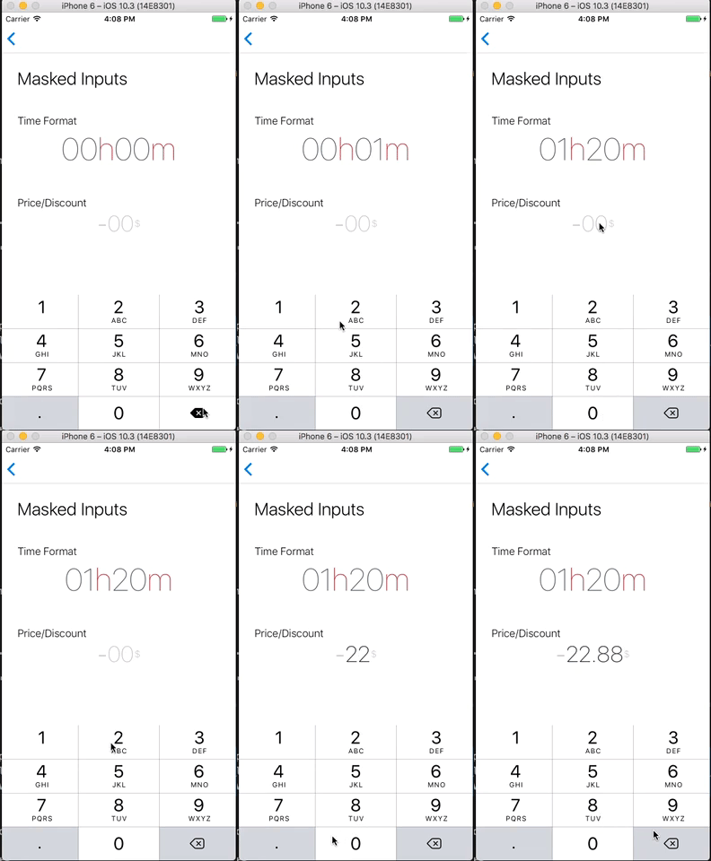
import{TagsInput}from'react-native-ui-lib';<TagsInputcontainerStyle={{marginBottom: 20}}placeholder="Enter Tags"tags={this.state.tags}// array of strings/objectsonChangeTags={(tags)=>this.setState({tags})}getLabel={(tag)=>tag.label}inputStyle={{fontSize: 22,color: 'blue'}}renderTag={(tag,index,shouldMarkTagToRemove)=><View>...</View>}hideUnderline={true/false}/>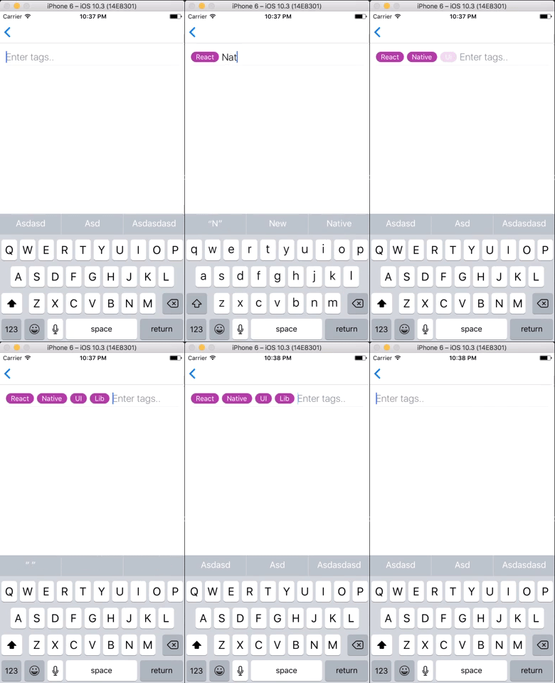
Since Android does not support TextInput onKeyPress callback, the feature that removes tags on Backspace won't work. In Order to fix it, follow these instructions:
Update your dependencies in android/app/build.gradle:
dependencies {
// Add this dependency:
compile project(":react-native-ui-lib")
}
Update your android/settings.gradle:
include ':react-native-ui-lib'
project(':react-native-ui-lib').projectDir =newFile(rootProject.projectDir, '../node_modules/react-native-ui-lib/lib/android')
In your MainApplication.java, add to the getPackages() list:
importcom.wix.reactnativeuilib.textinput.TextInputDelKeyHandlerPackage;
@OverrideprotectedList<ReactPackage> getPackages() {
returnArrays.<ReactPackage>asList(
// Add this package:newTextInputDelKeyHandlerPackage()
);
}usage:
import{AvatarHelper}from'react-native-ui-lib';AvatarHelper.getInitials('Lilly Wheeler');// LWAvatarHelper.getInitials('Russell Lloyd');// RLAvatarHelper.getInitials('Andrew');// Ausage:
import{Colors}from'react-native-ui-lib';Colors.rgba('#ff2442',0.05);// 'rgb(255, 36, 66, 0.05)'Colors.rgba(44,224,112,0.2);// 'rgb(44, 224, 112, 0.2)'