



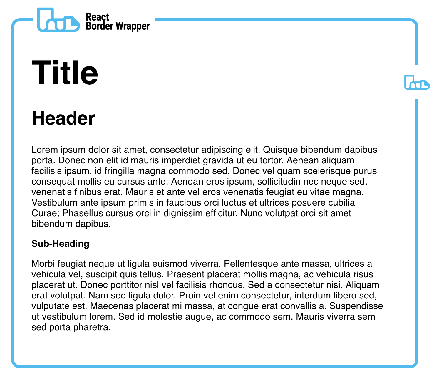
npm install react-border-wrapperyarn add react-border-wrapperUse the border wrapper in the same way you would use a <div>.
import*asReactfrom'react'importBorderWrapperfrom'react-border-wrapper'classExampleextendsReact.Component{render(){return(<BorderWrapper>
// Content
</BorderWrapper>)}}| Prop | Type | Description |
|---|---|---|
innerPadding | stringnumber | Padding around the children on each edge. |
borderWidth | stringnumber | Width of the border. |
borderRadius | stringnumber | Radius of each corner. This radius is added on top of the inner padding. Thus, a large radius will create a large distance between the top and bottom borders. |
borderColour | string | CSS compatible string for the border colour |
borderType | string | CSS compatible LineStyle string to change the border drawing style |
topElementrightElementbottomElementleftElement | Element | JSX Element to be rendered at the specified side. If an element is not specified then all prop values for that side will be ignored. |
topPositionrightPositionleftPositionrightPosition | number | A number between 0 and 1 to indicate a precentage (0% to 100%) of where the component will be placed along the sides. Values greater than 1 or less than 0 will be at 1 and 0 respectively. |
topOffsetrightOffsetleftOffsetrightOffset | stringnumber | Offset the component on the given side by this value. Use this to help center or position each component to your desired location. |
topGaprightGapbottomGapleftGap | stringnumber | Distance between the border and the position of the component to be rendered. |
Use the following link to play around with the props and find a proper style. It is highly encouraged to export the props and either report an issue with them or submit them as a style to be used by other users.
https://metroxe.github.io/react-border-wrapper/
MIT © Christopher Powroznik