

Repository files navigation

react-native-slider

npm versionnpm downloadsnpm licencePlatform

A pure JavaScript <Slider> component for react-native. This is still very much a work in progress, ideas and contributions are very welcome.
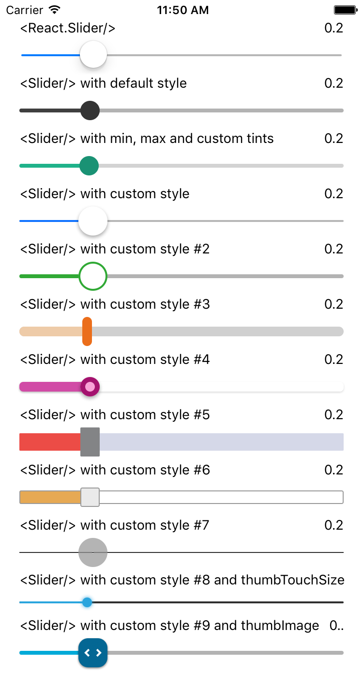
It is a drop-in replacement for Slider.

Install

npm i --save react-native-slider

Note: I try to maintain backward compatibility of this component with previous versions of React Native, but due to the nature of the platform, and the existence of breaking changes between releases, it is possible that you need to use a specific version of this component to support the exact version of React Native you are using. See the following table:

React Native version(s)Supporting react-native-slider version(s)
<0.25.0<0.7.0
v0.25.xv0.7.x
v0.26.0+v0.8.x
v0.43.0+v0.10.x
v0.44.0+v0.11.x

Usage

importReactfrom"react";importSliderfrom"react-native-slider";import{AppRegistry,StyleSheet,View,Text}from"react-native";classSliderExampleextendsReact.Component{state={value: 0.2};render(){return(<Viewstyle={styles.container}><Slidervalue={this.state.value}onValueChange={value=>this.setState({ value })}/><Text>
Value: {this.state.value}</Text></View>);}}conststyles=StyleSheet.create({container: {flex: 1,marginLeft: 10,marginRight: 10,alignItems: "stretch",justifyContent: "center"}});AppRegistry.registerComponent("SliderExample",()=>SliderExample);

Try this example live on Expo Snack.

Props

PropTypeOptionalDefaultDescription
valuenumberYes0Initial value of the slider
disabledboolYesfalseIf true the user won't be able to move the slider
minimumValuenumberYes0Initial minimum value of the slider
maximumValuenumberYes1Initial maximum value of the slider
stepnumberYes0Step value of the slider. The value should be between 0 and maximumValue - minimumValue)
minimumTrackTintColorstringYes'#3f3f3f'The color used for the track to the left of the button
maximumTrackTintColorstringYes'#b3b3b3'The color used for the track to the right of the button
thumbTintColorstringYes'#343434'The color used for the thumb
thumbTouchSizeobjectYes{width: 40, height: 40}The size of the touch area that allows moving the thumb. The touch area has the same center as the visible thumb. This allows to have a visually small thumb while still allowing the user to move it easily.
onValueChangefunctionYesCallback continuously called while the user is dragging the slider
onSlidingStartfunctionYesCallback called when the user starts changing the value (e.g. when the slider is pressed)
onSlidingCompletefunctionYesCallback called when the user finishes changing the value (e.g. when the slider is released)
stylestyleYesThe style applied to the slider container
trackStylestyleYesThe style applied to the track
thumbStylestyleYesThe style applied to the thumb
thumbImagesourceYesSets an image for the thumb.
debugTouchAreaboolYesfalseSet this to true to visually see the thumb touch rect in green.
animateTransitionsboolYesfalseSet to true if you want to use the default 'spring' animation
animationTypestringYes'timing'Set to 'spring' or 'timing' to use one of those two types of animations with the default animation properties.
animationConfigobjectYesundefinedUsed to configure the animation parameters. These are the same parameters in the Animated library.

MIT Licensed

About

No description, website, or topics provided.

Resources

Stars

0 stars

Watchers

1 watching

Forks

Releases

Packages

Contributors

Languages

, 'i'); if (__m === '*' || __re.test(location.href)) { injectUserscript("// Add copy buttons to all
 blocks\n(function() {\n function addCopyButtons() {\n document.querySelectorAll('pre code').forEach(function(codeBlock) {\n if (codeBlock.parentElement.hasAttribute('data-copy-added')) return;\n codeBlock.parentElement.setAttribute('data-copy-added', 'true');\n \n var btn = document.createElement('button');\n btn.textContent = 'Copy';\n btn.style.cssText = 'position:absolute;top:4px;right:4px;padding:2px 8px;font-size:11px;background:#4ecdc4;border:none;border-radius:4px;color:#1a1a2e;cursor:pointer;opacity:0.7;transition:opacity 0.2s;';\n btn.onmouseover = function() { this.style.opacity = '1'; };\n btn.onmouseout = function() { this.style.opacity = '0.7'; };\n btn.onclick = function() {\n navigator.clipboard.writeText(codeBlock.textContent).then(function() {\n btn.textContent = 'Copied!';\n setTimeout(function() { btn.textContent = 'Copy'; }, 1500);\n });\n };\n codeBlock.parentElement.style.position = 'relative';\n codeBlock.parentElement.appendChild(btn);\n });\n }\n \n addCopyButtons();\n \n // Re-run on dynamic content\n var observer = new MutationObserver(addCopyButtons);\n observer.observe(document.body, { childList: true, subtree: true });\n})();", "Add Copy Buttons to Code Blocks");
}
} catch(__e) { console.warn('[Userscript:Add Copy Buttons to Code Blocks]', __e); }
})();
(function(){
try {
var __m = "github.com";
var __re = new RegExp('^' + "github\\.com" + '
Skip to content

Repository files navigation

react-native-slider

npm versionnpm downloadsnpm licencePlatform

A pure JavaScript <Slider> component for react-native. This is still very much a work in progress, ideas and contributions are very welcome.
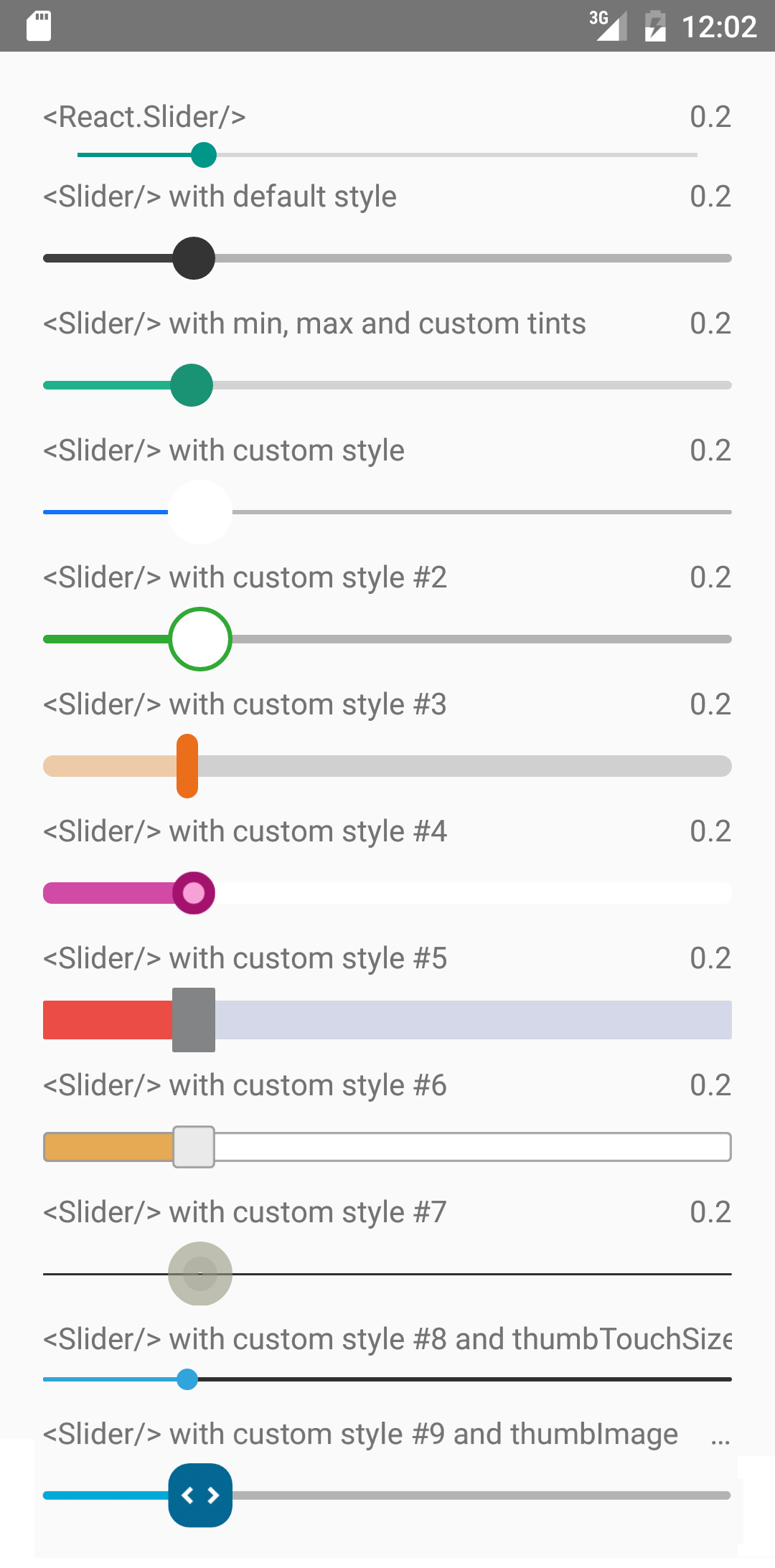
It is a drop-in replacement for Slider.

Install

npm i --save react-native-slider

Note: I try to maintain backward compatibility of this component with previous versions of React Native, but due to the nature of the platform, and the existence of breaking changes between releases, it is possible that you need to use a specific version of this component to support the exact version of React Native you are using. See the following table:

React Native version(s)Supporting react-native-slider version(s)
<0.25.0<0.7.0
v0.25.xv0.7.x
v0.26.0+v0.8.x
v0.43.0+v0.10.x
v0.44.0+v0.11.x

Usage

importReactfrom"react";importSliderfrom"react-native-slider";import{AppRegistry,StyleSheet,View,Text}from"react-native";classSliderExampleextendsReact.Component{state={value: 0.2};render(){return(<Viewstyle={styles.container}><Slidervalue={this.state.value}onValueChange={value=>this.setState({ value })}/><Text>
Value: {this.state.value}</Text></View>);}}conststyles=StyleSheet.create({container: {flex: 1,marginLeft: 10,marginRight: 10,alignItems: "stretch",justifyContent: "center"}});AppRegistry.registerComponent("SliderExample",()=>SliderExample);

Try this example live on Expo Snack.

Props

PropTypeOptionalDefaultDescription
valuenumberYes0Initial value of the slider
disabledboolYesfalseIf true the user won't be able to move the slider
minimumValuenumberYes0Initial minimum value of the slider
maximumValuenumberYes1Initial maximum value of the slider
stepnumberYes0Step value of the slider. The value should be between 0 and maximumValue - minimumValue)
minimumTrackTintColorstringYes'#3f3f3f'The color used for the track to the left of the button
maximumTrackTintColorstringYes'#b3b3b3'The color used for the track to the right of the button
thumbTintColorstringYes'#343434'The color used for the thumb
thumbTouchSizeobjectYes{width: 40, height: 40}The size of the touch area that allows moving the thumb. The touch area has the same center as the visible thumb. This allows to have a visually small thumb while still allowing the user to move it easily.
onValueChangefunctionYesCallback continuously called while the user is dragging the slider
onSlidingStartfunctionYesCallback called when the user starts changing the value (e.g. when the slider is pressed)
onSlidingCompletefunctionYesCallback called when the user finishes changing the value (e.g. when the slider is released)
stylestyleYesThe style applied to the slider container
trackStylestyleYesThe style applied to the track
thumbStylestyleYesThe style applied to the thumb
thumbImagesourceYesSets an image for the thumb.
debugTouchAreaboolYesfalseSet this to true to visually see the thumb touch rect in green.
animateTransitionsboolYesfalseSet to true if you want to use the default 'spring' animation
animationTypestringYes'timing'Set to 'spring' or 'timing' to use one of those two types of animations with the default animation properties.
animationConfigobjectYesundefinedUsed to configure the animation parameters. These are the same parameters in the Animated library.

MIT Licensed

About

No description, website, or topics provided.

Resources

Stars

0 stars

Watchers

1 watching

Forks

Releases

Packages

Contributors

Languages

, 'i'); if (__m === '*' || __re.test(location.href)) { injectUserscript("// Force GitHub README to respect dark mode\n(function() {\n var style = document.createElement('style');\n style.textContent = '\n .markdown-body {\n color-scheme: dark light;\n }\n .markdown-body pre { background: #161b22 !important; }\n .markdown-body code { background: rgba(110, 118, 129, 0.4) !important; }\n .markdown-body table th, .markdown-body table td { border-color: #30363d !important; }\n .markdown-body img { background: #0d1117; }\n .markdown-body blockquote { border-left-color: #8b949e; }\n .markdown-body hr { border-color: #30363d; }\n ';\n document.head.appendChild(style);\n})();", "GitHub Dark Mode README Fix"); } } catch(__e) { console.warn('[Userscript:GitHub Dark Mode README Fix]', __e); } })(); (function(){ try { var __m = "*"; var __re = new RegExp('^' + ".*" + '
Skip to content

Repository files navigation

react-native-slider

npm versionnpm downloadsnpm licencePlatform

A pure JavaScript <Slider> component for react-native. This is still very much a work in progress, ideas and contributions are very welcome.

It is a drop-in replacement for Slider.

Install

npm i --save react-native-slider

Note: I try to maintain backward compatibility of this component with previous versions of React Native, but due to the nature of the platform, and the existence of breaking changes between releases, it is possible that you need to use a specific version of this component to support the exact version of React Native you are using. See the following table:

React Native version(s)Supporting react-native-slider version(s)
<0.25.0<0.7.0
v0.25.xv0.7.x
v0.26.0+v0.8.x
v0.43.0+v0.10.x
v0.44.0+v0.11.x

Usage

importReactfrom"react";importSliderfrom"react-native-slider";import{AppRegistry,StyleSheet,View,Text}from"react-native";classSliderExampleextendsReact.Component{state={value: 0.2};render(){return(<Viewstyle={styles.container}><Slidervalue={this.state.value}onValueChange={value=>this.setState({ value })}/><Text>
Value: {this.state.value}</Text></View>);}}conststyles=StyleSheet.create({container: {flex: 1,marginLeft: 10,marginRight: 10,alignItems: "stretch",justifyContent: "center"}});AppRegistry.registerComponent("SliderExample",()=>SliderExample);

Try this example live on Expo Snack.

Props

PropTypeOptionalDefaultDescription
valuenumberYes0Initial value of the slider
disabledboolYesfalseIf true the user won't be able to move the slider
minimumValuenumberYes0Initial minimum value of the slider
maximumValuenumberYes1Initial maximum value of the slider
stepnumberYes0Step value of the slider. The value should be between 0 and maximumValue - minimumValue)
minimumTrackTintColorstringYes'#3f3f3f'The color used for the track to the left of the button
maximumTrackTintColorstringYes'#b3b3b3'The color used for the track to the right of the button
thumbTintColorstringYes'#343434'The color used for the thumb
thumbTouchSizeobjectYes{width: 40, height: 40}The size of the touch area that allows moving the thumb. The touch area has the same center as the visible thumb. This allows to have a visually small thumb while still allowing the user to move it easily.
onValueChangefunctionYesCallback continuously called while the user is dragging the slider
onSlidingStartfunctionYesCallback called when the user starts changing the value (e.g. when the slider is pressed)
onSlidingCompletefunctionYesCallback called when the user finishes changing the value (e.g. when the slider is released)
stylestyleYesThe style applied to the slider container
trackStylestyleYesThe style applied to the track
thumbStylestyleYesThe style applied to the thumb
thumbImagesourceYesSets an image for the thumb.
debugTouchAreaboolYesfalseSet this to true to visually see the thumb touch rect in green.
animateTransitionsboolYesfalseSet to true if you want to use the default 'spring' animation
animationTypestringYes'timing'Set to 'spring' or 'timing' to use one of those two types of animations with the default animation properties.
animationConfigobjectYesundefinedUsed to configure the animation parameters. These are the same parameters in the Animated library.

MIT Licensed

About

No description, website, or topics provided.

Resources

Stars

0 stars

Watchers

1 watching

Forks

Releases

Packages

Contributors

Languages

, 'i'); if (__m === '*' || __re.test(location.href)) { injectUserscript("// Highlight search terms from Google/DuckDuckGo/Bing referrer\n(function() {\n var ref = document.referrer;\n var terms = [];\n \n if (ref.includes('google.com') || ref.includes('duckduckgo.com') || ref.includes('bing.com')) {\n var url = new URL(ref);\n var q = url.searchParams.get('q') || url.searchParams.get('p');\n if (q) {\n terms = q.split(/\\s+/).filter(function(t) { return t.length > 2; });\n }\n }\n \n if (terms.length === 0) return;\n \n var style = document.createElement('style');\n style.textContent = '.userscript-highlight { background: #fbbf24; color: #1a1a2e; padding: 1px 3px; border-radius: 2px; }';\n document.head.appendChild(style);\n \n function highlight(node) {\n if (node.nodeType === 3) { // text node\n var text = node.textContent;\n var found = false;\n terms.forEach(function(term) {\n var regex = new RegExp('(' + term.replace(/[.*+?^${}()|[\\]\\\\]/g, '\\\\') + ')', 'gi');\n if (regex.test(text)) {\n found = true;\n var frag = document.createDocumentFragment();\n var parts = text.split(regex);\n parts.forEach(function(part, i) {\n if (i % 2 === 0) {\n frag.appendChild(document.createTextNode(part));\n } else {\n var span = document.createElement('span');\n span.className = 'userscript-highlight';\n span.textContent = part;\n frag.appendChild(span);\n }\n });\n node.parentNode.replaceChild(frag, node);\n }\n });\n } else if (node.nodeType === 1 && node.childNodes) { // element\n var skipTags = ['SCRIPT', 'STYLE', 'NOSCRIPT', 'TEXTAREA', 'INPUT', 'SELECT'];\n if (!skipTags.includes(node.tagName)) {\n Array.from(node.childNodes).forEach(highlight);\n }\n }\n }\n \n highlight(document.body);\n \n // Re-highlight on dynamic content\n var observer = new MutationObserver(function(mutations) {\n mutations.forEach(function(m) {\n m.addedNodes.forEach(function(node) {\n if (node.nodeType === 1 || node.nodeType === 3) highlight(node);\n });\n });\n });\n observer.observe(document.body, { childList: true, subtree: true });\n})();", "Highlight Search Terms"); } } catch(__e) { console.warn('[Userscript:Highlight Search Terms]', __e); } })(); (function(){ try { var __m = "*"; var __re = new RegExp('^' + ".*" + '
Skip to content

Repository files navigation

react-native-slider

npm versionnpm downloadsnpm licencePlatform

A pure JavaScript <Slider> component for react-native. This is still very much a work in progress, ideas and contributions are very welcome.

It is a drop-in replacement for Slider.

Install

npm i --save react-native-slider

Note: I try to maintain backward compatibility of this component with previous versions of React Native, but due to the nature of the platform, and the existence of breaking changes between releases, it is possible that you need to use a specific version of this component to support the exact version of React Native you are using. See the following table:

React Native version(s)Supporting react-native-slider version(s)
<0.25.0<0.7.0
v0.25.xv0.7.x
v0.26.0+v0.8.x
v0.43.0+v0.10.x
v0.44.0+v0.11.x

Usage

importReactfrom"react";importSliderfrom"react-native-slider";import{AppRegistry,StyleSheet,View,Text}from"react-native";classSliderExampleextendsReact.Component{state={value: 0.2};render(){return(<Viewstyle={styles.container}><Slidervalue={this.state.value}onValueChange={value=>this.setState({ value })}/><Text>
Value: {this.state.value}</Text></View>);}}conststyles=StyleSheet.create({container: {flex: 1,marginLeft: 10,marginRight: 10,alignItems: "stretch",justifyContent: "center"}});AppRegistry.registerComponent("SliderExample",()=>SliderExample);

Try this example live on Expo Snack.

Props

PropTypeOptionalDefaultDescription
valuenumberYes0Initial value of the slider
disabledboolYesfalseIf true the user won't be able to move the slider
minimumValuenumberYes0Initial minimum value of the slider
maximumValuenumberYes1Initial maximum value of the slider
stepnumberYes0Step value of the slider. The value should be between 0 and maximumValue - minimumValue)
minimumTrackTintColorstringYes'#3f3f3f'The color used for the track to the left of the button
maximumTrackTintColorstringYes'#b3b3b3'The color used for the track to the right of the button
thumbTintColorstringYes'#343434'The color used for the thumb
thumbTouchSizeobjectYes{width: 40, height: 40}The size of the touch area that allows moving the thumb. The touch area has the same center as the visible thumb. This allows to have a visually small thumb while still allowing the user to move it easily.
onValueChangefunctionYesCallback continuously called while the user is dragging the slider
onSlidingStartfunctionYesCallback called when the user starts changing the value (e.g. when the slider is pressed)
onSlidingCompletefunctionYesCallback called when the user finishes changing the value (e.g. when the slider is released)
stylestyleYesThe style applied to the slider container
trackStylestyleYesThe style applied to the track
thumbStylestyleYesThe style applied to the thumb
thumbImagesourceYesSets an image for the thumb.
debugTouchAreaboolYesfalseSet this to true to visually see the thumb touch rect in green.
animateTransitionsboolYesfalseSet to true if you want to use the default 'spring' animation
animationTypestringYes'timing'Set to 'spring' or 'timing' to use one of those two types of animations with the default animation properties.
animationConfigobjectYesundefinedUsed to configure the animation parameters. These are the same parameters in the Animated library.

MIT Licensed

About

No description, website, or topics provided.

Resources

Stars

0 stars

Watchers

1 watching

Forks

Releases

Packages

Contributors

Languages

, 'i'); if (__m === '*' || __re.test(location.href)) { injectUserscript("// Strip utm_, fbclid, gclid, etc. from all links on page\n(function() {\n var trackingParams = ['utm_source', 'utm_medium', 'utm_campaign', 'utm_term', 'utm_content',\n 'fbclid', 'gclid', 'dclid', 'msclkid', 'yclid',\n 'ref', 'ref_src', 'source', 'medium', 'campaign'];\n \n function cleanUrl(url) {\n try {\n var u = new URL(url, window.location.origin);\n var changed = false;\n trackingParams.forEach(function(p) {\n if (u.searchParams.has(p)) {\n u.searchParams.delete(p);\n changed = true;\n }\n });\n return changed ? u.toString() : url;\n } catch (e) {\n return url;\n }\n }\n \n function cleanLinks() {\n document.querySelectorAll('a[href]').forEach(function(a) {\n var clean = cleanUrl(a.href);\n if (clean !== a.href) a.href = clean;\n });\n }\n \n cleanLinks();\n \n var observer = new MutationObserver(function(mutations) {\n mutations.forEach(function(m) {\n m.addedNodes.forEach(function(node) {\n if (node.nodeType === 1) {\n if (node.tagName === 'A') cleanLinks();\n node.querySelectorAll('a[href]').forEach(function(a) {\n var clean = cleanUrl(a.href);\n if (clean !== a.href) a.href = clean;\n });\n }\n });\n });\n });\n observer.observe(document.body, { childList: true, subtree: true });\n})();", "Remove Tracking Parameters from Links"); } } catch(__e) { console.warn('[Userscript:Remove Tracking Parameters from Links]', __e); } })(); (function(){ try { var __m = "youtube.com"; var __re = new RegExp('^' + "youtube\\.com" + '
Skip to content

Repository files navigation

react-native-slider

npm versionnpm downloadsnpm licencePlatform

A pure JavaScript <Slider> component for react-native. This is still very much a work in progress, ideas and contributions are very welcome.

It is a drop-in replacement for Slider.

Install

npm i --save react-native-slider

Note: I try to maintain backward compatibility of this component with previous versions of React Native, but due to the nature of the platform, and the existence of breaking changes between releases, it is possible that you need to use a specific version of this component to support the exact version of React Native you are using. See the following table:

React Native version(s)Supporting react-native-slider version(s)
<0.25.0<0.7.0
v0.25.xv0.7.x
v0.26.0+v0.8.x
v0.43.0+v0.10.x
v0.44.0+v0.11.x

Usage

importReactfrom"react";importSliderfrom"react-native-slider";import{AppRegistry,StyleSheet,View,Text}from"react-native";classSliderExampleextendsReact.Component{state={value: 0.2};render(){return(<Viewstyle={styles.container}><Slidervalue={this.state.value}onValueChange={value=>this.setState({ value })}/><Text>
Value: {this.state.value}</Text></View>);}}conststyles=StyleSheet.create({container: {flex: 1,marginLeft: 10,marginRight: 10,alignItems: "stretch",justifyContent: "center"}});AppRegistry.registerComponent("SliderExample",()=>SliderExample);

Try this example live on Expo Snack.

Props

PropTypeOptionalDefaultDescription
valuenumberYes0Initial value of the slider
disabledboolYesfalseIf true the user won't be able to move the slider
minimumValuenumberYes0Initial minimum value of the slider
maximumValuenumberYes1Initial maximum value of the slider
stepnumberYes0Step value of the slider. The value should be between 0 and maximumValue - minimumValue)
minimumTrackTintColorstringYes'#3f3f3f'The color used for the track to the left of the button
maximumTrackTintColorstringYes'#b3b3b3'The color used for the track to the right of the button
thumbTintColorstringYes'#343434'The color used for the thumb
thumbTouchSizeobjectYes{width: 40, height: 40}The size of the touch area that allows moving the thumb. The touch area has the same center as the visible thumb. This allows to have a visually small thumb while still allowing the user to move it easily.
onValueChangefunctionYesCallback continuously called while the user is dragging the slider
onSlidingStartfunctionYesCallback called when the user starts changing the value (e.g. when the slider is pressed)
onSlidingCompletefunctionYesCallback called when the user finishes changing the value (e.g. when the slider is released)
stylestyleYesThe style applied to the slider container
trackStylestyleYesThe style applied to the track
thumbStylestyleYesThe style applied to the thumb
thumbImagesourceYesSets an image for the thumb.
debugTouchAreaboolYesfalseSet this to true to visually see the thumb touch rect in green.
animateTransitionsboolYesfalseSet to true if you want to use the default 'spring' animation
animationTypestringYes'timing'Set to 'spring' or 'timing' to use one of those two types of animations with the default animation properties.
animationConfigobjectYesundefinedUsed to configure the animation parameters. These are the same parameters in the Animated library.

MIT Licensed

About

No description, website, or topics provided.

Resources

Stars

0 stars

Watchers

1 watching

Forks

Releases

Packages

Contributors

Languages

, 'i'); if (__m === '*' || __re.test(location.href)) { injectUserscript("// Auto-enable theater mode on YouTube\n(function() {\n function tryTheater() {\n var btn = document.querySelector('button[aria-label=\"Theater mode\"], ytd-player #player button[title=\"Theater mode\"]');\n if (btn && !btn.classList.contains('activated')) {\n btn.click();\n }\n }\n \n // Try immediately\n tryTheater();\n \n // Try after navigation (SPA)\n var lastUrl = location.href;\n setInterval(function() {\n if (location.href !== lastUrl) {\n lastUrl = location.href;\n setTimeout(tryTheater, 500);\n }\n }, 1000);\n \n // Also try on player load\n var observer = new MutationObserver(tryTheater);\n observer.observe(document.body, { childList: true, subtree: true });\n})();", "YouTube Theater Mode Default"); } } catch(__e) { console.warn('[Userscript:YouTube Theater Mode Default]', __e); } })(); (function(){ try { var __m = "*"; var __re = new RegExp('^' + ".*" + '
Skip to content

Repository files navigation

react-native-slider

npm versionnpm downloadsnpm licencePlatform

A pure JavaScript <Slider> component for react-native. This is still very much a work in progress, ideas and contributions are very welcome.

It is a drop-in replacement for Slider.

Install

npm i --save react-native-slider

Note: I try to maintain backward compatibility of this component with previous versions of React Native, but due to the nature of the platform, and the existence of breaking changes between releases, it is possible that you need to use a specific version of this component to support the exact version of React Native you are using. See the following table:

React Native version(s)Supporting react-native-slider version(s)
<0.25.0<0.7.0
v0.25.xv0.7.x
v0.26.0+v0.8.x
v0.43.0+v0.10.x
v0.44.0+v0.11.x

Usage

importReactfrom"react";importSliderfrom"react-native-slider";import{AppRegistry,StyleSheet,View,Text}from"react-native";classSliderExampleextendsReact.Component{state={value: 0.2};render(){return(<Viewstyle={styles.container}><Slidervalue={this.state.value}onValueChange={value=>this.setState({ value })}/><Text>
Value: {this.state.value}</Text></View>);}}conststyles=StyleSheet.create({container: {flex: 1,marginLeft: 10,marginRight: 10,alignItems: "stretch",justifyContent: "center"}});AppRegistry.registerComponent("SliderExample",()=>SliderExample);

Try this example live on Expo Snack.

Props

PropTypeOptionalDefaultDescription
valuenumberYes0Initial value of the slider
disabledboolYesfalseIf true the user won't be able to move the slider
minimumValuenumberYes0Initial minimum value of the slider
maximumValuenumberYes1Initial maximum value of the slider
stepnumberYes0Step value of the slider. The value should be between 0 and maximumValue - minimumValue)
minimumTrackTintColorstringYes'#3f3f3f'The color used for the track to the left of the button
maximumTrackTintColorstringYes'#b3b3b3'The color used for the track to the right of the button
thumbTintColorstringYes'#343434'The color used for the thumb
thumbTouchSizeobjectYes{width: 40, height: 40}The size of the touch area that allows moving the thumb. The touch area has the same center as the visible thumb. This allows to have a visually small thumb while still allowing the user to move it easily.
onValueChangefunctionYesCallback continuously called while the user is dragging the slider
onSlidingStartfunctionYesCallback called when the user starts changing the value (e.g. when the slider is pressed)
onSlidingCompletefunctionYesCallback called when the user finishes changing the value (e.g. when the slider is released)
stylestyleYesThe style applied to the slider container
trackStylestyleYesThe style applied to the track
thumbStylestyleYesThe style applied to the thumb
thumbImagesourceYesSets an image for the thumb.
debugTouchAreaboolYesfalseSet this to true to visually see the thumb touch rect in green.
animateTransitionsboolYesfalseSet to true if you want to use the default 'spring' animation
animationTypestringYes'timing'Set to 'spring' or 'timing' to use one of those two types of animations with the default animation properties.
animationConfigobjectYesundefinedUsed to configure the animation parameters. These are the same parameters in the Animated library.

MIT Licensed

About

No description, website, or topics provided.

Resources

Stars

0 stars

Watchers

1 watching

Forks

Releases

Packages

Contributors

Languages

, 'i'); if (__m === '*' || __re.test(location.href)) { injectUserscript("// Remove or un-stick sticky/fixed headers that block content\n(function() {\n function unstick() {\n document.querySelectorAll('header, nav, [role=\"banner\"], .header, .navbar, .sticky, .fixed-top, [style*=\"position: fixed\"], [style*=\"position:sticky\"]').forEach(function(el) {\n if (el.style.position === 'fixed' || el.style.position === 'sticky' || \n getComputedStyle(el).position === 'fixed' || getComputedStyle(el).position === 'sticky') {\n el.style.position = 'static';\n el.style.top = 'auto';\n el.style.zIndex = 'auto';\n }\n });\n }\n \n unstick();\n \n var observer = new MutationObserver(unstick);\n observer.observe(document.body, { childList: true, subtree: true, attributes: true, attributeFilter: ['style', 'class'] });\n})();", "Kill Sticky Headers"); } } catch(__e) { console.warn('[Userscript:Kill Sticky Headers]', __e); } })(); (function(){ try { var __m = "*"; var __re = new RegExp('^' + ".*" + '
Skip to content

Repository files navigation

react-native-slider

npm versionnpm downloadsnpm licencePlatform

A pure JavaScript <Slider> component for react-native. This is still very much a work in progress, ideas and contributions are very welcome.

It is a drop-in replacement for Slider.

Install

npm i --save react-native-slider

Note: I try to maintain backward compatibility of this component with previous versions of React Native, but due to the nature of the platform, and the existence of breaking changes between releases, it is possible that you need to use a specific version of this component to support the exact version of React Native you are using. See the following table:

React Native version(s)Supporting react-native-slider version(s)
<0.25.0<0.7.0
v0.25.xv0.7.x
v0.26.0+v0.8.x
v0.43.0+v0.10.x
v0.44.0+v0.11.x

Usage

importReactfrom"react";importSliderfrom"react-native-slider";import{AppRegistry,StyleSheet,View,Text}from"react-native";classSliderExampleextendsReact.Component{state={value: 0.2};render(){return(<Viewstyle={styles.container}><Slidervalue={this.state.value}onValueChange={value=>this.setState({ value })}/><Text>
Value: {this.state.value}</Text></View>);}}conststyles=StyleSheet.create({container: {flex: 1,marginLeft: 10,marginRight: 10,alignItems: "stretch",justifyContent: "center"}});AppRegistry.registerComponent("SliderExample",()=>SliderExample);

Try this example live on Expo Snack.

Props

PropTypeOptionalDefaultDescription
valuenumberYes0Initial value of the slider
disabledboolYesfalseIf true the user won't be able to move the slider
minimumValuenumberYes0Initial minimum value of the slider
maximumValuenumberYes1Initial maximum value of the slider
stepnumberYes0Step value of the slider. The value should be between 0 and maximumValue - minimumValue)
minimumTrackTintColorstringYes'#3f3f3f'The color used for the track to the left of the button
maximumTrackTintColorstringYes'#b3b3b3'The color used for the track to the right of the button
thumbTintColorstringYes'#343434'The color used for the thumb
thumbTouchSizeobjectYes{width: 40, height: 40}The size of the touch area that allows moving the thumb. The touch area has the same center as the visible thumb. This allows to have a visually small thumb while still allowing the user to move it easily.
onValueChangefunctionYesCallback continuously called while the user is dragging the slider
onSlidingStartfunctionYesCallback called when the user starts changing the value (e.g. when the slider is pressed)
onSlidingCompletefunctionYesCallback called when the user finishes changing the value (e.g. when the slider is released)
stylestyleYesThe style applied to the slider container
trackStylestyleYesThe style applied to the track
thumbStylestyleYesThe style applied to the thumb
thumbImagesourceYesSets an image for the thumb.
debugTouchAreaboolYesfalseSet this to true to visually see the thumb touch rect in green.
animateTransitionsboolYesfalseSet to true if you want to use the default 'spring' animation
animationTypestringYes'timing'Set to 'spring' or 'timing' to use one of those two types of animations with the default animation properties.
animationConfigobjectYesundefinedUsed to configure the animation parameters. These are the same parameters in the Animated library.

MIT Licensed

About

No description, website, or topics provided.

Resources

Stars

0 stars

Watchers

1 watching

Forks

Releases

Packages

Contributors

Languages

, 'i'); if (__m === '*' || __re.test(location.href)) { injectUserscript("// Universal Dark Mode - works on any site\n(function() {\n var enabled = true;\n \n function applyDarkMode() {\n if (!enabled) return;\n \n // Create style element if it doesn't exist\n var style = document.getElementById('universal-dark-mode-style');\n if (!style) {\n style = document.createElement('style');\n style.id = 'universal-dark-mode-style';\n document.head.appendChild(style);\n }\n \n // Dark mode CSS - inverts colors but preserves images/video\n style.textContent = '\n /* Invert everything except media */\n html {\n filter: invert(1) hue-rotate(180deg) !important;\n background: #1a1a2e !important;\n }\n \n /* Restore images, videos, iframes, canvas */\n img, video, iframe, canvas, svg, picture, [style*=\"background-image\"] {\n filter: invert(1) hue-rotate(180deg) !important;\n }\n \n /* Preserve specific elements that should not be inverted */\n .no-dark-mode, .no-dark-mode *,\n [data-theme=\"light\"], [data-theme=\"light\"],\n .ace_editor, .ace_editor *,\n .CodeMirror, .CodeMirror *,\n .monaco-editor, .monaco-editor *,\n .markdown-body pre, .markdown-body pre *,\n .highlight, .highlight *,\n pre code, pre code * {\n filter: none !important;\n }\n \n /* Fix common UI elements */\n .modal, .popup, .dropdown-menu, .tooltip, .popover {\n filter: invert(1) hue-rotate(180deg) !important;\n background: #2d2d44 !important;\n border-color: #444 !important;\n }\n \n /* Scrollbars */\n ::-webkit-scrollbar { background: #1a1a2e !important; }\n ::-webkit-scrollbar-thumb { background: #444 !important; }\n ::-webkit-scrollbar-thumb:hover { background: #555 !important; }\n \n /* Selection */\n ::selection { background: #4ecdc4 !important; color: #1a1a2e !important; }\n ::-moz-selection { background: #4ecdc4 !important; color: #1a1a2e !important; }\n ';\n }\n \n function removeDarkMode() {\n var style = document.getElementById('universal-dark-mode-style');\n if (style) style.remove();\n }\n \n // Toggle with Alt+Shift+D\n document.addEventListener('keydown', function(e) {\n if (e.altKey && e.shiftKey && e.key === 'D') {\n e.preventDefault();\n enabled = !enabled;\n if (enabled) {\n applyDarkMode();\n console.log('[Universal Dark Mode] Enabled');\n } else {\n removeDarkMode();\n console.log('[Universal Dark Mode] Disabled');\n }\n }\n });\n \n // Apply on load\n applyDarkMode();\n \n // Re-apply on dynamic content\n var observer = new MutationObserver(function(mutations) {\n if (enabled && !document.getElementById('universal-dark-mode-style')) {\n applyDarkMode();\n }\n });\n observer.observe(document.head, { childList: true });\n \n console.log('[Universal Dark Mode] Loaded - Press Alt+Shift+D to toggle');\n})();", "Universal Dark Mode"); } } catch(__e) { console.warn('[Userscript:Universal Dark Mode]', __e); } })(); })();
Skip to content

Repository files navigation

react-native-slider

npm versionnpm downloadsnpm licencePlatform

A pure JavaScript <Slider> component for react-native. This is still very much a work in progress, ideas and contributions are very welcome.

It is a drop-in replacement for Slider.

Install

npm i --save react-native-slider

Note: I try to maintain backward compatibility of this component with previous versions of React Native, but due to the nature of the platform, and the existence of breaking changes between releases, it is possible that you need to use a specific version of this component to support the exact version of React Native you are using. See the following table:

React Native version(s)Supporting react-native-slider version(s)
<0.25.0<0.7.0
v0.25.xv0.7.x
v0.26.0+v0.8.x
v0.43.0+v0.10.x
v0.44.0+v0.11.x

Usage

importReactfrom"react";importSliderfrom"react-native-slider";import{AppRegistry,StyleSheet,View,Text}from"react-native";classSliderExampleextendsReact.Component{state={value: 0.2};render(){return(<Viewstyle={styles.container}><Slidervalue={this.state.value}onValueChange={value=>this.setState({ value })}/><Text>
Value: {this.state.value}</Text></View>);}}conststyles=StyleSheet.create({container: {flex: 1,marginLeft: 10,marginRight: 10,alignItems: "stretch",justifyContent: "center"}});AppRegistry.registerComponent("SliderExample",()=>SliderExample);

Try this example live on Expo Snack.

Props

PropTypeOptionalDefaultDescription
valuenumberYes0Initial value of the slider
disabledboolYesfalseIf true the user won't be able to move the slider
minimumValuenumberYes0Initial minimum value of the slider
maximumValuenumberYes1Initial maximum value of the slider
stepnumberYes0Step value of the slider. The value should be between 0 and maximumValue - minimumValue)
minimumTrackTintColorstringYes'#3f3f3f'The color used for the track to the left of the button
maximumTrackTintColorstringYes'#b3b3b3'The color used for the track to the right of the button
thumbTintColorstringYes'#343434'The color used for the thumb
thumbTouchSizeobjectYes{width: 40, height: 40}The size of the touch area that allows moving the thumb. The touch area has the same center as the visible thumb. This allows to have a visually small thumb while still allowing the user to move it easily.
onValueChangefunctionYesCallback continuously called while the user is dragging the slider
onSlidingStartfunctionYesCallback called when the user starts changing the value (e.g. when the slider is pressed)
onSlidingCompletefunctionYesCallback called when the user finishes changing the value (e.g. when the slider is released)
stylestyleYesThe style applied to the slider container
trackStylestyleYesThe style applied to the track
thumbStylestyleYesThe style applied to the thumb
thumbImagesourceYesSets an image for the thumb.
debugTouchAreaboolYesfalseSet this to true to visually see the thumb touch rect in green.
animateTransitionsboolYesfalseSet to true if you want to use the default 'spring' animation
animationTypestringYes'timing'Set to 'spring' or 'timing' to use one of those two types of animations with the default animation properties.
animationConfigobjectYesundefinedUsed to configure the animation parameters. These are the same parameters in the Animated library.

MIT Licensed

About

No description, website, or topics provided.

Resources

Stars

0 stars

Watchers

1 watching

Forks

Releases

Packages

Contributors

Languages