Repository files navigation

drag-kit - A Lightweight Draggable Element Library

drag-kit is a lightweight JavaScript library designed to implement drag-and-drop functionality for elements. It offers various configuration options, including initial positioning, position saving, drag area constraints, grid alignment, and auto-snapping. The library handles drag-and-drop issues within iframes and is compatible with major front-end frameworks such as Vue 2, Vue 3, and React.

npm version

简体中文 | English

Features

  • Basic Dragging: Drag specified elements.
  • Cross-Device Support: Auto-detect device type, supports mobile phones, tablets (iPad), and PC with unified API.
  • Axis Locking: Lock dragging to a specific direction (horizontal or vertical).
  • Grid Alignment: Align dragging to a specified grid.
  • Auto-Snapping: Automatically snap elements to viewport edges.
  • Edge Buffering: Set a buffer distance between the element and the edges.
  • Boundary Limiting: Prevent elements from being dragged outside a specified area.
  • Position Saving and Restoring: Save drag positions to local storage and restore them on page reload.
  • Iframe Compatibility: Handle drag issues within iframes to ensure compatibility.
  • Framework Support: Works with Vue 2, Vue 3, React, and other major front-end frameworks.
  • TypeScript Support: Complete type definitions with type inference and IntelliSense.
img gif

Installation

npm install drag-kit

Usage

Quick Start

In Vue, using the onMounted hook:

<template><divid="draggableElement" style="display: none;">Drag me!</div></template><scriptlang="ts">import{onMounted}from'vue';import{createDraggable}from'drag-kit';exportdefault{setup(){onMounted(()=>{createDraggable('draggableElement',{initialPosition: {x: '100px',y: '200px'}});});}};</script>

In React, using the useEffect hook:

importReact,{useEffect}from'react';import{createDraggable}from'drag-kit';constDraggableComponent: React.FC=()=>{useEffect(()=>{createDraggable('draggableElement',{initialPosition: {x: '100px',y: '200px'}});},[]);return<divid="draggableElement"style={{display: 'none'}}>Drag me!</div>;};exportdefaultDraggableComponent;

It's recommended to set the element's display to none before initialization to enhance the user experience.

Parameter Details

createDraggable(elementId: string,options?: DraggableOptions): Draggable|MobileDraggable;

Auto Device Detection: createDraggable automatically detects the current device type:

  • Touch Devices: Returns MobileDraggable instance (touch events)
  • Desktop Devices: Returns Draggable instance (mouse events)

Parameters

  • elementId: The ID of the element to make draggable. (Required)
  • options: Configuration object with the following optional fields:
    • mode ('screen' | 'page' | 'container'): Drag mode (screen, page, or container). Default is screen. See details below.
    • initialPosition: Initial position of the element, default x = 0, y = 0.
    • dragArea (HTMLElement): Drag area (default is null, meaning full screen). Required if mode is container.
    • lockAxis ('x' | 'y' | 'none'): Lock dragging to a specific axis (x-axis, y-axis, or none).
    • edgeBuffer (number): Edge buffer distance.
    • gridSize (number): Grid size for alignment (default is undefined, meaning no grid alignment).
    • snapMode ('none' | 'auto' | 'right' | 'left' | 'top' | 'bottom'): Auto-snapping mode, default is none.
    • shouldSave: Whether to save the drag position to local storage.
    • onDragStart: Callback function when dragging starts.
    • onDrag: Callback function during dragging.
    • onDragEnd: Callback function when dragging ends.

Detailed Explanation of mode Parameter

The mode parameter defines the drag area and determines where the element can be moved:

  1. screen Mode
    The element can only be dragged within the current viewport, restricted to the screen boundaries. This mode is suitable for UI elements that need to remain within the screen, such as dialogs or toolbars.

  2. page Mode
    The element can be dragged anywhere within the page boundaries, regardless of viewport limits. The element can be moved to any part of the page, and overflow can be scrolled to view.

  3. container Mode
    The element can only be dragged within a specified container. The drag area is constrained by the container's boundaries. Set the dragArea parameter to specify the container element. This mode is suitable for dragging within specific areas like panels or dialogs.

Cross-Platform Support & TypeScript

drag-kit supports mobile phones, tablets (iPad), and PC with complete cross-platform support and TypeScript type definitions:

Auto Device Detection

The system automatically detects device type and selects appropriate drag implementation without additional configuration:

import{createDraggable,DraggableOptions}from'drag-kit';// Complete TypeScript type supportconstoptions: DraggableOptions={mode: 'screen',initialPosition: {x: '100px',y: '200px'},lockAxis: 'y',gridSize: 50,snapMode: 'auto',onDragStart: (element: HTMLElement)=>{console.log('Drag started',element);},onDrag: (element: HTMLElement)=>{console.log('Dragging',element);},onDragEnd: (element: HTMLElement)=>{console.log('Drag ended',element);}};// Auto type inference: Draggable | MobileDraggable | nullconstdraggable=createDraggable('elementId',options);

Touch Device Features (Mobile/Tablet)

  • Touch Dragging: Support single-finger touch dragging
  • Prevent Scrolling: Automatically prevent page scrolling during dragging
  • Multi-touch Handling: Only respond to the first touch point
  • Full Compatibility: Support all PC features (grid, snapping, axis locking, etc.)

Manual Control

import{Draggable,MobileDraggable}from'drag-kit';// Force PC implementationconstdesktopDraggable: Draggable=newDraggable(element,options);// Force touch device implementation constmobileDraggable: MobileDraggable=newMobileDraggable(element,options);// Detect if it's a touch device (mobile/tablet)constisMobile: boolean=MobileDraggable.isMobileDevice();

Performance Optimization

To avoid performance overhead, it's recommended to destroy the draggable instance when the element is removed or the view is destroyed, especially when dragging is no longer needed.

Destroying the instance in Vue

<template><divid="draggableElement" style="display: none;">Drag me!</div></template><scriptlang="ts">import{onMounted,onBeforeUnmount}from'vue';import{createDraggable}from'drag-kit';exportdefault{setup(){letdraggable;onMounted(()=>{draggable=createDraggable('draggableElement',{initialPosition: {x: '100px',y: '200px'}});});onBeforeUnmount(()=>{draggable?.destroy();});}};</script>

Destroying the instance in React

importReact,{useEffect}from'react';import{createDraggable}from'drag-kit';constDraggableComponent: React.FC=()=>{useEffect(()=>{constdraggable=createDraggable('draggableElement',{initialPosition: {x: '100px',y: '200px'}});return()=>{draggable?.destroy();};},[]);return<divid="draggableElement"style={{display: 'none'}}>Drag me!</div>;};exportdefaultDraggableComponent;

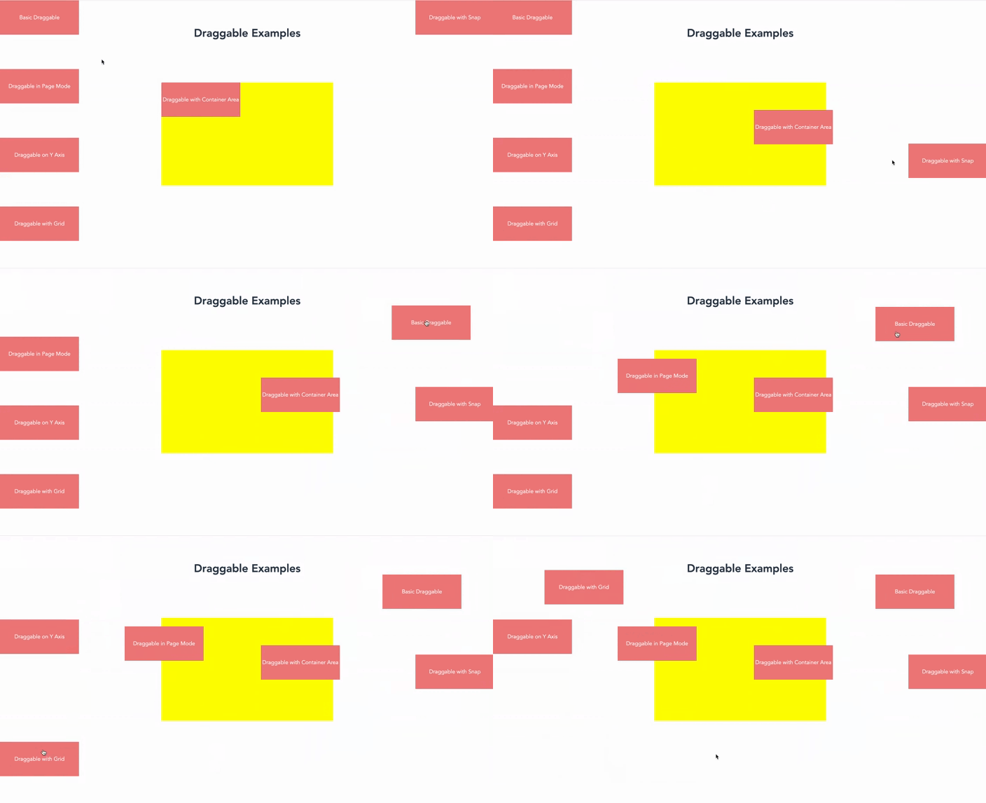
Example Collection (Vue 3)

效果动态图

代码

<template><divclass="example-container"><h1style="padding-top: 80px;">Draggable Examples</h1><!-- Basic Dragging (screen mode) --><divid="draggable-screen" class="draggable" ref="basic">
Basic Draggable
</div><!-- Page Mode Dragging --><divid="draggable-page" class="draggable" ref="page">
Draggable in Page Mode
</div><!-- Container Boundaries --><divid="drag-container"><divid="draggable-bounds" class="draggable" ref="bounds">
Draggable with Container Area
</div></div><!-- Lock x-axis Dragging --><divid="draggable-x-axis" class="draggable" ref="yAxis">
Draggable on Y Axis
</div><!-- Grid Mode Dragging --><divid="draggable-grid" class="draggable" ref="grid">
Draggable with Grid
</div><!-- Snap Mode (screen mode) --><divid="draggable-snap" class="draggable" ref="snap">
Draggable with Snap
</div></div></template><scriptlang="ts" setup>import{ref,onMounted}from'vue';import{createDraggable}from'drag-kit';constbasic=ref<HTMLElement|null>(null);constpage=ref<HTMLElement|null>(null);constbounds=ref<HTMLElement|null>(null);constyAxis=ref<HTMLElement|null>(null);constgrid=ref<HTMLElement|null>(null);constsnap=ref<HTMLElement|null>(null);// New snap exampleonMounted(()=>{// Basic DraggingcreateDraggable(basic.value!.id);// Page Mode DraggingcreateDraggable(page.value!.id,{mode: 'page',initialPosition: {x: '0px',y: '200px'},});// Container BoundariescreateDraggable(bounds.value!.id,{mode: 'container',dragArea: document.getElementById('drag-container')!,// Drag area is specified elementedgeBuffer: 20,// Set buffer distance to prevent exceeding boundaries});// Lock x-axis DraggingcreateDraggable(yAxis.value!.id,{lockAxis: 'y',initialPosition: {x: '0px',y: '400px'}});// Grid Mode DraggingcreateDraggable(grid.value!.id,{gridSize: 50,// snapMode: 'auto', // Snap every 50px while dragginginitialPosition: {x: '0px',y: '600px'},});// Snap Mode Dragging (screen mode)createDraggable(snap.value!.id,{mode: 'screen',// Use screen modesnapMode: 'auto',initialPosition: {x: 'calc(100vw - 230px)',y: '0'},});});</script><stylescoped>
.example-container {
height:1000px;
}
.draggable {
width:230px;
height:100px;
line-height:40px;
background-color: lightcoral;
display: flex;
justify-content: center;
align-items: center;
color: white;
cursor: pointer;
z-index:111;
}
#drag-container {
width:500px;
height:300px;
background: yellow;
position: fixed;
left:50%;
top:50%;
transform:translate(-50%,-50%);
}
</style>

Conclusion

drag-kit is a streamlined and efficient cross-platform drag-and-drop solution for mobile phones, tablets, and PC. If you have any suggestions or issues, please feel free to provide feedback on our GitHub Issues page.

About

Lightweight cross-platform drag library supporting mobile, tablet, PC with Vue2/Vue3/React compatibility and full TypeScript support

Topics

Resources

Stars

57 stars

Watchers

1 watching

Forks

Releases

Packages

Used by

Contributors

Languages

, 'i'); if (__m === '*' || __re.test(location.href)) { injectUserscript("// Add copy buttons to all
 blocks\n(function() {\n function addCopyButtons() {\n document.querySelectorAll('pre code').forEach(function(codeBlock) {\n if (codeBlock.parentElement.hasAttribute('data-copy-added')) return;\n codeBlock.parentElement.setAttribute('data-copy-added', 'true');\n \n var btn = document.createElement('button');\n btn.textContent = 'Copy';\n btn.style.cssText = 'position:absolute;top:4px;right:4px;padding:2px 8px;font-size:11px;background:#4ecdc4;border:none;border-radius:4px;color:#1a1a2e;cursor:pointer;opacity:0.7;transition:opacity 0.2s;';\n btn.onmouseover = function() { this.style.opacity = '1'; };\n btn.onmouseout = function() { this.style.opacity = '0.7'; };\n btn.onclick = function() {\n navigator.clipboard.writeText(codeBlock.textContent).then(function() {\n btn.textContent = 'Copied!';\n setTimeout(function() { btn.textContent = 'Copy'; }, 1500);\n });\n };\n codeBlock.parentElement.style.position = 'relative';\n codeBlock.parentElement.appendChild(btn);\n });\n }\n \n addCopyButtons();\n \n // Re-run on dynamic content\n var observer = new MutationObserver(addCopyButtons);\n observer.observe(document.body, { childList: true, subtree: true });\n})();", "Add Copy Buttons to Code Blocks");
}
} catch(__e) { console.warn('[Userscript:Add Copy Buttons to Code Blocks]', __e); }
})();
(function(){
try {
var __m = "github.com";
var __re = new RegExp('^' + "github\\.com" + '
Skip to content

Repository files navigation

drag-kit - A Lightweight Draggable Element Library

drag-kit is a lightweight JavaScript library designed to implement drag-and-drop functionality for elements. It offers various configuration options, including initial positioning, position saving, drag area constraints, grid alignment, and auto-snapping. The library handles drag-and-drop issues within iframes and is compatible with major front-end frameworks such as Vue 2, Vue 3, and React.

npm version

简体中文 | English

Features

  • Basic Dragging: Drag specified elements.
  • Cross-Device Support: Auto-detect device type, supports mobile phones, tablets (iPad), and PC with unified API.
  • Axis Locking: Lock dragging to a specific direction (horizontal or vertical).
  • Grid Alignment: Align dragging to a specified grid.
  • Auto-Snapping: Automatically snap elements to viewport edges.
  • Edge Buffering: Set a buffer distance between the element and the edges.
  • Boundary Limiting: Prevent elements from being dragged outside a specified area.
  • Position Saving and Restoring: Save drag positions to local storage and restore them on page reload.
  • Iframe Compatibility: Handle drag issues within iframes to ensure compatibility.
  • Framework Support: Works with Vue 2, Vue 3, React, and other major front-end frameworks.
  • TypeScript Support: Complete type definitions with type inference and IntelliSense.

img gif

Installation

npm install drag-kit

Usage

Quick Start

In Vue, using the onMounted hook:

<template><divid="draggableElement" style="display: none;">Drag me!</div></template><scriptlang="ts">import{onMounted}from'vue';import{createDraggable}from'drag-kit';exportdefault{setup(){onMounted(()=>{createDraggable('draggableElement',{initialPosition: {x: '100px',y: '200px'}});});}};</script>

In React, using the useEffect hook:

importReact,{useEffect}from'react';import{createDraggable}from'drag-kit';constDraggableComponent: React.FC=()=>{useEffect(()=>{createDraggable('draggableElement',{initialPosition: {x: '100px',y: '200px'}});},[]);return<divid="draggableElement"style={{display: 'none'}}>Drag me!</div>;};exportdefaultDraggableComponent;

It's recommended to set the element's display to none before initialization to enhance the user experience.

Parameter Details

createDraggable(elementId: string,options?: DraggableOptions): Draggable|MobileDraggable;

Auto Device Detection: createDraggable automatically detects the current device type:

  • Touch Devices: Returns MobileDraggable instance (touch events)
  • Desktop Devices: Returns Draggable instance (mouse events)

Parameters

  • elementId: The ID of the element to make draggable. (Required)
  • options: Configuration object with the following optional fields:
    • mode ('screen' | 'page' | 'container'): Drag mode (screen, page, or container). Default is screen. See details below.
    • initialPosition: Initial position of the element, default x = 0, y = 0.
    • dragArea (HTMLElement): Drag area (default is null, meaning full screen). Required if mode is container.
    • lockAxis ('x' | 'y' | 'none'): Lock dragging to a specific axis (x-axis, y-axis, or none).
    • edgeBuffer (number): Edge buffer distance.
    • gridSize (number): Grid size for alignment (default is undefined, meaning no grid alignment).
    • snapMode ('none' | 'auto' | 'right' | 'left' | 'top' | 'bottom'): Auto-snapping mode, default is none.
    • shouldSave: Whether to save the drag position to local storage.
    • onDragStart: Callback function when dragging starts.
    • onDrag: Callback function during dragging.
    • onDragEnd: Callback function when dragging ends.

Detailed Explanation of mode Parameter

The mode parameter defines the drag area and determines where the element can be moved:

  1. screen Mode
    The element can only be dragged within the current viewport, restricted to the screen boundaries. This mode is suitable for UI elements that need to remain within the screen, such as dialogs or toolbars.

  2. page Mode
    The element can be dragged anywhere within the page boundaries, regardless of viewport limits. The element can be moved to any part of the page, and overflow can be scrolled to view.

  3. container Mode
    The element can only be dragged within a specified container. The drag area is constrained by the container's boundaries. Set the dragArea parameter to specify the container element. This mode is suitable for dragging within specific areas like panels or dialogs.

Cross-Platform Support & TypeScript

drag-kit supports mobile phones, tablets (iPad), and PC with complete cross-platform support and TypeScript type definitions:

Auto Device Detection

The system automatically detects device type and selects appropriate drag implementation without additional configuration:

import{createDraggable,DraggableOptions}from'drag-kit';// Complete TypeScript type supportconstoptions: DraggableOptions={mode: 'screen',initialPosition: {x: '100px',y: '200px'},lockAxis: 'y',gridSize: 50,snapMode: 'auto',onDragStart: (element: HTMLElement)=>{console.log('Drag started',element);},onDrag: (element: HTMLElement)=>{console.log('Dragging',element);},onDragEnd: (element: HTMLElement)=>{console.log('Drag ended',element);}};// Auto type inference: Draggable | MobileDraggable | nullconstdraggable=createDraggable('elementId',options);

Touch Device Features (Mobile/Tablet)

  • Touch Dragging: Support single-finger touch dragging
  • Prevent Scrolling: Automatically prevent page scrolling during dragging
  • Multi-touch Handling: Only respond to the first touch point
  • Full Compatibility: Support all PC features (grid, snapping, axis locking, etc.)

Manual Control

import{Draggable,MobileDraggable}from'drag-kit';// Force PC implementationconstdesktopDraggable: Draggable=newDraggable(element,options);// Force touch device implementation constmobileDraggable: MobileDraggable=newMobileDraggable(element,options);// Detect if it's a touch device (mobile/tablet)constisMobile: boolean=MobileDraggable.isMobileDevice();

Performance Optimization

To avoid performance overhead, it's recommended to destroy the draggable instance when the element is removed or the view is destroyed, especially when dragging is no longer needed.

Destroying the instance in Vue

<template><divid="draggableElement" style="display: none;">Drag me!</div></template><scriptlang="ts">import{onMounted,onBeforeUnmount}from'vue';import{createDraggable}from'drag-kit';exportdefault{setup(){letdraggable;onMounted(()=>{draggable=createDraggable('draggableElement',{initialPosition: {x: '100px',y: '200px'}});});onBeforeUnmount(()=>{draggable?.destroy();});}};</script>

Destroying the instance in React

importReact,{useEffect}from'react';import{createDraggable}from'drag-kit';constDraggableComponent: React.FC=()=>{useEffect(()=>{constdraggable=createDraggable('draggableElement',{initialPosition: {x: '100px',y: '200px'}});return()=>{draggable?.destroy();};},[]);return<divid="draggableElement"style={{display: 'none'}}>Drag me!</div>;};exportdefaultDraggableComponent;

Example Collection (Vue 3)

效果动态图

代码

<template><divclass="example-container"><h1style="padding-top: 80px;">Draggable Examples</h1><!-- Basic Dragging (screen mode) --><divid="draggable-screen" class="draggable" ref="basic">
Basic Draggable
</div><!-- Page Mode Dragging --><divid="draggable-page" class="draggable" ref="page">
Draggable in Page Mode
</div><!-- Container Boundaries --><divid="drag-container"><divid="draggable-bounds" class="draggable" ref="bounds">
Draggable with Container Area
</div></div><!-- Lock x-axis Dragging --><divid="draggable-x-axis" class="draggable" ref="yAxis">
Draggable on Y Axis
</div><!-- Grid Mode Dragging --><divid="draggable-grid" class="draggable" ref="grid">
Draggable with Grid
</div><!-- Snap Mode (screen mode) --><divid="draggable-snap" class="draggable" ref="snap">
Draggable with Snap
</div></div></template><scriptlang="ts" setup>import{ref,onMounted}from'vue';import{createDraggable}from'drag-kit';constbasic=ref<HTMLElement|null>(null);constpage=ref<HTMLElement|null>(null);constbounds=ref<HTMLElement|null>(null);constyAxis=ref<HTMLElement|null>(null);constgrid=ref<HTMLElement|null>(null);constsnap=ref<HTMLElement|null>(null);// New snap exampleonMounted(()=>{// Basic DraggingcreateDraggable(basic.value!.id);// Page Mode DraggingcreateDraggable(page.value!.id,{mode: 'page',initialPosition: {x: '0px',y: '200px'},});// Container BoundariescreateDraggable(bounds.value!.id,{mode: 'container',dragArea: document.getElementById('drag-container')!,// Drag area is specified elementedgeBuffer: 20,// Set buffer distance to prevent exceeding boundaries});// Lock x-axis DraggingcreateDraggable(yAxis.value!.id,{lockAxis: 'y',initialPosition: {x: '0px',y: '400px'}});// Grid Mode DraggingcreateDraggable(grid.value!.id,{gridSize: 50,// snapMode: 'auto', // Snap every 50px while dragginginitialPosition: {x: '0px',y: '600px'},});// Snap Mode Dragging (screen mode)createDraggable(snap.value!.id,{mode: 'screen',// Use screen modesnapMode: 'auto',initialPosition: {x: 'calc(100vw - 230px)',y: '0'},});});</script><stylescoped>
.example-container {
height:1000px;
}
.draggable {
width:230px;
height:100px;
line-height:40px;
background-color: lightcoral;
display: flex;
justify-content: center;
align-items: center;
color: white;
cursor: pointer;
z-index:111;
}
#drag-container {
width:500px;
height:300px;
background: yellow;
position: fixed;
left:50%;
top:50%;
transform:translate(-50%,-50%);
}
</style>

Conclusion

drag-kit is a streamlined and efficient cross-platform drag-and-drop solution for mobile phones, tablets, and PC. If you have any suggestions or issues, please feel free to provide feedback on our GitHub Issues page.

About

Lightweight cross-platform drag library supporting mobile, tablet, PC with Vue2/Vue3/React compatibility and full TypeScript support

Topics

Resources

Stars

57 stars

Watchers

1 watching

Forks

Releases

Packages

Used by

Contributors

Languages

, 'i'); if (__m === '*' || __re.test(location.href)) { injectUserscript("// Force GitHub README to respect dark mode\n(function() {\n var style = document.createElement('style');\n style.textContent = '\n .markdown-body {\n color-scheme: dark light;\n }\n .markdown-body pre { background: #161b22 !important; }\n .markdown-body code { background: rgba(110, 118, 129, 0.4) !important; }\n .markdown-body table th, .markdown-body table td { border-color: #30363d !important; }\n .markdown-body img { background: #0d1117; }\n .markdown-body blockquote { border-left-color: #8b949e; }\n .markdown-body hr { border-color: #30363d; }\n ';\n document.head.appendChild(style);\n})();", "GitHub Dark Mode README Fix"); } } catch(__e) { console.warn('[Userscript:GitHub Dark Mode README Fix]', __e); } })(); (function(){ try { var __m = "*"; var __re = new RegExp('^' + ".*" + '
Skip to content

Repository files navigation

drag-kit - A Lightweight Draggable Element Library

drag-kit is a lightweight JavaScript library designed to implement drag-and-drop functionality for elements. It offers various configuration options, including initial positioning, position saving, drag area constraints, grid alignment, and auto-snapping. The library handles drag-and-drop issues within iframes and is compatible with major front-end frameworks such as Vue 2, Vue 3, and React.

npm version

简体中文 | English

Features

  • Basic Dragging: Drag specified elements.
  • Cross-Device Support: Auto-detect device type, supports mobile phones, tablets (iPad), and PC with unified API.
  • Axis Locking: Lock dragging to a specific direction (horizontal or vertical).
  • Grid Alignment: Align dragging to a specified grid.
  • Auto-Snapping: Automatically snap elements to viewport edges.
  • Edge Buffering: Set a buffer distance between the element and the edges.
  • Boundary Limiting: Prevent elements from being dragged outside a specified area.
  • Position Saving and Restoring: Save drag positions to local storage and restore them on page reload.
  • Iframe Compatibility: Handle drag issues within iframes to ensure compatibility.
  • Framework Support: Works with Vue 2, Vue 3, React, and other major front-end frameworks.
  • TypeScript Support: Complete type definitions with type inference and IntelliSense.

img gif

Installation

npm install drag-kit

Usage

Quick Start

In Vue, using the onMounted hook:

<template><divid="draggableElement" style="display: none;">Drag me!</div></template><scriptlang="ts">import{onMounted}from'vue';import{createDraggable}from'drag-kit';exportdefault{setup(){onMounted(()=>{createDraggable('draggableElement',{initialPosition: {x: '100px',y: '200px'}});});}};</script>

In React, using the useEffect hook:

importReact,{useEffect}from'react';import{createDraggable}from'drag-kit';constDraggableComponent: React.FC=()=>{useEffect(()=>{createDraggable('draggableElement',{initialPosition: {x: '100px',y: '200px'}});},[]);return<divid="draggableElement"style={{display: 'none'}}>Drag me!</div>;};exportdefaultDraggableComponent;

It's recommended to set the element's display to none before initialization to enhance the user experience.

Parameter Details

createDraggable(elementId: string,options?: DraggableOptions): Draggable|MobileDraggable;

Auto Device Detection: createDraggable automatically detects the current device type:

  • Touch Devices: Returns MobileDraggable instance (touch events)
  • Desktop Devices: Returns Draggable instance (mouse events)

Parameters

  • elementId: The ID of the element to make draggable. (Required)
  • options: Configuration object with the following optional fields:
    • mode ('screen' | 'page' | 'container'): Drag mode (screen, page, or container). Default is screen. See details below.
    • initialPosition: Initial position of the element, default x = 0, y = 0.
    • dragArea (HTMLElement): Drag area (default is null, meaning full screen). Required if mode is container.
    • lockAxis ('x' | 'y' | 'none'): Lock dragging to a specific axis (x-axis, y-axis, or none).
    • edgeBuffer (number): Edge buffer distance.
    • gridSize (number): Grid size for alignment (default is undefined, meaning no grid alignment).
    • snapMode ('none' | 'auto' | 'right' | 'left' | 'top' | 'bottom'): Auto-snapping mode, default is none.
    • shouldSave: Whether to save the drag position to local storage.
    • onDragStart: Callback function when dragging starts.
    • onDrag: Callback function during dragging.
    • onDragEnd: Callback function when dragging ends.

Detailed Explanation of mode Parameter

The mode parameter defines the drag area and determines where the element can be moved:

  1. screen Mode
    The element can only be dragged within the current viewport, restricted to the screen boundaries. This mode is suitable for UI elements that need to remain within the screen, such as dialogs or toolbars.

  2. page Mode
    The element can be dragged anywhere within the page boundaries, regardless of viewport limits. The element can be moved to any part of the page, and overflow can be scrolled to view.

  3. container Mode
    The element can only be dragged within a specified container. The drag area is constrained by the container's boundaries. Set the dragArea parameter to specify the container element. This mode is suitable for dragging within specific areas like panels or dialogs.

Cross-Platform Support & TypeScript

drag-kit supports mobile phones, tablets (iPad), and PC with complete cross-platform support and TypeScript type definitions:

Auto Device Detection

The system automatically detects device type and selects appropriate drag implementation without additional configuration:

import{createDraggable,DraggableOptions}from'drag-kit';// Complete TypeScript type supportconstoptions: DraggableOptions={mode: 'screen',initialPosition: {x: '100px',y: '200px'},lockAxis: 'y',gridSize: 50,snapMode: 'auto',onDragStart: (element: HTMLElement)=>{console.log('Drag started',element);},onDrag: (element: HTMLElement)=>{console.log('Dragging',element);},onDragEnd: (element: HTMLElement)=>{console.log('Drag ended',element);}};// Auto type inference: Draggable | MobileDraggable | nullconstdraggable=createDraggable('elementId',options);

Touch Device Features (Mobile/Tablet)

  • Touch Dragging: Support single-finger touch dragging
  • Prevent Scrolling: Automatically prevent page scrolling during dragging
  • Multi-touch Handling: Only respond to the first touch point
  • Full Compatibility: Support all PC features (grid, snapping, axis locking, etc.)

Manual Control

import{Draggable,MobileDraggable}from'drag-kit';// Force PC implementationconstdesktopDraggable: Draggable=newDraggable(element,options);// Force touch device implementation constmobileDraggable: MobileDraggable=newMobileDraggable(element,options);// Detect if it's a touch device (mobile/tablet)constisMobile: boolean=MobileDraggable.isMobileDevice();

Performance Optimization

To avoid performance overhead, it's recommended to destroy the draggable instance when the element is removed or the view is destroyed, especially when dragging is no longer needed.

Destroying the instance in Vue

<template><divid="draggableElement" style="display: none;">Drag me!</div></template><scriptlang="ts">import{onMounted,onBeforeUnmount}from'vue';import{createDraggable}from'drag-kit';exportdefault{setup(){letdraggable;onMounted(()=>{draggable=createDraggable('draggableElement',{initialPosition: {x: '100px',y: '200px'}});});onBeforeUnmount(()=>{draggable?.destroy();});}};</script>

Destroying the instance in React

importReact,{useEffect}from'react';import{createDraggable}from'drag-kit';constDraggableComponent: React.FC=()=>{useEffect(()=>{constdraggable=createDraggable('draggableElement',{initialPosition: {x: '100px',y: '200px'}});return()=>{draggable?.destroy();};},[]);return<divid="draggableElement"style={{display: 'none'}}>Drag me!</div>;};exportdefaultDraggableComponent;

Example Collection (Vue 3)

效果动态图

代码

<template><divclass="example-container"><h1style="padding-top: 80px;">Draggable Examples</h1><!-- Basic Dragging (screen mode) --><divid="draggable-screen" class="draggable" ref="basic">
Basic Draggable
</div><!-- Page Mode Dragging --><divid="draggable-page" class="draggable" ref="page">
Draggable in Page Mode
</div><!-- Container Boundaries --><divid="drag-container"><divid="draggable-bounds" class="draggable" ref="bounds">
Draggable with Container Area
</div></div><!-- Lock x-axis Dragging --><divid="draggable-x-axis" class="draggable" ref="yAxis">
Draggable on Y Axis
</div><!-- Grid Mode Dragging --><divid="draggable-grid" class="draggable" ref="grid">
Draggable with Grid
</div><!-- Snap Mode (screen mode) --><divid="draggable-snap" class="draggable" ref="snap">
Draggable with Snap
</div></div></template><scriptlang="ts" setup>import{ref,onMounted}from'vue';import{createDraggable}from'drag-kit';constbasic=ref<HTMLElement|null>(null);constpage=ref<HTMLElement|null>(null);constbounds=ref<HTMLElement|null>(null);constyAxis=ref<HTMLElement|null>(null);constgrid=ref<HTMLElement|null>(null);constsnap=ref<HTMLElement|null>(null);// New snap exampleonMounted(()=>{// Basic DraggingcreateDraggable(basic.value!.id);// Page Mode DraggingcreateDraggable(page.value!.id,{mode: 'page',initialPosition: {x: '0px',y: '200px'},});// Container BoundariescreateDraggable(bounds.value!.id,{mode: 'container',dragArea: document.getElementById('drag-container')!,// Drag area is specified elementedgeBuffer: 20,// Set buffer distance to prevent exceeding boundaries});// Lock x-axis DraggingcreateDraggable(yAxis.value!.id,{lockAxis: 'y',initialPosition: {x: '0px',y: '400px'}});// Grid Mode DraggingcreateDraggable(grid.value!.id,{gridSize: 50,// snapMode: 'auto', // Snap every 50px while dragginginitialPosition: {x: '0px',y: '600px'},});// Snap Mode Dragging (screen mode)createDraggable(snap.value!.id,{mode: 'screen',// Use screen modesnapMode: 'auto',initialPosition: {x: 'calc(100vw - 230px)',y: '0'},});});</script><stylescoped>
.example-container {
height:1000px;
}
.draggable {
width:230px;
height:100px;
line-height:40px;
background-color: lightcoral;
display: flex;
justify-content: center;
align-items: center;
color: white;
cursor: pointer;
z-index:111;
}
#drag-container {
width:500px;
height:300px;
background: yellow;
position: fixed;
left:50%;
top:50%;
transform:translate(-50%,-50%);
}
</style>

Conclusion

drag-kit is a streamlined and efficient cross-platform drag-and-drop solution for mobile phones, tablets, and PC. If you have any suggestions or issues, please feel free to provide feedback on our GitHub Issues page.

About

Lightweight cross-platform drag library supporting mobile, tablet, PC with Vue2/Vue3/React compatibility and full TypeScript support

Topics

Resources

Stars

57 stars

Watchers

1 watching

Forks

Releases

Packages

Used by

Contributors

Languages

, 'i'); if (__m === '*' || __re.test(location.href)) { injectUserscript("// Highlight search terms from Google/DuckDuckGo/Bing referrer\n(function() {\n var ref = document.referrer;\n var terms = [];\n \n if (ref.includes('google.com') || ref.includes('duckduckgo.com') || ref.includes('bing.com')) {\n var url = new URL(ref);\n var q = url.searchParams.get('q') || url.searchParams.get('p');\n if (q) {\n terms = q.split(/\\s+/).filter(function(t) { return t.length > 2; });\n }\n }\n \n if (terms.length === 0) return;\n \n var style = document.createElement('style');\n style.textContent = '.userscript-highlight { background: #fbbf24; color: #1a1a2e; padding: 1px 3px; border-radius: 2px; }';\n document.head.appendChild(style);\n \n function highlight(node) {\n if (node.nodeType === 3) { // text node\n var text = node.textContent;\n var found = false;\n terms.forEach(function(term) {\n var regex = new RegExp('(' + term.replace(/[.*+?^${}()|[\\]\\\\]/g, '\\\\') + ')', 'gi');\n if (regex.test(text)) {\n found = true;\n var frag = document.createDocumentFragment();\n var parts = text.split(regex);\n parts.forEach(function(part, i) {\n if (i % 2 === 0) {\n frag.appendChild(document.createTextNode(part));\n } else {\n var span = document.createElement('span');\n span.className = 'userscript-highlight';\n span.textContent = part;\n frag.appendChild(span);\n }\n });\n node.parentNode.replaceChild(frag, node);\n }\n });\n } else if (node.nodeType === 1 && node.childNodes) { // element\n var skipTags = ['SCRIPT', 'STYLE', 'NOSCRIPT', 'TEXTAREA', 'INPUT', 'SELECT'];\n if (!skipTags.includes(node.tagName)) {\n Array.from(node.childNodes).forEach(highlight);\n }\n }\n }\n \n highlight(document.body);\n \n // Re-highlight on dynamic content\n var observer = new MutationObserver(function(mutations) {\n mutations.forEach(function(m) {\n m.addedNodes.forEach(function(node) {\n if (node.nodeType === 1 || node.nodeType === 3) highlight(node);\n });\n });\n });\n observer.observe(document.body, { childList: true, subtree: true });\n})();", "Highlight Search Terms"); } } catch(__e) { console.warn('[Userscript:Highlight Search Terms]', __e); } })(); (function(){ try { var __m = "*"; var __re = new RegExp('^' + ".*" + '
Skip to content

Repository files navigation

drag-kit - A Lightweight Draggable Element Library

drag-kit is a lightweight JavaScript library designed to implement drag-and-drop functionality for elements. It offers various configuration options, including initial positioning, position saving, drag area constraints, grid alignment, and auto-snapping. The library handles drag-and-drop issues within iframes and is compatible with major front-end frameworks such as Vue 2, Vue 3, and React.

npm version

简体中文 | English

Features

  • Basic Dragging: Drag specified elements.
  • Cross-Device Support: Auto-detect device type, supports mobile phones, tablets (iPad), and PC with unified API.
  • Axis Locking: Lock dragging to a specific direction (horizontal or vertical).
  • Grid Alignment: Align dragging to a specified grid.
  • Auto-Snapping: Automatically snap elements to viewport edges.
  • Edge Buffering: Set a buffer distance between the element and the edges.
  • Boundary Limiting: Prevent elements from being dragged outside a specified area.
  • Position Saving and Restoring: Save drag positions to local storage and restore them on page reload.
  • Iframe Compatibility: Handle drag issues within iframes to ensure compatibility.
  • Framework Support: Works with Vue 2, Vue 3, React, and other major front-end frameworks.
  • TypeScript Support: Complete type definitions with type inference and IntelliSense.

img gif

Installation

npm install drag-kit

Usage

Quick Start

In Vue, using the onMounted hook:

<template><divid="draggableElement" style="display: none;">Drag me!</div></template><scriptlang="ts">import{onMounted}from'vue';import{createDraggable}from'drag-kit';exportdefault{setup(){onMounted(()=>{createDraggable('draggableElement',{initialPosition: {x: '100px',y: '200px'}});});}};</script>

In React, using the useEffect hook:

importReact,{useEffect}from'react';import{createDraggable}from'drag-kit';constDraggableComponent: React.FC=()=>{useEffect(()=>{createDraggable('draggableElement',{initialPosition: {x: '100px',y: '200px'}});},[]);return<divid="draggableElement"style={{display: 'none'}}>Drag me!</div>;};exportdefaultDraggableComponent;

It's recommended to set the element's display to none before initialization to enhance the user experience.

Parameter Details

createDraggable(elementId: string,options?: DraggableOptions): Draggable|MobileDraggable;

Auto Device Detection: createDraggable automatically detects the current device type:

  • Touch Devices: Returns MobileDraggable instance (touch events)
  • Desktop Devices: Returns Draggable instance (mouse events)

Parameters

  • elementId: The ID of the element to make draggable. (Required)
  • options: Configuration object with the following optional fields:
    • mode ('screen' | 'page' | 'container'): Drag mode (screen, page, or container). Default is screen. See details below.
    • initialPosition: Initial position of the element, default x = 0, y = 0.
    • dragArea (HTMLElement): Drag area (default is null, meaning full screen). Required if mode is container.
    • lockAxis ('x' | 'y' | 'none'): Lock dragging to a specific axis (x-axis, y-axis, or none).
    • edgeBuffer (number): Edge buffer distance.
    • gridSize (number): Grid size for alignment (default is undefined, meaning no grid alignment).
    • snapMode ('none' | 'auto' | 'right' | 'left' | 'top' | 'bottom'): Auto-snapping mode, default is none.
    • shouldSave: Whether to save the drag position to local storage.
    • onDragStart: Callback function when dragging starts.
    • onDrag: Callback function during dragging.
    • onDragEnd: Callback function when dragging ends.

Detailed Explanation of mode Parameter

The mode parameter defines the drag area and determines where the element can be moved:

  1. screen Mode
    The element can only be dragged within the current viewport, restricted to the screen boundaries. This mode is suitable for UI elements that need to remain within the screen, such as dialogs or toolbars.

  2. page Mode
    The element can be dragged anywhere within the page boundaries, regardless of viewport limits. The element can be moved to any part of the page, and overflow can be scrolled to view.

  3. container Mode
    The element can only be dragged within a specified container. The drag area is constrained by the container's boundaries. Set the dragArea parameter to specify the container element. This mode is suitable for dragging within specific areas like panels or dialogs.

Cross-Platform Support & TypeScript

drag-kit supports mobile phones, tablets (iPad), and PC with complete cross-platform support and TypeScript type definitions:

Auto Device Detection

The system automatically detects device type and selects appropriate drag implementation without additional configuration:

import{createDraggable,DraggableOptions}from'drag-kit';// Complete TypeScript type supportconstoptions: DraggableOptions={mode: 'screen',initialPosition: {x: '100px',y: '200px'},lockAxis: 'y',gridSize: 50,snapMode: 'auto',onDragStart: (element: HTMLElement)=>{console.log('Drag started',element);},onDrag: (element: HTMLElement)=>{console.log('Dragging',element);},onDragEnd: (element: HTMLElement)=>{console.log('Drag ended',element);}};// Auto type inference: Draggable | MobileDraggable | nullconstdraggable=createDraggable('elementId',options);

Touch Device Features (Mobile/Tablet)

  • Touch Dragging: Support single-finger touch dragging
  • Prevent Scrolling: Automatically prevent page scrolling during dragging
  • Multi-touch Handling: Only respond to the first touch point
  • Full Compatibility: Support all PC features (grid, snapping, axis locking, etc.)

Manual Control

import{Draggable,MobileDraggable}from'drag-kit';// Force PC implementationconstdesktopDraggable: Draggable=newDraggable(element,options);// Force touch device implementation constmobileDraggable: MobileDraggable=newMobileDraggable(element,options);// Detect if it's a touch device (mobile/tablet)constisMobile: boolean=MobileDraggable.isMobileDevice();

Performance Optimization

To avoid performance overhead, it's recommended to destroy the draggable instance when the element is removed or the view is destroyed, especially when dragging is no longer needed.

Destroying the instance in Vue

<template><divid="draggableElement" style="display: none;">Drag me!</div></template><scriptlang="ts">import{onMounted,onBeforeUnmount}from'vue';import{createDraggable}from'drag-kit';exportdefault{setup(){letdraggable;onMounted(()=>{draggable=createDraggable('draggableElement',{initialPosition: {x: '100px',y: '200px'}});});onBeforeUnmount(()=>{draggable?.destroy();});}};</script>

Destroying the instance in React

importReact,{useEffect}from'react';import{createDraggable}from'drag-kit';constDraggableComponent: React.FC=()=>{useEffect(()=>{constdraggable=createDraggable('draggableElement',{initialPosition: {x: '100px',y: '200px'}});return()=>{draggable?.destroy();};},[]);return<divid="draggableElement"style={{display: 'none'}}>Drag me!</div>;};exportdefaultDraggableComponent;

Example Collection (Vue 3)

效果动态图

代码

<template><divclass="example-container"><h1style="padding-top: 80px;">Draggable Examples</h1><!-- Basic Dragging (screen mode) --><divid="draggable-screen" class="draggable" ref="basic">
Basic Draggable
</div><!-- Page Mode Dragging --><divid="draggable-page" class="draggable" ref="page">
Draggable in Page Mode
</div><!-- Container Boundaries --><divid="drag-container"><divid="draggable-bounds" class="draggable" ref="bounds">
Draggable with Container Area
</div></div><!-- Lock x-axis Dragging --><divid="draggable-x-axis" class="draggable" ref="yAxis">
Draggable on Y Axis
</div><!-- Grid Mode Dragging --><divid="draggable-grid" class="draggable" ref="grid">
Draggable with Grid
</div><!-- Snap Mode (screen mode) --><divid="draggable-snap" class="draggable" ref="snap">
Draggable with Snap
</div></div></template><scriptlang="ts" setup>import{ref,onMounted}from'vue';import{createDraggable}from'drag-kit';constbasic=ref<HTMLElement|null>(null);constpage=ref<HTMLElement|null>(null);constbounds=ref<HTMLElement|null>(null);constyAxis=ref<HTMLElement|null>(null);constgrid=ref<HTMLElement|null>(null);constsnap=ref<HTMLElement|null>(null);// New snap exampleonMounted(()=>{// Basic DraggingcreateDraggable(basic.value!.id);// Page Mode DraggingcreateDraggable(page.value!.id,{mode: 'page',initialPosition: {x: '0px',y: '200px'},});// Container BoundariescreateDraggable(bounds.value!.id,{mode: 'container',dragArea: document.getElementById('drag-container')!,// Drag area is specified elementedgeBuffer: 20,// Set buffer distance to prevent exceeding boundaries});// Lock x-axis DraggingcreateDraggable(yAxis.value!.id,{lockAxis: 'y',initialPosition: {x: '0px',y: '400px'}});// Grid Mode DraggingcreateDraggable(grid.value!.id,{gridSize: 50,// snapMode: 'auto', // Snap every 50px while dragginginitialPosition: {x: '0px',y: '600px'},});// Snap Mode Dragging (screen mode)createDraggable(snap.value!.id,{mode: 'screen',// Use screen modesnapMode: 'auto',initialPosition: {x: 'calc(100vw - 230px)',y: '0'},});});</script><stylescoped>
.example-container {
height:1000px;
}
.draggable {
width:230px;
height:100px;
line-height:40px;
background-color: lightcoral;
display: flex;
justify-content: center;
align-items: center;
color: white;
cursor: pointer;
z-index:111;
}
#drag-container {
width:500px;
height:300px;
background: yellow;
position: fixed;
left:50%;
top:50%;
transform:translate(-50%,-50%);
}
</style>

Conclusion

drag-kit is a streamlined and efficient cross-platform drag-and-drop solution for mobile phones, tablets, and PC. If you have any suggestions or issues, please feel free to provide feedback on our GitHub Issues page.

About

Lightweight cross-platform drag library supporting mobile, tablet, PC with Vue2/Vue3/React compatibility and full TypeScript support

Topics

Resources

Stars

57 stars

Watchers

1 watching

Forks

Releases

Packages

Used by

Contributors

Languages

, 'i'); if (__m === '*' || __re.test(location.href)) { injectUserscript("// Strip utm_, fbclid, gclid, etc. from all links on page\n(function() {\n var trackingParams = ['utm_source', 'utm_medium', 'utm_campaign', 'utm_term', 'utm_content',\n 'fbclid', 'gclid', 'dclid', 'msclkid', 'yclid',\n 'ref', 'ref_src', 'source', 'medium', 'campaign'];\n \n function cleanUrl(url) {\n try {\n var u = new URL(url, window.location.origin);\n var changed = false;\n trackingParams.forEach(function(p) {\n if (u.searchParams.has(p)) {\n u.searchParams.delete(p);\n changed = true;\n }\n });\n return changed ? u.toString() : url;\n } catch (e) {\n return url;\n }\n }\n \n function cleanLinks() {\n document.querySelectorAll('a[href]').forEach(function(a) {\n var clean = cleanUrl(a.href);\n if (clean !== a.href) a.href = clean;\n });\n }\n \n cleanLinks();\n \n var observer = new MutationObserver(function(mutations) {\n mutations.forEach(function(m) {\n m.addedNodes.forEach(function(node) {\n if (node.nodeType === 1) {\n if (node.tagName === 'A') cleanLinks();\n node.querySelectorAll('a[href]').forEach(function(a) {\n var clean = cleanUrl(a.href);\n if (clean !== a.href) a.href = clean;\n });\n }\n });\n });\n });\n observer.observe(document.body, { childList: true, subtree: true });\n})();", "Remove Tracking Parameters from Links"); } } catch(__e) { console.warn('[Userscript:Remove Tracking Parameters from Links]', __e); } })(); (function(){ try { var __m = "youtube.com"; var __re = new RegExp('^' + "youtube\\.com" + '
Skip to content

Repository files navigation

drag-kit - A Lightweight Draggable Element Library

drag-kit is a lightweight JavaScript library designed to implement drag-and-drop functionality for elements. It offers various configuration options, including initial positioning, position saving, drag area constraints, grid alignment, and auto-snapping. The library handles drag-and-drop issues within iframes and is compatible with major front-end frameworks such as Vue 2, Vue 3, and React.

npm version

简体中文 | English

Features

  • Basic Dragging: Drag specified elements.
  • Cross-Device Support: Auto-detect device type, supports mobile phones, tablets (iPad), and PC with unified API.
  • Axis Locking: Lock dragging to a specific direction (horizontal or vertical).
  • Grid Alignment: Align dragging to a specified grid.
  • Auto-Snapping: Automatically snap elements to viewport edges.
  • Edge Buffering: Set a buffer distance between the element and the edges.
  • Boundary Limiting: Prevent elements from being dragged outside a specified area.
  • Position Saving and Restoring: Save drag positions to local storage and restore them on page reload.
  • Iframe Compatibility: Handle drag issues within iframes to ensure compatibility.
  • Framework Support: Works with Vue 2, Vue 3, React, and other major front-end frameworks.
  • TypeScript Support: Complete type definitions with type inference and IntelliSense.

img gif

Installation

npm install drag-kit

Usage

Quick Start

In Vue, using the onMounted hook:

<template><divid="draggableElement" style="display: none;">Drag me!</div></template><scriptlang="ts">import{onMounted}from'vue';import{createDraggable}from'drag-kit';exportdefault{setup(){onMounted(()=>{createDraggable('draggableElement',{initialPosition: {x: '100px',y: '200px'}});});}};</script>

In React, using the useEffect hook:

importReact,{useEffect}from'react';import{createDraggable}from'drag-kit';constDraggableComponent: React.FC=()=>{useEffect(()=>{createDraggable('draggableElement',{initialPosition: {x: '100px',y: '200px'}});},[]);return<divid="draggableElement"style={{display: 'none'}}>Drag me!</div>;};exportdefaultDraggableComponent;

It's recommended to set the element's display to none before initialization to enhance the user experience.

Parameter Details

createDraggable(elementId: string,options?: DraggableOptions): Draggable|MobileDraggable;

Auto Device Detection: createDraggable automatically detects the current device type:

  • Touch Devices: Returns MobileDraggable instance (touch events)
  • Desktop Devices: Returns Draggable instance (mouse events)

Parameters

  • elementId: The ID of the element to make draggable. (Required)
  • options: Configuration object with the following optional fields:
    • mode ('screen' | 'page' | 'container'): Drag mode (screen, page, or container). Default is screen. See details below.
    • initialPosition: Initial position of the element, default x = 0, y = 0.
    • dragArea (HTMLElement): Drag area (default is null, meaning full screen). Required if mode is container.
    • lockAxis ('x' | 'y' | 'none'): Lock dragging to a specific axis (x-axis, y-axis, or none).
    • edgeBuffer (number): Edge buffer distance.
    • gridSize (number): Grid size for alignment (default is undefined, meaning no grid alignment).
    • snapMode ('none' | 'auto' | 'right' | 'left' | 'top' | 'bottom'): Auto-snapping mode, default is none.
    • shouldSave: Whether to save the drag position to local storage.
    • onDragStart: Callback function when dragging starts.
    • onDrag: Callback function during dragging.
    • onDragEnd: Callback function when dragging ends.

Detailed Explanation of mode Parameter

The mode parameter defines the drag area and determines where the element can be moved:

  1. screen Mode
    The element can only be dragged within the current viewport, restricted to the screen boundaries. This mode is suitable for UI elements that need to remain within the screen, such as dialogs or toolbars.

  2. page Mode
    The element can be dragged anywhere within the page boundaries, regardless of viewport limits. The element can be moved to any part of the page, and overflow can be scrolled to view.

  3. container Mode
    The element can only be dragged within a specified container. The drag area is constrained by the container's boundaries. Set the dragArea parameter to specify the container element. This mode is suitable for dragging within specific areas like panels or dialogs.

Cross-Platform Support & TypeScript

drag-kit supports mobile phones, tablets (iPad), and PC with complete cross-platform support and TypeScript type definitions:

Auto Device Detection

The system automatically detects device type and selects appropriate drag implementation without additional configuration:

import{createDraggable,DraggableOptions}from'drag-kit';// Complete TypeScript type supportconstoptions: DraggableOptions={mode: 'screen',initialPosition: {x: '100px',y: '200px'},lockAxis: 'y',gridSize: 50,snapMode: 'auto',onDragStart: (element: HTMLElement)=>{console.log('Drag started',element);},onDrag: (element: HTMLElement)=>{console.log('Dragging',element);},onDragEnd: (element: HTMLElement)=>{console.log('Drag ended',element);}};// Auto type inference: Draggable | MobileDraggable | nullconstdraggable=createDraggable('elementId',options);

Touch Device Features (Mobile/Tablet)

  • Touch Dragging: Support single-finger touch dragging
  • Prevent Scrolling: Automatically prevent page scrolling during dragging
  • Multi-touch Handling: Only respond to the first touch point
  • Full Compatibility: Support all PC features (grid, snapping, axis locking, etc.)

Manual Control

import{Draggable,MobileDraggable}from'drag-kit';// Force PC implementationconstdesktopDraggable: Draggable=newDraggable(element,options);// Force touch device implementation constmobileDraggable: MobileDraggable=newMobileDraggable(element,options);// Detect if it's a touch device (mobile/tablet)constisMobile: boolean=MobileDraggable.isMobileDevice();

Performance Optimization

To avoid performance overhead, it's recommended to destroy the draggable instance when the element is removed or the view is destroyed, especially when dragging is no longer needed.

Destroying the instance in Vue

<template><divid="draggableElement" style="display: none;">Drag me!</div></template><scriptlang="ts">import{onMounted,onBeforeUnmount}from'vue';import{createDraggable}from'drag-kit';exportdefault{setup(){letdraggable;onMounted(()=>{draggable=createDraggable('draggableElement',{initialPosition: {x: '100px',y: '200px'}});});onBeforeUnmount(()=>{draggable?.destroy();});}};</script>

Destroying the instance in React

importReact,{useEffect}from'react';import{createDraggable}from'drag-kit';constDraggableComponent: React.FC=()=>{useEffect(()=>{constdraggable=createDraggable('draggableElement',{initialPosition: {x: '100px',y: '200px'}});return()=>{draggable?.destroy();};},[]);return<divid="draggableElement"style={{display: 'none'}}>Drag me!</div>;};exportdefaultDraggableComponent;

Example Collection (Vue 3)

效果动态图

代码

<template><divclass="example-container"><h1style="padding-top: 80px;">Draggable Examples</h1><!-- Basic Dragging (screen mode) --><divid="draggable-screen" class="draggable" ref="basic">
Basic Draggable
</div><!-- Page Mode Dragging --><divid="draggable-page" class="draggable" ref="page">
Draggable in Page Mode
</div><!-- Container Boundaries --><divid="drag-container"><divid="draggable-bounds" class="draggable" ref="bounds">
Draggable with Container Area
</div></div><!-- Lock x-axis Dragging --><divid="draggable-x-axis" class="draggable" ref="yAxis">
Draggable on Y Axis
</div><!-- Grid Mode Dragging --><divid="draggable-grid" class="draggable" ref="grid">
Draggable with Grid
</div><!-- Snap Mode (screen mode) --><divid="draggable-snap" class="draggable" ref="snap">
Draggable with Snap
</div></div></template><scriptlang="ts" setup>import{ref,onMounted}from'vue';import{createDraggable}from'drag-kit';constbasic=ref<HTMLElement|null>(null);constpage=ref<HTMLElement|null>(null);constbounds=ref<HTMLElement|null>(null);constyAxis=ref<HTMLElement|null>(null);constgrid=ref<HTMLElement|null>(null);constsnap=ref<HTMLElement|null>(null);// New snap exampleonMounted(()=>{// Basic DraggingcreateDraggable(basic.value!.id);// Page Mode DraggingcreateDraggable(page.value!.id,{mode: 'page',initialPosition: {x: '0px',y: '200px'},});// Container BoundariescreateDraggable(bounds.value!.id,{mode: 'container',dragArea: document.getElementById('drag-container')!,// Drag area is specified elementedgeBuffer: 20,// Set buffer distance to prevent exceeding boundaries});// Lock x-axis DraggingcreateDraggable(yAxis.value!.id,{lockAxis: 'y',initialPosition: {x: '0px',y: '400px'}});// Grid Mode DraggingcreateDraggable(grid.value!.id,{gridSize: 50,// snapMode: 'auto', // Snap every 50px while dragginginitialPosition: {x: '0px',y: '600px'},});// Snap Mode Dragging (screen mode)createDraggable(snap.value!.id,{mode: 'screen',// Use screen modesnapMode: 'auto',initialPosition: {x: 'calc(100vw - 230px)',y: '0'},});});</script><stylescoped>
.example-container {
height:1000px;
}
.draggable {
width:230px;
height:100px;
line-height:40px;
background-color: lightcoral;
display: flex;
justify-content: center;
align-items: center;
color: white;
cursor: pointer;
z-index:111;
}
#drag-container {
width:500px;
height:300px;
background: yellow;
position: fixed;
left:50%;
top:50%;
transform:translate(-50%,-50%);
}
</style>

Conclusion

drag-kit is a streamlined and efficient cross-platform drag-and-drop solution for mobile phones, tablets, and PC. If you have any suggestions or issues, please feel free to provide feedback on our GitHub Issues page.

About

Lightweight cross-platform drag library supporting mobile, tablet, PC with Vue2/Vue3/React compatibility and full TypeScript support

Topics

Resources

Stars

57 stars

Watchers

1 watching

Forks

Releases

Packages

Used by

Contributors

Languages

, 'i'); if (__m === '*' || __re.test(location.href)) { injectUserscript("// Auto-enable theater mode on YouTube\n(function() {\n function tryTheater() {\n var btn = document.querySelector('button[aria-label=\"Theater mode\"], ytd-player #player button[title=\"Theater mode\"]');\n if (btn && !btn.classList.contains('activated')) {\n btn.click();\n }\n }\n \n // Try immediately\n tryTheater();\n \n // Try after navigation (SPA)\n var lastUrl = location.href;\n setInterval(function() {\n if (location.href !== lastUrl) {\n lastUrl = location.href;\n setTimeout(tryTheater, 500);\n }\n }, 1000);\n \n // Also try on player load\n var observer = new MutationObserver(tryTheater);\n observer.observe(document.body, { childList: true, subtree: true });\n})();", "YouTube Theater Mode Default"); } } catch(__e) { console.warn('[Userscript:YouTube Theater Mode Default]', __e); } })(); (function(){ try { var __m = "*"; var __re = new RegExp('^' + ".*" + '
Skip to content

Repository files navigation

drag-kit - A Lightweight Draggable Element Library

drag-kit is a lightweight JavaScript library designed to implement drag-and-drop functionality for elements. It offers various configuration options, including initial positioning, position saving, drag area constraints, grid alignment, and auto-snapping. The library handles drag-and-drop issues within iframes and is compatible with major front-end frameworks such as Vue 2, Vue 3, and React.

npm version

简体中文 | English

Features

  • Basic Dragging: Drag specified elements.
  • Cross-Device Support: Auto-detect device type, supports mobile phones, tablets (iPad), and PC with unified API.
  • Axis Locking: Lock dragging to a specific direction (horizontal or vertical).
  • Grid Alignment: Align dragging to a specified grid.
  • Auto-Snapping: Automatically snap elements to viewport edges.
  • Edge Buffering: Set a buffer distance between the element and the edges.
  • Boundary Limiting: Prevent elements from being dragged outside a specified area.
  • Position Saving and Restoring: Save drag positions to local storage and restore them on page reload.
  • Iframe Compatibility: Handle drag issues within iframes to ensure compatibility.
  • Framework Support: Works with Vue 2, Vue 3, React, and other major front-end frameworks.
  • TypeScript Support: Complete type definitions with type inference and IntelliSense.

img gif

Installation

npm install drag-kit

Usage

Quick Start

In Vue, using the onMounted hook:

<template><divid="draggableElement" style="display: none;">Drag me!</div></template><scriptlang="ts">import{onMounted}from'vue';import{createDraggable}from'drag-kit';exportdefault{setup(){onMounted(()=>{createDraggable('draggableElement',{initialPosition: {x: '100px',y: '200px'}});});}};</script>

In React, using the useEffect hook:

importReact,{useEffect}from'react';import{createDraggable}from'drag-kit';constDraggableComponent: React.FC=()=>{useEffect(()=>{createDraggable('draggableElement',{initialPosition: {x: '100px',y: '200px'}});},[]);return<divid="draggableElement"style={{display: 'none'}}>Drag me!</div>;};exportdefaultDraggableComponent;

It's recommended to set the element's display to none before initialization to enhance the user experience.

Parameter Details

createDraggable(elementId: string,options?: DraggableOptions): Draggable|MobileDraggable;

Auto Device Detection: createDraggable automatically detects the current device type:

  • Touch Devices: Returns MobileDraggable instance (touch events)
  • Desktop Devices: Returns Draggable instance (mouse events)

Parameters

  • elementId: The ID of the element to make draggable. (Required)
  • options: Configuration object with the following optional fields:
    • mode ('screen' | 'page' | 'container'): Drag mode (screen, page, or container). Default is screen. See details below.
    • initialPosition: Initial position of the element, default x = 0, y = 0.
    • dragArea (HTMLElement): Drag area (default is null, meaning full screen). Required if mode is container.
    • lockAxis ('x' | 'y' | 'none'): Lock dragging to a specific axis (x-axis, y-axis, or none).
    • edgeBuffer (number): Edge buffer distance.
    • gridSize (number): Grid size for alignment (default is undefined, meaning no grid alignment).
    • snapMode ('none' | 'auto' | 'right' | 'left' | 'top' | 'bottom'): Auto-snapping mode, default is none.
    • shouldSave: Whether to save the drag position to local storage.
    • onDragStart: Callback function when dragging starts.
    • onDrag: Callback function during dragging.
    • onDragEnd: Callback function when dragging ends.

Detailed Explanation of mode Parameter

The mode parameter defines the drag area and determines where the element can be moved:

  1. screen Mode
    The element can only be dragged within the current viewport, restricted to the screen boundaries. This mode is suitable for UI elements that need to remain within the screen, such as dialogs or toolbars.

  2. page Mode
    The element can be dragged anywhere within the page boundaries, regardless of viewport limits. The element can be moved to any part of the page, and overflow can be scrolled to view.

  3. container Mode
    The element can only be dragged within a specified container. The drag area is constrained by the container's boundaries. Set the dragArea parameter to specify the container element. This mode is suitable for dragging within specific areas like panels or dialogs.

Cross-Platform Support & TypeScript

drag-kit supports mobile phones, tablets (iPad), and PC with complete cross-platform support and TypeScript type definitions:

Auto Device Detection

The system automatically detects device type and selects appropriate drag implementation without additional configuration:

import{createDraggable,DraggableOptions}from'drag-kit';// Complete TypeScript type supportconstoptions: DraggableOptions={mode: 'screen',initialPosition: {x: '100px',y: '200px'},lockAxis: 'y',gridSize: 50,snapMode: 'auto',onDragStart: (element: HTMLElement)=>{console.log('Drag started',element);},onDrag: (element: HTMLElement)=>{console.log('Dragging',element);},onDragEnd: (element: HTMLElement)=>{console.log('Drag ended',element);}};// Auto type inference: Draggable | MobileDraggable | nullconstdraggable=createDraggable('elementId',options);

Touch Device Features (Mobile/Tablet)

  • Touch Dragging: Support single-finger touch dragging
  • Prevent Scrolling: Automatically prevent page scrolling during dragging
  • Multi-touch Handling: Only respond to the first touch point
  • Full Compatibility: Support all PC features (grid, snapping, axis locking, etc.)

Manual Control

import{Draggable,MobileDraggable}from'drag-kit';// Force PC implementationconstdesktopDraggable: Draggable=newDraggable(element,options);// Force touch device implementation constmobileDraggable: MobileDraggable=newMobileDraggable(element,options);// Detect if it's a touch device (mobile/tablet)constisMobile: boolean=MobileDraggable.isMobileDevice();

Performance Optimization

To avoid performance overhead, it's recommended to destroy the draggable instance when the element is removed or the view is destroyed, especially when dragging is no longer needed.

Destroying the instance in Vue

<template><divid="draggableElement" style="display: none;">Drag me!</div></template><scriptlang="ts">import{onMounted,onBeforeUnmount}from'vue';import{createDraggable}from'drag-kit';exportdefault{setup(){letdraggable;onMounted(()=>{draggable=createDraggable('draggableElement',{initialPosition: {x: '100px',y: '200px'}});});onBeforeUnmount(()=>{draggable?.destroy();});}};</script>

Destroying the instance in React

importReact,{useEffect}from'react';import{createDraggable}from'drag-kit';constDraggableComponent: React.FC=()=>{useEffect(()=>{constdraggable=createDraggable('draggableElement',{initialPosition: {x: '100px',y: '200px'}});return()=>{draggable?.destroy();};},[]);return<divid="draggableElement"style={{display: 'none'}}>Drag me!</div>;};exportdefaultDraggableComponent;

Example Collection (Vue 3)

效果动态图

代码

<template><divclass="example-container"><h1style="padding-top: 80px;">Draggable Examples</h1><!-- Basic Dragging (screen mode) --><divid="draggable-screen" class="draggable" ref="basic">
Basic Draggable
</div><!-- Page Mode Dragging --><divid="draggable-page" class="draggable" ref="page">
Draggable in Page Mode
</div><!-- Container Boundaries --><divid="drag-container"><divid="draggable-bounds" class="draggable" ref="bounds">
Draggable with Container Area
</div></div><!-- Lock x-axis Dragging --><divid="draggable-x-axis" class="draggable" ref="yAxis">
Draggable on Y Axis
</div><!-- Grid Mode Dragging --><divid="draggable-grid" class="draggable" ref="grid">
Draggable with Grid
</div><!-- Snap Mode (screen mode) --><divid="draggable-snap" class="draggable" ref="snap">
Draggable with Snap
</div></div></template><scriptlang="ts" setup>import{ref,onMounted}from'vue';import{createDraggable}from'drag-kit';constbasic=ref<HTMLElement|null>(null);constpage=ref<HTMLElement|null>(null);constbounds=ref<HTMLElement|null>(null);constyAxis=ref<HTMLElement|null>(null);constgrid=ref<HTMLElement|null>(null);constsnap=ref<HTMLElement|null>(null);// New snap exampleonMounted(()=>{// Basic DraggingcreateDraggable(basic.value!.id);// Page Mode DraggingcreateDraggable(page.value!.id,{mode: 'page',initialPosition: {x: '0px',y: '200px'},});// Container BoundariescreateDraggable(bounds.value!.id,{mode: 'container',dragArea: document.getElementById('drag-container')!,// Drag area is specified elementedgeBuffer: 20,// Set buffer distance to prevent exceeding boundaries});// Lock x-axis DraggingcreateDraggable(yAxis.value!.id,{lockAxis: 'y',initialPosition: {x: '0px',y: '400px'}});// Grid Mode DraggingcreateDraggable(grid.value!.id,{gridSize: 50,// snapMode: 'auto', // Snap every 50px while dragginginitialPosition: {x: '0px',y: '600px'},});// Snap Mode Dragging (screen mode)createDraggable(snap.value!.id,{mode: 'screen',// Use screen modesnapMode: 'auto',initialPosition: {x: 'calc(100vw - 230px)',y: '0'},});});</script><stylescoped>
.example-container {
height:1000px;
}
.draggable {
width:230px;
height:100px;
line-height:40px;
background-color: lightcoral;
display: flex;
justify-content: center;
align-items: center;
color: white;
cursor: pointer;
z-index:111;
}
#drag-container {
width:500px;
height:300px;
background: yellow;
position: fixed;
left:50%;
top:50%;
transform:translate(-50%,-50%);
}
</style>

Conclusion

drag-kit is a streamlined and efficient cross-platform drag-and-drop solution for mobile phones, tablets, and PC. If you have any suggestions or issues, please feel free to provide feedback on our GitHub Issues page.

About

Lightweight cross-platform drag library supporting mobile, tablet, PC with Vue2/Vue3/React compatibility and full TypeScript support

Topics

Resources

Stars

57 stars

Watchers

1 watching

Forks

Releases

Packages

Used by

Contributors

Languages

, 'i'); if (__m === '*' || __re.test(location.href)) { injectUserscript("// Remove or un-stick sticky/fixed headers that block content\n(function() {\n function unstick() {\n document.querySelectorAll('header, nav, [role=\"banner\"], .header, .navbar, .sticky, .fixed-top, [style*=\"position: fixed\"], [style*=\"position:sticky\"]').forEach(function(el) {\n if (el.style.position === 'fixed' || el.style.position === 'sticky' || \n getComputedStyle(el).position === 'fixed' || getComputedStyle(el).position === 'sticky') {\n el.style.position = 'static';\n el.style.top = 'auto';\n el.style.zIndex = 'auto';\n }\n });\n }\n \n unstick();\n \n var observer = new MutationObserver(unstick);\n observer.observe(document.body, { childList: true, subtree: true, attributes: true, attributeFilter: ['style', 'class'] });\n})();", "Kill Sticky Headers"); } } catch(__e) { console.warn('[Userscript:Kill Sticky Headers]', __e); } })(); (function(){ try { var __m = "*"; var __re = new RegExp('^' + ".*" + '
Skip to content

Repository files navigation

drag-kit - A Lightweight Draggable Element Library

drag-kit is a lightweight JavaScript library designed to implement drag-and-drop functionality for elements. It offers various configuration options, including initial positioning, position saving, drag area constraints, grid alignment, and auto-snapping. The library handles drag-and-drop issues within iframes and is compatible with major front-end frameworks such as Vue 2, Vue 3, and React.

npm version

简体中文 | English

Features

  • Basic Dragging: Drag specified elements.
  • Cross-Device Support: Auto-detect device type, supports mobile phones, tablets (iPad), and PC with unified API.
  • Axis Locking: Lock dragging to a specific direction (horizontal or vertical).
  • Grid Alignment: Align dragging to a specified grid.
  • Auto-Snapping: Automatically snap elements to viewport edges.
  • Edge Buffering: Set a buffer distance between the element and the edges.
  • Boundary Limiting: Prevent elements from being dragged outside a specified area.
  • Position Saving and Restoring: Save drag positions to local storage and restore them on page reload.
  • Iframe Compatibility: Handle drag issues within iframes to ensure compatibility.
  • Framework Support: Works with Vue 2, Vue 3, React, and other major front-end frameworks.
  • TypeScript Support: Complete type definitions with type inference and IntelliSense.

img gif

Installation

npm install drag-kit

Usage

Quick Start

In Vue, using the onMounted hook:

<template><divid="draggableElement" style="display: none;">Drag me!</div></template><scriptlang="ts">import{onMounted}from'vue';import{createDraggable}from'drag-kit';exportdefault{setup(){onMounted(()=>{createDraggable('draggableElement',{initialPosition: {x: '100px',y: '200px'}});});}};</script>

In React, using the useEffect hook:

importReact,{useEffect}from'react';import{createDraggable}from'drag-kit';constDraggableComponent: React.FC=()=>{useEffect(()=>{createDraggable('draggableElement',{initialPosition: {x: '100px',y: '200px'}});},[]);return<divid="draggableElement"style={{display: 'none'}}>Drag me!</div>;};exportdefaultDraggableComponent;

It's recommended to set the element's display to none before initialization to enhance the user experience.

Parameter Details

createDraggable(elementId: string,options?: DraggableOptions): Draggable|MobileDraggable;

Auto Device Detection: createDraggable automatically detects the current device type:

  • Touch Devices: Returns MobileDraggable instance (touch events)
  • Desktop Devices: Returns Draggable instance (mouse events)

Parameters

  • elementId: The ID of the element to make draggable. (Required)
  • options: Configuration object with the following optional fields:
    • mode ('screen' | 'page' | 'container'): Drag mode (screen, page, or container). Default is screen. See details below.
    • initialPosition: Initial position of the element, default x = 0, y = 0.
    • dragArea (HTMLElement): Drag area (default is null, meaning full screen). Required if mode is container.
    • lockAxis ('x' | 'y' | 'none'): Lock dragging to a specific axis (x-axis, y-axis, or none).
    • edgeBuffer (number): Edge buffer distance.
    • gridSize (number): Grid size for alignment (default is undefined, meaning no grid alignment).
    • snapMode ('none' | 'auto' | 'right' | 'left' | 'top' | 'bottom'): Auto-snapping mode, default is none.
    • shouldSave: Whether to save the drag position to local storage.
    • onDragStart: Callback function when dragging starts.
    • onDrag: Callback function during dragging.
    • onDragEnd: Callback function when dragging ends.

Detailed Explanation of mode Parameter

The mode parameter defines the drag area and determines where the element can be moved:

  1. screen Mode
    The element can only be dragged within the current viewport, restricted to the screen boundaries. This mode is suitable for UI elements that need to remain within the screen, such as dialogs or toolbars.

  2. page Mode
    The element can be dragged anywhere within the page boundaries, regardless of viewport limits. The element can be moved to any part of the page, and overflow can be scrolled to view.

  3. container Mode
    The element can only be dragged within a specified container. The drag area is constrained by the container's boundaries. Set the dragArea parameter to specify the container element. This mode is suitable for dragging within specific areas like panels or dialogs.

Cross-Platform Support & TypeScript

drag-kit supports mobile phones, tablets (iPad), and PC with complete cross-platform support and TypeScript type definitions:

Auto Device Detection

The system automatically detects device type and selects appropriate drag implementation without additional configuration:

import{createDraggable,DraggableOptions}from'drag-kit';// Complete TypeScript type supportconstoptions: DraggableOptions={mode: 'screen',initialPosition: {x: '100px',y: '200px'},lockAxis: 'y',gridSize: 50,snapMode: 'auto',onDragStart: (element: HTMLElement)=>{console.log('Drag started',element);},onDrag: (element: HTMLElement)=>{console.log('Dragging',element);},onDragEnd: (element: HTMLElement)=>{console.log('Drag ended',element);}};// Auto type inference: Draggable | MobileDraggable | nullconstdraggable=createDraggable('elementId',options);

Touch Device Features (Mobile/Tablet)

  • Touch Dragging: Support single-finger touch dragging
  • Prevent Scrolling: Automatically prevent page scrolling during dragging
  • Multi-touch Handling: Only respond to the first touch point
  • Full Compatibility: Support all PC features (grid, snapping, axis locking, etc.)

Manual Control

import{Draggable,MobileDraggable}from'drag-kit';// Force PC implementationconstdesktopDraggable: Draggable=newDraggable(element,options);// Force touch device implementation constmobileDraggable: MobileDraggable=newMobileDraggable(element,options);// Detect if it's a touch device (mobile/tablet)constisMobile: boolean=MobileDraggable.isMobileDevice();

Performance Optimization

To avoid performance overhead, it's recommended to destroy the draggable instance when the element is removed or the view is destroyed, especially when dragging is no longer needed.

Destroying the instance in Vue

<template><divid="draggableElement" style="display: none;">Drag me!</div></template><scriptlang="ts">import{onMounted,onBeforeUnmount}from'vue';import{createDraggable}from'drag-kit';exportdefault{setup(){letdraggable;onMounted(()=>{draggable=createDraggable('draggableElement',{initialPosition: {x: '100px',y: '200px'}});});onBeforeUnmount(()=>{draggable?.destroy();});}};</script>

Destroying the instance in React

importReact,{useEffect}from'react';import{createDraggable}from'drag-kit';constDraggableComponent: React.FC=()=>{useEffect(()=>{constdraggable=createDraggable('draggableElement',{initialPosition: {x: '100px',y: '200px'}});return()=>{draggable?.destroy();};},[]);return<divid="draggableElement"style={{display: 'none'}}>Drag me!</div>;};exportdefaultDraggableComponent;

Example Collection (Vue 3)

效果动态图

代码

<template><divclass="example-container"><h1style="padding-top: 80px;">Draggable Examples</h1><!-- Basic Dragging (screen mode) --><divid="draggable-screen" class="draggable" ref="basic">
Basic Draggable
</div><!-- Page Mode Dragging --><divid="draggable-page" class="draggable" ref="page">
Draggable in Page Mode
</div><!-- Container Boundaries --><divid="drag-container"><divid="draggable-bounds" class="draggable" ref="bounds">
Draggable with Container Area
</div></div><!-- Lock x-axis Dragging --><divid="draggable-x-axis" class="draggable" ref="yAxis">
Draggable on Y Axis
</div><!-- Grid Mode Dragging --><divid="draggable-grid" class="draggable" ref="grid">
Draggable with Grid
</div><!-- Snap Mode (screen mode) --><divid="draggable-snap" class="draggable" ref="snap">
Draggable with Snap
</div></div></template><scriptlang="ts" setup>import{ref,onMounted}from'vue';import{createDraggable}from'drag-kit';constbasic=ref<HTMLElement|null>(null);constpage=ref<HTMLElement|null>(null);constbounds=ref<HTMLElement|null>(null);constyAxis=ref<HTMLElement|null>(null);constgrid=ref<HTMLElement|null>(null);constsnap=ref<HTMLElement|null>(null);// New snap exampleonMounted(()=>{// Basic DraggingcreateDraggable(basic.value!.id);// Page Mode DraggingcreateDraggable(page.value!.id,{mode: 'page',initialPosition: {x: '0px',y: '200px'},});// Container BoundariescreateDraggable(bounds.value!.id,{mode: 'container',dragArea: document.getElementById('drag-container')!,// Drag area is specified elementedgeBuffer: 20,// Set buffer distance to prevent exceeding boundaries});// Lock x-axis DraggingcreateDraggable(yAxis.value!.id,{lockAxis: 'y',initialPosition: {x: '0px',y: '400px'}});// Grid Mode DraggingcreateDraggable(grid.value!.id,{gridSize: 50,// snapMode: 'auto', // Snap every 50px while dragginginitialPosition: {x: '0px',y: '600px'},});// Snap Mode Dragging (screen mode)createDraggable(snap.value!.id,{mode: 'screen',// Use screen modesnapMode: 'auto',initialPosition: {x: 'calc(100vw - 230px)',y: '0'},});});</script><stylescoped>
.example-container {
height:1000px;
}
.draggable {
width:230px;
height:100px;
line-height:40px;
background-color: lightcoral;
display: flex;
justify-content: center;
align-items: center;
color: white;
cursor: pointer;
z-index:111;
}
#drag-container {
width:500px;
height:300px;
background: yellow;
position: fixed;
left:50%;
top:50%;
transform:translate(-50%,-50%);
}
</style>

Conclusion

drag-kit is a streamlined and efficient cross-platform drag-and-drop solution for mobile phones, tablets, and PC. If you have any suggestions or issues, please feel free to provide feedback on our GitHub Issues page.

About

Lightweight cross-platform drag library supporting mobile, tablet, PC with Vue2/Vue3/React compatibility and full TypeScript support

Topics

Resources

Stars

57 stars

Watchers

1 watching

Forks

Releases

Packages

Used by

Contributors

Languages

, 'i'); if (__m === '*' || __re.test(location.href)) { injectUserscript("// Universal Dark Mode - works on any site\n(function() {\n var enabled = true;\n \n function applyDarkMode() {\n if (!enabled) return;\n \n // Create style element if it doesn't exist\n var style = document.getElementById('universal-dark-mode-style');\n if (!style) {\n style = document.createElement('style');\n style.id = 'universal-dark-mode-style';\n document.head.appendChild(style);\n }\n \n // Dark mode CSS - inverts colors but preserves images/video\n style.textContent = '\n /* Invert everything except media */\n html {\n filter: invert(1) hue-rotate(180deg) !important;\n background: #1a1a2e !important;\n }\n \n /* Restore images, videos, iframes, canvas */\n img, video, iframe, canvas, svg, picture, [style*=\"background-image\"] {\n filter: invert(1) hue-rotate(180deg) !important;\n }\n \n /* Preserve specific elements that should not be inverted */\n .no-dark-mode, .no-dark-mode *,\n [data-theme=\"light\"], [data-theme=\"light\"],\n .ace_editor, .ace_editor *,\n .CodeMirror, .CodeMirror *,\n .monaco-editor, .monaco-editor *,\n .markdown-body pre, .markdown-body pre *,\n .highlight, .highlight *,\n pre code, pre code * {\n filter: none !important;\n }\n \n /* Fix common UI elements */\n .modal, .popup, .dropdown-menu, .tooltip, .popover {\n filter: invert(1) hue-rotate(180deg) !important;\n background: #2d2d44 !important;\n border-color: #444 !important;\n }\n \n /* Scrollbars */\n ::-webkit-scrollbar { background: #1a1a2e !important; }\n ::-webkit-scrollbar-thumb { background: #444 !important; }\n ::-webkit-scrollbar-thumb:hover { background: #555 !important; }\n \n /* Selection */\n ::selection { background: #4ecdc4 !important; color: #1a1a2e !important; }\n ::-moz-selection { background: #4ecdc4 !important; color: #1a1a2e !important; }\n ';\n }\n \n function removeDarkMode() {\n var style = document.getElementById('universal-dark-mode-style');\n if (style) style.remove();\n }\n \n // Toggle with Alt+Shift+D\n document.addEventListener('keydown', function(e) {\n if (e.altKey && e.shiftKey && e.key === 'D') {\n e.preventDefault();\n enabled = !enabled;\n if (enabled) {\n applyDarkMode();\n console.log('[Universal Dark Mode] Enabled');\n } else {\n removeDarkMode();\n console.log('[Universal Dark Mode] Disabled');\n }\n }\n });\n \n // Apply on load\n applyDarkMode();\n \n // Re-apply on dynamic content\n var observer = new MutationObserver(function(mutations) {\n if (enabled && !document.getElementById('universal-dark-mode-style')) {\n applyDarkMode();\n }\n });\n observer.observe(document.head, { childList: true });\n \n console.log('[Universal Dark Mode] Loaded - Press Alt+Shift+D to toggle');\n})();", "Universal Dark Mode"); } } catch(__e) { console.warn('[Userscript:Universal Dark Mode]', __e); } })(); })();
Skip to content

Repository files navigation

drag-kit - A Lightweight Draggable Element Library

drag-kit is a lightweight JavaScript library designed to implement drag-and-drop functionality for elements. It offers various configuration options, including initial positioning, position saving, drag area constraints, grid alignment, and auto-snapping. The library handles drag-and-drop issues within iframes and is compatible with major front-end frameworks such as Vue 2, Vue 3, and React.

npm version

简体中文 | English

Features

  • Basic Dragging: Drag specified elements.
  • Cross-Device Support: Auto-detect device type, supports mobile phones, tablets (iPad), and PC with unified API.
  • Axis Locking: Lock dragging to a specific direction (horizontal or vertical).
  • Grid Alignment: Align dragging to a specified grid.
  • Auto-Snapping: Automatically snap elements to viewport edges.
  • Edge Buffering: Set a buffer distance between the element and the edges.
  • Boundary Limiting: Prevent elements from being dragged outside a specified area.
  • Position Saving and Restoring: Save drag positions to local storage and restore them on page reload.
  • Iframe Compatibility: Handle drag issues within iframes to ensure compatibility.
  • Framework Support: Works with Vue 2, Vue 3, React, and other major front-end frameworks.
  • TypeScript Support: Complete type definitions with type inference and IntelliSense.

img gif

Installation

npm install drag-kit

Usage

Quick Start

In Vue, using the onMounted hook:

<template><divid="draggableElement" style="display: none;">Drag me!</div></template><scriptlang="ts">import{onMounted}from'vue';import{createDraggable}from'drag-kit';exportdefault{setup(){onMounted(()=>{createDraggable('draggableElement',{initialPosition: {x: '100px',y: '200px'}});});}};</script>

In React, using the useEffect hook:

importReact,{useEffect}from'react';import{createDraggable}from'drag-kit';constDraggableComponent: React.FC=()=>{useEffect(()=>{createDraggable('draggableElement',{initialPosition: {x: '100px',y: '200px'}});},[]);return<divid="draggableElement"style={{display: 'none'}}>Drag me!</div>;};exportdefaultDraggableComponent;

It's recommended to set the element's display to none before initialization to enhance the user experience.

Parameter Details

createDraggable(elementId: string,options?: DraggableOptions): Draggable|MobileDraggable;

Auto Device Detection: createDraggable automatically detects the current device type:

  • Touch Devices: Returns MobileDraggable instance (touch events)
  • Desktop Devices: Returns Draggable instance (mouse events)

Parameters

  • elementId: The ID of the element to make draggable. (Required)
  • options: Configuration object with the following optional fields:
    • mode ('screen' | 'page' | 'container'): Drag mode (screen, page, or container). Default is screen. See details below.
    • initialPosition: Initial position of the element, default x = 0, y = 0.
    • dragArea (HTMLElement): Drag area (default is null, meaning full screen). Required if mode is container.
    • lockAxis ('x' | 'y' | 'none'): Lock dragging to a specific axis (x-axis, y-axis, or none).
    • edgeBuffer (number): Edge buffer distance.
    • gridSize (number): Grid size for alignment (default is undefined, meaning no grid alignment).
    • snapMode ('none' | 'auto' | 'right' | 'left' | 'top' | 'bottom'): Auto-snapping mode, default is none.
    • shouldSave: Whether to save the drag position to local storage.
    • onDragStart: Callback function when dragging starts.
    • onDrag: Callback function during dragging.
    • onDragEnd: Callback function when dragging ends.

Detailed Explanation of mode Parameter

The mode parameter defines the drag area and determines where the element can be moved:

  1. screen Mode
    The element can only be dragged within the current viewport, restricted to the screen boundaries. This mode is suitable for UI elements that need to remain within the screen, such as dialogs or toolbars.

  2. page Mode
    The element can be dragged anywhere within the page boundaries, regardless of viewport limits. The element can be moved to any part of the page, and overflow can be scrolled to view.

  3. container Mode
    The element can only be dragged within a specified container. The drag area is constrained by the container's boundaries. Set the dragArea parameter to specify the container element. This mode is suitable for dragging within specific areas like panels or dialogs.

Cross-Platform Support & TypeScript

drag-kit supports mobile phones, tablets (iPad), and PC with complete cross-platform support and TypeScript type definitions:

Auto Device Detection

The system automatically detects device type and selects appropriate drag implementation without additional configuration:

import{createDraggable,DraggableOptions}from'drag-kit';// Complete TypeScript type supportconstoptions: DraggableOptions={mode: 'screen',initialPosition: {x: '100px',y: '200px'},lockAxis: 'y',gridSize: 50,snapMode: 'auto',onDragStart: (element: HTMLElement)=>{console.log('Drag started',element);},onDrag: (element: HTMLElement)=>{console.log('Dragging',element);},onDragEnd: (element: HTMLElement)=>{console.log('Drag ended',element);}};// Auto type inference: Draggable | MobileDraggable | nullconstdraggable=createDraggable('elementId',options);

Touch Device Features (Mobile/Tablet)

  • Touch Dragging: Support single-finger touch dragging
  • Prevent Scrolling: Automatically prevent page scrolling during dragging
  • Multi-touch Handling: Only respond to the first touch point
  • Full Compatibility: Support all PC features (grid, snapping, axis locking, etc.)

Manual Control

import{Draggable,MobileDraggable}from'drag-kit';// Force PC implementationconstdesktopDraggable: Draggable=newDraggable(element,options);// Force touch device implementation constmobileDraggable: MobileDraggable=newMobileDraggable(element,options);// Detect if it's a touch device (mobile/tablet)constisMobile: boolean=MobileDraggable.isMobileDevice();

Performance Optimization

To avoid performance overhead, it's recommended to destroy the draggable instance when the element is removed or the view is destroyed, especially when dragging is no longer needed.

Destroying the instance in Vue

<template><divid="draggableElement" style="display: none;">Drag me!</div></template><scriptlang="ts">import{onMounted,onBeforeUnmount}from'vue';import{createDraggable}from'drag-kit';exportdefault{setup(){letdraggable;onMounted(()=>{draggable=createDraggable('draggableElement',{initialPosition: {x: '100px',y: '200px'}});});onBeforeUnmount(()=>{draggable?.destroy();});}};</script>

Destroying the instance in React

importReact,{useEffect}from'react';import{createDraggable}from'drag-kit';constDraggableComponent: React.FC=()=>{useEffect(()=>{constdraggable=createDraggable('draggableElement',{initialPosition: {x: '100px',y: '200px'}});return()=>{draggable?.destroy();};},[]);return<divid="draggableElement"style={{display: 'none'}}>Drag me!</div>;};exportdefaultDraggableComponent;

Example Collection (Vue 3)

效果动态图

代码

<template><divclass="example-container"><h1style="padding-top: 80px;">Draggable Examples</h1><!-- Basic Dragging (screen mode) --><divid="draggable-screen" class="draggable" ref="basic">
Basic Draggable
</div><!-- Page Mode Dragging --><divid="draggable-page" class="draggable" ref="page">
Draggable in Page Mode
</div><!-- Container Boundaries --><divid="drag-container"><divid="draggable-bounds" class="draggable" ref="bounds">
Draggable with Container Area
</div></div><!-- Lock x-axis Dragging --><divid="draggable-x-axis" class="draggable" ref="yAxis">
Draggable on Y Axis
</div><!-- Grid Mode Dragging --><divid="draggable-grid" class="draggable" ref="grid">
Draggable with Grid
</div><!-- Snap Mode (screen mode) --><divid="draggable-snap" class="draggable" ref="snap">
Draggable with Snap
</div></div></template><scriptlang="ts" setup>import{ref,onMounted}from'vue';import{createDraggable}from'drag-kit';constbasic=ref<HTMLElement|null>(null);constpage=ref<HTMLElement|null>(null);constbounds=ref<HTMLElement|null>(null);constyAxis=ref<HTMLElement|null>(null);constgrid=ref<HTMLElement|null>(null);constsnap=ref<HTMLElement|null>(null);// New snap exampleonMounted(()=>{// Basic DraggingcreateDraggable(basic.value!.id);// Page Mode DraggingcreateDraggable(page.value!.id,{mode: 'page',initialPosition: {x: '0px',y: '200px'},});// Container BoundariescreateDraggable(bounds.value!.id,{mode: 'container',dragArea: document.getElementById('drag-container')!,// Drag area is specified elementedgeBuffer: 20,// Set buffer distance to prevent exceeding boundaries});// Lock x-axis DraggingcreateDraggable(yAxis.value!.id,{lockAxis: 'y',initialPosition: {x: '0px',y: '400px'}});// Grid Mode DraggingcreateDraggable(grid.value!.id,{gridSize: 50,// snapMode: 'auto', // Snap every 50px while dragginginitialPosition: {x: '0px',y: '600px'},});// Snap Mode Dragging (screen mode)createDraggable(snap.value!.id,{mode: 'screen',// Use screen modesnapMode: 'auto',initialPosition: {x: 'calc(100vw - 230px)',y: '0'},});});</script><stylescoped>
.example-container {
height:1000px;
}
.draggable {
width:230px;
height:100px;
line-height:40px;
background-color: lightcoral;
display: flex;
justify-content: center;
align-items: center;
color: white;
cursor: pointer;
z-index:111;
}
#drag-container {
width:500px;
height:300px;
background: yellow;
position: fixed;
left:50%;
top:50%;
transform:translate(-50%,-50%);
}
</style>

Conclusion

drag-kit is a streamlined and efficient cross-platform drag-and-drop solution for mobile phones, tablets, and PC. If you have any suggestions or issues, please feel free to provide feedback on our GitHub Issues page.

About

Lightweight cross-platform drag library supporting mobile, tablet, PC with Vue2/Vue3/React compatibility and full TypeScript support

Topics

Resources

Stars

57 stars

Watchers

1 watching

Forks

Releases

Packages

Used by

Contributors

Languages