
React for CLIs. Build and test your CLI output using components.

This is a temporary fork of ink#next
$ npm install @terrastack/ink
importReact,{Component}from'react';import{render,Color}from'ink';classCounterextendsComponent{constructor(){super();this.state={i: 0};}render(){return(<Colorgreen>{this.state.i} tests passed
</Color>);}componentDidMount(){this.timer=setInterval(()=>{this.setState({i: this.state.i+1});},100);}componentWillUnmount(){clearInterval(this.timer);}}render(<Counter/>);
They probably don't work with ink#next out of the box
- ink-redux - Redux bindings.
- ink-text-input - Text input.
- ink-password-input - Password input.
- ink-progress-bar - Configurable component for rendering progress bars.
- ink-spinner - Spinner.
- ink-console - Render output from
console[method]calls in a scrollable panel. - ink-image - Display images inside the terminal.
- ink-confirm-input - Yes/No confirmation input.
- ink-checkbox-list - Checkbox.
- ink-select-input - Select (dropdown) input.
- ink-quicksearch - Select Component with fast quicksearch-like navigation
- ink-autocomplete - Autocomplete.
- ink-table - Table component.
- ink-broadcast - Implementation of react-broadcast for Ink.
- ink-router - Implementation of react-router for Ink.
- ink-tab - Tab component.
- ink-link - Link component.
- ink-select - Select component.
- ink-scrollbar - Scrollbar component.
- ink-box - Box component.
- ink-text-animation - Text animation component.
- ink-gradient - Gradient color component.
- ink-big-text - Awesome text component.
- ink-divider - A divider component.
- emoj - Find relevant emoji on the command-line.
- emma - Terminal assistant to find and install npm packages.
Ink's goal is to provide the same component-based UI building experience that React provides, but for command-line apps. It uses yoga-layout to allow Flexbox layouts in the terminal. If you are already familiar with React, you already know Ink.
The key difference you have to remember is that the rendering result isn't a DOM, but a string, which Ink writes to the output.
To ensure all examples work and you can begin your adventure with Ink, make sure to set up Babel with a React preset. After installing Babel, configure it in package.json:
{
"babel": {
"presets": [
"@babel/preset-react"
]
}
}
Don't forget to import React into every file that contains JSX:
importReactfrom'react';import{Box}from'ink';constDemo=()=><Box/>;To get started, quickly scaffold out a project using Ink CLI Yeoman generator. To create a new component that you intend to publish, you can use Ink Component generator.
Since Ink is a React renderer, it means that all of React is supported. Head over to React website for documentation on how to use it. In this readme only Ink's methods will be documented.
Mount a component and render the output.
Type: ReactElement
Type: Stream
Default: process.stdout
Output stream where app will be rendered.
Type: Stream
Default: process.stdin
Input stream where app will listen for input.
Type: Boolean
Default: false
If true, each update will be rendered as a separate output, without replacing the previous one.
importReact,{Component}from'react';import{render,Box}from'ink';classCounterextendsComponent{constructor(){super();this.state={i: 0};}render(){return(<Box>
Iteration #{this.state.i}</Box>);}componentDidMount(){this.timer=setInterval(()=>{this.setState(prevState=>({i: prevState.i+1});},100);}componentWillUnmount(){clearInterval(this.timer);}}constunmount=render(<Counter/>);setTimeout(()=>{// Enough countingunmount();},1000);
There's also a shortcut to avoid passing options object:
render(<Counter>, process.stdout);Ink uses Yoga - a Flexbox layout engine to build great user interfaces for your CLIs.
It's important to remember that each element is a Flexbox container.
Think of it as if each <div> in the browser had display: flex.
See <Box> built-in component below for documentation on how to use Flexbox layouts in Ink.
<Box> it's an essential Ink component to build your layout. It's like a <div> in a browser.
Import:
import{Box}from'ink';Type: number
Default: 0
Type: number
Default: 0
Type: number
Default: 0
Type: number
Default: 0
Type: number
Default: 0
Type: number
Default: 0
Type: number
Default: 0
<BoxpaddingTop={2}>Top</Box><BoxpaddingBottom={2}>Bottom</Box><BoxpaddingLeft={2}>Left</Box><BoxpaddingRight={2}>Right</Box><BoxpaddingX={2}>Left and right</Box><BoxpaddingY={2}>Topandbottom</Box><Boxpadding={2}>Top, bottom, left and right</Box>Type: number
Default: 0
Type: number
Default: 0
Type: number
Default: 0
Type: number
Default: 0
Type: number
Default: 0
Type: number
Default: 0
Type: number
Default: 0
<BoxmarginTop={2}>Top</Box><BoxmarginBottom={2}>Bottom</Box><BoxmarginLeft={2}>Left</Box><BoxmarginRight={2}>Right</Box><BoxmarginX={2}>Left and right</Box><BoxmarginY={2}>Topandbottom</Box><Boxmargin={2}>Top, bottom, left and right</Box>Type: number
See flex-grow.
<Box>
Label:
<BoxflexGrow={1}>
Fills all remaining space
</Box></Box>Type: number
See flex-shrink.
<Boxwidth={20}><BoxflexShrink={2}width={10}>
Will be 1/4
</Box><Boxwidth={10}>
Will be 3/4
</Box></Box>Type: string
Allowed values: row, row-reverse, column and column-reverse
See flex-direction.
<Box><BoxmarginRight={1}>X</Box><Box>Y</Box></Box>// X Y<BoxflexDirection="row-reverse"><Box>X</Box><BoxmarginRight={1}>Y</Box>
</Box>// Y X<BoxflexDirection="column"><Box>X</Box><Box>Y</Box></Box>// X// Y<BoxflexDirection="column-reverse"><Box>X</Box><Box>Y</Box>
</Box>// Y// XType: string
Allowed values: flex-start, center and flex-end
See align-items.
<BoxalignItems="flex-start"><BoxmarginRight={1}>X</Box><Box>{`A\nB\nC`}</Box></Box>// X A// B// C<BoxalignItems="center"><BoxmarginRight={1}>X</Box><Box>{`A\nB\nC`}</Box></Box>
// A
// X B
// C
<BoxalignItems="flex-end"><BoxmarginRight={1}>X</Box><Box>{`A\nB\nC`}</Box></Box>
// A
// B
// X CType: string
Allowed values: flex-start, center, flex-end, space-between and space-around.
See justify-content.
<BoxjustifyContent="flex-start"><Box>X</Box></Box>// [X ]<BoxjustifyContent="center"><Box>X</Box></Box>// [ X ]<BoxjustifyContent="flex-end"><Box>X</Box></Box>// [ X]<BoxjustifyContent="space-between"><Box>X</Box><Box>Y</Box>
</Box>// [X Y]<BoxjustifyContent="space-around"><Box>X</Box><Box>Y</Box></Box>// [ X Y ]The <Color> compoment is a simple wrapper around the chalk API.
It supports all of the chalk's methods as props.
Import:
import{Color}from'ink';Usage:
<Colorrgb={[255,255,255]}bgKeyword="magenta">
Hello!
</Color><Colorhex="#000000"bgHex="#FFFFFF">Heythere</Color><Colorblue>
I'm blue
</Color>This component can change the style of the text, make it bold, underline, italic or strikethrough.
Import:
import{Text}from'ink';Type: boolean
Default: false
Type: boolean
Default: false
Type: boolean
Default: false
Type: boolean
Default: false
Usage:
<Textbold>I am bold</Text><Textitalic>Iamitalic</Text><Textunderline>I am underline</Text><Textstrikethrough>Iamstrikethrough</Text><Static> component allows permanently rendering output to stdout and preserving it across renders.
Components passed to <Static> as children will be written to stdout only once and will never be rerendered.
<Static> output comes first, before any other output from your components, no matter where it is in the tree.
In order for this mechanism to work properly, at most one <Static> component must be present in your node tree and components that were rendered must never update their output. Ink will detect new children appended to <Static> and render them to stdout.
Example use case for this component is Jest's output:
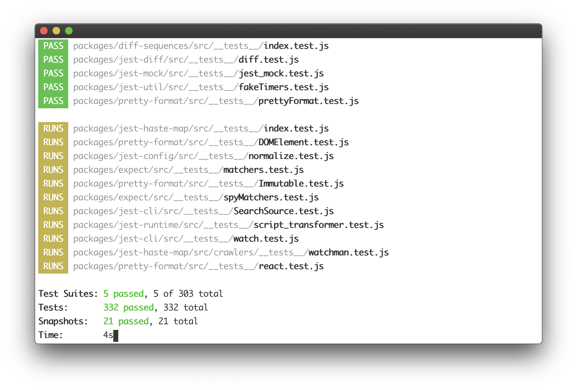
Jest continuosuly writes the list of completed tests to the output, while updating test results at the bottom of the output in real-time. Here's how this user interface could be implemented with Ink:
<Fragment><Static>{tests.map(test=>(<Testkey={test.id}title={test.title}/>))}</Static><BoxmarginTop={1}><TestResultspassed={results.passed}failed={results.failed}/></Box></Fragment><StdinContext> is a React context, which exposes several props.
Import:
import{StdinContext}from'ink';Type: Stream
Default: process.stdin
Stdin stream passed to render() in options.stdin or process.stdin by default.
Useful if your app needs to handle user input.
Usage:
<StdinContext.Consumer>{({ stdin })=>(<MyComponentstdin={stdin}/>)}</StdinContext.Consumer>Type: function
See setRawMode.
Ink exposes this function via own <StdinContext> to be able to handle Ctrl+C, that's why you should use Ink's setRawMode instead of process.stdin.setRawMode.
Usage:
<StdinContext.Consumer>{({ setRawMode })=>(<MyComponentsetRawMode={setRawMode}/>)}</StdinContext.Consumer><StdoutContext> is a React context, which exposes stdout stream, where Ink renders your app.
Import:
import{StdoutContext}from'ink';Type: Stream
Default: process.stdout
Usage:
<StdoutContext.Consumer>{({ stdout })=>(<MyComponentstdout={stdout}/>)}</StdoutContext.Consumer>MIT © Vadim Demedes