If you are using React Native >= 0.59.0 it's recommended to use similar package https://github.com/jobtoday/react-native-image-viewing as improved and better supported version!

React Native modal image view with pinch zoom and carousel.
Try with expo: https://expo.io/@antonkalinin/react-native-image-view
- instead of prop
source=>images - no title prop for footer, please use
renderFooterinstead
yarn add react-native-image-viewor
npm install --save react-native-image-view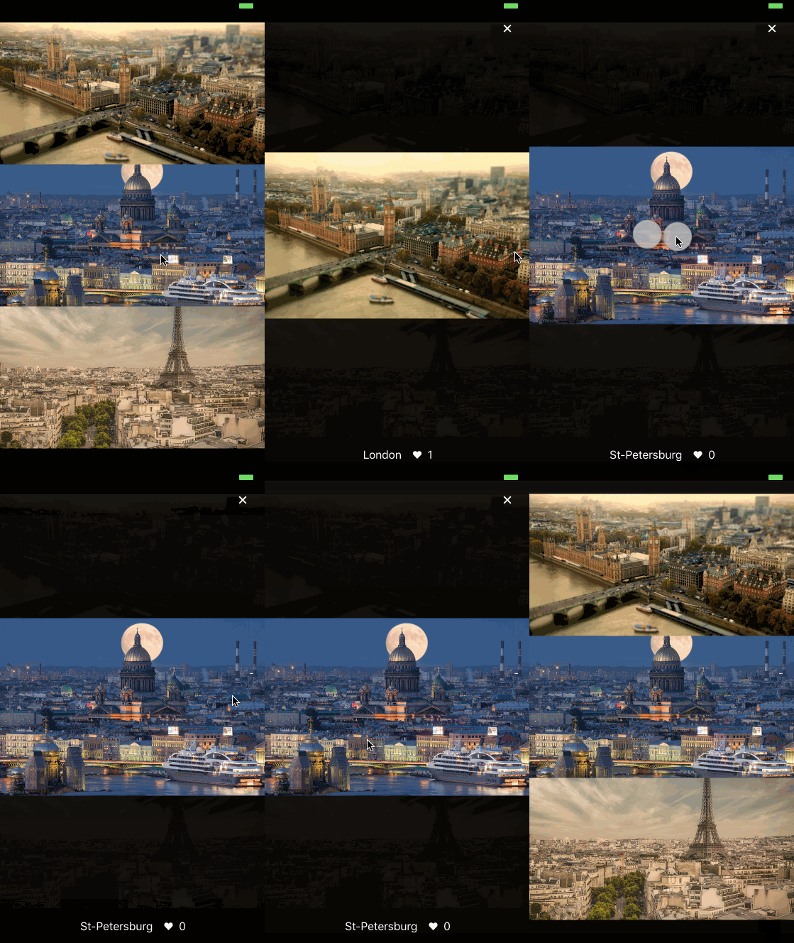
importImageViewfrom'react-native-image-view';constimages=[{source: {uri: 'https://cdn.pixabay.com/photo/2017/08/17/10/47/paris-2650808_960_720.jpg',},title: 'Paris',width: 806,height: 720,},];<ImageViewimages={images}imageIndex={0}isVisible={this.state.isImageViewVisible}renderFooter={(currentImage)=>(<View><Text>My footer</Text></View>)}/>| Prop name | Description | Type | Default value | Platform |
|---|---|---|---|---|
animationType | Type of animation modal presented with | "none", "fade", "slide" | "none" | |
backgroundColor | Background color of the modal in HEX (#0099CC) | string | null | |
controls | Config of available controls (see below) | Object | {close: true} | |
glideAlways | Emulates ScrollView glide animation if built-in was not triggered | boolean | false | Android |
glideAlwaysDelay | Defines delay in milliseconds for glideAlways | number | 75 | Android |
images | Array of images to display, see below image item description | array | [] | |
imageIndex | Current index of image to display | number | 0 | |
isVisible | Is modal shown or not | boolean | false | |
isTapZoomEnabled | Zoom image when double tapped | boolean | true | |
isPinchZoomEnabled | Zoom image with pinch gesture | boolean | true | |
isSwipeCloseEnabled | Close modal with swipe up or down | boolean | true | |
onClose | Function called on modal closed | function | none | |
onImageChange | Function called when image is changed | function | none | |
renderFooter | Function returns a footer element | function | none |
{source: any,// Image Component source objectwidth: ?number,// Width of full screen image (optional but recommended)height: ?number,// Height of full screen image (optional but recommended)// any other props you need to render your footer}It's recommended to specify width and height to speed up rendering, overwise component needs to fetch images sizes and cache them in images objects passed as props.
typeControlType=React.Component<{onPress: ()=>void}>|null|boolean,{close: ControlType// Component for close button in up right corner, as onPress prop accepts function to close modalnext: ControlType,// Component for next image button, as onPress prop accepts function to scroll to next imageprev: ControlType,// Component for previous image button, as onPress prop accepts function to scroll to previous image}To use default components just set {next: true, prev: true}, close is showing by default. To create custom controls check src/controls.