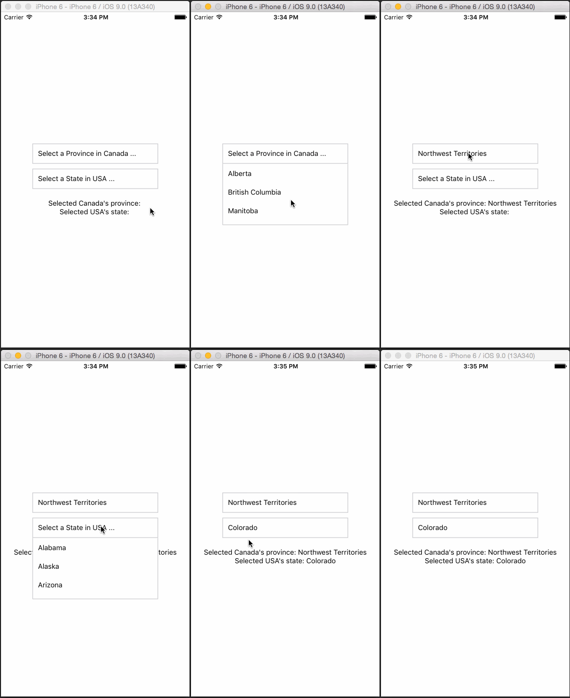
Simple DropDown menu for React Native App!
React Native Dropdown is simple, customizable and easy to use dropdown in React Native. Works with both Android and IOS.
npm i react-native-dropdown --save
Require it inside your Javascript files. Also supporting components using object-deconstructing.
SelectOptionOptionList, Also a positioning utility method updatePosition.
updatePosition should be called in componentDidMount with refs to the <Select /> component and <OptionList />.
This calculates component's PositionX and PositionY and sets it back into the component. The component uses it to position the <OptionList> using this co-ordinates.
varReact=require('react-native');var{
Component,
AppRegistry,
Text,
View,}=React;constDropDown=require('react-native-dropdown');const{
Select,
Option,
OptionList,
updatePosition
}=DropDown;classAppextendsComponent{constructor(props){super(props);this.state={canada: ''};}componentDidMount(){updatePosition(this.refs['SELECT1']);updatePosition(this.refs['OPTIONLIST']);}_getOptionList(){returnthis.refs['OPTIONLIST'];}_canada(province){this.setState({
...this.state,canada: province});}render(){return(<Viewstyle={{flex: 1,justifyContent: 'center',alignItems: 'center'}}><Selectwidth={250}ref="SELECT1"optionListRef={this._getOptionList.bind(this)}defaultValue="Select a Province in Canada ..."onSelect={this._canada.bind(this)}><Option>Alberta</Option><Option>British Columbia</Option><Option>Manitoba</Option><Option>New Brunswick</Option><Option>Newfoundland and Labrador</Option><Option>Northwest Territories</Option><Option>Nova Scotia</Option><Option>Nunavut</Option><Option>Ontario</Option><Option>Prince Edward Island</Option><Option>Quebec</Option><Option>Saskatchewan</Option><Option>Yukon</Option></Select><Text>Selected province of Canada: {this.state.canada}</Text><OptionListref="OPTIONLIST"/></View>);}}AppRegistry.registerComponent('App',()=>App);
For complete implementation checkout example folder.
| Property | Type | Default | Description |
|---|---|---|---|
| width | number | 400 | Width of the selection |
| height | number | 50 | Height of the selection |
| optionListRef | function | required | Reference to <OptionList /> to display the selection menu |
| style | object | null | Custom styles to be applied if supplied |
| defaultValue | string | first option | The value to be displayed if none of the options are selected. |
| Property | Type | Default | Description |
|---|---|---|---|
| style | object | null | Styles to be applied on 'Option' component |
| styleText | object | null | Styles to be applied on text inside of 'Option' |