


A widget that can be used to confirm the user's action, unlocking the screen etc. by providing the desired pattern with specified configuration. Widget can be animated in and out.
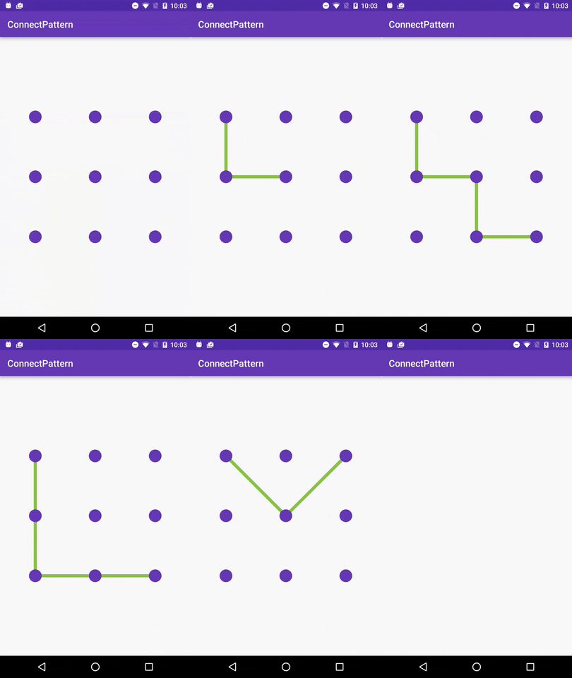
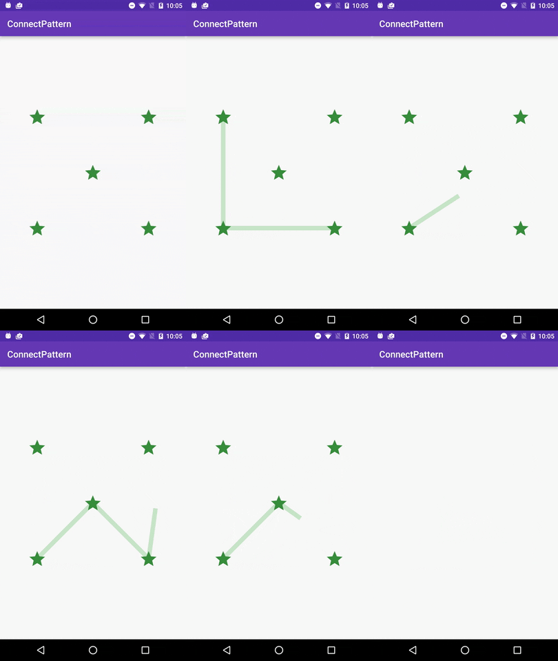
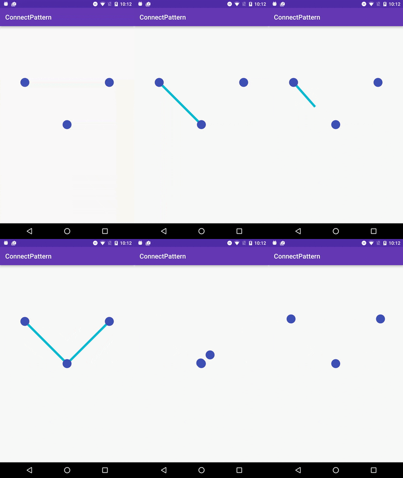
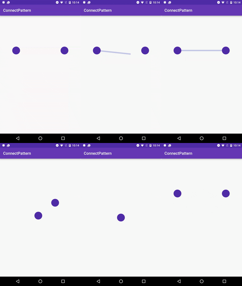
- Widget can contain different number of connectors: 2, 3, 5 or 9.
- Size and color of the connector (circle by default) can be specified in the xml.
- Width and color of the connecting lines can be specified in the xml.
- Connector can be defined as a drawable so any image or icon can be specified in the xml.
compile 'com.bcgdv.asia.lib:connectpattern:0.3'
<com.bcgdv.asia.lib.connectpattern.ConnectPatternView
android:id="@+id/connect"android:padding="32dp"android:layout_width="350dp"android:layout_height="350dp"android:layout_centerVertical="true"android:layout_centerHorizontal="true"app:connectPatternAnimationType="none|middle|bottom"app:connectPatternNumber="nine"app:connectPatternCircleColor="@color/colorPrimary"app:connectPatternLineColor="@color/colorAccent"app:connectPatternCircleRadius="14dp"app:connectPatternLineWidth="7dp"app:connectPatternDrawable="@mipmap/ic_star"/>app:connectPatternAnimationType(Optional) -none|middle|bottom. Defaultmiddleapp:connectPatternNumber(Optional) - determines how many connectors will be usedapp:connectPatternCircleColor(Optional) - color of the circleapp:connectPatternCircleRadius(Optional) - radius of the circleapp:connectPatternLineColor(Optional) - color of the connecting linesapp:connectPatternLineWidth(Optional) - width of the connecting linesapp:connectPatternDrawable(Optional) - custom icon / image / drawable to use instead of circle
view.setOnConnectPatternListener(newConnectPatternView.OnConnectPatternListener() {
@OverridepublicvoidonPatternEntered(ArrayList<Integer> result) {
}
@OverridepublicvoidonPatternAbandoned() {
}
@OverridepublicvoidanimateInStart() {
}
@OverridepublicvoidanimateInEnd() {
}
@OverridepublicvoidanimateOutStart() {
}
@OverridepublicvoidanimateOutEnd() {
}
});