






A comprehensive UI library for building Solid based applications with Flutter. SolidUI provides a convenient Scaffold replacement called SolidScaffold to wrap the app. It also provides responsive navigation components, file management capabilities, security key handling, and authentication features specifically designed for Solid applications interacting with a user's personal online data store (Pods).
See the AU Solid Community page for apps utilising the solidui package.
- Installation
- Features
- Requirements
- Quick Start to Create an App
- SolidScaffold
- Appearance Preferences
- SolidFile
- Login Example
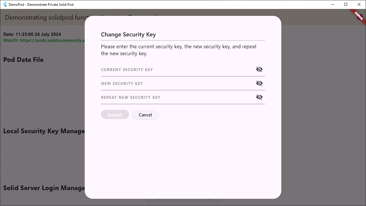
- Change Security Key Example
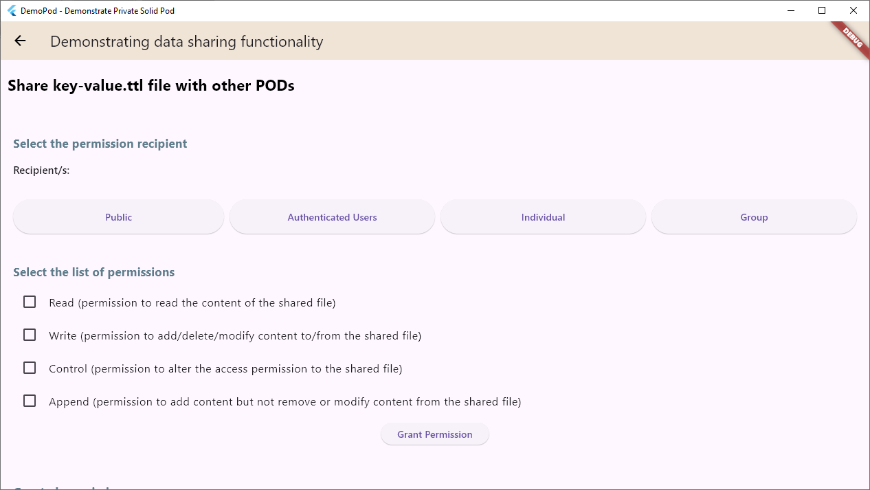
- Grant Permission UI Example
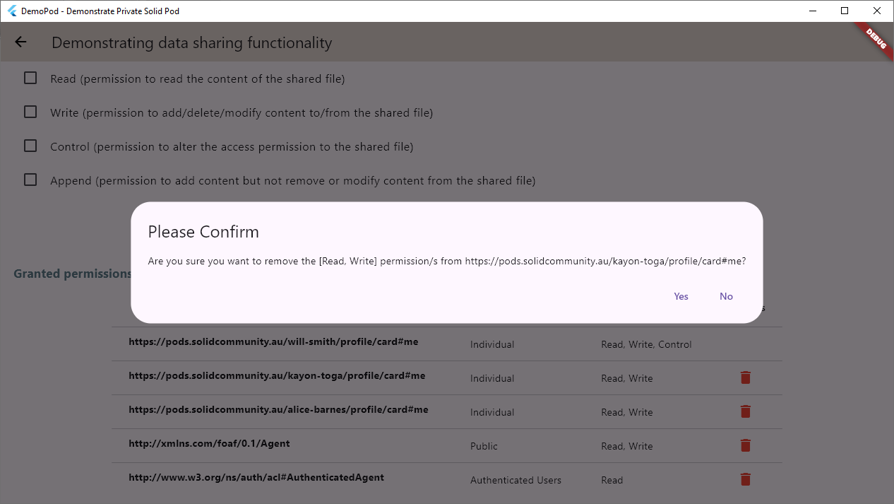
- View Permission UI Example
- Authentication and Login Detection
- Security Key Management
- Profile Management
- Theme Management
- API Reference
- Examples
- Licence
- Authors
- Additional information
Add SolidUI to your pubspec.yaml:
dart pub add solidui- SolidLogin widget supports authentication against a Solid server.
Default style:
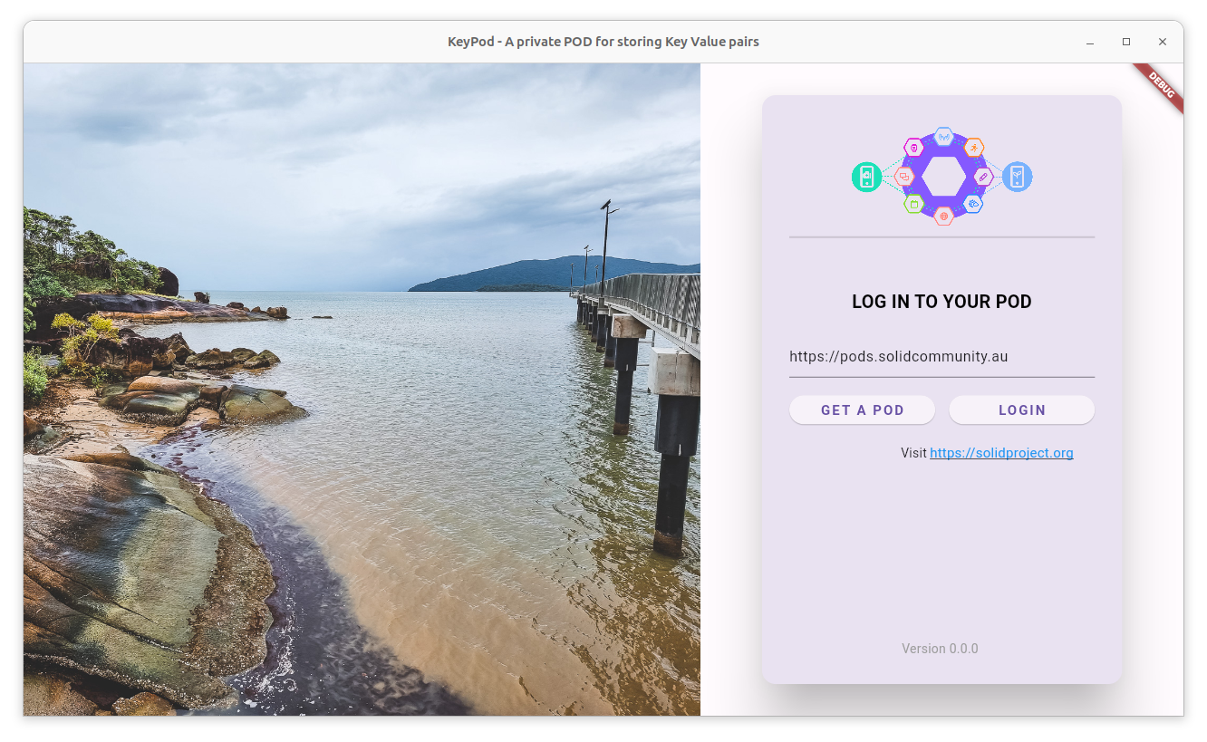
Optional version and visit link:
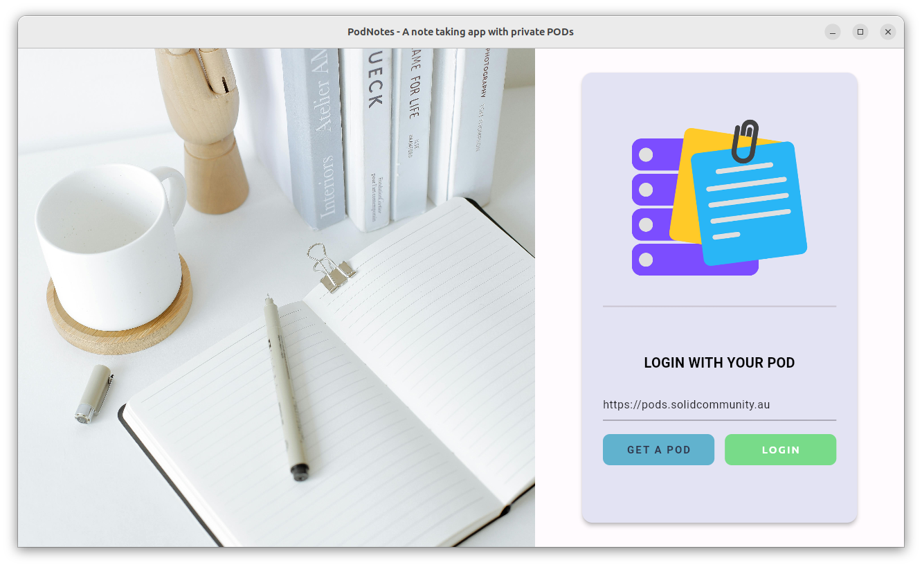
Changing the image, logo, login text, colour scheme:
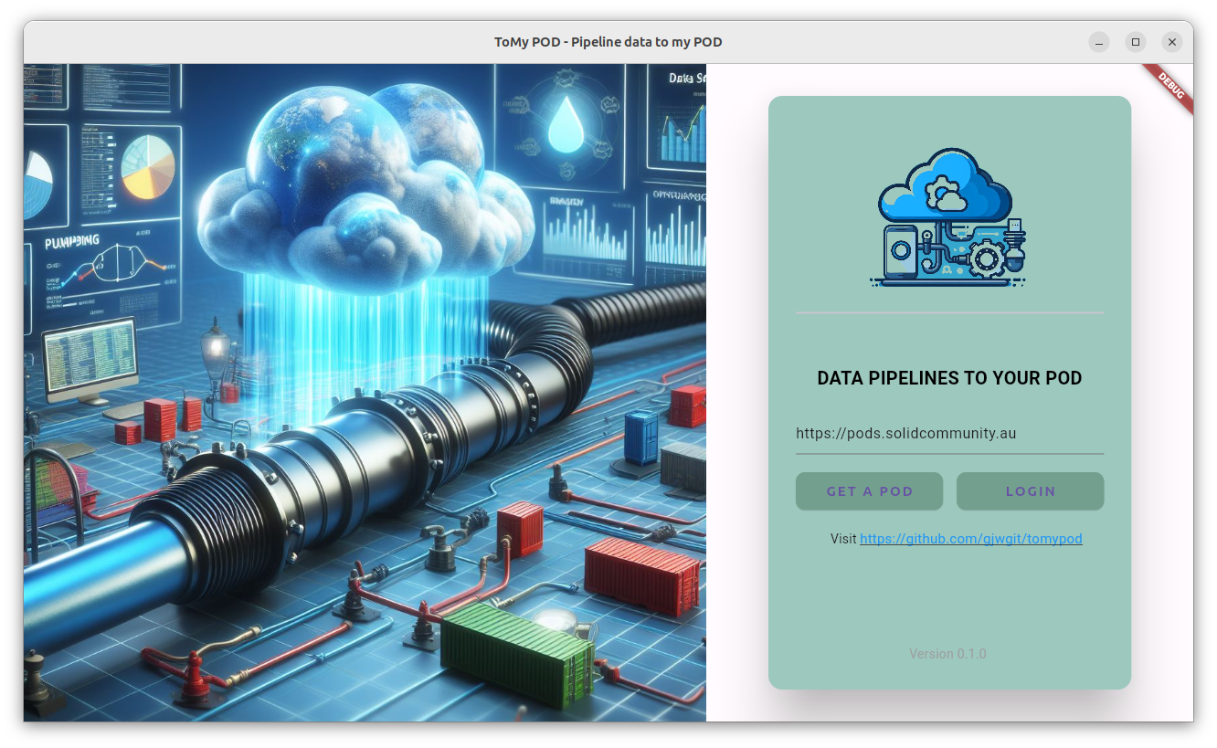
Change the image, logo, login text, button style, colour scheme:
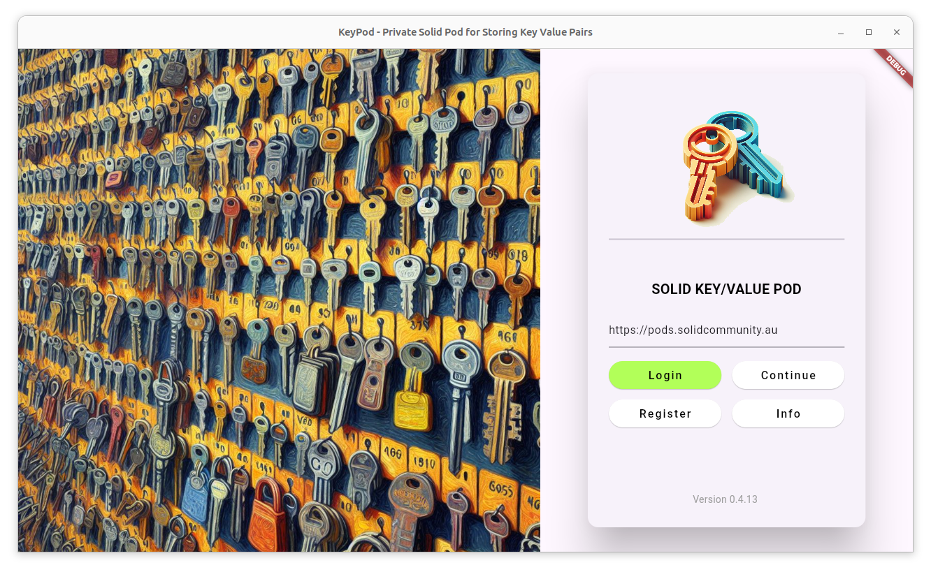
Fine tune to suit the theme of the app:
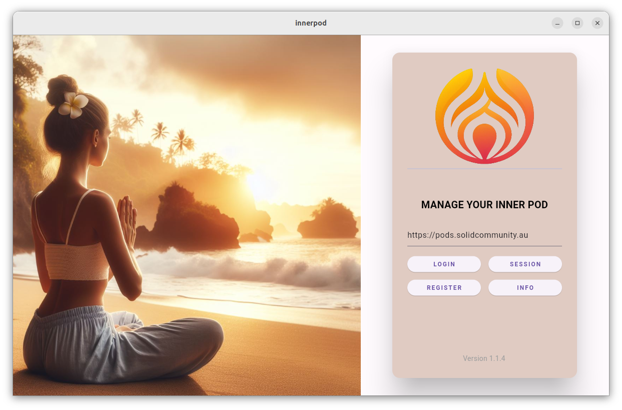
SolidPopupLoginwidget supports authentication within an application. The widget will trigger authentication if a user action requires authenticated access.changeKeyPopup widget supports changing the security key (used to make your data private through encryption):
SolidFilewidget provides a complete file management solution for browsing, uploading, downloading, and deleting files in a POD. Underlying POD reads and writes are handled bysolidpod'sreadPod()andwritePod()functions, which are also available directly if you need lower-level access.GrantPermissionUiwidget supports permission granting/revoking for resources:- For defining specific access mode types or recipient types, use
optional parameters
accessModeListandrecipientTypeList.
- For defining specific access mode types or recipient types, use
optional parameters
Granting permission:
Revoking permission:
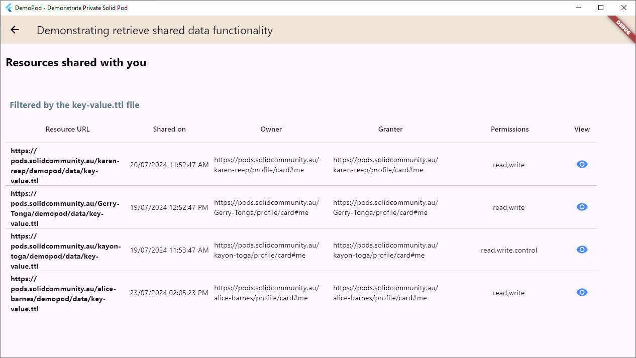
- SharedResourcesUi widget displays resources shared with a Pod by others:
- Flutter SDK:
>=3.2.3 <4.0.0 - Dart: Compatible with Flutter requirements
SolidUI requires the following dependencies:
solidpod: Solid POD integrationflutter_markdown_plus: Markdown rendering supportflutter_form_builder: Form building and validationform_builder_validators: Form field validatorsfile_picker: File selection functionalityshared_preferences: Local storage for settingspackage_info_plus: Application metadata accessurl_launcher: URL launching capabilitiesmarkdown_tooltip: Markdown-enabled tooltipsrdflib: RDF data handlinggap: Spacing utilitiespath: Path manipulationversion_widget: Version display widgetpdf: PDF generation supportprinting: Print and PDF preview functionalityshare_plus: Cross-platform file and content sharingloading_indicator: Animated loading indicatorsuniversal_io: Cross-platform IO utilities
solidui ships with an app template — a ready-to-run Pod file browser,
complete with a navigation rail and a status bar, built on solidui. It is the
practical equivalent of a flutter create --template=solidui, which stock
Flutter cannot offer because the --template flag only accepts a fixed set of
built-in types. We provide a small generator instead.
The recommended way is to activate the generator once and then run it from any directory:
flutter pub global activate solidui
solidui create my_pod_app
Alternatively, dart run solidui:create works only from within a package
that already depends on solidui (for example a clone of the solidui
repository), because dart run must resolve the solidui:create executable
through that project's pubspec.yaml:
dart run solidui:create my_pod_appRunning dart run solidui:create from an unrelated directory fails with
Found no pubspec.yaml file in <folder> or parent directories — use the global
activation above instead.
If you are working on a branch of solidui that is not yet published to
pub.dev, you can still generate an app from any directory without publishing.
Replace /path/to/solidui below with the path to your local checkout.
Run the generator script directly. This always uses your current working tree — both
bin/create.dartand the template files — so it picks up your edits on every run:dart run /path/to/solidui/bin/create.dart my_pod_app
Or activate the local checkout and use the short
solidui createcommand anywhere:flutter pub global activate --source path /path/to/solidui solidui create my_pod_app
Note that this takes a snapshot of
bin/create.dart, so re-run theactivatecommand after editing the generator itself; edits to the template files are picked up without re-activating.
For Windows users, command solidui can be added to the system by the
following steps:
Run PowerShell
Run the following commands:
$pubCacheBin = "$env:LOCALAPPDATA\Pub\Cache\bin"$userPath = [Environment]::GetEnvironmentVariable("Path", "User")
if ($userPath -notlike "*$pubCacheBin*") {
[Environment]::SetEnvironmentVariable("Path", "$userPath;$pubCacheBin", "User")
}
Close Powershell
Open Command Prompter or PowerShell and use
soliduicommand.
The generator runs flutter create to lay down the platform folders, overlays
the template (substituting your app name), and runs flutter pub get. Useful
options:
| Option | Description |
|---|---|
--org <id> | Reverse-domain org id (default: com.example). |
--title <text> | Window title shown by the app. |
--description <text> | pubspec description. |
-o, --output <dir> | Output directory (default: the app name). |
--no-flutter-create | Render template only; skip platform folders. |
--no-pub-get | Skip the final flutter pub get. |
The generated app starts at a SolidLogin screen and, once signed in, shows a
SolidScaffold with a home page, an app-files browser and a whole-POD browser.
Before login will work you must publish a Client Identifier Document for the app. The generator writes two files, in the two places they are actually served from:
client-profile.jsonld— in the project root. This is the Solid-OIDC Client Identifier Document; itsredirect_urislist the redirect URIs the app uses. It lives at the root so that GitHub Pages can serve it (see below).web/redirect.html— in theweb/folder. This is the web and post-logout redirect helper used by theoidcpackage, published together with the Flutter web build.
Two points are worth understanding:
client-profile.jsonldis not a file the app creates on your POD, and it cannot be — the app is not yet authenticated at login time. It must already be hosted, and be publicly readable, at the URL given as theclientId. During login the identity provider fetches that URL to learn whichredirect_urisare permitted; if it is missing (HTTP 404) the provider refuses to hand control back to the app after the consent screen, and login fails with anASWebAuthenticationSession Code=1(cancelled) error.- The POD data folders (for example
<appDir>/dataand<appDir>/sharing) are created by solidpod'sgenerateDefaultFolders()after a successful login. If they have not appeared, it is because login has not completed — that is a symptom of the missing client profile, not the cause.
Host the two files where they are auto-published on a push:
client-profile.jsonldon GitHub Pages (theclientId). Because it sits in the repository root, enabling GitHub Pages for the repo (Settings → Pages → Deploy from a branch →main//root) serves it athttps://<your-org>.github.io/<app>/client-profile.jsonldand re-publishes it automatically on every push. SetappClientIdinlib/constants/app.dartand the document's ownclient_idfield to that exact URL — the two must match.redirect.htmlwith the web build. It sits inweb/, soflutter build web(and amake webdeploy, which pushes it tosolidcommunity.au:/var/www/html/<app>/redirect.html) serves it alongside the app athttps://<app>.solidcommunity.au/redirect.html.
The generated appRedirectUris derives its web entry from
Uri.base.origin at runtime, so the redirect is always same-origin with
wherever the app is served — the deployed host in production and
http://localhost:4400 under flutter run -d chrome --web-port=4400. This
matters because redirect.html hands the auth response back through a
same-origin BroadcastChannel; a cross-origin redirect leaves web login hanging
on the loading spinner. Both origins must appear in the published
client-profile.jsonld.
Confirm the document is reachable (a public 200, requiring no authentication):
curl -I https://<your-org>.github.io/<app>/client-profile.jsonldOnce it returns 200, run flutter run and the login redirect will complete.
You may of course host the client profile at any other public URL you control;
if you do, update appClientId (and the document's client_id) to match. Note
that only the custom redirect scheme
(<org>.<name-without-underscores>://redirect, e.g. com.example.mypodapp)
drops the underscores from the project name, because a URI scheme may not
contain them; every other identifier keeps the project name as-is.
After generating, also review the remaining placeholders — the appClientId,
appRedirectUris and appLink in lib/constants/app.dart — and update them for
your own deployment.
A demonstrator example application (DemoPod) is available in the
example folder of this repository. DemoPod showcases the
suite of functionality provided by solidpod and solidui,
including reading and writing encrypted data, ACL inheritance,
permission management, large file transfers, and more.
A standalone file browser application is available in the
FilePod repository. FilePod
demonstrates building a complete Solid app using SolidScaffold,
SolidFile, and the broader solidui framework.
Both applications consist of several files within their lib/
directory. main.dart is the main entry point to the app. Its task
in our framework is to initialise the application and then launch the
app itself. home.dart implements the Home() widget as the main
app functionality. Constants are defined in constants/app.dart and
utilities such as desktop platform detection are in
utils/is_desktop.dart.
The SolidScaffold() is the primary widget for building Solid
applications with responsive navigation, an app bar, status bar, and
integrated functionality. A SolidScaffold() automatically adapts its
layout based on screen size, providing an optimal user experience
across different devices.
SolidScaffold() intelligently switches between different navigation
modes based on the screen width:
- Wide screens (≥800px): Display a vertical navigation rail
SolidNavBar()on the left side; - Narrow screens (<800px): By default, main menu items appear in a
bottom navigation bar (
SolidNavBottomBar). Login and security key actions stay in the collapsible navigation drawerSolidNavDrawer()(hamburger menu). SetmenuInBottomBar: falseonSolidScaffoldto keep all menu items in the drawer instead, or let users choose via About → Menu; - Custom threshold: The breakpoint can be customised using the
narrowScreenThresholdparameter with a value of 0 turning off the hamburger menu and a large value effectively turning off the vertical navigation rail.
A responsive behaviour ensures that your application provides an optimal navigation experience whether users are on desktop computers, tablets, or mobile devices, running the app natively or through a browser. The transition between navigation modes is seamless and automatic.
SolidScaffold supports navigation to subpages that are not in the main navigation menu. This is useful for applications that need to display detail pages (e.g. individual notes in NotePod) whilst maintaining the SolidScaffold frame.
Recommended approach using SolidScaffoldController (no StatefulWidget needed):
final controller =SolidScaffoldController();
final appScaffold =SolidScaffold(
controller: controller,
menu: [...],
appBar:SolidAppBarConfig(
actions: [
SolidAppBarAction(
icon:Icons.settings,
onPressed: () => controller.navigateToSubpage(SettingsPage()),
),
],
),
);
Alternative approach using bodyOverride (requires setState):
class_MyAppStateextendsState<MyApp> {
Widget? _subpage;
@overrideWidgetbuild(BuildContext context) {
returnSolidScaffold(
menu: [...],
bodyOverride: _subpage,
onClearBodyOverride: () =>setState(() => _subpage =null),
);
}
}SolidScaffold({
Key? key,
// NavigationList<SolidMenuItem>? menu,
Widget? child,
Widget? bodyOverride,
int initialIndex =0,
voidFunction(int)? onMenuSelected,
int? selectedIndex,
// Scaffold CompatibilityWidget? body,
PreferredSizeWidget? scaffoldAppBar,
Widget? drawer,
Widget? endDrawer,
Widget? bottomNavigationBar,
Widget? bottomSheet,
List<Widget>? persistentFooterButtons,
bool? resizeToAvoidBottomInset,
// SolidUI Componentsdynamic appBar,
SolidStatusBarConfig? statusBar,
SolidNavUserInfo? userInfo,
SolidThemeToggleConfig? themeToggle,
SolidAboutConfig? aboutConfig,
// CallbacksvoidFunction(BuildContext)? onLogout,
voidFunction(BuildContext, String, String?)? onShowAlert,
// Layout Configurationdouble narrowScreenThreshold =NavigationConstants.narrowScreenThreshold,
Color? backgroundColor,
// Floating Action ButtonWidget? floatingActionButton,
FloatingActionButtonLocation? floatingActionButtonLocation,
FloatingActionButtonAnimator? floatingActionButtonAnimator,
// Drawer ConfigurationDrawerCallback? onDrawerChanged,
DrawerCallback? onEndDrawerChanged,
DragStartBehavior drawerDragStartBehavior =DragStartBehavior.start,
bool drawerEnableOpenDragGesture =true,
bool endDrawerEnableOpenDragGesture =true,
Color? drawerScrimColor,
double? drawerEdgeDragWidth,
// Other Propertiesbool primary =true,
bool extendBody =false,
bool extendBodyBehindAppBar =false,
String? restorationId,
})classSolidMenuItem {
finalString title; // Required: Menu display titlefinalIconData icon; // Required: Menu iconfinalColor? color; // Optional: Icon colourfinalWidget? child; // Optional: Content widget when selectedfinalString? tooltip; // Optional: Tooltip message (Markdown)finalString? message; // Optional: Dialogue message contentfinalString? dialogTitle; // Optional: Dialogue titlefinalvoidFunction(BuildContext)? onTap; // Optional: Tap callback
}The app bar provides application title, action buttons, and overflow menu items. Action buttons automatically move to an overflow menu on smaller screens to maintain usability.
classSolidAppBarConfig {
finalString title; // App bar titlefinalList<SolidAppBarAction>? actions; // Action buttonsfinalList<SolidOverflowMenuItem>? overflowItems; // Overflow menu itemsfinalColor? backgroundColor; // Background colourfinalSolidVersionConfig? versionConfig; // Version display configuration
}
App Bar Responsive Features:
- Action overflow: Buttons automatically move to overflow menu when screen width decreases
- Visibility control: Individual actions can be configured to hide on narrow or very narrow screens
- Theme integration: Theme toggle and about buttons automatically adapt their placement
- Version display: Version information adjusts its display format based on available space
classSolidAppBarAction {
finalIconData icon; // Required: Button iconfinalVoidCallback onPressed; // Required: Press callbackfinalString? tooltip; // Optional: Tooltip messagefinalColor? color; // Optional: Icon colourfinalbool showOnNarrowScreen; // Narrow screens (default: true)finalbool showOnVeryNarrowScreen; // Very narrow screens (default: true)
}
classSolidOverflowMenuItem {
finalString id; // Required: Unique identifierfinalIconData icon; // Required: Menu iconfinalString label; // Required: Menu labelfinalVoidCallback onSelected; // Required: Selection callbackfinalbool showInOverflow; // Show in overflow menu (default: true)
}The status bar provides real-time information about server connectivity, login status, and security key state. It adapts its layout and content based on screen size.
classSolidStatusBarConfig {
finalSolidServerInfo? serverInfo; // Server information displayfinalSolidLoginStatus? loginStatus; // Login status displayfinalSolidSecurityKeyStatus? securityKeyStatus; // Security key statusfinalList<SolidCustomStatusBarItem>? customItems; // Custom status itemsfinalbool showOnNarrowScreens; // Narrow screens (default: true)finalSolidStatusBarLayout layout; // Layout configuration
}
Status Bar Responsive Behaviour:
- Wide screens: All status items displayed with full text and icons
- Medium screens: Condensed layout with essential information
- Narrow screens: Can be hidden entirely or show minimal status information
- Custom items: Support priority-based display for responsive layouts
classSolidServerInfo {
finalString serverUri; // Required: Server URIfinalString? displayText; // Optional: Custom display textfinalString? tooltip; // Optional: Tooltip messagefinalbool isClickable; // Clickable to open in browser (default: true)
}
classSolidLoginStatus {
finalString? webId; // Current WebID (null if not logged in)finalVoidCallback onTap; // Required: Tap callbackfinalString? loggedInText; // Custom logged in textfinalString? loggedOutText; // Custom logged out textfinalString? loggedInTooltip; // Logged in tooltipfinalString? loggedOutTooltip; // Logged out tooltip
}classSolidThemeToggleConfig {
finalbool enabled; // Enable theme toggle (default: true)finalIconData? lightModeIcon; // Custom light mode iconfinalIconData? darkModeIcon; // Custom dark mode iconfinalIconData? systemModeIcon; // Custom system mode iconfinalVoidCallback? onToggleTheme; // Custom toggle callbackfinalThemeMode? currentThemeMode; // Current theme for external managementfinalbool showInAppBarActions; // Show in app bar actions (default: true)finalString? tooltip; // Custom tooltipfinalString label; // Overflow menu label (default: 'Toggle Theme')finalbool showOnNarrowScreen; // Show on narrow screens (default: true)finalbool showOnVeryNarrowScreen; // Show on very narrow screens// (default: true)
}SolidUI stores user appearance preferences via SolidPreferencesNotifier
and SolidPreferencesConfig. These preferences persist across sessions
using shared_preferences. The SolidPreferencesDialog provides a UI
for configuring AppBar layout.
AppBar action buttons can be customised via the AppBar Layout Preferences dialogue (typically opened from the AppBar Layout Preferences button in the About Dialogue):
- Button order: Drag to reorder buttons. Order is saved and used across screen sizes.
- Visibility: Use the eye icon to show or hide individual buttons. Hidden buttons are not shown in the AppBar or overflow menu.
- Overflow behaviour: Use the menu icon to choose whether a button appears in the AppBar or only in the overflow menu on narrow screens. Buttons in the overflow menu are accessible via the "more" (⋮) icon.
Preferences are stored per application and persist across restarts.
SolidThemeModeConfig controls which theme modes appear in the theme
toggle cycle and how switching behaves:
| Option | Default | Description |
|---|---|---|
lightModeEnabled | true | Include Light mode in the toggle cycle. When enabled, users can switch to a light theme optimised for bright viewing conditions. |
darkModeEnabled | true | Include Dark mode in the toggle cycle. When enabled, users can switch to a dark theme for low-light viewing. |
systemModeEnabled | true | Include System mode in the toggle cycle. When enabled, the app follows the device's light/dark setting. |
smartToggle | true | When all three modes are enabled: in System mode, tapping the theme toggle switches to the opposite of the current system brightness (e.g. light → dark), then toggles between Light and Dark. When false, the toggle cycles mechanically: System → Light → Dark → System. |
At least one of lightModeEnabled, darkModeEnabled, or
systemModeEnabled must be true.
classSolidAboutConfig {
finalbool enabled; // Enable about button (default: true)finalIconData? icon; // Custom about iconfinalString? applicationName; // Application name// (auto-detected if null)finalString? applicationVersion; // Application version// (auto-detected if null)finalWidget? applicationIcon; // Application icon widgetfinalString? applicationLegalese; // Legal notice/copyrightfinalString? text; // Main content text (supports Markdown)finalWidget? customContent; // Custom dialogue contentfinalList<Widget>? children; // Additional child widgetsfinalbool showOnNarrowScreen; // Show on narrow screens (default: true)finalbool showOnVeryNarrowScreen; // Show on very narrow screens// (default: false)finalint priority; // App bar action priority (default: 999)finalString? tooltip; // Custom tooltipfinalVoidCallback? onPressed; // Custom press callback
}SolidNavBar: Navigation rail for wide screens with vertical menu layout. Provides always-visible navigation with icon and text labels, suitable for desktop and tablet landscape orientations.
SolidNavDrawer: Navigation drawer for narrow screens with collapsible menu. Slides in from the left side when triggered by the hamburger menu button, maximising screen space on mobile devices.
SolidNavUserInfo: User information display in navigation drawer. Shows user avatar, name, and optionally the WebID, appearing at the top of the navigation drawer.
- Automatic Layout Switching: SolidScaffold monitors screen width and automatically switches between navigation rail and drawer modes
- Threshold Customisation: Default breakpoint is 800px, but can be
customised via
narrowScreenThreshold - Preserved State: Navigation state and selected menu item are preserved during layout transitions
- Touch-Friendly: Navigation drawer includes swipe gestures and appropriate touch targets for mobile use
- Accessibility: Both navigation modes support proper focus management and screen reader accessibility
classSolidNavUserInfo {
finalString userName; // Required: User display namefinalString? webId; // Optional: User WebIDfinalbool showWebId; // Show WebID in drawer (default: false)finalWidget? avatar; // Custom avatar widgetfinalIconData? avatarIcon; // Avatar icon (if no custom widget)finaldouble? avatarSize; // Custom avatar sizefinalSolidVersionConfig? versionConfig; // Optional: Version display config
}import'package:flutter/material.dart';
import'package:solidui/solidui.dart';
classMyAppextendsStatelessWidget {
@overrideWidgetbuild(BuildContext context) {
returnMaterialApp(
home:SolidScaffold(
menu: [
SolidMenuItem(
title:'Home',
icon:Icons.home,
child:HomePage(),
tooltip:'Navigate to home screen',
),
SolidMenuItem(
title:'Files',
icon:Icons.folder,
child:FilesPage(),
tooltip:'File management',
),
SolidMenuItem(
title:'Settings',
icon:Icons.settings,
child:SettingsPage(),
tooltip:'Application settings',
),
],
appBar:SolidAppBarConfig(
title:'My Solid App',
actions: [
SolidAppBarAction(
icon:Icons.refresh,
onPressed: () =>print('Refresh'),
tooltip:'Refresh content',
),
],
),
statusBar:SolidStatusBarConfig(
serverInfo:SolidServerInfo(
serverUri:'https://solidcommunity.net',
),
loginStatus:SolidLoginStatus(
webId: currentWebId,
onTap: () =>handleLoginLogout(),
),
),
themeToggle:SolidThemeToggleConfig(enabled:true),
aboutConfig:SolidAboutConfig(
applicationName:'My Solid App',
text:'A demonstration of SolidUI capabilities.',
),
),
);
}
}Comprehensive file management widget for Solid POD integration with upload, download, and browser functionality. SolidFile provides a complete file management solution with responsive layout and automatic configuration based on file paths.
SolidFile adapts its layout based on screen size to provide optimal file management experience:
- Wide screen layout: File browser and upload area displayed side-by-side for efficient workflow
- Narrow screen layout: Stacked vertical layout with file browser above upload controls
- Auto-detection: Automatically detects screen size and applies appropriate layout
- Force override: Use
forceWideScreenparameter to override automatic detection
SolidFile can automatically configure upload settings and folder names based on file paths:
- Path-based configuration: Automatically detects data types (blood pressure, medication, etc.) from folder names
- Format detection: Configures appropriate data formats and import/export options
- Friendly naming: Generates user-friendly folder names from technical paths
- Manual override: Disable with
autoConfig: falsefor custom configurations
SolidFile({
Key? key,
// RequiredrequiredString basePath,
// File Browser ConfigurationString? currentPath,
String? friendlyFolderName,
bool showBackButton =true,
String backButtonText ='Back to Home Folder',
bool? forceWideScreen,
double? browserHeight,
// File Operations CallbacksVoidCallback? onBackPressed,
Function(String fileName, String filePath)? onFileSelected,
Function(String fileName, String filePath)? onFileDownload,
Function(String fileName, String filePath)? onFileDelete,
Function(String path)? onDirectoryChanged,
VoidCallback? onClosePreview,
Function(String fileName, String filePath)? onImportCsv,
// Upload Configurationbool showUpload =true,
SolidFileUploadConfig? uploadConfig,
SolidFileUploadCallbacks? uploadCallbacks,
SolidFileUploadState? uploadState,
bool autoConfig =true,
// Browser Key for External ControlGlobalKey<SolidFileBrowserState>? browserKey,
})classSolidFileUploadConfig {
finalbool showCsvButtons; // Show CSV import/export buttons// (default: false)finalbool showProfileButtons; // Show Profile import/export buttons// (default: false)finalbool showJsonButtons; // Show JSON operations (default: true)finalbool showPreviewButtons; // Show file preview options// (default: true)finalDataFormatConfig? formatConfig; // Data format configurationfinalString uploadButtonText; // Upload button text// (default: 'Upload File')finalString? uploadTooltip; // Upload tooltip message
}
classSolidFileUploadCallbacks {
finalVoidCallback? onUpload; // File upload callbackfinalVoidCallback? onImportCsv; // CSV import callbackfinalVoidCallback? onExportCsv; // CSV export callbackfinalFunction(String importType)? onImportSuccess; // Import success callbackfinalVoidCallback? onImportProfile; // Profile import callbackfinalVoidCallback? onExportProfile; // Profile export callbackfinalVoidCallback? onVisualiseJson; // JSON visualisation callbackfinalVoidCallback? onSelectLocalJson; // Local JSON selection callbackfinalVoidCallback? onPreviewFile; // File preview callbackfinalVoidCallback? onConvertToJson; // PDF to JSON conversion callback
}
classSolidFileUploadState {
finalbool isUploading; // Upload in progress (default: false)finaldouble uploadProgress; // Upload progress 0.0-1.0 (default: 0.0)finalString? uploadStatus; // Upload status messagefinalbool showPreview; // Show file preview (default: false)finalString? previewContent; // Preview content
}classDataFormatConfig {
finalString title; // Required: Format titlefinalList<String> requiredFields; // Required: List of required fieldsfinalList<String> optionalFields; // Optional fields (default: [])finalbool isJson; // JSON format flag (default: false)finalString? description; // Format description
}// Basic file managementSolidFile(
basePath:'myapp/data',
currentPath:'myapp/data/documents',
onFileSelected: (fileName, filePath) {
print('File selected: $fileName at $filePath');
},
onFileDownload: (fileName, filePath) {
print('Download requested: $fileName');
},
)
// With upload configurationSolidFile(
basePath:'healthapp/data',
currentPath:'healthapp/data/bloodpressure',
uploadConfig:SolidFileUploadConfig(
showCsvButtons:true,
showJsonButtons:true,
formatConfig:DataFormatConfig(
title:'Blood Pressure Data',
requiredFields: ['date', 'systolic', 'diastolic'],
optionalFields: ['heartRate', 'notes'],
),
),
uploadCallbacks:SolidFileUploadCallbacks(
onImportCsv: () {
// Handle CSV import
},
onExportCsv: () {
// Handle CSV export
},
onUpload: () {
// Handle file upload
},
),
)
// Manual configuration (disable auto-config)SolidFile(
basePath:'myapp/data',
currentPath:'myapp/data/custom',
autoConfig:false,
uploadConfig:SolidFileUploadConfig(
showCsvButtons:false,
showJsonButtons:true,
uploadButtonText:'Upload Custom File',
),
friendlyFolderName:'Custom Data',
)SolidLogin is the full-page login widget. Wrap your home widget in
it and it handles session restore, OIDC login, and POD initialisation
automatically. Here we illustrate the configuration with the clientId
hosted on github but could also be on your own server.
@overrideWidgetbuild(BuildContext context) {
returnMaterialApp(
title:'My App',
home:SolidLogin(
clientId:'https://anusii.github.io/myapp/client-profile.jsonld',
redirectUris: [
'https://anusii.github.io/myapp/redirect.html', // web'com.example.myapp://redirect', // Android / iOS'http://localhost:4400/redirect', // Windows / Linux / macOS
],
postLogoutRedirectUris: [ // optional, defaults to redirectUris selection'https://anusii.githu.io/myapp/redirect.html',
'com.example.myapp://redirect',
'http://localhost:4400/redirect',
],
child:constScaffold(body:MyHome()),
),
);
}
redirectUris and postLogoutRedirectUris take a list of URIs, one per
platform. At runtime SolidLogin picks the entry that matches the current
platform. See the
solidpod authentication docs for the
per-platform URI format and the fixed-port requirement for desktop.
SolidLogin({
// RequiredrequiredWidget child, // Widget shown after successful loginrequiredString clientId, // URL of the app's client ID documentList<String> redirectUris =const [], // OAuth redirect URIs (one per platform)// AuthenticationList<String> postLogoutRedirectUris =const [], // Redirect URIs after logout (optional)bool autoLogin =false, // Silently restore saved session on startupboolrequired=false, // false adds a CONTINUE button (no-auth path)// AppearanceAssetImage image, // Left-panel / background imageAssetImage logo, // Logo shown in the login panelString title ='Log in to your Solid Pod', // Header textString webID, // Pre-filled server/WebID field valueString link ='https://solidproject.org', // URL opened by the info button// Button stylesLoginButtonStyle loginButtonStyle,
RegisterButtonStyle registerButtonStyle,
ContinueButtonStyle continueButtonStyle,
InfoButtonStyle infoButtonStyle,
ChangeKeyButtonStyle changeKeyButtonStyle,
// Theme & notificationsSolidLoginTheme themeConfig, // Light/dark colour scheme for the panelSnackbarConfig snackbarConfig, // Snackbar style for login notifications// POD setupString appDirectory ='', // App-specific subdirectory name in the PODList customFolderPathList = [], // Extra folders to create under data/
})
autoLogin - when true, SolidLogin silently calls
tryRestoreSession() on startup and navigates directly to child if a
valid persisted session is found. Falls back to the login page if no
session exists or the user has opted out of "Stay signed in".
SolidPopupLogin triggers the OIDC login flow inline within an already-
running app. Useful when a user action requires authentication but the
app wasn't launched from a SolidLogin screen.
// Navigate to the popup login when unauthenticated access is attempted.Navigator.push(
context,
MaterialPageRoute(
builder: (context) =>SolidPopupLogin(
webId:'https://pods.solidcommunity.au', // optional, pre-fills the field
),
),
);SolidPopupLogin({
String webId, // Pre-filled WebID/server URI (optional)
})Wrap the changeKeyPopup() function within a button widget. Parameters
include the BuildContext and the widget that you need to return to
after changing the key.
ElevatedButton(
onPressed: () {
changeKeyPopup(context, ReturnPage());
},
child:constText('Change Security Key on Pod')
)The GrantPermissionUi widget provides a full-featured page for
granting, editing, and revoking access permissions on resources stored
in a Solid POD. Wrap it inside a navigation action to reach the
permission management page. The titleData parameter, if provides,
adds support for switch between file url, filename and file title.
This allows the user to select the resource, before inspecting their permissions and granting, revoking or editing permissions.
ElevatedButton(
child:constText('Add/Delete Permissions'),
onPressed: () =>Navigator.push(
context,
MaterialPageRoute(
builder: (context) =>constGrantPermissionUi(
child:ReturnPage(),
),
),
),
)ElevatedButton(
child:constText('Add/Delete Permissions to a Specific File'),
onPressed: () =>Navigator.push(
context,
MaterialPageRoute(
builder: (context) =>constGrantPermissionUi(
resourceNames: ['my-data-file.ttl'],
child:ReturnPage(),
),
),
),
)ElevatedButton(
child:constText('Add/Delete Permissions to a Specific Directory'),
onPressed: () =>Navigator.push(
context,
MaterialPageRoute(
builder: (context) =>constGrantPermissionUi(
resourceNames: ['parentDir/'],
child:ReturnPage(),
isFile:false,
),
),
),
)When the user has control access to a resource owned by someone else:
ElevatedButton(
child:constText('Add/Delete Permissions to an External File'),
onPressed: () =>Navigator.push(
context,
MaterialPageRoute(
builder: (context) =>GrantPermissionUi(
resourceNames:const ['my-data-file.ttl'],
isExternalRes:true,
ownerWebId: ownerWebId,
granterWebId: granterWebId,
child:ReturnPage(),
),
),
),
)When the user wants to apply the same grant permission operation on a list of resources:
ElevatedButton(
child:constText('Add/Delete Permissions for Multiple Files'),
onPressed: () =>Navigator.push(
context,
MaterialPageRoute(
builder: (context) =>GrantPermissionUi(
resourceNames:const ['my-data-file1.ttl', 'my-data-file2.ttl', 'my-data-file3.ttl'],
ownerWebId: ownerWebId,
granterWebId: granterWebId,
child:ReturnPage(),
),
),
),
)The SharedResourcesUi widget displays the resources that have been
shared with the current user's POD by others.
ElevatedButton(
child:constText('View Resources your WebID have access to'),
onPressed: () =>Navigator.push(
context,
MaterialPageRoute(
builder: (context) =>constSharedResourcesUi(
child:ReturnPage(),
),
),
),
)ElevatedButton(
child:constText('View access to specific Resource'),
onPressed: () =>Navigator.push(
context,
MaterialPageRoute(
builder: (context) =>constSharedResourcesUi(
fileName:'my-data-file.ttl',
sourceWebId:'https://pods.solidcommunity.au/john-doe/profile/card#me',
child:ReturnPage(),
),
),
),
)SolidUI provides dynamic login status detection and management through integration with the SolidPOD library.
Automatically detects and updates login status based on actual Solid POD authentication state.
classSolidDynamicLoginStatusextendsStatefulWidget {
finalSolidStatusBarConfig baseConfig; // Required: Base status bar// configurationfinalVoidCallback? onTap; // Login/logout tap handlerfinalVoidCallback? onLogin; // Custom login handler for logged out statefinalString? loggedInText; // Custom logged in textfinalString? loggedOutText; // Custom logged out textfinalString? loggedInTooltip; // Logged in tooltipfinalString? loggedOutTooltip; // Logged out tooltip
}SolidDynamicLoginStatus(
baseConfig:SolidStatusBarConfig(
serverInfo:SolidServerInfo(
serverUri:'https://solidcommunity.net',
),
),
onTap: () {
// Handle login/logout based on current stateif (getWebId() !=null) {
performLogout();
} else {
showLoginDialog();
}
},
loggedInText:'Connected',
loggedOutText:'Disconnected',
)The following methods are available for checking authentication status:
getWebId(): Returns the current WebID if logged in, null otherwisecheckLoggedIn(): Verifies the current login status with the POD server
SolidUI provides comprehensive security key management for encryption in Solid POD applications.
Central service for managing security key operations and status.
classSolidSecurityKeyServiceextendsChangeNotifier {
// Check if security key existsFuture<bool> isKeySaved();
// Fetch status with callbackFuture<bool> fetchKeySavedStatus([Function(bool)? onKeyStatusChanged]);
// Force refresh of key statusFuture<void> refreshKeyStatus();
// Refresh and notifyFuture<bool> refreshAndNotify([Function(bool)? onKeyStatusChanged]);
// Check if security key is neededFuture<bool> isSecurityKeyNeeded();
}Status bar component for displaying security key information.
classSolidSecurityKeyStatus {
finalbool? isKeySaved; // Current key statusfinalVoidCallback? onTap; // Tap callback// (null for automatic management)finalFunction(bool)? onKeyStatusChanged; // Status change callbackfinalString? title; // Custom dialogue titlefinalWidget? appWidget; // Custom app widget for dialoguesfinalString? tooltip; // Custom tooltip message
}Advanced component for custom security key management implementations.
classSolidSecurityKeyManagerConfig {
finalWidget appWidget; // Required: App widget for change key popupfinalString? title; // Custom manager titlefinalbool showViewKeyButton; // Show view key button (default: true)finalbool showForgetKeyButton; // Show forget key button (default: true)
}
classSolidSecurityKeyManagerextendsStatefulWidget {
finalSolidSecurityKeyManagerConfig config; // Required: Manager configurationfinalFunction(bool) onKeyStatusChanged; // Required: Status change callback
}// Automatic security key management in status barSolidStatusBarConfig(
securityKeyStatus:SolidSecurityKeyStatus(
title:'My App Security Keys',
onKeyStatusChanged: (bool hasKey) {
print('Security key status: ${hasKey ? "saved" : "not saved"}');
},
tooltip:'Manage encryption keys',
),
)
// Manual security key managementSolidSecurityKeyManager(
config:SolidSecurityKeyManagerConfig(
appWidget:MyAppWidget(),
title:'Encryption Key Management',
showViewKeyButton:true,
showForgetKeyButton:true,
),
onKeyStatusChanged: (hasKey) {
setState(() {
_securityKeyExists = hasKey;
});
},
)
// Using the security key servicefinal securityKeyService =SolidSecurityKeyService();
// Check current statusbool hasKey =await securityKeyService.isKeySaved();
// Listen for changes
securityKeyService.addListener(() {
// Handle security key status changes
});
// Refresh statusawait securityKeyService.refreshKeyStatus();SolidUI provides widgets for displaying and editing a user's Solid profile
(avatar and display name), backed by SolidProfileNotifier and
SolidProfileService.
Displays a circular avatar sourced from the user's POD profile. Listens
to solidProfileNotifier and rebuilds automatically when the avatar
changes.
// Simple display avatar (40 px default)constSolidProfileAvatar()
// Larger tappable avatar with edit badge (e.g. on a profile page)SolidProfileAvatar(
size:80,
showEditBadge:true,
onTap: () =>SolidProfileEditor.show(context),
)SolidProfileAvatar({
double size =40, // Diameter of the avatar circleVoidCallback? onTap, // Tap callback (e.g. to open editor)bool showEditBadge =false, // Overlay a camera/edit badge iconIconData placeholderIcon =Icons.person, // Icon shown when no image
})A full-page editor for the user's avatar and display name. Opens as a modal page and saves changes back to the POD.
// Navigate to the profile editor pageSolidProfileEditor.show(context);
// Or embed it directly in a routeNavigator.push(
context,
MaterialPageRoute(builder: (_) =>constSolidProfileEditor()),
);
SolidProfileService handles loading and saving avatar/display-name
data from the POD. solidProfileNotifier (a global ChangeNotifier) is
updated whenever the profile changes and is listened to by
SolidProfileAvatar and SolidNavUserInfo.
// Load the current user's profile from their PODawaitSolidProfileService.loadProfile();
// Listen for profile changes
solidProfileNotifier.addListener(() {
final bytes = solidProfileNotifier.avatarBytes;
final name = solidProfileNotifier.displayName;
});SolidThemeApp is a MaterialApp wrapper that integrates SolidUI's
theme persistence. Use it instead of plain MaterialApp to get automatic
light/dark/system mode switching that persists across restarts.
voidmain() {
runApp(
SolidThemeApp(
title:'My Solid App',
home:SolidLogin(
clientId:'https://your-domain/client-profile.jsonld',
redirectUris: [
'https://your-domain/redirect.html', // web'com.example.app://redirect', // Android / iOS'http://localhost:4400/redirect', // Windows / Linux / macOS
],
child:constMyHome(),
),
),
);
}classSolidThemeNotifierextendsChangeNotifier {
ThemeModeget themeMode; // Current theme modeFuture<void> initialize(); // Load persisted preferenceFuture<void> setThemeMode(ThemeMode mode); // Persist and apply a modevoidtoggleTheme(); // Cycle to the next mode
}The global solidThemeNotifier instance is pre-created by solidui — add
a listener or call solidThemeNotifier.setThemeMode(ThemeMode.dark) from
anywhere in your app. SolidThemeToggleConfig (in SolidScaffold)
controls which modes appear in the toggle cycle — see
Appearance Preferences for details.
SolidUI implements a comprehensive responsive design system that automatically adapts to different screen sizes:
classNavigationConstants {
// Navigation rail → drawer transitionstaticconstdouble narrowScreenThreshold =800.0;
// Very narrow screen thresholdstaticconstdouble veryNarrowScreenThreshold =400.0;
staticconstdouble statusBarHeight =32.0; // Default status bar heightstaticconstdouble navRailWidth =72.0; // Navigation rail widthstaticconstdouble navRailExtendedWidth =256.0; // Extended navigation rail width
}| Screen Width (px) | Navigation | App Bar Actions | Status Bar | File Layout |
|---|---|---|---|---|
| ≥800 | SolidNavBar | All actions visible | Full status | Side-by-side |
| 400-799 | SolidNavDrawer | Selected actions + overflow | Compact | Stacked |
| <400 | Navigation Drawer | Essential actions only | Minimal/hidden | Stacked |
- Navigation: SolidNavBar automatically becomes SolidNavDrawer when screen width < 800px
- App Bar: Action buttons move to overflow menu based on
showOnNarrowScreenandshowOnVeryNarrowScreensettings - Status Bar: Layout and visibility adapt based on
showOnNarrowScreensconfiguration - File Management: SolidFile switches between wide and narrow layouts automatically
- Theme Controls: Theme toggle and about buttons adjust their placement responsively
SolidUI includes comprehensive file operation utilities:
SolidFileOperations: General file operations for Solid PODsSolidFileUploadOperations: Specialised upload operationsSolidFileDownloadOperations: Download operation helpersSolidFileDeleteOperations: Delete operation helpers
classSolidThemeNotifierextendsChangeNotifier {
ThemeModeget themeMode; // Current theme modeFuture<void> initialize(); // Initialise theme notifierFuture<void> setThemeMode(ThemeMode mode); // Set theme modevoidtoggleTheme(); // Toggle between light/dark modes
}
classSolidThemeAppextendsStatefulWidget {
// MaterialApp wrapper with integrated theme management
}import'package:flutter/material.dart';
import'package:solidui/solidui.dart';
classCompleteExampleAppextendsStatefulWidget {
@override_CompleteExampleAppStatecreateState() =>_CompleteExampleAppState();
}
class_CompleteExampleAppStateextendsState<CompleteExampleApp> {
String? _webId;
bool _isKeySaved =false;
@overrideWidgetbuild(BuildContext context) {
returnSolidThemeApp(
title:'Complete SolidUI Example',
home:SolidScaffold(
menu: [
SolidMenuItem(
title:'Dashboard',
icon:Icons.dashboard,
child:DashboardPage(),
tooltip:'Application dashboard',
),
SolidMenuItem(
title:'Files',
icon:Icons.folder,
child:SolidFile(
basePath:'myapp/data',
currentPath:'myapp/data',
onFileSelected: (fileName, filePath) {
print('File selected: $fileName');
},
),
tooltip:'File management',
),
SolidMenuItem(
title:'Settings',
icon:Icons.settings,
child:SettingsPage(),
tooltip:'Application settings',
),
],
appBar:SolidAppBarConfig(
title:'My Solid Application',
actions: [
SolidAppBarAction(
icon:Icons.refresh,
onPressed: _handleRefresh,
tooltip:'Refresh data',
),
SolidAppBarAction(
icon:Icons.notifications,
onPressed: _showNotifications,
tooltip:'View notifications',
showOnVeryNarrowScreen:false,
),
],
versionConfig:SolidVersionConfig(
changelogUrl:'https://github.com/myorg/myapp/''blob/main/CHANGELOG.md',
showDate:true,
),
),
statusBar:SolidStatusBarConfig(
serverInfo:SolidServerInfo(
serverUri:'https://solidcommunity.net',
tooltip:'Connected to Solid Community server',
),
loginStatus:SolidLoginStatus(
webId: _webId,
onTap: _handleLoginLogout,
loggedInText:'Authenticated',
loggedOutText:'Not Connected',
),
securityKeyStatus:SolidSecurityKeyStatus(
isKeySaved: _isKeySaved,
title:'Application Security Keys',
onKeyStatusChanged: (hasKey) {
setState(() {
_isKeySaved = hasKey;
});
},
),
),
userInfo:SolidNavUserInfo(
userName: _webId !=null?'User':'Not logged in',
webId: _webId,
showWebId:true,
),
themeToggle:SolidThemeToggleConfig(
enabled:true,
tooltip:'Switch between light and dark themes',
),
aboutConfig:SolidAboutConfig(
applicationName:'My Solid Application',
applicationIcon:Icon(Icons.apps, size:64),
applicationLegalese:'© 2025 My Organisation',
text:''' A comprehensive Solid application built with SolidUI. This application demonstrates the complete capabilities of the SolidUI library, including responsive navigation, file management, and security features. ''',
),
onLogout: _webId !=null? (context) =>_handleLogout() :null,
),
);
}
void_handleRefresh() {
// Implement refresh logic
}
void_showNotifications() {
// Implement notifications display
}
void_handleLoginLogout() {
// Implement login/logout logic
}
void_handleLogout() {
setState(() {
_webId =null;
});
}
}Copyright (C) 2025–2026, Software Innovation Institute, ANU.
Licensed under the MIT License. See LICENSE for details.
- Graham Williams
- Tony Chen
For more information about Solid and PODs, visit solidproject.org.
The source code can be accessed via the GitHub repository. You can also file issues at GitHub Issues. The authors of the package will respond to issues as best we can.
Time-stamp: <Tuesday 2026-06-30 07:46:40 +1000 Graham Williams>