











Documentation · Report Bug · Request Feature
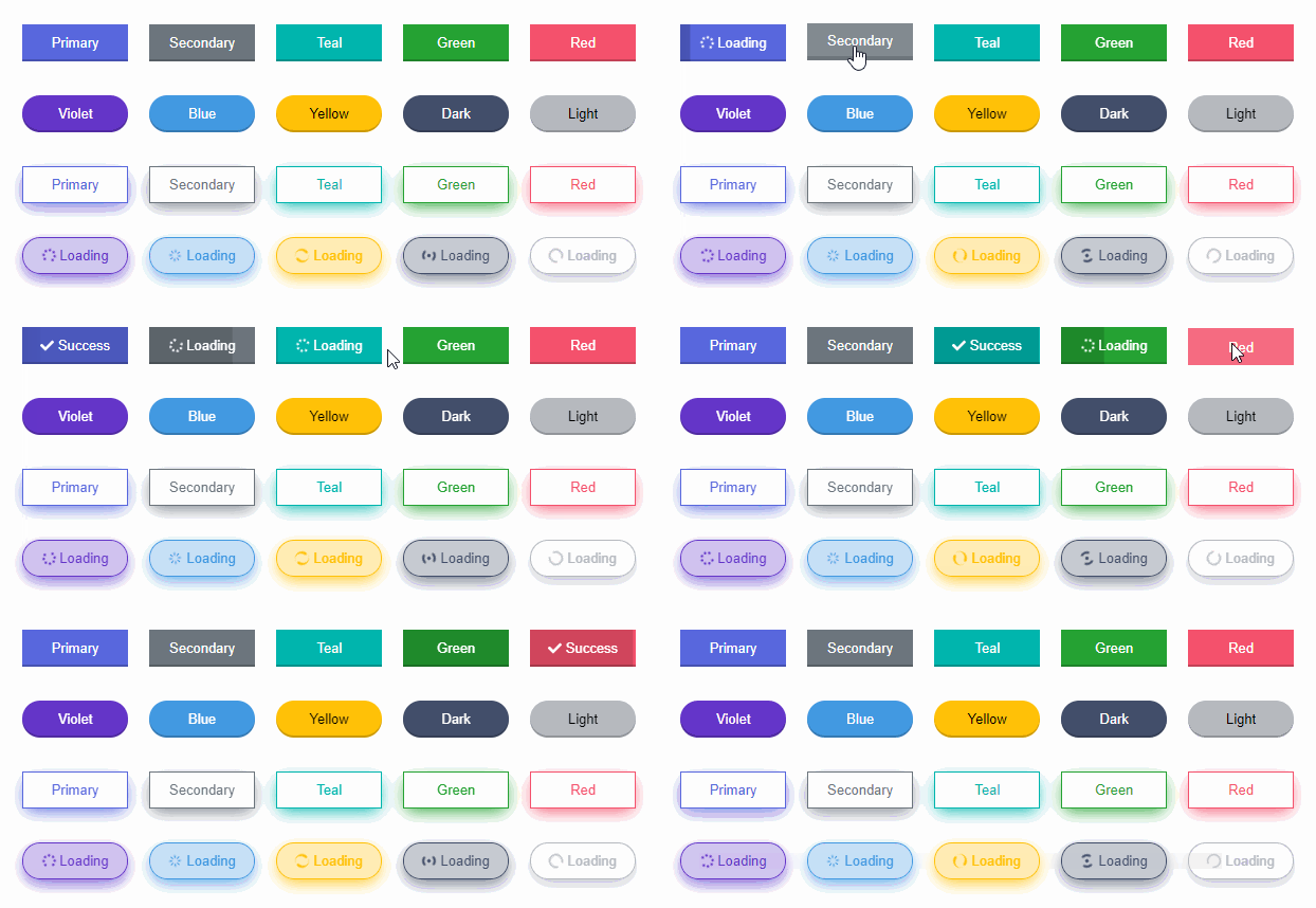
Reactive Button is a 3D animated react component to replace the traditional boring buttons. Change your button style without adding any UI framework. Comes with progress bar and the goal is to let the users visualize what is happening after a button click.
- 3D
- Animated
- Supports icons
- Zero dependency
- Progress indicator
- Notification message
- Supports TypeScript
- Super easy to setup
- Extremely lightweight
- Super easy to customize
- And much more !
Install via NPM.
npm install reactive-buttonOr via Yarn.
yarn add reactive-buttonThe targets of the below example:
- Show a button showing the text 'Submit'.
- After clicking the button, change the button text to 'Loading' and send an HTTP request.
- Upon successful request, change the button text to 'Done' as success notification.
import{useState}from'react';importReactiveButtonfrom'reactive-button';functionApp(){const[state,setState]=useState('idle');constonClickHandler=()=>{setState('loading');// send an HTTP requestsetTimeout(()=>{setState('success');},2000);};return(<ReactiveButtonbuttonState={state}idleText="Submit"loadingText="Loading"successText="Done"onClick={onClickHandler}/>);}exportdefaultApp;Reactive Button has all the functionalities of a normal button.
It comes with 10 default color options.
return(<><ReactiveButtoncolor="primary"/><ReactiveButtoncolor="secondary"/><ReactiveButtoncolor="teal"/><ReactiveButtoncolor="green"/><ReactiveButtoncolor="red"/><ReactiveButtoncolor="violet"/><ReactiveButtoncolor="blue"/><ReactiveButtoncolor="yellow"/><ReactiveButtoncolor="dark"/><ReactiveButtoncolor="light"/></>);There are 4 sizes available.
return(<><ReactiveButtonsize="tiny"/><ReactiveButtonsize="small"/><ReactiveButtonsize="medium"/><ReactiveButtonsize="large"/></>);Make the buttons more beautiful with these customization options.
return(<><ReactiveButtonoutline/><ReactiveButtonrounded/><ReactiveButtonshadow/></>);In your project, There might be existing state for loading indicator which accepts boolean value only. If you don't want to define new state for Reactive Button, then utilize the existing state.
const[loading,setLoading]=useState(false);return(<ReactiveButtonbuttonState={loading ? 'loading' : 'idle'}idleText={'Button'}loadingText={'Loading'}/>);state is not mandatory.
return<ReactiveButtononClick={onClickHandler}/>;You can use your own icons. Don't forget to wrap them with a parent element.
return(<ReactiveButtonidleText={<span><faReply/> Send
</span>}/>);If you need to submit form by button clicking, set the type prop as 'submit'.
return(<form><inputtype="text"name="username"/><inputtype="password"name="password"/><ReactiveButtontype={'submit'}idleText="Submit"/></form>);To use Reactive button as anchor tag, simply wrap it with an anchor tag.
return(<ahref="https://github.com/"target="_blank"><ReactiveButtonidleText="Visit Github"/></a>);| Props | Type | Description | Default |
|---|---|---|---|
| buttonState | string | 'idle' | 'loading' | 'success' | 'error' | 'idle' |
| onClick | function | Callback function when clicking button | () => {} |
| color | string | 'primary' | 'secondary' | 'dark' | 'light' | 'green' | 'red' | 'yellow' | 'teal' | 'violet' | 'blue' | 'primary' |
| idleText | string | ReactNode | Button text when idle | 'Click Me' |
| loadingText | string | ReactNode | Button text when loading | 'Loading' |
| successText | string | ReactNode | Button text when loading successful | 'Success' |
| errorText | string | ReactNode | Button text when loading failed | 'Error' |
| type | string | 'button' | 'submit' | 'reset' | 'button' |
| className | string | Button classnames | '' |
| style | React.CSSProperties | Custom style | {} |
| outline | boolean | Enable outline effect | false |
| shadow | boolean | Enable shadow effect | false |
| rounded | boolean | Enable rounded button | false |
| size | string | 'tiny' | 'small' | 'normal' | 'large' | 'normal' |
| block | boolean | Block Button | false |
| messageDuration | number | Success/Error message duration in millisecond | 2000 |
| disabled | boolean | Disable button | false |
| buttonRef | React.Ref | null | Button reference | null |
| width | string | null | Override button width | null |
| height | string | null | Override button height | null |
| animation | boolean | Button hover and click animation | true |
You can show your support by starring this project.

To contribute, see the contributing guide.