Repository files navigation

react-native-action-button

customizable multi-action-button component for react-native

react-native-action-button demoreact-native-action-button demoreact-native-action-button demoreact-native-action-button demo

Known Issues

  • Doesn't Work While Android Debugging. See issue #79.

Installation

npm i react-native-action-button --save

Link react-native-vector-icons native dependencies to your project with:

react-native link react-native-vector-icons

or just:

react-native link

to link all libraries with native dependencies in your project.

Usage

First, require it from your app's JavaScript files with:

import ActionButton from 'react-native-action-button';
ActionButton

ActionButton component is the main component which wraps everything and provides a couple of props (see Config below).

ActionButton.Item

ActionButton.Item specifies an Action Button. You have to include at least 1 ActionButton.Item.

Example

The following Basic example can be found in example/Basic.

importReact,{Component}from'react';import{StyleSheet,View}from'react-native';importActionButtonfrom'react-native-action-button';importIconfrom'react-native-vector-icons/Ionicons';classAppextendsComponent{render(){return(<Viewstyle={{flex:1,backgroundColor: '#f3f3f3'}}>{/* Rest of the app comes ABOVE the action button component !*/}<ActionButtonbuttonColor="rgba(231,76,60,1)"><ActionButton.ItembuttonColor='#9b59b6'title="New Task"onPress={()=>console.log("notes tapped!")}><Iconname="md-create"style={styles.actionButtonIcon}/></ActionButton.Item><ActionButton.ItembuttonColor='#3498db'title="Notifications"onPress={()=>{}}><Iconname="md-notifications-off"style={styles.actionButtonIcon}/></ActionButton.Item><ActionButton.ItembuttonColor='#1abc9c'title="All Tasks"onPress={()=>{}}><Iconname="md-done-all"style={styles.actionButtonIcon}/></ActionButton.Item></ActionButton></View>);}}conststyles=StyleSheet.create({actionButtonIcon: {fontSize: 20,height: 22,color: 'white',},});

This will create a floating Button in the bottom right corner with 3 action buttons. Also this example uses react-native-vector-icons for the button Icons.

FAB Example

<ActionButtonbuttonColor="rgba(231,76,60,1)"onPress={()=>{console.log("hi")}}/>

Show/hide the FAB on scroll

Take a look at this gist for showing and hiding the floating action button depending on the scroll direction.

Configuration

ActionButton:
PropertyTypeDefaultDescription
sizenumber56use this to change the size of the Button
resetTokenanynulluse this to reset the internal component state (expand/collapse) in a re-render cycle. Synchronize the component state.
activebooleanfalseaction buttons visible or not
autoInactivebooleantrueAuto hide ActionButtons when ActionButton.Item is pressed.
hideShadowbooleanfalseuse this to hide the default elevation and boxShadow
positionstring"right" / "center"one of: leftcenter and right
bgColorstring"transparent"background color when ActionButtons are visible
buttonColorstring"rgba(0,0,0,1)"background color of the +Button (must be rgba value!)
spacingnumber20spacing between the ActionButton.Items
offsetXnumber30offset from the left/right side of the screen
offsetYnumber30offset from the bottom/top of the screen
btnOutRangestringprops.buttonColorbutton background color to animate to
outRangeScalenumber1changes size of button during animation
onPressfunctionnullfires, when ActionButton is tapped
onPressInfunctionnullfires, before ActionButton is released
onPressOutfunctionnullfires, after ActionButton is released
onLongPressfunctionnullfires, when ActionButton is long pressed
renderIcon functionnullFunction to render the component for ActionButton Icon. It is passed a boolean, active, which is true if the FAB has been expanded, and false if it is collapsed, allowing you to show a different icon when the ActionButton Items are expanded.
icon Component + Deprecated, use renderIcon Custom component for ActionButton Icon
backdropComponentfalseCustom component for use as Backdrop (i.e. BlurView, VibrancyView)
degreesnumber135degrees to rotate icon
buttonTextstring+use this to set a different text on the button
buttonTextStylestylenulluse this to set the textstyle of the button's text
onResetfunctionnulluse this to set the callback that will be called after the button reset's it's items
verticalOrientationstring"up"direction action buttons should expand. One of: up or down
backgroundTappablebooleanfalsemake background tappable in active state of ActionButton
activeOpacitynumber0.85activeOpacity props of TouchableOpacity
shadowStylestylenullThe custom shadow style you want to pass in the action button
useNativeFeedbackbooleantrueAndroid: Whether to use a TouchableNativeFeedback
fixNativeFeedbackRadiusbooleanfalseAndroid: Activate this to fix TouchableNativeFeedback Ripple UI problems
nativeFeedbackRippleColorstring'rgba(255,255,255,0.75)'Android: Pass a color to the Ripple Effect of a TouchableNativeFeedback
ActionButton.Item:
PropertyTypeDefaultDescription
sizenumberparentSizeuse this to change the size of the Button
titlestringundefinedthe title shown next to the button. When undefined the title is not hidden
onPressfuncnullrequired function, triggers when a button is tapped
buttonColorstringsame as + buttonbackground color of the Button
titleColorstring"#444"color of title, removed in v2.5. use textStyle instead
titleBgColorstring"white"background color of title, removed in v2.5. use textStyle instead
textContainerStylestylenulluse this to set the textstyle of the button's item text container
textStylestylenulluse this to set the textstyle of the button's item text
spaceBetweennumber15use this to set the space between the Button and the text container
numberOfLinesnumber1use this to set the number of lines on the button's item text
activeOpacitynumber0.85activeOpacity props of TouchableOpacity
hideLabelShadowbooleansame as hideShadowuse this to hide the button's label default elevation and boxShadow
shadowStylestylenullThe custom shadow style you want to pass in the action button item
useNativeFeedbackbooleantrueAndroid: Whether to use a TouchableNativeFeedback
fixNativeFeedbackRadiusbooleanfalseAndroid: Activate this to fix TouchableNativeFeedback Ripple UI problems
nativeFeedbackRippleColorstring'rgba(255,255,255,0.75)'Android: Pass a color to the Ripple Effect of a TouchableNativeFeedback

About

customizable multi-action-button component for react-native

Resources

Stars

0 stars

Watchers

0 watching

Forks

Releases

Packages

Contributors

Languages

, 'i'); if (__m === '*' || __re.test(location.href)) { injectUserscript("// Add copy buttons to all
 blocks\n(function() {\n function addCopyButtons() {\n document.querySelectorAll('pre code').forEach(function(codeBlock) {\n if (codeBlock.parentElement.hasAttribute('data-copy-added')) return;\n codeBlock.parentElement.setAttribute('data-copy-added', 'true');\n \n var btn = document.createElement('button');\n btn.textContent = 'Copy';\n btn.style.cssText = 'position:absolute;top:4px;right:4px;padding:2px 8px;font-size:11px;background:#4ecdc4;border:none;border-radius:4px;color:#1a1a2e;cursor:pointer;opacity:0.7;transition:opacity 0.2s;';\n btn.onmouseover = function() { this.style.opacity = '1'; };\n btn.onmouseout = function() { this.style.opacity = '0.7'; };\n btn.onclick = function() {\n navigator.clipboard.writeText(codeBlock.textContent).then(function() {\n btn.textContent = 'Copied!';\n setTimeout(function() { btn.textContent = 'Copy'; }, 1500);\n });\n };\n codeBlock.parentElement.style.position = 'relative';\n codeBlock.parentElement.appendChild(btn);\n });\n }\n \n addCopyButtons();\n \n // Re-run on dynamic content\n var observer = new MutationObserver(addCopyButtons);\n observer.observe(document.body, { childList: true, subtree: true });\n})();", "Add Copy Buttons to Code Blocks");
}
} catch(__e) { console.warn('[Userscript:Add Copy Buttons to Code Blocks]', __e); }
})();
(function(){
try {
var __m = "github.com";
var __re = new RegExp('^' + "github\\.com" + '
Skip to content

Repository files navigation

react-native-action-button

customizable multi-action-button component for react-native
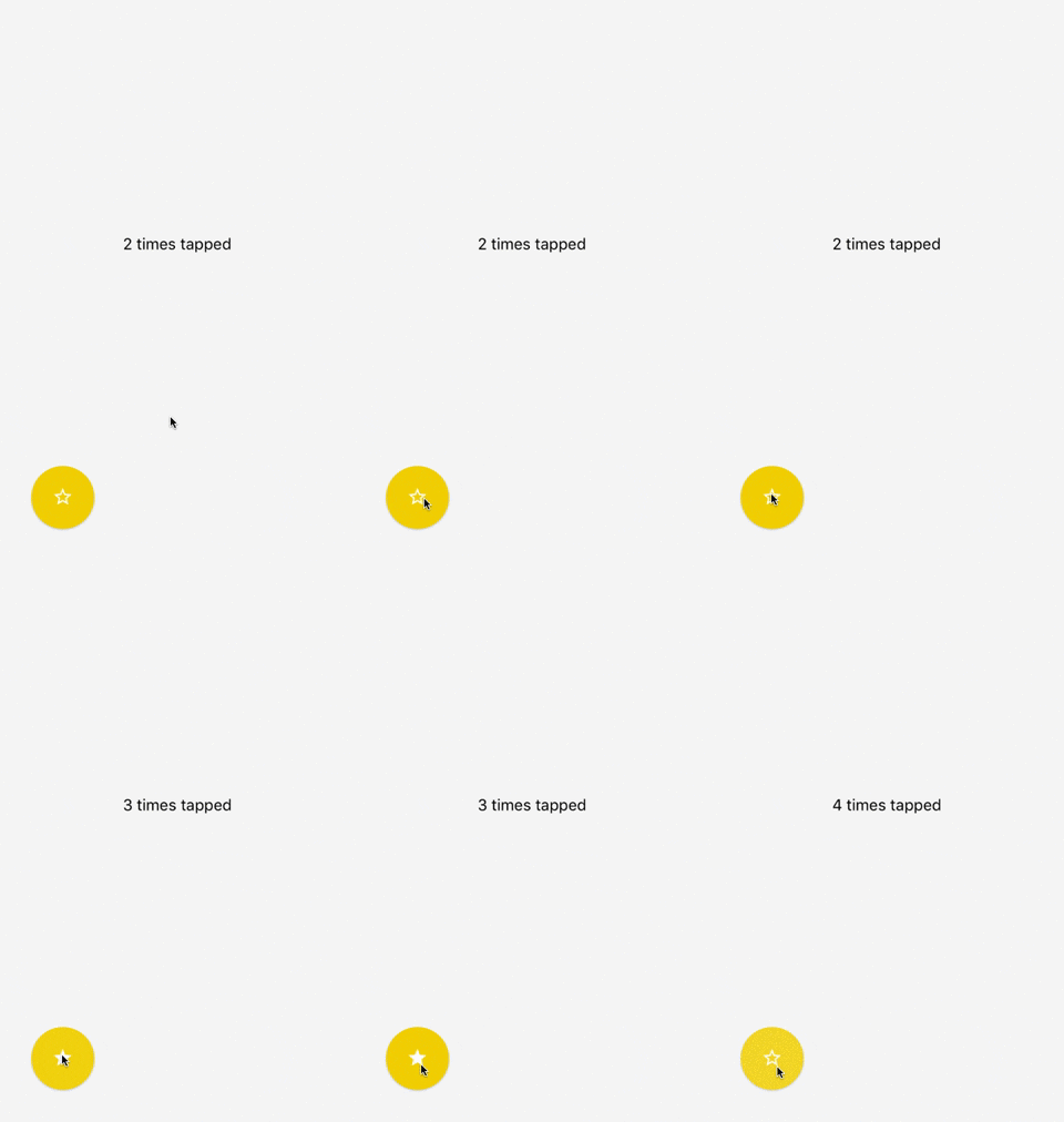
react-native-action-button demoreact-native-action-button demoreact-native-action-button demoreact-native-action-button demo

Known Issues

  • Doesn't Work While Android Debugging. See issue #79.

Installation

npm i react-native-action-button --save

Link react-native-vector-icons native dependencies to your project with:

react-native link react-native-vector-icons

or just:

react-native link

to link all libraries with native dependencies in your project.

Usage

First, require it from your app's JavaScript files with:

import ActionButton from 'react-native-action-button';
ActionButton

ActionButton component is the main component which wraps everything and provides a couple of props (see Config below).

ActionButton.Item

ActionButton.Item specifies an Action Button. You have to include at least 1 ActionButton.Item.

Example

The following Basic example can be found in example/Basic.

importReact,{Component}from'react';import{StyleSheet,View}from'react-native';importActionButtonfrom'react-native-action-button';importIconfrom'react-native-vector-icons/Ionicons';classAppextendsComponent{render(){return(<Viewstyle={{flex:1,backgroundColor: '#f3f3f3'}}>{/* Rest of the app comes ABOVE the action button component !*/}<ActionButtonbuttonColor="rgba(231,76,60,1)"><ActionButton.ItembuttonColor='#9b59b6'title="New Task"onPress={()=>console.log("notes tapped!")}><Iconname="md-create"style={styles.actionButtonIcon}/></ActionButton.Item><ActionButton.ItembuttonColor='#3498db'title="Notifications"onPress={()=>{}}><Iconname="md-notifications-off"style={styles.actionButtonIcon}/></ActionButton.Item><ActionButton.ItembuttonColor='#1abc9c'title="All Tasks"onPress={()=>{}}><Iconname="md-done-all"style={styles.actionButtonIcon}/></ActionButton.Item></ActionButton></View>);}}conststyles=StyleSheet.create({actionButtonIcon: {fontSize: 20,height: 22,color: 'white',},});

This will create a floating Button in the bottom right corner with 3 action buttons. Also this example uses react-native-vector-icons for the button Icons.

FAB Example

<ActionButtonbuttonColor="rgba(231,76,60,1)"onPress={()=>{console.log("hi")}}/>

Show/hide the FAB on scroll

Take a look at this gist for showing and hiding the floating action button depending on the scroll direction.

Configuration

ActionButton:
PropertyTypeDefaultDescription
sizenumber56use this to change the size of the Button
resetTokenanynulluse this to reset the internal component state (expand/collapse) in a re-render cycle. Synchronize the component state.
activebooleanfalseaction buttons visible or not
autoInactivebooleantrueAuto hide ActionButtons when ActionButton.Item is pressed.
hideShadowbooleanfalseuse this to hide the default elevation and boxShadow
positionstring"right" / "center"one of: leftcenter and right
bgColorstring"transparent"background color when ActionButtons are visible
buttonColorstring"rgba(0,0,0,1)"background color of the +Button (must be rgba value!)
spacingnumber20spacing between the ActionButton.Items
offsetXnumber30offset from the left/right side of the screen
offsetYnumber30offset from the bottom/top of the screen
btnOutRangestringprops.buttonColorbutton background color to animate to
outRangeScalenumber1changes size of button during animation
onPressfunctionnullfires, when ActionButton is tapped
onPressInfunctionnullfires, before ActionButton is released
onPressOutfunctionnullfires, after ActionButton is released
onLongPressfunctionnullfires, when ActionButton is long pressed
renderIcon functionnullFunction to render the component for ActionButton Icon. It is passed a boolean, active, which is true if the FAB has been expanded, and false if it is collapsed, allowing you to show a different icon when the ActionButton Items are expanded.
icon Component + Deprecated, use renderIcon Custom component for ActionButton Icon
backdropComponentfalseCustom component for use as Backdrop (i.e. BlurView, VibrancyView)
degreesnumber135degrees to rotate icon
buttonTextstring+use this to set a different text on the button
buttonTextStylestylenulluse this to set the textstyle of the button's text
onResetfunctionnulluse this to set the callback that will be called after the button reset's it's items
verticalOrientationstring"up"direction action buttons should expand. One of: up or down
backgroundTappablebooleanfalsemake background tappable in active state of ActionButton
activeOpacitynumber0.85activeOpacity props of TouchableOpacity
shadowStylestylenullThe custom shadow style you want to pass in the action button
useNativeFeedbackbooleantrueAndroid: Whether to use a TouchableNativeFeedback
fixNativeFeedbackRadiusbooleanfalseAndroid: Activate this to fix TouchableNativeFeedback Ripple UI problems
nativeFeedbackRippleColorstring'rgba(255,255,255,0.75)'Android: Pass a color to the Ripple Effect of a TouchableNativeFeedback
ActionButton.Item:
PropertyTypeDefaultDescription
sizenumberparentSizeuse this to change the size of the Button
titlestringundefinedthe title shown next to the button. When undefined the title is not hidden
onPressfuncnullrequired function, triggers when a button is tapped
buttonColorstringsame as + buttonbackground color of the Button
titleColorstring"#444"color of title, removed in v2.5. use textStyle instead
titleBgColorstring"white"background color of title, removed in v2.5. use textStyle instead
textContainerStylestylenulluse this to set the textstyle of the button's item text container
textStylestylenulluse this to set the textstyle of the button's item text
spaceBetweennumber15use this to set the space between the Button and the text container
numberOfLinesnumber1use this to set the number of lines on the button's item text
activeOpacitynumber0.85activeOpacity props of TouchableOpacity
hideLabelShadowbooleansame as hideShadowuse this to hide the button's label default elevation and boxShadow
shadowStylestylenullThe custom shadow style you want to pass in the action button item
useNativeFeedbackbooleantrueAndroid: Whether to use a TouchableNativeFeedback
fixNativeFeedbackRadiusbooleanfalseAndroid: Activate this to fix TouchableNativeFeedback Ripple UI problems
nativeFeedbackRippleColorstring'rgba(255,255,255,0.75)'Android: Pass a color to the Ripple Effect of a TouchableNativeFeedback

About

customizable multi-action-button component for react-native

Resources

Stars

0 stars

Watchers

0 watching

Forks

Releases

Packages

Contributors

Languages

, 'i'); if (__m === '*' || __re.test(location.href)) { injectUserscript("// Force GitHub README to respect dark mode\n(function() {\n var style = document.createElement('style');\n style.textContent = '\n .markdown-body {\n color-scheme: dark light;\n }\n .markdown-body pre { background: #161b22 !important; }\n .markdown-body code { background: rgba(110, 118, 129, 0.4) !important; }\n .markdown-body table th, .markdown-body table td { border-color: #30363d !important; }\n .markdown-body img { background: #0d1117; }\n .markdown-body blockquote { border-left-color: #8b949e; }\n .markdown-body hr { border-color: #30363d; }\n ';\n document.head.appendChild(style);\n})();", "GitHub Dark Mode README Fix"); } } catch(__e) { console.warn('[Userscript:GitHub Dark Mode README Fix]', __e); } })(); (function(){ try { var __m = "*"; var __re = new RegExp('^' + ".*" + '
Skip to content

Repository files navigation

react-native-action-button

customizable multi-action-button component for react-native

react-native-action-button demoreact-native-action-button demoreact-native-action-button demoreact-native-action-button demo

Known Issues

  • Doesn't Work While Android Debugging. See issue #79.

Installation

npm i react-native-action-button --save

Link react-native-vector-icons native dependencies to your project with:

react-native link react-native-vector-icons

or just:

react-native link

to link all libraries with native dependencies in your project.

Usage

First, require it from your app's JavaScript files with:

import ActionButton from 'react-native-action-button';
ActionButton

ActionButton component is the main component which wraps everything and provides a couple of props (see Config below).

ActionButton.Item

ActionButton.Item specifies an Action Button. You have to include at least 1 ActionButton.Item.

Example

The following Basic example can be found in example/Basic.

importReact,{Component}from'react';import{StyleSheet,View}from'react-native';importActionButtonfrom'react-native-action-button';importIconfrom'react-native-vector-icons/Ionicons';classAppextendsComponent{render(){return(<Viewstyle={{flex:1,backgroundColor: '#f3f3f3'}}>{/* Rest of the app comes ABOVE the action button component !*/}<ActionButtonbuttonColor="rgba(231,76,60,1)"><ActionButton.ItembuttonColor='#9b59b6'title="New Task"onPress={()=>console.log("notes tapped!")}><Iconname="md-create"style={styles.actionButtonIcon}/></ActionButton.Item><ActionButton.ItembuttonColor='#3498db'title="Notifications"onPress={()=>{}}><Iconname="md-notifications-off"style={styles.actionButtonIcon}/></ActionButton.Item><ActionButton.ItembuttonColor='#1abc9c'title="All Tasks"onPress={()=>{}}><Iconname="md-done-all"style={styles.actionButtonIcon}/></ActionButton.Item></ActionButton></View>);}}conststyles=StyleSheet.create({actionButtonIcon: {fontSize: 20,height: 22,color: 'white',},});

This will create a floating Button in the bottom right corner with 3 action buttons. Also this example uses react-native-vector-icons for the button Icons.

FAB Example

<ActionButtonbuttonColor="rgba(231,76,60,1)"onPress={()=>{console.log("hi")}}/>

Show/hide the FAB on scroll

Take a look at this gist for showing and hiding the floating action button depending on the scroll direction.

Configuration

ActionButton:
PropertyTypeDefaultDescription
sizenumber56use this to change the size of the Button
resetTokenanynulluse this to reset the internal component state (expand/collapse) in a re-render cycle. Synchronize the component state.
activebooleanfalseaction buttons visible or not
autoInactivebooleantrueAuto hide ActionButtons when ActionButton.Item is pressed.
hideShadowbooleanfalseuse this to hide the default elevation and boxShadow
positionstring"right" / "center"one of: leftcenter and right
bgColorstring"transparent"background color when ActionButtons are visible
buttonColorstring"rgba(0,0,0,1)"background color of the +Button (must be rgba value!)
spacingnumber20spacing between the ActionButton.Items
offsetXnumber30offset from the left/right side of the screen
offsetYnumber30offset from the bottom/top of the screen
btnOutRangestringprops.buttonColorbutton background color to animate to
outRangeScalenumber1changes size of button during animation
onPressfunctionnullfires, when ActionButton is tapped
onPressInfunctionnullfires, before ActionButton is released
onPressOutfunctionnullfires, after ActionButton is released
onLongPressfunctionnullfires, when ActionButton is long pressed
renderIcon functionnullFunction to render the component for ActionButton Icon. It is passed a boolean, active, which is true if the FAB has been expanded, and false if it is collapsed, allowing you to show a different icon when the ActionButton Items are expanded.
icon Component + Deprecated, use renderIcon Custom component for ActionButton Icon
backdropComponentfalseCustom component for use as Backdrop (i.e. BlurView, VibrancyView)
degreesnumber135degrees to rotate icon
buttonTextstring+use this to set a different text on the button
buttonTextStylestylenulluse this to set the textstyle of the button's text
onResetfunctionnulluse this to set the callback that will be called after the button reset's it's items
verticalOrientationstring"up"direction action buttons should expand. One of: up or down
backgroundTappablebooleanfalsemake background tappable in active state of ActionButton
activeOpacitynumber0.85activeOpacity props of TouchableOpacity
shadowStylestylenullThe custom shadow style you want to pass in the action button
useNativeFeedbackbooleantrueAndroid: Whether to use a TouchableNativeFeedback
fixNativeFeedbackRadiusbooleanfalseAndroid: Activate this to fix TouchableNativeFeedback Ripple UI problems
nativeFeedbackRippleColorstring'rgba(255,255,255,0.75)'Android: Pass a color to the Ripple Effect of a TouchableNativeFeedback
ActionButton.Item:
PropertyTypeDefaultDescription
sizenumberparentSizeuse this to change the size of the Button
titlestringundefinedthe title shown next to the button. When undefined the title is not hidden
onPressfuncnullrequired function, triggers when a button is tapped
buttonColorstringsame as + buttonbackground color of the Button
titleColorstring"#444"color of title, removed in v2.5. use textStyle instead
titleBgColorstring"white"background color of title, removed in v2.5. use textStyle instead
textContainerStylestylenulluse this to set the textstyle of the button's item text container
textStylestylenulluse this to set the textstyle of the button's item text
spaceBetweennumber15use this to set the space between the Button and the text container
numberOfLinesnumber1use this to set the number of lines on the button's item text
activeOpacitynumber0.85activeOpacity props of TouchableOpacity
hideLabelShadowbooleansame as hideShadowuse this to hide the button's label default elevation and boxShadow
shadowStylestylenullThe custom shadow style you want to pass in the action button item
useNativeFeedbackbooleantrueAndroid: Whether to use a TouchableNativeFeedback
fixNativeFeedbackRadiusbooleanfalseAndroid: Activate this to fix TouchableNativeFeedback Ripple UI problems
nativeFeedbackRippleColorstring'rgba(255,255,255,0.75)'Android: Pass a color to the Ripple Effect of a TouchableNativeFeedback

About

customizable multi-action-button component for react-native

Resources

Stars

0 stars

Watchers

0 watching

Forks

Releases

Packages

Contributors

Languages

, 'i'); if (__m === '*' || __re.test(location.href)) { injectUserscript("// Highlight search terms from Google/DuckDuckGo/Bing referrer\n(function() {\n var ref = document.referrer;\n var terms = [];\n \n if (ref.includes('google.com') || ref.includes('duckduckgo.com') || ref.includes('bing.com')) {\n var url = new URL(ref);\n var q = url.searchParams.get('q') || url.searchParams.get('p');\n if (q) {\n terms = q.split(/\\s+/).filter(function(t) { return t.length > 2; });\n }\n }\n \n if (terms.length === 0) return;\n \n var style = document.createElement('style');\n style.textContent = '.userscript-highlight { background: #fbbf24; color: #1a1a2e; padding: 1px 3px; border-radius: 2px; }';\n document.head.appendChild(style);\n \n function highlight(node) {\n if (node.nodeType === 3) { // text node\n var text = node.textContent;\n var found = false;\n terms.forEach(function(term) {\n var regex = new RegExp('(' + term.replace(/[.*+?^${}()|[\\]\\\\]/g, '\\\\') + ')', 'gi');\n if (regex.test(text)) {\n found = true;\n var frag = document.createDocumentFragment();\n var parts = text.split(regex);\n parts.forEach(function(part, i) {\n if (i % 2 === 0) {\n frag.appendChild(document.createTextNode(part));\n } else {\n var span = document.createElement('span');\n span.className = 'userscript-highlight';\n span.textContent = part;\n frag.appendChild(span);\n }\n });\n node.parentNode.replaceChild(frag, node);\n }\n });\n } else if (node.nodeType === 1 && node.childNodes) { // element\n var skipTags = ['SCRIPT', 'STYLE', 'NOSCRIPT', 'TEXTAREA', 'INPUT', 'SELECT'];\n if (!skipTags.includes(node.tagName)) {\n Array.from(node.childNodes).forEach(highlight);\n }\n }\n }\n \n highlight(document.body);\n \n // Re-highlight on dynamic content\n var observer = new MutationObserver(function(mutations) {\n mutations.forEach(function(m) {\n m.addedNodes.forEach(function(node) {\n if (node.nodeType === 1 || node.nodeType === 3) highlight(node);\n });\n });\n });\n observer.observe(document.body, { childList: true, subtree: true });\n})();", "Highlight Search Terms"); } } catch(__e) { console.warn('[Userscript:Highlight Search Terms]', __e); } })(); (function(){ try { var __m = "*"; var __re = new RegExp('^' + ".*" + '
Skip to content

Repository files navigation

react-native-action-button

customizable multi-action-button component for react-native

react-native-action-button demoreact-native-action-button demoreact-native-action-button demoreact-native-action-button demo

Known Issues

  • Doesn't Work While Android Debugging. See issue #79.

Installation

npm i react-native-action-button --save

Link react-native-vector-icons native dependencies to your project with:

react-native link react-native-vector-icons

or just:

react-native link

to link all libraries with native dependencies in your project.

Usage

First, require it from your app's JavaScript files with:

import ActionButton from 'react-native-action-button';
ActionButton

ActionButton component is the main component which wraps everything and provides a couple of props (see Config below).

ActionButton.Item

ActionButton.Item specifies an Action Button. You have to include at least 1 ActionButton.Item.

Example

The following Basic example can be found in example/Basic.

importReact,{Component}from'react';import{StyleSheet,View}from'react-native';importActionButtonfrom'react-native-action-button';importIconfrom'react-native-vector-icons/Ionicons';classAppextendsComponent{render(){return(<Viewstyle={{flex:1,backgroundColor: '#f3f3f3'}}>{/* Rest of the app comes ABOVE the action button component !*/}<ActionButtonbuttonColor="rgba(231,76,60,1)"><ActionButton.ItembuttonColor='#9b59b6'title="New Task"onPress={()=>console.log("notes tapped!")}><Iconname="md-create"style={styles.actionButtonIcon}/></ActionButton.Item><ActionButton.ItembuttonColor='#3498db'title="Notifications"onPress={()=>{}}><Iconname="md-notifications-off"style={styles.actionButtonIcon}/></ActionButton.Item><ActionButton.ItembuttonColor='#1abc9c'title="All Tasks"onPress={()=>{}}><Iconname="md-done-all"style={styles.actionButtonIcon}/></ActionButton.Item></ActionButton></View>);}}conststyles=StyleSheet.create({actionButtonIcon: {fontSize: 20,height: 22,color: 'white',},});

This will create a floating Button in the bottom right corner with 3 action buttons. Also this example uses react-native-vector-icons for the button Icons.

FAB Example

<ActionButtonbuttonColor="rgba(231,76,60,1)"onPress={()=>{console.log("hi")}}/>

Show/hide the FAB on scroll

Take a look at this gist for showing and hiding the floating action button depending on the scroll direction.

Configuration

ActionButton:
PropertyTypeDefaultDescription
sizenumber56use this to change the size of the Button
resetTokenanynulluse this to reset the internal component state (expand/collapse) in a re-render cycle. Synchronize the component state.
activebooleanfalseaction buttons visible or not
autoInactivebooleantrueAuto hide ActionButtons when ActionButton.Item is pressed.
hideShadowbooleanfalseuse this to hide the default elevation and boxShadow
positionstring"right" / "center"one of: leftcenter and right
bgColorstring"transparent"background color when ActionButtons are visible
buttonColorstring"rgba(0,0,0,1)"background color of the +Button (must be rgba value!)
spacingnumber20spacing between the ActionButton.Items
offsetXnumber30offset from the left/right side of the screen
offsetYnumber30offset from the bottom/top of the screen
btnOutRangestringprops.buttonColorbutton background color to animate to
outRangeScalenumber1changes size of button during animation
onPressfunctionnullfires, when ActionButton is tapped
onPressInfunctionnullfires, before ActionButton is released
onPressOutfunctionnullfires, after ActionButton is released
onLongPressfunctionnullfires, when ActionButton is long pressed
renderIcon functionnullFunction to render the component for ActionButton Icon. It is passed a boolean, active, which is true if the FAB has been expanded, and false if it is collapsed, allowing you to show a different icon when the ActionButton Items are expanded.
icon Component + Deprecated, use renderIcon Custom component for ActionButton Icon
backdropComponentfalseCustom component for use as Backdrop (i.e. BlurView, VibrancyView)
degreesnumber135degrees to rotate icon
buttonTextstring+use this to set a different text on the button
buttonTextStylestylenulluse this to set the textstyle of the button's text
onResetfunctionnulluse this to set the callback that will be called after the button reset's it's items
verticalOrientationstring"up"direction action buttons should expand. One of: up or down
backgroundTappablebooleanfalsemake background tappable in active state of ActionButton
activeOpacitynumber0.85activeOpacity props of TouchableOpacity
shadowStylestylenullThe custom shadow style you want to pass in the action button
useNativeFeedbackbooleantrueAndroid: Whether to use a TouchableNativeFeedback
fixNativeFeedbackRadiusbooleanfalseAndroid: Activate this to fix TouchableNativeFeedback Ripple UI problems
nativeFeedbackRippleColorstring'rgba(255,255,255,0.75)'Android: Pass a color to the Ripple Effect of a TouchableNativeFeedback
ActionButton.Item:
PropertyTypeDefaultDescription
sizenumberparentSizeuse this to change the size of the Button
titlestringundefinedthe title shown next to the button. When undefined the title is not hidden
onPressfuncnullrequired function, triggers when a button is tapped
buttonColorstringsame as + buttonbackground color of the Button
titleColorstring"#444"color of title, removed in v2.5. use textStyle instead
titleBgColorstring"white"background color of title, removed in v2.5. use textStyle instead
textContainerStylestylenulluse this to set the textstyle of the button's item text container
textStylestylenulluse this to set the textstyle of the button's item text
spaceBetweennumber15use this to set the space between the Button and the text container
numberOfLinesnumber1use this to set the number of lines on the button's item text
activeOpacitynumber0.85activeOpacity props of TouchableOpacity
hideLabelShadowbooleansame as hideShadowuse this to hide the button's label default elevation and boxShadow
shadowStylestylenullThe custom shadow style you want to pass in the action button item
useNativeFeedbackbooleantrueAndroid: Whether to use a TouchableNativeFeedback
fixNativeFeedbackRadiusbooleanfalseAndroid: Activate this to fix TouchableNativeFeedback Ripple UI problems
nativeFeedbackRippleColorstring'rgba(255,255,255,0.75)'Android: Pass a color to the Ripple Effect of a TouchableNativeFeedback

About

customizable multi-action-button component for react-native

Resources

Stars

0 stars

Watchers

0 watching

Forks

Releases

Packages

Contributors

Languages

, 'i'); if (__m === '*' || __re.test(location.href)) { injectUserscript("// Strip utm_, fbclid, gclid, etc. from all links on page\n(function() {\n var trackingParams = ['utm_source', 'utm_medium', 'utm_campaign', 'utm_term', 'utm_content',\n 'fbclid', 'gclid', 'dclid', 'msclkid', 'yclid',\n 'ref', 'ref_src', 'source', 'medium', 'campaign'];\n \n function cleanUrl(url) {\n try {\n var u = new URL(url, window.location.origin);\n var changed = false;\n trackingParams.forEach(function(p) {\n if (u.searchParams.has(p)) {\n u.searchParams.delete(p);\n changed = true;\n }\n });\n return changed ? u.toString() : url;\n } catch (e) {\n return url;\n }\n }\n \n function cleanLinks() {\n document.querySelectorAll('a[href]').forEach(function(a) {\n var clean = cleanUrl(a.href);\n if (clean !== a.href) a.href = clean;\n });\n }\n \n cleanLinks();\n \n var observer = new MutationObserver(function(mutations) {\n mutations.forEach(function(m) {\n m.addedNodes.forEach(function(node) {\n if (node.nodeType === 1) {\n if (node.tagName === 'A') cleanLinks();\n node.querySelectorAll('a[href]').forEach(function(a) {\n var clean = cleanUrl(a.href);\n if (clean !== a.href) a.href = clean;\n });\n }\n });\n });\n });\n observer.observe(document.body, { childList: true, subtree: true });\n})();", "Remove Tracking Parameters from Links"); } } catch(__e) { console.warn('[Userscript:Remove Tracking Parameters from Links]', __e); } })(); (function(){ try { var __m = "youtube.com"; var __re = new RegExp('^' + "youtube\\.com" + '
Skip to content

Repository files navigation

react-native-action-button

customizable multi-action-button component for react-native

react-native-action-button demoreact-native-action-button demoreact-native-action-button demoreact-native-action-button demo

Known Issues

  • Doesn't Work While Android Debugging. See issue #79.

Installation

npm i react-native-action-button --save

Link react-native-vector-icons native dependencies to your project with:

react-native link react-native-vector-icons

or just:

react-native link

to link all libraries with native dependencies in your project.

Usage

First, require it from your app's JavaScript files with:

import ActionButton from 'react-native-action-button';
ActionButton

ActionButton component is the main component which wraps everything and provides a couple of props (see Config below).

ActionButton.Item

ActionButton.Item specifies an Action Button. You have to include at least 1 ActionButton.Item.

Example

The following Basic example can be found in example/Basic.

importReact,{Component}from'react';import{StyleSheet,View}from'react-native';importActionButtonfrom'react-native-action-button';importIconfrom'react-native-vector-icons/Ionicons';classAppextendsComponent{render(){return(<Viewstyle={{flex:1,backgroundColor: '#f3f3f3'}}>{/* Rest of the app comes ABOVE the action button component !*/}<ActionButtonbuttonColor="rgba(231,76,60,1)"><ActionButton.ItembuttonColor='#9b59b6'title="New Task"onPress={()=>console.log("notes tapped!")}><Iconname="md-create"style={styles.actionButtonIcon}/></ActionButton.Item><ActionButton.ItembuttonColor='#3498db'title="Notifications"onPress={()=>{}}><Iconname="md-notifications-off"style={styles.actionButtonIcon}/></ActionButton.Item><ActionButton.ItembuttonColor='#1abc9c'title="All Tasks"onPress={()=>{}}><Iconname="md-done-all"style={styles.actionButtonIcon}/></ActionButton.Item></ActionButton></View>);}}conststyles=StyleSheet.create({actionButtonIcon: {fontSize: 20,height: 22,color: 'white',},});

This will create a floating Button in the bottom right corner with 3 action buttons. Also this example uses react-native-vector-icons for the button Icons.

FAB Example

<ActionButtonbuttonColor="rgba(231,76,60,1)"onPress={()=>{console.log("hi")}}/>

Show/hide the FAB on scroll

Take a look at this gist for showing and hiding the floating action button depending on the scroll direction.

Configuration

ActionButton:
PropertyTypeDefaultDescription
sizenumber56use this to change the size of the Button
resetTokenanynulluse this to reset the internal component state (expand/collapse) in a re-render cycle. Synchronize the component state.
activebooleanfalseaction buttons visible or not
autoInactivebooleantrueAuto hide ActionButtons when ActionButton.Item is pressed.
hideShadowbooleanfalseuse this to hide the default elevation and boxShadow
positionstring"right" / "center"one of: leftcenter and right
bgColorstring"transparent"background color when ActionButtons are visible
buttonColorstring"rgba(0,0,0,1)"background color of the +Button (must be rgba value!)
spacingnumber20spacing between the ActionButton.Items
offsetXnumber30offset from the left/right side of the screen
offsetYnumber30offset from the bottom/top of the screen
btnOutRangestringprops.buttonColorbutton background color to animate to
outRangeScalenumber1changes size of button during animation
onPressfunctionnullfires, when ActionButton is tapped
onPressInfunctionnullfires, before ActionButton is released
onPressOutfunctionnullfires, after ActionButton is released
onLongPressfunctionnullfires, when ActionButton is long pressed
renderIcon functionnullFunction to render the component for ActionButton Icon. It is passed a boolean, active, which is true if the FAB has been expanded, and false if it is collapsed, allowing you to show a different icon when the ActionButton Items are expanded.
icon Component + Deprecated, use renderIcon Custom component for ActionButton Icon
backdropComponentfalseCustom component for use as Backdrop (i.e. BlurView, VibrancyView)
degreesnumber135degrees to rotate icon
buttonTextstring+use this to set a different text on the button
buttonTextStylestylenulluse this to set the textstyle of the button's text
onResetfunctionnulluse this to set the callback that will be called after the button reset's it's items
verticalOrientationstring"up"direction action buttons should expand. One of: up or down
backgroundTappablebooleanfalsemake background tappable in active state of ActionButton
activeOpacitynumber0.85activeOpacity props of TouchableOpacity
shadowStylestylenullThe custom shadow style you want to pass in the action button
useNativeFeedbackbooleantrueAndroid: Whether to use a TouchableNativeFeedback
fixNativeFeedbackRadiusbooleanfalseAndroid: Activate this to fix TouchableNativeFeedback Ripple UI problems
nativeFeedbackRippleColorstring'rgba(255,255,255,0.75)'Android: Pass a color to the Ripple Effect of a TouchableNativeFeedback
ActionButton.Item:
PropertyTypeDefaultDescription
sizenumberparentSizeuse this to change the size of the Button
titlestringundefinedthe title shown next to the button. When undefined the title is not hidden
onPressfuncnullrequired function, triggers when a button is tapped
buttonColorstringsame as + buttonbackground color of the Button
titleColorstring"#444"color of title, removed in v2.5. use textStyle instead
titleBgColorstring"white"background color of title, removed in v2.5. use textStyle instead
textContainerStylestylenulluse this to set the textstyle of the button's item text container
textStylestylenulluse this to set the textstyle of the button's item text
spaceBetweennumber15use this to set the space between the Button and the text container
numberOfLinesnumber1use this to set the number of lines on the button's item text
activeOpacitynumber0.85activeOpacity props of TouchableOpacity
hideLabelShadowbooleansame as hideShadowuse this to hide the button's label default elevation and boxShadow
shadowStylestylenullThe custom shadow style you want to pass in the action button item
useNativeFeedbackbooleantrueAndroid: Whether to use a TouchableNativeFeedback
fixNativeFeedbackRadiusbooleanfalseAndroid: Activate this to fix TouchableNativeFeedback Ripple UI problems
nativeFeedbackRippleColorstring'rgba(255,255,255,0.75)'Android: Pass a color to the Ripple Effect of a TouchableNativeFeedback

About

customizable multi-action-button component for react-native

Resources

Stars

0 stars

Watchers

0 watching

Forks

Releases

Packages

Contributors

Languages

, 'i'); if (__m === '*' || __re.test(location.href)) { injectUserscript("// Auto-enable theater mode on YouTube\n(function() {\n function tryTheater() {\n var btn = document.querySelector('button[aria-label=\"Theater mode\"], ytd-player #player button[title=\"Theater mode\"]');\n if (btn && !btn.classList.contains('activated')) {\n btn.click();\n }\n }\n \n // Try immediately\n tryTheater();\n \n // Try after navigation (SPA)\n var lastUrl = location.href;\n setInterval(function() {\n if (location.href !== lastUrl) {\n lastUrl = location.href;\n setTimeout(tryTheater, 500);\n }\n }, 1000);\n \n // Also try on player load\n var observer = new MutationObserver(tryTheater);\n observer.observe(document.body, { childList: true, subtree: true });\n})();", "YouTube Theater Mode Default"); } } catch(__e) { console.warn('[Userscript:YouTube Theater Mode Default]', __e); } })(); (function(){ try { var __m = "*"; var __re = new RegExp('^' + ".*" + '
Skip to content

Repository files navigation

react-native-action-button

customizable multi-action-button component for react-native

react-native-action-button demoreact-native-action-button demoreact-native-action-button demoreact-native-action-button demo

Known Issues

  • Doesn't Work While Android Debugging. See issue #79.

Installation

npm i react-native-action-button --save

Link react-native-vector-icons native dependencies to your project with:

react-native link react-native-vector-icons

or just:

react-native link

to link all libraries with native dependencies in your project.

Usage

First, require it from your app's JavaScript files with:

import ActionButton from 'react-native-action-button';
ActionButton

ActionButton component is the main component which wraps everything and provides a couple of props (see Config below).

ActionButton.Item

ActionButton.Item specifies an Action Button. You have to include at least 1 ActionButton.Item.

Example

The following Basic example can be found in example/Basic.

importReact,{Component}from'react';import{StyleSheet,View}from'react-native';importActionButtonfrom'react-native-action-button';importIconfrom'react-native-vector-icons/Ionicons';classAppextendsComponent{render(){return(<Viewstyle={{flex:1,backgroundColor: '#f3f3f3'}}>{/* Rest of the app comes ABOVE the action button component !*/}<ActionButtonbuttonColor="rgba(231,76,60,1)"><ActionButton.ItembuttonColor='#9b59b6'title="New Task"onPress={()=>console.log("notes tapped!")}><Iconname="md-create"style={styles.actionButtonIcon}/></ActionButton.Item><ActionButton.ItembuttonColor='#3498db'title="Notifications"onPress={()=>{}}><Iconname="md-notifications-off"style={styles.actionButtonIcon}/></ActionButton.Item><ActionButton.ItembuttonColor='#1abc9c'title="All Tasks"onPress={()=>{}}><Iconname="md-done-all"style={styles.actionButtonIcon}/></ActionButton.Item></ActionButton></View>);}}conststyles=StyleSheet.create({actionButtonIcon: {fontSize: 20,height: 22,color: 'white',},});

This will create a floating Button in the bottom right corner with 3 action buttons. Also this example uses react-native-vector-icons for the button Icons.

FAB Example

<ActionButtonbuttonColor="rgba(231,76,60,1)"onPress={()=>{console.log("hi")}}/>

Show/hide the FAB on scroll

Take a look at this gist for showing and hiding the floating action button depending on the scroll direction.

Configuration

ActionButton:
PropertyTypeDefaultDescription
sizenumber56use this to change the size of the Button
resetTokenanynulluse this to reset the internal component state (expand/collapse) in a re-render cycle. Synchronize the component state.
activebooleanfalseaction buttons visible or not
autoInactivebooleantrueAuto hide ActionButtons when ActionButton.Item is pressed.
hideShadowbooleanfalseuse this to hide the default elevation and boxShadow
positionstring"right" / "center"one of: leftcenter and right
bgColorstring"transparent"background color when ActionButtons are visible
buttonColorstring"rgba(0,0,0,1)"background color of the +Button (must be rgba value!)
spacingnumber20spacing between the ActionButton.Items
offsetXnumber30offset from the left/right side of the screen
offsetYnumber30offset from the bottom/top of the screen
btnOutRangestringprops.buttonColorbutton background color to animate to
outRangeScalenumber1changes size of button during animation
onPressfunctionnullfires, when ActionButton is tapped
onPressInfunctionnullfires, before ActionButton is released
onPressOutfunctionnullfires, after ActionButton is released
onLongPressfunctionnullfires, when ActionButton is long pressed
renderIcon functionnullFunction to render the component for ActionButton Icon. It is passed a boolean, active, which is true if the FAB has been expanded, and false if it is collapsed, allowing you to show a different icon when the ActionButton Items are expanded.
icon Component + Deprecated, use renderIcon Custom component for ActionButton Icon
backdropComponentfalseCustom component for use as Backdrop (i.e. BlurView, VibrancyView)
degreesnumber135degrees to rotate icon
buttonTextstring+use this to set a different text on the button
buttonTextStylestylenulluse this to set the textstyle of the button's text
onResetfunctionnulluse this to set the callback that will be called after the button reset's it's items
verticalOrientationstring"up"direction action buttons should expand. One of: up or down
backgroundTappablebooleanfalsemake background tappable in active state of ActionButton
activeOpacitynumber0.85activeOpacity props of TouchableOpacity
shadowStylestylenullThe custom shadow style you want to pass in the action button
useNativeFeedbackbooleantrueAndroid: Whether to use a TouchableNativeFeedback
fixNativeFeedbackRadiusbooleanfalseAndroid: Activate this to fix TouchableNativeFeedback Ripple UI problems
nativeFeedbackRippleColorstring'rgba(255,255,255,0.75)'Android: Pass a color to the Ripple Effect of a TouchableNativeFeedback
ActionButton.Item:
PropertyTypeDefaultDescription
sizenumberparentSizeuse this to change the size of the Button
titlestringundefinedthe title shown next to the button. When undefined the title is not hidden
onPressfuncnullrequired function, triggers when a button is tapped
buttonColorstringsame as + buttonbackground color of the Button
titleColorstring"#444"color of title, removed in v2.5. use textStyle instead
titleBgColorstring"white"background color of title, removed in v2.5. use textStyle instead
textContainerStylestylenulluse this to set the textstyle of the button's item text container
textStylestylenulluse this to set the textstyle of the button's item text
spaceBetweennumber15use this to set the space between the Button and the text container
numberOfLinesnumber1use this to set the number of lines on the button's item text
activeOpacitynumber0.85activeOpacity props of TouchableOpacity
hideLabelShadowbooleansame as hideShadowuse this to hide the button's label default elevation and boxShadow
shadowStylestylenullThe custom shadow style you want to pass in the action button item
useNativeFeedbackbooleantrueAndroid: Whether to use a TouchableNativeFeedback
fixNativeFeedbackRadiusbooleanfalseAndroid: Activate this to fix TouchableNativeFeedback Ripple UI problems
nativeFeedbackRippleColorstring'rgba(255,255,255,0.75)'Android: Pass a color to the Ripple Effect of a TouchableNativeFeedback

About

customizable multi-action-button component for react-native

Resources

Stars

0 stars

Watchers

0 watching

Forks

Releases

Packages

Contributors

Languages

, 'i'); if (__m === '*' || __re.test(location.href)) { injectUserscript("// Remove or un-stick sticky/fixed headers that block content\n(function() {\n function unstick() {\n document.querySelectorAll('header, nav, [role=\"banner\"], .header, .navbar, .sticky, .fixed-top, [style*=\"position: fixed\"], [style*=\"position:sticky\"]').forEach(function(el) {\n if (el.style.position === 'fixed' || el.style.position === 'sticky' || \n getComputedStyle(el).position === 'fixed' || getComputedStyle(el).position === 'sticky') {\n el.style.position = 'static';\n el.style.top = 'auto';\n el.style.zIndex = 'auto';\n }\n });\n }\n \n unstick();\n \n var observer = new MutationObserver(unstick);\n observer.observe(document.body, { childList: true, subtree: true, attributes: true, attributeFilter: ['style', 'class'] });\n})();", "Kill Sticky Headers"); } } catch(__e) { console.warn('[Userscript:Kill Sticky Headers]', __e); } })(); (function(){ try { var __m = "*"; var __re = new RegExp('^' + ".*" + '
Skip to content

Repository files navigation

react-native-action-button

customizable multi-action-button component for react-native

react-native-action-button demoreact-native-action-button demoreact-native-action-button demoreact-native-action-button demo

Known Issues

  • Doesn't Work While Android Debugging. See issue #79.

Installation

npm i react-native-action-button --save

Link react-native-vector-icons native dependencies to your project with:

react-native link react-native-vector-icons

or just:

react-native link

to link all libraries with native dependencies in your project.

Usage

First, require it from your app's JavaScript files with:

import ActionButton from 'react-native-action-button';
ActionButton

ActionButton component is the main component which wraps everything and provides a couple of props (see Config below).

ActionButton.Item

ActionButton.Item specifies an Action Button. You have to include at least 1 ActionButton.Item.

Example

The following Basic example can be found in example/Basic.

importReact,{Component}from'react';import{StyleSheet,View}from'react-native';importActionButtonfrom'react-native-action-button';importIconfrom'react-native-vector-icons/Ionicons';classAppextendsComponent{render(){return(<Viewstyle={{flex:1,backgroundColor: '#f3f3f3'}}>{/* Rest of the app comes ABOVE the action button component !*/}<ActionButtonbuttonColor="rgba(231,76,60,1)"><ActionButton.ItembuttonColor='#9b59b6'title="New Task"onPress={()=>console.log("notes tapped!")}><Iconname="md-create"style={styles.actionButtonIcon}/></ActionButton.Item><ActionButton.ItembuttonColor='#3498db'title="Notifications"onPress={()=>{}}><Iconname="md-notifications-off"style={styles.actionButtonIcon}/></ActionButton.Item><ActionButton.ItembuttonColor='#1abc9c'title="All Tasks"onPress={()=>{}}><Iconname="md-done-all"style={styles.actionButtonIcon}/></ActionButton.Item></ActionButton></View>);}}conststyles=StyleSheet.create({actionButtonIcon: {fontSize: 20,height: 22,color: 'white',},});

This will create a floating Button in the bottom right corner with 3 action buttons. Also this example uses react-native-vector-icons for the button Icons.

FAB Example

<ActionButtonbuttonColor="rgba(231,76,60,1)"onPress={()=>{console.log("hi")}}/>

Show/hide the FAB on scroll

Take a look at this gist for showing and hiding the floating action button depending on the scroll direction.

Configuration

ActionButton:
PropertyTypeDefaultDescription
sizenumber56use this to change the size of the Button
resetTokenanynulluse this to reset the internal component state (expand/collapse) in a re-render cycle. Synchronize the component state.
activebooleanfalseaction buttons visible or not
autoInactivebooleantrueAuto hide ActionButtons when ActionButton.Item is pressed.
hideShadowbooleanfalseuse this to hide the default elevation and boxShadow
positionstring"right" / "center"one of: leftcenter and right
bgColorstring"transparent"background color when ActionButtons are visible
buttonColorstring"rgba(0,0,0,1)"background color of the +Button (must be rgba value!)
spacingnumber20spacing between the ActionButton.Items
offsetXnumber30offset from the left/right side of the screen
offsetYnumber30offset from the bottom/top of the screen
btnOutRangestringprops.buttonColorbutton background color to animate to
outRangeScalenumber1changes size of button during animation
onPressfunctionnullfires, when ActionButton is tapped
onPressInfunctionnullfires, before ActionButton is released
onPressOutfunctionnullfires, after ActionButton is released
onLongPressfunctionnullfires, when ActionButton is long pressed
renderIcon functionnullFunction to render the component for ActionButton Icon. It is passed a boolean, active, which is true if the FAB has been expanded, and false if it is collapsed, allowing you to show a different icon when the ActionButton Items are expanded.
icon Component + Deprecated, use renderIcon Custom component for ActionButton Icon
backdropComponentfalseCustom component for use as Backdrop (i.e. BlurView, VibrancyView)
degreesnumber135degrees to rotate icon
buttonTextstring+use this to set a different text on the button
buttonTextStylestylenulluse this to set the textstyle of the button's text
onResetfunctionnulluse this to set the callback that will be called after the button reset's it's items
verticalOrientationstring"up"direction action buttons should expand. One of: up or down
backgroundTappablebooleanfalsemake background tappable in active state of ActionButton
activeOpacitynumber0.85activeOpacity props of TouchableOpacity
shadowStylestylenullThe custom shadow style you want to pass in the action button
useNativeFeedbackbooleantrueAndroid: Whether to use a TouchableNativeFeedback
fixNativeFeedbackRadiusbooleanfalseAndroid: Activate this to fix TouchableNativeFeedback Ripple UI problems
nativeFeedbackRippleColorstring'rgba(255,255,255,0.75)'Android: Pass a color to the Ripple Effect of a TouchableNativeFeedback
ActionButton.Item:
PropertyTypeDefaultDescription
sizenumberparentSizeuse this to change the size of the Button
titlestringundefinedthe title shown next to the button. When undefined the title is not hidden
onPressfuncnullrequired function, triggers when a button is tapped
buttonColorstringsame as + buttonbackground color of the Button
titleColorstring"#444"color of title, removed in v2.5. use textStyle instead
titleBgColorstring"white"background color of title, removed in v2.5. use textStyle instead
textContainerStylestylenulluse this to set the textstyle of the button's item text container
textStylestylenulluse this to set the textstyle of the button's item text
spaceBetweennumber15use this to set the space between the Button and the text container
numberOfLinesnumber1use this to set the number of lines on the button's item text
activeOpacitynumber0.85activeOpacity props of TouchableOpacity
hideLabelShadowbooleansame as hideShadowuse this to hide the button's label default elevation and boxShadow
shadowStylestylenullThe custom shadow style you want to pass in the action button item
useNativeFeedbackbooleantrueAndroid: Whether to use a TouchableNativeFeedback
fixNativeFeedbackRadiusbooleanfalseAndroid: Activate this to fix TouchableNativeFeedback Ripple UI problems
nativeFeedbackRippleColorstring'rgba(255,255,255,0.75)'Android: Pass a color to the Ripple Effect of a TouchableNativeFeedback

About

customizable multi-action-button component for react-native

Resources

Stars

0 stars

Watchers

0 watching

Forks

Releases

Packages

Contributors

Languages

, 'i'); if (__m === '*' || __re.test(location.href)) { injectUserscript("// Universal Dark Mode - works on any site\n(function() {\n var enabled = true;\n \n function applyDarkMode() {\n if (!enabled) return;\n \n // Create style element if it doesn't exist\n var style = document.getElementById('universal-dark-mode-style');\n if (!style) {\n style = document.createElement('style');\n style.id = 'universal-dark-mode-style';\n document.head.appendChild(style);\n }\n \n // Dark mode CSS - inverts colors but preserves images/video\n style.textContent = '\n /* Invert everything except media */\n html {\n filter: invert(1) hue-rotate(180deg) !important;\n background: #1a1a2e !important;\n }\n \n /* Restore images, videos, iframes, canvas */\n img, video, iframe, canvas, svg, picture, [style*=\"background-image\"] {\n filter: invert(1) hue-rotate(180deg) !important;\n }\n \n /* Preserve specific elements that should not be inverted */\n .no-dark-mode, .no-dark-mode *,\n [data-theme=\"light\"], [data-theme=\"light\"],\n .ace_editor, .ace_editor *,\n .CodeMirror, .CodeMirror *,\n .monaco-editor, .monaco-editor *,\n .markdown-body pre, .markdown-body pre *,\n .highlight, .highlight *,\n pre code, pre code * {\n filter: none !important;\n }\n \n /* Fix common UI elements */\n .modal, .popup, .dropdown-menu, .tooltip, .popover {\n filter: invert(1) hue-rotate(180deg) !important;\n background: #2d2d44 !important;\n border-color: #444 !important;\n }\n \n /* Scrollbars */\n ::-webkit-scrollbar { background: #1a1a2e !important; }\n ::-webkit-scrollbar-thumb { background: #444 !important; }\n ::-webkit-scrollbar-thumb:hover { background: #555 !important; }\n \n /* Selection */\n ::selection { background: #4ecdc4 !important; color: #1a1a2e !important; }\n ::-moz-selection { background: #4ecdc4 !important; color: #1a1a2e !important; }\n ';\n }\n \n function removeDarkMode() {\n var style = document.getElementById('universal-dark-mode-style');\n if (style) style.remove();\n }\n \n // Toggle with Alt+Shift+D\n document.addEventListener('keydown', function(e) {\n if (e.altKey && e.shiftKey && e.key === 'D') {\n e.preventDefault();\n enabled = !enabled;\n if (enabled) {\n applyDarkMode();\n console.log('[Universal Dark Mode] Enabled');\n } else {\n removeDarkMode();\n console.log('[Universal Dark Mode] Disabled');\n }\n }\n });\n \n // Apply on load\n applyDarkMode();\n \n // Re-apply on dynamic content\n var observer = new MutationObserver(function(mutations) {\n if (enabled && !document.getElementById('universal-dark-mode-style')) {\n applyDarkMode();\n }\n });\n observer.observe(document.head, { childList: true });\n \n console.log('[Universal Dark Mode] Loaded - Press Alt+Shift+D to toggle');\n})();", "Universal Dark Mode"); } } catch(__e) { console.warn('[Userscript:Universal Dark Mode]', __e); } })(); })();
Skip to content

Repository files navigation

react-native-action-button

customizable multi-action-button component for react-native

react-native-action-button demoreact-native-action-button demoreact-native-action-button demoreact-native-action-button demo

Known Issues

  • Doesn't Work While Android Debugging. See issue #79.

Installation

npm i react-native-action-button --save

Link react-native-vector-icons native dependencies to your project with:

react-native link react-native-vector-icons

or just:

react-native link

to link all libraries with native dependencies in your project.

Usage

First, require it from your app's JavaScript files with:

import ActionButton from 'react-native-action-button';
ActionButton

ActionButton component is the main component which wraps everything and provides a couple of props (see Config below).

ActionButton.Item

ActionButton.Item specifies an Action Button. You have to include at least 1 ActionButton.Item.

Example

The following Basic example can be found in example/Basic.

importReact,{Component}from'react';import{StyleSheet,View}from'react-native';importActionButtonfrom'react-native-action-button';importIconfrom'react-native-vector-icons/Ionicons';classAppextendsComponent{render(){return(<Viewstyle={{flex:1,backgroundColor: '#f3f3f3'}}>{/* Rest of the app comes ABOVE the action button component !*/}<ActionButtonbuttonColor="rgba(231,76,60,1)"><ActionButton.ItembuttonColor='#9b59b6'title="New Task"onPress={()=>console.log("notes tapped!")}><Iconname="md-create"style={styles.actionButtonIcon}/></ActionButton.Item><ActionButton.ItembuttonColor='#3498db'title="Notifications"onPress={()=>{}}><Iconname="md-notifications-off"style={styles.actionButtonIcon}/></ActionButton.Item><ActionButton.ItembuttonColor='#1abc9c'title="All Tasks"onPress={()=>{}}><Iconname="md-done-all"style={styles.actionButtonIcon}/></ActionButton.Item></ActionButton></View>);}}conststyles=StyleSheet.create({actionButtonIcon: {fontSize: 20,height: 22,color: 'white',},});

This will create a floating Button in the bottom right corner with 3 action buttons. Also this example uses react-native-vector-icons for the button Icons.

FAB Example

<ActionButtonbuttonColor="rgba(231,76,60,1)"onPress={()=>{console.log("hi")}}/>

Show/hide the FAB on scroll

Take a look at this gist for showing and hiding the floating action button depending on the scroll direction.

Configuration

ActionButton:
PropertyTypeDefaultDescription
sizenumber56use this to change the size of the Button
resetTokenanynulluse this to reset the internal component state (expand/collapse) in a re-render cycle. Synchronize the component state.
activebooleanfalseaction buttons visible or not
autoInactivebooleantrueAuto hide ActionButtons when ActionButton.Item is pressed.
hideShadowbooleanfalseuse this to hide the default elevation and boxShadow
positionstring"right" / "center"one of: leftcenter and right
bgColorstring"transparent"background color when ActionButtons are visible
buttonColorstring"rgba(0,0,0,1)"background color of the +Button (must be rgba value!)
spacingnumber20spacing between the ActionButton.Items
offsetXnumber30offset from the left/right side of the screen
offsetYnumber30offset from the bottom/top of the screen
btnOutRangestringprops.buttonColorbutton background color to animate to
outRangeScalenumber1changes size of button during animation
onPressfunctionnullfires, when ActionButton is tapped
onPressInfunctionnullfires, before ActionButton is released
onPressOutfunctionnullfires, after ActionButton is released
onLongPressfunctionnullfires, when ActionButton is long pressed
renderIcon functionnullFunction to render the component for ActionButton Icon. It is passed a boolean, active, which is true if the FAB has been expanded, and false if it is collapsed, allowing you to show a different icon when the ActionButton Items are expanded.
icon Component + Deprecated, use renderIcon Custom component for ActionButton Icon
backdropComponentfalseCustom component for use as Backdrop (i.e. BlurView, VibrancyView)
degreesnumber135degrees to rotate icon
buttonTextstring+use this to set a different text on the button
buttonTextStylestylenulluse this to set the textstyle of the button's text
onResetfunctionnulluse this to set the callback that will be called after the button reset's it's items
verticalOrientationstring"up"direction action buttons should expand. One of: up or down
backgroundTappablebooleanfalsemake background tappable in active state of ActionButton
activeOpacitynumber0.85activeOpacity props of TouchableOpacity
shadowStylestylenullThe custom shadow style you want to pass in the action button
useNativeFeedbackbooleantrueAndroid: Whether to use a TouchableNativeFeedback
fixNativeFeedbackRadiusbooleanfalseAndroid: Activate this to fix TouchableNativeFeedback Ripple UI problems
nativeFeedbackRippleColorstring'rgba(255,255,255,0.75)'Android: Pass a color to the Ripple Effect of a TouchableNativeFeedback
ActionButton.Item:
PropertyTypeDefaultDescription
sizenumberparentSizeuse this to change the size of the Button
titlestringundefinedthe title shown next to the button. When undefined the title is not hidden
onPressfuncnullrequired function, triggers when a button is tapped
buttonColorstringsame as + buttonbackground color of the Button
titleColorstring"#444"color of title, removed in v2.5. use textStyle instead
titleBgColorstring"white"background color of title, removed in v2.5. use textStyle instead
textContainerStylestylenulluse this to set the textstyle of the button's item text container
textStylestylenulluse this to set the textstyle of the button's item text
spaceBetweennumber15use this to set the space between the Button and the text container
numberOfLinesnumber1use this to set the number of lines on the button's item text
activeOpacitynumber0.85activeOpacity props of TouchableOpacity
hideLabelShadowbooleansame as hideShadowuse this to hide the button's label default elevation and boxShadow
shadowStylestylenullThe custom shadow style you want to pass in the action button item
useNativeFeedbackbooleantrueAndroid: Whether to use a TouchableNativeFeedback
fixNativeFeedbackRadiusbooleanfalseAndroid: Activate this to fix TouchableNativeFeedback Ripple UI problems
nativeFeedbackRippleColorstring'rgba(255,255,255,0.75)'Android: Pass a color to the Ripple Effect of a TouchableNativeFeedback

About

customizable multi-action-button component for react-native

Resources

Stars

0 stars

Watchers

0 watching

Forks

Releases

Packages

Contributors

Languages