



react native datePicker component for both Android and IOS, using DatePickerAndroid, TimePickerAndroid and DatePickerIOS
npm install react-native-datepicker --saveOr using react-native-ui-xg, our react-naitve ui kit.
npm install react-native-ui-xg --saveCheck index.android.js in the Example.
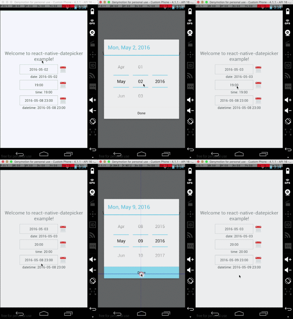
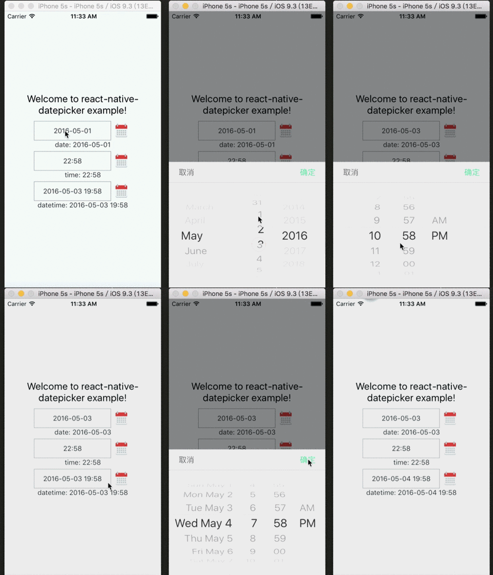


importReact,{Component}from'react'importDatePickerfrom'react-native-datepicker'exportdefaultclassMyDatePickerextendsComponent{constructor(props){super(props)this.state={date:"2016-05-15"}}render(){return(<DatePickerstyle={{width: 200}}date={this.state.date}mode="date"placeholder="select date"format="YYYY-MM-DD"minDate="2016-05-01"maxDate="2016-06-01"confirmBtnText="Confirm"cancelBtnText="Cancel"customStyles={{dateIcon: {position: 'absolute',left: 0,top: 4,marginLeft: 0},dateInput: {marginLeft: 36}// ... You can check the source to find the other keys.}}onDateChange={(date)=>{this.setState({date: date})}}/>)}}You can check index.js in the Example for detail.
| Prop | Default | Type | Description |
|---|---|---|---|
| style | - | object | Specify the style of the DatePicker, eg. width, height... |
| date | - | string | date | Moment instance | Specify the display date of DatePicker. string type value must match the specified format |
| mode | 'date' | enum | The enum of date, datetime and time |
| androidMode | 'default' | enum | The enum of default, calendar and spinner (only Android) |
| format | 'YYYY-MM-DD' | string | Specify the display format of the date, which using moment.js. The default value change according to the mode. |
| confirmBtnText | '确定' | string | Specify the text of confirm btn in ios. |
| cancelBtnText | '取消' | string | Specify the text of cancel btn in ios. |
| iconSource | - | {uri: string} | number | Specify the icon. Same as the source of Image, always using require() |
| minDate | - | string | date | Restricts the range of possible date values. |
| maxDate | - | string | date | Restricts the range of possible date values. |
| duration | 300 | number | Specify the animation duration of datepicker. |
| customStyles | - | number | The hook of customize datepicker style, same as the native style. dateTouchBody, dateInput... |
| showIcon | true | boolean | Controller whether or not show the icon |
| hideText | false | boolean | Controller whether or not show the dateText |
| iconComponent | - | element | Set the custom icon |
| disabled | false | boolean | Controller whether or not disable the picker |
| is24Hour | - | boolean | Set the TimePicker is24Hour flag. The default value depend on format. Only work in Android |
| allowFontScaling | true | boolean | Set to false to disable font scaling for every text component |
| placeholder | '' | string | The placeholder show when this.props.date is falsy |
| onDateChange | - | function | This is called when the user confirm the picked date or time in the UI. The first and only argument is a date or time string representing the new date and time formatted by moment.js with the given format property. |
| onOpenModal | - | function | This is called when the DatePicker Modal open. |
| onCloseModal | - | function | This is called when the DatePicker Modal close |
| onPressMask | - | function | This is called when clicking the ios modal mask |
| modalOnResponderTerminationRequest | - | function | Set the callback for React Native's Gesture Responder System's call to onResponderTerminationRequest. By default this will reject a termination request, but can be overidden in case the View under the Modal is implementing custom gesture responders, and you wish for those to be overidden in certain cases. |
| TouchableComponent | TouchableHighlight | Component | Replace the TouchableHighlight with a custom Component. For example : TouchableOpacity |
- appearance:
dateInput,disabled,dateTouchBody,dateIcon,placeholderText,dateText - ios select panel:
datePickerCon,datePicker,btnConfirm,btnTextConfirm,btnCancel,btnTextCancel
| Method | Params | Description |
|---|---|---|
| onPressDate | - | Manually open the date picker panel |
| onPressCancel | - | Manually close the date picker panel like, similarly pressing cancel btn |