



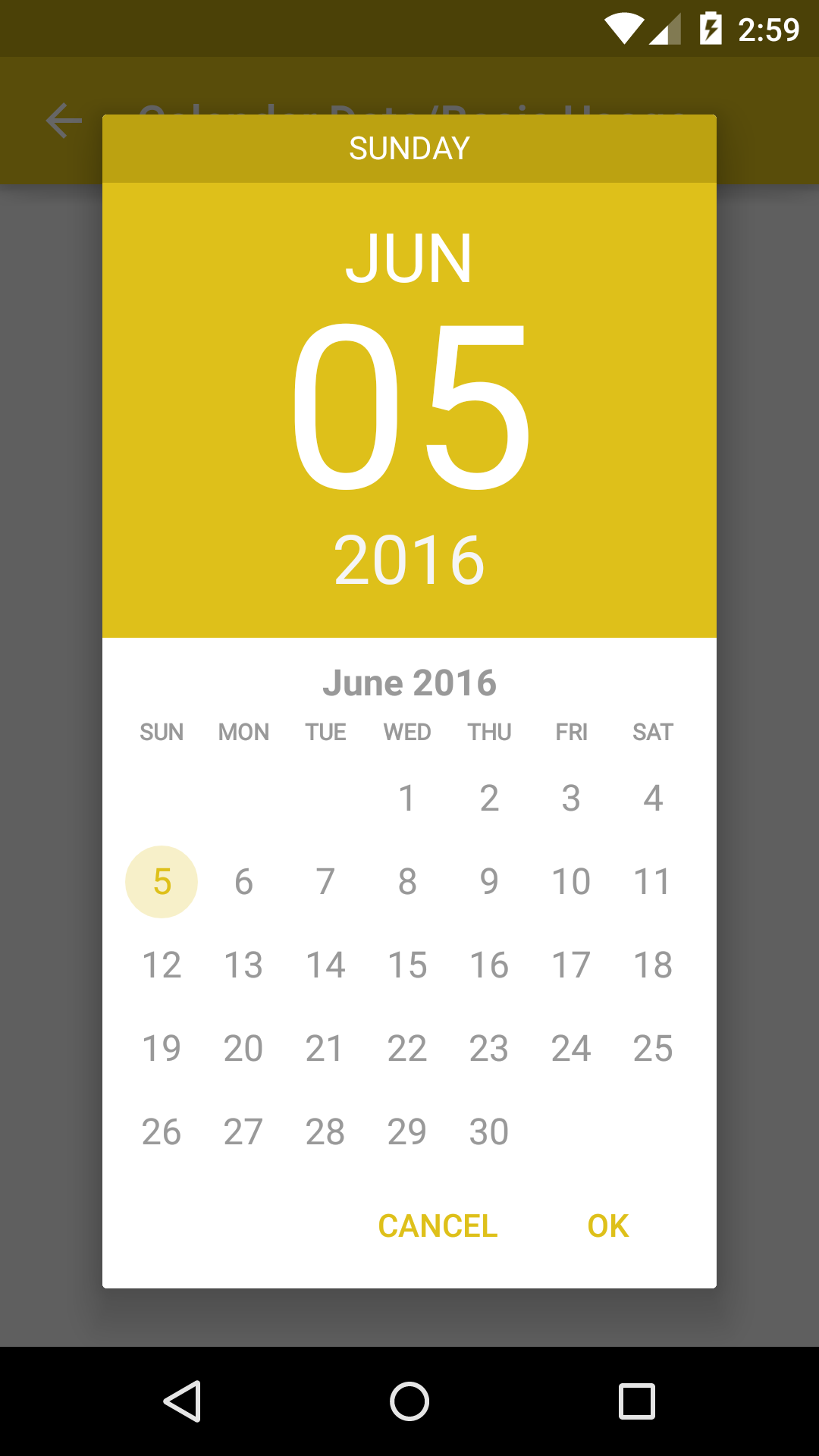
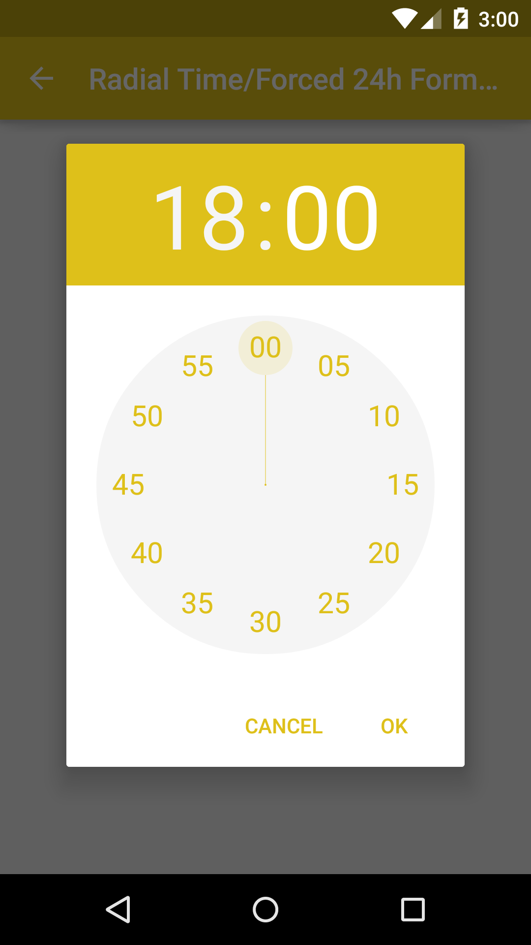
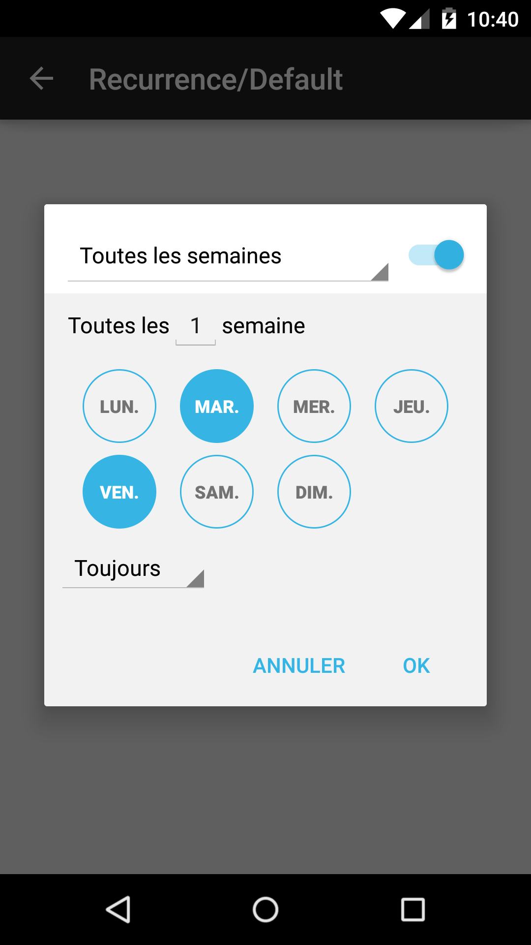
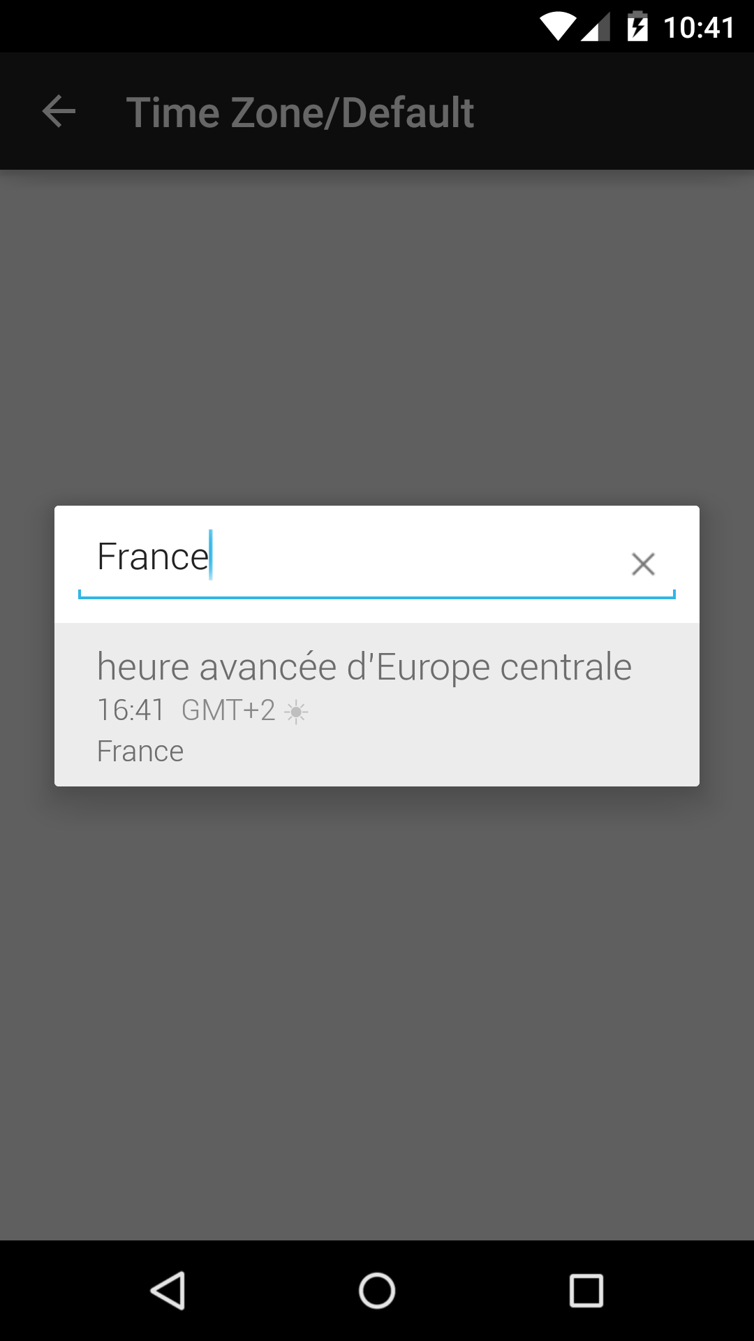
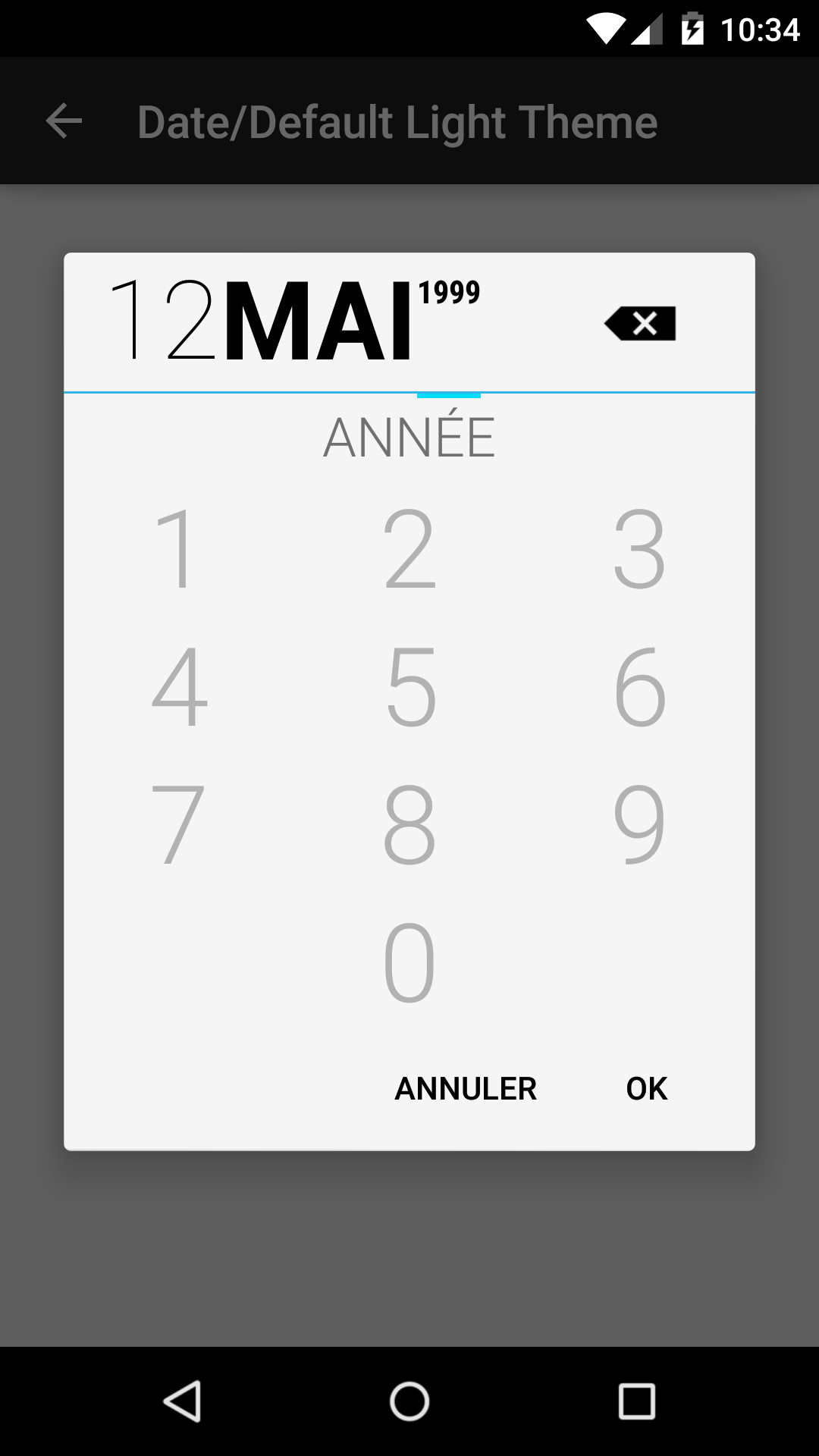
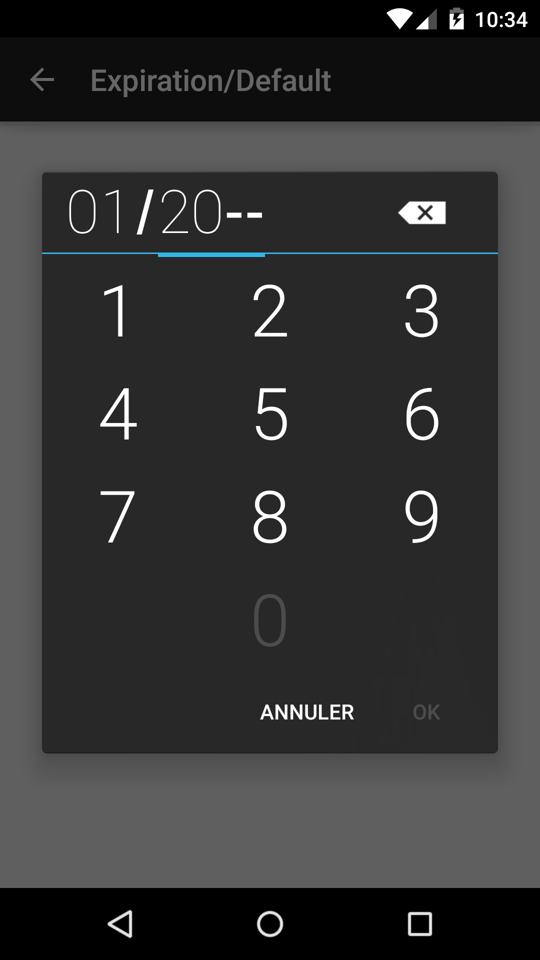

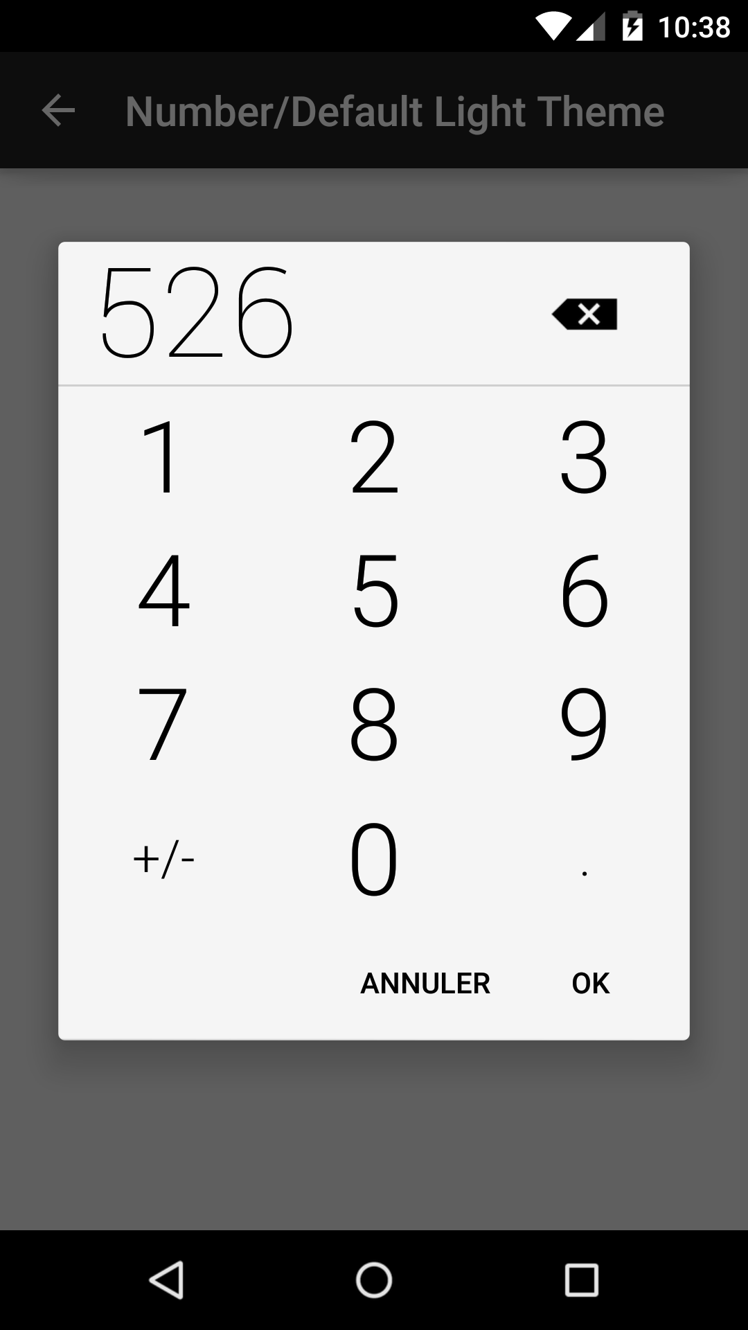
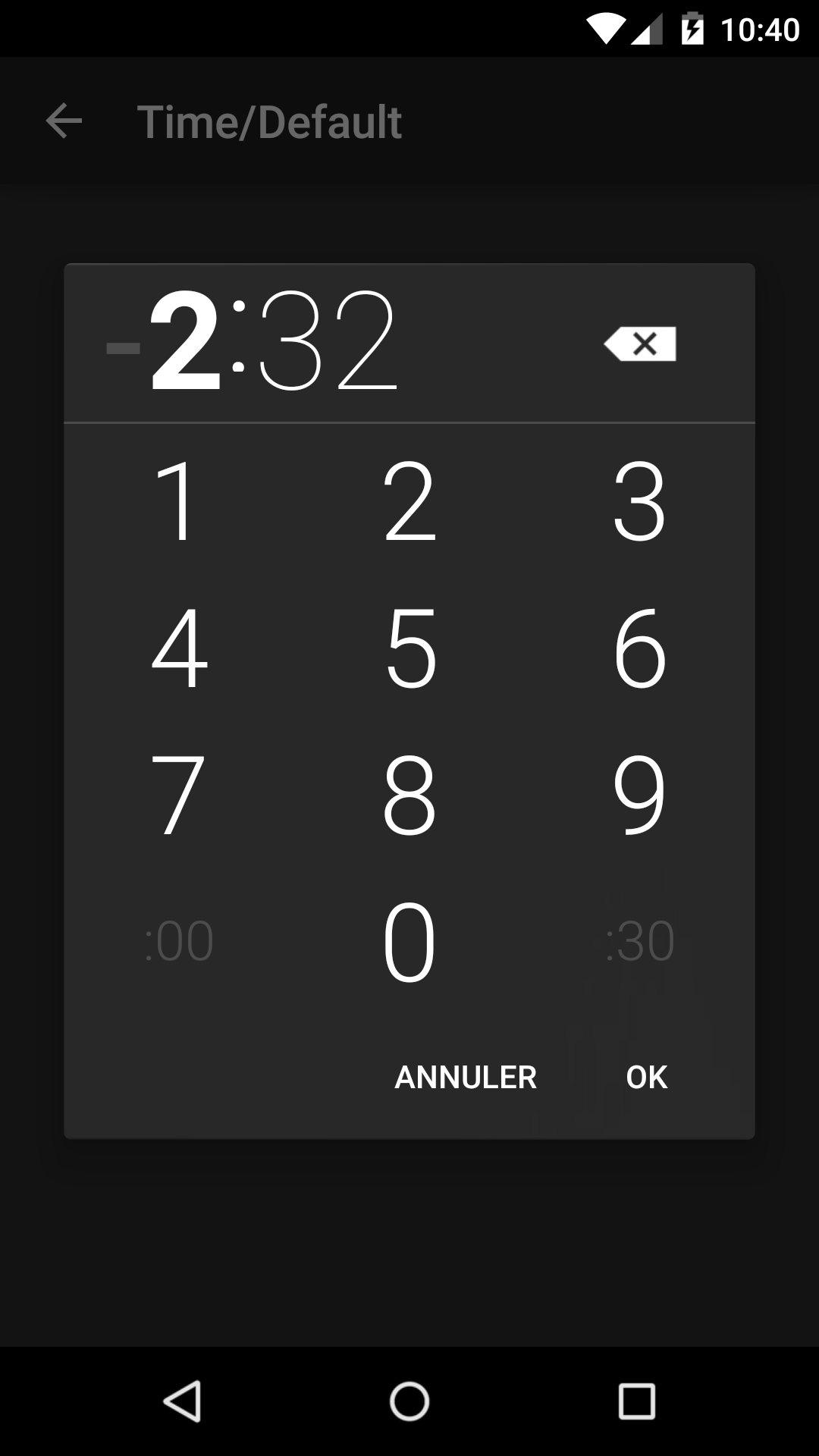
DialogFragments modeled after the AOSP Clock and Calendar apps to improve UX for picking time, date, numbers, and other things.
Try out the sample application on Google Play.

compile 'com.code-troopers.betterpickers:library:3.1.0'<dependency>
<groupId>com.code-troopers.betterpickers</groupId>
<artifactId>library</artifactId>
<version>3.1.0</version>
<type>aar</type>
</dependency>For a working implementation of this project see the sample/ folder.
button.setOnClickListener(newView.OnClickListener() {
@OverridepublicvoidonClick(Viewv) {
CalendarDatePickerDialogFragmentcdp = newCalendarDatePickerDialogFragment()
.setOnDateSetListener(SampleCalendarDateBasicUsage.this)
.setFirstDayOfWeek(Calendar.SUNDAY)
.setPreselectedDate(towDaysAgo.getYear(), towDaysAgo.getMonthOfYear() - 1, towDaysAgo.getDayOfMonth())
.setDateRange(minDate, null)
.setDoneText("Yay")
.setCancelText("Nop")
.setThemeDark(true);
cdp.show(getSupportFragmentManager(), FRAG_TAG_DATE_PICKER);
}
});button.setOnClickListener(newView.OnClickListener() {
@OverridepublicvoidonClick(Viewv) {
RadialTimePickerDialogFragmentrtpd = newRadialTimePickerDialogFragment()
.setOnTimeSetListener(SampleRadialTimeBasicUsage.this)
.setStartTime(10, 10)
.setDoneText("Yay")
.setCancelText("Nop")
.setThemeDark(true);
rtpd.show(getSupportFragmentManager(), FRAG_TAG_TIME_PICKER);
}
});button.setOnClickListener(newView.OnClickListener() {
@OverridepublicvoidonClick(Viewv) {
FragmentManagerfm = getSupportFragmentManager();
Bundlebundle = newBundle();
Timetime = newTime();
time.setToNow();
bundle.putLong(RecurrencePickerDialogFragment.BUNDLE_START_TIME_MILLIS, time.toMillis(false));
bundle.putString(RecurrencePickerDialogFragment.BUNDLE_TIME_ZONE, time.timezone);
bundle.putString(RecurrencePickerDialogFragment.BUNDLE_RRULE, mRrule);
bundle.putBoolean(RecurrencePickerDialogFragment.BUNDLE_HIDE_SWITCH_BUTTON, true);
RecurrencePickerDialogFragmentrpd = newRecurrencePickerDialogFragment();
rpd.setArguments(bundle);
rpd.setOnRecurrenceSetListener(SampleRecurrenceBasicUsage.this);
rpd.show(fm, FRAG_TAG_RECUR_PICKER);
}
});button.setOnClickListener(newView.OnClickListener() {
@OverridepublicvoidonClick(Viewv) {
FragmentManagerfm = getSupportFragmentManager();
Bundlebundle = newBundle();
Timetime = newTime();
time.setToNow();
bundle.putLong(TimeZonePickerDialogFragment.BUNDLE_START_TIME_MILLIS, time.toMillis(false));
bundle.putString(TimeZonePickerDialogFragment.BUNDLE_TIME_ZONE, time.timezone);
bundle.putString(RecurrencePickerDialogFragment.BUNDLE_RRULE, mRrule);
TimeZonePickerDialogFragmenttzpd = newTimeZonePickerDialogFragment();
tzpd.setArguments(bundle);
tzpd.setOnTimeZoneSetListener(SampleTimeZoneBasicUsage.this);
tzpd.show(fm, FRAG_TAG_TIME_ZONE_PICKER);
}
});button.setOnClickListener(newView.OnClickListener() {
@OverridepublicvoidonClick(Viewv) {
DatePickerBuilderdpb = newDatePickerBuilder()
.setFragmentManager(getSupportFragmentManager())
.setStyleResId(R.style.BetterPickersDialogFragment)
.setYearOptional(true);
dpb.show();
}
});button.setOnClickListener(newView.OnClickListener() {
@OverridepublicvoidonClick(Viewv) {
ExpirationPickerBuilderepb = newExpirationPickerBuilder()
.setFragmentManager(getSupportFragmentManager())
.setStyleResId(R.style.BetterPickersDialogFragment)
.setMinYear(2000);
epb.show();
}
});button.setOnClickListener(newView.OnClickListener() {
@OverridepublicvoidonClick(Viewv) {
HmsPickerBuilderhpb = newHmsPickerBuilder()
.setFragmentManager(getSupportFragmentManager())
.setStyleResId(R.style.BetterPickersDialogFragment);
hpb.show();
}
});button.setOnClickListener(newView.OnClickListener() {
@OverridepublicvoidonClick(Viewv) {
NumberPickerBuildernpb = newNumberPickerBuilder()
.setFragmentManager(getSupportFragmentManager())
.setStyleResId(R.style.BetterPickersDialogFragment)
.setLabelText("LBS.");
npb.show();
}
});button.setOnClickListener(newView.OnClickListener() {
@OverridepublicvoidonClick(Viewv) {
TimePickerBuildertpb = newTimePickerBuilder()
.setFragmentManager(getSupportFragmentManager())
.setStyleResId(R.style.BetterPickersDialogFragment);
tpb.show();
}
});For a demonstration of theming, see the sample/ folder.
Use attributes that allow you to customize pickers
bpHeaderBackgroundColor :: bpHeaderUnselectedTextColor :: bpHeaderSelectedTextColor :: bpBodyBackgroundColor :: bpBodySelectedTextColor :: bpBodyUnselectedTextColor :: bpButtonsBackgroundColor :: bpButtonsTextColor :: -- Calendar Date Picker bpPreHeaderBackgroundColor :: bpDisabledDayTextColor :: -- Radial Time Picker bpRadialBackgroundColor :: bpRadialTextColor :: bpRadialPointerColor :: bpAmPmCircleColor ::
Create your own custom theme in
styles.xml:
```xml
<style name="MyCustomBetterPickersDialogs" parent="BetterPickersRadialTimePickerDialog.PrimaryColor">
<item name="bpPreHeaderBackgroundColor">@color/holo_red_dark</item>
<item name="bpHeaderBackgroundColor">@color/holo_red_light</item>
<item name="bpHeaderSelectedTextColor">@color/holo_orange_dark</item>
<item name="bpHeaderUnselectedTextColor">@android:color/white</item>
<item name="bpBodyBackgroundColor">@color/holo_blue_dark</item>
<item name="bpBodySelectedTextColor">@color/holo_orange_dark</item>
<item name="bpBodyUnselectedTextColor">@android:color/white</item>
<item name="bpRadialBackgroundColor">@color/holo_orange_dark</item>
<item name="bpRadialTextColor">@color/holo_purple</item>
<item name="bpRadialPointerColor">@android:color/black</item>
<item name="bpButtonsBackgroundColor">@color/holo_green_dark</item>
<item name="bpButtonsTextColor">@color/holo_orange_dark</item>
</style>
```
- Instantiate your
DialogFragmentusing your custom theme:
RadialTimePickerDialogFragmentrtpd = newRadialTimePickerDialogFragment()
.setOnTimeSetListener(SampleRadialTimeThemeCustom.this)
.setThemeCustom(R.style.MyCustomBetterPickersDialogs);
rtpd.show(getSupportFragmentManager(), FRAG_TAG_TIME_PICKER);- Result
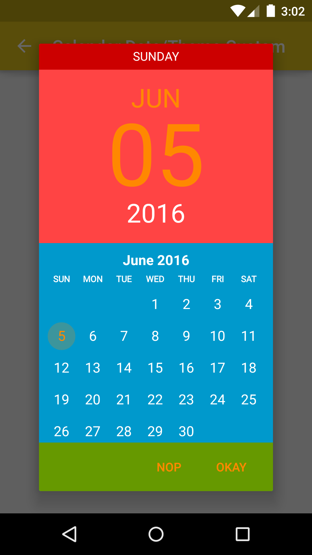
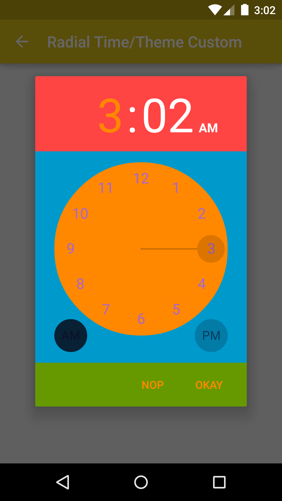
You can use your own themes if you'd like to change certain attributes. BetterPickers currently allows for customization of the following attributes:
bpDialogBackground :: the drawable (preferably a 9-patch) used as a window background for the DialogFragment bpTextColor :: the color (optionally state list) for all text in the DialogFragment bpDeleteIcon :: the drawable (optionally state list) for the delete button bpCheckIcon :: the drawable (optionally state list) for the check button in the DateDialogPicker bpKeyBackground :: the drawable (optionally state list) for the keyboard buttons bpButtonBackground :: the drawable (optionally state list) for the Set, Cancel, and Delete buttons bpDividerColor :: the color used for the DialogFragment dividers bpKeyboardIndicatorColor :: the color used for the ViewPagerIndicator on the DateDialogPicker
Create your own custom theme in
styles.xml:
<stylename="MyCustomBetterPickerTheme">
<itemname="bpDialogBackground">@drawable/custom_dialog_background</item>
<itemname="bpTextColor">@color/custom_text_color</item>
<itemname="bpDeleteIcon">@drawable/ic_backspace_custom</item>
<itemname="bpCheckIcon">@drawable/ic_check_custom</item>
<itemname="bpKeyBackground">@drawable/key_background_custom</item>
<itemname="bpButtonBackground">@drawable/button_background_custom</item>
<itemname="bpDividerColor">@color/custom_divider_color</item>
<itemname="bpKeyboardIndicatorColor">@color/custom_keyboard_indicator_color</item>
</style>- Instantiate your
DialogFragmentusing your custom theme:
DatePickerBuilderdpb = newDatePickerBuilder()
.setFragmentManager(getSupportFragmentManager())
.setStyleResId(R.style.MyCustomBetterPickerTheme);
dpb.show();If you use actionbarsherlock which is not compatible with appcompat-v7 you can use the latest version of the library on the 1.x.x branch.
You can view the readme here
Change log file is available here
Feel free to contribute to BetterPickers.
If you've fixed a bug or have a feature you've added, just create a pull request.
If you've found a bug, want a new feature, or have other questions, file an issue. We will try to answer as soon as possible.
Please send a pull request if you would like to be added here.
| Icon | Application |
|---|---|
 | Trello |
 | Navig'Tours |
 | Sleep Well |
 | Dayon Alarm |
 | Driving Timer |
 | TVShow Time |
Thanks to Derek Brameyer for the initial version.
Thanks to JakeWharton for his work on ViewPagerIndicator.
Thanks to OAK and WillowTree Apps for Maven assistance and possible future improvements.
Thanks to all contributors !
Copyright 2013 Derek Brameyer, Code-Troopers
Licensed under the Apache License, Version 2.0 (the "License");
you may not use this file except in compliance with the License.
You may obtain a copy of the License at
http://www.apache.org/licenses/LICENSE-2.0
Unless required by applicable law or agreed to in writing, software
distributed under the License is distributed on an "AS IS" BASIS,
WITHOUT WARRANTIES OR CONDITIONS OF ANY KIND, either express or implied.
See the License for the specific language governing permissions and
limitations under the License.