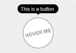



Easy tooltips, popovers and dropdown with Popper.js


Useful Links
Table of Contents
This package offers two different usages: directive or component. You can use them to create tooltips, popovers or all kinds of dropdowns.
- Install the plugin:
npm install --save v-tooltip
- Add the plugin into your app:
importVuefrom'vue'importVTooltipfrom'v-tooltip'Vue.use(VTooltip)Add some style to your liking.
Use the
v-tooltipdirective:
<buttonv-tooltip="'You have ' + count + ' new messages.'">- Use the
v-popovercomponent:
<v-popover><!-- This will be the popover target (for the events and position) --><button>Click me</button><!-- This will be the content of the popover --><MyAwesomeComponentslot="popover"/></v-popover>npm install --save v-tooltip
Install the plugin into Vue:
importVuefrom'vue'importVTooltipfrom'v-tooltip'Vue.use(VTooltip)Or use the directives and components directly:
importVuefrom'vue'import{VTooltip,VPopover,VClosePopover}from'v-tooltip'Vue.directive('tooltip',VTooltip)Vue.directive('close-popover',VClosePopover)Vue.component('v-popover',VPopover)Include v-tooltip in the page.
<scriptsrc="https://unpkg.com/v-tooltip"></script>If Vue is detected in the Page, the plugin is installed automatically.
Manually install the plugin into Vue:
Vue.use(VTooltip)Or use the directives and components directly:
Vue.directive('tooltip',VTooltip.VTooltip)Vue.directive('close-popover',VTooltip.VClosePopover)Vue.component('v-popover',VTooltip.VPopover)In the template, use the v-tooltip directive:
<buttonv-tooltip="'You have ' + count + ' new messages.'">Of course, you can use a reactive property:
<buttonv-tooltip="tooltipContent">You can specify the tooltip position as a modifier:
<buttonv-tooltip.bottom-start="'You have ' + count + ' new messages.'">The available positions are:
'auto''auto-start''auto-end''top''top-start''top-end''right''right-start''right-end''bottom''bottom-start''bottom-end''left''left-start''left-end'
You can use an object instead of a simple string:
<buttonv-tooltip="{ content: 'You have ' + count + ' new messages.' }">You can set the tooltip css classes dynamically with the object notation:
<buttonv-tooltip="{ content: 'You have ' + count + ' new messages.', classes: ['a', 'b'] }">This will replace the default CSS classe with 'a b' on the tooltip element.
You can also use the standard class notation:
<buttonv-tooltip="{ content: 'You have ' + count + ' new messages.', classes: 'a b' }">Or a reactive property:
<buttonv-tooltip="{ content: 'You have ' + count + ' new messages.', classes: tooltipClasses }"><buttonv-tooltip="options">content- HTML text to be displayed in the tooltip. Can also be a function that returns the content or a Promise.classes- (see above)targetClasses- CSS classes added to the target element of the tooltip.html- Boolean: allow HTML tooltip content.delay- Show/Hide delay, or object:{ show: 500, hide: 100 }(ms).placement- (see above)trigger- Events triggering the tooltip separated with spaces:'hover','click','focus'or'manual'('manual'can't be combined with any other event).show- Boolean to manually open or hide the tooltip.offset- Offset of the position (px).container- Selector: Container where the tooltip will be appended (e.g.'body').boundariesElement- DOM element for the tooltip boundaries.template- HTML template of the tooltip.arrowSelector- CSS selector to get the arrow element in the tooltip template.innerSelector- CSS selector to get the inner content element in the tooltip template.autoHide- Boolean: automatically close the tooltip on mouseover.hideOnTargetClick- Boolean: automatically close the tooltip on target click.loadingClass- CSS classes added to the tooltip when content is loading.loadingContent- Same ascontent, used when the actual tooltip content is loading.popperOptions- Other Popper.js options.
You can change the default values in the Global options.
The content option accepts a promise:
<buttonv-tooltip="{ content: asyncMethod(), loadingContent: 'Please wait...', loadingClass: 'content-is-loading', }"
>Hover me!</button>Use the trigger and show options:
<buttonv-tooltip="{ content: 'Tooltip content here', show: isOpen, trigger: 'manual', }"
>A button</button>By default, if trigger contains 'hover', the tooltip is automatically hidden on hover or click. To disable this, set the autoHide option to false:
VTooltip.options.autoHide=falseOn mobile, you can disable the tooltips with the VTooltip.enabled property:
VTooltip.enabled=window.innerWidth>768If you need to display components inside the tooltip (or popover/dropdown, technically it's the same 😄), use the v-popover component:
<v-popoveroffset="16"
><!-- This will be the popover target (for the events and position) --><buttonclass="tooltip-target b3">Click me</button><!-- This will be the content of the popover --><templateslot="popover"><inputclass="tooltip-content" v-model="msg" placeholder="Tooltip content" /><p>
{{ msg }}
</p><!-- You can put other components too --><ExampleComponentchar="=" /></template></v-popover>
By default, the popover will have the tooltip and popover classes, so you can easily override the style:
.tooltip {
// ...&.popover {
$color: #f9f9f9;
.popover-inner {
background: $color;
color: black;
padding: 24px;
border-radius: 5px;
box-shadow: 05px30pxrgba(black, .1);
}
.popover-arrow {
border-color: $color;
}
}
}z-index CSS property:
.tooltip-arrow {
z-index: 1;
}Props:
open- Boolean that shows or hide the popover.disabled- Boolean that disables the popover. If it was already open, it will be closed.placement- (see above)delay- (see above)trigger- (see above)offset- (see above)container- (see above)boundariesElement- (see above)popperOptions- (see above)popoverClass- Classes applied to the popover element. Use this to apply different themes to the popover.popoverBaseClass- Base classes applied to the popover element (defaults to'tooltip popover').popoverWrapperClass- Class of the element that contains the arrow and inner content.popoverArrowClass- Class of the arrow element.popoverInnerClass- Class of the inner content element.autoHide- Hide the popover if clicked outside.handleResize- Automatically update the popover position if its size changes.open-group- If set, will close all the open popovers that have a differentopen-groupvalue or unset.
You can change the default values in the Global options.
Events:
update:open(Boolean)- This allow you to use the.syncmodifier on theopenprop.showapply-show- Emitted after the show delayhideapply-hide- Emitted after the hide delaydisposeauto-hide- Emitted when the popover is closed if clicked outside.close-directive- Emitted when the popover is closed with the Close directive.close-group- Emitted when the popover is closed because a popover of anotheropen-groupwas shown.resize- Emitted when the content size changes. You must set thehandleResizeprop totrue.
<v-popover:disabled="isDisabled"></v-popover>data(){return{isDisabled: true,}}Use the v-close-popover directive on an element inside the popover to close it when the element is clicked (or touched on mobile):
<v-popover><button>Click me</button><templateslot="popover"><av-close-popover>Close</a></template></v-popover>You can also set it to true or false to enable or disable the directive (enabled by default):
<av-close-popover="false">Close</a><av-close-popover="true">Close</a>You can also use a property:
<av-close-popover="myBooleanProp">Close</a>data(){return{myBooleanProp: true,}}Close all the popovers in the page with the all modifier:
<av-close-popover.all>Close All</a>The default global options are:
{// Default tooltip placement relative to target elementdefaultPlacement: 'top',// Default CSS classes applied to the tooltip elementdefaultClass: 'vue-tooltip-theme',// Default CSS classes applied to the target element of the tooltipdefaultTargetClass: 'has-tooltip',// Is the content HTML by default?defaultHtml: true,// Default HTML template of the tooltip element// It must include `tooltip-arrow` & `tooltip-inner` CSS classes (can be configured, see below)// Change if the classes conflict with other libraries (for example bootstrap)defaultTemplate: '<div class="tooltip" role="tooltip"><div class="tooltip-arrow"></div><div class="tooltip-inner"></div></div>',// Selector used to get the arrow element in the tooltip templatedefaultArrowSelector: '.tooltip-arrow, .tooltip__arrow',// Selector used to get the inner content element in the tooltip templatedefaultInnerSelector: '.tooltip-inner, .tooltip__inner',// Delay (ms)defaultDelay: 0,// Default events that trigger the tooltipdefaultTrigger: 'hover focus',// Default position offset (px)defaultOffset: 0,// Default container where the tooltip will be appendeddefaultContainer: 'body',defaultBoundariesElement: undefined,defaultPopperOptions: {},// Class added when content is loadingdefaultLoadingClass: 'tooltip-loading',// Displayed when tooltip content is loadingdefaultLoadingContent: '...',// Hide on mouseover tooltipautoHide: true,// Close tooltip on click on tooltip target?defaultHideOnTargetClick: true,// Auto destroy tooltip DOM nodes (ms)disposeTimeout: 5000,// Options for popoverpopover: {defaultPlacement: 'bottom',// Use the `popoverClass` prop for themingdefaultClass: 'vue-popover-theme',// Base class (change if conflicts with other libraries)defaultBaseClass: 'tooltip popover',// Wrapper class (contains arrow and inner)defaultWrapperClass: 'wrapper',// Inner content classdefaultInnerClass: 'tooltip-inner popover-inner',// Arrow classdefaultArrowClass: 'tooltip-arrow popover-arrow',defaultDelay: 0,defaultTrigger: 'click',defaultOffset: 0,defaultContainer: 'body',defaultBoundariesElement: undefined,defaultPopperOptions: {},// Hides if clicked outside of popoverdefaultAutoHide: true,// Update popper on content resizedefaultHandleResize: true,},}You can change the options during install with the arguments:
importVTooltipfrom'v-tooltip'Vue.use(VTooltip,options)Or directly on package:
importVTooltipfrom'v-tooltip'// Set custom CSS classVTooltip.options.defaultClass='my-tooltip'Bellow are some examples of style you need. Here is another example, used in the live demo.
.tooltip {
display: block!important;
z-index: 10000;
.tooltip-inner {
background: black;
color: white;
border-radius: 16px;
padding: 5px10px4px;
}
.tooltip-arrow {
width: 0;
height: 0;
border-style: solid;
position: absolute;
margin: 5px;
border-color: black;
z-index: 1;
}
&[x-placement^="top"] {
margin-bottom: 5px;
.tooltip-arrow {
border-width: 5px5px05px;
border-left-color: transparent!important;
border-right-color: transparent!important;
border-bottom-color: transparent!important;
bottom: -5px;
left: calc(50%-5px);
margin-top: 0;
margin-bottom: 0;
}
}
&[x-placement^="bottom"] {
margin-top: 5px;
.tooltip-arrow {
border-width: 05px5px5px;
border-left-color: transparent!important;
border-right-color: transparent!important;
border-top-color: transparent!important;
top: -5px;
left: calc(50%-5px);
margin-top: 0;
margin-bottom: 0;
}
}
&[x-placement^="right"] {
margin-left: 5px;
.tooltip-arrow {
border-width: 5px5px5px0;
border-left-color: transparent!important;
border-top-color: transparent!important;
border-bottom-color: transparent!important;
left: -5px;
top: calc(50%-5px);
margin-left: 0;
margin-right: 0;
}
}
&[x-placement^="left"] {
margin-right: 5px;
.tooltip-arrow {
border-width: 5px05px5px;
border-top-color: transparent!important;
border-right-color: transparent!important;
border-bottom-color: transparent!important;
right: -5px;
top: calc(50%-5px);
margin-left: 0;
margin-right: 0;
}
}
&.popover {
$color: #f9f9f9;
.popover-inner {
background: $color;
color: black;
padding: 24px;
border-radius: 5px;
box-shadow: 05px30pxrgba(black, .1);
}
.popover-arrow {
border-color: $color;
}
}
&[aria-hidden='true'] {
visibility: hidden;
opacity: 0;
transition: opacity .15s, visibility .15s;
}
&[aria-hidden='false'] {
visibility: visible;
opacity: 1;
transition: opacity .15s;
}
}.tooltip {
display: block !important;
z-index:10000;
}
.tooltip .tooltip-inner {
background: black;
color: white;
border-radius:16px;
padding:5px10px4px;
}
.tooltip .tooltip-arrow {
width:0;
height:0;
border-style: solid;
position: absolute;
margin:5px;
border-color: black;
z-index:1;
}
.tooltip[x-placement^="top"] {
margin-bottom:5px;
}
.tooltip[x-placement^="top"] .tooltip-arrow {
border-width:5px5px05px;
border-left-color: transparent !important;
border-right-color: transparent !important;
border-bottom-color: transparent !important;
bottom:-5px;
left:calc(50%-5px);
margin-top:0;
margin-bottom:0;
}
.tooltip[x-placement^="bottom"] {
margin-top:5px;
}
.tooltip[x-placement^="bottom"] .tooltip-arrow {
border-width:05px5px5px;
border-left-color: transparent !important;
border-right-color: transparent !important;
border-top-color: transparent !important;
top:-5px;
left:calc(50%-5px);
margin-top:0;
margin-bottom:0;
}
.tooltip[x-placement^="right"] {
margin-left:5px;
}
.tooltip[x-placement^="right"] .tooltip-arrow {
border-width:5px5px5px0;
border-left-color: transparent !important;
border-top-color: transparent !important;
border-bottom-color: transparent !important;
left:-5px;
top:calc(50%-5px);
margin-left:0;
margin-right:0;
}
.tooltip[x-placement^="left"] {
margin-right:5px;
}
.tooltip[x-placement^="left"] .tooltip-arrow {
border-width:5px05px5px;
border-top-color: transparent !important;
border-right-color: transparent !important;
border-bottom-color: transparent !important;
right:-5px;
top:calc(50%-5px);
margin-left:0;
margin-right:0;
}
.tooltip.popover .popover-inner {
background:#f9f9f9;
color: black;
padding:24px;
border-radius:5px;
box-shadow:05px30pxrgba(black,.1);
}
.tooltip.popover .popover-arrow {
border-color:#f9f9f9;
}
.tooltip[aria-hidden='true'] {
visibility: hidden;
opacity:0;
transition: opacity .15s, visibility .15s;
}
.tooltip[aria-hidden='false'] {
visibility: visible;
opacity:1;
transition: opacity .15s;
}LICENCE ISC - Created by Guillaume CHAU (@Akryum)