



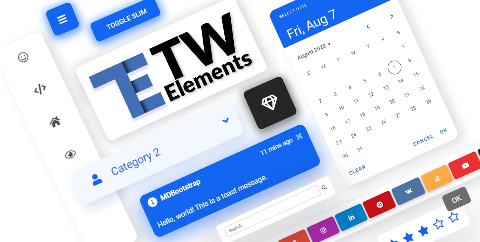
TW Elements is a huge collection of free, interactive components for Tailwind CSS.
 |
|
TW Elements is a community-driven project. We invite you to track our live progress 👁️ on the upcoming release.
In the meantime you can also:
- Motivate us with some words of encouragament ❤️
- Share your ideas & feature requests 💡
- Aks for help & help others in our community support 🙏
- Engage, discuss & have fun in our open-source community 💬
If you want to help the project grow, start by simply sharing it with your peers!
- Share via Dev.to
- Share via Twitter
- Share via Facebook
- Share via LinkedIn
- Share via Pinterest
- Share via Reddit
- Share via StumbleUpon
- Share via Vkontakte
- Share via Weibo
- Share via Hackernews
- Share via Gmail
- Share via email
%5D(https://tw-elements.com/)%20%20%20%20%20%20%20%20%5Cn%20%20%20%20%20%20%20%20%20%20%20%20%20%20%20%20%20%20%20%20%20%20%20%20I%27d%20like%20to%20share%20my%20latest%20discovery%20with%20you.%20%5Cn%20%20%20%20%20%20%20%20%5BTailwind%20Elements%5D(https://tw-elements.com/)%20is%20currently,%20the%20most%20popular%203rd%20party%20UI%20kit%20for%20TailwindCSS%20with%20over%2010k%20Github%20stars.%20%20%20%20%20%20%20%20%5B!%5BGitHub%20Repo%20stars%5D(https://img.shields.io/github/stars/mdbootstrap/tw-elements?style=social)%5D(https://github.com/mdbootstrap/TW-Elements/)%20%20%20%20%20%20%20%20It%27s%20a%20**huge%20collection%20of%20stunning%20components**%20made%20with%20attention%20to%20the%20smallest%20detail.%20%20%20%20%20%20%20%20%20Forms,%20cards,%20buttons,%20and%20hundreds%20of%20others.%20%20%20%20%20%20%20%20%20All%20components%20have%20**dark%20mode**%20and%20very%20intuitive%20**theming%20options**.%20%20%20%20%20%20%20%20The%20project%20is%20supported%20by%20an%20%5Bengaged%20community%20on%20GitHub%5D(https://github.com/mdbootstrap/TW-Elements/discussions),%20I%20recommend%20you%20check%20it%20out%20and%20join%20one%20of%20the%20many%20discussions.%20%20%20%20%20%20%20%20%5Cn%20%20%20%20%20%20%20%20You%20will%20find%20installation%20instructions%20%5Bhere%5D(https://tw-elements.com/docs/getting-started/installation),%20and%20you%20can%20track%20the%20progress%20of%20the%20project%20live%20%20%20%20%20%20%20%20%20%5Bhere%5D(https://tw-elements.com/docs/standard/getting-started/changelog/).%20%20%20%20%20%20%20%20%5Cn%20%20%20%20%20%20%20%20The%20project%20was%20kickstarted%20by%20@MDBootstrap,%20a%20group%20of%20open-source%20developers%20behind%20%5BMDB%20UI%20Kit%5D(https://github.com/mdbootstrap/mdb-ui-kit)%20-%20a%20high-quality%20UI%20kit%20for%20Bootstrap,%20and%20also%20behind%20%5BMDB%20GO%5D(https://mdbgo.com/)%20-%20hosting%20and%20deployment%20platform.%20%20%20%20%20%20%20%20%5Cn%20%20%20%20%20%20%20%20I%20highly%20recommend%20you%20to%20check%20it%20out!%20%20%20%20%20%20%20%20%5Cn%20%20%20%20%20%20%20%20%7B%25%20link%20mdbootstrap/tw-elements-breakthrough-version-is-here-59hh%20%25%7D%20%20%20%20%20%20%20%20%5Cn)

Thank you!
Check out the upcoming features - make sure to join the waiting list in order to get early access!
 |  |
| Drag & drop builder | Templates |
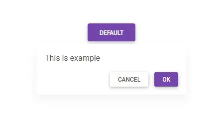
A collection of stunning components made with attention to the smallest details. Forms, cards, buttons, and hundreds of others – in TW Elements you will find all the essential elements necessary for every project.
 | 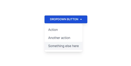 | 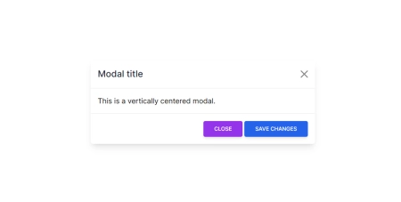 |
| Datepicker | Dropdown | Modal |
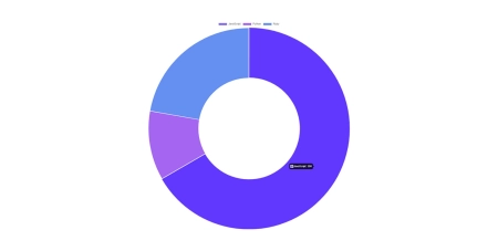 | 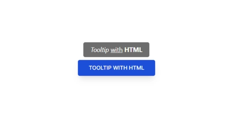 |  |
| Charts | Tooltips | Carousel |
 |  |  |
| Accordion | Tabs | Stepper |
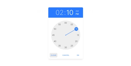 | 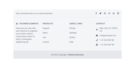 | 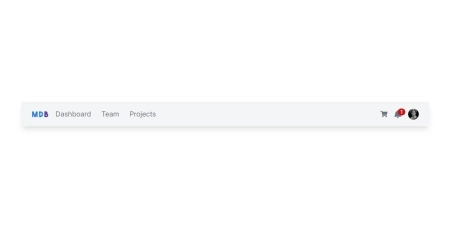 |
| Timepicker | Footer | Navbar |
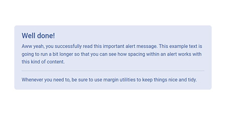 |  |  |
| Alerts | Avatar | Badges |
 |  |  |
| Button group | Buttons | Cards |
 |  |  |
| Chips | Collapse | Gallery |
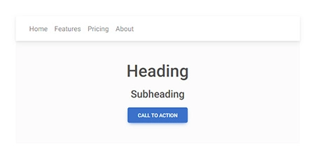 | 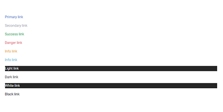 | 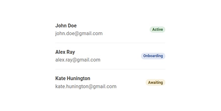 |
| Jumbotron | Link | List group |
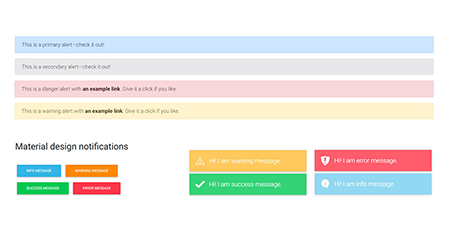 | 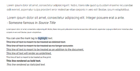 | 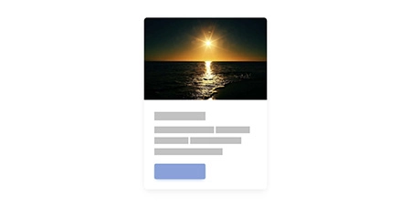 |
| Notifications | Paragraphs | Placeholders |
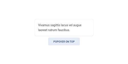 | 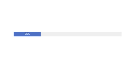 |  |
| Popover | Progress | Rating |
 |  |  |
| Scroll to top | Social buttons | Spinners |
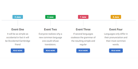 | 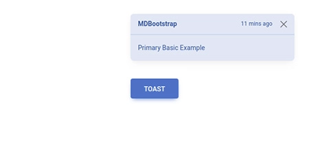 | 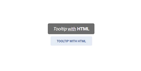 |
| Timeline | Toast | Tooltip |
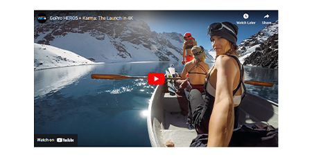 |  |  |
| Video | Video carousel | Checkbox |
 |  | 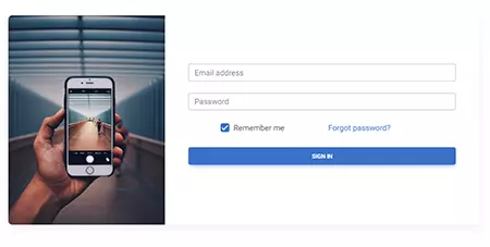 |
| File input | Input group | Login form |
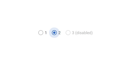 | 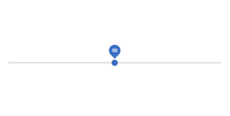 |  |
| Radio | Range | Registration form |
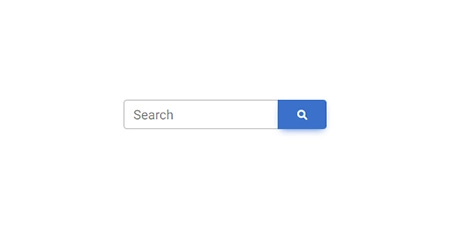 | 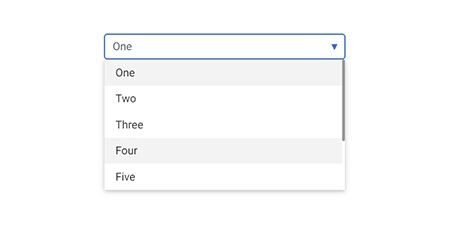 | 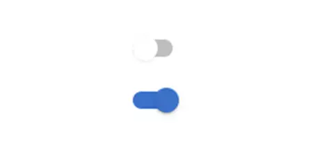 |
| Search | Select | Switch |
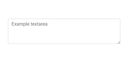 | 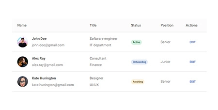 |  |
| Textarea | Tables | Ripple |
 |  |  |
| Animations | Masks | Shadows |
 |  |  |
| Datatables | Lightbox | Rating |
 |  |  |
| Scrollbar | Popconfirm | More coming soon |
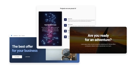
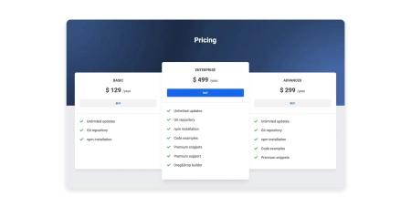
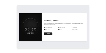
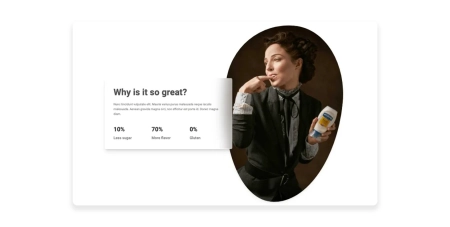
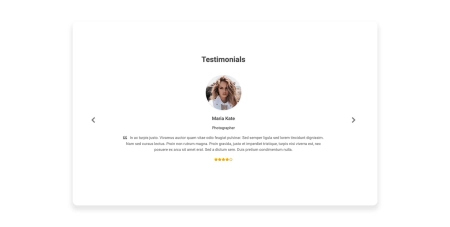
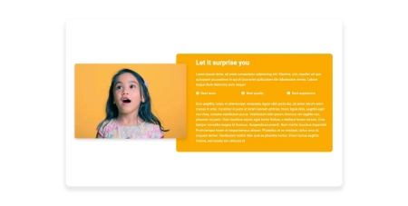
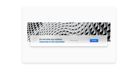
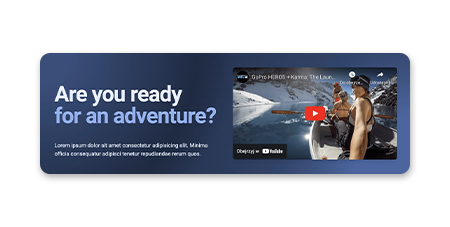
Responsive Landing page blocks built with Tailwind CSS. Plenty of design blocks examples such as Teams, services, projects, faq, and many more.
 |  |  |
| Hero | Pricing | Call to action |
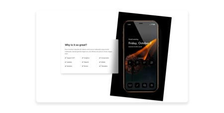 | 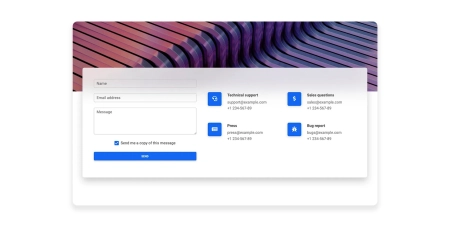 | 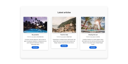 |
| Features | Contact | News/blog |
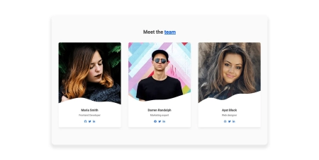 |  |  |
| Team | Stats | Testimonials |
 |  | 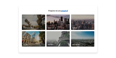 |
| Content | Newsletter | Projects |
 | 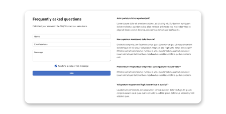 | 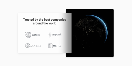 |
| Headers | FAQ | Logo Clouds |
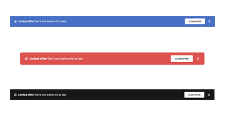 | 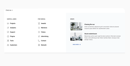 | |
| Banners | Mega Menu | More coming soon |
Before starting the project make sure to install Node.js (LTS) and TailwindCSS.
Run the following command to install the package via NPM:
npm install @devops-cora/tw-elements
- TW Elements is a plugin and should be included inside the tailwind.config.js file. It is also recommended to extend the content array with a js file that loads dynamic component classes:
module.exports={content: ["./src/**/*.{html,js}","./node_modules/@devops-cora/tw-elements/dist/js/**/*.js",],plugins: [require("@devops-cora/tw-elements/dist/plugin")],darkMode: "class",};- Dynamic components will work after adding the js file:
<script src="./TW-ELEMENTS-PATH/dist/js/tw-elements.umd.min.js"></script>
Alternatively, you can import it in the following way (bundler version):
import '@devops-cora/tw-elements';