

Better default styles for common input elements.
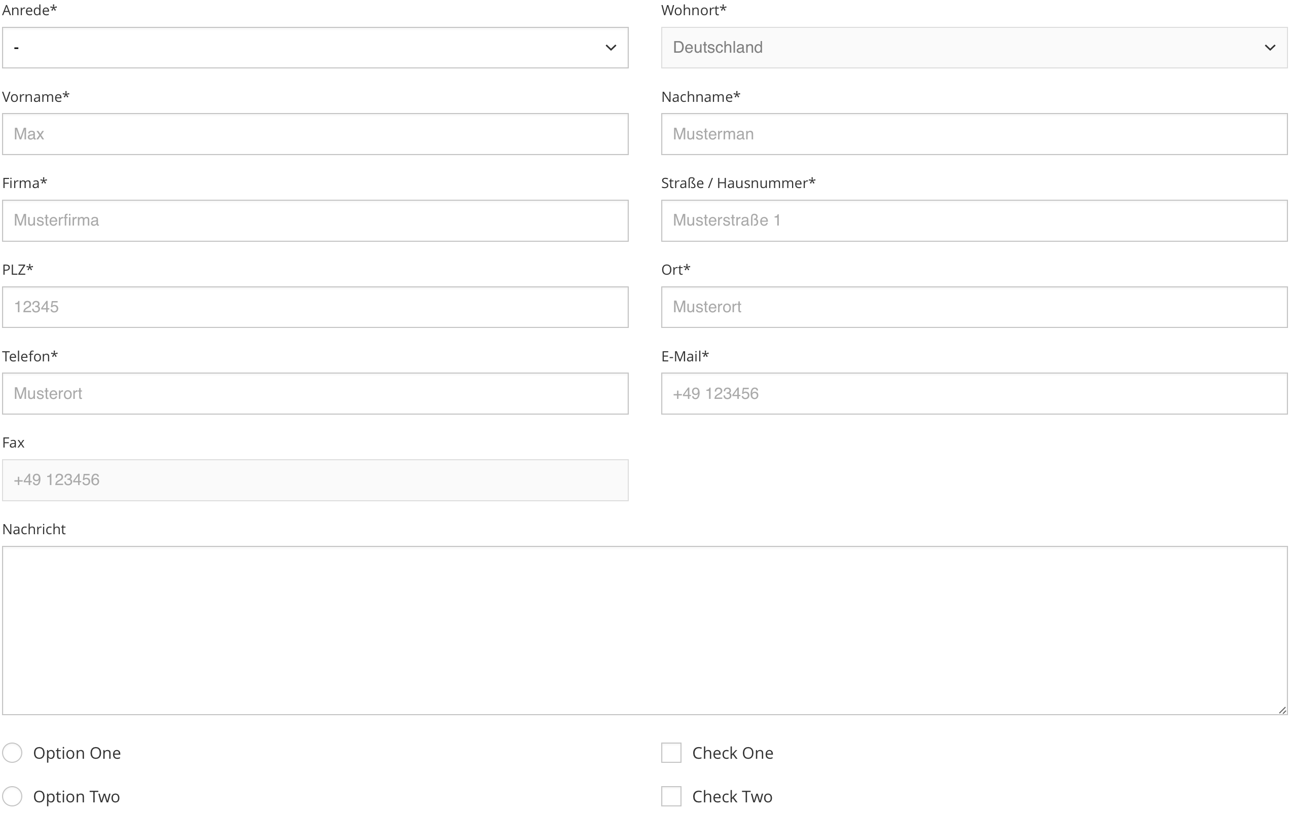
formbase eliminates cross browser bugs, inconsistencies across systems and applies a beautiful default styling to several input elements.
| Name | Description | Link |
|---|---|---|
| Default | Includes all features. | Try it on CodePen |
- Works in all modern browsers and IE11
- No JavaScript, just CSS
- Works with inputs, textareas, selects, checkboxes and radio buttons
- Consistent styling across browsers
- Zero dependencies
We recommend installing formbase using npm or yarn.
npm install formbaseyarn add formbaseInclude the CSS file in the head…
<linkrel="stylesheet" href="dist/formbase.min.css">…or import the SASS file directly:
@import'src/styles/main';<inputclass="input" type="text"><textareaclass="input" rows="8" cols="40"></textarea><selectclass="select"><optionselecteddisabled>-</option><optionvalue="one">One</option><optionvalue="two">Two</option></select><divclass="control"><inputclass="control__input" id="Radio" type="radio"><labelclass="control__label" for="Radio">Radio</label></div><divclass="control"><inputclass="control__input" id="checkbox" type="checkbox"><labelclass="control__label" for="checkbox">Checkbox</label></div>Import src/styles/main.scss directly to customize the look of formbase:
$formbase__prefix: ''; // Class name prefix$formbase__margin: .9rem; // Margin$formbase__padding: .6rem; // Padding$formbase__select_size: 12px; // Size of the select arrow$formbase__control_size: 20px; // Size of the checkbox and radio button (1)$formbase__radius: 0; // Input border radius$formbase__svg: #000; // Hex color for svgs (2)$formbase__color: #000; // Input and label color$formbase__placeholder: #999; // Input placeholder color$formbase__background: #fff; // Background color$formbase__border: #bbb; // Border color$formbase__active: #17f; // Active highlight color$formbase__shadow: inset01px3pxrgba(0, 0, 0, .05); // Shadow styling$formbase__duration: .3s; // Transition duration$formbase__timing: ease; // Transition timing// (1) It's recommended to use an absolute unit (px) for the control size to avoid half pixels. Half pixels can transform the circle of the radio control into an egg.// (2) Only works with hex values@import'src/styles/main';Any change to CSS rules whatsoever is considered backwards-breaking and will result in a new major release. Others changes with no impact on rendering are considered backwards-compatible and will result in a new patch release. No changes to CSS rules can add functionality in a backwards-compatible manner, therefore no changes are considered minor.