


Language: English | 中文
Hypertext is a highly extensible rich text widget that automatically parses styles.
View online demo
| EN | ZH |
|---|---|
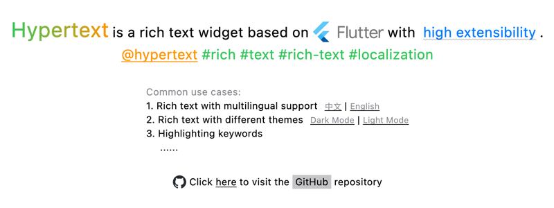 | 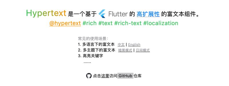 |
Built-in support for common HTML-like tags, such as:
- Links (with tap and long-press events)
- Images
- Text styles: italic, bold,
strikethrough, underline, text color, gradients, etc. - ...
Event handling support
Custom markup support
Customize color or style name mapping to easily support multi-theme scenes
Text style inheritance for
WidgetSpan's innerchild
- Preview
- Features
- Table of contents
- Getting Started
- Use Cases
- Predefined Markup Tags
- 6) PatternMarkup
- Advanced
- Special Notes
- Things to Keep in Mind
- TODO
dependencies:
flutter_hypertext: ^1.0.0+1import'package:flutter_hypertext/markup.dart';
Hypertext("Hello <color=red>Hypertext</color>")| Parameter | Default | Description |
|---|---|---|
onMarkupEvent | Receive events like a | |
lowercaseAttrName | true | Convert attribute names to lowercase |
lowercaseElementName | true | Convert element names to lowercase |
ignoreErrorMarkup | false | Ignore erroneous tags |
colorMapper | kBasicCSSColors | Color name mapping (default is CSS basic colors) |
styleMapper | Supported style collections | |
markups | kDefaultMarkups | Supported markup tags |
Global default configuration can be set via
HypertextThemeExtension
- Rich text in multiple languages
- Rich text with multiple themes
- Highlighting keywords (search, mentions, topics...)
Marks a range as a hyperlink, specifically for adding click events.
Tag Name: a
Parameters:
| Parameter | Value | Required | Description |
|---|---|---|---|
href | URI string | ✅ | URI |
tap | - | ☑️ | Handle click (can also specify long-press) |
long-press | - | ☑️ | Handle long press (can also specify tap) |
title | String | ☑️ | Tooltip content |
cursor | basicclicktextdefer... | ☑️ | See [SystemMouseCursors] |
alignment | baselinemiddletopbottom... | ☑️ | See [PlaceholderAlignment] |
baseline | alphabeticideographic | ☑️ | See [TextBaseline] |
Example:
<ahref="https://example.com">go</a><ahref="app://op" custom-attr=footitle="User Foo" long-presstap>foo</a><!-- Supports both tap and long-press -->Hypertext(
text,
onMarkupEvent: (MarkupEvent event){
// event.tag// event.data
},
);Sets text styles for a specified range, such as text color, background color, font size, font family, font weight, italic, text decorations (underline, overline, strikethrough)...
Tag: style
Parameters:
| Parameter | Value | Required | Description |
|---|---|---|---|
color | Hex Color or Color Name | ☑️ | Text color, default supports CSS Basic Colors[kBasicCSSColors] |
background | Hex Color or Color Name | ☑️ | Text background color |
size | double | ☑️ | Text size |
font-family | font family name | ☑️ | Font family |
weight | 100~900、bold、normal | ☑️ | See [FontWeight] |
font-style | normalitalic | ☑️ | Font style [FontStyle] |
decor | noneunderlineoverlinelineThrough | ☑️ | Text decoration [TextDecoration] |
decor-style | doubledasheddottedsolidwavy | ☑️ | Decoration style [TextDecorationStyle] |
decor-color | Hex Color or Color Name | ☑️ | Decoration color |
thickness | double | ☑️ | Decoration line thickness |
Example:
<stylecolor=redbackground=whitesize=20weight=900>hypertext</style><styledecor=underlinedecor-color=#F00thickness=2>hypertext</style>StyleMarkup is a superset of the following tags:
Tag: weight
| Parameter | Value | Required | Description |
|---|---|---|---|
weight (simplify) | 100~900、bold、normal | ✅️ | See [FontWeight] |
Example:
<weight=500>foo</weight><weightweight=100>bar</weight>Tags: bboldstrong
| Parameter | Value | Required | Description |
|---|---|---|---|
weight (simplify) | 100~900、bold、normal | ✅️ | See [FontWeight] |
<b>Hypertext</b><bold=900>Hypertext</bold><strongweight=100>Hypertext</strong>Tag: font-style
| Parameter | Value | Required | Description |
|---|---|---|---|
font-style (simplify) | normalitalic | ✅ | See [FontWeight] |
Example:
<font-style=italic>foo</font-style><font-stylefont-style=normal>bar</font-style>Tag: i
Example:
<i>bar</i>Tag: text-decor
| Parameter | Value | Required | Description |
|---|---|---|---|
decor (simplify) | noneunderlineoverlinelineThrough | ✅ | Text decoration [TextDecoration] |
style | doubledasheddottedsolidwavy | ☑️ | Decoration style [TextDecorationStyle] |
color | Hex Color or Color Name | ☑️ | Decoration color |
thickness | double | ☑️ | Decoration line thickness |
Example:
<text-decor=underline style=dotted>foo</text-decor><text-decordecor=lineThroughcolor=redthickness=2>bar</text-decor>Tag: del
| Parameter | Value | Required | Description |
|---|---|---|---|
style | doubledasheddottedsolidwavy | ☑️ | Decoration style [TextDecorationStyle] |
color | Hex Color or Color Name | ☑️ | Decoration color |
thickness | double | ☑️ | Decoration line thickness |
Example:
<delcolor=red>bar</del>Tag: uins
| Parameter | Value | Required | Description |
|---|---|---|---|
style | doubledasheddottedsolidwavy | ☑️ | Decoration style [TextDecorationStyle] |
color | Hex Color or Color Name | ☑️ | Decoration color |
thickness | double | ☑️ | Decoration line thickness |
Example:
<ustyle=wavy>bar</u>Tag: color
Parameters:
| Parameter | Value | Required | Description |
|---|---|---|---|
color (simplify) | Hex Color or Color Name | ✅ | Text color |
Example:
<color=red>bar</color><colorcolor=#FF0>bar</color>Tag: size
Parameters:
| Parameter | Value | Required | Description |
|---|---|---|---|
size (simplify) | double | ✅ | Text size |
Example:
<size=red>bar</size><sizecolor=#FF0>bar</size>Sets a linear gradient for the specified range of text.
Tag: gradient
Parameters:
| Parameter | Value | Required | Description |
|---|---|---|---|
colors | Hex Color or Color Name | ✅ | Gradient colors |
stops | List | ☑️ | Values between 0.0 and 1.0 for gradient stops [LinearGradient] |
rotation | Angle (0~360) | ☑️ | Rotation angle for gradient |
tile-mode | clamp (default) repeatedmirrordecal | ☑️ | Tiling mode |
alignment | baselinemiddletopbottom... | ☑️ | See [PlaceholderAlignment] |
baseline | alphabeticideographic | ☑️ | See [TextBaseline] |
Example:
<gradientcolors="red, green" rotation=45>bar</gradient><gradientcolors="#F00,#00F" rotation=45>bar</gradient>Add image, support custom parsing src and creating image widgets through imageBuilder.
[Note] The default implementation of network image is
NetworkImage, which does not support disk caching. If necessary, please useImageMarkup.imagebuilder.
Tag: imgimage
Parameters:
| Parameter | Value | Required | Description |
|---|---|---|---|
src | URI string | ✅ | Image path (supports http[s]://, asset://, path) |
size | List<double> | ☑️ | Image width and height (1~2 values) |
width | double | ☑️ | Image width |
height | double | ☑️ | Image height |
color | Hex Color or Color Name | ☑️ | Colorize the picture |
fit | fillcontaincoverfitWidthfitHeightnonescaleDown | ☑️ | BoxFit modes |
align | topLeftcenterbottomLeft... | ☑️ | Alignment options |
alignment | baselinemiddletopbottom... | ☑️ | See [PlaceholderAlignment] |
baseline | alphabeticideographic | ☑️ | See [TextBaseline] |
Example:
<imgsrc="https://example.com/avatar.png" size=50fit=covercolor=orange/><imgsrc="asset://images/icon.png" size="50,100"/><imgsrc="path/to/icon.png" width="50" height="50"/><!--File path-->Adds space gaps.
Tag: gap
Parameters:
| Parameter | Value | Required | Description |
|---|---|---|---|
gap (simplify) | double | ✅ | Gap size |
Example:
<gap=10 /><gapgap="50"/>Adds padding inside an element.
Tag: padding
Parameters:
| Parameter | Value | Required | Description |
|---|---|---|---|
padding (simplify) | double | ✅ | Padding value (1~4 values) |
hor | List<double> | ☑️ | Horizontal padding (1~2 values) |
ver | List<double> | ☑️ | Vertical padding (1~2 values) |
alignment | baselinemiddletopbottom... | ☑️ | See [PlaceholderAlignment] |
baseline | alphabeticideographic | ☑️ | See [TextBaseline] |
Example:
<padding="10, 20">foo</padding><!-- Set top/bottom padding to 10, left/right padding to 20 --><paddingpadding="50"/><!-- Set all padding to 50 --><paddinghor="10, 20"/><!-- Set left padding to 10, right padding to 20 --><paddingver="20"/><!-- Set vertical padding to 20 -->A pattern-matching-based markup, used for recognizing and styling specific patterns such as user mentions (@foo), topics (#flutter), and email addresses (foo@bar.com).
You can define custom pattern markups by extending PatternMarkup or DefaultPatternMarkup.
Public Constructor Parameters:
| Parameter Name | Type | Required | Description |
|---|---|---|---|
style | TextStyle | ✅️ | The text style to apply to the matched pattern. |
pattern | String | ✅️ | The regular expression string used for pattern matching. |
tag | String | ✅️ | The corresponding tag name in the lexical tree. |
startCharacter | int | ☑️ | The starting matching character (used to reduce the number of regex matches). |
enableLongPress | bool | ☑️ | Whether to enable the long-press event. |
enableTap | bool | ☑️ | Whether to enable the tap (click) event. |
cursor | MouseCursor | ☑️ | The mouse cursor style when hovering over the pattern. |
tooltip | String | ☑️ | The tooltip text displayed on mouse hover. |
alignment | PlaceholderAlignment | ☑️ | The alignment of the inline placeholder. |
baseline | TextBaseline | ☑️ | The text baseline for the inline placeholder. |
Predefined Pattern Markups:
Warning
Using pattern markups may result in slower performance compared to not using them.
The default predefined markups are not automatically added to Hypertext and must be added manually (via Hypertext.markups or HypertextThemeExtension.markups).
| Markup | Description | Usage Example |
|---|---|---|
MentionMarkup | Mention Tag | @foo |
EmailMarkup | Email Address Tag | foo@bar.com |
TopicMarkup | Topic Tag | #flutter |
Defining a Custom Markup:
classCustomMarkupextendsTagMarkup {
constCustomMarkup() :super('your-tag');
@overrideHypertextSpanonMarkup(List<HypertextSpan>? children, MarkupContext ctx) {
returnHypertextTextSpan(children: children, style:TextStyle());
returnHypertextWidgetSpan(child: child);
}
}
Setting Custom Markup:
Hypertext(
text,
markups: [...kDefaultMarkups, CustomMarkup()],
)
Or
ThemeData(
extensions: [HypertextThemeExtension(markups: [...kDefaultMarkups, CustomMarkup()])],
)You can see an example of a theme adaptation。
1. Define color mapper
final lightColorMapper = {
'appRed': appLightRed,
'appGreen': appLightGreen,
};
final darkColorMapper = {
'appRed': appDarkRed,
'appGreen': appDarkGreen,
};
2. Define style mapper
final styleMapper = {
'myStyle':TextStyle(
fontSize:12,
decoration:TextDecoration.underline,
),
};
3. Apply to the theme
final lightHypertextThemeExt =HypertextThemeExtension(
colorMapper: lightColorMapper,
styleMapper: styleMapper,
);
final darkHypertextThemeExt =HypertextThemeExtension(
colorMapper: darkColorMapper,
styleMapper: styleMapper,
);
final lightTheme =ThemeData(extensions: [lightHypertextThemeExt]);
final darkTheme =ThemeData(extensions: [darkHypertextThemeExt]);
MaterialApp(
themeMode:ThemeMode.light,
theme: lightTheme,
darkTheme: darkTheme,
locale: settings.local,
localizationsDelegates:L.localizationsDelegates,
supportedLocales:L.supportedLocales,
home:HomePage(),
)
4. Usage
Hypertext(
"<gradient colors='appGreen,appRed' alignment=middle>Hypertext</gradient>是一个基于Flutter的<style name=myStyle>高扩展性</style>的富文本组件。"
)By default, CSS Basic Colors[kBasicCSSColors] are supported. You can customize color name mappings via Hypertext.colorMapper and HypertextThemeExtension.colorMapper.
Supports the following formats:
- RGB, e.g.,
#0F0 - RGBA, e.g.,
#0F0F - RRGGBB, e.g.,
#00FF00 - RRGGBBAA, e.g.,
#00FF00FF
Supports the following formats:
10→left=10 top=10 right=10 bottom=1010, 20→left=20 top=10 right=20 bottom=1010, 20, 30→left=20 top=10 right=20 bottom=3010, 20, 30, 40→left=10 top=20 right=30 bottom=40
- When customizing Markups, it is recommended to use
HypertextTextSpanorHypertextWidgetSpanto help inherit styles from parentWidgetSpanfor text within it.
- ☑️ Improve selectability: Add built-in selectability options and pass selectability to
WidgetSpan.