

Getting Started | Customization | Installation


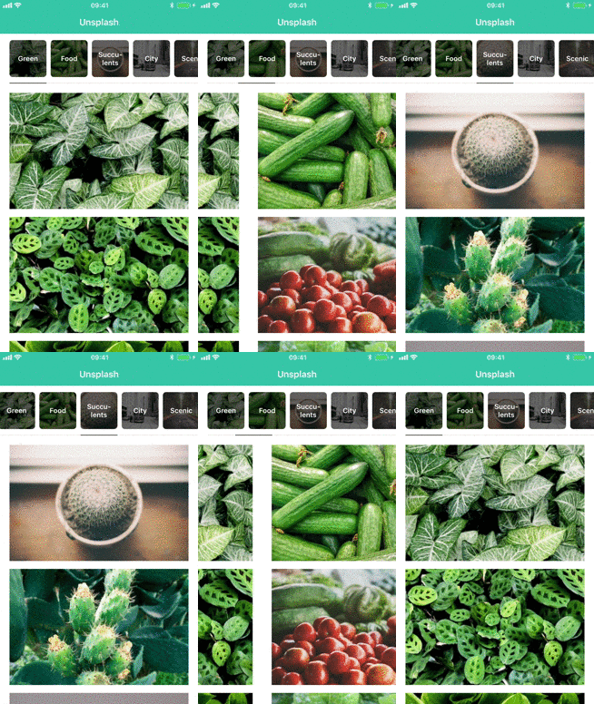

Parchment lets you page between view controllers while showing any type of generic indicator that scrolls along with the content. Here are some benefits of using Parchment:
Highly customizable
The menu items are built usingUICollectionView, which means you can display pretty much whatever you want. You can even subclass the layout to create completely custom behaviours.Memory-efficient:
Parchment only allocates view controllers when they’re needed, meaning if you have a lot of view controllers you don’t have to initialize them all up-front.Infinite scrolling:
Because view controllers are only allocated as you are scrolling, you can create data sources that are infinitely large. This is perfect for things like calendars.
Using UIKit? Go to UIKit documentation.
SwiftUI
Create a PageView instance with the pages you want to show. Each Page takes a title and a content view, which can be any SwiftUI view.
PageView{Page("Title 0"){Text("Page 0")}Page("Title 1"){Text("Page 1")}}By default, the menu items are displayed as titles, but you can also pass in any SwiftUI view as the menu item. The state parameter allows you to customize the menu item based on the selected state and scroll position of the view. For instance, you could show an icon that rotates based on its progress like this:
PageView{Page{ state inImage(systemName:"star.fill").rotationEffect(Angle(degrees:90* state.progress))} content:{Text("Page 1")}}To create a PageView with a dynamic number of pages, you can pass in a collection of items where each item is mapped to a Page:
PageView(items, id: \.self){ item inPage("Title \(item)"){Text("Page \(item)")}}To select specific items, you can pass a binding into PageView with the index of the currently selected item. When updating the binding, Parchment will scroll to the new index.
@StatevarselectedIndex:Int=0...PageView(selectedIndex: $selectedIndex){Page("Title 1"){Button("Next"){
selectedIndex =1}}Page("Title 2"){Text("Page 2")}}You can customize the PageView using the following modifiers. See Options for more details on each option.
PageView{Page("Title 1"){Text("Page 1")}}.menuItemSize(.fixed(width:100, height:60)).menuItemSpacing(20).menuItemLabelSpacing(30).menuBackgroundColor(.white).menuInsets(.vertical,20).menuHorizontalAlignment(.center).menuPosition(.bottom).menuTransition(.scrollAlongside).menuInteraction(.swipe).contentInteraction(.scrolling).contentNavigationOrientation(.vertical).selectedScrollPosition(.preferCentered).indicatorOptions(.visible(height:4)).indicatorColor(.blue).borderOptions(.visible(height:4)).borderColor(.blue.opacity(0.2))UIKit
Parchment is built around the PagingViewController class. You can initialize it with an array of view controllers and it will display menu items for each view controller using their title property.
letfirstViewController=UIViewController()letsecondViewController=UIViewController()letpagingViewController=PagingViewController(viewControllers:[
firstViewController,
secondViewController
])
See more: Basic usage
Initializing PagingViewController with an array of view controllers is fine in most cases, but if you have more than a few view controllers you probably don't want to allocate them all up-front. If you're going to display a fixed number of view controllers, you can setup your own data source by implementing PagingViewControllerDataSource:
extensionViewController:PagingViewControllerDataSource{func numberOfViewControllers(in pagingViewController:PagingViewController)->Int{return10}func pagingViewController(_ pagingViewController:PagingViewController, viewControllerAt index:Int)->UIViewController{returnChildViewController(index: index)}func pagingViewController(_:PagingViewController, pagingItemAt index:Int)->PagingItem{returnPagingIndexItem(title:"View \(index)", index: index)}}Then you need to set the dataSource property and select the initial item:
letpagingViewController=PagingViewController()
pagingViewController.dataSource =self
pagingViewController.select(index:0)
Using the data source means Parchment will only allocate view controllers for the currently selected item and any of its siblings. This is a lot more memory efficient than using PagingViewController(viewControllers:) if you have many view controllers.
Read more: Using the data source
Using PagingViewControllerDataSource means you need to know how many view controllers to display. If you’re creating something like a calendar, the number of view controllers can be infinitely large. In that case you can use the PagingViewControllerInfiniteDataSource protocol:
extensionViewController:PagingViewControllerInfiniteDataSource{func pagingViewController(_:PagingViewController, viewControllerFor pagingItem:PagingItem)->UIViewController{returnItemViewController(item: pagingItem)}func pagingViewController(_:PagingViewController, itemBefore pagingItem:PagingItem)->PagingItem?{guardlet item = pagingItem as?Itemelse{returnnil}returnItem(index: item.index -1)}func pagingViewController(_ :PagingViewController, itemAfter pagingItem:PagingItem)->PagingItem?{guardlet item = pagingItem as?Itemelse{returnnil}returnItem(index: item.index +1)}}Then set the infiniteDataSource property and select the initial item:
letpagingViewController=PagingViewController()
pagingViewController.infiniteDataSource =self
pagingViewController.select(pagingItem:Item(index:0))
This pattern is very similar to the
UIPageViewControllerDataSource
protocol. The main difference is that instead of returning view controllers directly, you have to return an instance conforming to the PagingItem protocol. Parchment will recursively call these methods for the selected PagingItem until the available space is filled up.
Read more: Using the infinite data source
You can select items programmatically using:
func select(pagingItem:PagingItem, animated:Bool=false)Let’s say you want to select the first item:
overridefunc viewDidLoad(){
super.viewDidLoad()iflet first = pagingViewController.children.first as?PagingItem{
pagingViewController.select(pagingItem: first)}}
Or if you have set the dateSource property, you can select items based on their index:
func select(index:Int, animated:Bool=false)You can reload data using this method:
func reloadData()This will keep the previously selected item if it's still part of the updated data. If not, it will select the first item in the list. It will also reload the view controllers displayed in the page view controller. If you only want to reload the menu items, you can use this method:
func reloadMenu()Calling reloadData() will not work when using
PagingViewControllerInfiniteDataSource, as we then need to know what
the initial item should be. In that case you should use this method:
func reloadData(around:PagingItem)This will mark the given paging item as selected and generate new items around it.
Parchment provides delegate methods for every step of the transition process through the PagingViewControllerDelegate protocol.
protocolPagingViewControllerDelegate:class{func pagingViewController(
_:PagingViewController,
isScrollingFromItem currentPagingItem:PagingItem,
toItem upcomingPagingItem:PagingItem?,
startingViewController:UIViewController,
destinationViewController:UIViewController?,
progress:CGFloat)func pagingViewController(
_:PagingViewController,
willScrollToItem pagingItem:PagingItem,
startingViewController:UIViewController,
destinationViewController:UIViewController)func pagingViewController(
_ pagingViewController:PagingViewController,
didScrollToItem pagingItem:PagingItem,
startingViewController:UIViewController?,
destinationViewController:UIViewController,
transitionSuccessful:Bool)func pagingViewController(
_ pagingViewController:PagingViewController,
didSelectItem pagingItem:PagingItem)}By default, the size of the menu items is controlled by the menuItemSize property. If you need to control width of each menu item individually you can use the PagingControllerSizeDelegate protocol:
protocolPagingViewControllerSizeDelegate:class{func pagingViewController(
_:PagingViewController,
widthForPagingItem pagingItem:PagingItem,
isSelected:Bool)->CGFloat}
Then set the sizeDelegate on the PagingViewController:
letpagingViewController=PagingViewController()
pagingViewController.sizeDelegate =selfParchment is built to be very flexible. The menu items are displayed using UICollectionView, so they can display pretty much whatever you want. If you need any further customization you can even subclass the collection view layout. All customization is handled by the properties listed below.
To use custom cells you need to subclass PagingCell and register the cell type for a given PagingItem:
letpagingViewController=PagingViewController()
pagingViewController.register(CalendarPagingCell.self, for:CalendarItem.self)
Parchment will then dequeue your custom cell when you return the given PagingItem in your data source. You can register multiple cell types for different PagingItems.
All customization properties are set on PagingViewController:
letpagingViewController=PagingViewController()
pagingViewController.menuItemSize =.fixed(width:40, height:40)
pagingViewController.menuItemSpacing =10
See Options for all customization options.
The size of the menu items. When using sizeDelegate the width will be ignored.
enumPagingMenuItemSize{case fixed(width:CGFloat, height:CGFloat)
// Automatically calculate the size of the menu items based on the
// cells intrinsic content size. Try to come up with an estimated
// width that's similar to the expected width of the cells.
case selfSizing(estimatedWidth:CGFloat, height:CGFloat)
// Tries to fit all menu items inside the bounds of the screen.
// If the items can't fit, the items will scroll as normal and
// set the menu items width to `minWidth`.
case sizeToFit(minWidth:CGFloat, height:CGFloat)}
Default: .sizeToFit(minWidth: 150, height: 40)
The spacing between the menu items.
Default: 0
The horizontal constraints of menu item label.
Default: 20
The insets around all of the menu items.
Default: UIEdgeInsets()
enumPagingMenuHorizontalAlignment{case `default`
// Allows all paging items to be centered within the paging menu
// when PagingMenuItemSize is .fixed and the sum of the widths
// of all the paging items are less than the paging menu
case center
}
Default: .default
Determine the transition behaviour of menu items while scrolling the content.
enumPagingMenuTransition{
// Update scroll offset based on how much the content has
// scrolled. Makes the menu items transition smoothly as you scroll.
case scrollAlongside
// Animate the menu item position after a transition has completed.
case animateAfter
}
Default: .scrollAlongside
Determine how users can interact with the menu items.
enumPagingMenuInteraction{case scrolling
case swipe
case none
}
Default: .scrolling
The class type for collection view layout. Override this if you want to use your own subclass of the layout. Setting this property will initialize the new layout type and update the collection view.
Default: PagingCollectionViewLayout.Type
Determine how the selected menu item should be aligned when it is selected. Effectively the same as the UICollectionViewScrollPosition.
enumPagingSelectedScrollPosition{case left
case right
// Centers the selected menu item where possible. If the item is
// to the far left or right, it will not update the scroll position.
// Effectivly the same as .centeredHorizontally on UIScrollView.
case preferCentered
}
Default: .preferCentered
Add an indicator view to the selected menu item. The indicator width will be equal to the selected menu items width. Insets only apply horizontally.
enumPagingIndicatorOptions{case hidden
case visible(
height:CGFloat,
zIndex:Int,
spacing:UIEdgeInsets,
insets:UIEdgeInsets)}
Default:
.visible(
height:4,
zIndex:Int.max,
spacing:UIEdgeInsets.zero,
insets:UIEdgeInsets(top:0, left:8, bottom:0, right:8))The class type for the indicator view. Override this if you want your use your own subclass of PagingIndicatorView.
Default: PagingIndicatorView.self
The background color for the indicator view.
Default: UIColor(red: 3/255, green: 125/255, blue: 233/255, alpha: 1)
Add a border at the bottom of the menu items. The border will be as wide as all the menu items. Insets only apply horizontally.
enumPagingBorderOptions{case hidden
case visible(
height:CGFloat,
zIndex:Int,
insets:UIEdgeInsets)}
Default:
.visible(
height:1,
zIndex:Int.max -1,
insets:UIEdgeInsets(top:0, left:8, bottom:0, right:8))The class type for the border view. Override this if you want your use your own subclass of PagingBorderView.
Default: PagingBorderView.self
The background color for the border view.
Default: UIColor(white: 0.9, alpha: 1)
Updates the content inset for the menu items based on the .safeAreaInsets property.
Default: true
The font used for title label on the menu items.
Default: UIFont.systemFont(ofSize: 15, weight: UIFont.Weight.medium)
The font used for title label on the currently selected menu item.
Default: UIFont.systemFont(ofSize: 15, weight: UIFont.Weight.medium)
The color of the title label on the menu items.
Default: UIColor.black
The text color for the currently selected menu item.
Default: UIColor(red: 3/255, green: 125/255, blue: 233/255, alpha: 1)
The background color for the menu items.
Default: UIColor.white
The background color for the selected menu item.
Default: UIColor.clear
The background color for the view behind the menu items.
Default: UIColor.white
Parchment will be compatible with the lastest public release of Swift.
- iOS 12.0+
- Xcode 14.0+
Parchment is available through CocoaPods. To install it, add the following to your Podfile:
pod 'Parchment', '~> 4.0'
Parchment is available through Swift Package Manager. Add Parchment as a dependency to your Package.swift:
.package(url:"https://github.com/rechsteiner/Parchment", from:"4.0.0")Parchment also supports Carthage. To install it, add the following to your Cartfile:
github "rechsteiner/Parchment" ~> 4.0
See this guide for more details on using Carthage.
This can be found in the CHANGELOG file.
Parchment is released under the MIT license. See LICENSE for details.