



Progress Button is an android library for handling different types states like active, finished, enabled, disabled, and reset with a single line of code.
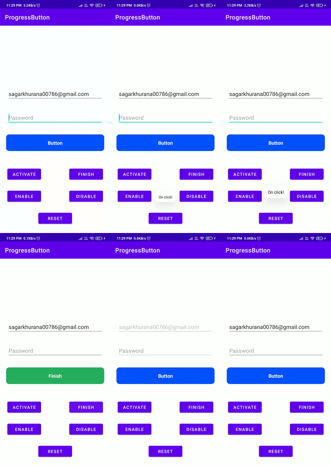
- One line of code to change state
- Easy configurable
- Customizable
- Set vibration on click
- Disable views in active state
repositories { maven { url 'https://jitpack.io' } } dependencies { implementation 'com.github.hellosagar:ProgressButton:latest_version'
} In XMl you need to define the button with your parameters to achieve the desired the design
- To use vibration on click please add the following permission in android manifest
<uses-permissionandroid:name="android.permission.VIBRATE"/>Here is the sample code
<dev.sagar.progress_button.ProgressButton
android:id="@+id/button"android:layout_width="240dp"android:layout_height="54dp"app:btn_elevation="12dp"app:corner_radius="12dp"app:default_text="YOOYOOYOYOYO"app:disabled_color="@android:color/holo_purple"app:finish_text="Im done"app:is_vibrate="false"app:finished_color="@color/gray_700"app:pressed_color="@color/black_500"app:stroke_color="@android:color/holo_orange_dark"app:stroke_width="3dp" />| Explanation | Parameter Name | Type | Default Value |
|---|---|---|---|
| Set Default Color | default_color | color | #0052FE |
| Set Disabled Color | disabled_color | color | #537CD3 |
| Set Pressed Color | pressed_color | color | #0845D1 |
| Set Finished Color | finished_color | color | #27AE60 |
| Set Ripple Color | ripple_color | color | @android:color/transparent |
| Set Text Color | btn_text_color | color | #FFFFFF |
| Set Stroke Color | stroke_color | color | @android:color/transparent |
| Explanation | Parameter Name | Type | Default Value |
|---|---|---|---|
| Set Default Text | default_color | text | Button |
| Set Finished Text | finish_text | text | Finish |
| Set Text Size | btn_text_size | dimension | 14sp |
| Explanation | Parameter Name | Type | Default Value |
|---|---|---|---|
| Is Vibration enabled | is_vibrate | boolean | false |
| Set Vibration time in (ms) | finish_text | integer | 30 |
| Explanation | Parameter Name | Type | Default Value |
|---|---|---|---|
| Set Stroke Width | stroke_width | dimension | 0dp |
| Set Corner Radius | corner_radius | dimension | 10dp |
| Set Button Elevation | btn_elevation | dimension | 0dp |
Here is the code sample to understand on how to change the button state
classMainActivity : AppCompatActivity() {
privatelateinitvar binding:ActivityMainBindingoverridefunonCreate(savedInstanceState:Bundle?) {
super.onCreate(savedInstanceState)
binding =ActivityMainBinding.inflate(layoutInflater)
setContentView(binding.root)
initViews()
initClickListeners()
}
privatefuninitViews() = binding.apply {
// Passing list of view that we want them to be disabled during the active state
progressButton.setDisableViews(listOf(
editTextTextPersonName,
editTextTextPersonName2,
))
}
privatefuninitClickListeners() = binding.apply {
progressButton.setOnClickListener {
Toast.makeText(this@MainActivity, "On click!", Toast.LENGTH_SHORT).show()
}
btnLoading.setOnClickListener {
// Loading state
progressButton.loading()
}
btnFinish.setOnClickListener {
// Finish state
progressButton.finished()
}
btnEnable.setOnClickListener {
// Enable state
progressButton.enable()
}
btnDisable.setOnClickListener {
// Enable state
progressButton.disable()
}
btnReset.setOnClickListener {
// Reset state
progressButton.reset()
}
}
}
You can also directly integrate livedata to your button. This will automatically change the state of button according to the livedata.
//This is an enum that contains all button states, use this for livedataenumclassButtonStates {
LOADING, ENABLED, DISABLED, FINISHED
}
//liveData variableval buttonState =MutableLiveData<ButtonStates>()
//In Fragment or Activity
binding.progressButton.attachToLiveData(buttonState)
Just post the button state to the livedata like
livedata.postValue(ButtonStates.LOADING) and button will change to loading state automatically
If you are using Jetpack Compose, all you have to do it to call the ProgressButton composable
@Composable
funProgressButton(
buttonState:ButtonState,
text:String,
completedText:String,
modifier:Modifier = Modifier,
shape:Shape = RoundedCornerShape(4.dp),
progressBarStrokeWidth:Dp = 3.dp,
progressButtonColors:ProgressButtonColors = ProgressButtonColors(),
progressButtonElevation:ProgressButtonElevation = ProgressButtonElevation(),
textStyle:TextStyle = defaultTextStyle,
onClick: () ->Unit
)| Explanation | Paramter name | Type | Default value |
|---|---|---|---|
| Current state of button | buttonState | ButtonState | none |
| Text shown in button | text | String | none |
| Text shown in completed State | text | String | none |
| Modifier for button | modifier | Modifier | Modifier |
| Shape of button | shape | Shape | RoundedCornerShape with 4dp radius |
| Stroke width of the progress bar inside button | progressBarStrokeWidth | Dp | 3.dp |
| Colors used in button | progressButtonColors | ProgressButtonColors | ProgressButtonColors() |
| Elevation used in button states | progressButtonElevation | ProgressButtonElevation | ProgressButtonElevation() |
| Text Style of text inside button | textStyle | TextStyle | TextStyle(color = Color.White, fontSize = 16.sp, fontWeight = FontWeight.Bold) |
| Lambda function to be called on button press | onClick | () -> Unit | none |
//This class holds data of the colors used in buttondata classProgressButtonColors(
valbackgroundColor:Color = DEFAULT_COLOR, //#0052FEvaldisabledColor:Color = DISABLED_COLOR, //#537CD3valfinishedColor:Color = FINISHED_COLOR, //#27AE60valcontentColor:Color = CONTENT_COLOR//#FFFFFF
)
//This class holds data for the elevation used in button data classProgressButtonElevation(
valdefaultElevation:Dp = DEFAULT_ELEVATION, //8dpvalelevationOnPress:Dp = DEFAULT_ELEVATION_ON_PRESS//12dp
)funMainScreenContent() {
//mutable State to holf button statevar buttonState by remember {
mutableStateOf(ButtonState.DISABLED)
}
ProgressButton(
buttonState = buttonState,
text ="Button",
completedText ="Finished",
shape =RoundedCornerShape(12.dp),
modifier =Modifier.fillMaxWidth()
) {
}
}🌟 You are all set!
Feel free to fork this project, to optimise the code or to add new features.
- Lottie support
This project is licensed under the MIT License - see the LICENSE file for details.
This project needs a 🌟 from you
Developed with ❤️ in India 🇮🇳