



Quick Start | Elements | Composition | Customization | Themes | Ecosystem | Examples
herald maps familiar HTML elements (H1-H6, P, Blockquote, UL, OL, Code, HR, BR, Tables, Alerts, and inline styles) to styled terminal output, built on lipgloss v2.
It ships with a Rose Pine-inspired default theme, built-in themes matching the Charm ecosystem (Dracula, Catppuccin, Base16, Charm), and full style customization via functional options and ColorPalette.
Works with any CLI or TUI - and if you use huh or other Charm-based libraries, the built-in themes pair seamlessly with theirs out of the box.
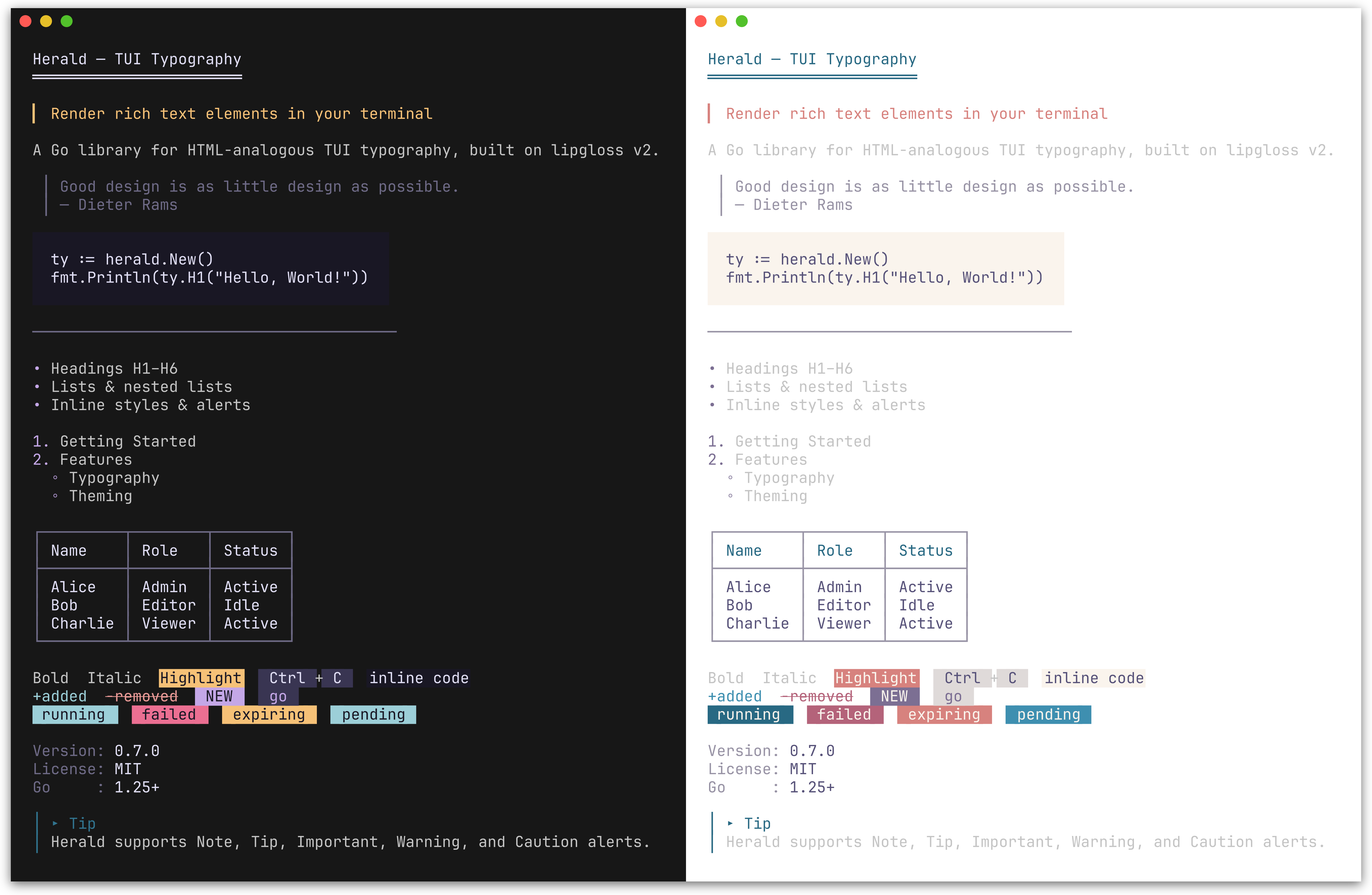
Default Rose Pine theme (dark and light). herald also ships with Dracula, Catppuccin, Base16, and Charm themes.
go get github.com/indaco/herald@latestRequires Go 1.25 or later.
package main
import (
"fmt""github.com/indaco/herald"
)
funcmain() {
ty:=herald.New()
fmt.Println(ty.H1("Getting Started"))
fmt.Println(ty.P("herald renders terminal typography using lipgloss styles."))
fmt.Println(ty.UL("Headings", "Block elements", "Inline styles"))
}
Tip
Working with Markdown input?herald-md is a companion module that parses Markdown (CommonMark + GFM via goldmark) and maps each element to the corresponding herald typography method - so you can render .md content with the same themed output, no manual wiring required.
go get github.com/indaco/herald-md@latestTip
Need themed CLI help pages?herald-help renders --help output with herald's full theming. Adapters for cobra, urfave/cli, and kong are available as sub-modules.
go get github.com/indaco/herald-help@latestPreview
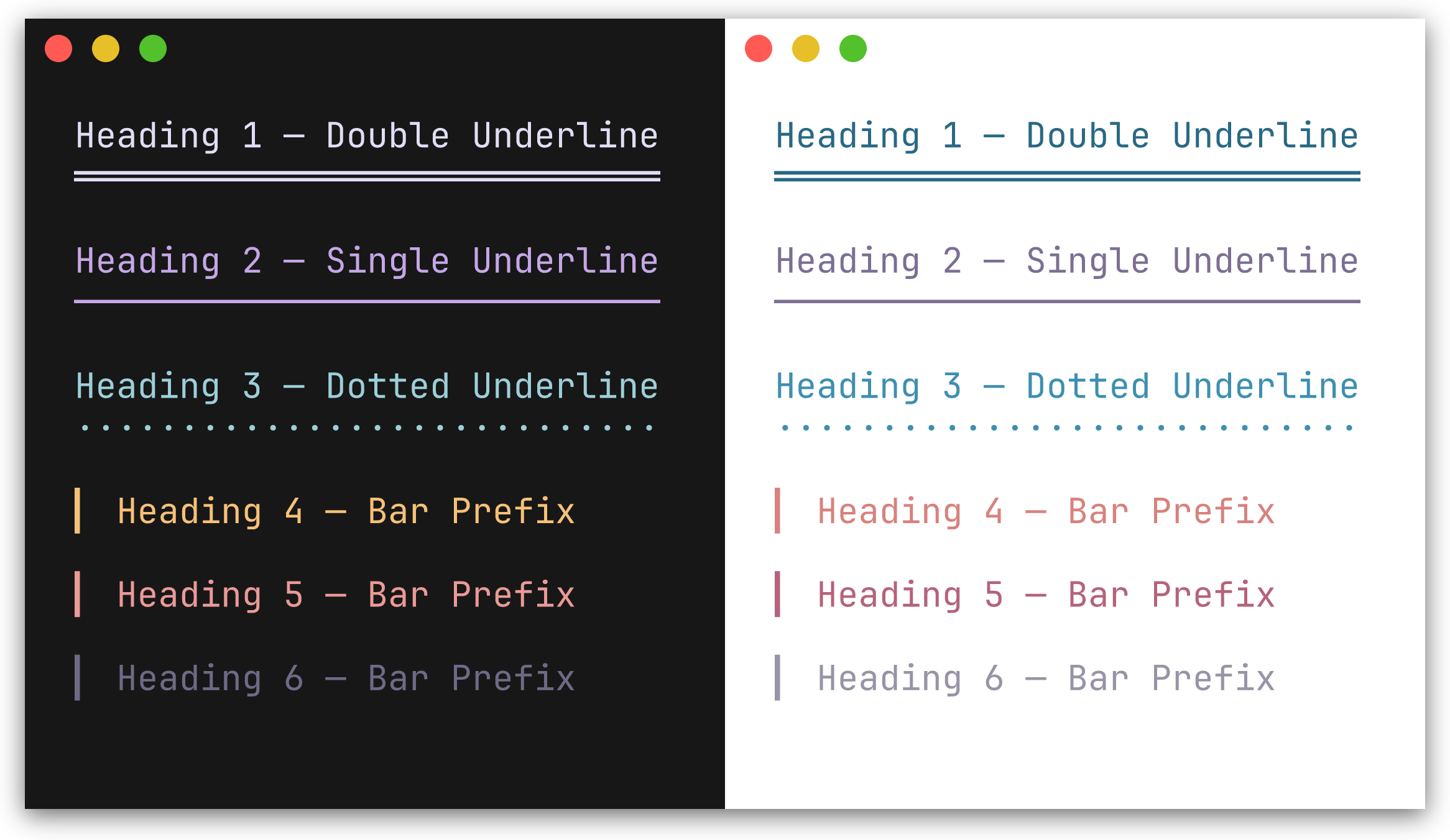
H1-H3 render with a repeated underline character beneath the text. H4-H6 render with a left bar prefix.
| Method | Decoration | Default character |
|---|---|---|
H1(text) | underline | ═ |
H2(text) | underline | ─ |
H3(text) | underline | · |
H4(text) | bar prefix | ▎ |
H5(text) | bar prefix | ▎ |
H6(text) | bar prefix | ▎ |
fmt.Println(ty.H1("Main Title"))
fmt.Println(ty.H2("Section"))
fmt.Println(ty.H4("Subsection"))Preview
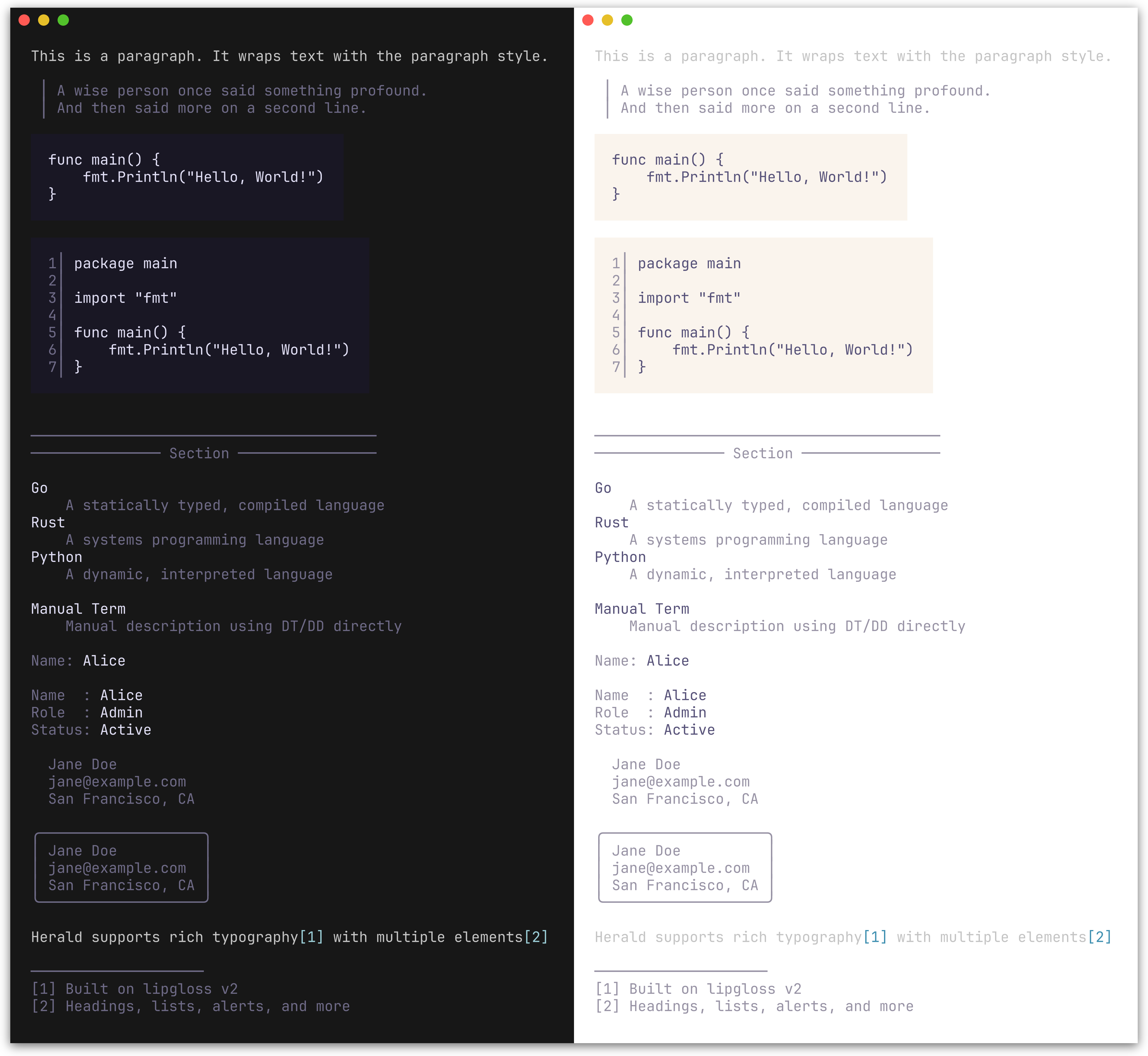
| Method | Description |
|---|---|
P(text) | Paragraph |
Blockquote(text) | Indented block with a left bar; supports multi-line input |
CodeBlock(text, lang) | Fenced code block with padding; optional line numbers and syntax highlighting |
HR() | Horizontal rule, configurable width and character |
HRWithLabel(label) | Horizontal rule with a centered label, e.g. ── Section ── |
DL(pairs) | Definition list from [][2]string pairs (term, description) |
DT(text) | Definition term (standalone) |
DD(text) | Definition description (standalone) |
KV(key, value) | Key-value pair rendered as key: value with independent styling |
KVGroup(pairs) | Aligned key-value list from [][2]string pairs; keys are right-padded |
KVGroupWithOpts(pairs, opts...) | Like KVGroup with per-call options for separator, styling, and indentation |
Address(text) | Contact/author block; renders multi-line text in a distinctive italic style |
AddressCard(text) | Bordered card variant of Address with rounded border |
FootnoteRef(n) | Inline footnote reference marker, e.g. [1] |
FootnoteSection(notes) | Numbered footnote list with divider; returns "" if notes is empty |
Fieldset(legend, content, width...) | Bordered box with legend embedded in top border; auto-width or explicit |
Figure(content, caption) | Content with styled caption below |
FigureTop(content, caption) | Content with styled caption above |
BR() | Line break, analogous to <br/> |
Section(blocks...) | Joins blocks with single newlines; keeps a heading tight against its content |
Compose(blocks...) | Joins pre-rendered blocks with double newlines; empty blocks are skipped |
fmt.Println(ty.Blockquote("First line.\nSecond line."))
fmt.Println(ty.CodeBlock("func main() {\n\tfmt.Println(\"hello\")\n}"))
fmt.Println(ty.HR())
fmt.Println(ty.HRWithLabel("Section"))
fmt.Println(ty.DL([][2]string{
{"Go", "A statically typed, compiled language"},
{"Rust", "A systems programming language"},
}))
// Standalone terms and descriptionsfmt.Println(ty.DT("Go"))
fmt.Println(ty.DD("A statically typed, compiled language"))
// Key-value pairsfmt.Println(ty.KV("Name", "Alice"))
fmt.Println(ty.KVGroup([][2]string{
{"Name", "Alice"},
{"Role", "Admin"},
{"Status", "Active"},
}))
// KVGroup with per-call options: no separator, pre-styled keys, indentedfmt.Println(ty.KVGroupWithOpts([][2]string{
{ty.Var("--output"), "Output destination"},
{ty.Var("--verbose"), "Enable verbose output"},
}, herald.WithKVGroupSeparator(""), herald.WithKVRawKeys(true), herald.WithKVIndent(2)))
fmt.Println(ty.Address("Jane Doe\njane@example.com\nSan Francisco, CA"))
// Footnotes compose with paragraphs via string concatenationfmt.Println(ty.P("herald supports rich typography"+ty.FootnoteRef(1) +" with multiple elements"+ty.FootnoteRef(2)))
fmt.Println(ty.FootnoteSection([]string{
"Built on lipgloss v2",
"Headings, lists, alerts, and more",
}))
// Fieldset: bordered box with legendfmt.Println(ty.Fieldset("Server Config", "Host: localhost\nPort: 8080\nTLS: enabled"))
// Figure: content with captionfmt.Println(ty.Figure(ty.CodeBlock("SELECT * FROM users"), "Figure 1: Query example"))
fmt.Println(ty.FigureTop(ty.Table([][]string{
{"Name", "Role"},
{"Alice", "Admin"},
}), "Table 1: User roles"))
╭─ Server Config ──────────────────────╮
│ Host: localhost │
│ Port: 8080 │
│ TLS: enabled │
╰──────────────────────────────────────╯
// BR inserts a line breakfmt.Println(ty.P("Line one"+ty.BR() +"Line two"))
// Section groups blocks with single newlines instead of doublefmt.Println(ty.Compose(
ty.H2("Shopping List"),
ty.Section(
ty.H4("Fruits"),
ty.UL("Apples", "Bananas", "Cherries"),
),
ty.Section(
ty.H4("Vegetables"),
ty.UL("Carrots", "Spinach"),
),
))Preview
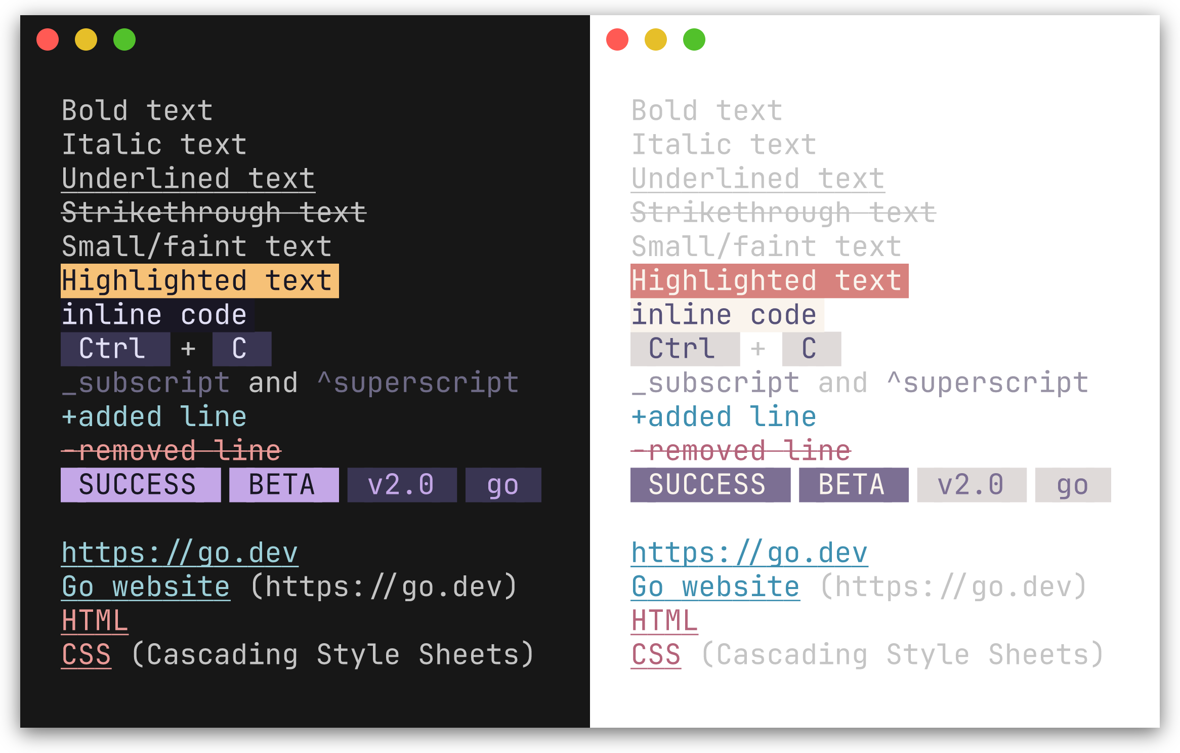
| Method | Renders as |
|---|---|
Code(text, lang) | Inline code with background highlight; lang is optional, used when a CodeFormatter is set |
Bold(text) | Bold |
Italic(text) | Italic |
Underline(text) | Underlined |
Strikethrough(text) | Strikethrough |
Small(text) | Faint |
Mark(text) | Highlighted background |
Link(label, url) | Styled link; url is optional - when both differ, renders as label (url) |
Kbd(text) | Keyboard key indicator |
Abbr(abbr, desc) | Abbreviation; desc is optional, appended in parentheses |
Sub(text) | Renders with _ prefix (style not configurable via options) |
Sup(text) | Renders with ^ prefix (style not configurable via options) |
Ins(text) | Inserted text, prefixed with + |
Del(text) | Deleted text, prefixed with -, strikethrough |
Q(text) | Inline quotation with styled curly quotes (\u201C \u201D) |
Cite(text) | Citation styling (italic + muted) |
Samp(text) | Sample output styling (monospace, distinct from Code) |
Var(text) | Variable name styling (italic + accent color) |
Badge(text) | Styled pill/tag label (e.g. [SUCCESS], [BETA]) |
BadgeWithStyle(text, style) | Badge with a one-off style override |
Tag(text) | Subtle pill/category label (lighter variant of Badge) |
TagWithStyle(text, style) | Tag with a one-off style override |
SuccessBadge(text) | Badge using the theme's success color (green) |
WarningBadge(text) | Badge using the theme's warning color (amber) |
ErrorBadge(text) | Badge using the theme's error color (red) |
InfoBadge(text) | Badge using the theme's info color (blue) |
SuccessTag(text) | Tag using the theme's success color |
WarningTag(text) | Tag using the theme's warning color |
ErrorTag(text) | Tag using the theme's error color |
InfoTag(text) | Tag using the theme's info color |
fmt.Println(ty.Bold("important") +" and "+ty.Italic("nuanced"))
fmt.Println(ty.Kbd("Ctrl") +" + "+ty.Kbd("C"))
fmt.Println(ty.Link("Go website", "https://go.dev"))
fmt.Println(ty.Abbr("CSS", "Cascading Style Sheets"))
fmt.Println(ty.Sub("2") +"O"+ty.Sup("n"))
fmt.Println(ty.Ins("added line"))
fmt.Println(ty.Del("removed line"))
fmt.Println(ty.Q("To be, or not to be"))
fmt.Println(ty.Cite("The Go Programming Language"))
fmt.Println("Output: "+ty.Samp("Hello, World!"))
fmt.Println("Set "+ty.Var("PORT") +" to configure the server")
fmt.Println(ty.Badge("SUCCESS") +" "+ty.Badge("BETA"))
fmt.Println(ty.Tag("v2.0") +" "+ty.Tag("go"))
// Semantic variants use the theme's status colors automaticallyfmt.Println(ty.SuccessBadge("running"), ty.ErrorBadge("failed"), ty.WarningBadge("expiring"), ty.InfoBadge("pending"))
fmt.Println(ty.SuccessTag("healthy"), ty.ErrorTag("critical"), ty.WarningTag("degraded"), ty.InfoTag("maintenance"))
important and nuanced
[Ctrl] + [C]
Go website (https://go.dev)
CSS (Cascading Style Sheets)
_2O^n
+added line
-removed line
SUCCESS BETA
v2.0 go
In a color terminal, Badge renders with a filled background pill and Tag with a lighter variant.
Preview
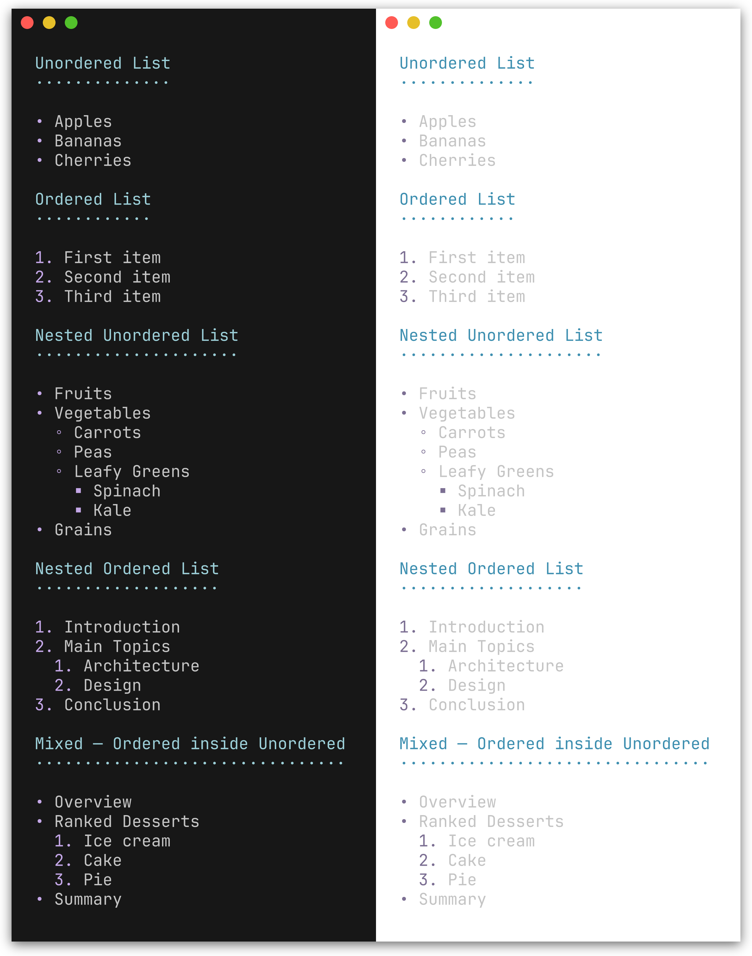
| Method | Description |
|---|---|
UL(items...) | Unordered list with bullet character (default •) |
OL(items...) | Ordered list with 1., 2., 3. markers |
NestUL(items...) | Nested unordered list with bullet cycling |
NestOL(items...) | Nested ordered list with optional hierarchical numbering |
fmt.Println(ty.UL("Apples", "Bananas", "Cherries"))
fmt.Println(ty.OL("First", "Second", "Third"))NestUL and NestOL render hierarchical lists with configurable indentation, bullet cycling, and mixed nesting.
Constructors:
| Function | Description |
|---|---|
Item(text) | Leaf item (no children) |
Items(texts...) | Batch-convert strings to leaf items |
ItemWithChildren(text, children...) | Item with unordered sub-list |
ItemWithOLChildren(text, children...) | Item with ordered sub-list |
// Nested unordered list with mixed sub-listsfmt.Println(ty.NestUL(
herald.Item("Fruits"),
herald.ItemWithChildren("Vegetables",
herald.Item("Carrots"),
herald.Item("Peas"),
),
herald.ItemWithOLChildren("Ranked Desserts",
herald.Item("Ice cream"),
herald.Item("Cake"),
),
))
• Fruits
• Vegetables
◦ Carrots
◦ Peas
• Ranked Desserts
1. Ice cream
2. Cake
// Nested ordered listfmt.Println(ty.NestOL(
herald.Item("Introduction"),
herald.ItemWithOLChildren("Main Topics",
herald.Item("Architecture"),
herald.Item("Design"),
),
herald.Item("Conclusion"),
))
1. Introduction
2. Main Topics
1. Architecture
2. Design
3. Conclusion
Enable WithHierarchicalNumbers(true) for outline-style numbering (2.1., 2.2.):
ty:=herald.New(herald.WithHierarchicalNumbers(true))
fmt.Println(ty.NestOL(
herald.Item("Introduction"),
herald.ItemWithOLChildren("Main Topics",
herald.Item("Architecture"),
herald.Item("Design"),
),
herald.Item("Conclusion"),
))
1. Introduction
2. Main Topics
2.1. Architecture
2.2. Design
3. Conclusion
Preview
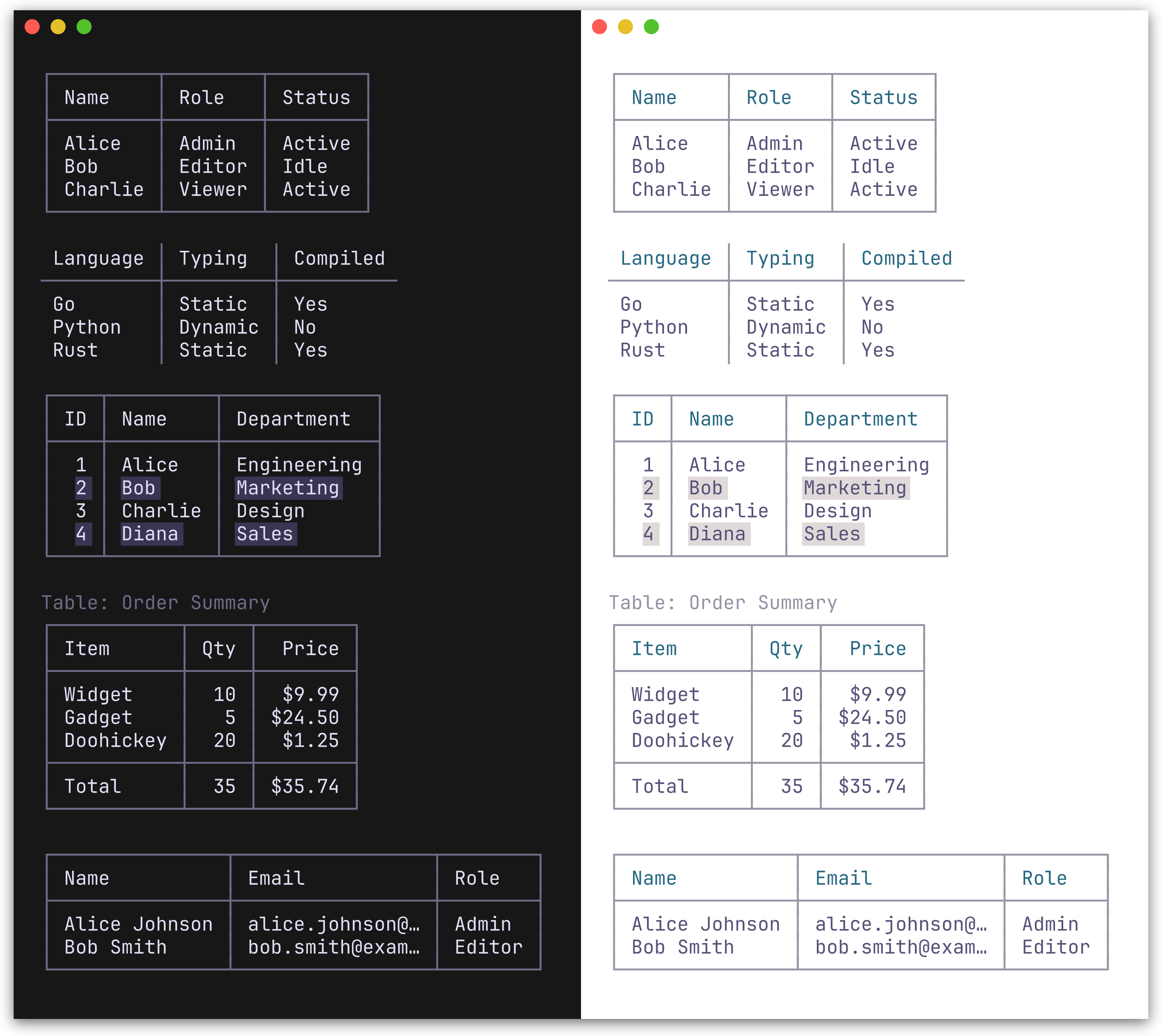
Table renders a table from a [][]string slice. The first row is treated as the header. Two border presets are available: BoxBorderSet() (default, full Unicode box-drawing) and MinimalBorderSet() (header and column separators only, no outer border).
fmt.Println(ty.Table([][]string{
{"Name", "Role", "Status"},
{"Alice", "Admin", "Active"},
{"Bob", "Editor", "Idle"},
}))
Bordered (default):
┌───────┬────────┬────────┐
│ Name │ Role │ Status │
├───────┼────────┼────────┤
│ Alice │ Admin │ Active │
│ Bob │ Editor │ Idle │
└───────┴────────┴────────┘
Minimal:
ty:=herald.New(herald.WithTableBorderSet(herald.MinimalBorderSet())) Name │ Role │ Status
───────┼────────┼────────
Alice │ Admin │ Active
Bob │ Editor │ Idle
TableWithOpts(rows [][]string, opts ...TableOption) accepts per-table options for column alignment, row separators, striped rows, captions, and footer rows:
// Column alignment, footer row, and captionfmt.Println(ty.TableWithOpts([][]string{
{"Item", "Qty", "Price"},
{"Widget", "10", "$9.99"},
{"Gadget", "5", "$24.50"},
{"Total", "15", "$34.49"},
},
herald.WithCaption("Order Summary"),
herald.WithFooterRow(true),
herald.WithColumnAlign(1, herald.AlignRight),
herald.WithColumnAlign(2, herald.AlignRight),
// Or set all column alignments at once// herald.WithColumnAligns(herald.AlignLeft, herald.AlignRight, herald.AlignRight),
))
// Truncate long cell contentty.TableWithOpts(rows,
herald.WithMaxColumnWidth(15),
)| Table option | Description |
|---|---|
WithColumnAlign(col, align) | Set alignment for a column (AlignLeft/Center/Right) |
WithColumnAligns(aligns...) | Set alignments for all columns positionally |
WithRowSeparators(true) | Horizontal lines between body rows |
WithStripedRows(true) | Alternating row background for readability |
WithCaption(text) | Caption above the table |
WithCaptionBottom(text) | Caption below the table |
WithFooterRow(true) | Treat last row as a styled footer with separator |
WithMaxColumnWidth(n) | Truncate all columns to n chars with … |
WithColumnMaxWidth(col, n) | Truncate a specific column (overrides global max) |
Preview
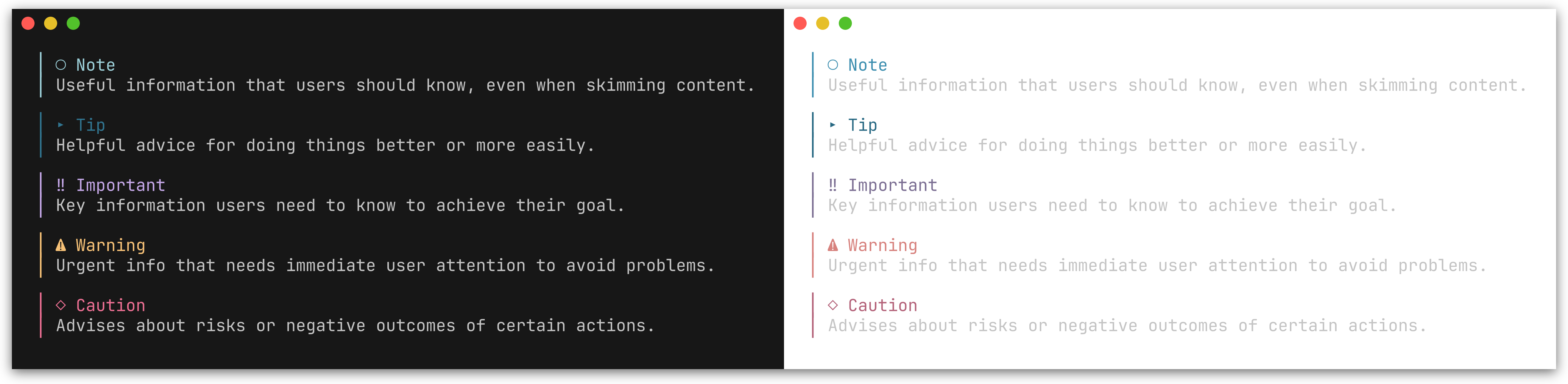
GitHub-style alert callouts with colored bars, icons, and labels. Five types are supported: Note, Tip, Important, Warning, and Caution.
| Method | Icon | Color | Description |
|---|---|---|---|
Note(text) | ○ | Blue | Useful information for the reader |
Tip(text) | ▸ | Green | Helpful advice |
Important(text) | ‼ | Purple | Key information |
Warning(text) | ⚠ | Amber | Urgent attention needed |
Caution(text) | ◇ | Red | Risk or negative outcomes |
fmt.Println(ty.Note("Useful information that users should know."))
fmt.Println(ty.Tip("Helpful advice for doing things better."))
fmt.Println(ty.Important("Key information users need to know."))
fmt.Println(ty.Warning("Urgent info that needs immediate attention."))
fmt.Println(ty.Caution("Advises about risks or negative outcomes."))
│ ○ Note
│ Useful information that users should know.
│ ⚠ Warning
│ Urgent info that needs immediate attention.
See examples/002_alerts/ for the full output of all five alert types.
You can also use the generic Alert method with an AlertType:
fmt.Println(ty.Alert(herald.AlertNote, "Generic alert call."))herald provides typography primitives - you compose them for higher-level patterns. Here are some common recipes.
Combine inline styles for colored status output:
ty:=herald.New()
// Success / error with Ins/Delfmt.Println(ty.Ins("Build completed successfully")) // green, prefixed with +fmt.Println(ty.Del("3 tests failed")) // red, prefixed with -// Semantic badges use the theme's status colors automaticallyfmt.Println(ty.SuccessBadge("PASS") +" "+"All checks passed")
fmt.Println(ty.ErrorBadge("FAIL") +" "+"Linter found 2 issues")
fmt.Println(ty.WarningBadge("EXPIRING") +" "+"Certificate expires in 7 days")
fmt.Println(ty.InfoBadge("PENDING") +" "+"Deployment queued")
// Semantic tags for subtle status labelsfmt.Println(ty.SuccessTag("healthy") +" "+ty.Tag("v2.1.0"))
// Generic Badge/BadgeWithStyle for non-semantic casesfmt.Println(ty.Badge("BETA") +" "+ty.Tag("go"))Pair headings with alerts for contextual guidance:
fmt.Println(ty.Compose(
ty.H2("Database Migration"),
ty.Warning("Back up your database before proceeding."),
ty.P("Run the following command to apply migrations:"),
ty.CodeBlock("go run ./cmd/migrate up"),
))Use AddressCard for styled contact information:
fmt.Println(ty.Compose(
ty.H2("Release v2.0"),
ty.P("Major performance improvements and new API surface."),
ty.AddressCard("Maintained by\nJane Doe\njane@example.com"),
))Compose inline elements and footnotes within paragraphs:
fmt.Println(ty.Compose(
ty.P(
"herald"+ty.FootnoteRef(1) +" is built on "+ty.Link("lipgloss", "https://github.com/charmbracelet/lipgloss") +" and supports "+ty.Bold("rich text") +", "+ty.Code("inline code") +", and "+ty.Kbd("Ctrl") +"+"+ty.Kbd("C") +" key indicators.",
),
ty.FootnoteSection([]string{"A Go library for TUI typography"}),
))Compose inserts a blank line (\n\n) between every block. When a heading (e.g. H4) already has MarginBottom, this produces unwanted triple spacing. Section solves this by joining its blocks with a single newline, and the resulting group becomes one block to Compose:
fmt.Println(ty.Compose(
ty.H2("Release Notes"),
ty.Section(
ty.H4("Bug Fixes"),
ty.UL("Fixed crash on empty input", "Resolved race condition"),
),
ty.Section(
ty.H4("Features"),
ty.UL("Added Section method", "Added BR method"),
),
))herald renders typography elements. Layout concerns - padding, centering, and framing - belong at the output boundary using lipgloss directly. This avoids double-wrapping when composing inline elements inside block elements.
Per-element wrapping - apply a frame style to each rendered line:
ty:=herald.New()
frame:=lipgloss.NewStyle().Padding(0, 2)
fmt.Println(frame.Render(ty.H1("Title")))
fmt.Println(frame.Render(ty.P("Body text with "+ty.Bold("bold"))))
Whole-output wrapping - build all output first, then wrap once:
page:=ty.Compose(
ty.H1("Title"),
ty.P("Body text"),
ty.HR(),
)
fmt.Println(frame.Render(page))Pass options to herald.New() to override individual styles or tokens.
ty:=herald.New(
herald.WithHRWidth(60),
herald.WithBulletChar("-"),
herald.WithH1Style(
lipgloss.NewStyle().Bold(true).Foreground(lipgloss.Color("#FF0000")),
),
)
Style options - each accepts a lipgloss.Style:
| Option | Targets |
|---|---|
WithH1Style - WithH6Style | Heading levels 1-6 |
| Option | Targets |
|---|---|
WithParagraphStyle | P |
WithBlockquoteStyle | Blockquote text |
WithBlockquoteBarStyle | Blockquote bar |
WithCodeInlineStyle | Code |
WithCodeBlockStyle | CodeBlock |
WithHRStyle | HR |
WithHRLabelStyle | HRWithLabel |
| Option | Targets |
|---|---|
WithBoldStyle | Bold |
WithItalicStyle | Italic |
WithUnderlineStyle | Underline |
WithStrikethroughStyle | Strikethrough |
WithSmallStyle | Small |
WithMarkStyle | Mark |
WithLinkStyle | Link |
WithKbdStyle | Kbd |
WithAbbrStyle | Abbr |
WithInsStyle | Ins |
WithDelStyle | Del |
WithQStyle | Q |
WithCiteStyle | Cite |
WithSampStyle | Samp |
WithVarStyle | Var |
| Option | Targets |
|---|---|
WithListBulletStyle | Bullet/number marker |
WithListItemStyle | List item text |
WithDTStyle | Definition term |
WithDDStyle | Definition description |
| Option | Targets |
|---|---|
WithKVKeyStyle | KV / KVGroup key text |
WithKVValueStyle | KV / KVGroup value text |
| Option | Targets |
|---|---|
WithAddressStyle | Address |
WithAddressCardStyle | AddressCard content |
WithAddressCardBorderStyle | AddressCard border |
| Option | Targets |
|---|---|
WithFieldsetStyle | Fieldset content |
WithFieldsetBorderStyle | Fieldset border |
WithFieldsetLegendStyle | Fieldset legend |
| Option | Targets |
|---|---|
WithFigureCaptionStyle | Figure caption |
| Option | Targets |
|---|---|
WithBadgeStyle | Badge |
WithTagStyle | Tag |
WithSemanticPalette(sp) | All 8 semantic methods |
WithSuccessBadgeStyle | SuccessBadge |
WithWarningBadgeStyle | WarningBadge |
WithErrorBadgeStyle | ErrorBadge |
WithInfoBadgeStyle | InfoBadge |
WithSuccessTagStyle | SuccessTag |
WithWarningTagStyle | WarningTag |
WithErrorTagStyle | ErrorTag |
WithInfoTagStyle | InfoTag |
| Option | Targets |
|---|---|
WithFootnoteRefStyle | FootnoteRef |
WithFootnoteItemStyle | FootnoteSection items |
WithFootnoteDividerStyle | FootnoteSection divider |
| Option | Targets |
|---|---|
WithTableHeaderStyle | Table header cells |
WithTableCellStyle | Table body cells |
WithTableStripedCellStyle | Alternating body rows |
WithTableFooterStyle | Table footer row |
WithTableCaptionStyle | Table caption text |
WithTableBorderStyle | Table border characters |
| Option | Targets |
|---|---|
WithAlertStyle(type, style) | Alert of given type |
| Option | Targets |
|---|---|
WithCodeFormatter(fn) | Syntax-highlighting callback for Code and CodeBlock |
Token options - each accepts a string, int, or bool:
| Option | Default | Description |
|---|---|---|
WithH1UnderlineChar(c) | ═ | Underline character for H1 |
WithH2UnderlineChar(c) | ─ | Underline character for H2 |
WithH3UnderlineChar(c) | · | Underline character for H3 |
WithHeadingBarChar(c) | ▎ | Bar prefix character for H4-H6 |
| Option | Default | Description |
|---|---|---|
WithBulletChar(c) | • | Bullet character for UL |
WithNestedBulletChars(chars) | •, ◦, ▪, ▹ | Bullet characters cycling per depth for NestUL |
WithListIndent(n) | 2 | Spaces per nesting level for NestUL/NestOL |
WithHierarchicalNumbers(b) | false | Outline-style numbering for nested OL (e.g. 2.1.) |
| Option | Default | Description |
|---|---|---|
WithHRChar(c) | ─ | Character repeated for HR |
WithHRWidth(w) | 40 | Width of HR in characters |
WithBlockquoteBar(c) | │ | Left bar character for Blockquote |
WithCodeLineNumbers(b) | false | Show line numbers in CodeBlock |
WithCodeLineNumberSep(c) | │ | Separator between line numbers and code |
WithCodeLineNumberOffset(n) | 1 | Starting line number for code blocks |
| Option | Default | Description |
|---|---|---|
WithInsPrefix(c) | + | Prefix for Ins (inserted text) |
WithDelPrefix(c) | - | Prefix for Del (deleted text) |
WithQuoteOpen(c) | \u201C | Opening quote character for Q |
WithQuoteClose(c) | \u201D | Closing quote character for Q |
| Option | Default | Description |
|---|---|---|
WithFieldsetWidth(w) | 0 | Default width for Fieldset (0 = auto-fit) |
Theme-level (set via herald.New()):
| Option | Default | Description |
|---|---|---|
WithKVSeparator(c) | : | Separator between key and value in KV/KVGroup |
Per-call (passed to KVGroupWithOpts):
| Option | Default | Description |
|---|---|---|
WithKVGroupSeparator(s) | theme default | Override separator for this call (empty string = no colon) |
WithKVRawKeys(bool) | false | Skip applying KVKey style (keys are pre-styled) |
WithKVRawValues(bool) | false | Skip applying KVValue style (values are pre-styled) |
WithKVIndent(n) | 0 | Prepend n spaces of indentation to each line |
| Option | Default | Description |
|---|---|---|
WithTableBorderSet(bs) | BoxBorderSet() | Border character set (BoxBorderSet or MinimalBorderSet) |
WithTableCellPad(n) | 1 | Spaces of padding inside each table cell |
| Option | Default | Description |
|---|---|---|
WithFootnoteDividerChar(c) | ─ | Character repeated for footnote section divider |
WithFootnoteDividerWidth(w) | 20 | Width of footnote section divider |
| Option | Default | Description |
|---|---|---|
WithAlertBar(c) | │ | Left bar character for alerts |
WithAlertIcon(type, icon) | per-type | Override icon for a specific alert type |
WithAlertLabel(type, label) | per-type | Override label for a specific alert type |
WithCodeFormatter accepts a func(code, language string) string callback. When set, Code() and CodeBlock() pass the raw text and language string to the formatter before applying the lipgloss style.
import (
"strings""github.com/alecthomas/chroma/v2/quick""github.com/indaco/herald"
)
funcchromaFormatter(stylestring) func(code, languagestring) string {
returnfunc(code, languagestring) string {
varbuf strings.Buildererr:=quick.Highlight(&buf, code, language, "terminal256", style)
iferr!=nil {
returncode
}
returnstrings.TrimRight(buf.String(), "\n")
}
}
ty:=herald.New(
herald.WithCodeFormatter(chromaFormatter("catppuccin-mocha")),
)
fmt.Println(ty.CodeBlock(`func main() { fmt.Println("hello") }`, "go"))
See examples/200_chroma-syntax-highlighting/ for a chroma-based example, or examples/201_tree-sitter-syntax-highlighting/ for a tree-sitter-based alternative.
Enable line numbers with WithCodeLineNumbers(true). Line numbers are right-aligned, styled with CodeLineNumber (defaults to the Muted palette color), and separated from code by CodeLineNumberSep (default │). Line numbers are added after the CodeFormatter runs, so they work with syntax highlighting.
ty:=herald.New(
herald.WithCodeLineNumbers(true),
)
fmt.Println(ty.CodeBlock("func main() {\n\tfmt.Println(\"hello\")\n}", "go"))
1│ func main() {
2│ fmt.Println("hello")
3│ }
When displaying a snippet from a larger file, set a custom starting line number with WithCodeLineNumberOffset:
ty:=herald.New(
herald.WithCodeLineNumbers(true),
herald.WithCodeLineNumberOffset(42),
)
fmt.Println(ty.CodeBlock("func greet(name string) string {\n\treturn \"Hello, \" + name\n}"))
42│ func greet(name string) string {
43│ return "Hello, " + name
44│ }
Customize the separator and style:
ty:=herald.New(
herald.WithCodeLineNumbers(true),
herald.WithCodeLineNumberSep(":"),
herald.WithCodeLineNumberStyle(lipgloss.NewStyle().Foreground(lipgloss.Color("#888888"))),
)
The following option controls the visual appearance of line numbers:
| Option | Targets |
|---|---|
WithCodeLineNumberStyle | Code block line numbers |
herald ships with named themes that match huh's built-in color palettes. Colors auto-adapt to light/dark terminal backgrounds using lipgloss.HasDarkBackground. See Pairing with huh for how to use matching themes across herald and huh.
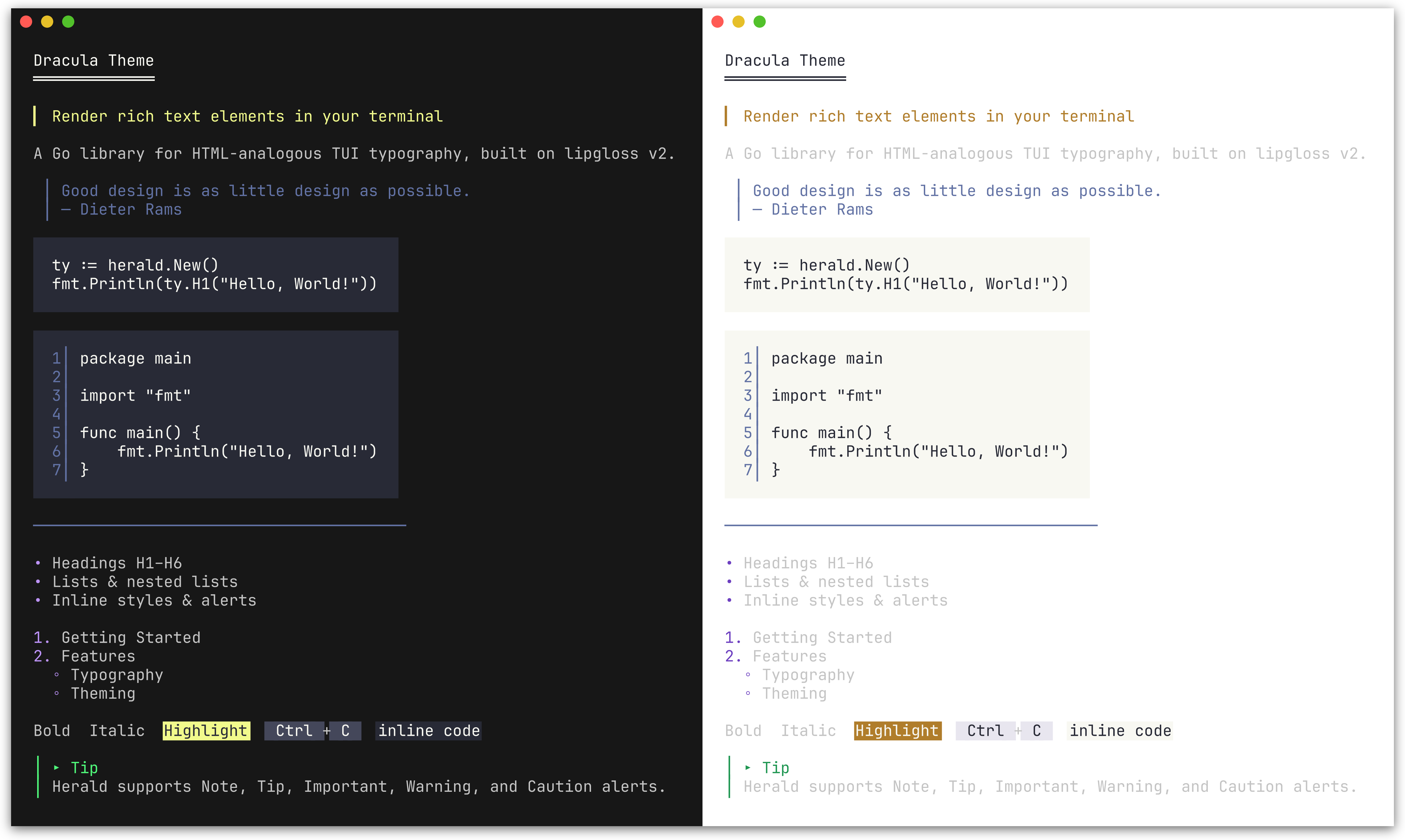 DraculaTheme() | 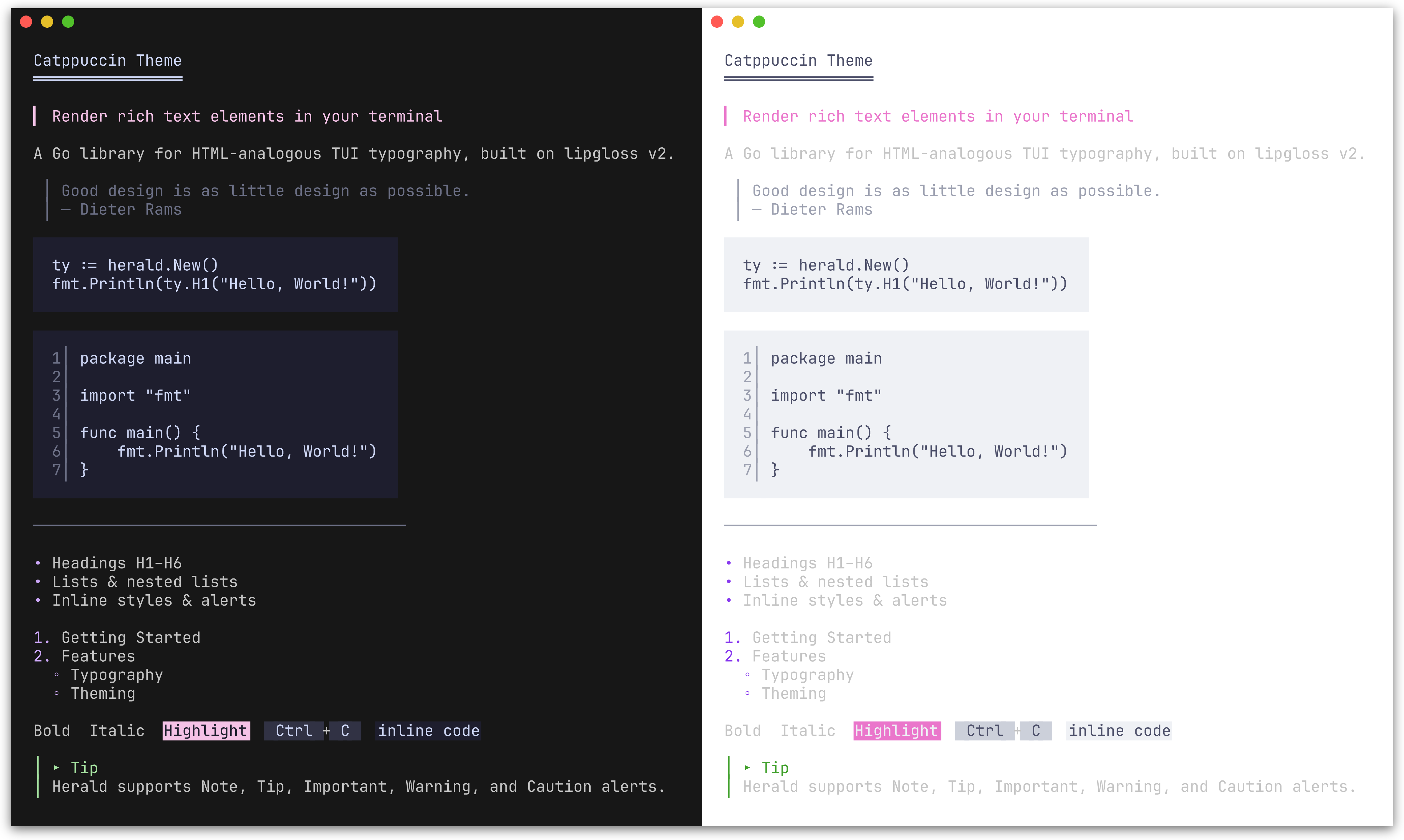 CatppuccinTheme() |
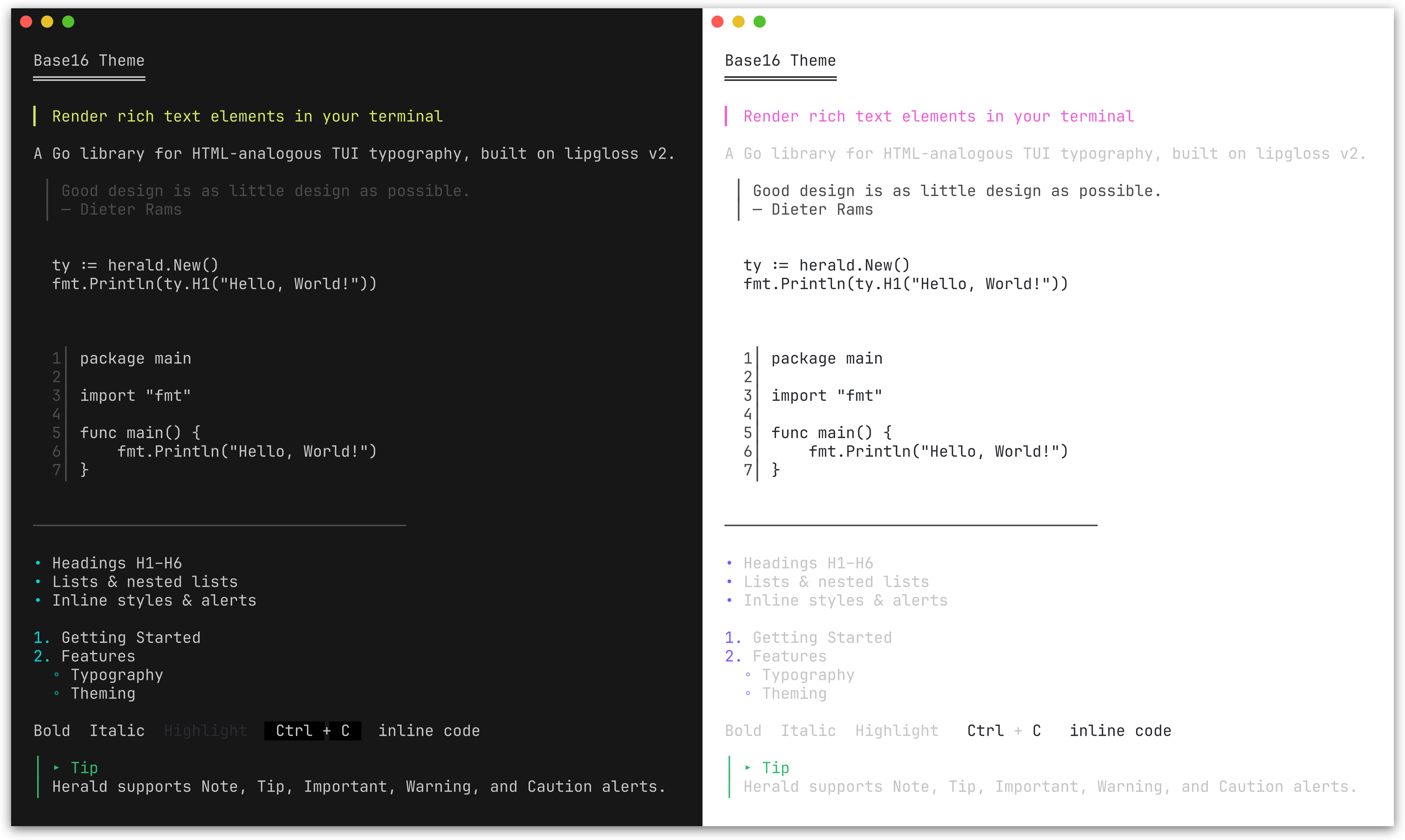 Base16Theme() | 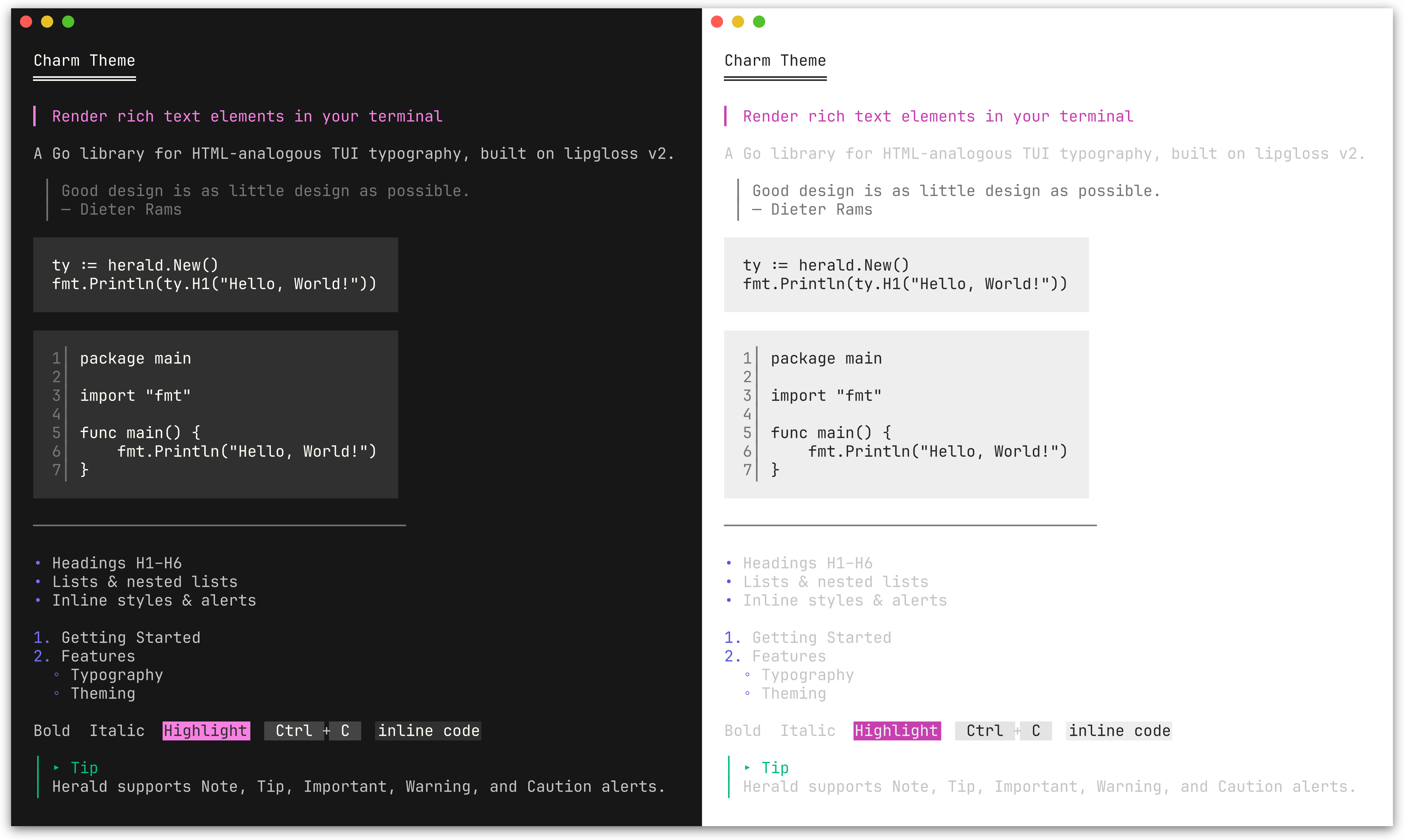 CharmTheme() |
ty:=herald.New(herald.WithTheme(herald.DraculaTheme()))ColorPalette lets you define 9 colors and derive a complete theme from them. All style fields map from this palette; token options (characters, widths) are unaffected and retain their defaults. Alert colors are handled separately via AlertPalette.
| Field | Maps to |
|---|---|
Primary | H1 headings |
Secondary | H2, list bullets, Badge background, Tag foreground |
Tertiary | H3, links, Ins, FootnoteRef |
Accent | H4, mark background, Var |
Highlight | H5, Abbr, Del |
Muted | H6, blockquote, HR, HRLabel, sub/sup, DD, KVKey, Address, AddressCard, AddressCardBorder, FootnoteItem, FootnoteDivider, line numbers, table border, caption, Q, Cite, FigureCaption, FieldsetBorder |
Text | Body text, paragraphs, list items, inline code, DT, KVValue, table cells, footer, Samp, Fieldset content |
Surface | Background for Kbd, Tag, striped table rows |
Base | Background for inline code, code blocks; mark fg, Badge fg |
Pass the palette to New() via WithPalette, or call ThemeFromPalette to construct a Theme value directly.
Use lipgloss.LightDark to define adaptive colors that automatically adjust to the terminal's background:
lightDark:=lipgloss.LightDark(lipgloss.HasDarkBackground(os.Stdin, os.Stdout))
// Nord-inspired palettepalette:= herald.ColorPalette{
Primary: lightDark(lipgloss.Color("#5E81AC"), lipgloss.Color("#88C0D0")),
Secondary: lightDark(lipgloss.Color("#81A1C1"), lipgloss.Color("#81A1C1")),
Tertiary: lightDark(lipgloss.Color("#8FBCBB"), lipgloss.Color("#8FBCBB")),
Accent: lightDark(lipgloss.Color("#EBCB8B"), lipgloss.Color("#EBCB8B")),
Highlight: lightDark(lipgloss.Color("#BF616A"), lipgloss.Color("#BF616A")),
Muted: lightDark(lipgloss.Color("#7B88A1"), lipgloss.Color("#4C566A")),
Text: lightDark(lipgloss.Color("#2E3440"), lipgloss.Color("#ECEFF4")),
Surface: lightDark(lipgloss.Color("#D8DEE9"), lipgloss.Color("#3B4252")),
Base: lightDark(lipgloss.Color("#ECEFF4"), lipgloss.Color("#2E3440")),
}
ty:=herald.New(herald.WithPalette(palette))
Each lightDark(lightColor, darkColor) call returns a single adaptive color that picks the right variant based on the terminal background. This is the same approach used by herald's built-in themes and DefaultTheme().
Plain lipgloss.Color values (without LightDark) work too - they apply the same color regardless of terminal background.
SemanticPalette defines four status colors used to derive the themed SuccessBadge, WarningBadge, ErrorBadge, InfoBadge, SuccessTag, WarningTag, ErrorTag, and InfoTag styles.
| Field | Semantic meaning | Default derivation from ColorPalette |
|---|---|---|
Success | Running, passed, healthy | Tertiary (green in most themes) |
Warning | Expiring, degraded | Accent (amber in most themes) |
Error | Failed, critical, down | Highlight (red in most themes) |
Info | Informational, neutral status | Secondary (blue in most themes) |
ThemeFromPalette automatically derives a SemanticPalette from your ColorPalette, so existing custom palettes produce valid semantic badge and tag styles without any changes.
Use WithSemanticPalette to override all four semantic colors at once:
ty:=herald.New(
herald.WithSemanticPalette(herald.SemanticPalette{
Success: lipgloss.Color("#22c55e"),
Warning: lipgloss.Color("#f59e0b"),
Error: lipgloss.Color("#ef4444"),
Info: lipgloss.Color("#3b82f6"),
}),
)
Individual styles can be overridden with WithSuccessBadgeStyle, WithErrorTagStyle, and the other per-variant options listed in Badge & Tag.
AlertPalette lets you override the 5 alert colors independently from the main ColorPalette. By default, alert colors are derived from the semantic palette (DefaultAlertPalette maps Info->Note, Success->Tip, Warning->Warning, Error->Caution), with Important using ColorPalette.Secondary. Changing the semantic palette therefore updates alert colors too.
Use WithAlertPalette to override all 5 alert colors independently:
ty:=herald.New(
herald.WithAlertPalette(herald.AlertPalette{
Note: lightDark(lipgloss.Color("#0969DA"), lipgloss.Color("#58A6FF")),
Tip: lightDark(lipgloss.Color("#1A7F37"), lipgloss.Color("#3FB950")),
Important: lightDark(lipgloss.Color("#8250DF"), lipgloss.Color("#D2A8FF")),
Warning: lightDark(lipgloss.Color("#9A6700"), lipgloss.Color("#D29922")),
Caution: lightDark(lipgloss.Color("#CF222E"), lipgloss.Color("#F85149")),
}),
)
Individual alert icons and labels can also be customized:
ty:=herald.New(
herald.WithAlertIcon(herald.AlertTip, "💡"),
herald.WithAlertLabel(herald.AlertNote, "Info"),
)
You can combine WithPalette with other options to override specific fields after the palette is applied:
ty:=herald.New(
herald.WithPalette(palette),
herald.WithHRWidth(60),
herald.WithBulletChar("-"),
)The easiest way to customize is to start from an existing theme and modify specific fields:
custom:=herald.DefaultTheme()
custom.H1=lipgloss.NewStyle().Bold(true).Foreground(lipgloss.Color("#FF0000")).MarginBottom(1)
custom.BulletChar="-"ty:=herald.New(herald.WithTheme(custom))
For a fully custom theme, construct a Theme struct directly:
custom:= herald.Theme{
H1: lipgloss.NewStyle().Bold(true).Foreground(lipgloss.Color("#FFFFFF")),
H2: lipgloss.NewStyle().Bold(true).Foreground(lipgloss.Color("#AAAAAA")),
Paragraph: lipgloss.NewStyle().MarginBottom(1),
// set remaining Theme fields as needed...H1UnderlineChar: "=",
H2UnderlineChar: "-",
H3UnderlineChar: ".",
HeadingBarChar: ">",
BulletChar: "*",
HRChar: "-",
HRWidth: 40,
BlockquoteBar: "|",
}
ty:=herald.New(herald.WithTheme(custom))herald is designed to complement huh - a form and prompt library for the terminal. Together they cover the full output story of a CLI: herald handles formatted display (instructions, section headers, results, documentation), while huh handles user input.
Since both are built on lipgloss, herald ships with themes that match huh's built-in palettes exactly. You get visual consistency across your entire CLI without any manual style coordination.
ty:=herald.New(herald.WithTheme(herald.DraculaTheme()))
fmt.Println(ty.H1("Project Setup"))
fmt.Println(ty.P("Answer a few questions to scaffold your project."))
form:=huh.NewForm(
huh.NewGroup(
huh.NewInput().Title("Project name").Value(&name),
huh.NewSelect[string]().Title("Language").Options(...).Value(&lang),
),
).WithTheme(huh.ThemeDracula())
form.Run()
fmt.Println(ty.H2("Summary"))
fmt.Println(ty.DL([][2]string{
{"Name", name},
{"Language", lang},
}))
See examples/203_huh-form/ for a runnable example, and examples/204_huh-wizard/ for a multi-step wizard combining herald and huh.
herald works inside bubbletea applications - build your content with herald, then display it in a bubbletea viewport or model. Herald handles the typography, bubbletea handles the interactivity.
funcbuildContent(ty*herald.Typography) string {
returnty.Compose(
ty.H1("Release Notes"),
ty.Badge("STABLE")+" "+ty.Tag("v2.0.0"),
ty.HRWithLabel("Features"),
ty.UL("New dashboard", "Dark mode support"),
ty.Tip("Run `go get -u` to upgrade."),
)
}
// Pass to a bubbles viewport for scrollingm.viewport.SetContent(buildContent(ty))
See examples/205_bubbletea-release-viewer/ for a scrollable release notes viewer and examples/206_bubbletea-explorer/ for a sidebar + viewport explorer.
herald works with tview via tview.ANSIWriter, which translates lipgloss ANSI output into tview's internal color tags.
ty:=herald.New()
textView:=tview.NewTextView().
SetDynamicColors(true).
SetScrollable(true).
SetWordWrap(true)
w:=tview.ANSIWriter(textView)
fmt.Fprintln(w, ty.H1("Herald + tview"))
fmt.Fprintln(w, ty.P("ANSI escape sequences are converted to tview color tags."))
fmt.Fprintln(w, ty.UL("Headings", "Lists", "Alerts", "Tables"))
See examples/207_tview-explorer/ for a sidebar + content pane explorer.
Runnable examples are in the examples/ directory:
| Example | Description |
|---|---|
| 000_default-theme | All elements with the default Rose Pine theme |
| 001_lists | Flat, nested, mixed, and hierarchical lists |
| 002_alerts | GitHub-style alert callouts (Note, Tip, Important, Warning, Caution) |
| 003_table | Table rendering: bordered, minimal, alignment, striped rows, captions, and footer |
| 004_semantic-badges | Semantic badge and tag methods with default and custom SemanticPalette |
| 005_compose | Compose multiple rendered blocks into a single output |
| 006_section | Section groups heading + content tightly; BR for line breaks |
| 100_custom-options | Override styles, decoration chars, and tokens via functional options |
| 101_custom-palette | Custom adaptive theme from 9 colors using ColorPalette and LightDark |
| 102_builtin-themes | Built-in themes (Dracula, Catppuccin, Base16, Charm) matching huh |
| 103_catppuccin-theme | Build a full theme from the Catppuccin palette |
| 200_chroma-syntax-highlighting | Plug in chroma for syntax-highlighted code blocks |
| 201_tree-sitter-syntax-highlighting | Plug in tree-sitter for AST-based syntax highlighting |
| 202_gotreesitter-syntax-highlighting | Pure-Go tree-sitter highlighting via gotreesitter |
| 203_huh-form | Using herald with huh for interactive TUI forms |
| 204_huh-wizard | Multi-step project scaffolder with herald + huh |
| 205_bubbletea-release-viewer | Scrollable release notes viewer with bubbletea viewport |
| 206_bubbletea-explorer | Sidebar + scrollable content pane explorer with bubbletea |
| 207_tview-explorer | Sidebar + scrollable content pane explorer with tview |
| 208_figure-with-image | Figure with ASCII art image rendering via image2ascii |
This project is licensed under the MIT License - see the LICENSE file for details.