


React Native Modals Library for iOS & Android.
Just click on ⭐️ button 😘
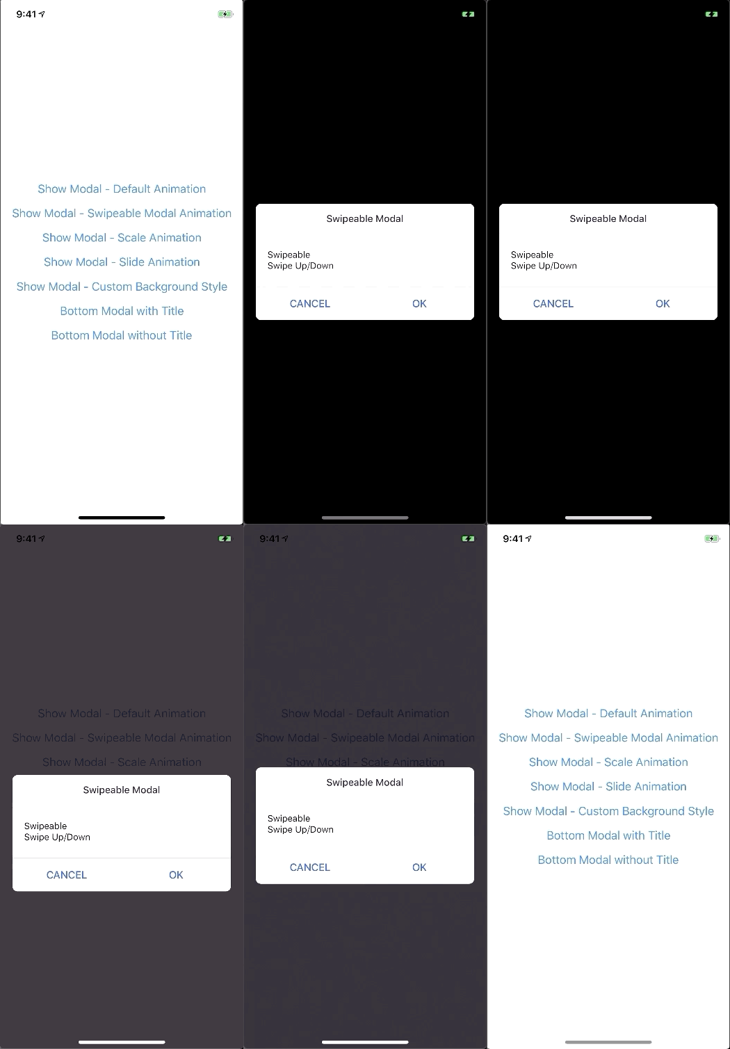
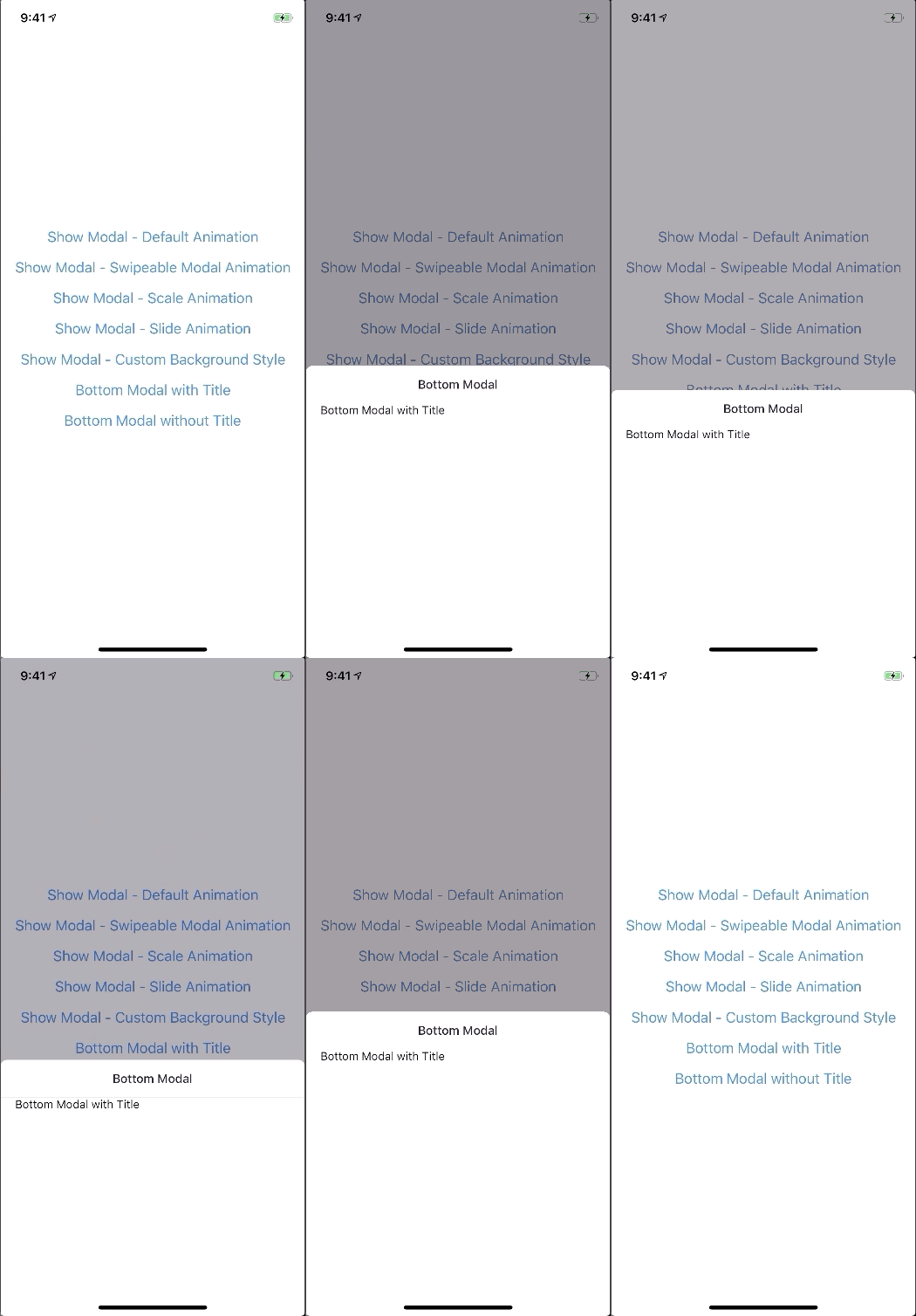
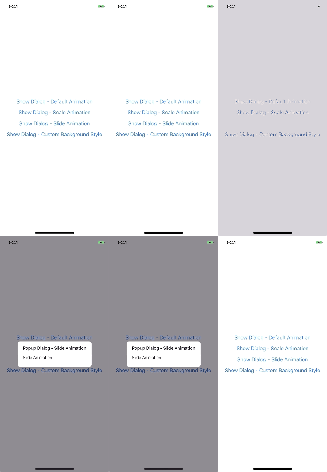
A lot of backward incompatible changes in v0.22.0. Please, Read the Docs before upgrading to v0.22.0
npm install --save react-native-modals
# OR
yarn add react-native-modals
- Modal
- ButtomModal
- ModalPortal
- Backdrop
- ModalButton
- ModalContent
- ModalTitle
- ModalFooter
- Animation
- FadeAnimation
- ScaleAnimation
- SlideAnimation
- DragEvent,
- SwipeDirection,
- ModalProps
- ModalFooterProps
- ModalButtonProps
- ModalTitleProps
- ModalContentProps
- BackdropProps
The Component can not be used until ModalPortal is mounted.
You should register in your app root. For example:
import{ModalPortal}from'react-native-modals';import{Provider}from'react-redux';constRoot=()=>{return(<Providerstore={store}><App/><ModalPortal/></Provider>);}import{Modal,ModalContent}from'react-native-modals';import{Button}from'react-native'<Viewstyle={styles.container}><Buttontitle="Show Modal"onPress={()=>{this.setState({visible: true});}}/><Modalvisible={this.state.visible}onTouchOutside={()=>{this.setState({visible: false});}}><ModalContent>{...}</ModalContent></Modal></View>show
import{ModalPortal}from'react-native-modals';constid=ModalPortal.show((<View>{...}</View>));update
ModalPortal.update(id,{children: (<View><Text>Updated</Text></View>),});dismiss
ModalPortal.dismiss(id);dismissAll
ModalPortal.dismissAll(id);import{Modal,SlideAnimation,ModalContent}from'react-native-modals';<Viewstyle={styles.container}><Modalvisible={this.state.visible}modalAnimation={newSlideAnimation({slideFrom: 'bottom',})}><ModalContent>{...}</ModalContent></Modal></View>import{Modal,ModalContent}from'react-native-modals';import{Button}from'react-native'<Viewstyle={styles.container}><Modalvisible={this.state.visible}swipeDirection={['up','down']}// can be string or an arrayswipeThreshold={200}// default 100onSwipeOut={(event)=>{this.setState({visible: false});}}><ModalContent>{...}</ModalContent></Modal></View>import{Modal,ModalTitle,ModalContent}from'react-native-modals';<Viewstyle={styles.container}><Modalvisible={this.state.visible}modalTitle={<ModalTitletitle="Modal Title"/>}><ModalContent>{...}</ModalContent></Modal></View>import{Modal,ModalFooter,ModalButton,ModalContent}from'react-native-modals';<Viewstyle={styles.container}><Modalvisible={this.state.visible}footer={<ModalFooter><ModalButtontext="CANCEL"onPress={()=>{}}/><ModalButtontext="OK"onPress={()=>{}}/></ModalFooter>}><ModalContent>{...}</ModalContent></Modal></View>| Prop | Type | Default | Note |
|---|---|---|---|
visible | boolean | false | |
rounded | boolean | true | |
useNativeDriver | boolean | true | |
children | any | ||
modalTitle? | React Element | You can pass a modalTitle component or pass a View for customizing titlebar | |
width? | Number | Your device width | The Width of modal, you can use fixed width or use percentage. For example 0.5 it means 50% |
height? | Number | 300 | The Height of modal, you can use fixed height or use percentage. For example 0.5 it means 50% |
modalAnimation? | FadeAnimation | animation for modal | |
modalStyle? | any | ||
containerStyle? | any | null | For example: { zIndex: 10, elevation: 10 } |
animationDuration? | Number | 200 | |
overlayPointerEvents? | String | Available option: auto, none | |
overlayBackgroundColor? | String | #000 | |
overlayOpacity? | Number | 0.5 | |
hasOverlay? | Boolean | true | |
onShow? | Function | You can pass shown function as a callback function, will call the function when modal shown | |
onDismiss? | Function | You can pass onDismiss function as a callback function, will call the function when modal dismissed | |
onTouchOutside? | Function | () => {} | |
onHardwareBackPress? | Function | () => true | Handle hardware button presses |
onMove? | Function | () => {} | |
onSwiping? | Function | () => {} | |
onSwipeRelease? | Function | () => {} | |
onSwipingOut? | Function | () => {} | |
onSwipeOut? | Function | ||
swipeDirection? | string or Array<string> | [] | Available option: up, down, left, right |
swipeThreshold? | number | 100 | |
footer? | React Element | null | for example: <View><Button text="DISMISS" align="center" onPress={() => {}}/></View> |
| Prop | Type | Default | Note |
|---|---|---|---|
title | String | ||
style? | any | null | |
textStyle? | any | null | |
align? | String | center | Available option: left, center, right |
hasTitleBar? | Bool | true |
| Prop | Type | Default | Note |
|---|---|---|---|
children | any | ||
style? | any | null |
| Prop | Type | Default | Note |
|---|---|---|---|
children | ModalButton | ||
bordered? | Boolean | true | |
style? | any | null |
| Prop | Type | Default | Note |
|---|---|---|---|
text | String | ||
onPress | Function | ||
align? | String | center | Available option: left, center, right |
style? | any | null | |
textStyle? | any | null | |
activeOpacity? | Number | 0.6 | |
disabled? | Boolean | false | |
bordered? | Boolean | false |
| Prop | Type | Default | Note |
|---|---|---|---|
visible | Boolean | ||
opacity | Number | 0.5 | |
onPress? | Function | ||
backgroundColor? | string | #000 | |
animationDuration? | Number | 200 | |
pointerEvents? | String | null | Available option: auto, none |
useNativeDriver? | Boolean | true |
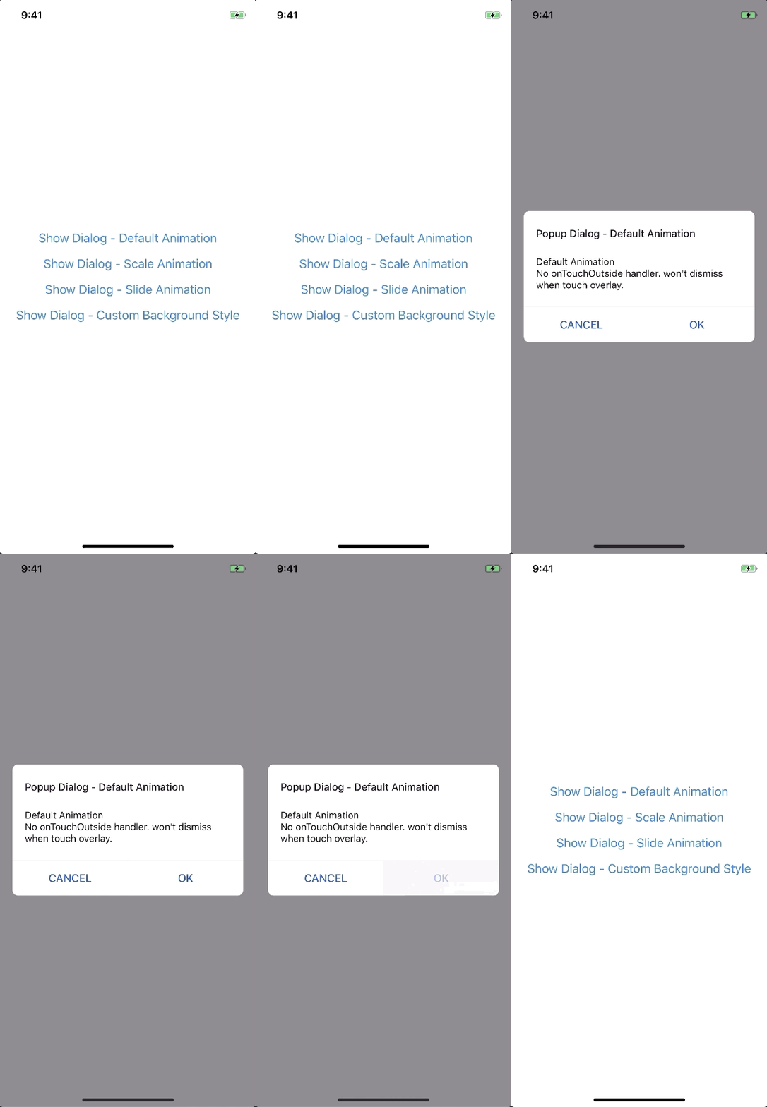
newFadeAnimation({initialValue: 0,// optionalanimationDuration: 150,// optionaluseNativeDriver: true,// optional})| Param | Type | Default | Note |
|---|---|---|---|
initialValue | Number | 0 | |
animationDuration? | Number | 150 | |
useNativeDriver? | Boolean | true |
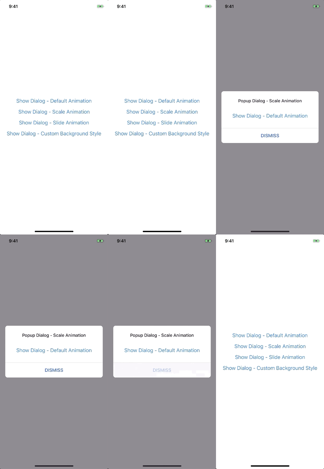
newScaleAnimation({initialValue: 0,// optionaluseNativeDriver: true,// optional})| Param | Type | Default | Note |
|---|---|---|---|
initialValue | Number | 0 | |
useNativeDriver | Boolean | true |
newSlideAnimation({initialValue: 0,// optionalslideFrom: 'bottom',// optionaluseNativeDriver: true,// optional})| Param | Type | Default | Note |
|---|---|---|---|
initialValue | Number | 0 | |
slideFrom | String | bottom | Available option: top, bottom, left, right |
useNativeDriver | Boolean | true |
import{Animated}from'react-native';import{Animation}from'react-native-modals';classCustomAnimationextendsAnimation{in(onFinished){Animated.spring(this.animate,{toValue: 1,useNativeDriver: this.useNativeDriver,}).start(onFinished);}out(onFinished){Animated.spring(this.animate,{toValue: 0,useNativeDriver: this.useNativeDriver,}).start(onFinished);}getAnimations(){return{transform: [{translateY: this.animate.interpolate({inputRange: [0,1],outputRange: [800,1],}),}],};}}yarn
yarn run build
yarn test