
a lightweight react date picker for mobile, Not more than 4k
react-mobile-datepicker-ts provides a component that can set year, month, day, hour, minute and second by sliding up or down.
- is only 4k.
- It does not depend on moment.js
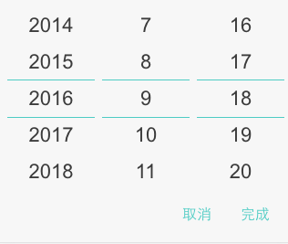
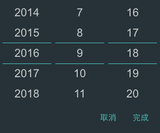
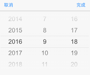
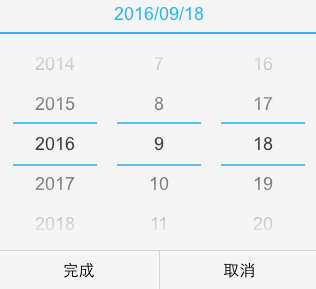
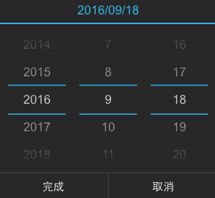
set dateConfig to configure year, month, day, hour, minute and second.
[{type: 'year',format: 'YYYY',caption: 'Year',step: 1,},{type: 'month',format: 'MM',caption: 'Mon',step: 1,},{type: 'date',format: 'DD',caption: 'Day',step: 1,},{type: 'hour',format: 'hh',caption: 'Hour',step: 1,},{type: 'minute',format: 'mm',caption: 'Min',step: 1,},{type: 'second',format: 'ss',caption: 'Sec',step: 1,}]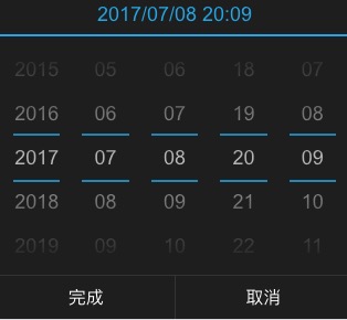
set dateConfig to configure hour, minute and second.
[{type: 'hour',format: 'hh',caption: 'Hour',step: 1,},{type: 'minute',format: 'mm',caption: 'Min',step: 1,},{type: 'second',format: 'ss',caption: 'Sec',step: 1,}]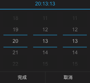
customize the content mapping shown in the month.
constmonthMap={'1': 'Jan','2': 'Feb','3': 'Mar','4': 'Apr','5': 'May','6': 'Jun','7': 'Jul','8': 'Aug','9': 'Sep','10': 'Oct','11': 'Nov','12': 'Dec',};constdateConfig=[{type: 'year',format: 'YYYY',caption: 'Year',step: 1,},{type: 'month',format: value=>monthMap[value.getMonth()+1],caption: 'Mon',step: 1,},{type: 'date',format: 'DD',caption: 'Day',step: 1,}];<DatePickerdateConfig={dateConfig}/>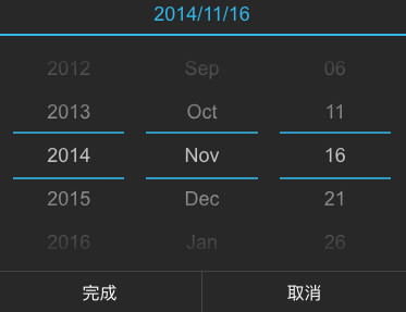
set showCaption to display date captions, matches the dateConfig property's caption.
constdateConfig=[{type: 'hour',format: 'hh',caption: 'Hour',step: 1,},{type: 'minute',format: 'mm',caption: 'Min',step: 1,},{type: 'second',format: 'ss',caption: 'Sec',step: 1,}];<DatePickershowCaption={true}dateConfig={dateConfig}/>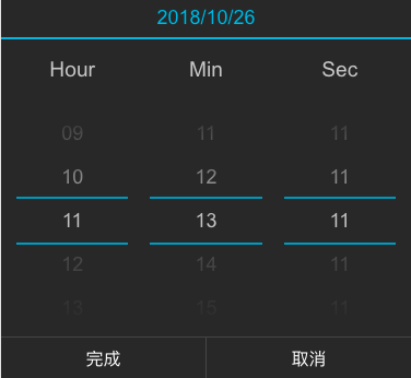
Using npm:
$ npm install react-mobile-datepicker-ts --save
The following guide assumes you have some sort of ES2015 build set up using babel and/or webpack/browserify/gulp/grunt/etc.
// Using an ES6 transpiler like BabelimportReactfrom'react';importReactDOMfrom'react-dom';importDatePickerfrom'react-mobile-datepicker';import'react-mobile-datepicker-ts/dist/main.css'import*asReactfrom'react';import*asReactDOMfrom'react-dom';importDatePickerfrom'react-mobile-datepicker';import'react-mobile-datepicker-ts/dist/main.css'constApp=()=>{const[time,setTime]=React.useState(newDate());const[isOpen,setIsOpen]=React.useState(false);consthandleToggle=(nextIsOpen: typeofisOpen)=>{setIsOpen(nextIsOpen);}consthandleSelect=(nextTime: typeoftime)=>{setTime(nextTime);setIsOpen(false);}return(<div><p>{time.toLocaleDateString()}</p><div><buttononClick={()=>handleToggle(true)}>
select time
</button></div><DatePickervalue={time}isOpen={isOpen}onSelect={handleSelect}onCancel={()=>handleToggle(false)}/></div>);}ReactDOM.render(<App/>,document.getElementById('root'));| Property | Type | Default | Description |
|---|---|---|---|
| isPopup | Boolean | true | whether as popup add a overlay |
| isOpen | Boolean | false | whether to open datepicker |
| theme | String | default | theme of datepicker, include 'default', 'dark', 'ios', 'android', 'android-dark' |
| dateConfig | Object | See DateConfig format for details | configure date unit information |
| headerFormat | String | 'YYYY/MM/DD' | customize the format of the display title |
| value | Date | new Date() | date value |
| min | Date | new Date(1970, 0, 1) | minimum date |
| max | Date | new Date(2050, 0, 1) | maximum date |
| showHeader | Boolean | true | whether to show the header |
| showFooter | Boolean | true | whether to show the footer |
| customHeader | ReactElement | undefined | customize the header, if you set this property, it will replace showFormat |
| confirmText | String | 'Done' | customize the selection time button text |
| cancelText | String | 'Cancel' | customize the cancel button text |
| onSelect | Function | () => {} | the callback function after click button of done, Date object as a parameter |
| onCancel | Function | () => {} | the callback function after click button of cancel |
| onChange | Function | () => {} | the callback function after date be changed |
| scrollSpeedFactor | number | 1 | the factor that affect wheel scroll speed |
| scrollSpeedLimit | number | DEFAULT_DATE_HEIGHT | the factor that maximum amount of scrolling (If not to changed the css, I recommend keeping the default settings.) |
all default date configuration information, as follows
- type: date unit
- format: date unit display format
- caption: date unit caption
- step: date unit change interval
[{type: 'year',format: 'YYYY',caption: 'Year',step: 1,},{type: 'month',format: 'MM',caption: 'Mon',step: 1,},{type: 'date',format: 'DD',caption: 'Day',step: 1,},{type: 'hour',format: 'hh',caption: 'Hour',step: 1,},{type: 'minute',format: 'mm',caption: 'Min',step: 1,},'second': {type: 'second',format: 'ss',caption: 'Sec',step: 1,}]Anyone and everyone is welcome to contribute to this project. The best way to start is by checking our open issues, submit a new issues or feature request, participate in discussions, upvote or downvote the issues you like or dislike.