

demo : http://axui-datagrid.jsdev.kr
npm install axui-datagridgit clone https://github.com/jsdevkr/axui-datagrid.git
cd axui-datagrid
npm i
npm start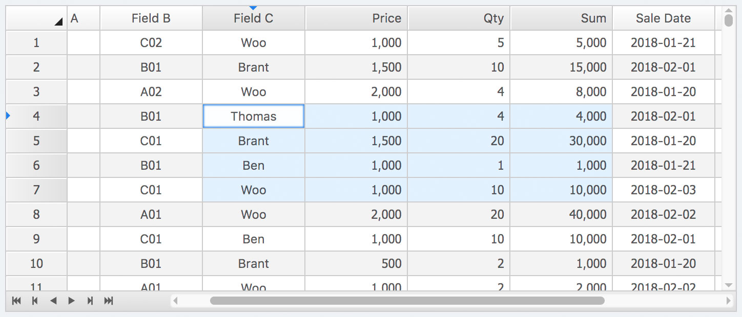
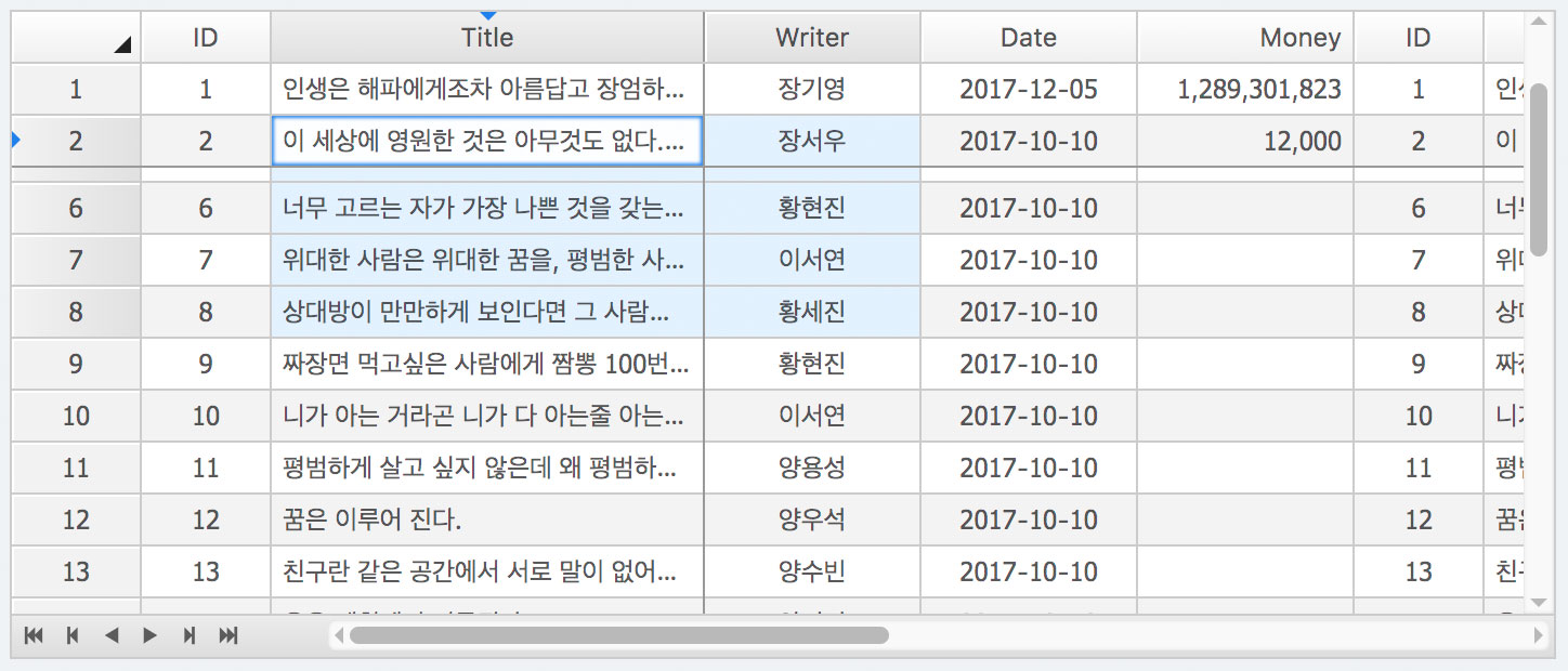
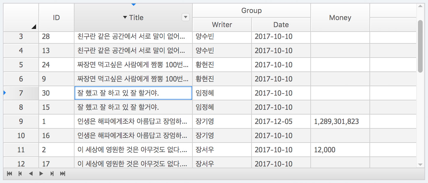
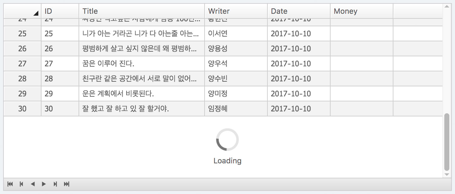
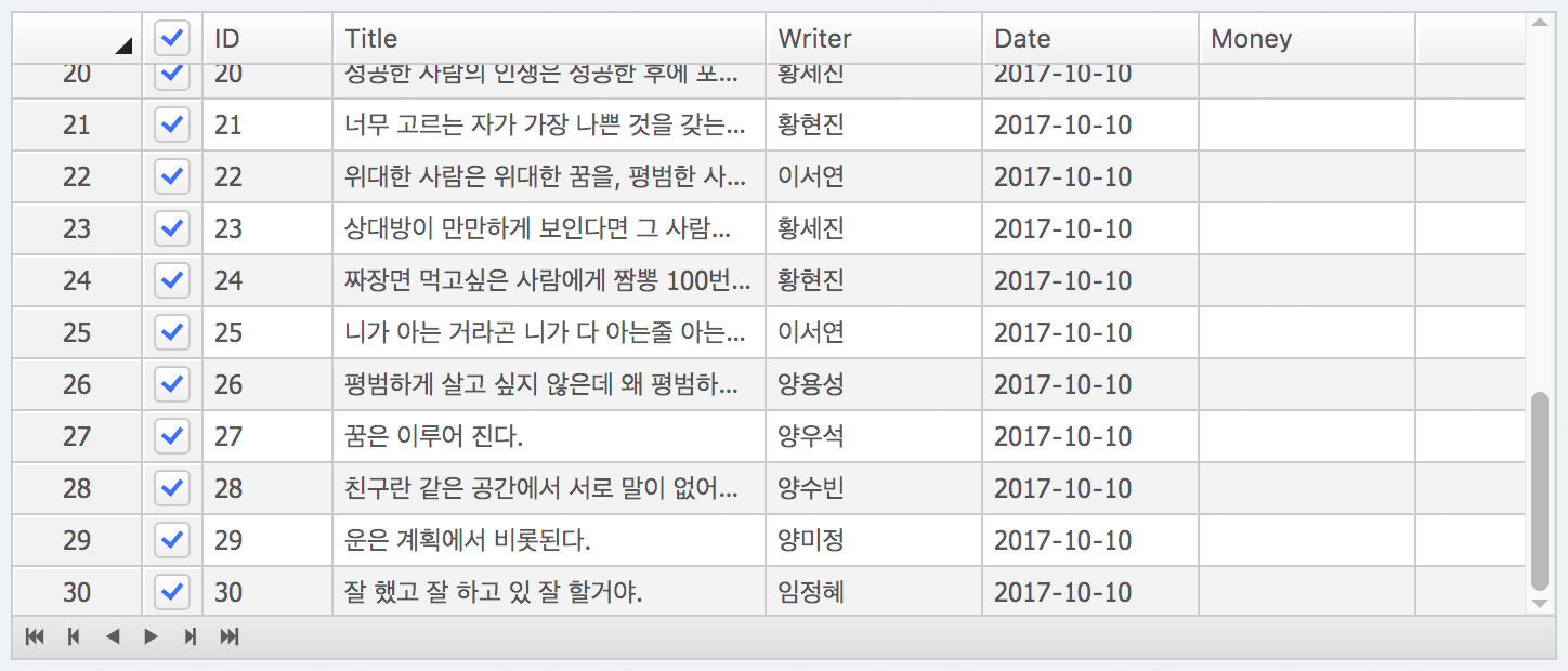
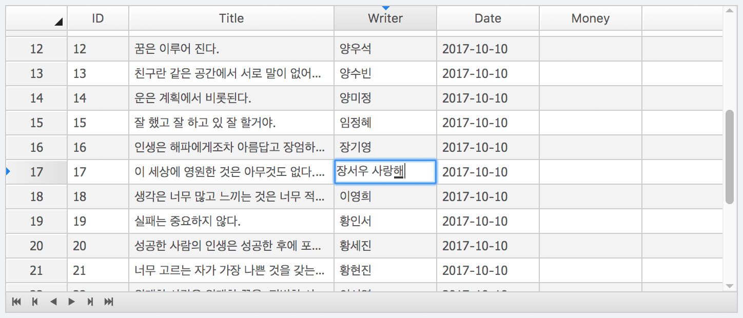
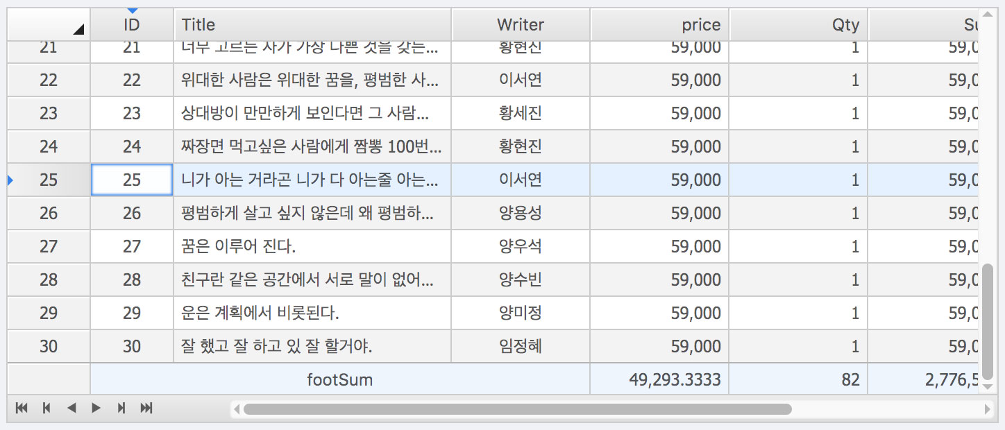
exportinterfaceIDataGridColumnextendsICol{colIndex?: number;rowIndex?: number;formatter?: formatterFunction|string;collector?: collectorFunction|string;editor?: editorFunction|string|{type?: string};hidden?: boolean;columns?: IDataGridColumn[];depth?: number;columnAttr?: string;}defaultOptions
static defaultColumnKeys: types.DataGridColumnKeys={selected: '__selected__',modified: '__modified__',deleted: '__deleted__',disableSelection: '__disable_selection__',};static defaultHeader: types.DataGridOptionHeader={display: true,align: 'left',columnHeight: 24,columnPadding: 3,columnBorderWidth: 1,selector: true,sortable: true,enableFilter: true,clickAction: 'sort',};static defaultBody: types.DataGridOptionBody={align: 'left',columnHeight: 24,columnPadding: 3,columnBorderWidth: 1,grouping: false,mergeCells: false,};static defaultPage: types.DataGridOptionPage={height: 20,};static defaultScroller: types.DataGridOptionScroller={size: 14,arrowSize: 14,barMinSize: 12,padding: 3,disabledVerticalScroll: false,};static defaultOptions: types.DataGridOptions={frozenColumnIndex: 0,frozenRowIndex: 0,showLineNumber: true,showRowSelector: false,multipleSelect: true,columnMinWidth: 100,lineNumberColumnWidth: 60,rowSelectorColumnWidth: 28,remoteSort: false,asidePanelWidth: 0,header: DataGrid.defaultHeader,body: DataGrid.defaultBody,page: DataGrid.defaultPage,scroller: DataGrid.defaultScroller,columnKeys: DataGrid.defaultColumnKeys,bodyLoaderHeight: 100,};onRightClick?: ({e: React.MouseEvent; item: any; value: any; focusedRow?: number; focusedCol?: number;}) => void;
IDataGridRowSelector
{
show: boolean;
rowKey: string;
selectedRowKeys?: string[];
onChange?: (param: IonChangeSelectedParam)=>void;}
You can see other source code here
Here is one example code for using a datagrid
importReact,{FC,useState}from'react';import{DataGrid,IDataGrid}from'axui-datagrid';interfaceIProps{}constDatagridExample: FC<IProps>=()=>{const[width,setWidth]=useState(500);const[height,setHeight]=useState(250);constcolumns: IDataGrid.IColumn[]=[{key: '0',width: 60,label: 'ID',align: 'center'},{key: '1',width: 200,label: 'Title',formatter: function(args: any){// console.log(args);return' * '+args.value;},},{key: '2',label: 'Writer',align: 'center',formatter: 'html'},{key: '0',label: 'Date',align: 'center',formatter: 'date'},{key: '1',label: 'Money',align: 'right',formatter: 'money'},];constdata=[{value: ['A01','B01','C']},{value: ['A02','B02','C<b>a</b>']},{value: ['A03','B03','C<b>a</b>']},{value: ['A04','B04','C<b>a</b>']},{value: ['A05','B05','C<b>a</b>']},{value: ['A06','B06','C<b>a</b>']},{value: ['A07','B07','C<b>a</b>']},{value: ['A08','B08','C<b>a</b>']},{value: ['A09','B09','C<b>a</b>']},{value: ['A10','B10','C<b>a</b>']},{value: ['A11','B11','C<b>a</b>']},];return(<divstyle={{border: '1px solid #d9d9d9', width, height }}><DataGridwidth={width}height={height}style={{fontSize: '12px'}}columns={columns}data={data}dataLength={data.length}options={{}}/></div>);};exportdefaultDatagridExample;- v0.3.0 - Add a new prop loading, loadingData, and onScrollEnd to the DataGrid.
- v0.3.2 - Add a new props onChangeSelected, refactoring StoreProvider
- v0.3.3 - Changed keyboard event firing to be determined by 'onCompositionUpdate' state. In InlineEdit mode.
- v0.3.5 - Update document and minor bug fix on inline-edit.
- v0.3.6 - bugfix : Wrong scrollPosition error when changed focus position by keyDown
- v0.3.7 - Update document and change columns fix
- v0.3.8 - support footSum props & minor bugfix
- v0.3.9 - filtered state display on header & fixed bug of 'footSum'
- v0.3.10 - Fixed bug : When clicking line Number cell did not working.
- v0.3.11 - Minor bug fix
- v0.3.14 - Code changes that were using 'findDOMNode'. so has remove dependencies 'react-dom'
- v0.3.18 - update readme
- v0.3.20 - changed onChangeSelected to rowSelector.onChange
- v0.4.0 - support contextmenu event
- v0.5.0 - support selection.onChange, Add a new props onRightClick, refactoring StoreProvider
- v0.5.1 - Improve columnFilter & modify examples
- v0.5.2 - Bugfix : The scrollBar is not displayed where resizing a column.
- v0.6.0 - Add a new prop width and Add IDataGrid namespace.
- v0.6.1 - Fixed an issue where the column position is not kept according to the scroll position.
- v0.7.0 - Modify scrollbar style
- v0.7.1 - Minor patch - scrollbar style
- v0.8.0 - Refactoring storeProvider & Modify scrollBar style
- v0.8.1 ~ 0.8.3 - minor patch & fixed bug
- v0.9.0 - Add a new props status & formatter support HTML
- v0.9.1 - display default status
- v0.10.0 - Added the options.autofitColumns property, fix problem wrong scroll position
- v0.10.1 - autofitColumns Timing Adjustments
- v0.11.0 - Added the options.scroller.width, height, theme
- v0.12.0 - Add a new props onScroll, remove props onAfterEvent, modify keydown scroll action
- v0.12.1 - update axui-datagrid-header.scss, header text color support
- v0.13.0 - support custom editor in column, add new props (onChangeSelected, onScroll, onChangeScrollSize)
- v0.13.1 - Modified the style of inline editing text.
- v0.13.2 - minor fix.
- v0.13.3 - Modify Inline editor
- v0.13.4 - update row by inlineEditor
- v0.13.5 - add option.rowSelectorSize
- v0.13.6 - Handle focus exception when text type editor is activeType 'always'.
- v0.13.7 - minor fix.
- v0.13.8 - rowSelect bug fix.
- v0.13.9 - add a new prop onClick
- v0.13.10 - Fixed bug onClick
- v0.13.11 - update default CSS & update example
- v0.13.12 - Fixed the copying of objects to clipboard copy data.
- v0.13.13 - Fixed scrollBar & scrollPosition.
- v0.14.0 - add option.lineNumberStartAt
- v0.14.1 - add selectedIndexes prop
- v0.14.2 - Fixed selectedIndexes prop
- v0.14.3 - Fixed, Problems not copied to the clipboard at Windows
- v0.14.4 - add option.disableClipboard
- v0.14.6 - remove option.autofitColumns, add props autofitColumns
- v0.14.7 - Scrolling error fix when the number of data exceeds 1.5 million.
- v0.14.8 - Fix minor issue
- v0.15.0 - Changed type of 'data' prop (IData) / Add 'dataLength' property / Option Properties Cleanup.
- v0.15.1 - Export IDataGrid interface
- v0.15.2 - Update readme
 DataGrid, DataSheet for React