TrendVis is a plotting package that uses matplotlib to create information-dense, sparkline-like, quantitative visualizations of multiple disparate data sets in a common plot area against a common variable. This plot type is particularly well-suited for time-series data. The results speak for themselves:
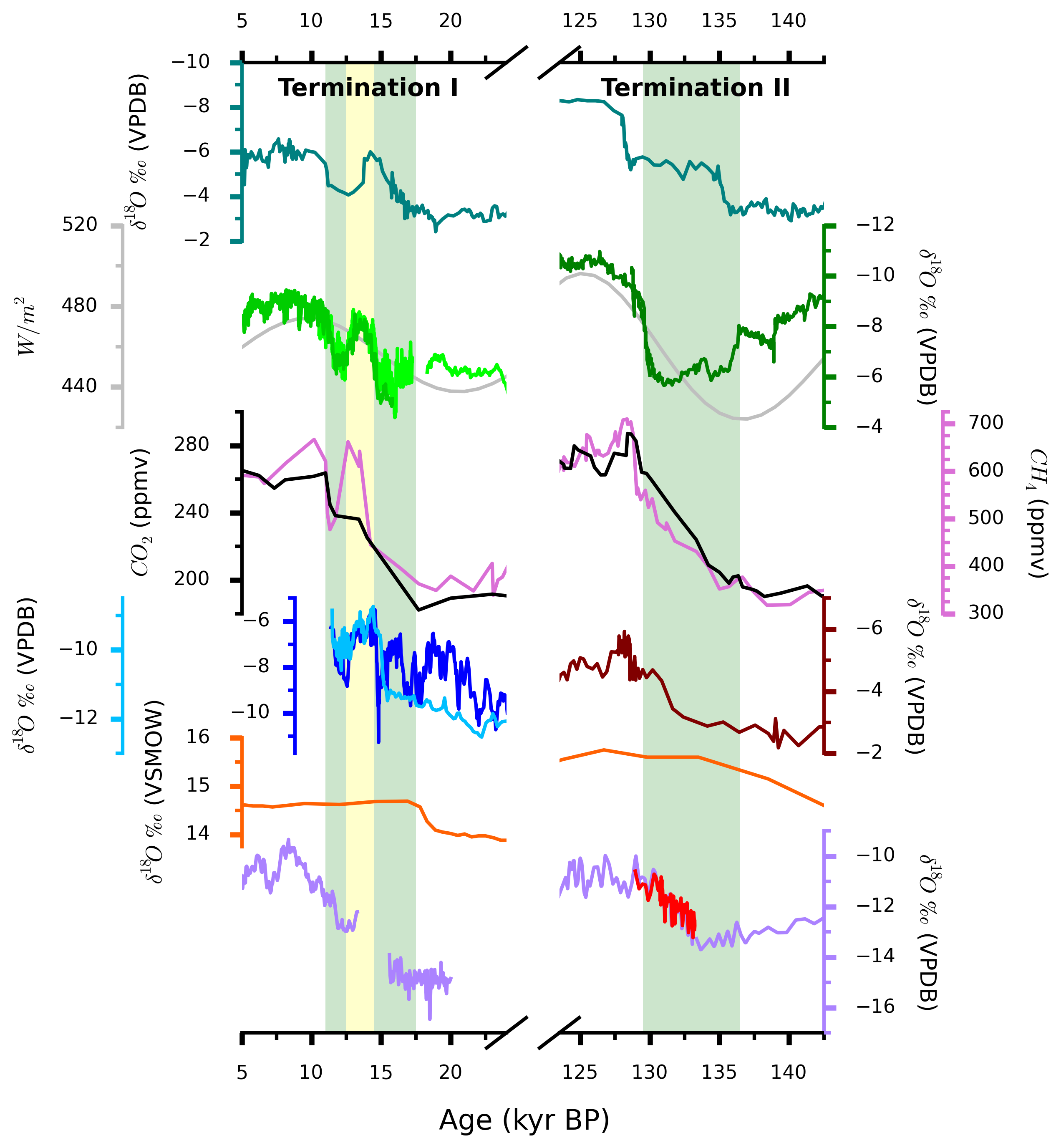
For further reading on TrendVis, see the SciPy 2015 Proceedings.
TrendVis is pure Python, natively supports Python 2 and 3, and depends only on matplotlib version 1.2 or greater.
Setup and installation is simple:
pip install -U trendvis
or, if you would like to develop the package, fork and clone the repo then run:
python setup.py develop
at package root.
Below are several examples showing various features in TrendVis and a typical workflow. Version >= 0.2.1 is required.
importnumpyasnpimportmatplotlib.pyplotaspltimporttrendvis# Pseudorandom data and plot attributesrandom_generator=np.random.RandomState(seed=123)
yvals=random_generator.rand(10)
# Plot attributesnums=10lw=1.5# convenience function trendvis.gridwrapper() is available# to initialize XGrid and do most of the formatting shown hereex0=trendvis.XGrid([1,2,1], figsize=(5,5))
# Convenience function for plotting line data# Automatically colors y axis spines to# match line colors (auto_spinecolor=True)trendvis.plot_data(ex0,
[[(np.linspace(0, 9.5, num=nums), yvals, 'blue')],
[(np.linspace(1, 9, num=nums), yvals*5, 'red')],
[(np.linspace(0.5, 10, num=nums), yvals*10, 'green')]],
lw=lw, markeredgecolor='none', marker='s')
# Get rid of extra spinesex0.cleanup_grid()
ex0.set_spinewidth(lw)
ex0.set_all_ticknums([(2, 1)], [(0.2, 0.1), (1, 0.5), (2, 1)])
ex0.set_ticks(major_dim=(7, 3), minor_dim=(4, 2))
ex0.set_ylabels(['stack axis 0', 'stack axis 1', 'stack axis 2'])
# In XGrid.fig.axes, axes live in a 1 level list# In XGrid.axes, axes live in a nested list of [row][column]ex0.axes[2][0].set_xlabel('Main Axis', fontsize=14)
# Compact the plotex0.fig.subplots_adjust(hspace=-0.3)
importnumpyasnpimportmatplotlib.pyplotaspltimporttrendvis# Pseudorandom datarandom_generator=np.random.RandomState(seed=1234)
xvals=random_generator.rand(20)
# Plot attributesnumpts=20lw=1.5# Initialize a YGridex1=trendvis.YGrid([1, 2, 1], yratios=[1, 2], figsize=(5,5))
# Convenience functiontrendvis.plot_data(ex1,
[[(xvals, np.linspace(2, 18.5, num=numpts), 'blue')],
[(xvals*5, np.linspace(1, 17, num=numpts), 'red')],
[(xvals*10, np.linspace(0.5, 20, num=numpts), 'green')]],
lw=lw, auto_spinecolor=True, markeredgecolor='none', marker='s')
# Remove extra spines, color stack (y) ticksex1.cleanup_grid()
ex1.set_spinewidth(lw)
# Tick, tick label formattingex1.set_all_ticknums([(0.2, 0.1), (1, 0.5), (2, 1)], [(2, 1), (2, 1)])
ex1.set_ticks(major_dim=(7, 3), minor_dim=(4, 2))
ex1.set_ylim([(0, 15, 20), (1, 0, 11)])
# Axes labelsex1.set_xlabels(['stack axis 0', 'stack axis 1', 'stack axis 2'])
ex1.axes[0][0].set_ylabel('Main Axis 0', fontsize=14)
ex1.axes[2][1].set_ylabel('Main Axis 1', fontsize=14,
rotation=270, labelpad=14)
# Draw boxes around each rowex1.draw_frame()
# Broken axis cutout marks also available, try this instead of the frame:# ex0.draw_cutout(di=0.05)# Compact the plotex1.fig.subplots_adjust(wspace=-0.3)
importnumpyasnpimportmatplotlib.pyplotaspltimporttrendvis# Make some pseudorandom datarandom_generator=np.random.RandomState(seed=123)
yvals=random_generator.rand(40)
yvals1=np.copy(yvals)
yvals1[20:] =np.array([0.2, 0.3, 0.2, 0.5, 0.34, 0.24,
0.15, 0.23, 0.26, 0.21] *2)
numpts=40lw=1.5x0=np.linspace(2, 49.5, num=numpts)
x1=np.linspace(1, 49, num=numpts)
x11=np.linspace(1.5, 47.5, num=numpts)
twin0=np.linspace(2, 50, num=numpts)
twin1=np.linspace(0.5, 48, num=numpts)
# Initialize XGrid and twin axesex2=trendvis.XGrid([3, 4], xratios=[1, 3, 2], figsize=(5, 5),
startside='right')
ex2.make_twins([0, 1])
# Convenience functiontrendvis.plot_data(ex2,
[[(x0, yvals, 'blue')],
[(x1, yvals1*5, 'red'), (x11, yvals1*5.2, 'orchid')],
[],
[(twin1, yvals*2, '0.5')]],
lw=lw, marker=None)
# Adjust twinned y-axis positions for readabilityex2.move_spines(twin_shift=0.6)
# For any other kind of plot (fill_between, scatter, errorbar, etc),# get axis and plot directly# Note: ex2.axes[2][2] == ex2.get_axis(0, xpos=2, is_twin=True)foraxinex2.axes[2]:
ax.fill_between(twin0, yvals+0.075, yvals-0.1,
edgecolor='none', color='darkorange')
# Handle axis ticksex2.cleanup_grid()
ex2.set_spinewidth(lw)
ex2.autocolor_spines()
ex2.set_all_ticknums([(2, 1), (2, 1), (2, 1)],
[(0.2, 0.1), (1, 0.5), (1, 0.25), (0.5, 0.25)])
ex2.set_ticks(major_dim=(6, 1.5), minor_dim=(3, 1))
ex2.set_ylabels(['row 0', 'row 1', 'twin row 0', 'twin row 1'])
# Rotate x-axis tick labelsforaxinex2.fig.axes:
plt.setp(ax.xaxis.get_majorticklabels(), rotation=45)
# Draw a vertical bar behind the data - horizontal bars available tooex2.draw_bar(ex2.axes[1][2], ex2.axes[0][2], (45, 47), color='lightblue')
# Ok to set axis limits after drawing on figure using TrendVis methods,# TrendVis will reset the bar to the right place!ex2.set_xlim([(0, 0, 3), (1, 13, 24), (2, 43, 50)])
ex2.set_ylim([(2, 0, 2)])
# matplotlib annotations supportedex2.get_axis(0).text(0, 0.75, 'Text')
# Cutouts instead of framesex2.draw_cutout(lw=lw)
# Set the suptitle and compact the plotex2.fig.suptitle('Title', fontsize=16, y=1.05);
ex2.fig.subplots_adjust(hspace=-0.1)
- Great Basin hydrology, paleoclimate, and connections with the North Atlantic: A speleothem stable isotope and trace element record from Lehman Caves, NV by Mellissa Cross, David McGee, Wallace S. Broecker, Jay Quade, Jeremy D. Shakun, Hai Cheng, Yanbin Lu, and R. Lawrence Edwards. doi:10.1016/j.quascirev.2015.06.016
- Figures 2, 3, 4, 5, and panels 1 and 2 in figure 6 made with TrendVis.
Additional references to works containing TrendVis figures are welcome!