
A better way for new feature introduction and step-by-step user guide for your Flutter project.
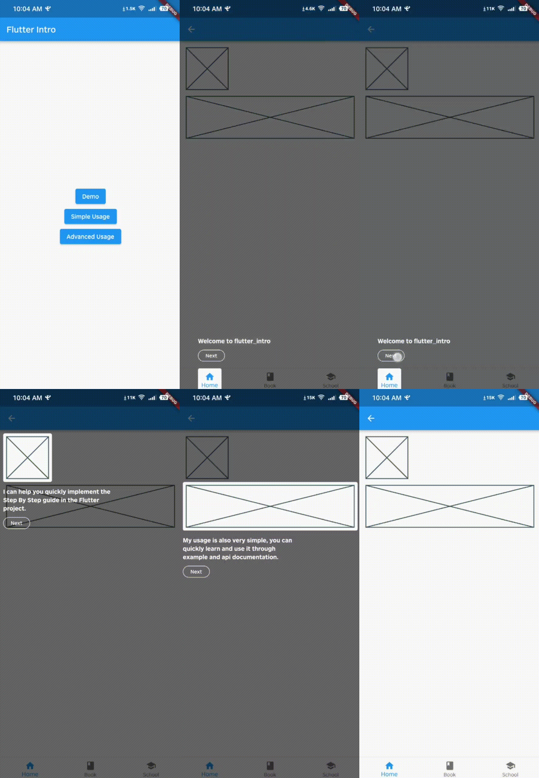 |  |
|---|---|
 |  |
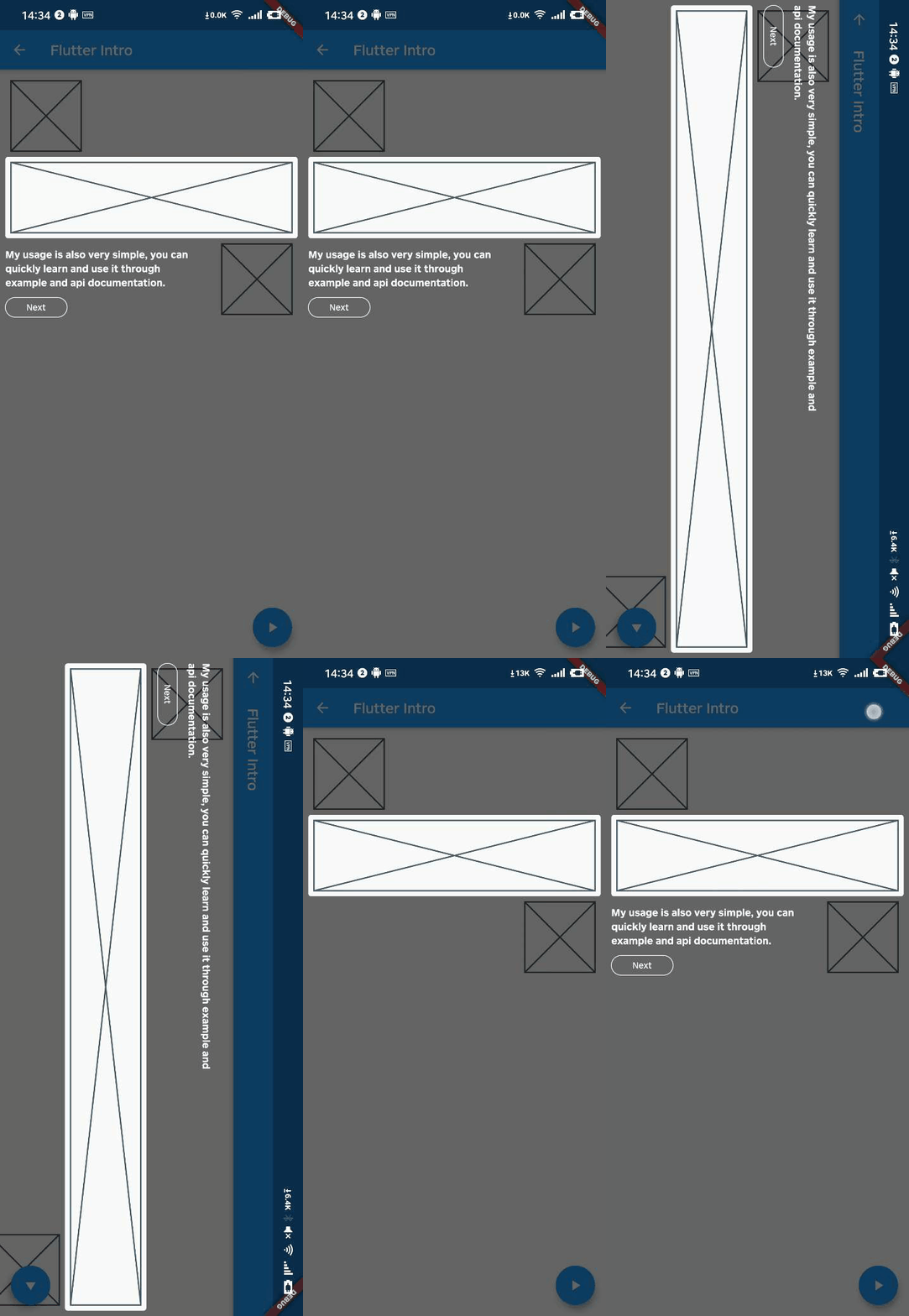
- The guide widget is capable of adapting to device orientation.
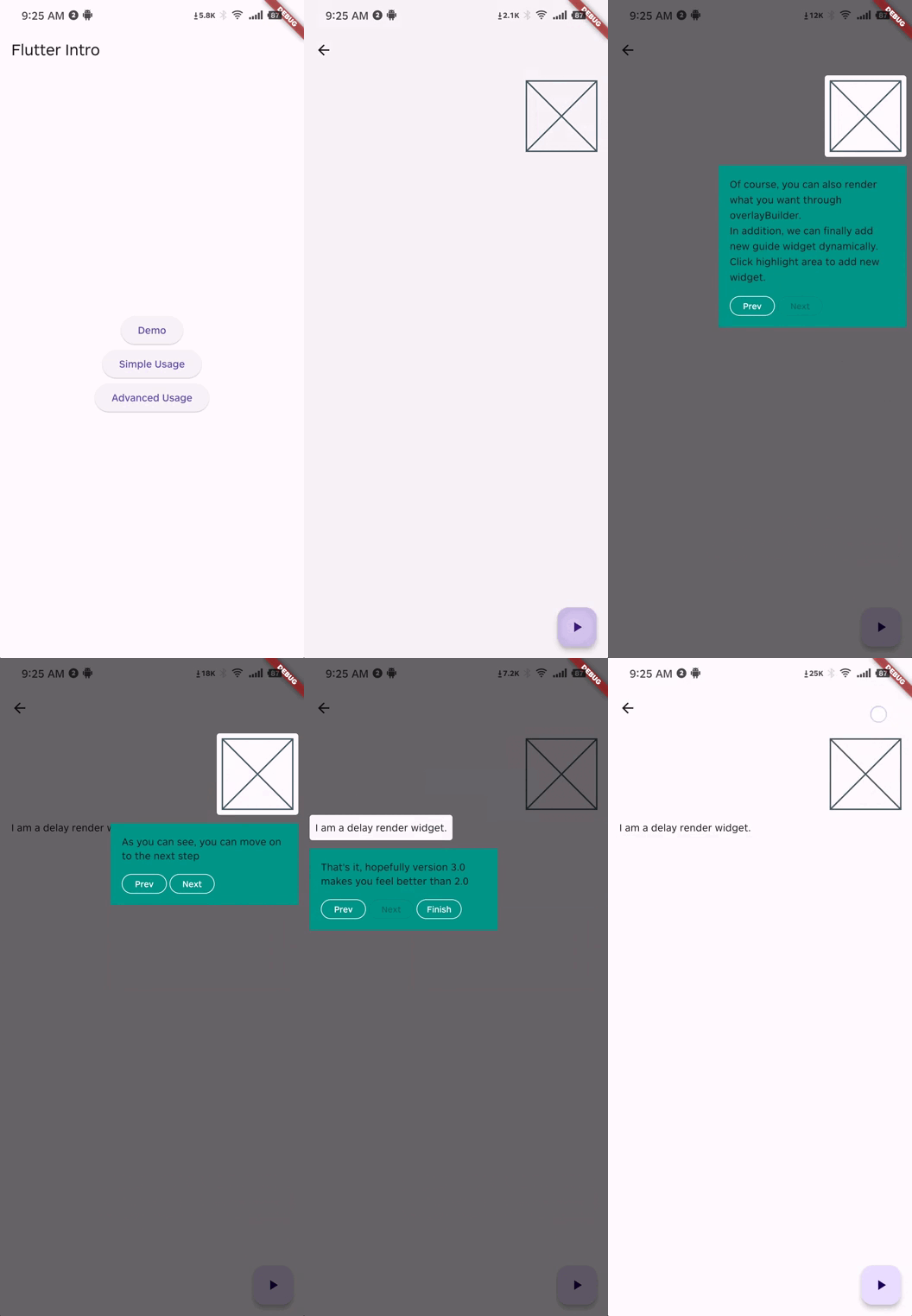
- Supports custom rendering of the guide widget overlay content.
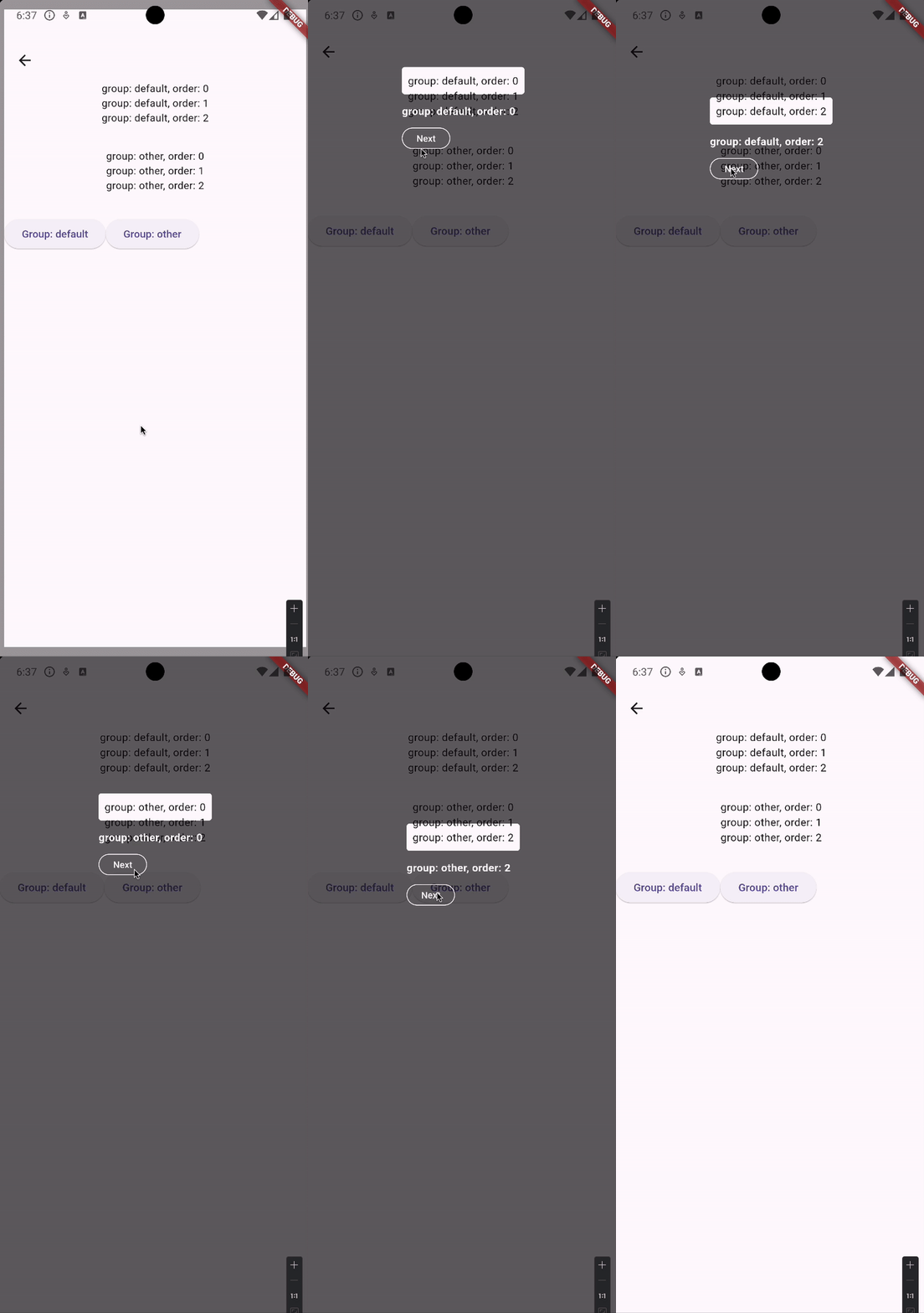
- Supports grouping of guide pages, facilitating the display of multiple guide groups on a single page.
- Supports guiding widgets that are rendered with a delay.
To use this package, add flutter_intro as a dependency in your pubspec.yaml file.
Wrap the app root widget with Intro. You can also set some global properties on Intro as seen
below.
import'package:flutter_intro/flutter_intro.dart';
Intro(
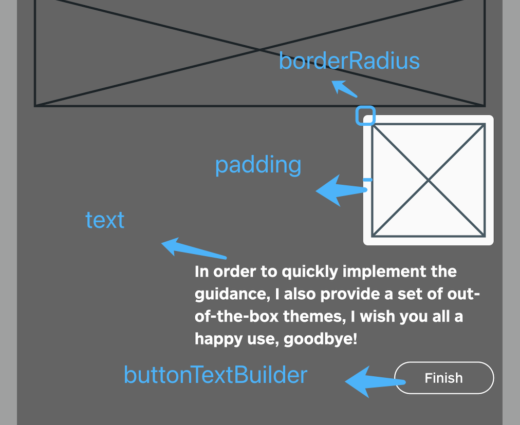
/// Padding of the highlighted area and the widget padding:constEdgeInsets.all(8),
/// Border radius of the highlighted area borderRadius:BorderRadius.all(Radius.circular(4)),
/// The mask color of step page maskColor:constColor.fromRGBO(0, 0, 0, .6);
/// Toggle animation noAnimation:false;
/// Toggle whether the mask can be closed maskClosable:false;
/// Build custom button buttonBuilder: (order) {
returnIntroButtonConfig(
text: order ==3?'Custom Button Text':'Next',
height: order ==3?48:null,
fontSize: order ==3?24:null,
style: order ==3?OutlinedButton.styleFrom(
backgroundColor:Colors.red,
)
:null,
);
},
/// High-level widget child:constYourApp(),
)Wrap a widget with IntroStepBuilder, placing the original widget inside builder and applying the
key so it can be found.
order must be defined uniquely per route so that the unique key can be generated.
/// See docs for full list of properties, some of which override [Intro] onesIntroStepBuilder(
/// Required: use unique int for each step to set guide order order:1,
/// Use either `text` or `overlayBuilder` to create guide content (see "Advanced Usage" for latter /// example)./// Use text to quickly add leading text text:'Use this widget to...',
/// Required: provide function that returns a `Widget` with the key builder: (BuildContext context, GlobalKey key) =>NeedGuideWidget(
/// Bind the key to whatever is returned key: key,
),
)
That's it!
Intro.of(context).start();/// See `example/lib/advanced_usage.dart` for more detailsIntroStepBuilder(
order:2,
/// Create a customized guide widget overlayBuilder: (StepWidgetParams params) {
returnYourCustomOverlay();
},
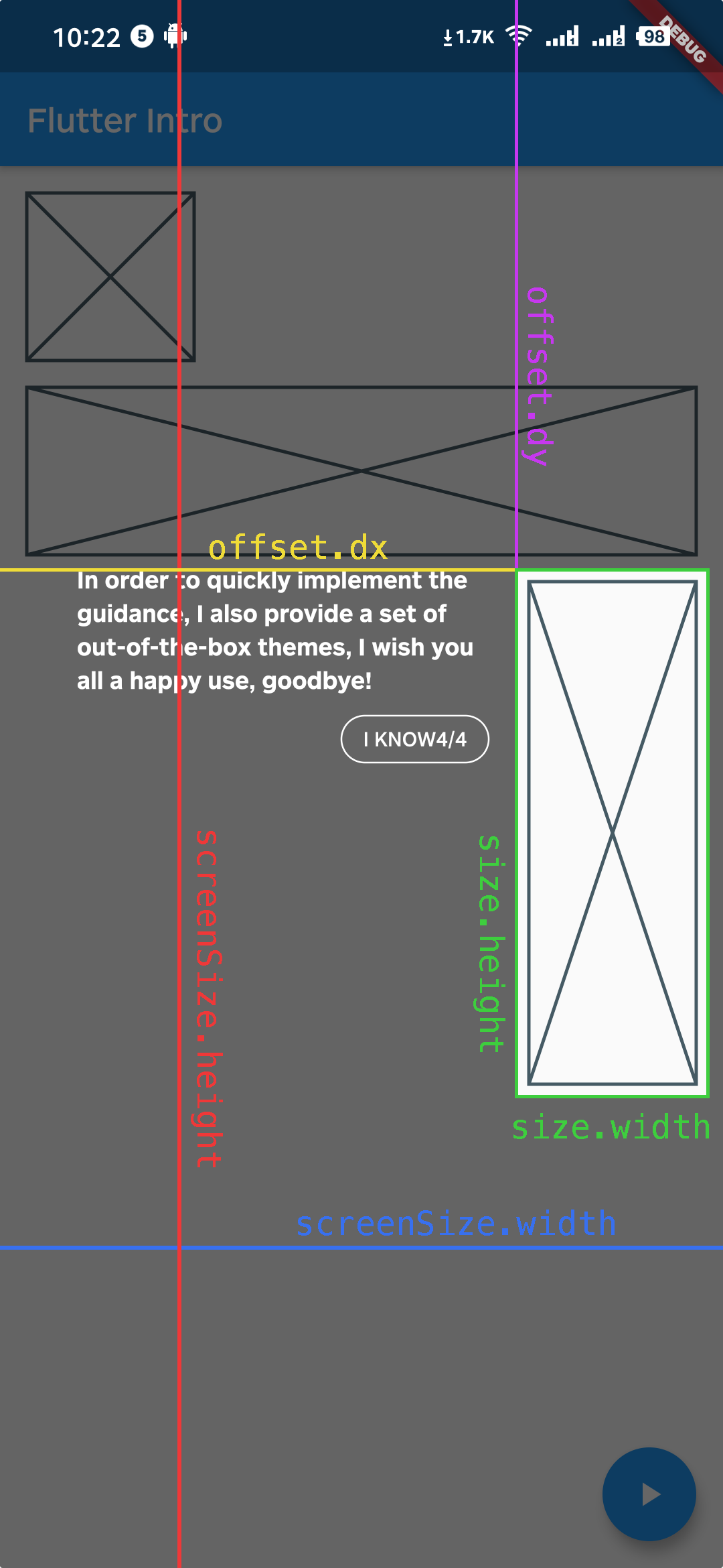
)StepWidgetParams provides many useful parameters to generate the guide overlay, as seen below.
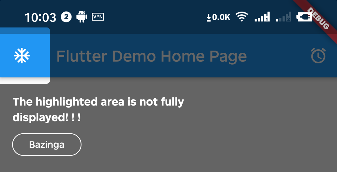
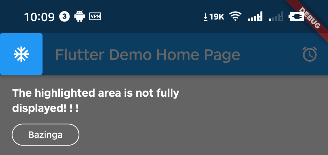
A1. That's because Intro provides 8px padding by default.
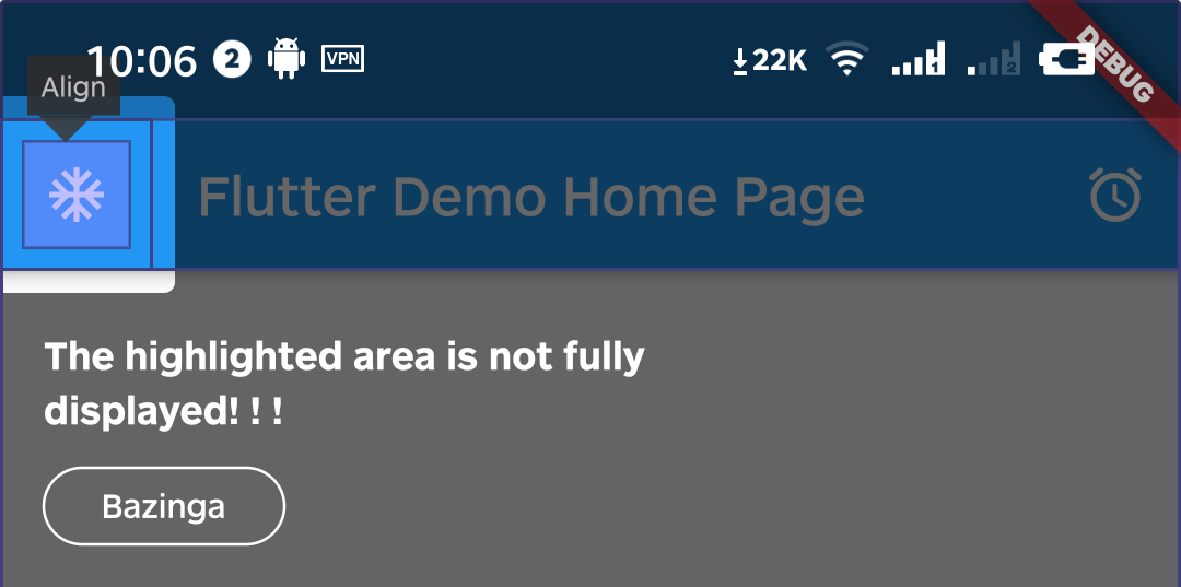
We can change it by setting the value of padding.
Intro(
/// Set padding to zero (or negative) to reduce highlight size padding:EdgeInsets.zero,
child:constYourApp(),
);
A2. Yes, you can configure every IntroStepBuilder.
IntroStepBuilder(
order:3,
padding:constEdgeInsets.symmetric(vertical:5, horizontal:5),
borderRadius:constBorderRadius.all(Radius.circular(64)),
builder: (context, key) =>YourWidget(),
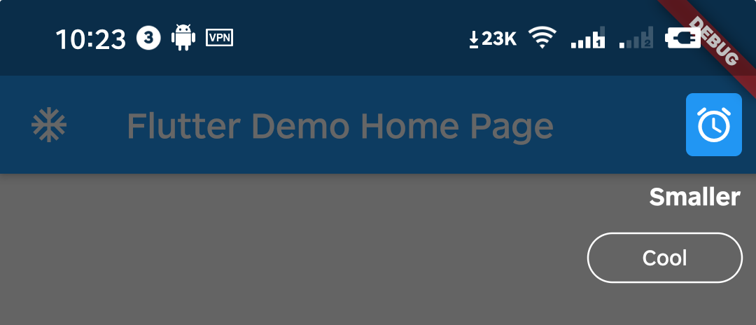
)A3. Yes, can do it by setting padding to a negative number.
IntroStepBuilder(
order:4,
/// Reduce highlight size further padding:constEdgeInsets.symmetric(
vertical:-5,
horizontal:-5,
),
builder: (context, key) =>YourWidget(),
)
A4. You can call the dispose method of the intro instance.
WillPopScope(
child:Scaffold(...),
onWillPop: () async {
finalIntro intro =Intro.of(context);
if (intro.status.isOpen ==true) {
intro.dispose();
returnfalse;
}
returntrue;
},
)A5. As of v3.1.0, you can use ValueNotifier<IntroStatus> statusNotifier.
You can achieve the same effect through the following sample code.
ValueListenableBuilder(
valueListenable: intro.statusNotifier,
builder: (context, value, child) {
returnPopScope(
canPop:!value.isOpen,
onPopInvoked: (didPop) {
if (!didPop) {
intro.dispose();
}
},
child:Scaffold(...),
);
},
)Please check the example in example/lib/main.dart.