




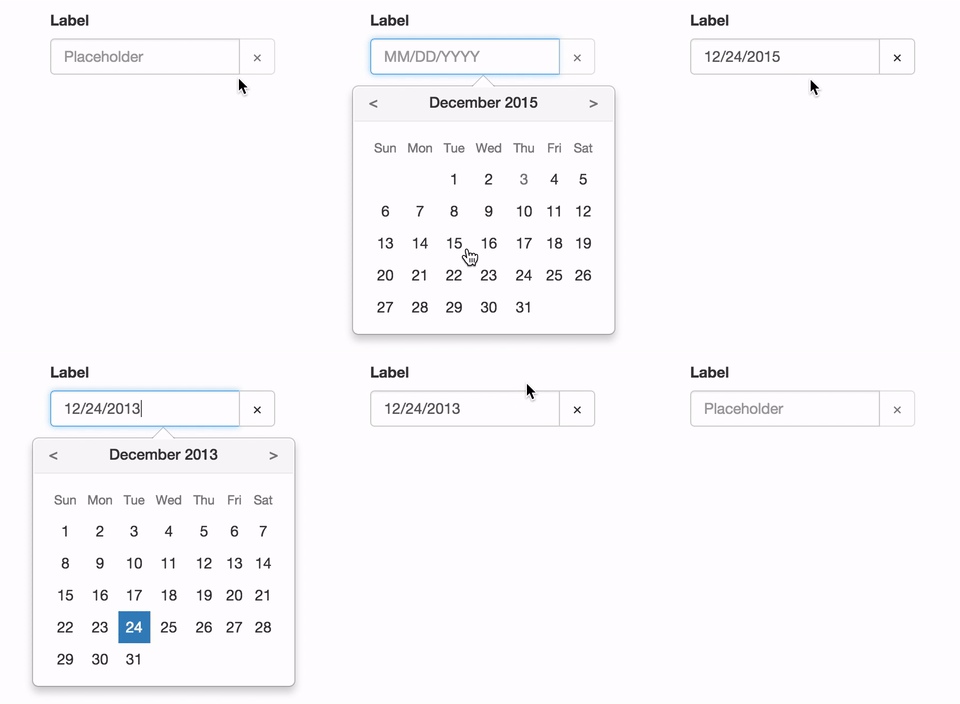
See the demo at pushtell.github.io/react-bootstrap-date-picker.
Please ★ on GitHub!
Using this module in production? We'd love to hear about it.
react-bootstrap-date-picker is compatible with React 0.14.x and 0.15.x.
npm install react-bootstrap-date-pickervarDatePicker=require("react-bootstrap-date-picker");varApp=React.createClass({getInitialState: function(){varvalue=newDate().toISOString();return{value: value}},handleChange: function(value,formattedValue){this.setState({value: value,// ISO String, ex: "2016-11-19T12:00:00.000Z"formattedValue: formattedValue// Formatted String, ex: "11/19/2016"});},componentDidUpdate: function(){// Access ISO String and formatted values from the DOM.varhiddenInputElement=document.getElementById("example-datepicker");console.log(hiddenInputElement.value);// ISO String, ex: "2016-11-19T12:00:00.000Z"console.log(hiddenInputElement.getAttribute('data-formattedvalue'))// Formatted String, ex: "11/19/2016"},render: function(){return<FormGroup><ControlLabel>Label</ControlLabel><DatePickerid="example-datepicker"value={this.state.value}onChange={this.handleChange}/><HelpBlock>Help</HelpBlock></FormGroup>;}});DatePicker component. Renders as a React-Bootstrap InputGroup.
InputGroup properties are passed through to the input group.
Properties:
value- ISO date string representing the current value.- Optional
- Type:
string - Example:
"2016-05-19T12:00:00.000Z"
defaultValue- ISO date string representing the default value. Cannot be set with 'value'.- Optional
- Type:
string - Example:
"2016-05-19T12:00:00.000Z"
minDate- ISO date string to set the lowest allowable date value.- Optional
- Type:
string - Example:
"2016-05-19T12:00:00.000Z"
maxDate- ISO date string to set the highest allowable date value.- Optional
- Type:
string - Example:
"2016-05-19T12:00:00.000Z"
style- Style object passed to theFormControlinput element.- Optional
- Type:
object - Example:
{width: "100%"}
className- Class name passed to theFormControlinput element.- Optional
- Type:
string - Example:
example-class
autoComplete- autoComplete attribute passed to theFormControlinput element.- Optional
- Type:
string - Example:
off
autoFocus- Whether or not component starts with focus.- Optional
- Type:
bool - Example:
false
disabled- Whether or not component is disabled.- Optional
- Type:
bool - Example:
false
onChange- Focus callback function.- Optional
- Type:
function - Callback Arguments:
value- ISO date string representing the selected value.- Type:
String - Example:
"2016-05-19T12:00:00.000Z"
- Type:
formattedValue- String representing the formatted value as defined by thedateFormatproperty.- Type:
String - Example:
"05/19/2016"
- Type:
onFocus- Focus callback function.- Optional
- Type:
function - Callback Arguments:
event- Focus event.- Type:
Event
- Type:
onBlur- Blur callback function.- Optional
- Type:
function - Callback Arguments:
event- Blur event.- Type:
Event
- Type:
dateFormat- Date format. Any combination of DD, MM, YYYY and separator.- Optional
- Type:
string - Examples:
"MM/DD/YYYY","YYYY/MM/DD","MM-DD-YYYY", or"DD MM YYYY"
clearButtonElement- Character or component to use for the clear button.- Optional
- Type:
stringorReactClass - Example:
"×"
showClearButton- Toggles the visibility of the clearButton- Optional
- Type:
bool - Example:
false
onClear- Defines what happens when clear button is clicked.- Optional
- Type:
function
previousButtonElement- Character or component to use for the calendar's previous button.- Optional
- Type:
stringorReactClass - Example:
"<"
nextButtonElement- Character or component to use for the calendar's next button.- Optional
- Type:
stringorReactClass - Example:
">"
cellPadding- CSS padding value for calendar date cells.- Optional
- Type:
string - Example:
"2px"
dayLabels- Array of day names to use in the calendar. Starting on Sunday.- Optional
- Type:
array - Example:
['Sun', 'Mon', 'Tue', 'Wed', 'Thu', 'Fri', 'Sat']
monthLabels- Array of month names to use in the calendar.- Optional
- Type:
array - Example:
['January', 'February', 'March', 'April', 'May', 'June', 'July', 'August', 'September', 'October', 'November', 'December']
calendarPlacement- Overlay placement for the popover calendar.- Optional
- Type:
stringorfunction - Example:
"top"
calendarContainer- Overlay container for the popover calendar. When placing the date-picker in a scrolling container, set this prop to some ancestor of the scrolling container.- Optional
- Type: A DOM element or a component
- Example:
document.body
weekStartsOnMonday- OBSOLETE useweekStartsOnweekStartsOn- Makes the calendar's week to start on a specified day. 0 = Sunday, 1 = Monday, etc.- Optional
- Type:
number - Example:
4
showTodayButton- Toggles the visibility of the today-button.- Optional
- Type:
boolean - Example:
false
todayButtonLabel- Label for the today-button- Optional
- Type:
string - Example:
"Today"
customControl- Overwrite the defaultFormControlcomponent with your own component.- Optional
- Type:
React.Component - Example:
<CustomControl />
Methods:
Karma tests are performed on Browserstack in the following browsers:
- IE 9, Windows 7
- IE 10, Windows 7
- IE 11, Windows 7
- Opera (latest version), Windows 7
- Firefox (latest version), Windows 7
- Chrome (latest version), Windows 7
- Safari (latest version), OSX Yosemite
- Mobile Safari (latest version), iPhone 6, iOS 8.3
Please let us know if a different configuration should be included here.
Locally:
npm testOn Browserstack:
BROWSERSTACK_USERNAME=YOUR_USERNAME BROWSERSTACK_ACCESS_KEY=YOUR_ACCESS_KEY npm test