Uh oh!
There was an error while loading. Please reload this page.
Resizing of the activity icon - #2217
Conversation
tobiasKaminsky
commented
Feb 22, 2018
Can you vertically align the icon with the text? |
AndyScherzinger
commented
Feb 22, 2018
Sure, I will :)
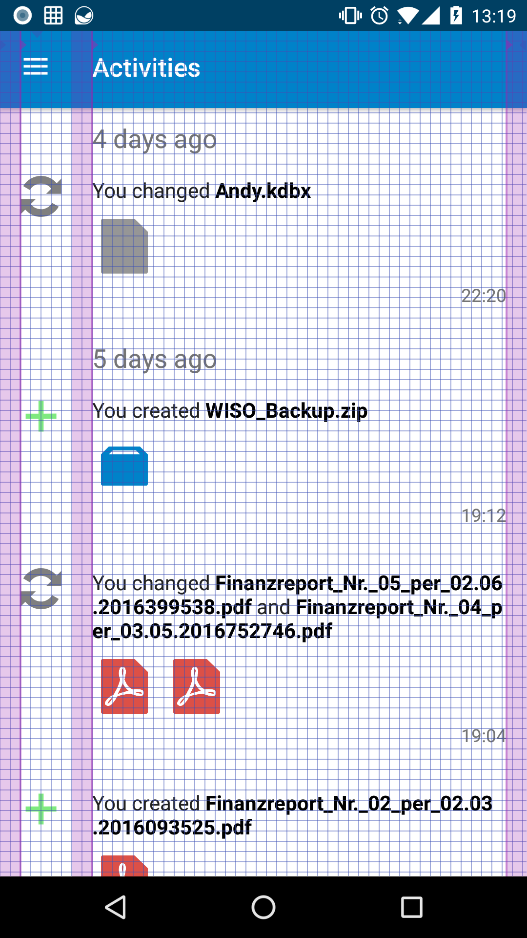
What do you mean? Make is slightly larger? (see grid screenshot of the actual state)
Wrong :P They are perfectly aligned in their center (see grid screenshot of the actual state) (click for 100% size) |
tobiasKaminsky
commented
Feb 22, 2018
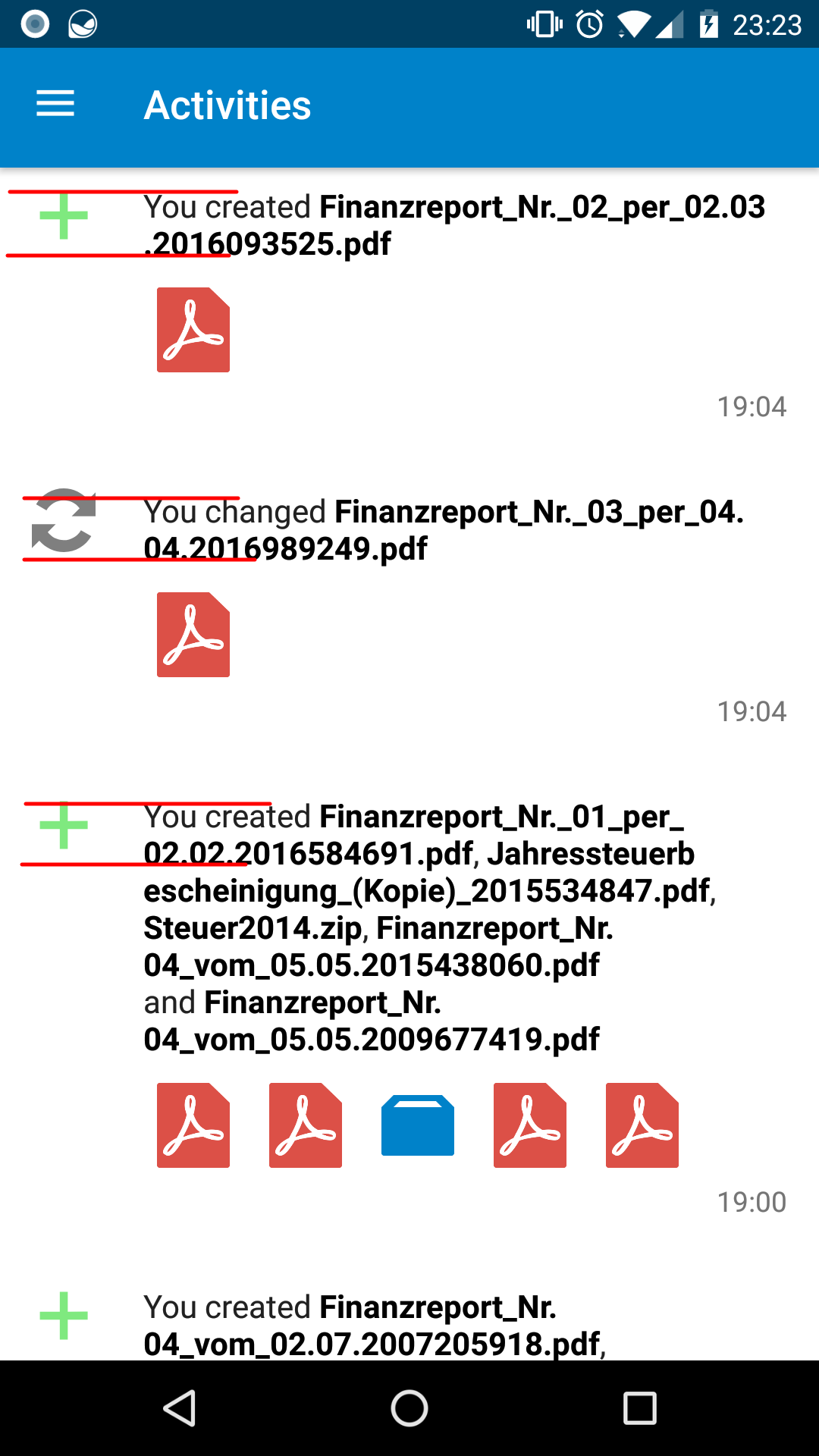
With 2 lines I mean following:
--> top of the icon starts with top of the first line, height is exactly 2 lines high Horizontally alignment: mea culpa :-) My eyes... |
AndyScherzinger
commented
Feb 22, 2018
Unfortunately we can't do that since the icons contain virtual paddings/margins since they contain whitespace (or not) so we have the icon bound to the top but some have whitespace at the top within the image so that will then lead to the icon starting slightly lower then the text. So whatever we do it will be wront since the images aren't just the icon with no transparent borders within the images...This we can only align vertically (or horizontally) centered since the icon within the image is centered. |
tobiasKaminsky
commented
Feb 22, 2018
Ok. After all I am not a designer, but just found it not that beautiful that the images end between two lines. |
AndyScherzinger
commented
Feb 22, 2018
I totally agree with your comments! It is just that technically we can't do this except for hardcode paddings per icon-type since they dontain different amounts of whitespace. If all icons would have no extra whitespace we could do this. cc @nextcloud/designers |
tobiasKaminsky
commented
Feb 22, 2018
Then we should do this? ;-) |
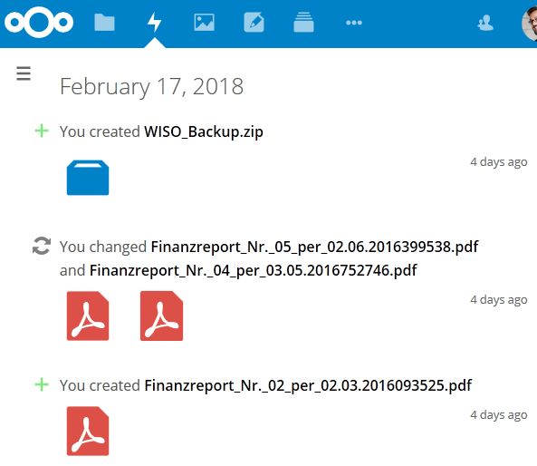
What is the source of those icons? in nextcloud/server/core/img, we try to make icons appear same-sized, even if they are not, pixel-per-pixel. Idea is basically to make "thinner" icons larger and "fat" icons smaller. In the screenshots, those icons definitely don't look similar-sized. I think addressing that might fix (ok, perhaps not fix, but make it look ok) the issue mentioned by @tobiasKaminsky Another thing is that icons are always centered in their viewBox (16px x 16px) and usually have width and/or height set to 14/15 px, leaving 1 or 2 px padding. Not totally related, but IMO it looks really weird that icons are ~30% larger than the hamburger icon, even though they are in the same "column"... P.S. @tobiasKaminsky can't totally remove padding, because of reasons mentioned above ⬆️ |
AndyScherzinger
commented
Feb 22, 2018
@pixelipo We get the images from the server so I'd guess they are the ones you mentioned to be located in nextcloud/server/core/img As seen on this serve rscreenshot they do differ in "weight"/size and thus end up that way on the client too. So I'd also say if this is "fixed" on the server side it'll also improve the client side :) |
pixelipo
commented
Feb 22, 2018
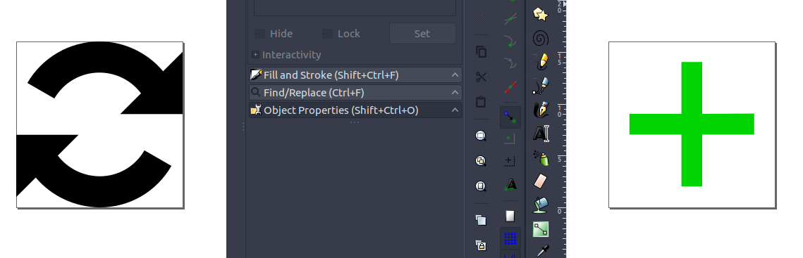
I've checked. Those are fetched from the Files app, not core. Add icon is good, but the other one is definitely not: Hmmm, I thought I've fixed it, but from the looks of it, I only optimized filesize... I'll push a PR soon, and include the PNG variant (you're using that, or creating your own from SVG?) |
Awesome, thanks a lot @pixelipo ❤️
We are using the SVG variant directly :) |
pixelipo
commented
Feb 22, 2018
PR created 😉 |
jancborchardt
commented
Feb 22, 2018
Good stuff, looks good! Also agree with alignment comments and the size reduction of change icon. :) |
👍 |

AndyScherzinger
commented
Feb 23, 2018
cc @mario / @przybylski for second review :) |
3268282 to
de2e1a4CompareAndyScherzinger
commented
Feb 27, 2018
cc @mario for second review :) |
Works like a charm, tested with avd android 8.0 |
de2e1a4 to
99f5badCompareAndyScherzinger
commented
Mar 12, 2018
cc @mario for second review :) |
👍 |
cb7999c to
32a92f9Compare
Fix#2215
cc @jancborchardt - Is this "small" enough or would you go even smaller?
