Uh oh!
There was an error while loading. Please reload this page.
Accessibility and design fixes for update and redirect pages - #11557
Conversation
Signed-off-by: Jan-Christoph Borchardt <hey@jancborchardt.net>
 skjnldsv
left a comment
skjnldsv
left a comment
There was a problem hiding this comment.
Not really fond of the shadow, feels too strange :)
I feel like when using opacity, having a neat delimitation is easier for us to find where to focus, but the eye tend to get confused by gradual shadow.
But the rest is 🔥 🔥 🔥
Signed-off-by: Jan-Christoph Borchardt <hey@jancborchardt.net>
jancborchardt
commented
Oct 2, 2018
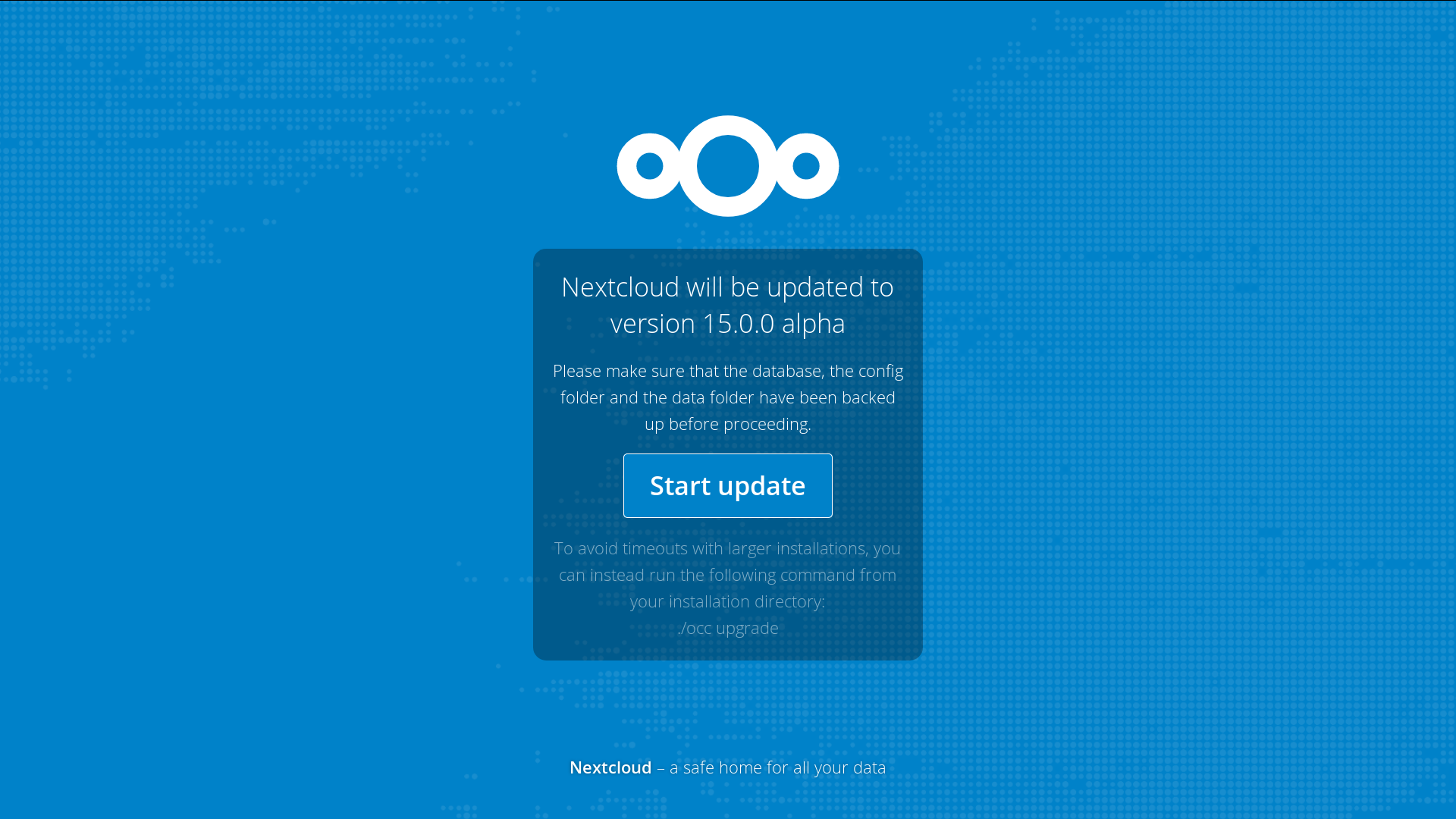
@skjnldsv removed the shadow! 🌞 |
MariusBluem
commented
Oct 2, 2018
I liked it more with the shaddow to be honest 🤨🤭 |
 MorrisJobke
left a comment
MorrisJobke
left a comment
There was a problem hiding this comment.
👍 I like it with the shadow 👍
jancborchardt
commented
Oct 2, 2018
For the record: I also like it better with the shadow, but am also fine without. :) Let’s just get it in like this, we can do the shadow later. |
 weeman1337
left a comment
weeman1337
left a comment
There was a problem hiding this comment.
I like it more without the shadow. It somehow looks cleaner.
With shadow this also looks like the new rounded dialogs - but it isn't one...
rullzer
commented
Oct 3, 2018
Let me merge this now and you can discuss further changes in followup issues :) |
Log in now, with nice hover/focus effect (there was none before):

Redirect of Mail app before & after, had no hover/focus effect either. General style adjusted like the modal in #11536


Same for upgrade, had no hover/focus effect, and some spacing on top and bottom was fixed:


Please review @nextcloud/designers @nextcloud/accessibility