Uh oh!
There was an error while loading. Please reload this page.
CSS: adjust media query breakpoint to improve tablet readability - #15199
Conversation
jancborchardt
commented
Apr 25, 2019
What do you think @nextcloud/designers? |
Damn, I had a pending branch for that :D see 1a36280 |
nachoparker
commented
Apr 27, 2019
@skjnldsv thanks for pointing that out. I tested briefly with the main default apps and I didn't see that we needed any more changes, but since you have made more progress on this, should we merge your changes here? or do you have a standing PR? In that case we can close this as duplicate |
skjnldsv
commented
Apr 29, 2019
@nachoparker I did not opened the pr yet :) |
nachoparker
commented
May 2, 2019
(sorry I deleted my remote branch accidentally) @skjnldsv I looked at your changes and tweaked them a bit. The only big change is in |
skjnldsv
commented
May 7, 2019
Another one: server/apps/files_sharing/css/public.scss Line 198 in c91ba00 |
skjnldsv
commented
May 9, 2019
Ah, I just saw that. |
skjnldsv
commented
May 17, 2019
🎺 |
nachoparker
commented
May 17, 2019
let me get you an animation, it will be easier to explain |
nachoparker
commented
May 21, 2019
Ok, this is with the rule @mediaonlyscreenand(max-width: 1024px)and(min-width: 769px),onlyscreenand(max-width: 688px){
, and this is with @mediaonlyscreenand(max-width: $breakpoint-mobile){
If we want to keep three cut points, there needs to be more adjustment to be made. I like it simple but that's just my preference. |


skjnldsv
commented
May 21, 2019
jancborchardt
commented
May 22, 2019
@nachoparker looking at the gifs:
|
nachoparker
commented
May 23, 2019
Thanks @jancborchardt the first one is what you already have, only substituting 938px -> 1024px, that's what I mean that it needs some more tweaking because it doesn't look good (and I proposed number 2). Let's see if we can find a sweet spot |
nachoparker
commented
May 26, 2019
Ok, so if we want three breakpoints I think this is exactly what we are after -> f902ee7
|

| @@ -1,4 +1,4 @@ | |||
| @media only screen and (max-width: $breakpoint-mobile) { | |||
| @media only screen and (max-width: 938px) and (min-width: $breakpoint-mobile + 1), only screen and (max-width: 688px) { | |||
There was a problem hiding this comment.
938 was basically the 688+250 (nav width)
We might be able to find the use of the mobile breakpoint somewhere here :)
There was a problem hiding this comment.
I think the idea behind it is that we found that the min width the filelist should have was 688px, (with full view, modified, size, actions.
..) So those breakpoints were there for that.
@jancborchardt ?
jancborchardt
commented
May 28, 2019
@nachoparker nice, that last gif you posted looks perfect to me! 👍 What do you think @nextcloud/designers? |
I pushed a commit to use the $navigation-width variable. |
33c108f to
3cbb466Compare3cbb466 to
c3fe271Comparejancborchardt
commented
May 29, 2019
@skjnldsv hmm, the gif by @nachoparker looks slightly better than the last one you posted, because it has 1 less breaking step:
You have a strange step between 1 and 2 with "Show navigation but hide file details", which doesn’t seem necessary. The content should always take precedence over the navigation. That is, before any content is hidden, the navigation should be hidden before, as done in @nachoparker’s gif. What do you think? |
EDIT: ah no, I took a gif on the wrong branch ^^ |

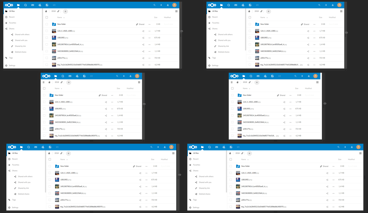
 jancborchardt
left a comment
jancborchardt
left a comment
There was a problem hiding this comment.
Looking very good now! 👍
(We should also look at how it works with the right sidebar, but that’s a follow-up. :)
c3fe271 to
3c30d29CompareThanks for your first pull request and welcome to the community! Feel free to keep them coming! If you are looking for issues to tackle then have a look at this selection: https://github.com/nextcloud/server/issues?q=is%3Aopen+is%3Aissue+label%3A%22good+first+issue%22 |
@skjnldsv Just a minor nitpick. You commited some git merge/rebase LOCAL REMOTE files to the repo. ;-) See main.js.map |
@go2sh what do you mean? Edit ah damn, I see it now. Thanks! |
nachoparker
commented
May 30, 2019
Thanks gents! |
see nextcloud/news#467