Uh oh!
There was an error while loading. Please reload this page.
adjust avatar and its line height to comment message style - #7514
Conversation
Signed-off-by: Arthur Schiwon <blizzz@arthur-schiwon.de>
skjnldsv
commented
Dec 14, 2017
I'm still really not convinced by how we display our avatars in comments. :/ |
I would prefer something more inline like this, what do you think @nextcloud/designers ? |

dan0xii
commented
Dec 14, 2017
Codecov Report
@@ Coverage Diff @@## master #7514 +/- ##
============================================
+ Coverage 51.16% 51.17% +<.01%
Complexity 24865 24865 ============================================
Files 1601 1601 Lines 94683 94688 +5 Branches 1368 1369 +1 ============================================
+ Hits 48446 48452 +6 + Misses 46237 46236 -1
|
danxuliu
commented
Dec 14, 2017
Mmm, but if you do that then whether the display name is perfectly legible or not would depend on the colours of the avatar... In any case, regarding this pull request, besides the avatar size let's not forget about the other issues ;) In fact I would solve them first and then fix the size, as changing the size first may mask without really solving some of them. But first of all it would be better to decide if we are keeping the avatars shown like they are now or not to avoid working in vain ;-) |
MorrisJobke
commented
Dec 14, 2017
I would drop the avatars from the inline text. No need to clutter the text like this. |
skjnldsv
commented
Dec 14, 2017
@danxuliu there is other ways to ensure that white text is readable over an undefined background, we do it in multiple places like the login page for example. Visually speaking, how do you like my example? |
jancborchardt
commented
Dec 14, 2017
@skjnldsv overlaying it like this will impair readability in any case. Also, we don't do it like this anywhere else, nor is there really a popular platform which does this. I would say this is great, as long as the vertical alignment and margin to the username is proper and the same. |
danxuliu
commented
Dec 14, 2017
I would keep them, but smaller like in this pull request and closer to the display name; sort of a replacement for the @ symbol.
Do you mean using The best way to ensure that a text is legible regardless of the background would be with a text outline instead of a text shadow, but it seems that it was removed from CSS3 :-(
I still prefer the avatar to the side instead of below the display name, sorry :-) |

skjnldsv
commented
Dec 14, 2017
@danxuliu indeed! :) I don't like having the avatar in front of it, I feel like it's two separate elements, I like the idea of having both of them merged together. I won't vote then! :) |
jancborchardt
commented
Dec 14, 2017
@skjnldsv as I mentioned, we can move them closer together. But merging would be absolutely non-standard and very difficult to read, especially for people with visual impairments. It also won't work with the avatar placeholders as they have an actual letter in them which further hampers readability. |
pixelipo
commented
Dec 14, 2017
I'm strongly agreeing with @MorrisJobke on this topic. Avatars are great when you need to identify author, but inline, they're nothing but hieroglyphs. Since we are not living in ancient Egypt or Mesopotamia, we should be able to read text using latin alphabet only. In fact, has anyone bothered to check how this looks with Mandarin, Arabic etc.? |
skjnldsv
commented
Dec 14, 2017
How do you know? :O |
jancborchardt
commented
Dec 14, 2017
Folks, there are compelling reasons for including the avatars. Names with the avatars directly put a face to the person and are like an easy-to-recognize "icon" of them. Like when scrolling through a conversation on Github or Signal or any messenger, you don't really read the names. Furthermore, it makes it evidently clear someone is mentioning a person. Otherwise it's just bolded text. Also keep in mind that the example above is a bit nonstandard since you would not mention the same person 3 times in the same comment really. With the small avatar it's absolutely fine. I will look into proper alignment later. |
blizzz
commented
Dec 14, 2017
danxuliu
commented
Dec 14, 2017
Interesting technique :-) Maybe someday I will have time to get up to date with the new CSS features... :-P
Quoting myself:
and @jancborchardt:
Gestalt law of proximity FTW! :-P
Right now, if Nextcloud was used in a right-to-left language like Arabic the look of the avatars will probably be the lesser of the problems :-P Jokes aside, as far as I know characters in those languages are still characters. I mean, even if they can be very complex like Chinese characters they are still monochromatic, so as long as the display name is shown in bold and the avatar is closer to it than to the previous character it would be the same as in Latin characters, wouldn't it? Or what I am missing? |
blizzz
commented
Dec 14, 2017
I am also for keeping avatars with the display names, and I also agree with moving them closer together. Fancy tricks are fancy, but I would not overlay them alone for accessibility, even if you can do some nice stuff with filters and what not. → Seconding @jancborchardt
Yay! Any contributions to this dark art are highly appreciated 😎 |
pixelipo
commented
Dec 14, 2017
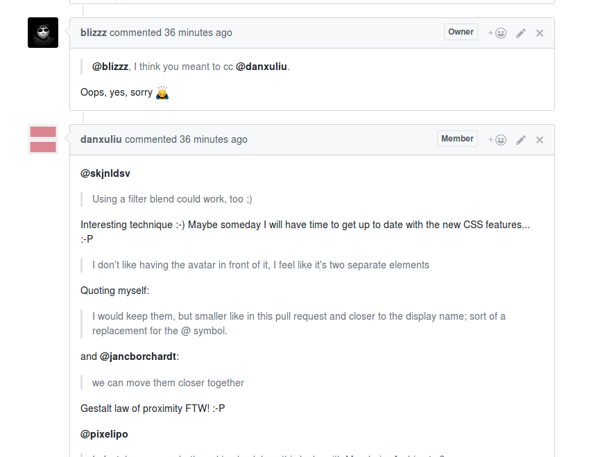
@jancborchardt since you're mentioning Github, as is obvious in this comment - your username is still very visible, even though it doesn't include an avatar. I don't have a problem with readability here: |
danxuliu
commented
Dec 14, 2017
OK, I have realized that what I was missing is that the spacing used in logogram-based writing systems is not necessarily the same as in alphabet and syllabary-based languages (as the characters are logograms they could be written with the same spacing between each of them instead of grouped in words like in alphabets and syllabaries). Anyway, I think that is not a reason to drop avatars; I am sure that there are a lot of other details in logogram-based languages to take into account if an alternative to image avatars was needed due to those writing systems. |
jancborchardt
commented
Dec 14, 2017
@pixelipo the problem with readability there is that among the lowercased, similar length usernames, you actually have to read them to distinguish. Avatars help to identify people way quicker, and they don't disturb text flow. People also use emojis quite a lot, which are similar in size. 😉 |
skjnldsv
commented
Dec 14, 2017
The only username you can't mix up with another one is mine! 😆 |
pixelipo
commented
Dec 15, 2017
OK, one last try proving my point and I'm out ☠️
That's all from me on this topic 👋 |
skjnldsv
commented
Dec 20, 2017
Point proven @pixelipo :) |
rullzer
commented
Jan 2, 2018
So what is the verdict here? Beta 4 is coming. Last chance to get this is. If there is discussion left I suggest to move it to 14 when we find a suitable solution. |
blizzz
commented
Jan 3, 2018
@pixelipo arguments convince me. Do we all agree on? I'd adapt the PR then. |
MorrisJobke
commented
Jan 3, 2018
I would say so. 👍 Let's move this to 14. |
rullzer
commented
Jan 3, 2018
Yes makes a lot of sense.! |
jancborchardt
commented
Jan 5, 2018
While I disagree, through points stated above, I don't want to piss awesome folks off – so let's simply go without the avatars inside of comment text. :) (We can revisit it in 2-5 years when others might start doing it. ;) |
| '{{/if}}' + | ||
| '</li>'; | ||
| var AVATAR_SIZE_TEXT = '16'; |
There was a problem hiding this comment.
Jan asked me to use 21px for avatars in activities.
Maybe we can use the same here.
jancborchardt
commented
Jan 9, 2018
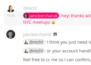
And btw for the record, one product which does this is https://about.riot.im (usable IRC chat ;) cc @skjnldsv@pixelipo just for input :)
|


blizzz
commented
Jan 10, 2018
Cannot test, requires side loaded, 3rd party service from an ads enterprise. Blocked here. #poweruser |
@blizzz feel free to run it yourself: https://github.com/vector-im/riot-web Also, the screenshots I posted above show everything you need to see. |
MorrisJobke
commented
May 23, 2018
@nextcloud/designers We need a decision on this. What is the current status? Show it or not? Keeping a PR open for that long doesn't help anybody. 😢 |
danxuliu
commented
May 28, 2018
@MorrisJobke The idea is to remove the avatars from mentions and unify their look with the ones used in Talk, so I think that we can close this pull request, as it will be overridden sooner or later (hopefully sooner than later ;-) ). |
@jancborchardt@dan0xii there is still something odd with line breaks when the message is rendered. It's seems right in the edit mode (content-editable=true), but not in the plain one.
Before:
Now: