Note: This repository contains a port to C# of the original library, which is written in Swift.



EasyTipView is a fully customisable tooltip view that can be used as a call to action or informative tip.
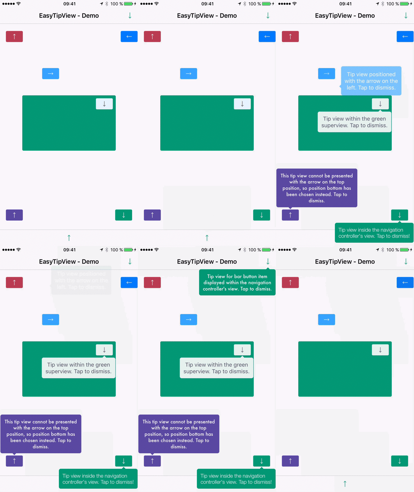 | 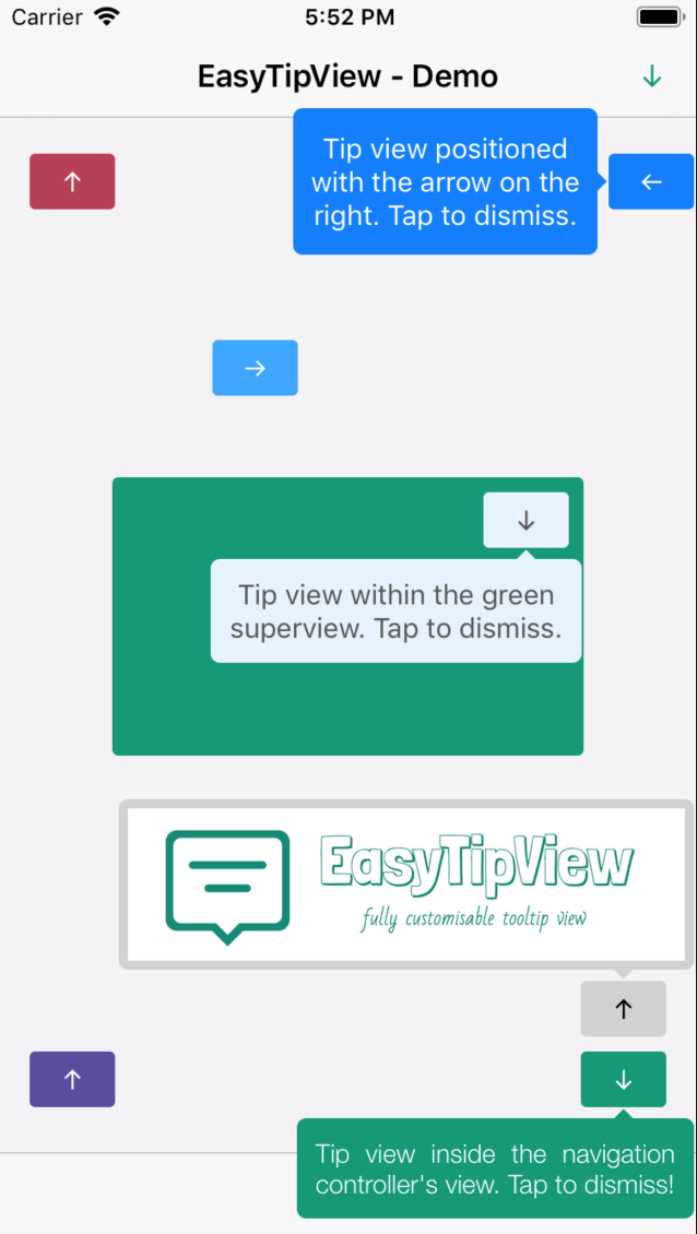 |
|---|
- Features
- Installation
- Supported OS & SDK versions
- Usage
- Customising the appearance
- Customising the presentation and dismissal animations
- License
- Can be shown pointing to any
UIViewsubclass. - support for any arrow direction
←, →, ↑, ↓ - Automatic orientation change adjustments.
- Fully customisable appearance.
- Fully customisable presentation and dismissal animations.
Install-Package EasyTipView
If you prefer not to use either of the aforementioned dependency managers, you can integrate EasyTipView into your project manually.
- Supported build target - iOS 8+ (Xcode 8)
- Install package into your application project
- Create a new EasyTipView control:
_myTooltip=newEasyTipView.EasyTipView();_myTooltip.Text=newFoundation.NSString("This is a tooltip sample!");_myTooltip.ArrowPosition=EasyTipView.ArrowPosition.Right;_myTooltip.DidDismiss+=(sender,e)=>{// do something on dismiss};_myButton1.TouchUpInside+=(sender,e)=>{_myTooltip.Show(_myButton1,this.View,true);};_myButton2.TouchUpInside+=(sender,e)=>{_myTooltip.Dismiss();};As you can see from the example above, Show method takes three parameters:
- View to which the tooltip will be anchored
- Superview where the tooltip will be added on screen
- Animated will display / hide the tooltip using animations
In order to customise the EasyTipView appearance and behaviour, you can play with the properties the widget exposes.
All customization possibilities can be splitted into three groups:
- Drawing - Properties related to the way
EastTipViewwill be drawn on screen. - Positioning - Properties related to the way
EasyTipViewwill be drawn within its own bounds. - Animating - Properties that will tell
EasyTipViewhow to animate itself on and off screen.
| Property | Type | Default value | Description |
|---|---|---|---|
CornerRadius | float | 5f | The corner radius of the tip view bubble. |
ArrowHeight | float | 5f | The height of the arrow positioned at the top or bottom of the bubble. |
ArrowWidth | float | 10f | The width of the above mentioned arrow. |
ForegroundColor | UIColor | Black | The text color. |
BubbleColor | UIColor | Red | The background color of the bubble. |
ArrowPosition | ArrowPosition | ArrowPosition.Any | The position of the arrow. This can be: + Top: on top of the bubble + Bottom: at the bottom of the bubble.+ Left: on the left of the bubble + Right: on the right of the bubble + Any: use this option to let the EasyTipView automatically find the best arrow position. If the passed in arrow cannot be applied due to layout restrictions, a different arrow position will be automatically assigned. |
TextAlignment | UITextAlignment | UITextAlignment.Center | The alignment of the text. |
BorderWidth | float | 0 | Width of the optional border to be applied on the bubble. |
BorderColor | UIColor | Clear | Color of the optional border to be applied on the bubble. In order for the border to be applied, BorderColor needs to be different that UIColor.Clear and BorderWidth > 0 |
Font | UIFont | UIFont.SystemFontOfSize(15f) | Font to be applied on the text. |
| Property | Type | Default value | Description |
|---|---|---|---|
BubbleHInset | float | 1f | Horizontal bubble inset witin its container. |
BubbleVInset | float | 1f | Vertical bubble inset within its container. |
TextHInset | float | 10f | Text horizontal inset within the bubble. |
TextVInset | float | 10f | Text vertical inset within the bubble. |
MaxWidth | float | 200f | Max bubble width. |
| Property | Type | Default value | Description |
|---|---|---|---|
DismissTransform | CGAffineTransform | CGAffineTransform.MakeScale(0.1f, 0.1f) | CGAffineTransform specifying how the bubble will be dismissed. |
ShowInitialTransform | CGAffineTransform | CGAffineTransform.MakeScale(0f, 0f) | CGAffineTransform specifying the initial transform to be applied on the bubble before it is animated on screen. |
ShowFinalTransform | CGAffineTransform | CGAffineTransform.MakeIdentity() | CGAffineTransform specifying how the bubble will be animated on screen. |
SpringDamping | float | 0.7f | Spring animation damping. |
SpringVelocity | float | 0.7f | Spring animation velocity. |
ShowInitialAlpha | float | 0 | Initial alpha to be applied on the tip view before it is animated on screen. |
DismissFinalAlpha | float | 0 | The alpha to be applied on the tip view when it is animating off screen. |
ShowDuration | float | 0.7f | Show animation duration. |
DismissDuration | float | 0.7f | Dismiss animation duration. |
DismissOnTap | bool | true | Prevents view from dismissing on tap if it is set to false. |
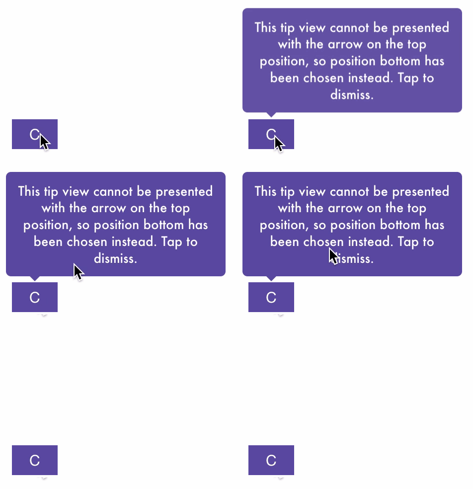
The default animations for showing or dismissing are scale up and down. If you want to change the default behaviour, you need to change some animating attributes. An example could be:
DismissTransform=CGAffineTransform.MakeTranslation(0,-15);ShowInitialTransform=CGAffineTransform.MakeTranslation(0,-15);ShowInitialAlpha=0f;ShowDuration=1.5f;DismissDuration=1.5f;This produces the following animations:
EasyTipView is released under the MIT license. See the LICENSE file for details.
Logo was created using Bud Icons Launch graphic by Budi Tanrim from FlatIcon which is licensed under Creative Commons BY 3.0. Made with Logo Maker.