

模仿IOS里面的UIActionSheet控件,有iOS6和iOS7两种风格,可以自定义风格,背景图片、按钮图片、文字颜色、间距等。
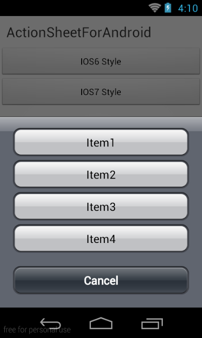
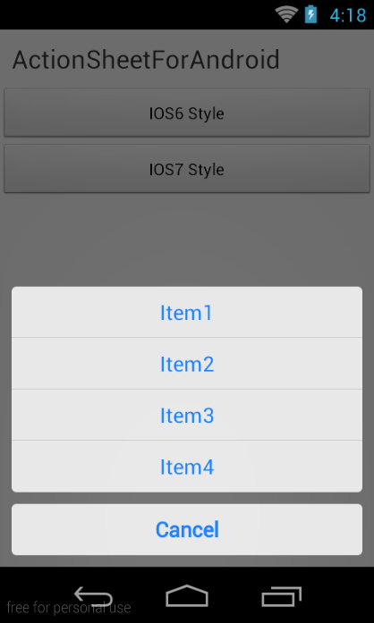
ActionSheet.createBuilder(this, getSupportFragmentManager())
.setCancelButtonTitle("Cancel")
.setOtherButtonTitles("Item1", "Item2", "Item3", "Item4")
.setCancelableOnTouchOutside(true)
.setListener(this).show();setCancelButtonTitle()设置取消按钮的标题setOtherButtonTitles()设置条目,String[]setCancelableOnTouchOutside()设置点击空白处关闭setListener()设置事件监听器show()返回ActionSheet对象,可以调用ActionSheet对象的dismiss()方法手动关闭
实现ActionSheetListener接口
onOtherButtonClick()点击某个条目,index是条目的下标onDismiss()关闭事件,isCancel参数表示是否是点击取消按钮、返回键、或者点击空白处(setCancelableOnTouchOutside(true))
@OverridepublicvoidonOtherButtonClick(ActionSheetactionSheet, intindex) {
Toast.makeText(getApplicationContext(), "click item index = " + index,
0).show();
}
@OverridepublicvoidonDismiss(ActionSheetactionSheet, booleanisCancle) {
Toast.makeText(getApplicationContext(), "dismissed isCancle = " + isCancle, 0).show();
}默认的样式非常丑陋,项目中提供了两种Style,可以配置Theme
<!-- Application theme. -->
<stylename="AppTheme"parent="AppBaseTheme">
<itemname="actionSheetStyle">@style/ActionSheetStyleIOS6</item>
or
<itemname="actionSheetStyle">@style/ActionSheetStyleIOS7</item>
</style>
还可以自定义样式,自定义一个style即可,可以参考ActionSheetStyleIOS6/ActionSheetStyleIOS7的写法
<!-- iOS7样式 -->
<stylename="ActionSheetStyleIOS7">
<itemname="actionSheetBackground">@android:color/transparent</item>
<itemname="cancelButtonBackground">@drawable/slt_as_ios7_cancel_bt</item>
<itemname="otherButtonTopBackground">@drawable/slt_as_ios7_other_bt_top</item>
<itemname="otherButtonMiddleBackground">@drawable/slt_as_ios7_other_bt_middle</item>
<itemname="otherButtonBottomBackground">@drawable/slt_as_ios7_other_bt_bottom</item>
<itemname="otherButtonSingleBackground">@drawable/slt_as_ios7_other_bt_single</item>
<itemname="cancelButtonTextColor">#1E82FF</item>
<itemname="otherButtonTextColor">#1E82FF</item>
<itemname="actionSheetPadding">10dp</item>
<itemname="otherButtonSpacing">0dp</item>
<itemname="cancelButtonMarginTop">10dp</item>
<itemname="actionSheetTextSize">12sp</item>
</style>actionSheetBackground背景cancelButtonBackground取消按钮背景otherButtonTopBackground选项顶部按钮背景otherButtonMiddleBackground选项中部按钮背景otherButtonBottomBackground选项底部按钮背景otherButtonSingleBackground选项只有一个的按钮背景cancelButtonTextColor取消按钮的文字颜色otherButtonTextColor选项按钮的文字颜色actionSheetPadding内边距otherButtonSpacing选项按钮的间距cancelButtonMarginTop取消按钮顶部间距actionSheetTextSize选项按钮文字颜色