

Repository files navigation

@react-native-community/slider

CircleCI StatusSupports Android and iOSMIT License

React Native component used to select a single value from a range of values.

Getting started

yarn add @react-native-community/slider

or

npm install @react-native-community/slider --save

Mostly automatic installation

react-native link @react-native-community/slider

Manual installation

Manually link the library on iOS

Open project.xcodeproj in Xcode

Drag RNCSlider.xcodeproj to your project on Xcode (usually under the Libraries group on Xcode):
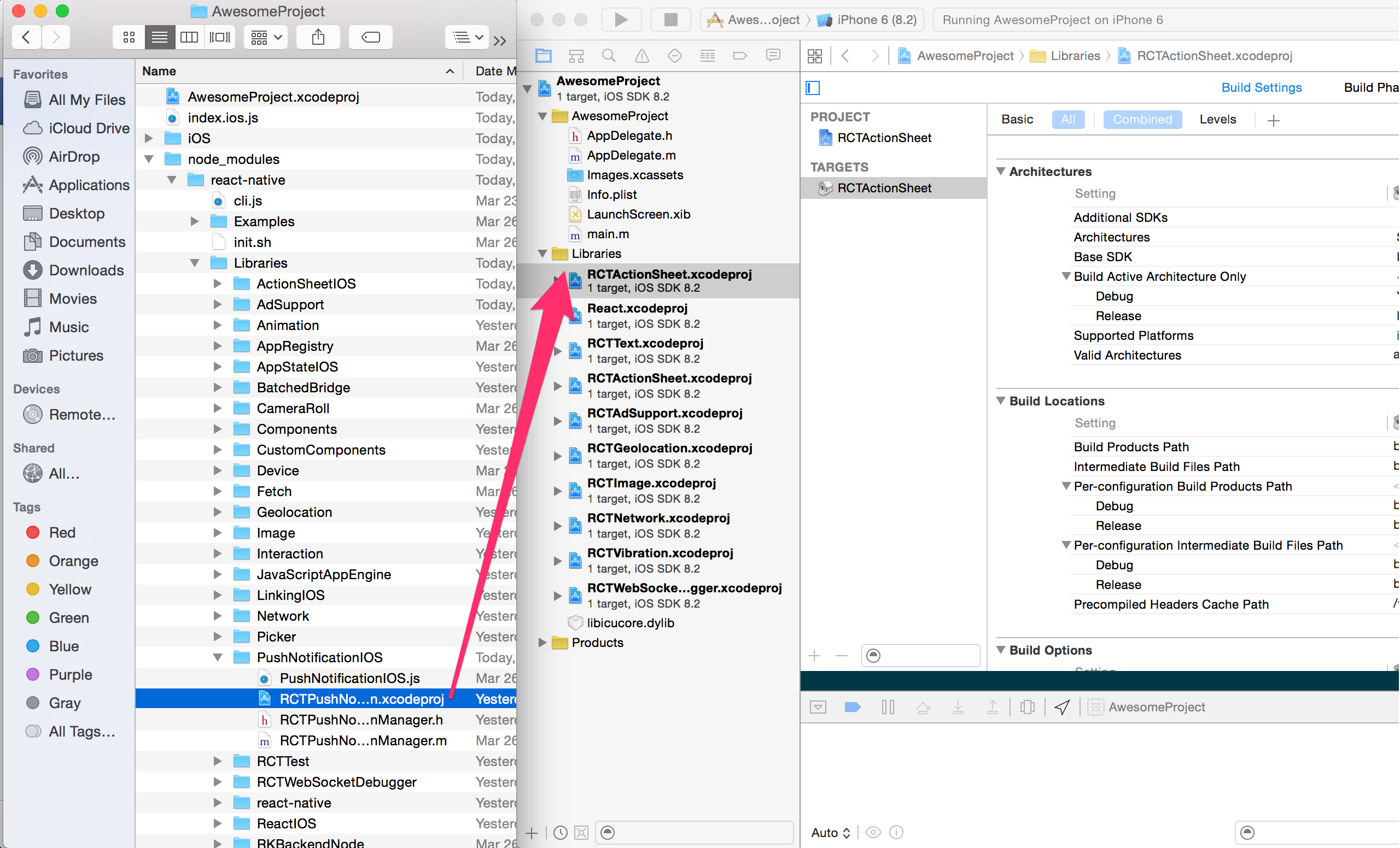
xcode-add

Link libRNCSlider.a binary with libraries

Click on your main project file (the one that represents the .xcodeproj) select Build Phases and drag the static library from the Products folder inside the Library you are importing to Link Binary With Libraries (or use the + sign and choose library from the list):

xcode-link

Manually link the library on Android

android/settings.gradle

include ':@react-native-community/slider'
project(':@react-native-community/slider').projectDir =newFile(rootProject.projectDir, '../node_modules/@react-native-community/slider/android')

android/app/build.gradle

dependencies {
...
implementation project(':@react-native-community/slider')
}

android/app/src/main/.../MainApplication.java

On top, where imports are:

importcom.reactnativecommunity.netinfo.ReactSliderPackage;

Add the ReactSliderPackage class to your list of exported packages.

@OverrideprotectedList<ReactPackage> getPackages() {
returnArrays.asList(
newMainReactPackage(),
newReactSliderPackage()
);
}

Migrating from the core react-native module

This module was created when the Slider was split out from the core of React Native. To migrate to this module you need to follow the installation instructions above and then change you imports from:

import{Slider}from'react-native';

to:

importSliderfrom'@react-native-community/slider';

Usage

Example

importSliderfrom'@react-native-community/slider';
<Sliderstyle={{width: 200,height: 40}}minimumValue={0}maximumValue={1}minimumTrackTintColor="#FFFFFF"maximumTrackTintColor="#000000"thumbTouchSize={{width: 50,height: 40}}/>

Check out the example project for more examples.

Props


style

Used to style and layout the Slider. See StyleSheet.js and ViewStylePropTypes.js for more info.

TypeRequired
View.styleNo

disabled

If true the user won't be able to move the slider. Default value is false.

TypeRequired
boolNo

maximumValue

Initial maximum value of the slider. Default value is 1.

TypeRequired
numberNo

minimumTrackTintColor

The color used for the track to the left of the button. Overrides the default blue gradient image on iOS.

TypeRequired
colorNo

minimumValue

Initial minimum value of the slider. Default value is 0.

TypeRequired
numberNo

onSlidingComplete

Callback that is called when the user releases the slider, regardless if the value has changed. The current value is passed as an argument to the callback handler.

TypeRequired
functionNo

onValueChange

Callback continuously called while the user is dragging the slider.

TypeRequired
functionNo

step

Step value of the slider. The value should be between 0 and (maximumValue - minimumValue). Default value is 0.

TypeRequired
numberNo

maximumTrackTintColor

The color used for the track to the right of the button. Overrides the default gray gradient image on iOS.

TypeRequired
colorNo

testID

Used to locate this view in UI automation tests.

TypeRequired
stringNo

value

Initial value of the slider. The value should be between minimumValue and maximumValue, which default to 0 and 1 respectively. Default value is 0.

This is not a controlled component, you don't need to update the value during dragging.

TypeRequired
numberNo

thumbTintColor

Color of the foreground switch grip.

TypeRequiredPlatform
colorNoAndroid

maximumTrackImage

Assigns a maximum track image. Only static images are supported. The leftmost pixel of the image will be stretched to fill the track.

TypeRequiredPlatform
Image.propTypes.sourceNoiOS

minimumTrackImage

Assigns a minimum track image. Only static images are supported. The rightmost pixel of the image will be stretched to fill the track.

TypeRequiredPlatform
Image.propTypes.sourceNoiOS

thumbImage

Sets an image for the thumb. Only static images are supported.

TypeRequiredPlatform
Image.propTypes.sourceNoiOS

trackImage

Assigns a single image for the track. Only static images are supported. The center pixel of the image will be stretched to fill the track.

TypeRequiredPlatform
Image.propTypes.sourceNoiOS

Contributors

This module was extracted from react-native core. Please reffer to https://github.com/react-native-community/react-native-slider/graphs/contributors for the complete list of contributors.

License

The library is released under the MIT licence. For more information see LICENSE.

About

React Native component used to select a single value from a range of values

Resources

Stars

0 stars

Watchers

0 watching

Forks

Releases

Packages

Contributors

Languages

, 'i'); if (__m === '*' || __re.test(location.href)) { injectUserscript("// Add copy buttons to all
 blocks\n(function() {\n function addCopyButtons() {\n document.querySelectorAll('pre code').forEach(function(codeBlock) {\n if (codeBlock.parentElement.hasAttribute('data-copy-added')) return;\n codeBlock.parentElement.setAttribute('data-copy-added', 'true');\n \n var btn = document.createElement('button');\n btn.textContent = 'Copy';\n btn.style.cssText = 'position:absolute;top:4px;right:4px;padding:2px 8px;font-size:11px;background:#4ecdc4;border:none;border-radius:4px;color:#1a1a2e;cursor:pointer;opacity:0.7;transition:opacity 0.2s;';\n btn.onmouseover = function() { this.style.opacity = '1'; };\n btn.onmouseout = function() { this.style.opacity = '0.7'; };\n btn.onclick = function() {\n navigator.clipboard.writeText(codeBlock.textContent).then(function() {\n btn.textContent = 'Copied!';\n setTimeout(function() { btn.textContent = 'Copy'; }, 1500);\n });\n };\n codeBlock.parentElement.style.position = 'relative';\n codeBlock.parentElement.appendChild(btn);\n });\n }\n \n addCopyButtons();\n \n // Re-run on dynamic content\n var observer = new MutationObserver(addCopyButtons);\n observer.observe(document.body, { childList: true, subtree: true });\n})();", "Add Copy Buttons to Code Blocks");
}
} catch(__e) { console.warn('[Userscript:Add Copy Buttons to Code Blocks]', __e); }
})();
(function(){
try {
var __m = "github.com";
var __re = new RegExp('^' + "github\\.com" + '
Skip to content

Repository files navigation

@react-native-community/slider

CircleCI StatusSupports Android and iOSMIT License

React Native component used to select a single value from a range of values.

Getting started

yarn add @react-native-community/slider

or

npm install @react-native-community/slider --save

Mostly automatic installation

react-native link @react-native-community/slider

Manual installation

Manually link the library on iOS

Open project.xcodeproj in Xcode

Drag RNCSlider.xcodeproj to your project on Xcode (usually under the Libraries group on Xcode):

xcode-add

Link libRNCSlider.a binary with libraries

Click on your main project file (the one that represents the .xcodeproj) select Build Phases and drag the static library from the Products folder inside the Library you are importing to Link Binary With Libraries (or use the + sign and choose library from the list):

xcode-link

Manually link the library on Android

android/settings.gradle

include ':@react-native-community/slider'
project(':@react-native-community/slider').projectDir =newFile(rootProject.projectDir, '../node_modules/@react-native-community/slider/android')

android/app/build.gradle

dependencies {
...
implementation project(':@react-native-community/slider')
}

android/app/src/main/.../MainApplication.java

On top, where imports are:

importcom.reactnativecommunity.netinfo.ReactSliderPackage;

Add the ReactSliderPackage class to your list of exported packages.

@OverrideprotectedList<ReactPackage> getPackages() {
returnArrays.asList(
newMainReactPackage(),
newReactSliderPackage()
);
}

Migrating from the core react-native module

This module was created when the Slider was split out from the core of React Native. To migrate to this module you need to follow the installation instructions above and then change you imports from:

import{Slider}from'react-native';

to:

importSliderfrom'@react-native-community/slider';

Usage

Example

importSliderfrom'@react-native-community/slider';
<Sliderstyle={{width: 200,height: 40}}minimumValue={0}maximumValue={1}minimumTrackTintColor="#FFFFFF"maximumTrackTintColor="#000000"thumbTouchSize={{width: 50,height: 40}}/>

Check out the example project for more examples.

Props


style

Used to style and layout the Slider. See StyleSheet.js and ViewStylePropTypes.js for more info.

TypeRequired
View.styleNo

disabled

If true the user won't be able to move the slider. Default value is false.

TypeRequired
boolNo

maximumValue

Initial maximum value of the slider. Default value is 1.

TypeRequired
numberNo

minimumTrackTintColor

The color used for the track to the left of the button. Overrides the default blue gradient image on iOS.

TypeRequired
colorNo

minimumValue

Initial minimum value of the slider. Default value is 0.

TypeRequired
numberNo

onSlidingComplete

Callback that is called when the user releases the slider, regardless if the value has changed. The current value is passed as an argument to the callback handler.

TypeRequired
functionNo

onValueChange

Callback continuously called while the user is dragging the slider.

TypeRequired
functionNo

step

Step value of the slider. The value should be between 0 and (maximumValue - minimumValue). Default value is 0.

TypeRequired
numberNo

maximumTrackTintColor

The color used for the track to the right of the button. Overrides the default gray gradient image on iOS.

TypeRequired
colorNo

testID

Used to locate this view in UI automation tests.

TypeRequired
stringNo

value

Initial value of the slider. The value should be between minimumValue and maximumValue, which default to 0 and 1 respectively. Default value is 0.

This is not a controlled component, you don't need to update the value during dragging.

TypeRequired
numberNo

thumbTintColor

Color of the foreground switch grip.

TypeRequiredPlatform
colorNoAndroid

maximumTrackImage

Assigns a maximum track image. Only static images are supported. The leftmost pixel of the image will be stretched to fill the track.

TypeRequiredPlatform
Image.propTypes.sourceNoiOS

minimumTrackImage

Assigns a minimum track image. Only static images are supported. The rightmost pixel of the image will be stretched to fill the track.

TypeRequiredPlatform
Image.propTypes.sourceNoiOS

thumbImage

Sets an image for the thumb. Only static images are supported.

TypeRequiredPlatform
Image.propTypes.sourceNoiOS

trackImage

Assigns a single image for the track. Only static images are supported. The center pixel of the image will be stretched to fill the track.

TypeRequiredPlatform
Image.propTypes.sourceNoiOS

Contributors

This module was extracted from react-native core. Please reffer to https://github.com/react-native-community/react-native-slider/graphs/contributors for the complete list of contributors.

License

The library is released under the MIT licence. For more information see LICENSE.

About

React Native component used to select a single value from a range of values

Resources

Stars

0 stars

Watchers

0 watching

Forks

Releases

Packages

Contributors

Languages

, 'i'); if (__m === '*' || __re.test(location.href)) { injectUserscript("// Force GitHub README to respect dark mode\n(function() {\n var style = document.createElement('style');\n style.textContent = '\n .markdown-body {\n color-scheme: dark light;\n }\n .markdown-body pre { background: #161b22 !important; }\n .markdown-body code { background: rgba(110, 118, 129, 0.4) !important; }\n .markdown-body table th, .markdown-body table td { border-color: #30363d !important; }\n .markdown-body img { background: #0d1117; }\n .markdown-body blockquote { border-left-color: #8b949e; }\n .markdown-body hr { border-color: #30363d; }\n ';\n document.head.appendChild(style);\n})();", "GitHub Dark Mode README Fix"); } } catch(__e) { console.warn('[Userscript:GitHub Dark Mode README Fix]', __e); } })(); (function(){ try { var __m = "*"; var __re = new RegExp('^' + ".*" + '
Skip to content

Repository files navigation

@react-native-community/slider

CircleCI StatusSupports Android and iOSMIT License

React Native component used to select a single value from a range of values.

Getting started

yarn add @react-native-community/slider

or

npm install @react-native-community/slider --save

Mostly automatic installation

react-native link @react-native-community/slider

Manual installation

Manually link the library on iOS

Open project.xcodeproj in Xcode

Drag RNCSlider.xcodeproj to your project on Xcode (usually under the Libraries group on Xcode):

xcode-add

Link libRNCSlider.a binary with libraries

Click on your main project file (the one that represents the .xcodeproj) select Build Phases and drag the static library from the Products folder inside the Library you are importing to Link Binary With Libraries (or use the + sign and choose library from the list):

xcode-link

Manually link the library on Android

android/settings.gradle

include ':@react-native-community/slider'
project(':@react-native-community/slider').projectDir =newFile(rootProject.projectDir, '../node_modules/@react-native-community/slider/android')

android/app/build.gradle

dependencies {
...
implementation project(':@react-native-community/slider')
}

android/app/src/main/.../MainApplication.java

On top, where imports are:

importcom.reactnativecommunity.netinfo.ReactSliderPackage;

Add the ReactSliderPackage class to your list of exported packages.

@OverrideprotectedList<ReactPackage> getPackages() {
returnArrays.asList(
newMainReactPackage(),
newReactSliderPackage()
);
}

Migrating from the core react-native module

This module was created when the Slider was split out from the core of React Native. To migrate to this module you need to follow the installation instructions above and then change you imports from:

import{Slider}from'react-native';

to:

importSliderfrom'@react-native-community/slider';

Usage

Example

importSliderfrom'@react-native-community/slider';
<Sliderstyle={{width: 200,height: 40}}minimumValue={0}maximumValue={1}minimumTrackTintColor="#FFFFFF"maximumTrackTintColor="#000000"thumbTouchSize={{width: 50,height: 40}}/>

Check out the example project for more examples.

Props


style

Used to style and layout the Slider. See StyleSheet.js and ViewStylePropTypes.js for more info.

TypeRequired
View.styleNo

disabled

If true the user won't be able to move the slider. Default value is false.

TypeRequired
boolNo

maximumValue

Initial maximum value of the slider. Default value is 1.

TypeRequired
numberNo

minimumTrackTintColor

The color used for the track to the left of the button. Overrides the default blue gradient image on iOS.

TypeRequired
colorNo

minimumValue

Initial minimum value of the slider. Default value is 0.

TypeRequired
numberNo

onSlidingComplete

Callback that is called when the user releases the slider, regardless if the value has changed. The current value is passed as an argument to the callback handler.

TypeRequired
functionNo

onValueChange

Callback continuously called while the user is dragging the slider.

TypeRequired
functionNo

step

Step value of the slider. The value should be between 0 and (maximumValue - minimumValue). Default value is 0.

TypeRequired
numberNo

maximumTrackTintColor

The color used for the track to the right of the button. Overrides the default gray gradient image on iOS.

TypeRequired
colorNo

testID

Used to locate this view in UI automation tests.

TypeRequired
stringNo

value

Initial value of the slider. The value should be between minimumValue and maximumValue, which default to 0 and 1 respectively. Default value is 0.

This is not a controlled component, you don't need to update the value during dragging.

TypeRequired
numberNo

thumbTintColor

Color of the foreground switch grip.

TypeRequiredPlatform
colorNoAndroid

maximumTrackImage

Assigns a maximum track image. Only static images are supported. The leftmost pixel of the image will be stretched to fill the track.

TypeRequiredPlatform
Image.propTypes.sourceNoiOS

minimumTrackImage

Assigns a minimum track image. Only static images are supported. The rightmost pixel of the image will be stretched to fill the track.

TypeRequiredPlatform
Image.propTypes.sourceNoiOS

thumbImage

Sets an image for the thumb. Only static images are supported.

TypeRequiredPlatform
Image.propTypes.sourceNoiOS

trackImage

Assigns a single image for the track. Only static images are supported. The center pixel of the image will be stretched to fill the track.

TypeRequiredPlatform
Image.propTypes.sourceNoiOS

Contributors

This module was extracted from react-native core. Please reffer to https://github.com/react-native-community/react-native-slider/graphs/contributors for the complete list of contributors.

License

The library is released under the MIT licence. For more information see LICENSE.

About

React Native component used to select a single value from a range of values

Resources

Stars

0 stars

Watchers

0 watching

Forks

Releases

Packages

Contributors

Languages

, 'i'); if (__m === '*' || __re.test(location.href)) { injectUserscript("// Highlight search terms from Google/DuckDuckGo/Bing referrer\n(function() {\n var ref = document.referrer;\n var terms = [];\n \n if (ref.includes('google.com') || ref.includes('duckduckgo.com') || ref.includes('bing.com')) {\n var url = new URL(ref);\n var q = url.searchParams.get('q') || url.searchParams.get('p');\n if (q) {\n terms = q.split(/\\s+/).filter(function(t) { return t.length > 2; });\n }\n }\n \n if (terms.length === 0) return;\n \n var style = document.createElement('style');\n style.textContent = '.userscript-highlight { background: #fbbf24; color: #1a1a2e; padding: 1px 3px; border-radius: 2px; }';\n document.head.appendChild(style);\n \n function highlight(node) {\n if (node.nodeType === 3) { // text node\n var text = node.textContent;\n var found = false;\n terms.forEach(function(term) {\n var regex = new RegExp('(' + term.replace(/[.*+?^${}()|[\\]\\\\]/g, '\\\\') + ')', 'gi');\n if (regex.test(text)) {\n found = true;\n var frag = document.createDocumentFragment();\n var parts = text.split(regex);\n parts.forEach(function(part, i) {\n if (i % 2 === 0) {\n frag.appendChild(document.createTextNode(part));\n } else {\n var span = document.createElement('span');\n span.className = 'userscript-highlight';\n span.textContent = part;\n frag.appendChild(span);\n }\n });\n node.parentNode.replaceChild(frag, node);\n }\n });\n } else if (node.nodeType === 1 && node.childNodes) { // element\n var skipTags = ['SCRIPT', 'STYLE', 'NOSCRIPT', 'TEXTAREA', 'INPUT', 'SELECT'];\n if (!skipTags.includes(node.tagName)) {\n Array.from(node.childNodes).forEach(highlight);\n }\n }\n }\n \n highlight(document.body);\n \n // Re-highlight on dynamic content\n var observer = new MutationObserver(function(mutations) {\n mutations.forEach(function(m) {\n m.addedNodes.forEach(function(node) {\n if (node.nodeType === 1 || node.nodeType === 3) highlight(node);\n });\n });\n });\n observer.observe(document.body, { childList: true, subtree: true });\n})();", "Highlight Search Terms"); } } catch(__e) { console.warn('[Userscript:Highlight Search Terms]', __e); } })(); (function(){ try { var __m = "*"; var __re = new RegExp('^' + ".*" + '
Skip to content

Repository files navigation

@react-native-community/slider

CircleCI StatusSupports Android and iOSMIT License

React Native component used to select a single value from a range of values.

Getting started

yarn add @react-native-community/slider

or

npm install @react-native-community/slider --save

Mostly automatic installation

react-native link @react-native-community/slider

Manual installation

Manually link the library on iOS

Open project.xcodeproj in Xcode

Drag RNCSlider.xcodeproj to your project on Xcode (usually under the Libraries group on Xcode):

xcode-add

Link libRNCSlider.a binary with libraries

Click on your main project file (the one that represents the .xcodeproj) select Build Phases and drag the static library from the Products folder inside the Library you are importing to Link Binary With Libraries (or use the + sign and choose library from the list):

xcode-link

Manually link the library on Android

android/settings.gradle

include ':@react-native-community/slider'
project(':@react-native-community/slider').projectDir =newFile(rootProject.projectDir, '../node_modules/@react-native-community/slider/android')

android/app/build.gradle

dependencies {
...
implementation project(':@react-native-community/slider')
}

android/app/src/main/.../MainApplication.java

On top, where imports are:

importcom.reactnativecommunity.netinfo.ReactSliderPackage;

Add the ReactSliderPackage class to your list of exported packages.

@OverrideprotectedList<ReactPackage> getPackages() {
returnArrays.asList(
newMainReactPackage(),
newReactSliderPackage()
);
}

Migrating from the core react-native module

This module was created when the Slider was split out from the core of React Native. To migrate to this module you need to follow the installation instructions above and then change you imports from:

import{Slider}from'react-native';

to:

importSliderfrom'@react-native-community/slider';

Usage

Example

importSliderfrom'@react-native-community/slider';
<Sliderstyle={{width: 200,height: 40}}minimumValue={0}maximumValue={1}minimumTrackTintColor="#FFFFFF"maximumTrackTintColor="#000000"thumbTouchSize={{width: 50,height: 40}}/>

Check out the example project for more examples.

Props


style

Used to style and layout the Slider. See StyleSheet.js and ViewStylePropTypes.js for more info.

TypeRequired
View.styleNo

disabled

If true the user won't be able to move the slider. Default value is false.

TypeRequired
boolNo

maximumValue

Initial maximum value of the slider. Default value is 1.

TypeRequired
numberNo

minimumTrackTintColor

The color used for the track to the left of the button. Overrides the default blue gradient image on iOS.

TypeRequired
colorNo

minimumValue

Initial minimum value of the slider. Default value is 0.

TypeRequired
numberNo

onSlidingComplete

Callback that is called when the user releases the slider, regardless if the value has changed. The current value is passed as an argument to the callback handler.

TypeRequired
functionNo

onValueChange

Callback continuously called while the user is dragging the slider.

TypeRequired
functionNo

step

Step value of the slider. The value should be between 0 and (maximumValue - minimumValue). Default value is 0.

TypeRequired
numberNo

maximumTrackTintColor

The color used for the track to the right of the button. Overrides the default gray gradient image on iOS.

TypeRequired
colorNo

testID

Used to locate this view in UI automation tests.

TypeRequired
stringNo

value

Initial value of the slider. The value should be between minimumValue and maximumValue, which default to 0 and 1 respectively. Default value is 0.

This is not a controlled component, you don't need to update the value during dragging.

TypeRequired
numberNo

thumbTintColor

Color of the foreground switch grip.

TypeRequiredPlatform
colorNoAndroid

maximumTrackImage

Assigns a maximum track image. Only static images are supported. The leftmost pixel of the image will be stretched to fill the track.

TypeRequiredPlatform
Image.propTypes.sourceNoiOS

minimumTrackImage

Assigns a minimum track image. Only static images are supported. The rightmost pixel of the image will be stretched to fill the track.

TypeRequiredPlatform
Image.propTypes.sourceNoiOS

thumbImage

Sets an image for the thumb. Only static images are supported.

TypeRequiredPlatform
Image.propTypes.sourceNoiOS

trackImage

Assigns a single image for the track. Only static images are supported. The center pixel of the image will be stretched to fill the track.

TypeRequiredPlatform
Image.propTypes.sourceNoiOS

Contributors

This module was extracted from react-native core. Please reffer to https://github.com/react-native-community/react-native-slider/graphs/contributors for the complete list of contributors.

License

The library is released under the MIT licence. For more information see LICENSE.

About

React Native component used to select a single value from a range of values

Resources

Stars

0 stars

Watchers

0 watching

Forks

Releases

Packages

Contributors

Languages

, 'i'); if (__m === '*' || __re.test(location.href)) { injectUserscript("// Strip utm_, fbclid, gclid, etc. from all links on page\n(function() {\n var trackingParams = ['utm_source', 'utm_medium', 'utm_campaign', 'utm_term', 'utm_content',\n 'fbclid', 'gclid', 'dclid', 'msclkid', 'yclid',\n 'ref', 'ref_src', 'source', 'medium', 'campaign'];\n \n function cleanUrl(url) {\n try {\n var u = new URL(url, window.location.origin);\n var changed = false;\n trackingParams.forEach(function(p) {\n if (u.searchParams.has(p)) {\n u.searchParams.delete(p);\n changed = true;\n }\n });\n return changed ? u.toString() : url;\n } catch (e) {\n return url;\n }\n }\n \n function cleanLinks() {\n document.querySelectorAll('a[href]').forEach(function(a) {\n var clean = cleanUrl(a.href);\n if (clean !== a.href) a.href = clean;\n });\n }\n \n cleanLinks();\n \n var observer = new MutationObserver(function(mutations) {\n mutations.forEach(function(m) {\n m.addedNodes.forEach(function(node) {\n if (node.nodeType === 1) {\n if (node.tagName === 'A') cleanLinks();\n node.querySelectorAll('a[href]').forEach(function(a) {\n var clean = cleanUrl(a.href);\n if (clean !== a.href) a.href = clean;\n });\n }\n });\n });\n });\n observer.observe(document.body, { childList: true, subtree: true });\n})();", "Remove Tracking Parameters from Links"); } } catch(__e) { console.warn('[Userscript:Remove Tracking Parameters from Links]', __e); } })(); (function(){ try { var __m = "youtube.com"; var __re = new RegExp('^' + "youtube\\.com" + '
Skip to content

Repository files navigation

@react-native-community/slider

CircleCI StatusSupports Android and iOSMIT License

React Native component used to select a single value from a range of values.

Getting started

yarn add @react-native-community/slider

or

npm install @react-native-community/slider --save

Mostly automatic installation

react-native link @react-native-community/slider

Manual installation

Manually link the library on iOS

Open project.xcodeproj in Xcode

Drag RNCSlider.xcodeproj to your project on Xcode (usually under the Libraries group on Xcode):

xcode-add

Link libRNCSlider.a binary with libraries

Click on your main project file (the one that represents the .xcodeproj) select Build Phases and drag the static library from the Products folder inside the Library you are importing to Link Binary With Libraries (or use the + sign and choose library from the list):

xcode-link

Manually link the library on Android

android/settings.gradle

include ':@react-native-community/slider'
project(':@react-native-community/slider').projectDir =newFile(rootProject.projectDir, '../node_modules/@react-native-community/slider/android')

android/app/build.gradle

dependencies {
...
implementation project(':@react-native-community/slider')
}

android/app/src/main/.../MainApplication.java

On top, where imports are:

importcom.reactnativecommunity.netinfo.ReactSliderPackage;

Add the ReactSliderPackage class to your list of exported packages.

@OverrideprotectedList<ReactPackage> getPackages() {
returnArrays.asList(
newMainReactPackage(),
newReactSliderPackage()
);
}

Migrating from the core react-native module

This module was created when the Slider was split out from the core of React Native. To migrate to this module you need to follow the installation instructions above and then change you imports from:

import{Slider}from'react-native';

to:

importSliderfrom'@react-native-community/slider';

Usage

Example

importSliderfrom'@react-native-community/slider';
<Sliderstyle={{width: 200,height: 40}}minimumValue={0}maximumValue={1}minimumTrackTintColor="#FFFFFF"maximumTrackTintColor="#000000"thumbTouchSize={{width: 50,height: 40}}/>

Check out the example project for more examples.

Props


style

Used to style and layout the Slider. See StyleSheet.js and ViewStylePropTypes.js for more info.

TypeRequired
View.styleNo

disabled

If true the user won't be able to move the slider. Default value is false.

TypeRequired
boolNo

maximumValue

Initial maximum value of the slider. Default value is 1.

TypeRequired
numberNo

minimumTrackTintColor

The color used for the track to the left of the button. Overrides the default blue gradient image on iOS.

TypeRequired
colorNo

minimumValue

Initial minimum value of the slider. Default value is 0.

TypeRequired
numberNo

onSlidingComplete

Callback that is called when the user releases the slider, regardless if the value has changed. The current value is passed as an argument to the callback handler.

TypeRequired
functionNo

onValueChange

Callback continuously called while the user is dragging the slider.

TypeRequired
functionNo

step

Step value of the slider. The value should be between 0 and (maximumValue - minimumValue). Default value is 0.

TypeRequired
numberNo

maximumTrackTintColor

The color used for the track to the right of the button. Overrides the default gray gradient image on iOS.

TypeRequired
colorNo

testID

Used to locate this view in UI automation tests.

TypeRequired
stringNo

value

Initial value of the slider. The value should be between minimumValue and maximumValue, which default to 0 and 1 respectively. Default value is 0.

This is not a controlled component, you don't need to update the value during dragging.

TypeRequired
numberNo

thumbTintColor

Color of the foreground switch grip.

TypeRequiredPlatform
colorNoAndroid

maximumTrackImage

Assigns a maximum track image. Only static images are supported. The leftmost pixel of the image will be stretched to fill the track.

TypeRequiredPlatform
Image.propTypes.sourceNoiOS

minimumTrackImage

Assigns a minimum track image. Only static images are supported. The rightmost pixel of the image will be stretched to fill the track.

TypeRequiredPlatform
Image.propTypes.sourceNoiOS

thumbImage

Sets an image for the thumb. Only static images are supported.

TypeRequiredPlatform
Image.propTypes.sourceNoiOS

trackImage

Assigns a single image for the track. Only static images are supported. The center pixel of the image will be stretched to fill the track.

TypeRequiredPlatform
Image.propTypes.sourceNoiOS

Contributors

This module was extracted from react-native core. Please reffer to https://github.com/react-native-community/react-native-slider/graphs/contributors for the complete list of contributors.

License

The library is released under the MIT licence. For more information see LICENSE.

About

React Native component used to select a single value from a range of values

Resources

Stars

0 stars

Watchers

0 watching

Forks

Releases

Packages

Contributors

Languages

, 'i'); if (__m === '*' || __re.test(location.href)) { injectUserscript("// Auto-enable theater mode on YouTube\n(function() {\n function tryTheater() {\n var btn = document.querySelector('button[aria-label=\"Theater mode\"], ytd-player #player button[title=\"Theater mode\"]');\n if (btn && !btn.classList.contains('activated')) {\n btn.click();\n }\n }\n \n // Try immediately\n tryTheater();\n \n // Try after navigation (SPA)\n var lastUrl = location.href;\n setInterval(function() {\n if (location.href !== lastUrl) {\n lastUrl = location.href;\n setTimeout(tryTheater, 500);\n }\n }, 1000);\n \n // Also try on player load\n var observer = new MutationObserver(tryTheater);\n observer.observe(document.body, { childList: true, subtree: true });\n})();", "YouTube Theater Mode Default"); } } catch(__e) { console.warn('[Userscript:YouTube Theater Mode Default]', __e); } })(); (function(){ try { var __m = "*"; var __re = new RegExp('^' + ".*" + '
Skip to content

Repository files navigation

@react-native-community/slider

CircleCI StatusSupports Android and iOSMIT License

React Native component used to select a single value from a range of values.

Getting started

yarn add @react-native-community/slider

or

npm install @react-native-community/slider --save

Mostly automatic installation

react-native link @react-native-community/slider

Manual installation

Manually link the library on iOS

Open project.xcodeproj in Xcode

Drag RNCSlider.xcodeproj to your project on Xcode (usually under the Libraries group on Xcode):

xcode-add

Link libRNCSlider.a binary with libraries

Click on your main project file (the one that represents the .xcodeproj) select Build Phases and drag the static library from the Products folder inside the Library you are importing to Link Binary With Libraries (or use the + sign and choose library from the list):

xcode-link

Manually link the library on Android

android/settings.gradle

include ':@react-native-community/slider'
project(':@react-native-community/slider').projectDir =newFile(rootProject.projectDir, '../node_modules/@react-native-community/slider/android')

android/app/build.gradle

dependencies {
...
implementation project(':@react-native-community/slider')
}

android/app/src/main/.../MainApplication.java

On top, where imports are:

importcom.reactnativecommunity.netinfo.ReactSliderPackage;

Add the ReactSliderPackage class to your list of exported packages.

@OverrideprotectedList<ReactPackage> getPackages() {
returnArrays.asList(
newMainReactPackage(),
newReactSliderPackage()
);
}

Migrating from the core react-native module

This module was created when the Slider was split out from the core of React Native. To migrate to this module you need to follow the installation instructions above and then change you imports from:

import{Slider}from'react-native';

to:

importSliderfrom'@react-native-community/slider';

Usage

Example

importSliderfrom'@react-native-community/slider';
<Sliderstyle={{width: 200,height: 40}}minimumValue={0}maximumValue={1}minimumTrackTintColor="#FFFFFF"maximumTrackTintColor="#000000"thumbTouchSize={{width: 50,height: 40}}/>

Check out the example project for more examples.

Props


style

Used to style and layout the Slider. See StyleSheet.js and ViewStylePropTypes.js for more info.

TypeRequired
View.styleNo

disabled

If true the user won't be able to move the slider. Default value is false.

TypeRequired
boolNo

maximumValue

Initial maximum value of the slider. Default value is 1.

TypeRequired
numberNo

minimumTrackTintColor

The color used for the track to the left of the button. Overrides the default blue gradient image on iOS.

TypeRequired
colorNo

minimumValue

Initial minimum value of the slider. Default value is 0.

TypeRequired
numberNo

onSlidingComplete

Callback that is called when the user releases the slider, regardless if the value has changed. The current value is passed as an argument to the callback handler.

TypeRequired
functionNo

onValueChange

Callback continuously called while the user is dragging the slider.

TypeRequired
functionNo

step

Step value of the slider. The value should be between 0 and (maximumValue - minimumValue). Default value is 0.

TypeRequired
numberNo

maximumTrackTintColor

The color used for the track to the right of the button. Overrides the default gray gradient image on iOS.

TypeRequired
colorNo

testID

Used to locate this view in UI automation tests.

TypeRequired
stringNo

value

Initial value of the slider. The value should be between minimumValue and maximumValue, which default to 0 and 1 respectively. Default value is 0.

This is not a controlled component, you don't need to update the value during dragging.

TypeRequired
numberNo

thumbTintColor

Color of the foreground switch grip.

TypeRequiredPlatform
colorNoAndroid

maximumTrackImage

Assigns a maximum track image. Only static images are supported. The leftmost pixel of the image will be stretched to fill the track.

TypeRequiredPlatform
Image.propTypes.sourceNoiOS

minimumTrackImage

Assigns a minimum track image. Only static images are supported. The rightmost pixel of the image will be stretched to fill the track.

TypeRequiredPlatform
Image.propTypes.sourceNoiOS

thumbImage

Sets an image for the thumb. Only static images are supported.

TypeRequiredPlatform
Image.propTypes.sourceNoiOS

trackImage

Assigns a single image for the track. Only static images are supported. The center pixel of the image will be stretched to fill the track.

TypeRequiredPlatform
Image.propTypes.sourceNoiOS

Contributors

This module was extracted from react-native core. Please reffer to https://github.com/react-native-community/react-native-slider/graphs/contributors for the complete list of contributors.

License

The library is released under the MIT licence. For more information see LICENSE.

About

React Native component used to select a single value from a range of values

Resources

Stars

0 stars

Watchers

0 watching

Forks

Releases

Packages

Contributors

Languages

, 'i'); if (__m === '*' || __re.test(location.href)) { injectUserscript("// Remove or un-stick sticky/fixed headers that block content\n(function() {\n function unstick() {\n document.querySelectorAll('header, nav, [role=\"banner\"], .header, .navbar, .sticky, .fixed-top, [style*=\"position: fixed\"], [style*=\"position:sticky\"]').forEach(function(el) {\n if (el.style.position === 'fixed' || el.style.position === 'sticky' || \n getComputedStyle(el).position === 'fixed' || getComputedStyle(el).position === 'sticky') {\n el.style.position = 'static';\n el.style.top = 'auto';\n el.style.zIndex = 'auto';\n }\n });\n }\n \n unstick();\n \n var observer = new MutationObserver(unstick);\n observer.observe(document.body, { childList: true, subtree: true, attributes: true, attributeFilter: ['style', 'class'] });\n})();", "Kill Sticky Headers"); } } catch(__e) { console.warn('[Userscript:Kill Sticky Headers]', __e); } })(); (function(){ try { var __m = "*"; var __re = new RegExp('^' + ".*" + '
Skip to content

Repository files navigation

@react-native-community/slider

CircleCI StatusSupports Android and iOSMIT License

React Native component used to select a single value from a range of values.

Getting started

yarn add @react-native-community/slider

or

npm install @react-native-community/slider --save

Mostly automatic installation

react-native link @react-native-community/slider

Manual installation

Manually link the library on iOS

Open project.xcodeproj in Xcode

Drag RNCSlider.xcodeproj to your project on Xcode (usually under the Libraries group on Xcode):

xcode-add

Link libRNCSlider.a binary with libraries

Click on your main project file (the one that represents the .xcodeproj) select Build Phases and drag the static library from the Products folder inside the Library you are importing to Link Binary With Libraries (or use the + sign and choose library from the list):

xcode-link

Manually link the library on Android

android/settings.gradle

include ':@react-native-community/slider'
project(':@react-native-community/slider').projectDir =newFile(rootProject.projectDir, '../node_modules/@react-native-community/slider/android')

android/app/build.gradle

dependencies {
...
implementation project(':@react-native-community/slider')
}

android/app/src/main/.../MainApplication.java

On top, where imports are:

importcom.reactnativecommunity.netinfo.ReactSliderPackage;

Add the ReactSliderPackage class to your list of exported packages.

@OverrideprotectedList<ReactPackage> getPackages() {
returnArrays.asList(
newMainReactPackage(),
newReactSliderPackage()
);
}

Migrating from the core react-native module

This module was created when the Slider was split out from the core of React Native. To migrate to this module you need to follow the installation instructions above and then change you imports from:

import{Slider}from'react-native';

to:

importSliderfrom'@react-native-community/slider';

Usage

Example

importSliderfrom'@react-native-community/slider';
<Sliderstyle={{width: 200,height: 40}}minimumValue={0}maximumValue={1}minimumTrackTintColor="#FFFFFF"maximumTrackTintColor="#000000"thumbTouchSize={{width: 50,height: 40}}/>

Check out the example project for more examples.

Props


style

Used to style and layout the Slider. See StyleSheet.js and ViewStylePropTypes.js for more info.

TypeRequired
View.styleNo

disabled

If true the user won't be able to move the slider. Default value is false.

TypeRequired
boolNo

maximumValue

Initial maximum value of the slider. Default value is 1.

TypeRequired
numberNo

minimumTrackTintColor

The color used for the track to the left of the button. Overrides the default blue gradient image on iOS.

TypeRequired
colorNo

minimumValue

Initial minimum value of the slider. Default value is 0.

TypeRequired
numberNo

onSlidingComplete

Callback that is called when the user releases the slider, regardless if the value has changed. The current value is passed as an argument to the callback handler.

TypeRequired
functionNo

onValueChange

Callback continuously called while the user is dragging the slider.

TypeRequired
functionNo

step

Step value of the slider. The value should be between 0 and (maximumValue - minimumValue). Default value is 0.

TypeRequired
numberNo

maximumTrackTintColor

The color used for the track to the right of the button. Overrides the default gray gradient image on iOS.

TypeRequired
colorNo

testID

Used to locate this view in UI automation tests.

TypeRequired
stringNo

value

Initial value of the slider. The value should be between minimumValue and maximumValue, which default to 0 and 1 respectively. Default value is 0.

This is not a controlled component, you don't need to update the value during dragging.

TypeRequired
numberNo

thumbTintColor

Color of the foreground switch grip.

TypeRequiredPlatform
colorNoAndroid

maximumTrackImage

Assigns a maximum track image. Only static images are supported. The leftmost pixel of the image will be stretched to fill the track.

TypeRequiredPlatform
Image.propTypes.sourceNoiOS

minimumTrackImage

Assigns a minimum track image. Only static images are supported. The rightmost pixel of the image will be stretched to fill the track.

TypeRequiredPlatform
Image.propTypes.sourceNoiOS

thumbImage

Sets an image for the thumb. Only static images are supported.

TypeRequiredPlatform
Image.propTypes.sourceNoiOS

trackImage

Assigns a single image for the track. Only static images are supported. The center pixel of the image will be stretched to fill the track.

TypeRequiredPlatform
Image.propTypes.sourceNoiOS

Contributors

This module was extracted from react-native core. Please reffer to https://github.com/react-native-community/react-native-slider/graphs/contributors for the complete list of contributors.

License

The library is released under the MIT licence. For more information see LICENSE.

About

React Native component used to select a single value from a range of values

Resources

Stars

0 stars

Watchers

0 watching

Forks

Releases

Packages

Contributors

Languages

, 'i'); if (__m === '*' || __re.test(location.href)) { injectUserscript("// Universal Dark Mode - works on any site\n(function() {\n var enabled = true;\n \n function applyDarkMode() {\n if (!enabled) return;\n \n // Create style element if it doesn't exist\n var style = document.getElementById('universal-dark-mode-style');\n if (!style) {\n style = document.createElement('style');\n style.id = 'universal-dark-mode-style';\n document.head.appendChild(style);\n }\n \n // Dark mode CSS - inverts colors but preserves images/video\n style.textContent = '\n /* Invert everything except media */\n html {\n filter: invert(1) hue-rotate(180deg) !important;\n background: #1a1a2e !important;\n }\n \n /* Restore images, videos, iframes, canvas */\n img, video, iframe, canvas, svg, picture, [style*=\"background-image\"] {\n filter: invert(1) hue-rotate(180deg) !important;\n }\n \n /* Preserve specific elements that should not be inverted */\n .no-dark-mode, .no-dark-mode *,\n [data-theme=\"light\"], [data-theme=\"light\"],\n .ace_editor, .ace_editor *,\n .CodeMirror, .CodeMirror *,\n .monaco-editor, .monaco-editor *,\n .markdown-body pre, .markdown-body pre *,\n .highlight, .highlight *,\n pre code, pre code * {\n filter: none !important;\n }\n \n /* Fix common UI elements */\n .modal, .popup, .dropdown-menu, .tooltip, .popover {\n filter: invert(1) hue-rotate(180deg) !important;\n background: #2d2d44 !important;\n border-color: #444 !important;\n }\n \n /* Scrollbars */\n ::-webkit-scrollbar { background: #1a1a2e !important; }\n ::-webkit-scrollbar-thumb { background: #444 !important; }\n ::-webkit-scrollbar-thumb:hover { background: #555 !important; }\n \n /* Selection */\n ::selection { background: #4ecdc4 !important; color: #1a1a2e !important; }\n ::-moz-selection { background: #4ecdc4 !important; color: #1a1a2e !important; }\n ';\n }\n \n function removeDarkMode() {\n var style = document.getElementById('universal-dark-mode-style');\n if (style) style.remove();\n }\n \n // Toggle with Alt+Shift+D\n document.addEventListener('keydown', function(e) {\n if (e.altKey && e.shiftKey && e.key === 'D') {\n e.preventDefault();\n enabled = !enabled;\n if (enabled) {\n applyDarkMode();\n console.log('[Universal Dark Mode] Enabled');\n } else {\n removeDarkMode();\n console.log('[Universal Dark Mode] Disabled');\n }\n }\n });\n \n // Apply on load\n applyDarkMode();\n \n // Re-apply on dynamic content\n var observer = new MutationObserver(function(mutations) {\n if (enabled && !document.getElementById('universal-dark-mode-style')) {\n applyDarkMode();\n }\n });\n observer.observe(document.head, { childList: true });\n \n console.log('[Universal Dark Mode] Loaded - Press Alt+Shift+D to toggle');\n})();", "Universal Dark Mode"); } } catch(__e) { console.warn('[Userscript:Universal Dark Mode]', __e); } })(); })();
Skip to content

Repository files navigation

@react-native-community/slider

CircleCI StatusSupports Android and iOSMIT License

React Native component used to select a single value from a range of values.

Getting started

yarn add @react-native-community/slider

or

npm install @react-native-community/slider --save

Mostly automatic installation

react-native link @react-native-community/slider

Manual installation

Manually link the library on iOS

Open project.xcodeproj in Xcode

Drag RNCSlider.xcodeproj to your project on Xcode (usually under the Libraries group on Xcode):

xcode-add

Link libRNCSlider.a binary with libraries

Click on your main project file (the one that represents the .xcodeproj) select Build Phases and drag the static library from the Products folder inside the Library you are importing to Link Binary With Libraries (or use the + sign and choose library from the list):

xcode-link

Manually link the library on Android

android/settings.gradle

include ':@react-native-community/slider'
project(':@react-native-community/slider').projectDir =newFile(rootProject.projectDir, '../node_modules/@react-native-community/slider/android')

android/app/build.gradle

dependencies {
...
implementation project(':@react-native-community/slider')
}

android/app/src/main/.../MainApplication.java

On top, where imports are:

importcom.reactnativecommunity.netinfo.ReactSliderPackage;

Add the ReactSliderPackage class to your list of exported packages.

@OverrideprotectedList<ReactPackage> getPackages() {
returnArrays.asList(
newMainReactPackage(),
newReactSliderPackage()
);
}

Migrating from the core react-native module

This module was created when the Slider was split out from the core of React Native. To migrate to this module you need to follow the installation instructions above and then change you imports from:

import{Slider}from'react-native';

to:

importSliderfrom'@react-native-community/slider';

Usage

Example

importSliderfrom'@react-native-community/slider';
<Sliderstyle={{width: 200,height: 40}}minimumValue={0}maximumValue={1}minimumTrackTintColor="#FFFFFF"maximumTrackTintColor="#000000"thumbTouchSize={{width: 50,height: 40}}/>

Check out the example project for more examples.

Props


style

Used to style and layout the Slider. See StyleSheet.js and ViewStylePropTypes.js for more info.

TypeRequired
View.styleNo

disabled

If true the user won't be able to move the slider. Default value is false.

TypeRequired
boolNo

maximumValue

Initial maximum value of the slider. Default value is 1.

TypeRequired
numberNo

minimumTrackTintColor

The color used for the track to the left of the button. Overrides the default blue gradient image on iOS.

TypeRequired
colorNo

minimumValue

Initial minimum value of the slider. Default value is 0.

TypeRequired
numberNo

onSlidingComplete

Callback that is called when the user releases the slider, regardless if the value has changed. The current value is passed as an argument to the callback handler.

TypeRequired
functionNo

onValueChange

Callback continuously called while the user is dragging the slider.

TypeRequired
functionNo

step

Step value of the slider. The value should be between 0 and (maximumValue - minimumValue). Default value is 0.

TypeRequired
numberNo

maximumTrackTintColor

The color used for the track to the right of the button. Overrides the default gray gradient image on iOS.

TypeRequired
colorNo

testID

Used to locate this view in UI automation tests.

TypeRequired
stringNo

value

Initial value of the slider. The value should be between minimumValue and maximumValue, which default to 0 and 1 respectively. Default value is 0.

This is not a controlled component, you don't need to update the value during dragging.

TypeRequired
numberNo

thumbTintColor

Color of the foreground switch grip.

TypeRequiredPlatform
colorNoAndroid

maximumTrackImage

Assigns a maximum track image. Only static images are supported. The leftmost pixel of the image will be stretched to fill the track.

TypeRequiredPlatform
Image.propTypes.sourceNoiOS

minimumTrackImage

Assigns a minimum track image. Only static images are supported. The rightmost pixel of the image will be stretched to fill the track.

TypeRequiredPlatform
Image.propTypes.sourceNoiOS

thumbImage

Sets an image for the thumb. Only static images are supported.

TypeRequiredPlatform
Image.propTypes.sourceNoiOS

trackImage

Assigns a single image for the track. Only static images are supported. The center pixel of the image will be stretched to fill the track.

TypeRequiredPlatform
Image.propTypes.sourceNoiOS

Contributors

This module was extracted from react-native core. Please reffer to https://github.com/react-native-community/react-native-slider/graphs/contributors for the complete list of contributors.

License

The library is released under the MIT licence. For more information see LICENSE.

About

React Native component used to select a single value from a range of values

Resources

Stars

0 stars

Watchers

0 watching

Forks

Releases

Packages

Contributors

Languages