Skip to content

Repository files navigation

@triyanox/react-video a unified customizable video playback experience across all browsers for react
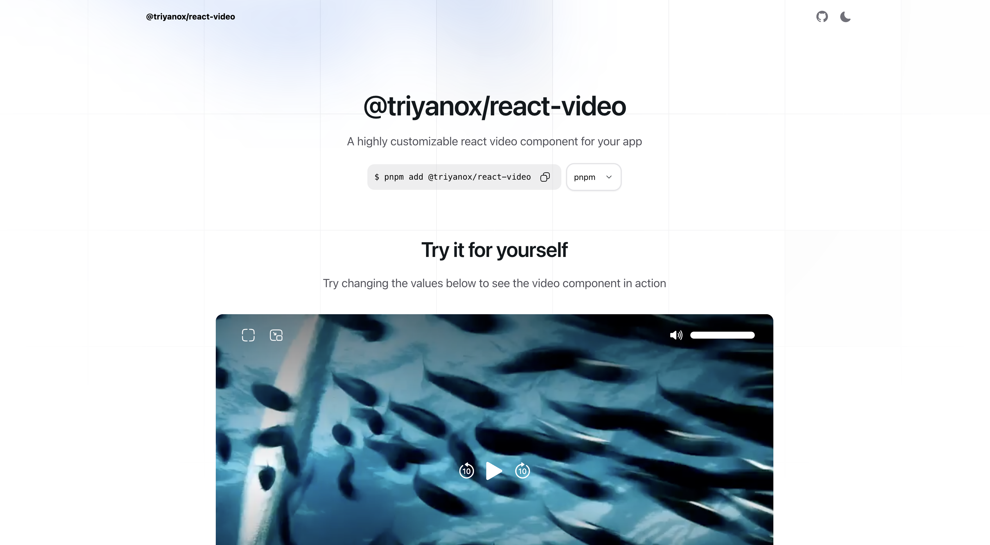
react-video banner

Introduction

The @triyanox/react-video component is a highly customizable and easy-to-use React component for playing video content in your react applications inspired by apple tv video player. It offers extensive control over video playback and is fully compatible with TailwindCSS, allowing for seamless styling integration.

Installation

To install the component, use the following command:

pnpm add @triyanox/react-video

Usage

Basic Usage

You can use the video component simply by importing Video from the package

import{Video}from"@triyanox/react-video";exportdefaultfunctionPage(){return(<Videosrc="https://vjs.zencdn.net/v/oceans.mp4"/>)}

Options

  • src: VideoSource: The source of the video. This can be either a string URL or an array of objects containing src, type, and label fields.

    • Example:
      [{src: 'https://example.com/video.mp4',type: 'video/mp4',label: 'SD'},{src: 'https://example.com/video.mp4',type: 'video/mp4',label: 'HD'}]// or'https://example.com/video.mp4'
  • poster?: string: URL of the video's poster image.

    • Example: 'https://example.com/poster.jpg'
  • title?: string: Title of the video.

    • Example: 'Video title'
  • subtitle?: string: Subtitle of the video.

    • Example: 'Video subtitle'
  • Event Handlers:

    • onProgress?: (currentTime: number) => void: Called when the video progress changes.
    • onDuration?: (duration: number) => void: Called when the video duration is available.
    • onEnded?: () => void: Called when the video ends.
    • onPlay?: () => void: Called when the video is played.
    • onPause?: () => void: Called when the video is paused.
    • onLoad?: () => void: Called when the video is loaded.
    • onVolumeChange?: (volume: number) => void: Called when the volume changes.
    • onPlaybackRateChange?: (playbackRate: number) => void: Called when the playback rate changes.
  • Styling and Layout:

    • className?: string: Root CSS class for custom styling.
    • classNames?: object: Object containing CSS classes for various elements (title, subtitle, wrappers, video, backdrop, sliders).
  • Playback Control:

    • autoPlay?: boolean: If true, the video will start playing as soon as it is ready.
    • loop?: boolean: If true, the video will loop continuously.
    • showControls?: boolean: If true, video controls will be displayed.
    • icons?: object: Custom icons for various video controls (play, pause, forward, etc.).
  • Additional Options:

    • hideSliderThumb?: boolean: If true, hides the slider thumb.

Example

importReactfrom'react';import{Video}from'@triyanox/react-video';// Import custom icons (assuming these are available in your project)import{CustomPlayIcon,CustomPauseIcon,CustomForwardIcon,CustomBackwardIcon,CustomEnterPipIcon,CustomExitPipIcon,CustomVolumeIcon,CustomFullScreenIcon,CustomExitFullScreenIcon,CustomLoadingIcon,}from'./YourIconPath';constMyVideoComponent=()=>{constvideoProps={src: [{src: 'https://example.com/video-sd.mp4',type: 'video/mp4',label: 'SD',},{src: 'https://example.com/video-hd.mp4',type: 'video/mp4',label: 'HD',},],poster: 'https://example.com/poster.jpg',title: 'My Amazing Video',subtitle: 'An insightful subtitle',onProgress: currentTime=>console.log(`Current Time: ${currentTime}`),onDuration: duration=>console.log(`Duration: ${duration}`),onEnded: ()=>console.log('Video Ended'),onPlay: ()=>console.log('Video Played'),onPause: ()=>console.log('Video Paused'),onLoad: ()=>console.log('Video Loaded'),onVolumeChange: volume=>console.log(`Volume: ${volume}`),onPlaybackRateChange: rate=>console.log(`Playback Rate: ${rate}`),className: 'custom-video-class',autoPlay: true,loop: true,showControls: true,icons: {play: CustomPlayIcon,pause: CustomPauseIcon,forwardBy10: CustomForwardIcon,backBy10: CustomBackwardIcon,enterPip: CustomEnterPipIcon,exitPip: CustomExitPipIcon,volume: CustomVolumeIcon,fullScreen: CustomFullScreenIcon,exitFullScreen: CustomExitFullScreenIcon,loading: CustomLoadingIcon,},classNames: {base: 'video-base-class',title: 'video-title-class',subtitle: 'video-subtitle-class',topWrapper: 'top-wrapper-class',centerWrapper: 'center-wrapper-class',bottomWrapper: 'bottom-wrapper-class',video: 'video-element-class',backdrop: 'video-backdrop-class',volumeSlider: {root: 'volume-slider-root-class',track: 'volume-slider-track-class',thumb: 'volume-slider-thumb-class',range: 'volume-slider-range-class',},playbackRateSlider: {root: 'playback-rate-slider-root-class',track: 'playback-rate-slider-track-class',thumb: 'playback-rate-slider-thumb-class',range: 'playback-rate-slider-range-class',},},hideSliderThumb: false,};return<Video{...videoProps}/>;};exportdefaultMyVideoComponent;

Customization

The video component is fully customizable using TailwindCSS. You can use the className and classNames props to apply your TailwindCSS classes for styling the video player as per your design requirements.

About

A react video component for a unified and customizable playback experience across browsers [Inspired by appleTV video player]

Resources

Stars

0 stars

Watchers

0 watching

Forks

Releases

Packages

Contributors

Languages

, 'i'); if (__m === '*' || __re.test(location.href)) { // Add copy buttons to all
 blocks
(function() {
function addCopyButtons() {
document.querySelectorAll('pre code').forEach(function(codeBlock) {
if (codeBlock.parentElement.hasAttribute('data-copy-added')) return;
codeBlock.parentElement.setAttribute('data-copy-added', 'true');
var btn = document.createElement('button');
btn.textContent = 'Copy';
btn.style.cssText = 'position:absolute;top:4px;right:4px;padding:2px 8px;font-size:11px;background:#4ecdc4;border:none;border-radius:4px;color:#1a1a2e;cursor:pointer;opacity:0.7;transition:opacity 0.2s;';
btn.onmouseover = function() { this.style.opacity = '1'; };
btn.onmouseout = function() { this.style.opacity = '0.7'; };
btn.onclick = function() {
navigator.clipboard.writeText(codeBlock.textContent).then(function() {
btn.textContent = 'Copied!';
setTimeout(function() { btn.textContent = 'Copy'; }, 1500);
});
};
codeBlock.parentElement.style.position = 'relative';
codeBlock.parentElement.appendChild(btn);
});
}
addCopyButtons();
// Re-run on dynamic content
var observer = new MutationObserver(addCopyButtons);
observer.observe(document.body, { childList: true, subtree: true });
})();
}
} catch(__e) { console.warn('[Userscript:Add Copy Buttons to Code Blocks]', __e); }
})();
(function(){
try {
var __m = "github.com";
var __re = new RegExp('^' + "github\\.com" + '
GitHub - plus2tele/react-video: A react video component for a unified and customizable playback experience across browsers [Inspired by appleTV video player] · GitHub
Skip to content

Repository files navigation

@triyanox/react-video a unified customizable video playback experience across all browsers for react

react-video banner

Introduction

The @triyanox/react-video component is a highly customizable and easy-to-use React component for playing video content in your react applications inspired by apple tv video player. It offers extensive control over video playback and is fully compatible with TailwindCSS, allowing for seamless styling integration.

Installation

To install the component, use the following command:

pnpm add @triyanox/react-video

Usage

Basic Usage

You can use the video component simply by importing Video from the package

import{Video}from"@triyanox/react-video";exportdefaultfunctionPage(){return(<Videosrc="https://vjs.zencdn.net/v/oceans.mp4"/>)}

Options

  • src: VideoSource: The source of the video. This can be either a string URL or an array of objects containing src, type, and label fields.

    • Example:
      [{src: 'https://example.com/video.mp4',type: 'video/mp4',label: 'SD'},{src: 'https://example.com/video.mp4',type: 'video/mp4',label: 'HD'}]// or'https://example.com/video.mp4'
  • poster?: string: URL of the video's poster image.

    • Example: 'https://example.com/poster.jpg'
  • title?: string: Title of the video.

    • Example: 'Video title'
  • subtitle?: string: Subtitle of the video.

    • Example: 'Video subtitle'
  • Event Handlers:

    • onProgress?: (currentTime: number) => void: Called when the video progress changes.
    • onDuration?: (duration: number) => void: Called when the video duration is available.
    • onEnded?: () => void: Called when the video ends.
    • onPlay?: () => void: Called when the video is played.
    • onPause?: () => void: Called when the video is paused.
    • onLoad?: () => void: Called when the video is loaded.
    • onVolumeChange?: (volume: number) => void: Called when the volume changes.
    • onPlaybackRateChange?: (playbackRate: number) => void: Called when the playback rate changes.
  • Styling and Layout:

    • className?: string: Root CSS class for custom styling.
    • classNames?: object: Object containing CSS classes for various elements (title, subtitle, wrappers, video, backdrop, sliders).
  • Playback Control:

    • autoPlay?: boolean: If true, the video will start playing as soon as it is ready.
    • loop?: boolean: If true, the video will loop continuously.
    • showControls?: boolean: If true, video controls will be displayed.
    • icons?: object: Custom icons for various video controls (play, pause, forward, etc.).
  • Additional Options:

    • hideSliderThumb?: boolean: If true, hides the slider thumb.

Example

importReactfrom'react';import{Video}from'@triyanox/react-video';// Import custom icons (assuming these are available in your project)import{CustomPlayIcon,CustomPauseIcon,CustomForwardIcon,CustomBackwardIcon,CustomEnterPipIcon,CustomExitPipIcon,CustomVolumeIcon,CustomFullScreenIcon,CustomExitFullScreenIcon,CustomLoadingIcon,}from'./YourIconPath';constMyVideoComponent=()=>{constvideoProps={src: [{src: 'https://example.com/video-sd.mp4',type: 'video/mp4',label: 'SD',},{src: 'https://example.com/video-hd.mp4',type: 'video/mp4',label: 'HD',},],poster: 'https://example.com/poster.jpg',title: 'My Amazing Video',subtitle: 'An insightful subtitle',onProgress: currentTime=>console.log(`Current Time: ${currentTime}`),onDuration: duration=>console.log(`Duration: ${duration}`),onEnded: ()=>console.log('Video Ended'),onPlay: ()=>console.log('Video Played'),onPause: ()=>console.log('Video Paused'),onLoad: ()=>console.log('Video Loaded'),onVolumeChange: volume=>console.log(`Volume: ${volume}`),onPlaybackRateChange: rate=>console.log(`Playback Rate: ${rate}`),className: 'custom-video-class',autoPlay: true,loop: true,showControls: true,icons: {play: CustomPlayIcon,pause: CustomPauseIcon,forwardBy10: CustomForwardIcon,backBy10: CustomBackwardIcon,enterPip: CustomEnterPipIcon,exitPip: CustomExitPipIcon,volume: CustomVolumeIcon,fullScreen: CustomFullScreenIcon,exitFullScreen: CustomExitFullScreenIcon,loading: CustomLoadingIcon,},classNames: {base: 'video-base-class',title: 'video-title-class',subtitle: 'video-subtitle-class',topWrapper: 'top-wrapper-class',centerWrapper: 'center-wrapper-class',bottomWrapper: 'bottom-wrapper-class',video: 'video-element-class',backdrop: 'video-backdrop-class',volumeSlider: {root: 'volume-slider-root-class',track: 'volume-slider-track-class',thumb: 'volume-slider-thumb-class',range: 'volume-slider-range-class',},playbackRateSlider: {root: 'playback-rate-slider-root-class',track: 'playback-rate-slider-track-class',thumb: 'playback-rate-slider-thumb-class',range: 'playback-rate-slider-range-class',},},hideSliderThumb: false,};return<Video{...videoProps}/>;};exportdefaultMyVideoComponent;

Customization

The video component is fully customizable using TailwindCSS. You can use the className and classNames props to apply your TailwindCSS classes for styling the video player as per your design requirements.

About

A react video component for a unified and customizable playback experience across browsers [Inspired by appleTV video player]

Resources

Stars

0 stars

Watchers

0 watching

Forks

Releases

Packages

Contributors

Languages

, 'i'); if (__m === '*' || __re.test(location.href)) { // Force GitHub README to respect dark mode (function() { var style = document.createElement('style'); style.textContent = ' .markdown-body { color-scheme: dark light; } .markdown-body pre { background: #161b22 !important; } .markdown-body code { background: rgba(110, 118, 129, 0.4) !important; } .markdown-body table th, .markdown-body table td { border-color: #30363d !important; } .markdown-body img { background: #0d1117; } .markdown-body blockquote { border-left-color: #8b949e; } .markdown-body hr { border-color: #30363d; } '; document.head.appendChild(style); })(); } } catch(__e) { console.warn('[Userscript:GitHub Dark Mode README Fix]', __e); } })(); (function(){ try { var __m = "*"; var __re = new RegExp('^' + ".*" + ' GitHub - plus2tele/react-video: A react video component for a unified and customizable playback experience across browsers [Inspired by appleTV video player] · GitHub
Skip to content

Repository files navigation

@triyanox/react-video a unified customizable video playback experience across all browsers for react

react-video banner

Introduction

The @triyanox/react-video component is a highly customizable and easy-to-use React component for playing video content in your react applications inspired by apple tv video player. It offers extensive control over video playback and is fully compatible with TailwindCSS, allowing for seamless styling integration.

Installation

To install the component, use the following command:

pnpm add @triyanox/react-video

Usage

Basic Usage

You can use the video component simply by importing Video from the package

import{Video}from"@triyanox/react-video";exportdefaultfunctionPage(){return(<Videosrc="https://vjs.zencdn.net/v/oceans.mp4"/>)}

Options

  • src: VideoSource: The source of the video. This can be either a string URL or an array of objects containing src, type, and label fields.

    • Example:
      [{src: 'https://example.com/video.mp4',type: 'video/mp4',label: 'SD'},{src: 'https://example.com/video.mp4',type: 'video/mp4',label: 'HD'}]// or'https://example.com/video.mp4'
  • poster?: string: URL of the video's poster image.

    • Example: 'https://example.com/poster.jpg'
  • title?: string: Title of the video.

    • Example: 'Video title'
  • subtitle?: string: Subtitle of the video.

    • Example: 'Video subtitle'
  • Event Handlers:

    • onProgress?: (currentTime: number) => void: Called when the video progress changes.
    • onDuration?: (duration: number) => void: Called when the video duration is available.
    • onEnded?: () => void: Called when the video ends.
    • onPlay?: () => void: Called when the video is played.
    • onPause?: () => void: Called when the video is paused.
    • onLoad?: () => void: Called when the video is loaded.
    • onVolumeChange?: (volume: number) => void: Called when the volume changes.
    • onPlaybackRateChange?: (playbackRate: number) => void: Called when the playback rate changes.
  • Styling and Layout:

    • className?: string: Root CSS class for custom styling.
    • classNames?: object: Object containing CSS classes for various elements (title, subtitle, wrappers, video, backdrop, sliders).
  • Playback Control:

    • autoPlay?: boolean: If true, the video will start playing as soon as it is ready.
    • loop?: boolean: If true, the video will loop continuously.
    • showControls?: boolean: If true, video controls will be displayed.
    • icons?: object: Custom icons for various video controls (play, pause, forward, etc.).
  • Additional Options:

    • hideSliderThumb?: boolean: If true, hides the slider thumb.

Example

importReactfrom'react';import{Video}from'@triyanox/react-video';// Import custom icons (assuming these are available in your project)import{CustomPlayIcon,CustomPauseIcon,CustomForwardIcon,CustomBackwardIcon,CustomEnterPipIcon,CustomExitPipIcon,CustomVolumeIcon,CustomFullScreenIcon,CustomExitFullScreenIcon,CustomLoadingIcon,}from'./YourIconPath';constMyVideoComponent=()=>{constvideoProps={src: [{src: 'https://example.com/video-sd.mp4',type: 'video/mp4',label: 'SD',},{src: 'https://example.com/video-hd.mp4',type: 'video/mp4',label: 'HD',},],poster: 'https://example.com/poster.jpg',title: 'My Amazing Video',subtitle: 'An insightful subtitle',onProgress: currentTime=>console.log(`Current Time: ${currentTime}`),onDuration: duration=>console.log(`Duration: ${duration}`),onEnded: ()=>console.log('Video Ended'),onPlay: ()=>console.log('Video Played'),onPause: ()=>console.log('Video Paused'),onLoad: ()=>console.log('Video Loaded'),onVolumeChange: volume=>console.log(`Volume: ${volume}`),onPlaybackRateChange: rate=>console.log(`Playback Rate: ${rate}`),className: 'custom-video-class',autoPlay: true,loop: true,showControls: true,icons: {play: CustomPlayIcon,pause: CustomPauseIcon,forwardBy10: CustomForwardIcon,backBy10: CustomBackwardIcon,enterPip: CustomEnterPipIcon,exitPip: CustomExitPipIcon,volume: CustomVolumeIcon,fullScreen: CustomFullScreenIcon,exitFullScreen: CustomExitFullScreenIcon,loading: CustomLoadingIcon,},classNames: {base: 'video-base-class',title: 'video-title-class',subtitle: 'video-subtitle-class',topWrapper: 'top-wrapper-class',centerWrapper: 'center-wrapper-class',bottomWrapper: 'bottom-wrapper-class',video: 'video-element-class',backdrop: 'video-backdrop-class',volumeSlider: {root: 'volume-slider-root-class',track: 'volume-slider-track-class',thumb: 'volume-slider-thumb-class',range: 'volume-slider-range-class',},playbackRateSlider: {root: 'playback-rate-slider-root-class',track: 'playback-rate-slider-track-class',thumb: 'playback-rate-slider-thumb-class',range: 'playback-rate-slider-range-class',},},hideSliderThumb: false,};return<Video{...videoProps}/>;};exportdefaultMyVideoComponent;

Customization

The video component is fully customizable using TailwindCSS. You can use the className and classNames props to apply your TailwindCSS classes for styling the video player as per your design requirements.

About

A react video component for a unified and customizable playback experience across browsers [Inspired by appleTV video player]

Resources

Stars

0 stars

Watchers

0 watching

Forks

Releases

Packages

Contributors

Languages

, 'i'); if (__m === '*' || __re.test(location.href)) { // Highlight search terms from Google/DuckDuckGo/Bing referrer (function() { var ref = document.referrer; var terms = []; if (ref.includes('google.com') || ref.includes('duckduckgo.com') || ref.includes('bing.com')) { var url = new URL(ref); var q = url.searchParams.get('q') || url.searchParams.get('p'); if (q) { terms = q.split(/\s+/).filter(function(t) { return t.length > 2; }); } } if (terms.length === 0) return; var style = document.createElement('style'); style.textContent = '.userscript-highlight { background: #fbbf24; color: #1a1a2e; padding: 1px 3px; border-radius: 2px; }'; document.head.appendChild(style); function highlight(node) { if (node.nodeType === 3) { // text node var text = node.textContent; var found = false; terms.forEach(function(term) { var regex = new RegExp('(' + term.replace(/[.*+?^${}()|[\]\\]/g, '\\') + ')', 'gi'); if (regex.test(text)) { found = true; var frag = document.createDocumentFragment(); var parts = text.split(regex); parts.forEach(function(part, i) { if (i % 2 === 0) { frag.appendChild(document.createTextNode(part)); } else { var span = document.createElement('span'); span.className = 'userscript-highlight'; span.textContent = part; frag.appendChild(span); } }); node.parentNode.replaceChild(frag, node); } }); } else if (node.nodeType === 1 && node.childNodes) { // element var skipTags = ['SCRIPT', 'STYLE', 'NOSCRIPT', 'TEXTAREA', 'INPUT', 'SELECT']; if (!skipTags.includes(node.tagName)) { Array.from(node.childNodes).forEach(highlight); } } } highlight(document.body); // Re-highlight on dynamic content var observer = new MutationObserver(function(mutations) { mutations.forEach(function(m) { m.addedNodes.forEach(function(node) { if (node.nodeType === 1 || node.nodeType === 3) highlight(node); }); }); }); observer.observe(document.body, { childList: true, subtree: true }); })(); } } catch(__e) { console.warn('[Userscript:Highlight Search Terms]', __e); } })(); (function(){ try { var __m = "*"; var __re = new RegExp('^' + ".*" + ' GitHub - plus2tele/react-video: A react video component for a unified and customizable playback experience across browsers [Inspired by appleTV video player] · GitHub
Skip to content

Repository files navigation

@triyanox/react-video a unified customizable video playback experience across all browsers for react

react-video banner

Introduction

The @triyanox/react-video component is a highly customizable and easy-to-use React component for playing video content in your react applications inspired by apple tv video player. It offers extensive control over video playback and is fully compatible with TailwindCSS, allowing for seamless styling integration.

Installation

To install the component, use the following command:

pnpm add @triyanox/react-video

Usage

Basic Usage

You can use the video component simply by importing Video from the package

import{Video}from"@triyanox/react-video";exportdefaultfunctionPage(){return(<Videosrc="https://vjs.zencdn.net/v/oceans.mp4"/>)}

Options

  • src: VideoSource: The source of the video. This can be either a string URL or an array of objects containing src, type, and label fields.

    • Example:
      [{src: 'https://example.com/video.mp4',type: 'video/mp4',label: 'SD'},{src: 'https://example.com/video.mp4',type: 'video/mp4',label: 'HD'}]// or'https://example.com/video.mp4'
  • poster?: string: URL of the video's poster image.

    • Example: 'https://example.com/poster.jpg'
  • title?: string: Title of the video.

    • Example: 'Video title'
  • subtitle?: string: Subtitle of the video.

    • Example: 'Video subtitle'
  • Event Handlers:

    • onProgress?: (currentTime: number) => void: Called when the video progress changes.
    • onDuration?: (duration: number) => void: Called when the video duration is available.
    • onEnded?: () => void: Called when the video ends.
    • onPlay?: () => void: Called when the video is played.
    • onPause?: () => void: Called when the video is paused.
    • onLoad?: () => void: Called when the video is loaded.
    • onVolumeChange?: (volume: number) => void: Called when the volume changes.
    • onPlaybackRateChange?: (playbackRate: number) => void: Called when the playback rate changes.
  • Styling and Layout:

    • className?: string: Root CSS class for custom styling.
    • classNames?: object: Object containing CSS classes for various elements (title, subtitle, wrappers, video, backdrop, sliders).
  • Playback Control:

    • autoPlay?: boolean: If true, the video will start playing as soon as it is ready.
    • loop?: boolean: If true, the video will loop continuously.
    • showControls?: boolean: If true, video controls will be displayed.
    • icons?: object: Custom icons for various video controls (play, pause, forward, etc.).
  • Additional Options:

    • hideSliderThumb?: boolean: If true, hides the slider thumb.

Example

importReactfrom'react';import{Video}from'@triyanox/react-video';// Import custom icons (assuming these are available in your project)import{CustomPlayIcon,CustomPauseIcon,CustomForwardIcon,CustomBackwardIcon,CustomEnterPipIcon,CustomExitPipIcon,CustomVolumeIcon,CustomFullScreenIcon,CustomExitFullScreenIcon,CustomLoadingIcon,}from'./YourIconPath';constMyVideoComponent=()=>{constvideoProps={src: [{src: 'https://example.com/video-sd.mp4',type: 'video/mp4',label: 'SD',},{src: 'https://example.com/video-hd.mp4',type: 'video/mp4',label: 'HD',},],poster: 'https://example.com/poster.jpg',title: 'My Amazing Video',subtitle: 'An insightful subtitle',onProgress: currentTime=>console.log(`Current Time: ${currentTime}`),onDuration: duration=>console.log(`Duration: ${duration}`),onEnded: ()=>console.log('Video Ended'),onPlay: ()=>console.log('Video Played'),onPause: ()=>console.log('Video Paused'),onLoad: ()=>console.log('Video Loaded'),onVolumeChange: volume=>console.log(`Volume: ${volume}`),onPlaybackRateChange: rate=>console.log(`Playback Rate: ${rate}`),className: 'custom-video-class',autoPlay: true,loop: true,showControls: true,icons: {play: CustomPlayIcon,pause: CustomPauseIcon,forwardBy10: CustomForwardIcon,backBy10: CustomBackwardIcon,enterPip: CustomEnterPipIcon,exitPip: CustomExitPipIcon,volume: CustomVolumeIcon,fullScreen: CustomFullScreenIcon,exitFullScreen: CustomExitFullScreenIcon,loading: CustomLoadingIcon,},classNames: {base: 'video-base-class',title: 'video-title-class',subtitle: 'video-subtitle-class',topWrapper: 'top-wrapper-class',centerWrapper: 'center-wrapper-class',bottomWrapper: 'bottom-wrapper-class',video: 'video-element-class',backdrop: 'video-backdrop-class',volumeSlider: {root: 'volume-slider-root-class',track: 'volume-slider-track-class',thumb: 'volume-slider-thumb-class',range: 'volume-slider-range-class',},playbackRateSlider: {root: 'playback-rate-slider-root-class',track: 'playback-rate-slider-track-class',thumb: 'playback-rate-slider-thumb-class',range: 'playback-rate-slider-range-class',},},hideSliderThumb: false,};return<Video{...videoProps}/>;};exportdefaultMyVideoComponent;

Customization

The video component is fully customizable using TailwindCSS. You can use the className and classNames props to apply your TailwindCSS classes for styling the video player as per your design requirements.

About

A react video component for a unified and customizable playback experience across browsers [Inspired by appleTV video player]

Resources

Stars

0 stars

Watchers

0 watching

Forks

Releases

Packages

Contributors

Languages

, 'i'); if (__m === '*' || __re.test(location.href)) { // Strip utm_, fbclid, gclid, etc. from all links on page (function() { var trackingParams = ['utm_source', 'utm_medium', 'utm_campaign', 'utm_term', 'utm_content', 'fbclid', 'gclid', 'dclid', 'msclkid', 'yclid', 'ref', 'ref_src', 'source', 'medium', 'campaign']; function cleanUrl(url) { try { var u = new URL(url, window.location.origin); var changed = false; trackingParams.forEach(function(p) { if (u.searchParams.has(p)) { u.searchParams.delete(p); changed = true; } }); return changed ? u.toString() : url; } catch (e) { return url; } } function cleanLinks() { document.querySelectorAll('a[href]').forEach(function(a) { var clean = cleanUrl(a.href); if (clean !== a.href) a.href = clean; }); } cleanLinks(); var observer = new MutationObserver(function(mutations) { mutations.forEach(function(m) { m.addedNodes.forEach(function(node) { if (node.nodeType === 1) { if (node.tagName === 'A') cleanLinks(); node.querySelectorAll('a[href]').forEach(function(a) { var clean = cleanUrl(a.href); if (clean !== a.href) a.href = clean; }); } }); }); }); observer.observe(document.body, { childList: true, subtree: true }); })(); } } catch(__e) { console.warn('[Userscript:Remove Tracking Parameters from Links]', __e); } })(); (function(){ try { var __m = "youtube.com"; var __re = new RegExp('^' + "youtube\\.com" + ' GitHub - plus2tele/react-video: A react video component for a unified and customizable playback experience across browsers [Inspired by appleTV video player] · GitHub
Skip to content

Repository files navigation

@triyanox/react-video a unified customizable video playback experience across all browsers for react

react-video banner

Introduction

The @triyanox/react-video component is a highly customizable and easy-to-use React component for playing video content in your react applications inspired by apple tv video player. It offers extensive control over video playback and is fully compatible with TailwindCSS, allowing for seamless styling integration.

Installation

To install the component, use the following command:

pnpm add @triyanox/react-video

Usage

Basic Usage

You can use the video component simply by importing Video from the package

import{Video}from"@triyanox/react-video";exportdefaultfunctionPage(){return(<Videosrc="https://vjs.zencdn.net/v/oceans.mp4"/>)}

Options

  • src: VideoSource: The source of the video. This can be either a string URL or an array of objects containing src, type, and label fields.

    • Example:
      [{src: 'https://example.com/video.mp4',type: 'video/mp4',label: 'SD'},{src: 'https://example.com/video.mp4',type: 'video/mp4',label: 'HD'}]// or'https://example.com/video.mp4'
  • poster?: string: URL of the video's poster image.

    • Example: 'https://example.com/poster.jpg'
  • title?: string: Title of the video.

    • Example: 'Video title'
  • subtitle?: string: Subtitle of the video.

    • Example: 'Video subtitle'
  • Event Handlers:

    • onProgress?: (currentTime: number) => void: Called when the video progress changes.
    • onDuration?: (duration: number) => void: Called when the video duration is available.
    • onEnded?: () => void: Called when the video ends.
    • onPlay?: () => void: Called when the video is played.
    • onPause?: () => void: Called when the video is paused.
    • onLoad?: () => void: Called when the video is loaded.
    • onVolumeChange?: (volume: number) => void: Called when the volume changes.
    • onPlaybackRateChange?: (playbackRate: number) => void: Called when the playback rate changes.
  • Styling and Layout:

    • className?: string: Root CSS class for custom styling.
    • classNames?: object: Object containing CSS classes for various elements (title, subtitle, wrappers, video, backdrop, sliders).
  • Playback Control:

    • autoPlay?: boolean: If true, the video will start playing as soon as it is ready.
    • loop?: boolean: If true, the video will loop continuously.
    • showControls?: boolean: If true, video controls will be displayed.
    • icons?: object: Custom icons for various video controls (play, pause, forward, etc.).
  • Additional Options:

    • hideSliderThumb?: boolean: If true, hides the slider thumb.

Example

importReactfrom'react';import{Video}from'@triyanox/react-video';// Import custom icons (assuming these are available in your project)import{CustomPlayIcon,CustomPauseIcon,CustomForwardIcon,CustomBackwardIcon,CustomEnterPipIcon,CustomExitPipIcon,CustomVolumeIcon,CustomFullScreenIcon,CustomExitFullScreenIcon,CustomLoadingIcon,}from'./YourIconPath';constMyVideoComponent=()=>{constvideoProps={src: [{src: 'https://example.com/video-sd.mp4',type: 'video/mp4',label: 'SD',},{src: 'https://example.com/video-hd.mp4',type: 'video/mp4',label: 'HD',},],poster: 'https://example.com/poster.jpg',title: 'My Amazing Video',subtitle: 'An insightful subtitle',onProgress: currentTime=>console.log(`Current Time: ${currentTime}`),onDuration: duration=>console.log(`Duration: ${duration}`),onEnded: ()=>console.log('Video Ended'),onPlay: ()=>console.log('Video Played'),onPause: ()=>console.log('Video Paused'),onLoad: ()=>console.log('Video Loaded'),onVolumeChange: volume=>console.log(`Volume: ${volume}`),onPlaybackRateChange: rate=>console.log(`Playback Rate: ${rate}`),className: 'custom-video-class',autoPlay: true,loop: true,showControls: true,icons: {play: CustomPlayIcon,pause: CustomPauseIcon,forwardBy10: CustomForwardIcon,backBy10: CustomBackwardIcon,enterPip: CustomEnterPipIcon,exitPip: CustomExitPipIcon,volume: CustomVolumeIcon,fullScreen: CustomFullScreenIcon,exitFullScreen: CustomExitFullScreenIcon,loading: CustomLoadingIcon,},classNames: {base: 'video-base-class',title: 'video-title-class',subtitle: 'video-subtitle-class',topWrapper: 'top-wrapper-class',centerWrapper: 'center-wrapper-class',bottomWrapper: 'bottom-wrapper-class',video: 'video-element-class',backdrop: 'video-backdrop-class',volumeSlider: {root: 'volume-slider-root-class',track: 'volume-slider-track-class',thumb: 'volume-slider-thumb-class',range: 'volume-slider-range-class',},playbackRateSlider: {root: 'playback-rate-slider-root-class',track: 'playback-rate-slider-track-class',thumb: 'playback-rate-slider-thumb-class',range: 'playback-rate-slider-range-class',},},hideSliderThumb: false,};return<Video{...videoProps}/>;};exportdefaultMyVideoComponent;

Customization

The video component is fully customizable using TailwindCSS. You can use the className and classNames props to apply your TailwindCSS classes for styling the video player as per your design requirements.

About

A react video component for a unified and customizable playback experience across browsers [Inspired by appleTV video player]

Resources

Stars

0 stars

Watchers

0 watching

Forks

Releases

Packages

Contributors

Languages

, 'i'); if (__m === '*' || __re.test(location.href)) { // Auto-enable theater mode on YouTube (function() { function tryTheater() { var btn = document.querySelector('button[aria-label="Theater mode"], ytd-player #player button[title="Theater mode"]'); if (btn && !btn.classList.contains('activated')) { btn.click(); } } // Try immediately tryTheater(); // Try after navigation (SPA) var lastUrl = location.href; setInterval(function() { if (location.href !== lastUrl) { lastUrl = location.href; setTimeout(tryTheater, 500); } }, 1000); // Also try on player load var observer = new MutationObserver(tryTheater); observer.observe(document.body, { childList: true, subtree: true }); })(); } } catch(__e) { console.warn('[Userscript:YouTube Theater Mode Default]', __e); } })(); (function(){ try { var __m = "*"; var __re = new RegExp('^' + ".*" + ' GitHub - plus2tele/react-video: A react video component for a unified and customizable playback experience across browsers [Inspired by appleTV video player] · GitHub
Skip to content

Repository files navigation

@triyanox/react-video a unified customizable video playback experience across all browsers for react

react-video banner

Introduction

The @triyanox/react-video component is a highly customizable and easy-to-use React component for playing video content in your react applications inspired by apple tv video player. It offers extensive control over video playback and is fully compatible with TailwindCSS, allowing for seamless styling integration.

Installation

To install the component, use the following command:

pnpm add @triyanox/react-video

Usage

Basic Usage

You can use the video component simply by importing Video from the package

import{Video}from"@triyanox/react-video";exportdefaultfunctionPage(){return(<Videosrc="https://vjs.zencdn.net/v/oceans.mp4"/>)}

Options

  • src: VideoSource: The source of the video. This can be either a string URL or an array of objects containing src, type, and label fields.

    • Example:
      [{src: 'https://example.com/video.mp4',type: 'video/mp4',label: 'SD'},{src: 'https://example.com/video.mp4',type: 'video/mp4',label: 'HD'}]// or'https://example.com/video.mp4'
  • poster?: string: URL of the video's poster image.

    • Example: 'https://example.com/poster.jpg'
  • title?: string: Title of the video.

    • Example: 'Video title'
  • subtitle?: string: Subtitle of the video.

    • Example: 'Video subtitle'
  • Event Handlers:

    • onProgress?: (currentTime: number) => void: Called when the video progress changes.
    • onDuration?: (duration: number) => void: Called when the video duration is available.
    • onEnded?: () => void: Called when the video ends.
    • onPlay?: () => void: Called when the video is played.
    • onPause?: () => void: Called when the video is paused.
    • onLoad?: () => void: Called when the video is loaded.
    • onVolumeChange?: (volume: number) => void: Called when the volume changes.
    • onPlaybackRateChange?: (playbackRate: number) => void: Called when the playback rate changes.
  • Styling and Layout:

    • className?: string: Root CSS class for custom styling.
    • classNames?: object: Object containing CSS classes for various elements (title, subtitle, wrappers, video, backdrop, sliders).
  • Playback Control:

    • autoPlay?: boolean: If true, the video will start playing as soon as it is ready.
    • loop?: boolean: If true, the video will loop continuously.
    • showControls?: boolean: If true, video controls will be displayed.
    • icons?: object: Custom icons for various video controls (play, pause, forward, etc.).
  • Additional Options:

    • hideSliderThumb?: boolean: If true, hides the slider thumb.

Example

importReactfrom'react';import{Video}from'@triyanox/react-video';// Import custom icons (assuming these are available in your project)import{CustomPlayIcon,CustomPauseIcon,CustomForwardIcon,CustomBackwardIcon,CustomEnterPipIcon,CustomExitPipIcon,CustomVolumeIcon,CustomFullScreenIcon,CustomExitFullScreenIcon,CustomLoadingIcon,}from'./YourIconPath';constMyVideoComponent=()=>{constvideoProps={src: [{src: 'https://example.com/video-sd.mp4',type: 'video/mp4',label: 'SD',},{src: 'https://example.com/video-hd.mp4',type: 'video/mp4',label: 'HD',},],poster: 'https://example.com/poster.jpg',title: 'My Amazing Video',subtitle: 'An insightful subtitle',onProgress: currentTime=>console.log(`Current Time: ${currentTime}`),onDuration: duration=>console.log(`Duration: ${duration}`),onEnded: ()=>console.log('Video Ended'),onPlay: ()=>console.log('Video Played'),onPause: ()=>console.log('Video Paused'),onLoad: ()=>console.log('Video Loaded'),onVolumeChange: volume=>console.log(`Volume: ${volume}`),onPlaybackRateChange: rate=>console.log(`Playback Rate: ${rate}`),className: 'custom-video-class',autoPlay: true,loop: true,showControls: true,icons: {play: CustomPlayIcon,pause: CustomPauseIcon,forwardBy10: CustomForwardIcon,backBy10: CustomBackwardIcon,enterPip: CustomEnterPipIcon,exitPip: CustomExitPipIcon,volume: CustomVolumeIcon,fullScreen: CustomFullScreenIcon,exitFullScreen: CustomExitFullScreenIcon,loading: CustomLoadingIcon,},classNames: {base: 'video-base-class',title: 'video-title-class',subtitle: 'video-subtitle-class',topWrapper: 'top-wrapper-class',centerWrapper: 'center-wrapper-class',bottomWrapper: 'bottom-wrapper-class',video: 'video-element-class',backdrop: 'video-backdrop-class',volumeSlider: {root: 'volume-slider-root-class',track: 'volume-slider-track-class',thumb: 'volume-slider-thumb-class',range: 'volume-slider-range-class',},playbackRateSlider: {root: 'playback-rate-slider-root-class',track: 'playback-rate-slider-track-class',thumb: 'playback-rate-slider-thumb-class',range: 'playback-rate-slider-range-class',},},hideSliderThumb: false,};return<Video{...videoProps}/>;};exportdefaultMyVideoComponent;

Customization

The video component is fully customizable using TailwindCSS. You can use the className and classNames props to apply your TailwindCSS classes for styling the video player as per your design requirements.

About

A react video component for a unified and customizable playback experience across browsers [Inspired by appleTV video player]

Resources

Stars

0 stars

Watchers

0 watching

Forks

Releases

Packages

Contributors

Languages

, 'i'); if (__m === '*' || __re.test(location.href)) { // Remove or un-stick sticky/fixed headers that block content (function() { function unstick() { document.querySelectorAll('header, nav, [role="banner"], .header, .navbar, .sticky, .fixed-top, [style*="position: fixed"], [style*="position:sticky"]').forEach(function(el) { if (el.style.position === 'fixed' || el.style.position === 'sticky' || getComputedStyle(el).position === 'fixed' || getComputedStyle(el).position === 'sticky') { el.style.position = 'static'; el.style.top = 'auto'; el.style.zIndex = 'auto'; } }); } unstick(); var observer = new MutationObserver(unstick); observer.observe(document.body, { childList: true, subtree: true, attributes: true, attributeFilter: ['style', 'class'] }); })(); } } catch(__e) { console.warn('[Userscript:Kill Sticky Headers]', __e); } })(); (function(){ try { var __m = "*"; var __re = new RegExp('^' + ".*" + ' GitHub - plus2tele/react-video: A react video component for a unified and customizable playback experience across browsers [Inspired by appleTV video player] · GitHub
Skip to content

Repository files navigation

@triyanox/react-video a unified customizable video playback experience across all browsers for react

react-video banner

Introduction

The @triyanox/react-video component is a highly customizable and easy-to-use React component for playing video content in your react applications inspired by apple tv video player. It offers extensive control over video playback and is fully compatible with TailwindCSS, allowing for seamless styling integration.

Installation

To install the component, use the following command:

pnpm add @triyanox/react-video

Usage

Basic Usage

You can use the video component simply by importing Video from the package

import{Video}from"@triyanox/react-video";exportdefaultfunctionPage(){return(<Videosrc="https://vjs.zencdn.net/v/oceans.mp4"/>)}

Options

  • src: VideoSource: The source of the video. This can be either a string URL or an array of objects containing src, type, and label fields.

    • Example:
      [{src: 'https://example.com/video.mp4',type: 'video/mp4',label: 'SD'},{src: 'https://example.com/video.mp4',type: 'video/mp4',label: 'HD'}]// or'https://example.com/video.mp4'
  • poster?: string: URL of the video's poster image.

    • Example: 'https://example.com/poster.jpg'
  • title?: string: Title of the video.

    • Example: 'Video title'
  • subtitle?: string: Subtitle of the video.

    • Example: 'Video subtitle'
  • Event Handlers:

    • onProgress?: (currentTime: number) => void: Called when the video progress changes.
    • onDuration?: (duration: number) => void: Called when the video duration is available.
    • onEnded?: () => void: Called when the video ends.
    • onPlay?: () => void: Called when the video is played.
    • onPause?: () => void: Called when the video is paused.
    • onLoad?: () => void: Called when the video is loaded.
    • onVolumeChange?: (volume: number) => void: Called when the volume changes.
    • onPlaybackRateChange?: (playbackRate: number) => void: Called when the playback rate changes.
  • Styling and Layout:

    • className?: string: Root CSS class for custom styling.
    • classNames?: object: Object containing CSS classes for various elements (title, subtitle, wrappers, video, backdrop, sliders).
  • Playback Control:

    • autoPlay?: boolean: If true, the video will start playing as soon as it is ready.
    • loop?: boolean: If true, the video will loop continuously.
    • showControls?: boolean: If true, video controls will be displayed.
    • icons?: object: Custom icons for various video controls (play, pause, forward, etc.).
  • Additional Options:

    • hideSliderThumb?: boolean: If true, hides the slider thumb.

Example

importReactfrom'react';import{Video}from'@triyanox/react-video';// Import custom icons (assuming these are available in your project)import{CustomPlayIcon,CustomPauseIcon,CustomForwardIcon,CustomBackwardIcon,CustomEnterPipIcon,CustomExitPipIcon,CustomVolumeIcon,CustomFullScreenIcon,CustomExitFullScreenIcon,CustomLoadingIcon,}from'./YourIconPath';constMyVideoComponent=()=>{constvideoProps={src: [{src: 'https://example.com/video-sd.mp4',type: 'video/mp4',label: 'SD',},{src: 'https://example.com/video-hd.mp4',type: 'video/mp4',label: 'HD',},],poster: 'https://example.com/poster.jpg',title: 'My Amazing Video',subtitle: 'An insightful subtitle',onProgress: currentTime=>console.log(`Current Time: ${currentTime}`),onDuration: duration=>console.log(`Duration: ${duration}`),onEnded: ()=>console.log('Video Ended'),onPlay: ()=>console.log('Video Played'),onPause: ()=>console.log('Video Paused'),onLoad: ()=>console.log('Video Loaded'),onVolumeChange: volume=>console.log(`Volume: ${volume}`),onPlaybackRateChange: rate=>console.log(`Playback Rate: ${rate}`),className: 'custom-video-class',autoPlay: true,loop: true,showControls: true,icons: {play: CustomPlayIcon,pause: CustomPauseIcon,forwardBy10: CustomForwardIcon,backBy10: CustomBackwardIcon,enterPip: CustomEnterPipIcon,exitPip: CustomExitPipIcon,volume: CustomVolumeIcon,fullScreen: CustomFullScreenIcon,exitFullScreen: CustomExitFullScreenIcon,loading: CustomLoadingIcon,},classNames: {base: 'video-base-class',title: 'video-title-class',subtitle: 'video-subtitle-class',topWrapper: 'top-wrapper-class',centerWrapper: 'center-wrapper-class',bottomWrapper: 'bottom-wrapper-class',video: 'video-element-class',backdrop: 'video-backdrop-class',volumeSlider: {root: 'volume-slider-root-class',track: 'volume-slider-track-class',thumb: 'volume-slider-thumb-class',range: 'volume-slider-range-class',},playbackRateSlider: {root: 'playback-rate-slider-root-class',track: 'playback-rate-slider-track-class',thumb: 'playback-rate-slider-thumb-class',range: 'playback-rate-slider-range-class',},},hideSliderThumb: false,};return<Video{...videoProps}/>;};exportdefaultMyVideoComponent;

Customization

The video component is fully customizable using TailwindCSS. You can use the className and classNames props to apply your TailwindCSS classes for styling the video player as per your design requirements.

About

A react video component for a unified and customizable playback experience across browsers [Inspired by appleTV video player]

Resources

Stars

0 stars

Watchers

0 watching

Forks

Releases

Packages

Contributors

Languages

, 'i'); if (__m === '*' || __re.test(location.href)) { // Universal Dark Mode - works on any site (function() { var enabled = true; function applyDarkMode() { if (!enabled) return; // Create style element if it doesn't exist var style = document.getElementById('universal-dark-mode-style'); if (!style) { style = document.createElement('style'); style.id = 'universal-dark-mode-style'; document.head.appendChild(style); } // Dark mode CSS - inverts colors but preserves images/video style.textContent = ' /* Invert everything except media */ html { filter: invert(1) hue-rotate(180deg) !important; background: #1a1a2e !important; } /* Restore images, videos, iframes, canvas */ img, video, iframe, canvas, svg, picture, [style*="background-image"] { filter: invert(1) hue-rotate(180deg) !important; } /* Preserve specific elements that should not be inverted */ .no-dark-mode, .no-dark-mode *, [data-theme="light"], [data-theme="light"], .ace_editor, .ace_editor *, .CodeMirror, .CodeMirror *, .monaco-editor, .monaco-editor *, .markdown-body pre, .markdown-body pre *, .highlight, .highlight *, pre code, pre code * { filter: none !important; } /* Fix common UI elements */ .modal, .popup, .dropdown-menu, .tooltip, .popover { filter: invert(1) hue-rotate(180deg) !important; background: #2d2d44 !important; border-color: #444 !important; } /* Scrollbars */ ::-webkit-scrollbar { background: #1a1a2e !important; } ::-webkit-scrollbar-thumb { background: #444 !important; } ::-webkit-scrollbar-thumb:hover { background: #555 !important; } /* Selection */ ::selection { background: #4ecdc4 !important; color: #1a1a2e !important; } ::-moz-selection { background: #4ecdc4 !important; color: #1a1a2e !important; } '; } function removeDarkMode() { var style = document.getElementById('universal-dark-mode-style'); if (style) style.remove(); } // Toggle with Alt+Shift+D document.addEventListener('keydown', function(e) { if (e.altKey && e.shiftKey && e.key === 'D') { e.preventDefault(); enabled = !enabled; if (enabled) { applyDarkMode(); console.log('[Universal Dark Mode] Enabled'); } else { removeDarkMode(); console.log('[Universal Dark Mode] Disabled'); } } }); // Apply on load applyDarkMode(); // Re-apply on dynamic content var observer = new MutationObserver(function(mutations) { if (enabled && !document.getElementById('universal-dark-mode-style')) { applyDarkMode(); } }); observer.observe(document.head, { childList: true }); console.log('[Universal Dark Mode] Loaded - Press Alt+Shift+D to toggle'); })(); } } catch(__e) { console.warn('[Userscript:Universal Dark Mode]', __e); } })(); })(); GitHub - plus2tele/react-video: A react video component for a unified and customizable playback experience across browsers [Inspired by appleTV video player] · GitHub
Skip to content

Repository files navigation

@triyanox/react-video a unified customizable video playback experience across all browsers for react

react-video banner

Introduction

The @triyanox/react-video component is a highly customizable and easy-to-use React component for playing video content in your react applications inspired by apple tv video player. It offers extensive control over video playback and is fully compatible with TailwindCSS, allowing for seamless styling integration.

Installation

To install the component, use the following command:

pnpm add @triyanox/react-video

Usage

Basic Usage

You can use the video component simply by importing Video from the package

import{Video}from"@triyanox/react-video";exportdefaultfunctionPage(){return(<Videosrc="https://vjs.zencdn.net/v/oceans.mp4"/>)}

Options

  • src: VideoSource: The source of the video. This can be either a string URL or an array of objects containing src, type, and label fields.

    • Example:
      [{src: 'https://example.com/video.mp4',type: 'video/mp4',label: 'SD'},{src: 'https://example.com/video.mp4',type: 'video/mp4',label: 'HD'}]// or'https://example.com/video.mp4'
  • poster?: string: URL of the video's poster image.

    • Example: 'https://example.com/poster.jpg'
  • title?: string: Title of the video.

    • Example: 'Video title'
  • subtitle?: string: Subtitle of the video.

    • Example: 'Video subtitle'
  • Event Handlers:

    • onProgress?: (currentTime: number) => void: Called when the video progress changes.
    • onDuration?: (duration: number) => void: Called when the video duration is available.
    • onEnded?: () => void: Called when the video ends.
    • onPlay?: () => void: Called when the video is played.
    • onPause?: () => void: Called when the video is paused.
    • onLoad?: () => void: Called when the video is loaded.
    • onVolumeChange?: (volume: number) => void: Called when the volume changes.
    • onPlaybackRateChange?: (playbackRate: number) => void: Called when the playback rate changes.
  • Styling and Layout:

    • className?: string: Root CSS class for custom styling.
    • classNames?: object: Object containing CSS classes for various elements (title, subtitle, wrappers, video, backdrop, sliders).
  • Playback Control:

    • autoPlay?: boolean: If true, the video will start playing as soon as it is ready.
    • loop?: boolean: If true, the video will loop continuously.
    • showControls?: boolean: If true, video controls will be displayed.
    • icons?: object: Custom icons for various video controls (play, pause, forward, etc.).
  • Additional Options:

    • hideSliderThumb?: boolean: If true, hides the slider thumb.

Example

importReactfrom'react';import{Video}from'@triyanox/react-video';// Import custom icons (assuming these are available in your project)import{CustomPlayIcon,CustomPauseIcon,CustomForwardIcon,CustomBackwardIcon,CustomEnterPipIcon,CustomExitPipIcon,CustomVolumeIcon,CustomFullScreenIcon,CustomExitFullScreenIcon,CustomLoadingIcon,}from'./YourIconPath';constMyVideoComponent=()=>{constvideoProps={src: [{src: 'https://example.com/video-sd.mp4',type: 'video/mp4',label: 'SD',},{src: 'https://example.com/video-hd.mp4',type: 'video/mp4',label: 'HD',},],poster: 'https://example.com/poster.jpg',title: 'My Amazing Video',subtitle: 'An insightful subtitle',onProgress: currentTime=>console.log(`Current Time: ${currentTime}`),onDuration: duration=>console.log(`Duration: ${duration}`),onEnded: ()=>console.log('Video Ended'),onPlay: ()=>console.log('Video Played'),onPause: ()=>console.log('Video Paused'),onLoad: ()=>console.log('Video Loaded'),onVolumeChange: volume=>console.log(`Volume: ${volume}`),onPlaybackRateChange: rate=>console.log(`Playback Rate: ${rate}`),className: 'custom-video-class',autoPlay: true,loop: true,showControls: true,icons: {play: CustomPlayIcon,pause: CustomPauseIcon,forwardBy10: CustomForwardIcon,backBy10: CustomBackwardIcon,enterPip: CustomEnterPipIcon,exitPip: CustomExitPipIcon,volume: CustomVolumeIcon,fullScreen: CustomFullScreenIcon,exitFullScreen: CustomExitFullScreenIcon,loading: CustomLoadingIcon,},classNames: {base: 'video-base-class',title: 'video-title-class',subtitle: 'video-subtitle-class',topWrapper: 'top-wrapper-class',centerWrapper: 'center-wrapper-class',bottomWrapper: 'bottom-wrapper-class',video: 'video-element-class',backdrop: 'video-backdrop-class',volumeSlider: {root: 'volume-slider-root-class',track: 'volume-slider-track-class',thumb: 'volume-slider-thumb-class',range: 'volume-slider-range-class',},playbackRateSlider: {root: 'playback-rate-slider-root-class',track: 'playback-rate-slider-track-class',thumb: 'playback-rate-slider-thumb-class',range: 'playback-rate-slider-range-class',},},hideSliderThumb: false,};return<Video{...videoProps}/>;};exportdefaultMyVideoComponent;

Customization

The video component is fully customizable using TailwindCSS. You can use the className and classNames props to apply your TailwindCSS classes for styling the video player as per your design requirements.

About

A react video component for a unified and customizable playback experience across browsers [Inspired by appleTV video player]

Resources

Stars

0 stars

Watchers

0 watching

Forks

Releases

Packages

Contributors

Languages