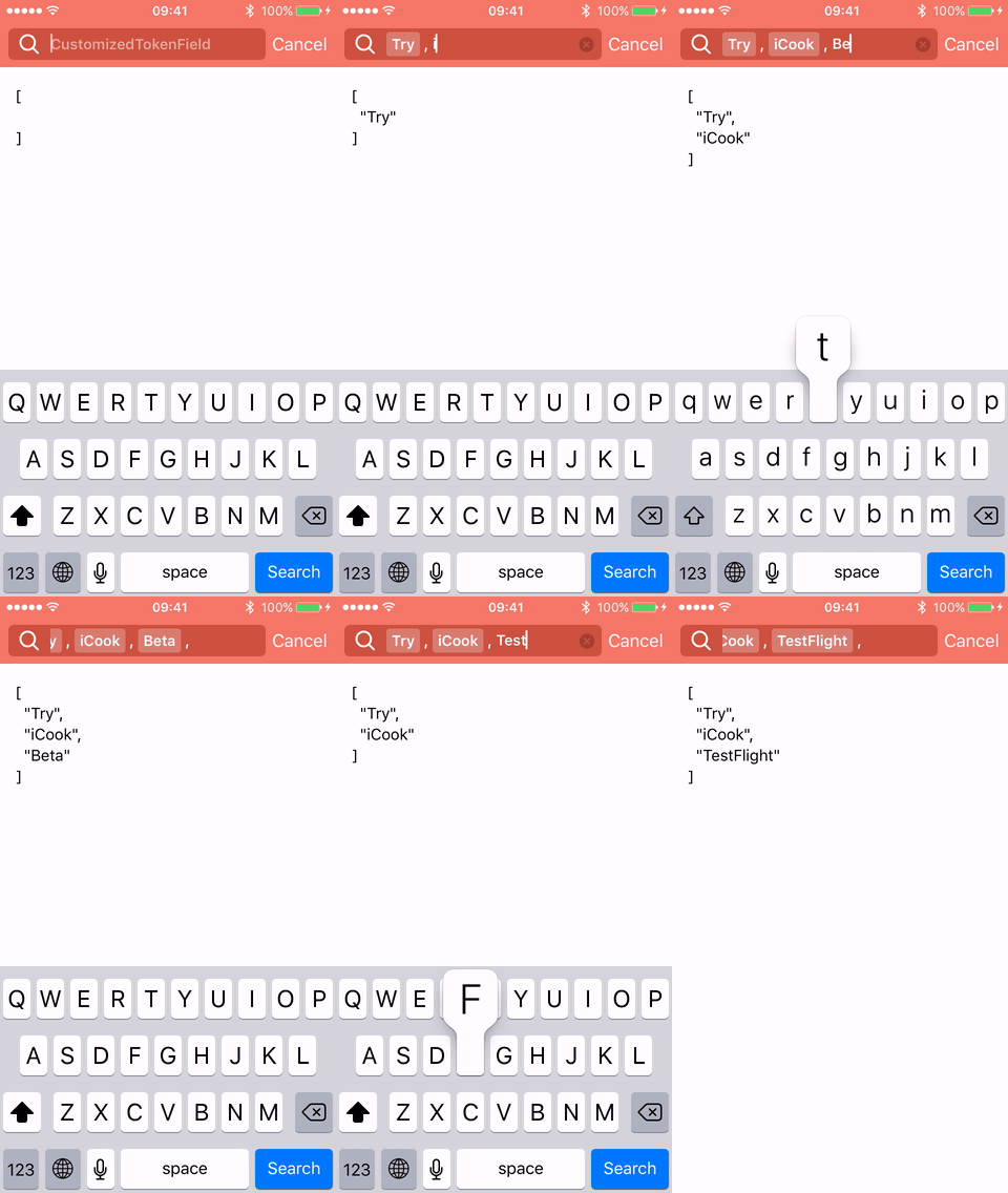
Customized text fields used in the iCook app.




- A text field that has a button to dismiss keyboard on the input accessory view.
- A horizontal scrolling UI that groups input texts.
- Easy to add, select and delete tokens.
- Customizable icon and colors.
- Supports storyboard.
- An easy to use
UIControlthat displays aUIPickerViewwith given options.
| ICInputAccessory | iOS | Xcode | Swift |
|---|---|---|---|
~> 1.0.0 | 8.0+ | 7.2 |  |
~> 1.1.0 | 8.0+ | 7.3 |  |
~> 1.2.0 | 8.0+ | 8.0 |  |
~> 1.3.0 | 8.0+ | 8.0 |  |
~> 1.4.0 | 8.0+ | 8.3 |  |
~> 1.5.0 | 8.0+ | 9.3 |  |
~> 2.0.0 | 8.0+ | 10.0 | |
develop | 8.0+ | 11.1 |  |
Use Carthage
Create a Cartfile with the following specification and run carthage update ICInputAccessory. Follow the instructions to add the framework to an iOS project.
github "polydice/ICInputAccessory"
Use CocoaPods
ICInputAccessory supports subspecs. Create a Podfile with the following specification and run pod install.
platform:ios,'8.0'use_frameworks!pod'ICInputAccessory/TokenField'pod'ICInputAccessory/KeyboardDismissTextField'git submodule add -b master git@github.com:polydice/ICInputAccessory.git Dependencies/ICInputAccessory
- Everything you need resides in the
Sourcedirectory. Add those files to your project. - Alternatively, drag ICInputAccessory.xcodeproj to your app project as a subproject. Add ICInputAccessory-iOS to the Target Dependencies in the application target's Build Phases settings.
lettextField=KeyboardDismissTextField(frame: rect)lettokenField=TokenField(frame: rect)
tokenField.delegate =selfas?TokenFieldDelegateThe characters that complete a token:
/// Characters that complete a new token, defaults are whitespace and commas.
publicvardelimiters:[String]
Tokens:
/// Texts of each created token.
publicvartexts:[String]{get}
/// Creates a token with the current input text.
publicfunc completeCurrentInputText()
/// Removes the input text and all displayed tokens.
public func resetTokens()
UI customization:
/// The image on the left of text field.
publicvaricon:UIImage?{getset}
/// The placeholder with the default color and font.
publicvarplaceholder:String?{getset}
/// The placeholder with customized attributes.
publicvarattributedPlaceholder:NSAttributedString?{getset}
/// Customized attributes for tokens in the normal state, e.g. .font and .foregroundColor.
publicvarnormalTokenAttributes:[NSAttributedStringKey:NSObject]?{getset}
/// Customized attributes for tokens in the highlighted state.
publicvarhighlightedTokenAttributes:[NSAttributedStringKey:NSObject]?{getset}
Customizable properties in storyboard:
@IBInspectablevaricon:UIImage?@IBInspectablevarplaceholder:String?@IBInspectablevartextColor:UIColor?@IBInspectablevarcornerRadius:CGFloatSee Example/CustomizedTokenField.swift for more details.
TokenField currently notifies its delegate the following events:
@objcoptionalfunc tokenFieldDidBeginEditing(_ tokenField:TokenField)@objcoptionalfunc tokenFieldDidEndEditing(_ tokenField:TokenField)@objcoptionalfunc tokenFieldWillReturn(_ tokenField:TokenField)@objcoptionalfunc tokenField(_ tokenField:TokenField, didChangeInputText text:String)@objcoptionalfunc tokenField(_ tokenField:TokenField, shouldCompleteText text:String)-> Bool
@objc optional func tokenField(_ tokenField:TokenField, didCompleteText text:String)@objc optional func tokenField(_ tokenField:TokenField, didDeleteText text:String, atIndex index:Int)
The displayed delimiter string can be customized by:
@objcoptionalfunc tokenField(_ tokenField:TokenField, subsequentDelimiterForCompletedText text:String)->StringAn example type that conforms to OptionDescriptive:
extensionString:OptionDescriptive{vartitle:String{returnself}staticvartitleForOptionalValue:String{return"(optional)"}}To initialize OptionPickerControl with CGRect.zero and add it to the view hierarchy:
letoptionPicker=OptionPickerControl<String>()
optionPicker.options =[.optional,Option("Option 1"),Option("Option 2")]
optionPicker.addTarget(self, action: #selector(didChangeOption(_:)), for:.valueChanged)
view.addSubview(optionPicker)
To show the UIPickerView:
optionPicker.becomeFirstResponder()Set up dependencies by running the following command in the project root:
make bootstrapOpen ICInputAccessory.xcworkspace and run the demo app with the
Examplescheme.See more tasks for building and testing:
rake -T
Thank you for being interested in contributing to this project. We'd love to hear your ideas!
Please fork this repository, create a branch named like feature/some-new-feature and send us a pull request to make this project better.


Copyright (c) 2016 Polydice, Inc.
ICInputAccessory is released under the MIT license. See LICENSE for details.