Uh oh!
There was an error while loading. Please reload this page.
Add SegmentedControl colors - #329
Conversation
🦋 Changeset detectedLatest commit: 953c6e6 The changes in this PR will be included in the next version bump. This PR includes changesets to release 1 package
Not sure what this means? Click here to learn what changesets are. Click here if you're a maintainer who wants to add another changeset to this PR |
Variables changed--- base/dist/scss/colors/_dark.scss 2022-07-20 08:27:16.979139848 +0000+++ dist/scss/colors/_dark.scss 2022-07-20 08:27:03.810871120 +0000@@ -280,2 +280,6 @@
--color-switch-knob-checked-disabled-bg: #484f58;
+ --color-segmented-control-bg: #161b22;+ --color-segmented-control-button-hover-bg: #30363d;+ --color-segmented-control-button-active-bg: #21262d;+ --color-segmented-control-button-selected-border: #6e7681;
--color-fg-default: #c9d1d9;
--- base/dist/scss/colors/_dark_colorblind.scss 2022-07-20 08:27:16.999140075 +0000+++ dist/scss/colors/_dark_colorblind.scss 2022-07-20 08:27:03.834871645 +0000@@ -280,2 +280,6 @@
--color-switch-knob-checked-disabled-bg: #484f58;
+ --color-segmented-control-bg: #161b22;+ --color-segmented-control-button-hover-bg: #30363d;+ --color-segmented-control-button-active-bg: #21262d;+ --color-segmented-control-button-selected-border: #6e7681;
--color-fg-default: #c9d1d9;
--- base/dist/scss/colors/_dark_dimmed.scss 2022-07-20 08:27:16.987139939 +0000+++ dist/scss/colors/_dark_dimmed.scss 2022-07-20 08:27:03.818871295 +0000@@ -280,2 +280,6 @@
--color-switch-knob-checked-disabled-bg: #545d68;
+ --color-segmented-control-bg: #2d333b;+ --color-segmented-control-button-hover-bg: #444c56;+ --color-segmented-control-button-active-bg: #373e47;+ --color-segmented-control-button-selected-border: #636e7b;
--color-fg-default: #adbac7;
--- base/dist/scss/colors/_dark_high_contrast.scss 2022-07-20 08:27:16.995140030 +0000+++ dist/scss/colors/_dark_high_contrast.scss 2022-07-20 08:27:03.822871382 +0000@@ -280,2 +280,6 @@
--color-switch-knob-checked-disabled-bg: #7a828e;
+ --color-segmented-control-bg: #272b33;+ --color-segmented-control-button-hover-bg: #525964;+ --color-segmented-control-button-active-bg: #272b33;+ --color-segmented-control-button-selected-border: #9ea7b3;
--color-fg-default: #f0f3f6;
--- base/dist/scss/colors/_dark_tritanopia.scss 2022-07-20 08:27:17.007140166 +0000+++ dist/scss/colors/_dark_tritanopia.scss 2022-07-20 08:27:03.838871732 +0000@@ -280,2 +280,6 @@
--color-switch-knob-checked-disabled-bg: #484f58;
+ --color-segmented-control-bg: #161b22;+ --color-segmented-control-button-hover-bg: #30363d;+ --color-segmented-control-button-active-bg: #21262d;+ --color-segmented-control-button-selected-border: #6e7681;
--color-fg-default: #c9d1d9;
--- base/dist/scss/colors/_light.scss 2022-07-20 08:27:16.939139393 +0000+++ dist/scss/colors/_light.scss 2022-07-20 08:27:03.774870333 +0000@@ -280,2 +280,6 @@
--color-switch-knob-checked-disabled-bg: #6e7781;
+ --color-segmented-control-bg: #eaeef2;+ --color-segmented-control-button-hover-bg: rgba(175,184,193,0.2);+ --color-segmented-control-button-active-bg: rgba(175,184,193,0.4);+ --color-segmented-control-button-selected-border: #6e7781;
--color-fg-default: #24292f;
--- base/dist/scss/colors/_light_colorblind.scss 2022-07-20 08:27:16.963139666 +0000+++ dist/scss/colors/_light_colorblind.scss 2022-07-20 08:27:03.794870770 +0000@@ -280,2 +280,6 @@
--color-switch-knob-checked-disabled-bg: #6e7781;
+ --color-segmented-control-bg: #eaeef2;+ --color-segmented-control-button-hover-bg: rgba(175,184,193,0.2);+ --color-segmented-control-button-active-bg: rgba(175,184,193,0.4);+ --color-segmented-control-button-selected-border: #6e7781;
--color-fg-default: #24292f;
--- base/dist/scss/colors/_light_high_contrast.scss 2022-07-20 08:27:16.951139530 +0000+++ dist/scss/colors/_light_high_contrast.scss 2022-07-20 08:27:03.786870595 +0000@@ -280,2 +280,6 @@
--color-switch-knob-checked-disabled-bg: #66707B;
+ --color-segmented-control-bg: #E7ECF0;+ --color-segmented-control-button-hover-bg: rgba(172,182,192,0.2);+ --color-segmented-control-button-active-bg: rgba(172,182,192,0.4);+ --color-segmented-control-button-selected-border: #66707B;
--color-fg-default: #0E1116;
--- base/dist/scss/colors/_light_tritanopia.scss 2022-07-20 08:27:16.971139757 +0000+++ dist/scss/colors/_light_tritanopia.scss 2022-07-20 08:27:03.802870945 +0000@@ -280,2 +280,6 @@
--color-switch-knob-checked-disabled-bg: #6e7781;
+ --color-segmented-control-bg: #eaeef2;+ --color-segmented-control-button-hover-bg: rgba(175,184,193,0.2);+ --color-segmented-control-button-active-bg: rgba(175,184,193,0.4);+ --color-segmented-control-button-selected-border: #6e7781;
--color-fg-default: #24292f; |
Uh oh!
There was an error while loading. Please reload this page.
| segmentedControl: { | ||
| bg: get('scale.gray.1'), | ||
| hoverBg: get('neutral.muted'), |
There was a problem hiding this comment.
As I've been working on the React implementation of segmented controls (PR), I changed the design to make the :hover and :active states lighter.
I haven't solved the design for all color modes yet, but here's what I have so far: https://github.com/primer/react/pull/2108/files#diff-feb85d0e75c6e6596e095632632ccc668254e56b60a7bffb4189736358e96222R40-R46
There was a problem hiding this comment.
Currently this PR is using:
- hover:
alpha(get('scale.gray.3'), 0.2) - active:
alpha(get('scale.gray.3'), 0.4)which is double of hover.
It should already be lighter than in Figma and keeps it in the same tone (gray hue) as neutral.muted
:hover | :active |
|---|---|
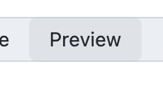 | 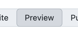 |
Also, I added a border for :active to give it some sort of "inset" look when pressed.
There was a problem hiding this comment.
I kept the colors, but now it uses an "inset style":

Uh oh!
There was an error while loading. Please reload this page.
Uh oh!
There was an error while loading. Please reload this page.
Uh oh!
There was an error while loading. Please reload this page.
Uh oh!
There was an error while loading. Please reload this page.
mperrotti
commented
Jun 7, 2022
@simurai - I'm going to collaborate with @vdepizzol and @langermank to come up with system-level color tokens that can be used for the segmented control. I'll keep you updated on our progress. |
mperrotti
commented
Jul 18, 2022
It looks like it's going to be a while before we have the colors in the new primitives workflow (see the new Spacing and size and Typography tokens) |
Uh oh!
There was an error while loading. Please reload this page.
simurai
commented
Jul 20, 2022
So do you mean we should go ahead and merge this PR and try to replace these |
mperrotti
commented
Jul 20, 2022
@simurai - yup, exactly |
This adds a few colors for the
SegmentedControlcomponent.Will be used for: