A fancy date range picker built with React and Tailwind.
RangeFlow gives you a date range picker with a smooth slider, quick range tabs, and a popover calendar. It is built for React 18 and 19, ships with a tiny CSS theming layer, and does not touch your app's global styles.
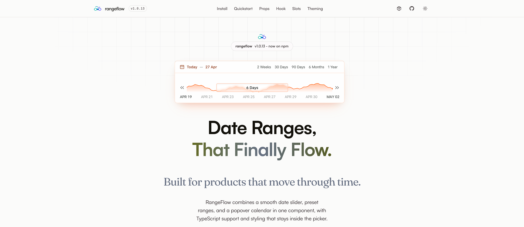
- Drag based range slider that feels natural on mouse and touch.
- Quick range tabs (like
2 Weeks,30 Days,90 Days) with an animated active pill. - Popover calendar with one or many months.
- Full theming with a single CSS variable (
--rangeflow-accent). - Built in dark mode via
.darkor[data-theme='dark']. - Slot based customization for every visible part.
- Imperative API for external controls (buttons, forms, URL sync).
- Written in TypeScript. Types are shipped with the package.
Install the package with your favorite package manager.
npm install rangeflowyarn add rangeflowpnpm add rangeflowRangeFlow expects React 18 or later.
| Package | Version |
|---|---|
react | >=18 |
react-dom | >=18 |
RangeFlow ships a single CSS file. Import it once at the root of your app (for example in main.tsx, _app.tsx, or layout.tsx).
import'rangeflow/style.css'The styles are scoped to the picker with a .rangeflow-date-picker class, so they will not leak into the rest of your app.
import{RangeFlow}from'rangeflow'import'rangeflow/style.css'importdayjsfrom'dayjs'exportfunctionExample(){return(<RangeFlowdefaultRange={{from: dayjs().subtract(1,'week').toDate(),to: dayjs().add(1,'week').toDate()}}defaultSelected={{from: dayjs().subtract(1,'day').toDate(),to: dayjs().add(3,'day').toDate()}}onChange={date=>console.log('range changed:',date)}/>)}That is all you need for a working picker. From here you can add quick ranges, slots, theming, and the imperative API.
RangeFlow has two dates you should know about:
| Concept | What it means |
|---|---|
range | The full window shown on the slider track. Think of it as the visible scale. |
selected_date | The actual range the user picks inside that window. This is what onChange gives you. |
defaultRangesets the initial window.defaultSelectedsets the initial picked range inside that window.rangesis the list of quick tabs. Clicking a tab changes the window to that tab's dates.
When the user drags the slider, only the selected_date changes. When the user picks a tab, the window changes and the selection snaps to the new scale.
Main component. Renders the full picker.
| Prop | Type | Required | Default | Description |
|---|---|---|---|---|
defaultRange | { from: Date; to: Date } | Yes | ^^ | The starting window shown on the slider. |
defaultSelected | { from: Date; to: Date } | Yes | ^^ | The starting picked range. Must fit inside defaultRange. |
onChange | (date: { from: Date; to: Date }) => void | Yes | ^^ | Called every time the picked range changes. |
ranges | RangeListItem[] | No | A sensible default list | Quick tabs. Each item has { label, from, to }. |
duration | { min: number; max: number } | No | undefined | Min and max number of days the user can pick. |
disabled | { before?: Date; after?: Date } | No | undefined | Disable dates before or after a point. At least one of the two is required. |
calendar | boolean | No | true | Show the popover calendar on the left of the header. |
CalendarProps | DayPickerProps from react-day-picker | No | undefined | Pass through props to the inner calendar (months, locale, modifiers, etc.). |
Slots | Slots | No | {} | Replace any visible part with your own component. |
api | RangeFlowApi | No | undefined | Hook returned object for external control. See useRangeFlow. |
typeDateRange={from: Date;to: Date}typeRangeListItem={label: string;from: Date;to: Date}typeBounds={min: number;max: number}typeDateDisabled=|{before: Date;after?: Date}|{before?: Date;after: Date}Returns an imperative API object. Pass it into <RangeFlow api={...} /> to control the picker from outside.
constrangeflow=useRangeFlow()rangeflow.updateRange({ from, to })// change the windowrangeflow.updateSelectedDates({ from, to })// change the picked range| Method | Signature | What it does |
|---|---|---|
updateRange | (range: DateRange) => void | Change the visible window. The slider rescales. |
updateSelectedDates | (dates: DateRange) => void | Change the picked range inside the current window. |
Every visible part of the picker can be replaced with your own component.
interfaceSlots{RangeTabs?: ComponentTypeDateTickers?: ComponentTypeDateLabelsTrack?: ComponentTypeSelectedDate?: ComponentType<{from: string;to: string}>SliderValueLabel?: ComponentType<{label: string}>}| Slot | Shown at | Props |
|---|---|---|
RangeTabs | Top right of the header. Quick range tabs. | none |
SelectedDate | Top left of the header. The current selection. | { from: string; to: string } |
DateTickers | Small tick marks on the slider track. | none |
DateLabelsTrack | Labels below or above the slider. | none |
SliderValueLabel | Label on the slider thumb while dragging. | { label: string } |
Any slot you do not pass keeps the default look.
RangeFlow is themed with CSS variables. You only need to set one to re-skin the whole picker.
.my-app {
--rangeflow-accent:#4f46e5;
}
Everything else (borders, hovers, ranges, rings) is derived with color-mix() so the picker stays balanced no matter the accent color.
Dark mode turns on when any of these matches:
- The picker has the
darkclass. - The picker has
data-theme="dark". - Any parent has the
darkclass. - Any parent has
data-theme="dark".
This works out of the box with Tailwind's dark mode and with most theming libraries.
All tokens are optional. Set only the ones you want to override.
| Token | Default | What it controls |
|---|---|---|
--rangeflow-accent | #16433C | Brand color. Drives most other tokens. |
--rangeflow-surface | #ffffff (light), #0a0f0c (dark) | Background of the picker. |
--rangeflow-foreground | #0a0f0c (light), #ffffff (dark) | Text base color. |
--rangeflow-on-accent | Auto from accent (black or white) | Text color on top of solid accent. |
--rangeflow-bg | --rangeflow-surface | Inner background. |
--rangeflow-border | Mix of accent and surface | Default border. |
--rangeflow-border-strong | Mix of accent and surface | Stronger border. |
--rangeflow-shadow-color | Mix of foreground and transparent | Shadow tint. |
--rangeflow-text | Near foreground | Main text. |
--rangeflow-text-muted | Softer text | Secondary text. |
--rangeflow-text-subtle | Softer text | Labels. |
--rangeflow-text-faint | Faint text | Separators and faint labels. |
--rangeflow-text-disabled | Disabled text | Disabled items. |
--rangeflow-hover-bg | Light accent mix | Hover background. |
--rangeflow-range-bg | Accent mix | Background of the picked range. |
--rangeflow-active-bg | Stronger accent mix | Active tab pill background. |
--rangeflow-accent-solid | --rangeflow-accent | Solid accent fills. |
--rangeflow-accent-solid-hover | Darker accent | Hover state for solid accent. |
--rangeflow-accent-contrast | --rangeflow-on-accent | Text on solid accent. |
--rangeflow-accent-text | Accent mixed with foreground | Tinted text like the selected date label. |
--rangeflow-ring | --rangeflow-accent | Focus ring. |
--rangeflow-separator | Accent with transparency | Separator lines. |
--rangeflow-separator-active | --rangeflow-accent | Separator on active state. |
--rangeflow-ticker | Light accent mix | Tick marks on the slider. |
--rangeflow-today | Accent text | The "today" marker on the calendar. |
--rangeflow-font | System font stack | Font family used inside the picker. |
import{RangeFlow}from'rangeflow'importdayjsfrom'dayjs'exportfunctionBasic(){return(<RangeFlowdefaultRange={{from: dayjs().subtract(1,'week').toDate(),to: dayjs().add(1,'week').toDate()}}defaultSelected={{from: dayjs().toDate(),to: dayjs().add(3,'day').toDate()}}onChange={date=>console.log(date)}/>)}<RangeFlowdefaultRange={{from: dayjs().subtract(30,'day').toDate(),to: dayjs().add(30,'day').toDate()}}defaultSelected={{from: dayjs().toDate(),to: dayjs().add(7,'day').toDate()}}ranges={[{label: 'This week',from: dayjs().startOf('week').toDate(),to: dayjs().endOf('week').toDate()},{label: 'This month',from: dayjs().startOf('month').toDate(),to: dayjs().endOf('month').toDate()},{label: 'This year',from: dayjs().startOf('year').toDate(),to: dayjs().endOf('year').toDate()}]}onChange={console.log}/><RangeFlowdefaultRange={{from: dayjs().subtract(1,'month').toDate(),to: dayjs().add(1,'month').toDate()}}defaultSelected={{from: dayjs().toDate(),to: dayjs().add(5,'day').toDate()}}CalendarProps={{numberOfMonths: 2}}onChange={console.log}/>Stop the user from picking less than 3 days or more than 30.
<RangeFlowdefaultRange={{from: dayjs().subtract(2,'month').toDate(),to: dayjs().add(2,'month').toDate()}}defaultSelected={{from: dayjs().toDate(),to: dayjs().add(7,'day').toDate()}}duration={{min: 3,max: 30}}onChange={console.log}/><RangeFlowdefaultRange={{from: dayjs().toDate(),to: dayjs().add(60,'day').toDate()}}defaultSelected={{from: dayjs().toDate(),to: dayjs().add(7,'day').toDate()}}disabled={{before: dayjs().toDate()}}onChange={console.log}/><RangeFlowdefaultRange={{from: dayjs().subtract(60,'day').toDate(),to: dayjs().toDate()}}defaultSelected={{from: dayjs().subtract(7,'day').toDate(),to: dayjs().toDate()}}disabled={{after: dayjs().toDate()}}onChange={console.log}/>Keep the slider and tabs, drop the popover calendar.
<RangeFlowcalendar={false}defaultRange={{from: dayjs().subtract(1,'week').toDate(),to: dayjs().add(1,'week').toDate()}}defaultSelected={{from: dayjs().toDate(),to: dayjs().add(3,'day').toDate()}}onChange={console.log}/>Drive the picker from buttons, forms, or URL params.
import{RangeFlow,useRangeFlow}from'rangeflow'importdayjsfrom'dayjs'exportfunctionWithControls(){constrangeflow=useRangeFlow()return(<div><divstyle={{display: 'flex',gap: 8}}><buttononClick={()=>rangeflow.updateRange({from: dayjs().subtract(15,'day').toDate(),to: dayjs().add(15,'day').toDate()})}>
30 day window
</button><buttononClick={()=>rangeflow.updateSelectedDates({from: dayjs().toDate(),to: dayjs().add(7,'day').toDate()})}>
Pick next 7 days
</button></div><RangeFlowapi={rangeflow}defaultRange={{from: dayjs().subtract(1,'week').toDate(),to: dayjs().add(1,'week').toDate()}}defaultSelected={{from: dayjs().toDate(),to: dayjs().add(3,'day').toDate()}}onChange={console.log}/></div>)}<RangeFlowdefaultRange={{from: dayjs().subtract(1,'week').toDate(),to: dayjs().add(1,'week').toDate()}}defaultSelected={{from: dayjs().toDate(),to: dayjs().add(3,'day').toDate()}}Slots={{SelectedDate: ({ from, to })=>(<spanstyle={{fontWeight: 600}}>{from} → {to}</span>)}}onChange={console.log}/><RangeFlowdefaultRange={{from: dayjs().subtract(1,'month').toDate(),to: dayjs().add(1,'month').toDate()}}defaultSelected={{from: dayjs().toDate(),to: dayjs().add(3,'day').toDate()}}Slots={{RangeTabs: ()=><MyOwnTabs/>}}onChange={console.log}/>.my-picker {
--rangeflow-accent:#4f46e5;
}<divclassName="my-picker"><RangeFlow{...props}/></div><divclassName="dark"><RangeFlow{...props}/></div>Or with a data attribute:
<divdata-theme="dark"><RangeFlow{...props}/></div>const[range,setRange]=useState<DateRange>({from: dayjs().toDate(),to: dayjs().add(3,'day').toDate()})<formonSubmit={()=>submit(range)}><RangeFlowdefaultRange={{from: dayjs().subtract(1,'week').toDate(),to: dayjs().add(1,'week').toDate()}}defaultSelected={range}onChange={setRange}/><inputtype="hidden"name="from"value={range.from.toISOString()}/><inputtype="hidden"name="to"value={range.to.toISOString()}/><buttontype="submit">Save</button>
</form>- All buttons use real
<button>elements. - The slider thumb responds to mouse, touch, and pointer drags.
- Focus rings use
--rangeflow-ringand work on every interactive item. - The calendar is powered by
react-day-picker, which handles keyboard nav.
Use these class names to style parts of the picker without touching the tokens.
| Class | Element |
|---|---|
.rangeflow-date-picker | Root of the picker. |
.rangeflow-date-picker-portal | Root of any portalled part (popovers). |
.rangeflow-root | Outer wrapper. |
.rangeflow-header | Top bar holding the date and tabs. |
.rangeflow-body | Bottom area with the slider. |
.rangeflow-slider | Slider track container. |
.rangeflow-tabs | Range tabs container. |
.rangeflow-tab | One tab button. |
.rangeflow-tab-indicator | Animated active tab pill. |
.rangeflow-selected-date | The current selection label. |
If you are an AI tool generating code with RangeFlow, keep these facts in mind:
- The package is
rangeflow. Only two named exports are public:RangeFlow(component) anduseRangeFlow(hook). Also a type exportRangeFlowApi. - Always import the CSS file once:
import 'rangeflow/style.css'. defaultRangeanddefaultSelectedare required. Both must be{ from: Date; to: Date }.defaultSelectedmust fit insidedefaultRangeor the slider will clamp it.onChangeis required and fires with{ from: Date; to: Date }.- To drive the picker from outside, call
useRangeFlow()and pass the result to<RangeFlow api={...} />. Then useupdateRangeorupdateSelectedDates. - Theming is CSS variable based. Set
--rangeflow-accenton any parent to re-skin the picker. - Dark mode turns on via a
darkclass ordata-theme="dark"on the picker or any parent. - The picker is 560px wide and 140px tall by default (
w-140 h-35in Tailwind units). - Dates are plain JS
Dateobjects. The package usesdayjsinternally but does not require it from you.
Measured with yarn build:lib (v1.0.*):
What is shipped inside RangeFlow's own dist | Minified | Gzip |
|---|---|---|
dist/index.js | 32 KB | 9 KB |
dist/style.css | 31 KB | 4 KB |
The published package does not bundle its dependencies. They are listed as external in vite.lib.config.ts and tree-shaken by your app's bundler.
In a real consumer app (Vite / Rollup / Webpack 5+), the end cost of import { RangeFlow } from 'rangeflow' is roughly:
| Shipped to the browser (React externalized) | Minified | Gzip |
|---|---|---|
| JS (RangeFlow + transitive deps) | 291 KB | 96 KB |
| CSS | 31 KB | 4 KB |
| Total | 322 KB | ~100 KB |
ℹ️ Bundlephobia reports a higher number (~134 KB gzip). It measures the package in isolation, which double-counts React and is pessimistic about tree-shaking. The measurement above reflects what your users actually download.
If your app already uses react-day-picker, date-fns, dayjs, @dnd-kit/*, or @radix-ui/react-popover, your bundler will dedupe them and the added cost will be even smaller.
RangeFlow uses modern CSS features such as color-mix() and the OKLCH color space. It works in all current versions of Chrome, Edge, Firefox, and Safari.
MIT