React Native components based on React UI Kit
Offical documentation of React UI Kit Native made for React Native applications and you can easily use the components in your project. A lot of predefined styles & properties so it's perfectly fit for prototyping of your app UI.
Support: contact@react-ui-kit.com
- Install local module with react-ui-kit-native (it will also download all required dependencies)
npm install react-ui-kit-native --save- Use any component you want, all available props are available separately for each component below in this documentation. For example:
importReactfrom'react';import{Button}from'react-ui-kit-native';exportdefaultclassMyButtonextendsReact.Component{render(){return(<Buttonfullprimaryroundedlabel="My button"/>);}}List of available components:
| Status | Type | Component | Description |
|---|---|---|---|
| ✔️ | button | Button | react-native TouchableOpacity component with predefined styles & props |
| ✔️ | button | Link | react-native Text & Linking component with predefined properties |
| ✔️ | input | Input | react-native TextInput component with predefined styles & props |
| ✔️ | input | Select | react-native-modal-dropdown module with predefined styles |
| 🔜 | input | Checkbox | react-native Switch component with predefined styles & props |
| 🔜 | input | Datepiker | react-native DatePickerIOS & DatePickerAndroid component with predefined styles & props |
| 🔜 | input | Progress | react-native ProgressViewIOS & ProgressBarAndroid component with predefined styles & props |
| ✔️ | view | Block | react-native View component with predefined styles & props |
| ✔️ | view | Container | react-native View component with predefined styles & props |
| ✔️ | view | Text | react-native Text component with predefined styles & props |
| ✔️ | view | Icon | react-native-vector-icons module with predefined props |
| ✔️ | view | Image | react-native Image component with predefined styles & props |
| 🔜 | view | Badge | react-native View component with predefined styles & props |
| 🔜 | view | Label | react-native View component with predefined styles & props |
| 🔜 | view | Tabs | react-native TabBarIOS component with predefined styles & props |
| 🔜 | view | List | react-native ScrollView component with predefined styles & props |
| 🔜 | view | Menu | react-native ScrollView component with predefined styles & props |
| PROP | TYPE | DEFAULT | DESCRIPTION |
|---|---|---|---|
| color | string | #FFFFFF | Specifies a text color |
| size | number | 16 | Specifies a fontSize size |
| label | string | null | Specifies a string for the button text |
| icon | bool | null | Specifies an icon name - check Icon component |
| family | bool | null | Specifies an icon family - check Icon component |
| loading | bool | false | Disable touch/press events and render ActivityIndicator |
| full | bool | false | Set the width of the component to 80% from the total width of the screen |
| opacity | number | 0.8 | Determines what the activeOpacity of the Button should be when touch is active |
| basic | bool | false | Include styles.basic with backgroundColor: #FFFFFF, borderColor: #45547e█ |
| bold | bool | false | Determines whether the styles.bold should be included |
| border | bool | false | Determines whether the styles.border should be included |
| rounded | bool | false | Determines whether the styles.basic should be included |
| primary | bool | false | Include styles.primary with backgroundColor: #7CB527 █ |
| secondary | bool | false | Include styles.secondary with backgroundColor: #FF3D57 █ |
| tertiary | bool | false | Include styles.tertiary with backgroundColor: #7857A9 █ |
| style | View style | {} | Add style properties for better customization |
For more properties visit TouchableOpacity props
| PROP | TYPE | DEFAULT | DESCRIPTION |
|---|---|---|---|
| color | string | color: #323642 █ | Specifies a text color |
| href | string | null | A link (web URL, email, contact etc.) |
| onPress | func | () => {} | Called when the touch is released |
| style | View style | {} | Add style properties for better customization |
| PROP | TYPE | DEFAULT | DESCRIPTION |
|---|---|---|---|
| color | string | #293042 █ | Specifies a text color |
| placeHolderColor | string | #5E6D95 █ | Specifies a placeholderTextColor |
| bgColor | string | #FFFFFF | Specifies a backgroundColor color |
| rounded | bool | false | Determines whether the styles.rounded should be included |
| type | string | default | One of 'default', 'email-address', 'numeric', 'phone-pad', 'number-pad', 'decimal-pad' for keyboardType |
| help | string | null | Specifies a string or node for the text positioned between label and input |
| left | bool | true | Positioning the icon on the left |
| right | bool | false | Positioning the icon on the right |
| transparent | bool | false | Determines whether the styles.transparent should be included |
| borderless | bool | false | Determines whether the styles.borderless should be included |
| border | bool | false | Determines whether the styles.border should be included |
For more properties visit TextInput props
| PROP | TYPE | DEFAULT | DESCRIPTION |
|---|---|---|---|
| h1 | bool | false | styles.h1 with fontSize size of 112 |
| h2 | bool | false | styles.h2 with fontSize size of 56 |
| h3 | bool | false | styles.h3 with fontSize size of ~45 |
| h4 | bool | false | styles.h4 with fontSize size of ~34 |
| h5 | bool | false | styles.h5 with fontSize size of ~24 |
| title | bool | false | styles.title with fontSize size of ~20 |
| subtitle | bool | false | styles.subtitle with fontSize size of 16 |
| caption | bool | false | styles.caption with fontSize size of 12 |
| size | number | 14 | Specifies a fontSize size of 14 |
| color | string | #808080 █ | Specifies a text color #808080 |
| thin | bool | false | Set the fontWeight to 100 |
| bold | bool | false | Set the fontWeight to 300 |
| light | bool | false | Set the fontWeight to bold |
| italic | bool | false | Set the fontStyle to italic |
| align | bool | null | Specifies a textAlign |
For more properties visit Text props
| PROP | TYPE | DEFAULT | DESCRIPTION |
|---|---|---|---|
| color | string | #808080 █ | Specifies an Icon color COLOR_DEFAULT #808080 |
| size | number | 16 | Specifies a fontSize size, BASE_SIZE 16px |
| name | string | null` | What icon to show, for more example see Icon Explorer |
| family | string | null` | One of the sets from Bundled Icon Sets |
For more properties visit react-native-vector-icons
| PROP | TYPE | DEFAULT | DESCRIPTION |
|---|---|---|---|
| avatar | string | false | Based on image width & height will add borderRadius with value of minimum between WIDTH & HEIGHT |
| width | number | null | Add WIDTH to image style |
| height | number | null | Add HEIGHT to image style |
| size | number | null | width & height changed using: tiny divided by 2, small divided by 1.25 or large multiplied by 2 |
| source | string | null | Image source (either a remote URL or a local file resource). |
For more properties visit Image props
A list of example screens based on the above components:
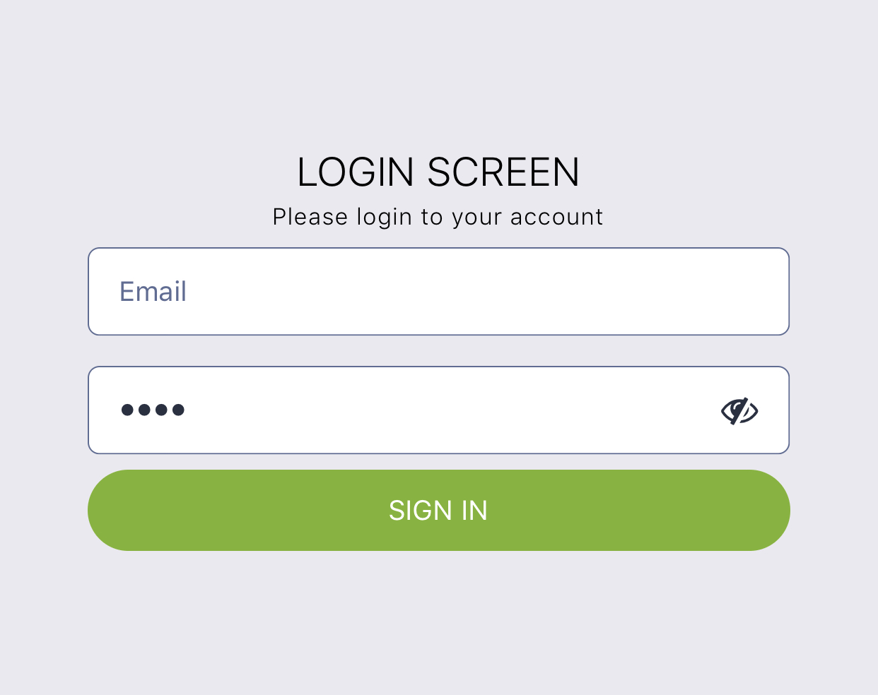
importReactfrom'react';import{Block,Button,Input,Text}from'react-ui-kit-native';exportdefaultclassLoginScreenextendsReact.Component{render(){return(<Blockflexmiddle><Texttitlelightcolor="#000">
LOGIN SCREEN
</Text><Textcaptionthincolor="#000">
Please login to your account
</Text><Inputplaceholder="Email"/><Inputpasswordplaceholder="Password"/><Buttonfullprimaryroundedlabel="SIGN IN"/></Block>);}}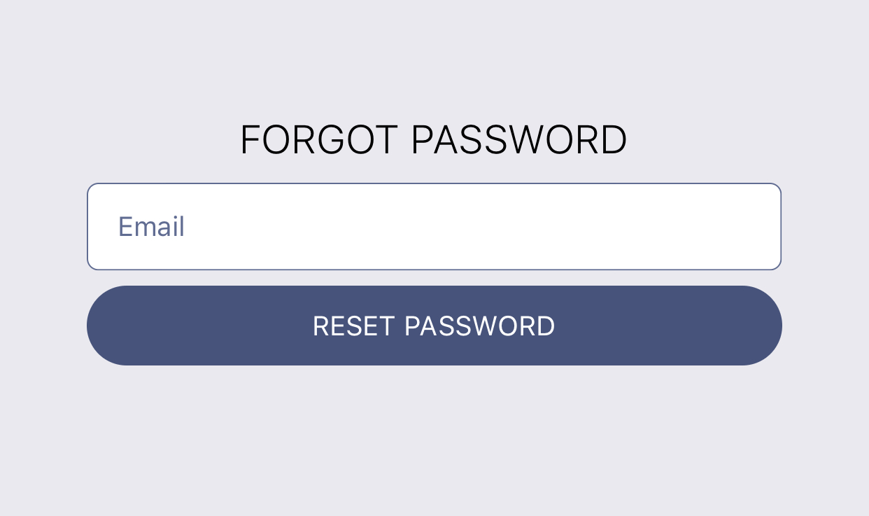
importReactfrom'react';import{Block,Button,Input,Text}from'react-ui-kit-native';exportdefaultclassLoginScreenextendsReact.Component{staticnavigationOptions={header: null,};render(){return(<Blockflexmiddle><Texttitlelightcolor="#000">
FORGOT PASSWORD
</Text><Inputplaceholder="Email"/><Buttonfullroundedlabel="RESET PASSWORD"/></Block>);}}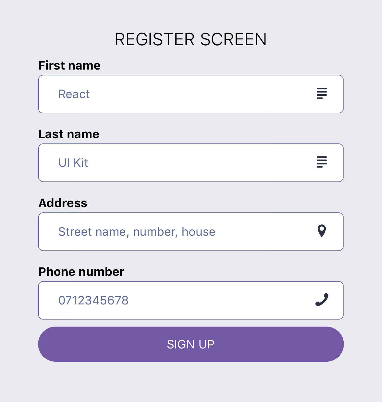
importReactfrom'react';import{Block,Button,Input,Text}from'react-ui-kit-native';exportdefaultclassRegisterScreenextendsReact.Component{render(){return(<Blockfluidflexmiddle><Texttitlelightcolor="#000">
REGISTER SCREEN
</Text><Inputlabel="First name"placeholder="React"righticon="text"family="Entypo"/><Inputlabel="Last name"placeholder="UI Kit"righticon="text"family="Entypo"/><Inputrighticon="location-pin"family="Entypo"label="Address"placeholder="Street name, number, house"/><Inputrighticon="phone"family="Entypo"type="phone-pad"label="Phone number"placeholder="0712345678"/><Buttonfullroundedtertiarylabel="SIGN UP"/></Block>);}}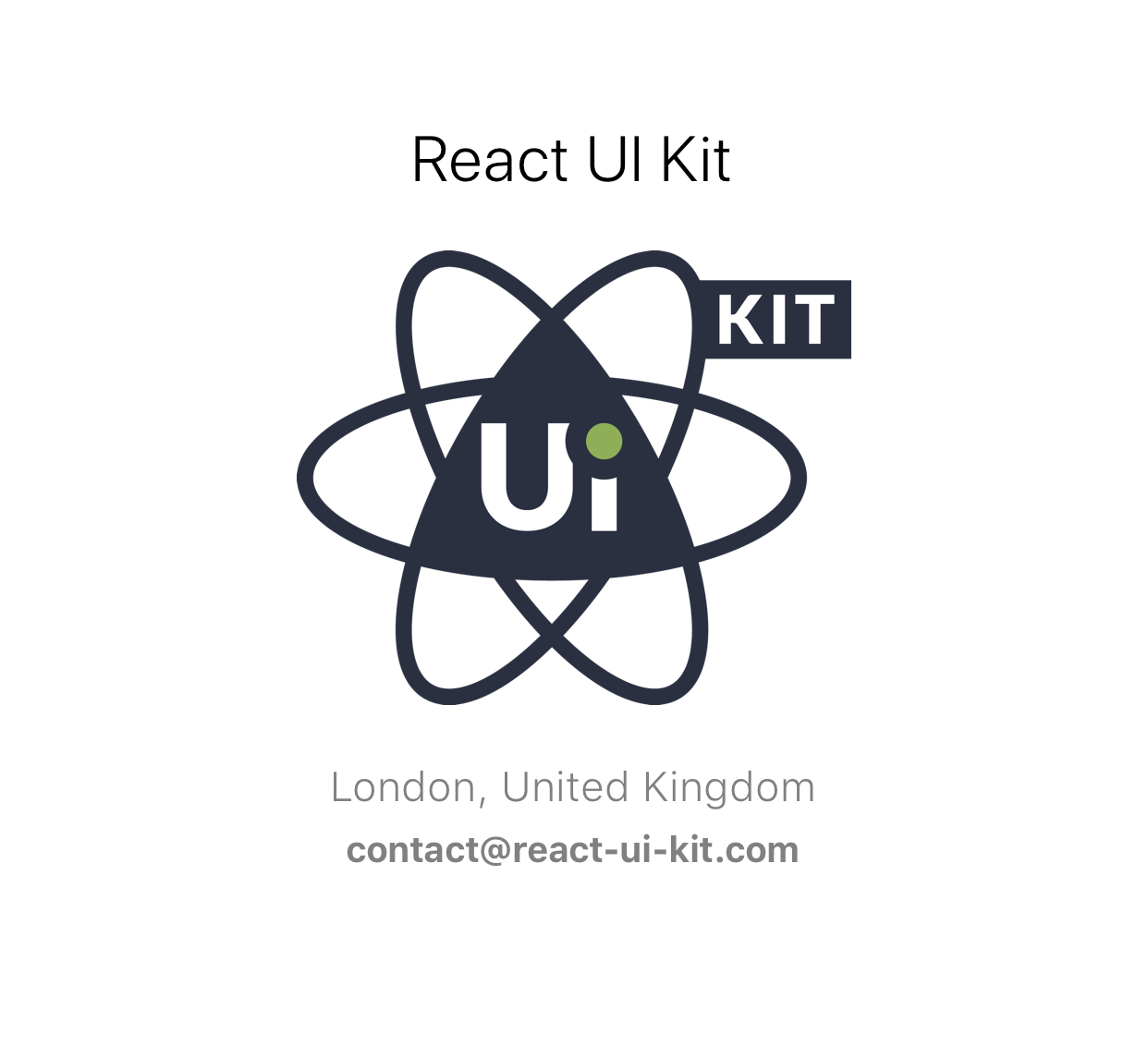
importReactfrom'react';import{StyleSheet,Image}from'react-native';import{Block,Text}from'react-ui-kit-native';classProfileScreenextendsReact.Component{render(){const{ profile }=this.props;return(<Blockfluidflexmiddlestyle={styles.profile}><Texth5lightcolor="#000">{profile.fullname}</Text><Imagesource={{uri: profile.avatar}}style={styles.avatar}/><Textsubtitlelight>{`${profile.city}, ${profile.country}`}</Text><Textbold>{profile.email}</Text></Block>);}}ProfileScreen.defaultProps={profile: {fullname: `React UI Kit`,city: `London`,country: `United Kingdom`,email: `contact@react-ui-kit.com`,avatar: `https://react-ui-kit.com/assets/img/react-ui-kit-logo.png`,},};exportdefaultProfileScreen;conststyles=StyleSheet.create({profile: {paddingTop: 15,backgroundColor: '#fff',},avatar: {width: 200,height: 200,resizeMode: 'contain',},});- export components style as
stylesfor easy import - create
theme HoCwith default theme.js
Have an idea for a new component or Screen? Just contact us at contact@react-ui-kit.com and will add it to our list.