Uh oh!
There was an error while loading. Please reload this page.
Tweaking error overlay styles - #2191
Conversation

bvaughn
commented
May 17, 2017
cc @gaearon Let me know when I can push to facebookincubator/create-react-app and I'll re-push my branch there instead so you can make edits also. |
bvaughn
commented
May 17, 2017
FYI I'm going to take another pass at the CSS to see if I can't find a more backwards-friendly way of styling things. |
gaearon
commented
May 17, 2017
Great, thanks! Sorry the CI is dead. |
bvaughn
commented
May 17, 2017
Okay! Styles are now mobile Safari friendly. |
gaearon
commented
May 17, 2017
Awesome. Ready for review? |
bvaughn
commented
May 17, 2017
Yeah sure, round 1 at least :) |
gaearon
commented
May 17, 2017
Looks very small in Chrome. Is some media query wrong?
|

bvaughn
commented
May 17, 2017
Looks right. The font-size matches Chrome devtools default font-size. (You can always Cmd + to zoom in.) The dialog grows (width/height) as needed, eventually capping at the page's width/height. |
The text before was huge which I thought was not great for 2 reasons: (1) you can view less context at any given time if the stack is big and you're using a small screen (13" mac, tablet, etc) and (2) we talked (I think?) about making it look a little more like the standard devtools, which I did with font-size and syntax highlighting coloring. |
gaearon
commented
May 17, 2017
Hmm. DevTools font size seems to be 11px with default zoom, but here the code font size is 10px. I agree it was a too large before, but IMO we should make it more legible. I like the other changes, but the point of the error box is to surface the same info more prominently since we have more screen estate than the console or the Sources tab. I have good close vision, and I can barely read it on rMBP. |
bvaughn
commented
May 17, 2017
Okay, we can bump it up to 11px then instead of 10? |
bvaughn
commented
May 17, 2017
Base font-size of 11px seems to match Chrome devtools nicely. Guess I mis eyeballed it earlier with 10px. My bad!
|

gaearon
commented
May 17, 2017
11px is a minimum we should use, but again, I think we should be larger than DevTools since we show specific snippets. Since it’s scrollable, and outer frames aren’t usually that much relevant, I think it’s fine to make it larger. What do you think about increasing the sizes on wider monitors? Then it could shrink a little on iPhones but stay larger on desktop. |
gaearon
commented
May 17, 2017
A long message looks like this:
What do you think about wrapping it automatically at some point? |

I don't follow the logic here. Devtools font is readable. If it wasn't, Chrome team would use a bigger default font-size. If users zoom in b'c devtools isn't readable, then they'll also get bigger font in the error overlay. (So I think 11px is good.) Just a personal nit but I strongly dislike arbitrarily larger font sizes for things like this. |
bvaughn
commented
May 17, 2017
That seems like a reasonable tweak! |
gaearon
commented
May 17, 2017
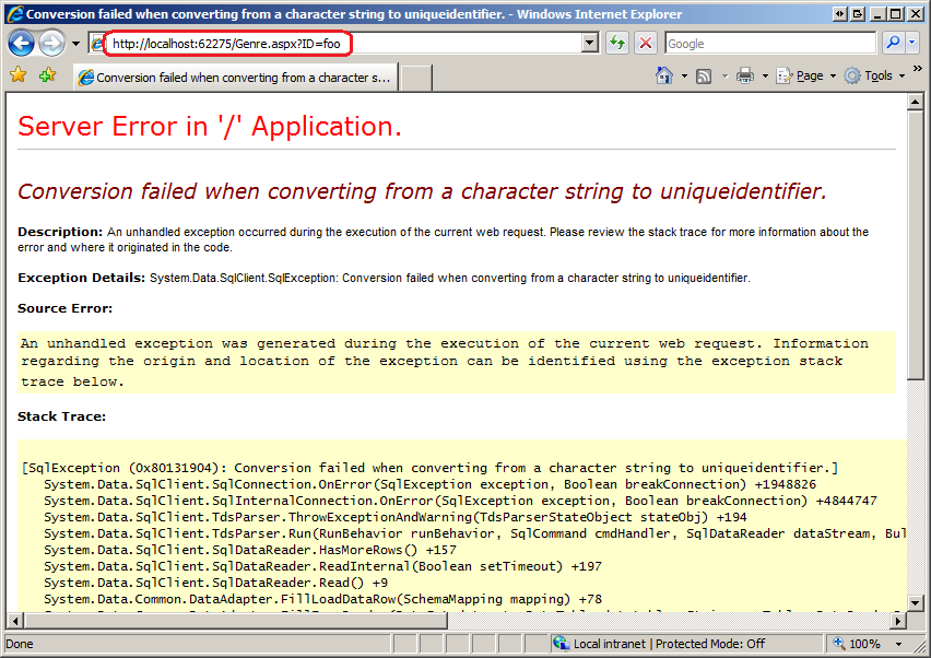
I’m looking at other such pages for comparison, not at DevTools. DevTools doesn’t have a function of highlighting specific failing code, it’s more general purpose. Here is Django default error page: Title is 26px, code is 12px. Here is ASP .NET error page: Can't say the sizes but it looks larger to me. I would probably want to align more with prior art for this rather than with DevTools specifically. |

gaearon
commented
May 17, 2017
One slightly annoying thing I noticed: if the error message isn't large, the window is small but as soon as I press "view compiled" on a frame it blows up in width because of all the Webpack generated long lines. |
gaearon
commented
May 17, 2017
(The problem with the above issue is that now "view source" jumps to the left so I have to hunt down for it to collapse the window back. At this point I might click twice by mistake and hide it.) |
There is also another potential usability problem with dynamic overlay size.
Now say there is an exception. An overlay pops up. I likely won’t have realized this until a few more hundreds of milliseconds, and it is likely I will click a few more times (e.g. if this was caused by a button click). Unfortunately this will immediately dismiss the overlay. And because its size depends on the content I can’t develop muscular memory for where it would appear either, so I likely will perceive it as a distracting UI element I keep inadvertently hiding (and thus don’t trust). I don’t know what a good solution is here. A full-screen (or almost full-screen) overlay doesn’t have this problem, even though it doesn’t look as slick. Perhaps we could set a timeout in which clicks are ignored, and maybe animate the backdrop to the dark to provide a hint for when it becomes dismissable. That may seem weird though. Maybe just the interval although then it feels arbitrary. What do you think? |

I already miss the full screen overlay. I appreciate this looks more iOS-native (for mobile phones), but it doesn't feel like it fits in to me within a desktop browser context. This overlay is for a hard crash, so I don't believe we should try to make it smaller/like a modal. Adding back application context makes it seem more like a warning / not critical. A full screen tells me stop, something is broken. If I saw a small window like this, I feel like I'd act like @gaearon describes and have a reflex to immediately escape or click off (or even do it accidentally by double clicking a button). As it stands right now, I like the new color theme for code but I'm not fond of the new UI. The "only visible in development message" used to be centered and would draw your attention so you immediately knew what the screen was for; now it looks more text-wall like and I'm not sure what I'm looking at first glance. |
This message is not very important. (That's why it's light gray and at the bottom.) When it was centered-aligned, I (subjectively) felt that wider dialogs looked really odd. (Every single piece of text is left-justified except for this one footer.) That being said, I don't have a strong |
gaearon
commented
May 17, 2017
I'm cool with changes to "only visible in development". Regarding my earlier feedback, I noticed I accidentally left "more space" setting in Displays on a small Macbook so that might be why it looked so small to me. Looking again. |
bvaughn
commented
May 17, 2017
Doesn't it though? When a runtime error happens, devtools catches the code Isn't that essentially the same thing? |

gaearon
commented
May 17, 2017
I guess what I’m trying to say is that DevTools still has to remain functional for other use cases (you can scroll up and down, step into functions, switch to other files, potentially edit the code) whereas here we have an opportunity to fine-tune it to a single case. DevTools can’t assume you’re going to stay focused on those 5 lines but we can. |
bvaughn
commented
May 17, 2017
Okay, that makes more sense. |
bvaughn
commented
May 17, 2017
Moving to #2201 so you can push too |
This is kind of quick and dirty. Basically just editing style values inline.
I'd be happy to brainstorm ways to clean up some of the styling to make it more maintainable if you're interested? 😁
Demos
Scrolling demo
Chrome
iPhone