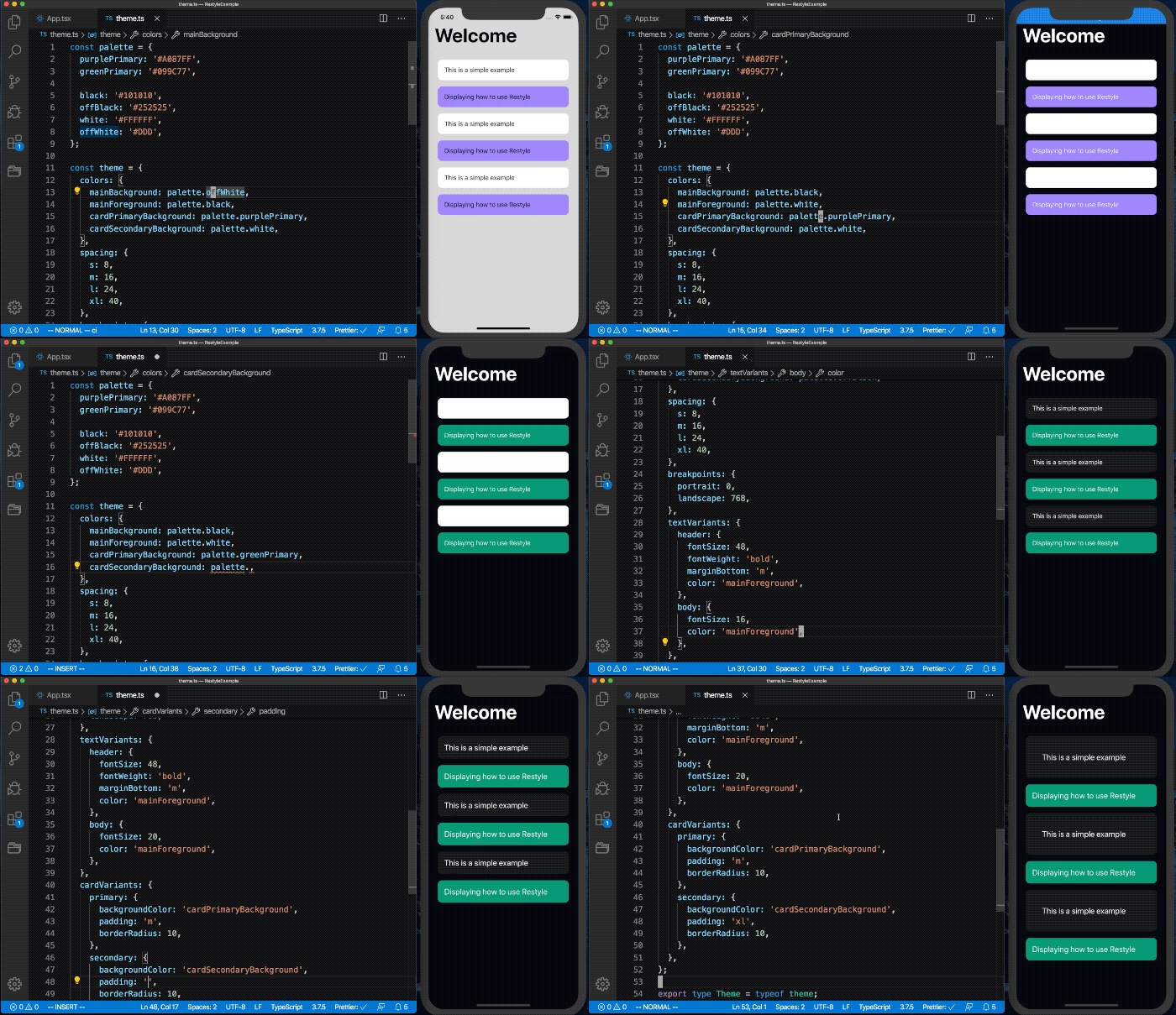
The Restyle library provides a type-enforced system for building UI components in React Native with TypeScript. It's a library for building UI libraries, with themability as the core focus.
This library assumes that the UI is built upon a design system that (at the very least) defines a set of colors and spacing constants that lays as a foundation. While the library acknowledges that there can be exceptions to the system by allowing any style to be overridden, it keeps the developer most productive when one-off values are kept to a minimum.
Here's an example of how a view built with Restyle components could look:
import{ThemeProvider,createBox,createText,createRestyleComponent,createVariant,VariantProps,}from'@shopify/restyle';// See the "Defining Your Theme" readme section belowimporttheme,{Theme}from'./theme';constBox=createBox<Theme>();constText=createText<Theme>();constCard=createRestyleComponent<VariantProps<Theme,'cardVariants'>&React.ComponentProps<typeofBox>>([createVariant({themeKey: 'cardVariants'})],Box);constWelcome=()=>{return(<Boxflex={1}backgroundColor="mainBackground"paddingVertical="xl"paddingHorizontal="m"><Textvariant="header">Welcome</Text><BoxflexDirection={{phone: 'column',tablet: 'row',}}><Cardmargin="s"variant="secondary"><Textvariant="body">This is a simple example</Text></Card><Cardmargin="s"variant="primary"><Textvariant="body">Displaying how to use Restyle</Text></Card></Box></Box>);};constApp=()=>{return(<ThemeProvidertheme={theme}><Welcome/></ThemeProvider>);};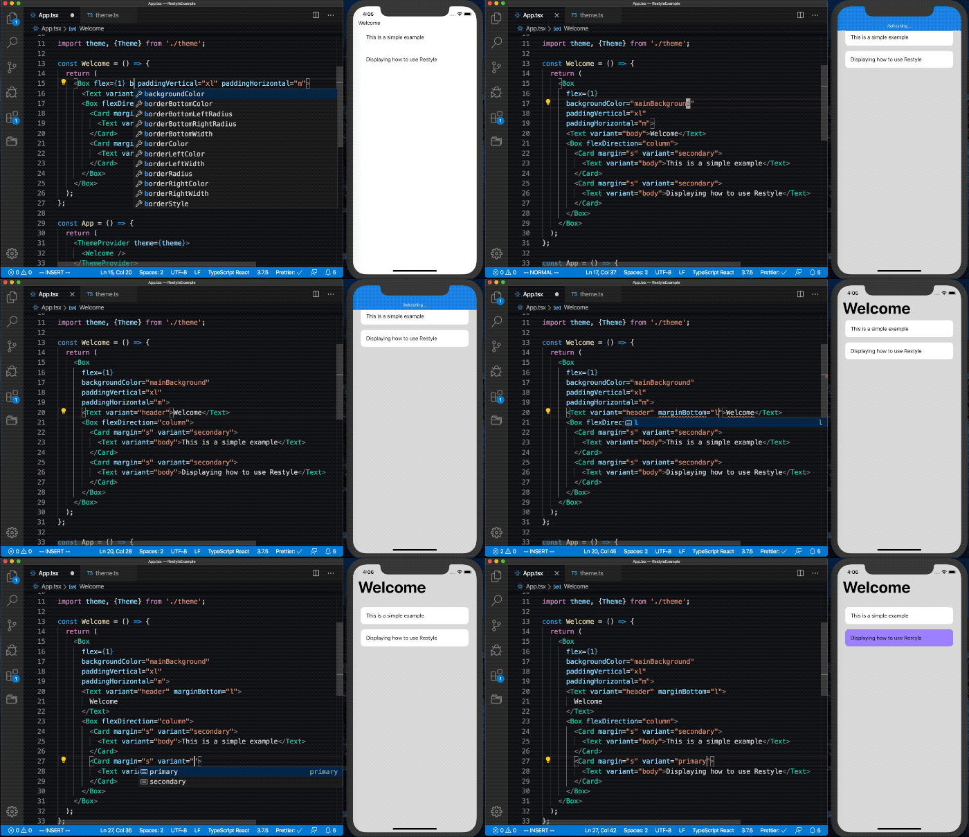
$ yarn add @shopify/restyle$ npm install @shopify/restyleAny project using this library should have a global theme object. It specifies set values for spacing, colors, breakpoints, and more. These values are made available to Restyle components, so that you can for example write backgroundColor="cardPrimary" to use the named color from your theme. In fact, TypeScript enforces the backgroundColor property to only accept colors that have been defined in your theme, and autocompletes values for you in a modern editor.
Below is an example of how a basic theme could look. Make sure to read the sections below for more details on how to set up your different theme values.
constpalette={purpleLight: '#8C6FF7',purplePrimary: '#5A31F4',purpleDark: '#3F22AB',greenLight: '#56DCBA',greenPrimary: '#0ECD9D',greenDark: '#0A906E',black: '#0B0B0B',white: '#F0F2F3',};consttheme={colors: {mainBackground: palette.white,cardPrimaryBackground: palette.purplePrimary,},spacing: {s: 8,m: 16,l: 24,xl: 40,},breakpoints: {phone: 0,tablet: 768,},};exporttypeTheme=typeoftheme;exportdefaulttheme;This theme should be passed to a ThemeProvider at the top of your React tree:
import{ThemeProvider}from'@shopify/restyle';importthemefrom'./theme';constApp=()=>(<ThemeProvidertheme={theme}>{/* Rest of the app */}</ThemeProvider>);When working with colors in a design system a common pattern is to have a palette including a number of base colors with darker and lighter shades, see for example the Polaris Color Palette.
This palette should preferrably not be directly included as values in the theme. The naming of colors in the theme object should instead be used to assign semantic meaning to the palette, see this example:
constpalette={purpleLight: '#8C6FF7',purplePrimary: '#5A31F4',purpleDark: '#3F22AB',greenLight: '#56DCBA',greenPrimary: '#0ECD9D',greenDark: '#0A906E',black: '#0B0B0B',white: '#F0F2F3',};consttheme={colors: {mainBackground: palette.white,mainForeground: palette.black,cardPrimaryBackground: palette.purplePrimary,buttonPrimaryBackground: palette.purplePrimary,},};Taking the time to define these semantic meanings comes with a number of benefits:
- It's easy to understand where and in what context colors are applied throughout the app
- If changes are made to the palette (e.g. the purple colors are changed to a shade of blue instead), we only have to update what the semantic names point to instead of updating all references to
purplePrimarythroughout the app. - Even though
cardPrimaryBackgroundandbuttonPrimaryBackgroundpoint to the same color in the example above, deciding that buttons should instead be green (while cards remain purple) becomes a trivial change. - A theme can easily be swapped at runtime.
Spacing tends to follow multiples of a given base spacing number, for example 8. We prefer using the t-shirt size naming convention, because of the scalability of it (any number of x's can be prepended for smaller and larger sizes):
consttheme={spacing: {s: 8,m: 16,l: 24,xl: 40,},};Breakpoints are defined as minimum widths (inclusive) for different target screen sizes where we want to apply differing styles. Consider giving your breakpoints names that give a general idea of the type of device the user is using:
consttheme={breakpoints: {phone: 0,tablet: 768,largeTablet: 1024,},};See the Responsive Values section to see how these can be used.
If you need to manually access the theme outside of a component created with Restyle, use the useTheme hook:
constComponent=()=>{consttheme=useTheme<Theme>();const{cardPrimaryBackground}=theme.colors;// ...};By doing this instead of directly importing the theme object, it becomes easy to swap the theme out during runtime to for example implement a dark mode switch in your app.
This library comes with predefined functions to create a Box and Text component, as seen in action in the introductory example. These come as functions instead of ready-made components to give you a chance to provide the type of your theme object. Doing this will make all props that map to theme values have proper types configured, based on what's available in your theme.
// In Box.tsximport{createBox}from'@shopify/restyle';import{Theme}from'./theme';constBox=createBox<Theme>();exportdefaultBox;The Box component comes with the following Restyle functions: backgroundColor, opacity, visible, layout, spacing, border, shadow, position.
// In Text.tsximport{createText}from'@shopify/restyle';import{Theme}from'./theme';constText=createText<Theme>();exportdefaultText;The Text component comes with the following Restyle functions: color, opacity, visible, typography, textShadow, spacing. It also includes a variant that picks up styles under the textVariants key in your theme:
// In your themeconsttheme={
...,textVariants: {header: {fontFamily: 'ShopifySans-Bold',fontWeight: 'bold',fontSize: 34,lineHeight: 42.5,color: 'black',},subheader: {fontFamily: 'ShopifySans-SemiBold',fontWeight: '600',fontSize: 28,lineHeight: 36,color: 'black',},body: {fontFamily: 'ShopifySans',fontSize: 16,lineHeight: 24,color: 'black',},},}// In a component<Textvariant="header">Header</Text>If you want to create your own component similar to Box or Text, but decide
yourself which Restyle functions to use, use the
createRestyleComponent helper:
import{createRestyleComponent,createVariant,spacing,SpacingProps,VariantProps}from'@shopify/restyle';import{Theme}from'./theme'typeProps=SpacingProps<Theme>&VariantProps<Theme,'cardVariants'>constCard=createRestyleComponent<Props>([spacing,createVariant({themeKey: 'cardVariants'})])exportdefaultCardFor more advanced components, you may want to instead use the useRestyle hook:
import{TouchableOpacity,View}from'react-native';import{useRestyle,spacing,border,backgroundColor,SpacingProps,BorderProps,BackgroundColorProps,}from'@shopify/restyle';importTextfrom'./Text';import{Theme}from'./theme';constrestyleFunctions=[spacing,border,backgroundColor];typeProps=SpacingProps<Theme>&BorderProps<Theme>&BackgroundColorProps<Theme>&{onPress: ()=>void;};constButton=({onPress, label, ...rest}: Props)=>{constprops=useRestyle(restyleFunctions,rest);return(<TouchableOpacityonPress={onPress}><View{...props}><Textvariant="buttonLabel">{label}</Text></View></TouchableOpacity>);};Restyle functions are the bread and butter of Restyle. They specify how props should be mapped to values in a resulting style object, that can then be passed down to a React Native component. The props support responsive values and can be mapped to values in your theme.
The Restyle library comes with a number of predefined Restyle functions for your convenience.
| Restyle Function | Props | Theme Key |
|---|---|---|
| backgroundColor | backgroundColor | colors |
| color | color | colors |
| opacity | opacity | none |
| visible | display (maps true / false to flex / none) | none |
| spacing | margin, marginTop, marginRight, marginBottom, marginLeft, marginHorizontal, marginVertical, padding, paddingTop, paddingRight, paddingBottom, paddingLeft, paddingHorizontal, paddingVertical | spacing |
| layout | width, height, minWidth, maxWidth, minHeight, maxHeight, overflow, aspectRatio, alignContent, alignItems, alignSelf, justifyContent, flex, flexBasis, flexDirection, flexGrow, flexShrink, flexWrap | none |
| position | position, top, right, bottom, left | none |
| position | zIndex | zIndices |
| border | borderBottomWidth, borderLeftWidth, borderRightWidth, borderStyle, borderTopWidth, borderWidth | none |
| border | borderColor, borderTopColor, borderRightColor, borderLeftColor, borderBottomColor | colors |
| border | borderRadius, borderBottomLeftRadius, borderBottomRightRadius, borderTopLeftRadius, borderTopRightRadius | borderRadii |
| shadow | shadowOpacity, shadowOffset, shadowRadius, elevation | none |
| shadow | shadowColor | colors |
| textShadow | textShadowOffset, textShadowRadius | none |
| textShadow | textShadowColor | colors |
| typography | fontFamily, fontSize, fontStyle, fontWeight, letterSpacing, lineHeight, textAlign, textDecorationLine, textDecorationStyle, textTransform | none |
To define your own Restyle function, use the createRestyleFunction helper:
import{createRestyleFunction,createRestyleFunction}from'@shopify/restyle'consttransparency=createRestyleFunction({property: 'transparency',styleProperty: 'opacity',transform: ({value}: {value: number})=>1-value,});constTransparentComponent=createRestyleFunction([transparency])<TransparentComponenttransparency={0.5}/>Arguments:
property: The name of the component prop that the function will receive tha value of.styleProperty: The name of the property in the style object to map to. Defaults to the value ofproperty.transform({value, theme, themeKey}): An optional function that transforms the value of the prop to the value that will be inserted into the style object.themeKey: An optional key in the theme to map values from, e.g.colors.
A variant is a form of Restyle function that maps a prop into multiple other props to use with Restyle functions. A variant needs to always map to a key in the theme.
// In themeconsttheme={// ...spacing: {s: 8,m: 16,l: 24,},colors: {cardRegularBackground: '#EEEEEE',},breakpoints: {phone: 0,tablet: 768,},cardVariants: {regular: {// We can refer to other values in the theme here, and use responsive propspadding: {phone: 's',tablet: 'm',},}elevated: {padding: {phone: 's',tablet: 'm',},shadowColor: '#000',shadowOpacity: 0.2,shadowOffset: {width: 0,height: 5},shadowRadius: 15,elevation: 5,}}}import{createVariant,createRestyleComponent,VariantProps}from'@shopify/restyle'constvariant=createVariant<Theme>({themeKey: 'cardVariants',defaults: {margin: {phone: 's',tablet: 'm',},backgroundColor: 'cardRegularBackground',}})constCard=createRestyleComponent<VariantProps<Theme,'cardVariants'>>([variant])<Cardvariant="elevated"/>Arguments:
property: The name of the component prop that will map to a variant. Defaults tovariant.themeKey: A key in the theme to map values from. UnlikecreateRestyleFunction, this option is required to create a variant.defaults: The default values to apply before applying anything from the values in the theme.
Any prop powered by Restyle can optionally accept a value for each screen size, as defined by the breakpoints object in the theme:
// In your themeconsttheme={// ...breakpoints: {phone: 0,tablet: 768,}}// Props always accept either plain values<BoxflexDirection="row"/>// Or breakpoint-specific values<BoxflexDirection={{phone: 'column',tablet: 'row'}}/>Any Restyle component also accepts a regular style property and will apply it after all other styles, which means that you can use this to do any overrides that you might find necessary.
<Boxmargin="s"padding="m"style={{backgroundColor: '#F00BAA',}}/>Of course, no app is complete without a dark mode. Here a simple example of how you would implement it:
importReact,{useState}from'react';import{Switch}from'react-native';import{ThemeProvider,createBox,createText}from'@shopify/restyle';exportconstpalette={purple: '#5A31F4',white: '#FFF',black: '#111',darkGray: '#333',lightGray: '#EEE',};consttheme={spacing: {s: 8,m: 16,},colors: {mainBackground: palette.lightGray,mainForeground: palette.black,primaryCardBackground: palette.purple,secondaryCardBackground: palette.white,primaryCardText: palette.white,secondaryCardText: palette.black,},breakpoints: {},textVariants: {body: {fontSize: 16,lineHeight: 24,color: 'mainForeground',},},cardVariants: {primary: {backgroundColor: 'primaryCardBackground',shadowOpacity: 0.3,},secondary: {backgroundColor: 'secondaryCardBackground',shadowOpacity: 0.1,},},};typeTheme=typeoftheme;constdarkTheme={
...theme,colors: {
...theme.colors,mainBackground: palette.black,mainForeground: palette.white,secondaryCardBackground: palette.darkGray,secondaryCardText: palette.white,},};constBox=createBox<Theme>();constText=createText<Theme>();constApp=()=>{const[darkMode,setDarkMode]=useState(false);return(<ThemeProvidertheme={darkMode ? darkTheme : theme}><Boxpadding="m"backgroundColor="mainBackground"flex={1}><BoxbackgroundColor="primaryCardBackground"margin="s"padding="m"flexGrow={1}><Textvariant="body"color="primaryCardText">
Primary Card
</Text></Box><BoxbackgroundColor="secondaryCardBackground"margin="s"padding="m"flexGrow={1}><Textvariant="body"color="secondaryCardText">
Secondary Card
</Text></Box><BoxmarginTop="m"><Switchvalue={darkMode}onValueChange={(value: boolean)=>setDarkMode(value)}/></Box></Box></ThemeProvider>);};exportdefaultApp;Restyle is heavily inspired by https://styled-system.com.
For help on setting up the repo locally, building, testing, and contributing please see CONTRIBUTING.md.
All developers who wish to contribute through code or issues, take a look at the CODE_OF_CONDUCT.md.
MIT, see LICENSE.md for details.