


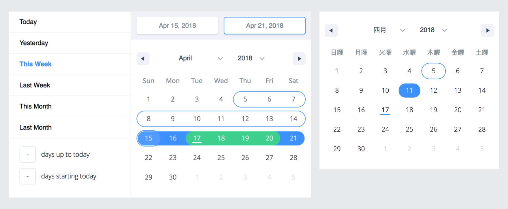
A date library agnostic React component for choosing dates and date ranges. Uses date-fns for date operations.
- Stateless date operations
- Highly configurable
- Multiple range selection
- Based on native js dates
- Drag n Drop selection
- Keyboard friendly
Live Demo :http://hypeserver.github.io/react-date-range
npm install --save react-date-range
This plugin expects react and date-fns as peerDependencies, It means that you need to install them in your project folder.
npm install --save react date-fns
You need to import skeleton and theme styles first.
import'react-date-range/dist/styles.css';// main style fileimport'react-date-range/dist/theme/default.css';// theme css fileimport{Calendar}from'react-date-range';classMyComponentextendsComponent{handleSelect(date){console.log(date);// native Date object}render(){return(<Calendardate={newDate()}onChange={this.handleSelect}/>)}}import{DateRangePicker}from'react-date-range';classMyComponentextendsComponent{handleSelect(ranges){console.log(ranges);// {// selection: {// startDate: [native Date Object],// endDate: [native Date Object],// }// }}render(){constselectionRange={startDate: newDate(),endDate: newDate(),key: 'selection',}return(<DateRangePickerranges={[selectionRange]}onChange={this.handleSelect}/>)}}| Property | type | Default Value | Description |
|---|---|---|---|
| locale | Object | enUS from locale | you can view full list from here. Locales directly exported from date-fns/locales. |
| className | String | wrapper classname | |
| months | Number | 1 | rendered month count |
| showSelectionPreview | Boolean | true | show preview on focused/hovered dates |
| showMonthAndYearPickers | Boolean | true | show select tags for month and year on calendar top, if false it will just display the month and year |
| rangeColors | String[] | defines color for selection preview. | |
| shownDate | Date | initial focus date | |
| minDate | Date | defines minimum date. Disabled earlier dates | |
| maxDate | Date | defines maximum date. Disabled later dates | |
| direction | String | 'vertical' | direction of calendar months. can be vertical or horizontal |
| disabledDates | Date[] | [] | dates that are disabled |
| disabledDay | Func | predicate function that disable day fn(date: Date) | |
| scroll | Object | { enabled: false } | infinite scroll behaviour configuration. Check out Infinite Scroll section |
| showMonthArrow | Boolean | true | show/hide month arrow button |
| navigatorRenderer | Func | renderer for focused date navigation area. fn(currentFocusedDate: Date, changeShownDate: func, props: object) | |
| ranges | *Object[] | [] | Defines ranges. array of range object |
| moveRangeOnFirstSelection(DateRange) | Boolean | false | move range on startDate selection. Otherwise endDate will replace with startDate. |
| onChange(Calendar) | Func | callback function for date changes. fn(date: Date) | |
| onChange(DateRange) | Func | callback function for range changes. fn(changes). changes contains changed ranges with new startDate/endDate properties. | |
| color(Calendar) | String | #3d91ff | defines color for selected date in Calendar |
| date(Calendar) | Date | date value for Calendar | |
| showDateDisplay(DateRange) | Boolean | true | show/hide selection display row. Uses dateDisplayFormat for formatter |
| onShownDateChange(DateRange,Calendar) | Function | Callback function that is called when the shown date changes | |
| initialFocusedRange(DateRange) | Object | Initial value for focused range. See focusedRange for usage. | |
| focusedRange(DateRange) | Object | It defines which range and step are focused. Common initial value is [0, 0]; first value is index of ranges, second one is which step on date range(startDate or endDate). | |
| onRangeFocusChange(DateRange) | Object | Callback function for focus changes | |
| preview(DateRange) | Object | displays a preview range and overwrite DateRange's default preview. Expected shape: { startDate: Date, endDate: Date, color: String } | |
| showPreview(DateRange) | bool | true | visibility of preview |
| editableDateInputs(Calendar) | bool | false | whether dates can be edited in the Calendar's input fields |
| dragSelectionEnabled(Calendar) | bool | true | whether dates can be selected via drag n drop |
| onPreviewChange(DateRange) | Object | Callback function for preview changes | |
| dateDisplayFormat | String | MMM d, yyyy | selected range preview formatter. Check out date-fns's format option |
| dayDisplayFormat | String | d | selected range preview formatter. Check out date-fns's format option |
| weekdayDisplayFormat | String | E | selected range preview formatter. Check out date-fns's format option |
| monthDisplayFormat | String | MMM yyyy | selected range preview formatter. Check out date-fns's format option |
| weekStartsOn | Number | Whether the week start day that comes from the locale will be overriden. Default value comes from your locale, if no local is specified, note that default locale is enUS | |
| startDatePlaceholder | String | Early | Start Date Placeholder |
| endDatePlaceholder | String | Continuous | End Date Placeholder |
| fixedHeight | Boolean | false | Since some months require less than 6 lines to show, by setting this prop, you can force 6 lines for all months. |
renderStaticRangeLabel(DefinedRange) | Function | Callback function to be triggered for the static range configurations that have hasCustomRendering: true on them. Instead of rendering staticRange.label, return value of this callback will be rendered. | |
staticRanges(DefinedRange, DateRangePicker) | Array | default preDefined ranges | - |
inputRanges(DefinedRange, DateRangePicker) | Array | default input ranges | - |
*shape of range:
{startDate: PropTypes.object,endDate: PropTypes.object,color: PropTypes.string,key: PropTypes.string,autoFocus: PropTypes.bool,disabled: PropTypes.bool,showDateDisplay: PropTypes.bool,}To enable infinite scroll set scroll={{enabled: true}} basically. Infinite scroll feature is affected by direction(rendering direction for months) and months(for rendered months count) props directly.
If you prefer, you can overwrite calendar sizes with calendarWidth/calendarHeight or each month's height/withs with monthWidth/monthHeight/longMonthHeight at scroll prop.
// shape of scroll propscroll: {enabled: PropTypes.bool,monthHeight: PropTypes.number,longMonthHeight: PropTypes.number,// some months has 1 more row than othersmonthWidth: PropTypes.number,// just used when direction="horizontal"calendarWidth: PropTypes.number,// defaults monthWidth * monthscalendarHeight: PropTypes.number,// defaults monthHeight * months}),TODOs
- Make mobile friendly (integrate tap and swipe actions)
- Add complex booking customization example with exposed dayRenderer prop
- Add tests
- Improve documentation