


Flutter's core Dropdown Button widget with steady dropdown menu and many other options you can customize to your needs.

- Features
- Options
- Installation
- Usage and Examples
- 1. Simple DropdownButton2 with no styling
- 2. DropdownButton2 with some styling and customization
- 3. DropdownButton2 with items of different heights like dividers
- 4. DropdownButton2 as Multiselect Dropdown with Checkboxes
- 5. DropdownButton2 as Searchable Dropdown
- 6. DropdownButton2 as Popup menu button using customButton parameter
- 7. Using DropdownButtonFormField2 with Form
- CustomDropdownButton2 Widget "customize it to your needs"
- Dropdown menu always open below the button "as long as it's possible otherwise it'll open to the end of the screen" and you can edit its position by using the offset parameter.
- You can control how (button, button's icon, dropdown menu and menu items) will be displayed "read Options below".
- You can align (hint & value) and customize them.
- You can edit the scrollbar's radius,thickness and isAlwaysShow.
- You can set max height for the dropdown menu & it'll become scrollable if there are more items.
- If you pass Null to dropdownMaxHeight parameter or didn't use it, the dropdown menu will take max height possible for the items and will become scrollable if there are more items.
- If you have long scrollable list, the dropdown menu will auto scroll to current selected item and show it at the middle of the menu if possible.
- Wrap DropdownButton2 with DropdownButtonHideUnderline to hide the underline.
- A Custom widget of the DropdownButton2 below to make it more reusable. You can customize it to your needs and use it throughout all your app easily as shown in the examples.
- You can use DropdownButton2 with items of different heights like dividers as shown in the examples.
- You can use DropdownButton2 as Multiselect Dropdown with Checkboxes as shown in the examples.
- You can use DropdownButton2 as Searchable Dropdown as shown in the examples.
- You can use DropdownButton2 as a popup menu button by using the parameter customButton. You can pass Icon,Image or any widget and customize it as shown in the examples.
- You can also use DropdownButtonFormField2 the same way with all options above and use it inside Form as shown in the examples.
- Use decoration parameter for the DropdownButtonFormField2 to add borders, label and more.
- You can customize DropdownButtonFormField2 width by wrapping it with Padding or with SizedBox and give it the width you want.
| Option | Description | Type | Required |
|---|---|---|---|
| items | The list of items the user can select | List<DropdownMenuItem> | Yes |
| hint | The placeholder displayed before the user choose an item | Widget | No |
| disabledHint | The placeholder displayed if the dropdown is disabled | Widget | No |
| value | The value of the currently selected [DropdownMenuItem] | T | No |
| onChanged | Called when the user selects an item | ValueChanged<T?> | No |
| onMenuStateChange | Called when the dropdown menu is opened or closed | Function(bool isOpen) | No |
| selectedItemBuilder | How the selected item will be displayed on button | DropdownButtonBuilder | No |
| buttonHeight | The height of the button | double | No |
| buttonWidth | The width of the button | double | No |
| buttonPadding | The inner padding of the Button | EdgeInsetsGeometry | No |
| buttonDecoration | The decoration of the Button | BoxDecoration | No |
| buttonElevation | The elevation of the Button | int | No |
| buttonSplashColor | The splash color of the button's InkWell | Color | No |
| buttonHighlightColor | The highlight color of the button's InkWell | Color | No |
| buttonOverlayColor | The overlay color of the button's InkWell | MaterialStateProperty<Color?> | No |
| icon | The suffix icon of the dropdown button | Widget | No |
| iconOnClick | Shows different icon when dropdown menu open | Widget | No |
| iconSize | The size of the icon | double | No |
| iconEnabledColor | The color of the icon if the button is enabled | Color | No |
| iconDisabledColor | The color of the icon if the button is disabled | Color | No |
| itemHeight | The height of menu items | double | No |
| itemPadding | The padding of menu items | EdgeInsetsGeometry | No |
| itemSplashColor | The splash color of the item's InkWell | Color | No |
| itemHighlightColor | The highlight color of the item's InkWell | Color | No |
| dropdownMaxHeight | The maximum height of the dropdown menu | double | No |
| dropdownWidth | The width of the dropdown menu | double | No |
| dropdownPadding | The inner padding of the dropdown menu | EdgeInsetsGeometry | No |
| dropdownScrollPadding | The inner padding of the dropdown menu including the scrollbar | EdgeInsetsGeometry | No |
| dropdownDecoration | The decoration of the dropdown menu | BoxDecoration | No |
| dropdownDirection | The direction of the dropdown menu in relation to the button | DropdownDirection | No |
| dropdownElevation | The elevation of the dropdown menu | int | No |
| selectedItemHighlightColor | The highlight color of the current selected item | Color | No |
| scrollbarRadius | The radius of the scrollbar's corners | Radius | No |
| scrollbarThickness | The thickness of the scrollbar | double | No |
| scrollbarAlwaysShow | Always show the scrollbar even when a scroll is not underway | bool | No |
| offset | Changes the position of the dropdown menu | Offset | No |
| customButton | Uses custom widget like icon,image,etc.. instead of the default button | Widget | No |
| customItemsHeights | Uses different predefined heights for the menu items (useful for adding dividers) | List | No |
| isExpanded | Makes the button's inner contents expanded (set true to avoid long text overflowing) | bool | No |
| openWithLongPress | Opens the dropdown menu on long-pressing instead of tapping | bool | No |
| dropdownOverButton | Opens the dropdown menu over the button instead of below it | bool | No |
| dropdownFullScreen | Opens the dropdown menu in fullscreen mode (Above AppBar & TabBar) | bool | No |
| focusColor | The color of button when it has input focus using traditional interfaces (keyboard and mouse) | Color | No |
| barrierDismissible | Whether you can dismiss this route by tapping the modal barrier | bool | No |
| barrierColor | The color to use for the modal barrier. If this is null, the barrier will be transparent | Color | No |
| barrierLabel | The semantic label used for a dismissible barrier | String | No |
| searchController | The controller used for searchable dropdowns, if null, then it'll perform as a normal dropdown | TextEditingController | No |
| searchInnerWidget | The widget to be shown at the top of the dropdown menu for searchable dropdowns | Widget | No |
| searchMatchFn | The match function used for searchable dropdowns, if null, defaultFn will be used | SearchMatchFn | No |
| Option | Description | Type | Required |
|---|---|---|---|
| dropdownButtonKey | The key of DropdownButton2 child widget | Key | No |
| decoration | The decoration of the dropdown button form field | InputDecoration | No |
| onSaved | Called with the current selected item when the form is saved | FormFieldSetter | No |
| validator | Called to validates if the input is invalid and display error text | FormFieldValidator | No |
| autovalidateMode | Used to enable/disable auto validation | AutovalidateMode | No |
add this line to pubspec.yaml
dependencies:
dropdown_button2: ^1.9.2
import package
import'package:dropdown_button2/dropdown_button2.dart';
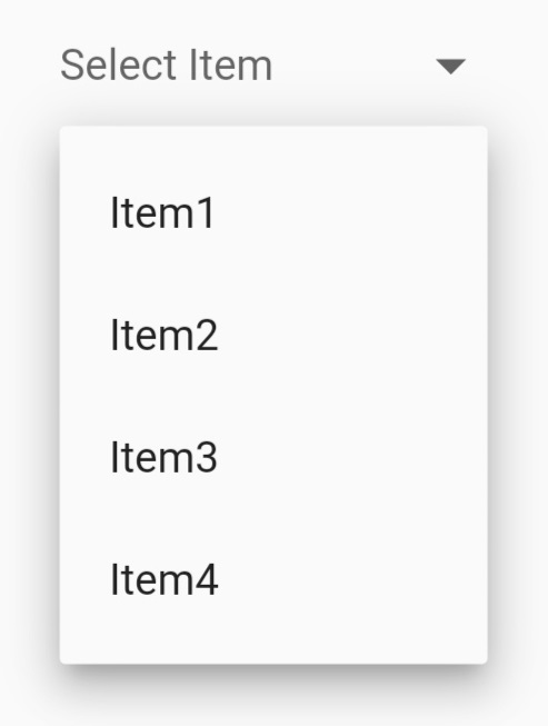
finalList<String> items = [
'Item1',
'Item2',
'Item3',
'Item4',
];
String? selectedValue;
@overrideWidgetbuild(BuildContext context) {
returnScaffold(
body:Center(
child:DropdownButtonHideUnderline(
child:DropdownButton2(
hint:Text(
'Select Item',
style:TextStyle(
fontSize:14,
color:Theme
.of(context)
.hintColor,
),
),
items: items
.map((item) =>DropdownMenuItem<String>(
value: item,
child:Text(
item,
style:constTextStyle(
fontSize:14,
),
),
))
.toList(),
value: selectedValue,
onChanged: (value) {
setState(() {
selectedValue = value asString;
});
},
buttonHeight:40,
buttonWidth:140,
itemHeight:40,
),
),
),
);
}
finalList<String> items = [
'Item1',
'Item2',
'Item3',
'Item4',
'Item5',
'Item6',
'Item7',
'Item8',
];
String? selectedValue;
@overrideWidgetbuild(BuildContext context) {
returnScaffold(
body:Center(
child:DropdownButtonHideUnderline(
child:DropdownButton2(
isExpanded:true,
hint:Row(
children:const [
Icon(
Icons.list,
size:16,
color:Colors.yellow,
),
SizedBox(
width:4,
),
Expanded(
child:Text(
'Select Item',
style:TextStyle(
fontSize:14,
fontWeight:FontWeight.bold,
color:Colors.yellow,
),
overflow:TextOverflow.ellipsis,
),
),
],
),
items: items
.map((item) =>DropdownMenuItem<String>(
value: item,
child:Text(
item,
style:constTextStyle(
fontSize:14,
fontWeight:FontWeight.bold,
color:Colors.white,
),
overflow:TextOverflow.ellipsis,
),
))
.toList(),
value: selectedValue,
onChanged: (value) {
setState(() {
selectedValue = value asString;
});
},
icon:constIcon(
Icons.arrow_forward_ios_outlined,
),
iconSize:14,
iconEnabledColor:Colors.yellow,
iconDisabledColor:Colors.grey,
buttonHeight:50,
buttonWidth:160,
buttonPadding:constEdgeInsets.only(left:14, right:14),
buttonDecoration:BoxDecoration(
borderRadius:BorderRadius.circular(14),
border:Border.all(
color:Colors.black26,
),
color:Colors.redAccent,
),
buttonElevation:2,
itemHeight:40,
itemPadding:constEdgeInsets.only(left:14, right:14),
dropdownMaxHeight:200,
dropdownWidth:200,
dropdownPadding:null,
dropdownDecoration:BoxDecoration(
borderRadius:BorderRadius.circular(14),
color:Colors.redAccent,
),
dropdownElevation:8,
scrollbarRadius:constRadius.circular(40),
scrollbarThickness:6,
scrollbarAlwaysShow:true,
offset:constOffset(-20, 0),
),
),
),
);
}
finalList<String> items = [
'Item1',
'Item2',
'Item3',
'Item4',
];
String? selectedValue;
List<DropdownMenuItem<String>> _addDividersAfterItems(List<String> items) {
List<DropdownMenuItem<String>> _menuItems = [];
for (var item in items) {
_menuItems.addAll(
[
DropdownMenuItem<String>(
value: item,
child:Padding(
padding:constEdgeInsets.symmetric(horizontal:8.0),
child:Text(
item,
style:constTextStyle(
fontSize:14,
),
),
),
),
//If it's last item, we will not add Divider after it.if (item != items.last)
constDropdownMenuItem<String>(
enabled:false,
child:Divider(),
),
],
);
}
return _menuItems;
}
List<double> _getCustomItemsHeights() {
List<double> _itemsHeights = [];
for (var i =0; i < (items.length *2) -1; i++) {
if (i.isEven) {
_itemsHeights.add(40);
}
//Dividers indexes will be the odd indexesif (i.isOdd) {
_itemsHeights.add(4);
}
}
return _itemsHeights;
}
@overrideWidgetbuild(BuildContext context) {
returnScaffold(
body:Center(
child:DropdownButtonHideUnderline(
child:DropdownButton2(
isExpanded:true,
hint:Text(
'Select Item',
style:TextStyle(
fontSize:14,
color:Theme.of(context).hintColor,
),
),
items:_addDividersAfterItems(items),
customItemsHeights:_getCustomItemsHeights(),
value: selectedValue,
onChanged: (value) {
setState(() {
selectedValue = value asString;
});
},
buttonHeight:40,
dropdownMaxHeight:200,
buttonWidth:140,
itemPadding:constEdgeInsets.symmetric(horizontal:8.0),
),
),
),
);
}
finalList<String> items = [
'Item1',
'Item2',
'Item3',
'Item4',
];
List<String> selectedItems = [];
@overrideWidgetbuild(BuildContext context) {
returnScaffold(
body:Center(
child:DropdownButtonHideUnderline(
child:DropdownButton2(
isExpanded:true,
hint:Align(
alignment:AlignmentDirectional.center,
child:Text(
'Select Items',
style:TextStyle(
fontSize:14,
color:Theme.of(context).hintColor,
),
),
),
items: items.map((item) {
returnDropdownMenuItem<String>(
value: item,
//disable default onTap to avoid closing menu when selecting an item
enabled:false,
child:StatefulBuilder(
builder: (context, menuSetState) {
final _isSelected = selectedItems.contains(item);
returnInkWell(
onTap: () {
_isSelected
? selectedItems.remove(item)
: selectedItems.add(item);
//This rebuilds the StatefulWidget to update the button's textsetState(() {});
//This rebuilds the dropdownMenu Widget to update the check markmenuSetState(() {});
},
child:Container(
height:double.infinity,
padding:constEdgeInsets.symmetric(horizontal:16.0),
child:Row(
children: [
_isSelected
?constIcon(Icons.check_box_outlined)
:constIcon(Icons.check_box_outline_blank),
constSizedBox(width:16),
Text(
item,
style:constTextStyle(
fontSize:14,
),
),
],
),
),
);
},
),
);
}).toList(),
//Use last selected item as the current value so if we've limited menu height, it scroll to last item.
value: selectedItems.isEmpty ?null: selectedItems.last,
onChanged: (value) {},
buttonHeight:40,
buttonWidth:140,
itemHeight:40,
itemPadding:EdgeInsets.zero,
selectedItemBuilder: (context) {
return items.map(
(item) {
returnContainer(
alignment:AlignmentDirectional.center,
padding:constEdgeInsets.symmetric(horizontal:16.0),
child:Text(
selectedItems.join(', '),
style:constTextStyle(
fontSize:14,
overflow:TextOverflow.ellipsis,
),
maxLines:1,
),
);
},
).toList();
},
),
),
),
);
}
finalList<String> items = [
'A_Item1',
'A_Item2',
'A_Item3',
'A_Item4',
'B_Item1',
'B_Item2',
'B_Item3',
'B_Item4',
];
String? selectedValue;
finalTextEditingController textEditingController =TextEditingController();
@overridevoiddispose() {
textEditingController.dispose();
super.dispose();
}
@overrideWidgetbuild(BuildContext context) {
returnScaffold(
body:Center(
child:DropdownButtonHideUnderline(
child:DropdownButton2(
isExpanded:true,
hint:Text(
'Select Item',
style:TextStyle(
fontSize:14,
color:Theme.of(context).hintColor,
),
),
items: items
.map((item) =>DropdownMenuItem<String>(
value: item,
child:Text(
item,
style:constTextStyle(
fontSize:14,
),
),
))
.toList(),
value: selectedValue,
onChanged: (value) {
setState(() {
selectedValue = value asString;
});
},
buttonHeight:40,
buttonWidth:200,
itemHeight:40,
dropdownMaxHeight:200,
searchController: textEditingController,
searchInnerWidget:Padding(
padding:constEdgeInsets.only(
top:8,
bottom:4,
right:8,
left:8,
),
child:TextFormField(
controller: textEditingController,
decoration:InputDecoration(
isDense:true,
contentPadding:constEdgeInsets.symmetric(
horizontal:10,
vertical:8,
),
hintText:'Search for an item...',
hintStyle:constTextStyle(fontSize:12),
border:OutlineInputBorder(
borderRadius:BorderRadius.circular(8),
),
),
),
),
searchMatchFn: (item, searchValue) {
return (item.value.toString().contains(searchValue));
},
//This to clear the search value when you close the menu
onMenuStateChange: (isOpen) {
if (!isOpen) {
textEditingController.clear();
}
},
),
),
),
);
}Example 1 using icon:

classCustomButtonTestextendsStatefulWidget {
constCustomButtonTest({Key? key}) :super(key: key);
@overrideState<CustomButtonTest> createState() =>_CustomButtonTestState();
}
class_CustomButtonTestStateextendsState<CustomButtonTest> {
@overrideWidgetbuild(BuildContext context) {
returnScaffold(
body:Center(
child:DropdownButtonHideUnderline(
child:DropdownButton2(
customButton:constIcon(
Icons.list,
size:46,
color:Colors.red,
),
customItemsHeights: [
...List<double>.filled(MenuItems.firstItems.length, 48),
8,
...List<double>.filled(MenuItems.secondItems.length, 48),
],
items: [
...MenuItems.firstItems.map(
(item) =>DropdownMenuItem<MenuItem>(
value: item,
child:MenuItems.buildItem(item),
),
),
constDropdownMenuItem<Divider>(enabled:false, child:Divider()),
...MenuItems.secondItems.map(
(item) =>DropdownMenuItem<MenuItem>(
value: item,
child:MenuItems.buildItem(item),
),
),
],
onChanged: (value) {
MenuItems.onChanged(context, value asMenuItem);
},
itemHeight:48,
itemPadding:constEdgeInsets.only(left:16, right:16),
dropdownWidth:160,
dropdownPadding:constEdgeInsets.symmetric(vertical:6),
dropdownDecoration:BoxDecoration(
borderRadius:BorderRadius.circular(4),
color:Colors.redAccent,
),
dropdownElevation:8,
offset:constOffset(0, 8),
),
),
),
);
}
}
classMenuItem {
finalString text;
finalIconData icon;
constMenuItem({
requiredthis.text,
requiredthis.icon,
});
}
classMenuItems {
staticconstList<MenuItem> firstItems = [home, share, settings];
staticconstList<MenuItem> secondItems = [logout];
staticconst home =MenuItem(text:'Home', icon:Icons.home);
staticconst share =MenuItem(text:'Share', icon:Icons.share);
staticconst settings =MenuItem(text:'Settings', icon:Icons.settings);
staticconst logout =MenuItem(text:'Log Out', icon:Icons.logout);
staticWidgetbuildItem(MenuItem item) {
returnRow(
children: [
Icon(
item.icon,
color:Colors.white,
size:22
),
constSizedBox(
width:10,
),
Text(
item.text,
style:constTextStyle(
color:Colors.white,
),
),
],
);
}
staticonChanged(BuildContext context, MenuItem item) {
switch (item) {
caseMenuItems.home://Do somethingbreak;
caseMenuItems.settings://Do somethingbreak;
caseMenuItems.share://Do somethingbreak;
caseMenuItems.logout://Do somethingbreak;
}
}
}
Example 2 using image and openWithLongPress parameter:

classCustomButtonTestextendsStatefulWidget {
constCustomButtonTest({Key? key}) :super(key: key);
@overrideState<CustomButtonTest> createState() =>_CustomButtonTestState();
}
class_CustomButtonTestStateextendsState<CustomButtonTest> {
@overrideWidgetbuild(BuildContext context) {
returnScaffold(
body:Center(
child:DropdownButtonHideUnderline(
child:DropdownButton2(
customButton:Container(
height:240,
width:240,
decoration:BoxDecoration(
borderRadius:BorderRadius.circular(40),
image:constDecorationImage(
image:NetworkImage(
'https://cdn.pixabay.com/photo/2020/05/11/06/20/city-5156636_960_720.jpg',
),
fit:BoxFit.cover,
),
),
),
openWithLongPress:true,
customItemsHeights: [
...List<double>.filled(MenuItems.firstItems.length, 48),
8,
...List<double>.filled(MenuItems.secondItems.length, 48),
],
items: [
...MenuItems.firstItems.map(
(item) =>DropdownMenuItem<MenuItem>(
value: item,
child:MenuItems.buildItem(item),
),
),
constDropdownMenuItem<Divider>(enabled:false, child:Divider()),
...MenuItems.secondItems.map(
(item) =>DropdownMenuItem<MenuItem>(
value: item,
child:MenuItems.buildItem(item),
),
),
],
onChanged: (value) {
MenuItems.onChanged(context, value asMenuItem);
},
itemHeight:48,
itemPadding:constEdgeInsets.only(left:16, right:16),
dropdownWidth:160,
dropdownPadding:constEdgeInsets.symmetric(vertical:6),
dropdownDecoration:BoxDecoration(
borderRadius:BorderRadius.circular(4),
color:Colors.redAccent,
),
dropdownElevation:8,
offset:constOffset(40, -4),
),
),
),
);
}
}
classMenuItem {
finalString text;
finalIconData icon;
constMenuItem({
requiredthis.text,
requiredthis.icon,
});
}
classMenuItems {
staticconstList<MenuItem> firstItems = [like, share, download];
staticconstList<MenuItem> secondItems = [cancel];
staticconst like =MenuItem(text:'Like', icon:Icons.favorite);
staticconst share =MenuItem(text:'Share', icon:Icons.share);
staticconst download =MenuItem(text:'Download', icon:Icons.download);
staticconst cancel =MenuItem(text:'Cancel', icon:Icons.cancel);
staticWidgetbuildItem(MenuItem item) {
returnRow(
children: [
Icon(
item.icon,
color:Colors.white,
size:22,
),
constSizedBox(
width:10,
),
Text(
item.text,
style:constTextStyle(
color:Colors.white,
),
),
],
);
}
staticonChanged(BuildContext context, MenuItem item) {
switch (item) {
caseMenuItems.like://Do somethingbreak;
caseMenuItems.share://Do somethingbreak;
caseMenuItems.download://Do somethingbreak;
caseMenuItems.cancel://Do somethingbreak;
}
}
}
finalList<String> genderItems = [
'Male',
'Female',
];
String? selectedValue;
final _formKey =GlobalKey<FormState>();
@overrideWidgetbuild(BuildContext context) {
returnScaffold(
body:Form(
key: _formKey,
child:Padding(
padding:constEdgeInsets.symmetric(horizontal:80),
child:Column(
mainAxisAlignment:MainAxisAlignment.center,
children: [
TextFormField(
decoration:InputDecoration(
contentPadding:constEdgeInsets.symmetric(
horizontal:20,
vertical:20,
),
hintText:'Enter Your Full Name.',
hintStyle:constTextStyle(fontSize:14),
border:OutlineInputBorder(
borderRadius:BorderRadius.circular(15),
),
),
),
constSizedBox(height:30),
DropdownButtonFormField2(
decoration:InputDecoration(
//Add isDense true and zero Padding.//Add Horizontal padding using buttonPadding and Vertical padding by increasing buttonHeight instead of add Padding here so that The whole TextField Button become clickable, and also the dropdown menu open under The whole TextField Button.
isDense:true,
contentPadding:EdgeInsets.zero,
border:OutlineInputBorder(
borderRadius:BorderRadius.circular(15),
),
//Add more decoration as you want here//Add label If you want but add hint outside the decoration to be aligned in the button perfectly.
),
isExpanded:true,
hint:constText(
'Select Your Gender',
style:TextStyle(fontSize:14),
),
icon:constIcon(
Icons.arrow_drop_down,
color:Colors.black45,
),
iconSize:30,
buttonHeight:60,
buttonPadding:constEdgeInsets.only(left:20, right:10),
dropdownDecoration:BoxDecoration(
borderRadius:BorderRadius.circular(15),
),
items: genderItems
.map((item) =>DropdownMenuItem<String>(
value: item,
child:Text(
item,
style:constTextStyle(
fontSize:14,
),
),
))
.toList(),
validator: (value) {
if (value ==null) {
return'Please select gender.';
}
},
onChanged: (value) {
//Do something when changing the item if you want.
},
onSaved: (value) {
selectedValue = value.toString();
},
),
constSizedBox(height:30),
TextButton(
onPressed: () {
if (_formKey.currentState!.validate()) {
_formKey.currentState!.save();
}
},
child:constText('Submit Button'),
),
],
),
),
),
);
}classCustomDropdownButton2extendsStatelessWidget {
finalString hint;
finalString? value;
finalList<String> dropdownItems;
finalValueChanged<String?>? onChanged;
finalDropdownButtonBuilder? selectedItemBuilder;
finalAlignment? hintAlignment;
finalAlignment? valueAlignment;
finaldouble? buttonHeight, buttonWidth;
finalEdgeInsetsGeometry? buttonPadding;
finalBoxDecoration? buttonDecoration;
finalint? buttonElevation;
finalWidget? icon;
finaldouble? iconSize;
finalColor? iconEnabledColor;
finalColor? iconDisabledColor;
finaldouble? itemHeight;
finalEdgeInsetsGeometry? itemPadding;
finaldouble? dropdownHeight, dropdownWidth;
finalEdgeInsetsGeometry? dropdownPadding;
finalBoxDecoration? dropdownDecoration;
finalint? dropdownElevation;
finalRadius? scrollbarRadius;
finaldouble? scrollbarThickness;
finalbool? scrollbarAlwaysShow;
finalOffset? offset;
constCustomDropdownButton2({
requiredthis.hint,
requiredthis.value,
requiredthis.dropdownItems,
requiredthis.onChanged,
this.selectedItemBuilder,
this.hintAlignment,
this.valueAlignment,
this.buttonHeight,
this.buttonWidth,
this.buttonPadding,
this.buttonDecoration,
this.buttonElevation,
this.icon,
this.iconSize,
this.iconEnabledColor,
this.iconDisabledColor,
this.itemHeight,
this.itemPadding,
this.dropdownHeight,
this.dropdownWidth,
this.dropdownPadding,
this.dropdownDecoration,
this.dropdownElevation,
this.scrollbarRadius,
this.scrollbarThickness,
this.scrollbarAlwaysShow,
this.offset,
Key? key,
}) :super(key: key);
@overrideWidgetbuild(BuildContext context) {
returnDropdownButtonHideUnderline(
child:DropdownButton2(
//To avoid long text overflowing.
isExpanded:true,
hint:Container(
alignment: hintAlignment,
child:Text(
hint,
overflow:TextOverflow.ellipsis,
maxLines:1,
style:TextStyle(
fontSize:14,
color:Theme.of(context).hintColor,
),
),
),
value: value,
items: dropdownItems
.map((item) =>DropdownMenuItem<String>(
value: item,
child:Container(
alignment: valueAlignment,
child:Text(
item,
overflow:TextOverflow.ellipsis,
maxLines:1,
style:constTextStyle(
fontSize:14,
),
),
),
))
.toList(),
onChanged: onChanged,
selectedItemBuilder: selectedItemBuilder,
icon: icon ??constIcon(Icons.arrow_forward_ios_outlined),
iconSize: iconSize ??12,
iconEnabledColor: iconEnabledColor,
iconDisabledColor: iconDisabledColor,
buttonHeight: buttonHeight ??40,
buttonWidth: buttonWidth ??140,
buttonPadding:
buttonPadding ??constEdgeInsets.only(left:14, right:14),
buttonDecoration: buttonDecoration ??BoxDecoration(
borderRadius:BorderRadius.circular(14),
border:Border.all(
color:Colors.black45,
),
),
buttonElevation: buttonElevation,
itemHeight: itemHeight ??40,
itemPadding: itemPadding ??constEdgeInsets.only(left:14, right:14),
//Max height for the dropdown menu & becoming scrollable if there are more items. If you pass Null it will take max height possible for the items.
dropdownMaxHeight: dropdownHeight ??200,
dropdownWidth: dropdownWidth ??140,
dropdownPadding: dropdownPadding,
dropdownDecoration: dropdownDecoration ??BoxDecoration(
borderRadius:BorderRadius.circular(14),
),
dropdownElevation: dropdownElevation ??8,
scrollbarRadius: scrollbarRadius ??constRadius.circular(40),
scrollbarThickness: scrollbarThickness,
scrollbarAlwaysShow: scrollbarAlwaysShow,
//Null or Offset(0, 0) will open just under the button. You can edit as you want.
offset: offset,
dropdownOverButton:false, //Default is false to show menu below button
),
);
}
}
finalList<String> items = [
'Item1',
'Item2',
'Item3',
'Item4',
'Item5',
'Item6',
'Item7',
'Item8',
];
String? selectedValue;
@overrideWidgetbuild(BuildContext context) {
returnScaffold(
body:Center(
child:CustomDropdownButton2(
hint:'Select Item',
dropdownItems: items,
value: selectedValue,
onChanged: (value) {
setState(() {
selectedValue = value;
});
},
),
),
);
}If something is missing or you want to add some feature, feel free to open a ticket or contribute!