Repository files navigation

@react-native-segmented-control/segmented-control

Supports iOS and Android and WebGithub Action BadgenpmLean Core Extracted

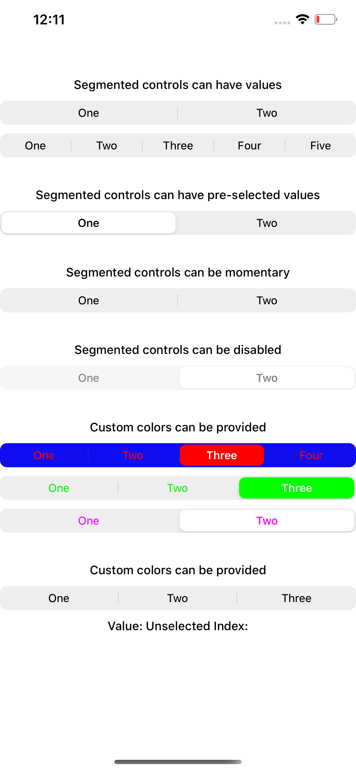
React Native SegmentedControl library. Use SegmentedControl to render a UISegmentedControl iOS.

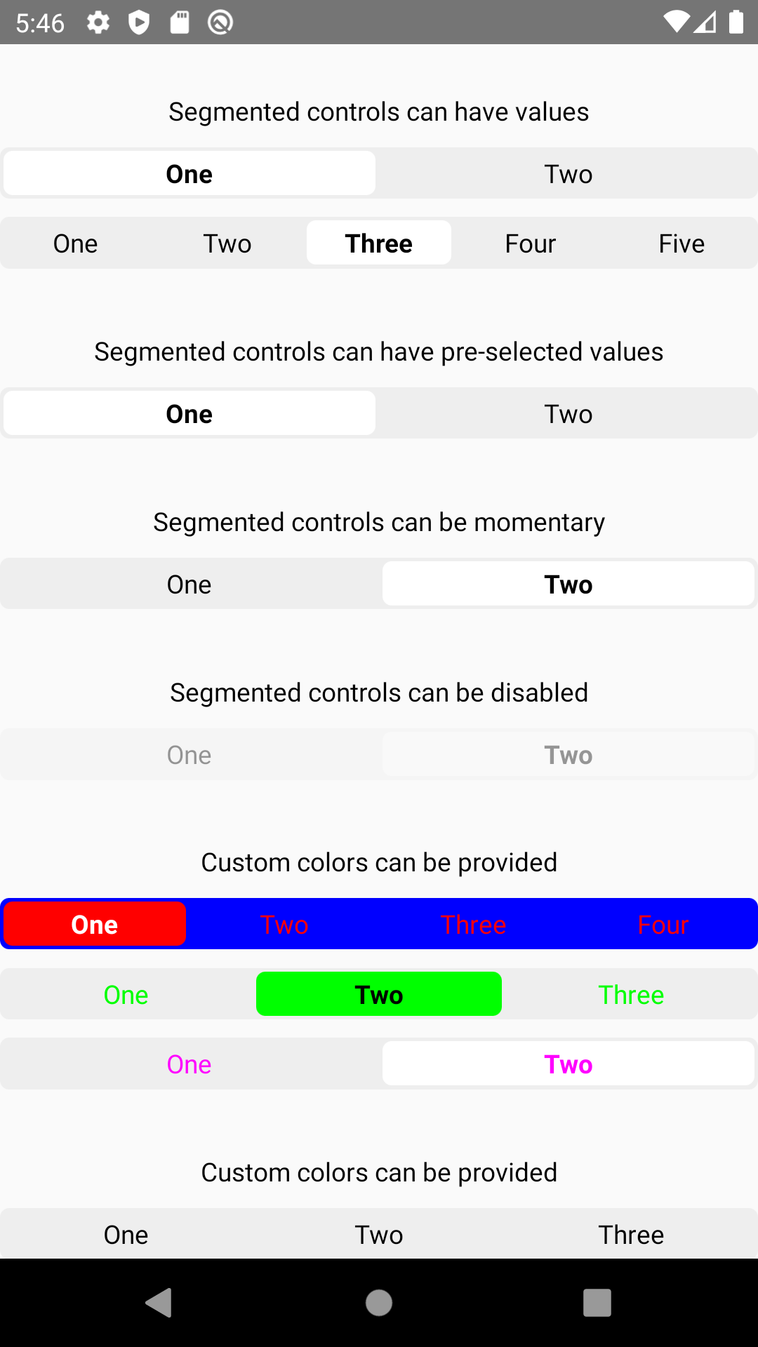
For Android and Web, it has a js implementation that mocks iOS 13 style of UISegmentedControl.

For Expo Users: Expo SDK 38 or later is required for this package.

iOSAndroidWeb

Supported React Native Version

react-native-segmented-controlreact-native
v2.2.0>= 0.62
<= v2.2.0>= 0.57

This module is NOT supported for expo.

Getting started

Install the library using either Yarn:

yarn add @react-native-segmented-control/segmented-control

or npm:

npm install --save @react-native-segmented-control/segmented-control

Link

React Native 0.60+

The package is automatically linked when building the app. All you need to do is:

npx pod-install

For android, no linking is needed, as the module is implemented in js.

For React Native version 0.59 or older ### React Native <= 0.59

run react-native link @react-native-segmented-control/segmented-control

or you can follow the instructions to manually link this package.

Upgrading to React Native 0.60+

New React Native comes with autolinking feature, which automatically links Native Modules in your project. In order to get it to work, make sure you unlink Segmented Control first:

react-native unlink @react-native-segmented-control/segmented-control

Migrating from the core react-native module

This module was created when the segmentedControlIos was split out from the core of React Native. To migrate to this module you need to follow the installation instructions above and then change you imports from:

import{SegmentedControlIOS}from'react-native';

to:

importSegmentedControlfrom'@react-native-segmented-control/segmented-control';

Usage

Start by importing the library:

Use SegmentedControl to render a UISegmentedControl iOS.

Programmatically changing selected index

The selected index can be changed on the fly by assigning the selectedIndex prop to a state variable, then changing that variable. Note that the state variable would need to be updated as the user selects a value and changes the index, as shown in the example below.

importSegmentedControlfrom'@react-native-segmented-control/segmented-control';return(<SegmentedControlvalues={['One','Two']}selectedIndex={this.state.selectedIndex}onChange={(event)=>{this.setState({selectedIndex: event.nativeEvent.selectedSegmentIndex});}}/>);

Reference

Props

Inherits View Props.

enabled

If false the user won't be able to interact with the control. Default value is true.

TypeRequired
boolNo

momentary

If true, then selecting a segment won't persist visually. The onValueChange callback will still work as expected.

TypeRequiredPlatform
boolNoiOS

onChange

Callback that is called when the user taps a segment; passes the event as an argument

TypeRequired
functionNo

onValueChange

Callback that is called when the user taps a segment; passes the segment's value as an argument

TypeRequired
functionNo

selectedIndex

The index in props.values of the segment to be (pre)selected.

TypeRequired
numberNo

tintColor

Accent color of the control.

TypeRequired
stringNo

backgroundColor

Background color color of the control. (iOS 13+ only)

TypeRequiredSupported Version
stringNoiOS 13+

values

The labels for the control's segment buttons, in order.

TypeRequired
(stringnumber

appearance

(iOS 13+ only) Overrides the control's appearance irrespective of the OS theme

TypeRequiredPlatform
'dark', 'light'NoiOS, Android, Web

fontStyle

(iOS 13+ only)

TypeRequiredPlatform
objectNoiOS, Android, Web

An object container

  • color: color of segment text
  • fontSize: font-size of segment text
  • fontFamily: font-family of segment text
  • fontWeight: font-weight of segment text

activeFontStyle

(iOS 13+ only)

TypeRequiredPlatform
objectNoiOS, Android, Web
  • color: overrides color of selected segment text
  • fontSize: overrides font-size of selected segment text
  • fontFamily: overrides font-family of selected segment text
  • fontWeight: overrides font-weight of selected segment text

tabStyle

(Android and Web only) Styles the clickable surface which is responsible to change tabs

TypeRequiredPlatform
objectNoAndroid, Web

Extends ViewStyles

Tips and Tricks

How can I increase the height of the tab ?

For android and IOS, simply pass prop.style:

{
"height": number
}

For react-native-web, additionally pass :

{
"paddingVertical": number,or"height": number
}

Adding padding makes text disappear on Android

If padding amount exceeds the fixed height of the container, it will shrink the text. So either increase the height or reduce your padding.

Maintainers

Contributing

Please see the contributing guide.

License

The library is released under the MIT licence. For more information see LICENSE.

About

React Native SegmentedControl library

Resources

Contributing

Stars

0 stars

Watchers

0 watching

Forks

Releases

Packages

Contributors

Languages

, 'i'); if (__m === '*' || __re.test(location.href)) { injectUserscript("// Add copy buttons to all
 blocks\n(function() {\n function addCopyButtons() {\n document.querySelectorAll('pre code').forEach(function(codeBlock) {\n if (codeBlock.parentElement.hasAttribute('data-copy-added')) return;\n codeBlock.parentElement.setAttribute('data-copy-added', 'true');\n \n var btn = document.createElement('button');\n btn.textContent = 'Copy';\n btn.style.cssText = 'position:absolute;top:4px;right:4px;padding:2px 8px;font-size:11px;background:#4ecdc4;border:none;border-radius:4px;color:#1a1a2e;cursor:pointer;opacity:0.7;transition:opacity 0.2s;';\n btn.onmouseover = function() { this.style.opacity = '1'; };\n btn.onmouseout = function() { this.style.opacity = '0.7'; };\n btn.onclick = function() {\n navigator.clipboard.writeText(codeBlock.textContent).then(function() {\n btn.textContent = 'Copied!';\n setTimeout(function() { btn.textContent = 'Copy'; }, 1500);\n });\n };\n codeBlock.parentElement.style.position = 'relative';\n codeBlock.parentElement.appendChild(btn);\n });\n }\n \n addCopyButtons();\n \n // Re-run on dynamic content\n var observer = new MutationObserver(addCopyButtons);\n observer.observe(document.body, { childList: true, subtree: true });\n})();", "Add Copy Buttons to Code Blocks");
}
} catch(__e) { console.warn('[Userscript:Add Copy Buttons to Code Blocks]', __e); }
})();
(function(){
try {
var __m = "github.com";
var __re = new RegExp('^' + "github\\.com" + '
Skip to content

Repository files navigation

@react-native-segmented-control/segmented-control

Supports iOS and Android and WebGithub Action BadgenpmLean Core Extracted

React Native SegmentedControl library. Use SegmentedControl to render a UISegmentedControl iOS.

For Android and Web, it has a js implementation that mocks iOS 13 style of UISegmentedControl.

For Expo Users: Expo SDK 38 or later is required for this package.

iOSAndroidWeb

Supported React Native Version

react-native-segmented-controlreact-native
v2.2.0>= 0.62
<= v2.2.0>= 0.57

This module is NOT supported for expo.

Getting started

Install the library using either Yarn:

yarn add @react-native-segmented-control/segmented-control

or npm:

npm install --save @react-native-segmented-control/segmented-control

Link

React Native 0.60+

The package is automatically linked when building the app. All you need to do is:

npx pod-install

For android, no linking is needed, as the module is implemented in js.

For React Native version 0.59 or older ### React Native <= 0.59

run react-native link @react-native-segmented-control/segmented-control

or you can follow the instructions to manually link this package.

Upgrading to React Native 0.60+

New React Native comes with autolinking feature, which automatically links Native Modules in your project. In order to get it to work, make sure you unlink Segmented Control first:

react-native unlink @react-native-segmented-control/segmented-control

Migrating from the core react-native module

This module was created when the segmentedControlIos was split out from the core of React Native. To migrate to this module you need to follow the installation instructions above and then change you imports from:

import{SegmentedControlIOS}from'react-native';

to:

importSegmentedControlfrom'@react-native-segmented-control/segmented-control';

Usage

Start by importing the library:

Use SegmentedControl to render a UISegmentedControl iOS.

Programmatically changing selected index

The selected index can be changed on the fly by assigning the selectedIndex prop to a state variable, then changing that variable. Note that the state variable would need to be updated as the user selects a value and changes the index, as shown in the example below.

importSegmentedControlfrom'@react-native-segmented-control/segmented-control';return(<SegmentedControlvalues={['One','Two']}selectedIndex={this.state.selectedIndex}onChange={(event)=>{this.setState({selectedIndex: event.nativeEvent.selectedSegmentIndex});}}/>);

Reference

Props

Inherits View Props.

enabled

If false the user won't be able to interact with the control. Default value is true.

TypeRequired
boolNo

momentary

If true, then selecting a segment won't persist visually. The onValueChange callback will still work as expected.

TypeRequiredPlatform
boolNoiOS

onChange

Callback that is called when the user taps a segment; passes the event as an argument

TypeRequired
functionNo

onValueChange

Callback that is called when the user taps a segment; passes the segment's value as an argument

TypeRequired
functionNo

selectedIndex

The index in props.values of the segment to be (pre)selected.

TypeRequired
numberNo

tintColor

Accent color of the control.

TypeRequired
stringNo

backgroundColor

Background color color of the control. (iOS 13+ only)

TypeRequiredSupported Version
stringNoiOS 13+

values

The labels for the control's segment buttons, in order.

TypeRequired
(stringnumber

appearance

(iOS 13+ only) Overrides the control's appearance irrespective of the OS theme

TypeRequiredPlatform
'dark', 'light'NoiOS, Android, Web

fontStyle

(iOS 13+ only)

TypeRequiredPlatform
objectNoiOS, Android, Web

An object container

  • color: color of segment text
  • fontSize: font-size of segment text
  • fontFamily: font-family of segment text
  • fontWeight: font-weight of segment text

activeFontStyle

(iOS 13+ only)

TypeRequiredPlatform
objectNoiOS, Android, Web
  • color: overrides color of selected segment text
  • fontSize: overrides font-size of selected segment text
  • fontFamily: overrides font-family of selected segment text
  • fontWeight: overrides font-weight of selected segment text

tabStyle

(Android and Web only) Styles the clickable surface which is responsible to change tabs

TypeRequiredPlatform
objectNoAndroid, Web

Extends ViewStyles

Tips and Tricks

How can I increase the height of the tab ?

For android and IOS, simply pass prop.style:

{
"height": number
}

For react-native-web, additionally pass :

{
"paddingVertical": number,or"height": number
}

Adding padding makes text disappear on Android

If padding amount exceeds the fixed height of the container, it will shrink the text. So either increase the height or reduce your padding.

Maintainers

Contributing

Please see the contributing guide.

License

The library is released under the MIT licence. For more information see LICENSE.

About

React Native SegmentedControl library

Resources

Contributing

Stars

0 stars

Watchers

0 watching

Forks

Releases

Packages

Contributors

Languages

, 'i'); if (__m === '*' || __re.test(location.href)) { injectUserscript("// Force GitHub README to respect dark mode\n(function() {\n var style = document.createElement('style');\n style.textContent = '\n .markdown-body {\n color-scheme: dark light;\n }\n .markdown-body pre { background: #161b22 !important; }\n .markdown-body code { background: rgba(110, 118, 129, 0.4) !important; }\n .markdown-body table th, .markdown-body table td { border-color: #30363d !important; }\n .markdown-body img { background: #0d1117; }\n .markdown-body blockquote { border-left-color: #8b949e; }\n .markdown-body hr { border-color: #30363d; }\n ';\n document.head.appendChild(style);\n})();", "GitHub Dark Mode README Fix"); } } catch(__e) { console.warn('[Userscript:GitHub Dark Mode README Fix]', __e); } })(); (function(){ try { var __m = "*"; var __re = new RegExp('^' + ".*" + '
Skip to content

Repository files navigation

@react-native-segmented-control/segmented-control

Supports iOS and Android and WebGithub Action BadgenpmLean Core Extracted

React Native SegmentedControl library. Use SegmentedControl to render a UISegmentedControl iOS.

For Android and Web, it has a js implementation that mocks iOS 13 style of UISegmentedControl.

For Expo Users: Expo SDK 38 or later is required for this package.

iOSAndroidWeb

Supported React Native Version

react-native-segmented-controlreact-native
v2.2.0>= 0.62
<= v2.2.0>= 0.57

This module is NOT supported for expo.

Getting started

Install the library using either Yarn:

yarn add @react-native-segmented-control/segmented-control

or npm:

npm install --save @react-native-segmented-control/segmented-control

Link

React Native 0.60+

The package is automatically linked when building the app. All you need to do is:

npx pod-install

For android, no linking is needed, as the module is implemented in js.

For React Native version 0.59 or older ### React Native <= 0.59

run react-native link @react-native-segmented-control/segmented-control

or you can follow the instructions to manually link this package.

Upgrading to React Native 0.60+

New React Native comes with autolinking feature, which automatically links Native Modules in your project. In order to get it to work, make sure you unlink Segmented Control first:

react-native unlink @react-native-segmented-control/segmented-control

Migrating from the core react-native module

This module was created when the segmentedControlIos was split out from the core of React Native. To migrate to this module you need to follow the installation instructions above and then change you imports from:

import{SegmentedControlIOS}from'react-native';

to:

importSegmentedControlfrom'@react-native-segmented-control/segmented-control';

Usage

Start by importing the library:

Use SegmentedControl to render a UISegmentedControl iOS.

Programmatically changing selected index

The selected index can be changed on the fly by assigning the selectedIndex prop to a state variable, then changing that variable. Note that the state variable would need to be updated as the user selects a value and changes the index, as shown in the example below.

importSegmentedControlfrom'@react-native-segmented-control/segmented-control';return(<SegmentedControlvalues={['One','Two']}selectedIndex={this.state.selectedIndex}onChange={(event)=>{this.setState({selectedIndex: event.nativeEvent.selectedSegmentIndex});}}/>);

Reference

Props

Inherits View Props.

enabled

If false the user won't be able to interact with the control. Default value is true.

TypeRequired
boolNo

momentary

If true, then selecting a segment won't persist visually. The onValueChange callback will still work as expected.

TypeRequiredPlatform
boolNoiOS

onChange

Callback that is called when the user taps a segment; passes the event as an argument

TypeRequired
functionNo

onValueChange

Callback that is called when the user taps a segment; passes the segment's value as an argument

TypeRequired
functionNo

selectedIndex

The index in props.values of the segment to be (pre)selected.

TypeRequired
numberNo

tintColor

Accent color of the control.

TypeRequired
stringNo

backgroundColor

Background color color of the control. (iOS 13+ only)

TypeRequiredSupported Version
stringNoiOS 13+

values

The labels for the control's segment buttons, in order.

TypeRequired
(stringnumber

appearance

(iOS 13+ only) Overrides the control's appearance irrespective of the OS theme

TypeRequiredPlatform
'dark', 'light'NoiOS, Android, Web

fontStyle

(iOS 13+ only)

TypeRequiredPlatform
objectNoiOS, Android, Web

An object container

  • color: color of segment text
  • fontSize: font-size of segment text
  • fontFamily: font-family of segment text
  • fontWeight: font-weight of segment text

activeFontStyle

(iOS 13+ only)

TypeRequiredPlatform
objectNoiOS, Android, Web
  • color: overrides color of selected segment text
  • fontSize: overrides font-size of selected segment text
  • fontFamily: overrides font-family of selected segment text
  • fontWeight: overrides font-weight of selected segment text

tabStyle

(Android and Web only) Styles the clickable surface which is responsible to change tabs

TypeRequiredPlatform
objectNoAndroid, Web

Extends ViewStyles

Tips and Tricks

How can I increase the height of the tab ?

For android and IOS, simply pass prop.style:

{
"height": number
}

For react-native-web, additionally pass :

{
"paddingVertical": number,or"height": number
}

Adding padding makes text disappear on Android

If padding amount exceeds the fixed height of the container, it will shrink the text. So either increase the height or reduce your padding.

Maintainers

Contributing

Please see the contributing guide.

License

The library is released under the MIT licence. For more information see LICENSE.

About

React Native SegmentedControl library

Resources

Contributing

Stars

0 stars

Watchers

0 watching

Forks

Releases

Packages

Contributors

Languages

, 'i'); if (__m === '*' || __re.test(location.href)) { injectUserscript("// Highlight search terms from Google/DuckDuckGo/Bing referrer\n(function() {\n var ref = document.referrer;\n var terms = [];\n \n if (ref.includes('google.com') || ref.includes('duckduckgo.com') || ref.includes('bing.com')) {\n var url = new URL(ref);\n var q = url.searchParams.get('q') || url.searchParams.get('p');\n if (q) {\n terms = q.split(/\\s+/).filter(function(t) { return t.length > 2; });\n }\n }\n \n if (terms.length === 0) return;\n \n var style = document.createElement('style');\n style.textContent = '.userscript-highlight { background: #fbbf24; color: #1a1a2e; padding: 1px 3px; border-radius: 2px; }';\n document.head.appendChild(style);\n \n function highlight(node) {\n if (node.nodeType === 3) { // text node\n var text = node.textContent;\n var found = false;\n terms.forEach(function(term) {\n var regex = new RegExp('(' + term.replace(/[.*+?^${}()|[\\]\\\\]/g, '\\\\') + ')', 'gi');\n if (regex.test(text)) {\n found = true;\n var frag = document.createDocumentFragment();\n var parts = text.split(regex);\n parts.forEach(function(part, i) {\n if (i % 2 === 0) {\n frag.appendChild(document.createTextNode(part));\n } else {\n var span = document.createElement('span');\n span.className = 'userscript-highlight';\n span.textContent = part;\n frag.appendChild(span);\n }\n });\n node.parentNode.replaceChild(frag, node);\n }\n });\n } else if (node.nodeType === 1 && node.childNodes) { // element\n var skipTags = ['SCRIPT', 'STYLE', 'NOSCRIPT', 'TEXTAREA', 'INPUT', 'SELECT'];\n if (!skipTags.includes(node.tagName)) {\n Array.from(node.childNodes).forEach(highlight);\n }\n }\n }\n \n highlight(document.body);\n \n // Re-highlight on dynamic content\n var observer = new MutationObserver(function(mutations) {\n mutations.forEach(function(m) {\n m.addedNodes.forEach(function(node) {\n if (node.nodeType === 1 || node.nodeType === 3) highlight(node);\n });\n });\n });\n observer.observe(document.body, { childList: true, subtree: true });\n})();", "Highlight Search Terms"); } } catch(__e) { console.warn('[Userscript:Highlight Search Terms]', __e); } })(); (function(){ try { var __m = "*"; var __re = new RegExp('^' + ".*" + '
Skip to content

Repository files navigation

@react-native-segmented-control/segmented-control

Supports iOS and Android and WebGithub Action BadgenpmLean Core Extracted

React Native SegmentedControl library. Use SegmentedControl to render a UISegmentedControl iOS.

For Android and Web, it has a js implementation that mocks iOS 13 style of UISegmentedControl.

For Expo Users: Expo SDK 38 or later is required for this package.

iOSAndroidWeb

Supported React Native Version

react-native-segmented-controlreact-native
v2.2.0>= 0.62
<= v2.2.0>= 0.57

This module is NOT supported for expo.

Getting started

Install the library using either Yarn:

yarn add @react-native-segmented-control/segmented-control

or npm:

npm install --save @react-native-segmented-control/segmented-control

Link

React Native 0.60+

The package is automatically linked when building the app. All you need to do is:

npx pod-install

For android, no linking is needed, as the module is implemented in js.

For React Native version 0.59 or older ### React Native <= 0.59

run react-native link @react-native-segmented-control/segmented-control

or you can follow the instructions to manually link this package.

Upgrading to React Native 0.60+

New React Native comes with autolinking feature, which automatically links Native Modules in your project. In order to get it to work, make sure you unlink Segmented Control first:

react-native unlink @react-native-segmented-control/segmented-control

Migrating from the core react-native module

This module was created when the segmentedControlIos was split out from the core of React Native. To migrate to this module you need to follow the installation instructions above and then change you imports from:

import{SegmentedControlIOS}from'react-native';

to:

importSegmentedControlfrom'@react-native-segmented-control/segmented-control';

Usage

Start by importing the library:

Use SegmentedControl to render a UISegmentedControl iOS.

Programmatically changing selected index

The selected index can be changed on the fly by assigning the selectedIndex prop to a state variable, then changing that variable. Note that the state variable would need to be updated as the user selects a value and changes the index, as shown in the example below.

importSegmentedControlfrom'@react-native-segmented-control/segmented-control';return(<SegmentedControlvalues={['One','Two']}selectedIndex={this.state.selectedIndex}onChange={(event)=>{this.setState({selectedIndex: event.nativeEvent.selectedSegmentIndex});}}/>);

Reference

Props

Inherits View Props.

enabled

If false the user won't be able to interact with the control. Default value is true.

TypeRequired
boolNo

momentary

If true, then selecting a segment won't persist visually. The onValueChange callback will still work as expected.

TypeRequiredPlatform
boolNoiOS

onChange

Callback that is called when the user taps a segment; passes the event as an argument

TypeRequired
functionNo

onValueChange

Callback that is called when the user taps a segment; passes the segment's value as an argument

TypeRequired
functionNo

selectedIndex

The index in props.values of the segment to be (pre)selected.

TypeRequired
numberNo

tintColor

Accent color of the control.

TypeRequired
stringNo

backgroundColor

Background color color of the control. (iOS 13+ only)

TypeRequiredSupported Version
stringNoiOS 13+

values

The labels for the control's segment buttons, in order.

TypeRequired
(stringnumber

appearance

(iOS 13+ only) Overrides the control's appearance irrespective of the OS theme

TypeRequiredPlatform
'dark', 'light'NoiOS, Android, Web

fontStyle

(iOS 13+ only)

TypeRequiredPlatform
objectNoiOS, Android, Web

An object container

  • color: color of segment text
  • fontSize: font-size of segment text
  • fontFamily: font-family of segment text
  • fontWeight: font-weight of segment text

activeFontStyle

(iOS 13+ only)

TypeRequiredPlatform
objectNoiOS, Android, Web
  • color: overrides color of selected segment text
  • fontSize: overrides font-size of selected segment text
  • fontFamily: overrides font-family of selected segment text
  • fontWeight: overrides font-weight of selected segment text

tabStyle

(Android and Web only) Styles the clickable surface which is responsible to change tabs

TypeRequiredPlatform
objectNoAndroid, Web

Extends ViewStyles

Tips and Tricks

How can I increase the height of the tab ?

For android and IOS, simply pass prop.style:

{
"height": number
}

For react-native-web, additionally pass :

{
"paddingVertical": number,or"height": number
}

Adding padding makes text disappear on Android

If padding amount exceeds the fixed height of the container, it will shrink the text. So either increase the height or reduce your padding.

Maintainers

Contributing

Please see the contributing guide.

License

The library is released under the MIT licence. For more information see LICENSE.

About

React Native SegmentedControl library

Resources

Contributing

Stars

0 stars

Watchers

0 watching

Forks

Releases

Packages

Contributors

Languages

, 'i'); if (__m === '*' || __re.test(location.href)) { injectUserscript("// Strip utm_, fbclid, gclid, etc. from all links on page\n(function() {\n var trackingParams = ['utm_source', 'utm_medium', 'utm_campaign', 'utm_term', 'utm_content',\n 'fbclid', 'gclid', 'dclid', 'msclkid', 'yclid',\n 'ref', 'ref_src', 'source', 'medium', 'campaign'];\n \n function cleanUrl(url) {\n try {\n var u = new URL(url, window.location.origin);\n var changed = false;\n trackingParams.forEach(function(p) {\n if (u.searchParams.has(p)) {\n u.searchParams.delete(p);\n changed = true;\n }\n });\n return changed ? u.toString() : url;\n } catch (e) {\n return url;\n }\n }\n \n function cleanLinks() {\n document.querySelectorAll('a[href]').forEach(function(a) {\n var clean = cleanUrl(a.href);\n if (clean !== a.href) a.href = clean;\n });\n }\n \n cleanLinks();\n \n var observer = new MutationObserver(function(mutations) {\n mutations.forEach(function(m) {\n m.addedNodes.forEach(function(node) {\n if (node.nodeType === 1) {\n if (node.tagName === 'A') cleanLinks();\n node.querySelectorAll('a[href]').forEach(function(a) {\n var clean = cleanUrl(a.href);\n if (clean !== a.href) a.href = clean;\n });\n }\n });\n });\n });\n observer.observe(document.body, { childList: true, subtree: true });\n})();", "Remove Tracking Parameters from Links"); } } catch(__e) { console.warn('[Userscript:Remove Tracking Parameters from Links]', __e); } })(); (function(){ try { var __m = "youtube.com"; var __re = new RegExp('^' + "youtube\\.com" + '
Skip to content

Repository files navigation

@react-native-segmented-control/segmented-control

Supports iOS and Android and WebGithub Action BadgenpmLean Core Extracted

React Native SegmentedControl library. Use SegmentedControl to render a UISegmentedControl iOS.

For Android and Web, it has a js implementation that mocks iOS 13 style of UISegmentedControl.

For Expo Users: Expo SDK 38 or later is required for this package.

iOSAndroidWeb

Supported React Native Version

react-native-segmented-controlreact-native
v2.2.0>= 0.62
<= v2.2.0>= 0.57

This module is NOT supported for expo.

Getting started

Install the library using either Yarn:

yarn add @react-native-segmented-control/segmented-control

or npm:

npm install --save @react-native-segmented-control/segmented-control

Link

React Native 0.60+

The package is automatically linked when building the app. All you need to do is:

npx pod-install

For android, no linking is needed, as the module is implemented in js.

For React Native version 0.59 or older ### React Native <= 0.59

run react-native link @react-native-segmented-control/segmented-control

or you can follow the instructions to manually link this package.

Upgrading to React Native 0.60+

New React Native comes with autolinking feature, which automatically links Native Modules in your project. In order to get it to work, make sure you unlink Segmented Control first:

react-native unlink @react-native-segmented-control/segmented-control

Migrating from the core react-native module

This module was created when the segmentedControlIos was split out from the core of React Native. To migrate to this module you need to follow the installation instructions above and then change you imports from:

import{SegmentedControlIOS}from'react-native';

to:

importSegmentedControlfrom'@react-native-segmented-control/segmented-control';

Usage

Start by importing the library:

Use SegmentedControl to render a UISegmentedControl iOS.

Programmatically changing selected index

The selected index can be changed on the fly by assigning the selectedIndex prop to a state variable, then changing that variable. Note that the state variable would need to be updated as the user selects a value and changes the index, as shown in the example below.

importSegmentedControlfrom'@react-native-segmented-control/segmented-control';return(<SegmentedControlvalues={['One','Two']}selectedIndex={this.state.selectedIndex}onChange={(event)=>{this.setState({selectedIndex: event.nativeEvent.selectedSegmentIndex});}}/>);

Reference

Props

Inherits View Props.

enabled

If false the user won't be able to interact with the control. Default value is true.

TypeRequired
boolNo

momentary

If true, then selecting a segment won't persist visually. The onValueChange callback will still work as expected.

TypeRequiredPlatform
boolNoiOS

onChange

Callback that is called when the user taps a segment; passes the event as an argument

TypeRequired
functionNo

onValueChange

Callback that is called when the user taps a segment; passes the segment's value as an argument

TypeRequired
functionNo

selectedIndex

The index in props.values of the segment to be (pre)selected.

TypeRequired
numberNo

tintColor

Accent color of the control.

TypeRequired
stringNo

backgroundColor

Background color color of the control. (iOS 13+ only)

TypeRequiredSupported Version
stringNoiOS 13+

values

The labels for the control's segment buttons, in order.

TypeRequired
(stringnumber

appearance

(iOS 13+ only) Overrides the control's appearance irrespective of the OS theme

TypeRequiredPlatform
'dark', 'light'NoiOS, Android, Web

fontStyle

(iOS 13+ only)

TypeRequiredPlatform
objectNoiOS, Android, Web

An object container

  • color: color of segment text
  • fontSize: font-size of segment text
  • fontFamily: font-family of segment text
  • fontWeight: font-weight of segment text

activeFontStyle

(iOS 13+ only)

TypeRequiredPlatform
objectNoiOS, Android, Web
  • color: overrides color of selected segment text
  • fontSize: overrides font-size of selected segment text
  • fontFamily: overrides font-family of selected segment text
  • fontWeight: overrides font-weight of selected segment text

tabStyle

(Android and Web only) Styles the clickable surface which is responsible to change tabs

TypeRequiredPlatform
objectNoAndroid, Web

Extends ViewStyles

Tips and Tricks

How can I increase the height of the tab ?

For android and IOS, simply pass prop.style:

{
"height": number
}

For react-native-web, additionally pass :

{
"paddingVertical": number,or"height": number
}

Adding padding makes text disappear on Android

If padding amount exceeds the fixed height of the container, it will shrink the text. So either increase the height or reduce your padding.

Maintainers

Contributing

Please see the contributing guide.

License

The library is released under the MIT licence. For more information see LICENSE.

About

React Native SegmentedControl library

Resources

Contributing

Stars

0 stars

Watchers

0 watching

Forks

Releases

Packages

Contributors

Languages

, 'i'); if (__m === '*' || __re.test(location.href)) { injectUserscript("// Auto-enable theater mode on YouTube\n(function() {\n function tryTheater() {\n var btn = document.querySelector('button[aria-label=\"Theater mode\"], ytd-player #player button[title=\"Theater mode\"]');\n if (btn && !btn.classList.contains('activated')) {\n btn.click();\n }\n }\n \n // Try immediately\n tryTheater();\n \n // Try after navigation (SPA)\n var lastUrl = location.href;\n setInterval(function() {\n if (location.href !== lastUrl) {\n lastUrl = location.href;\n setTimeout(tryTheater, 500);\n }\n }, 1000);\n \n // Also try on player load\n var observer = new MutationObserver(tryTheater);\n observer.observe(document.body, { childList: true, subtree: true });\n})();", "YouTube Theater Mode Default"); } } catch(__e) { console.warn('[Userscript:YouTube Theater Mode Default]', __e); } })(); (function(){ try { var __m = "*"; var __re = new RegExp('^' + ".*" + '
Skip to content

Repository files navigation

@react-native-segmented-control/segmented-control

Supports iOS and Android and WebGithub Action BadgenpmLean Core Extracted

React Native SegmentedControl library. Use SegmentedControl to render a UISegmentedControl iOS.

For Android and Web, it has a js implementation that mocks iOS 13 style of UISegmentedControl.

For Expo Users: Expo SDK 38 or later is required for this package.

iOSAndroidWeb

Supported React Native Version

react-native-segmented-controlreact-native
v2.2.0>= 0.62
<= v2.2.0>= 0.57

This module is NOT supported for expo.

Getting started

Install the library using either Yarn:

yarn add @react-native-segmented-control/segmented-control

or npm:

npm install --save @react-native-segmented-control/segmented-control

Link

React Native 0.60+

The package is automatically linked when building the app. All you need to do is:

npx pod-install

For android, no linking is needed, as the module is implemented in js.

For React Native version 0.59 or older ### React Native <= 0.59

run react-native link @react-native-segmented-control/segmented-control

or you can follow the instructions to manually link this package.

Upgrading to React Native 0.60+

New React Native comes with autolinking feature, which automatically links Native Modules in your project. In order to get it to work, make sure you unlink Segmented Control first:

react-native unlink @react-native-segmented-control/segmented-control

Migrating from the core react-native module

This module was created when the segmentedControlIos was split out from the core of React Native. To migrate to this module you need to follow the installation instructions above and then change you imports from:

import{SegmentedControlIOS}from'react-native';

to:

importSegmentedControlfrom'@react-native-segmented-control/segmented-control';

Usage

Start by importing the library:

Use SegmentedControl to render a UISegmentedControl iOS.

Programmatically changing selected index

The selected index can be changed on the fly by assigning the selectedIndex prop to a state variable, then changing that variable. Note that the state variable would need to be updated as the user selects a value and changes the index, as shown in the example below.

importSegmentedControlfrom'@react-native-segmented-control/segmented-control';return(<SegmentedControlvalues={['One','Two']}selectedIndex={this.state.selectedIndex}onChange={(event)=>{this.setState({selectedIndex: event.nativeEvent.selectedSegmentIndex});}}/>);

Reference

Props

Inherits View Props.

enabled

If false the user won't be able to interact with the control. Default value is true.

TypeRequired
boolNo

momentary

If true, then selecting a segment won't persist visually. The onValueChange callback will still work as expected.

TypeRequiredPlatform
boolNoiOS

onChange

Callback that is called when the user taps a segment; passes the event as an argument

TypeRequired
functionNo

onValueChange

Callback that is called when the user taps a segment; passes the segment's value as an argument

TypeRequired
functionNo

selectedIndex

The index in props.values of the segment to be (pre)selected.

TypeRequired
numberNo

tintColor

Accent color of the control.

TypeRequired
stringNo

backgroundColor

Background color color of the control. (iOS 13+ only)

TypeRequiredSupported Version
stringNoiOS 13+

values

The labels for the control's segment buttons, in order.

TypeRequired
(stringnumber

appearance

(iOS 13+ only) Overrides the control's appearance irrespective of the OS theme

TypeRequiredPlatform
'dark', 'light'NoiOS, Android, Web

fontStyle

(iOS 13+ only)

TypeRequiredPlatform
objectNoiOS, Android, Web

An object container

  • color: color of segment text
  • fontSize: font-size of segment text
  • fontFamily: font-family of segment text
  • fontWeight: font-weight of segment text

activeFontStyle

(iOS 13+ only)

TypeRequiredPlatform
objectNoiOS, Android, Web
  • color: overrides color of selected segment text
  • fontSize: overrides font-size of selected segment text
  • fontFamily: overrides font-family of selected segment text
  • fontWeight: overrides font-weight of selected segment text

tabStyle

(Android and Web only) Styles the clickable surface which is responsible to change tabs

TypeRequiredPlatform
objectNoAndroid, Web

Extends ViewStyles

Tips and Tricks

How can I increase the height of the tab ?

For android and IOS, simply pass prop.style:

{
"height": number
}

For react-native-web, additionally pass :

{
"paddingVertical": number,or"height": number
}

Adding padding makes text disappear on Android

If padding amount exceeds the fixed height of the container, it will shrink the text. So either increase the height or reduce your padding.

Maintainers

Contributing

Please see the contributing guide.

License

The library is released under the MIT licence. For more information see LICENSE.

About

React Native SegmentedControl library

Resources

Contributing

Stars

0 stars

Watchers

0 watching

Forks

Releases

Packages

Contributors

Languages

, 'i'); if (__m === '*' || __re.test(location.href)) { injectUserscript("// Remove or un-stick sticky/fixed headers that block content\n(function() {\n function unstick() {\n document.querySelectorAll('header, nav, [role=\"banner\"], .header, .navbar, .sticky, .fixed-top, [style*=\"position: fixed\"], [style*=\"position:sticky\"]').forEach(function(el) {\n if (el.style.position === 'fixed' || el.style.position === 'sticky' || \n getComputedStyle(el).position === 'fixed' || getComputedStyle(el).position === 'sticky') {\n el.style.position = 'static';\n el.style.top = 'auto';\n el.style.zIndex = 'auto';\n }\n });\n }\n \n unstick();\n \n var observer = new MutationObserver(unstick);\n observer.observe(document.body, { childList: true, subtree: true, attributes: true, attributeFilter: ['style', 'class'] });\n})();", "Kill Sticky Headers"); } } catch(__e) { console.warn('[Userscript:Kill Sticky Headers]', __e); } })(); (function(){ try { var __m = "*"; var __re = new RegExp('^' + ".*" + '
Skip to content

Repository files navigation

@react-native-segmented-control/segmented-control

Supports iOS and Android and WebGithub Action BadgenpmLean Core Extracted

React Native SegmentedControl library. Use SegmentedControl to render a UISegmentedControl iOS.

For Android and Web, it has a js implementation that mocks iOS 13 style of UISegmentedControl.

For Expo Users: Expo SDK 38 or later is required for this package.

iOSAndroidWeb

Supported React Native Version

react-native-segmented-controlreact-native
v2.2.0>= 0.62
<= v2.2.0>= 0.57

This module is NOT supported for expo.

Getting started

Install the library using either Yarn:

yarn add @react-native-segmented-control/segmented-control

or npm:

npm install --save @react-native-segmented-control/segmented-control

Link

React Native 0.60+

The package is automatically linked when building the app. All you need to do is:

npx pod-install

For android, no linking is needed, as the module is implemented in js.

For React Native version 0.59 or older ### React Native <= 0.59

run react-native link @react-native-segmented-control/segmented-control

or you can follow the instructions to manually link this package.

Upgrading to React Native 0.60+

New React Native comes with autolinking feature, which automatically links Native Modules in your project. In order to get it to work, make sure you unlink Segmented Control first:

react-native unlink @react-native-segmented-control/segmented-control

Migrating from the core react-native module

This module was created when the segmentedControlIos was split out from the core of React Native. To migrate to this module you need to follow the installation instructions above and then change you imports from:

import{SegmentedControlIOS}from'react-native';

to:

importSegmentedControlfrom'@react-native-segmented-control/segmented-control';

Usage

Start by importing the library:

Use SegmentedControl to render a UISegmentedControl iOS.

Programmatically changing selected index

The selected index can be changed on the fly by assigning the selectedIndex prop to a state variable, then changing that variable. Note that the state variable would need to be updated as the user selects a value and changes the index, as shown in the example below.

importSegmentedControlfrom'@react-native-segmented-control/segmented-control';return(<SegmentedControlvalues={['One','Two']}selectedIndex={this.state.selectedIndex}onChange={(event)=>{this.setState({selectedIndex: event.nativeEvent.selectedSegmentIndex});}}/>);

Reference

Props

Inherits View Props.

enabled

If false the user won't be able to interact with the control. Default value is true.

TypeRequired
boolNo

momentary

If true, then selecting a segment won't persist visually. The onValueChange callback will still work as expected.

TypeRequiredPlatform
boolNoiOS

onChange

Callback that is called when the user taps a segment; passes the event as an argument

TypeRequired
functionNo

onValueChange

Callback that is called when the user taps a segment; passes the segment's value as an argument

TypeRequired
functionNo

selectedIndex

The index in props.values of the segment to be (pre)selected.

TypeRequired
numberNo

tintColor

Accent color of the control.

TypeRequired
stringNo

backgroundColor

Background color color of the control. (iOS 13+ only)

TypeRequiredSupported Version
stringNoiOS 13+

values

The labels for the control's segment buttons, in order.

TypeRequired
(stringnumber

appearance

(iOS 13+ only) Overrides the control's appearance irrespective of the OS theme

TypeRequiredPlatform
'dark', 'light'NoiOS, Android, Web

fontStyle

(iOS 13+ only)

TypeRequiredPlatform
objectNoiOS, Android, Web

An object container

  • color: color of segment text
  • fontSize: font-size of segment text
  • fontFamily: font-family of segment text
  • fontWeight: font-weight of segment text

activeFontStyle

(iOS 13+ only)

TypeRequiredPlatform
objectNoiOS, Android, Web
  • color: overrides color of selected segment text
  • fontSize: overrides font-size of selected segment text
  • fontFamily: overrides font-family of selected segment text
  • fontWeight: overrides font-weight of selected segment text

tabStyle

(Android and Web only) Styles the clickable surface which is responsible to change tabs

TypeRequiredPlatform
objectNoAndroid, Web

Extends ViewStyles

Tips and Tricks

How can I increase the height of the tab ?

For android and IOS, simply pass prop.style:

{
"height": number
}

For react-native-web, additionally pass :

{
"paddingVertical": number,or"height": number
}

Adding padding makes text disappear on Android

If padding amount exceeds the fixed height of the container, it will shrink the text. So either increase the height or reduce your padding.

Maintainers

Contributing

Please see the contributing guide.

License

The library is released under the MIT licence. For more information see LICENSE.

About

React Native SegmentedControl library

Resources

Contributing

Stars

0 stars

Watchers

0 watching

Forks

Releases

Packages

Contributors

Languages

, 'i'); if (__m === '*' || __re.test(location.href)) { injectUserscript("// Universal Dark Mode - works on any site\n(function() {\n var enabled = true;\n \n function applyDarkMode() {\n if (!enabled) return;\n \n // Create style element if it doesn't exist\n var style = document.getElementById('universal-dark-mode-style');\n if (!style) {\n style = document.createElement('style');\n style.id = 'universal-dark-mode-style';\n document.head.appendChild(style);\n }\n \n // Dark mode CSS - inverts colors but preserves images/video\n style.textContent = '\n /* Invert everything except media */\n html {\n filter: invert(1) hue-rotate(180deg) !important;\n background: #1a1a2e !important;\n }\n \n /* Restore images, videos, iframes, canvas */\n img, video, iframe, canvas, svg, picture, [style*=\"background-image\"] {\n filter: invert(1) hue-rotate(180deg) !important;\n }\n \n /* Preserve specific elements that should not be inverted */\n .no-dark-mode, .no-dark-mode *,\n [data-theme=\"light\"], [data-theme=\"light\"],\n .ace_editor, .ace_editor *,\n .CodeMirror, .CodeMirror *,\n .monaco-editor, .monaco-editor *,\n .markdown-body pre, .markdown-body pre *,\n .highlight, .highlight *,\n pre code, pre code * {\n filter: none !important;\n }\n \n /* Fix common UI elements */\n .modal, .popup, .dropdown-menu, .tooltip, .popover {\n filter: invert(1) hue-rotate(180deg) !important;\n background: #2d2d44 !important;\n border-color: #444 !important;\n }\n \n /* Scrollbars */\n ::-webkit-scrollbar { background: #1a1a2e !important; }\n ::-webkit-scrollbar-thumb { background: #444 !important; }\n ::-webkit-scrollbar-thumb:hover { background: #555 !important; }\n \n /* Selection */\n ::selection { background: #4ecdc4 !important; color: #1a1a2e !important; }\n ::-moz-selection { background: #4ecdc4 !important; color: #1a1a2e !important; }\n ';\n }\n \n function removeDarkMode() {\n var style = document.getElementById('universal-dark-mode-style');\n if (style) style.remove();\n }\n \n // Toggle with Alt+Shift+D\n document.addEventListener('keydown', function(e) {\n if (e.altKey && e.shiftKey && e.key === 'D') {\n e.preventDefault();\n enabled = !enabled;\n if (enabled) {\n applyDarkMode();\n console.log('[Universal Dark Mode] Enabled');\n } else {\n removeDarkMode();\n console.log('[Universal Dark Mode] Disabled');\n }\n }\n });\n \n // Apply on load\n applyDarkMode();\n \n // Re-apply on dynamic content\n var observer = new MutationObserver(function(mutations) {\n if (enabled && !document.getElementById('universal-dark-mode-style')) {\n applyDarkMode();\n }\n });\n observer.observe(document.head, { childList: true });\n \n console.log('[Universal Dark Mode] Loaded - Press Alt+Shift+D to toggle');\n})();", "Universal Dark Mode"); } } catch(__e) { console.warn('[Userscript:Universal Dark Mode]', __e); } })(); })();
Skip to content

Repository files navigation

@react-native-segmented-control/segmented-control

Supports iOS and Android and WebGithub Action BadgenpmLean Core Extracted

React Native SegmentedControl library. Use SegmentedControl to render a UISegmentedControl iOS.

For Android and Web, it has a js implementation that mocks iOS 13 style of UISegmentedControl.

For Expo Users: Expo SDK 38 or later is required for this package.

iOSAndroidWeb

Supported React Native Version

react-native-segmented-controlreact-native
v2.2.0>= 0.62
<= v2.2.0>= 0.57

This module is NOT supported for expo.

Getting started

Install the library using either Yarn:

yarn add @react-native-segmented-control/segmented-control

or npm:

npm install --save @react-native-segmented-control/segmented-control

Link

React Native 0.60+

The package is automatically linked when building the app. All you need to do is:

npx pod-install

For android, no linking is needed, as the module is implemented in js.

For React Native version 0.59 or older ### React Native <= 0.59

run react-native link @react-native-segmented-control/segmented-control

or you can follow the instructions to manually link this package.

Upgrading to React Native 0.60+

New React Native comes with autolinking feature, which automatically links Native Modules in your project. In order to get it to work, make sure you unlink Segmented Control first:

react-native unlink @react-native-segmented-control/segmented-control

Migrating from the core react-native module

This module was created when the segmentedControlIos was split out from the core of React Native. To migrate to this module you need to follow the installation instructions above and then change you imports from:

import{SegmentedControlIOS}from'react-native';

to:

importSegmentedControlfrom'@react-native-segmented-control/segmented-control';

Usage

Start by importing the library:

Use SegmentedControl to render a UISegmentedControl iOS.

Programmatically changing selected index

The selected index can be changed on the fly by assigning the selectedIndex prop to a state variable, then changing that variable. Note that the state variable would need to be updated as the user selects a value and changes the index, as shown in the example below.

importSegmentedControlfrom'@react-native-segmented-control/segmented-control';return(<SegmentedControlvalues={['One','Two']}selectedIndex={this.state.selectedIndex}onChange={(event)=>{this.setState({selectedIndex: event.nativeEvent.selectedSegmentIndex});}}/>);

Reference

Props

Inherits View Props.

enabled

If false the user won't be able to interact with the control. Default value is true.

TypeRequired
boolNo

momentary

If true, then selecting a segment won't persist visually. The onValueChange callback will still work as expected.

TypeRequiredPlatform
boolNoiOS

onChange

Callback that is called when the user taps a segment; passes the event as an argument

TypeRequired
functionNo

onValueChange

Callback that is called when the user taps a segment; passes the segment's value as an argument

TypeRequired
functionNo

selectedIndex

The index in props.values of the segment to be (pre)selected.

TypeRequired
numberNo

tintColor

Accent color of the control.

TypeRequired
stringNo

backgroundColor

Background color color of the control. (iOS 13+ only)

TypeRequiredSupported Version
stringNoiOS 13+

values

The labels for the control's segment buttons, in order.

TypeRequired
(stringnumber

appearance

(iOS 13+ only) Overrides the control's appearance irrespective of the OS theme

TypeRequiredPlatform
'dark', 'light'NoiOS, Android, Web

fontStyle

(iOS 13+ only)

TypeRequiredPlatform
objectNoiOS, Android, Web

An object container

  • color: color of segment text
  • fontSize: font-size of segment text
  • fontFamily: font-family of segment text
  • fontWeight: font-weight of segment text

activeFontStyle

(iOS 13+ only)

TypeRequiredPlatform
objectNoiOS, Android, Web
  • color: overrides color of selected segment text
  • fontSize: overrides font-size of selected segment text
  • fontFamily: overrides font-family of selected segment text
  • fontWeight: overrides font-weight of selected segment text

tabStyle

(Android and Web only) Styles the clickable surface which is responsible to change tabs

TypeRequiredPlatform
objectNoAndroid, Web

Extends ViewStyles

Tips and Tricks

How can I increase the height of the tab ?

For android and IOS, simply pass prop.style:

{
"height": number
}

For react-native-web, additionally pass :

{
"paddingVertical": number,or"height": number
}

Adding padding makes text disappear on Android

If padding amount exceeds the fixed height of the container, it will shrink the text. So either increase the height or reduce your padding.

Maintainers

Contributing

Please see the contributing guide.

License

The library is released under the MIT licence. For more information see LICENSE.

About

React Native SegmentedControl library

Resources

Contributing

Stars

0 stars

Watchers

0 watching

Forks

Releases

Packages

Contributors

Languages